Tile layout patterns and ideas – 16 clever design tricks with tile
These tile layout patterns bring you creative ways to add impact and individuality to your space
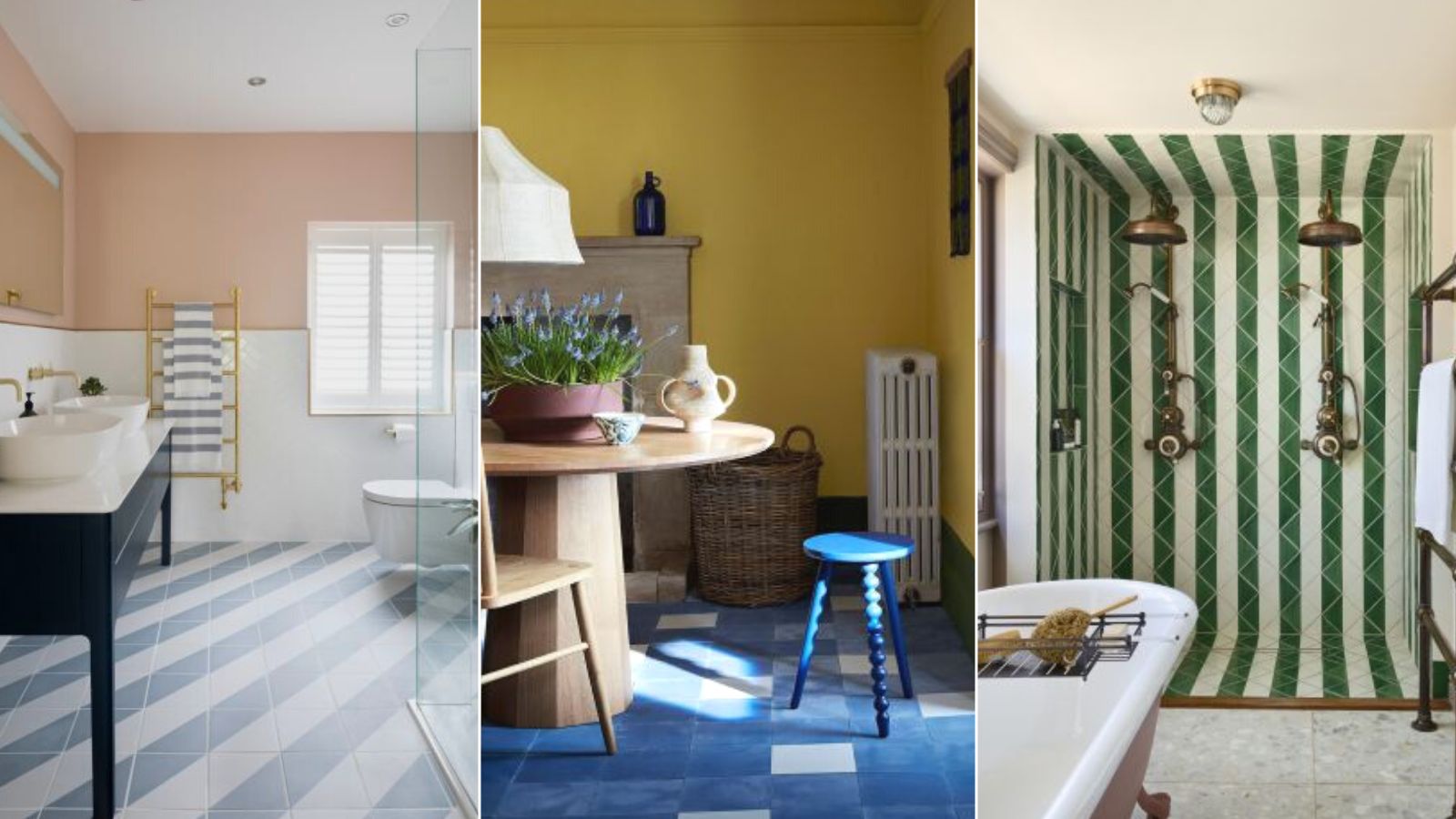

Tile represents a great opportunity to be as creative as you wish. Certainly, their hardwearing qualities make them a practical choice for walls and floors, but they can also be as subtle or as striking in design as you wish.
Available in a multitude of colors, finishes, shapes, sizes and price points, tile also possesses a secret weapon – the chance to express your individuality and change the proportions of your space visually by choosing a stylish or tricksy layout.
The fun of designing an adventurous pattern in beautiful hues is yours to be had, as is the opportunity to opt for a classic layout in soft color to add subtle interest to your scheme. And you can choose to lay and grout tile yourself, or call in a professional to create your design.
So, before you begin to hunt down kitchen tile ideas or bathroom tile ideas, let these tile layout patterns inspire your scheme.
Tile layout patterns and ideas
When you choose tile for a bathroom, kitchen, entryway and beyond, it's easy to be seduced by tile trends or the pattern or color alone. However, you can use kitchen floor tile ideas, for example, to create space-stretching effects, or bathroom wall tile ideas to introduce texture, and to display intriguing patterns and contrasts in a previously clinical space. These clever tile layout patterns give you a taste of what's possible.
1. Use pattern and grout lines to stretch space visually
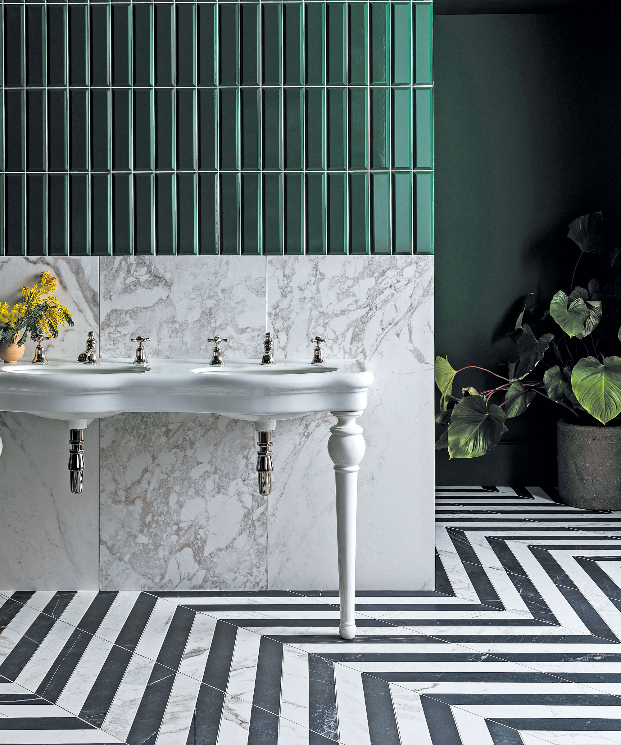
'Any tile layout pattern that is viewed diagonally, as with the bathroom floor tiles above, draws the eye diagonally to the four corners of the room, which creates a visual trick that makes the space look bigger than it is,' says Lucy Searle, Homes & Gardens' Editor in Chief.
This trick works in exactly the same way with grout lines, too, and you can see with the tall, thin green wall tiles above how the eye is drawn upwards, creating an impression of height, perfect for a room with a low ceiling.
2. Use color fade to exaggerate ceiling height
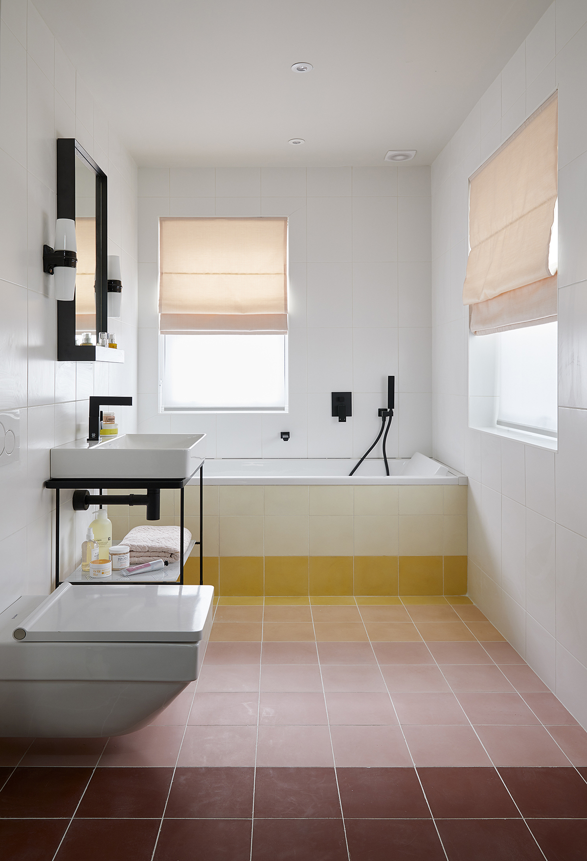
If you are looking for small bathroom tile ideas we have the perfect tile layout pattern for you. This bathroom by Base Interior shows off a tile trick that can be used in any room that's limited in height, whether a bathroom, kitchen, mudroom or entryway.
Simply use tile that is darker in the lower half of the tiled area and swap to lighter colors as you proceed upwards; it creates a visual trick of a taller room.
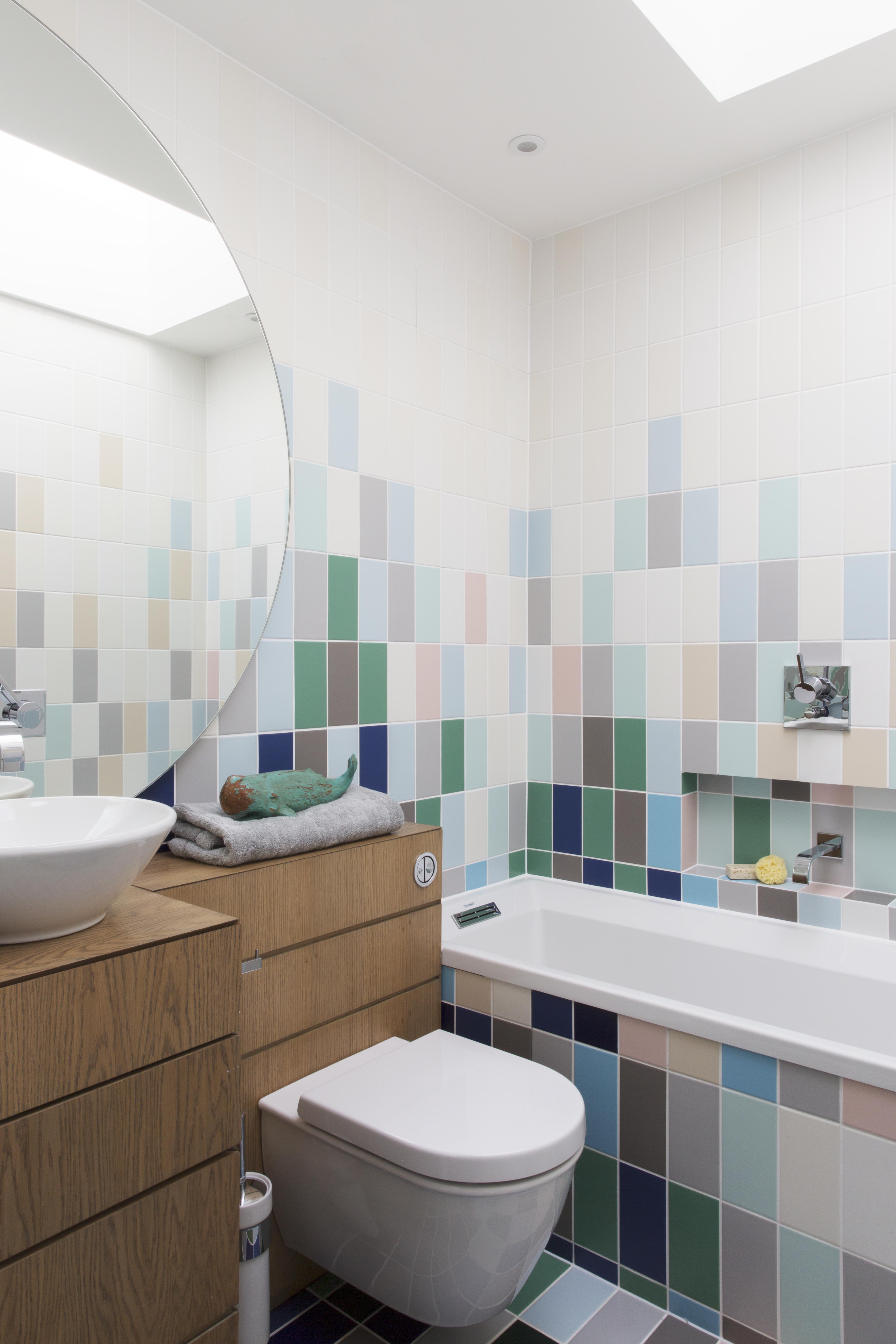
3. Create a rainbow effect to add interest to a plain space
Just as you can use color fade to exaggerate ceiling height, a similar effect can make a small bathroom look bigger and more interesting with a rainbow stripe of tiles. If you are going to attempt this look, it's important to stick to a very limited range of colors so that the effect is subtle not strident, and put the lighter colors further away to make the room feel longer.
4. Mix tile materials for interest
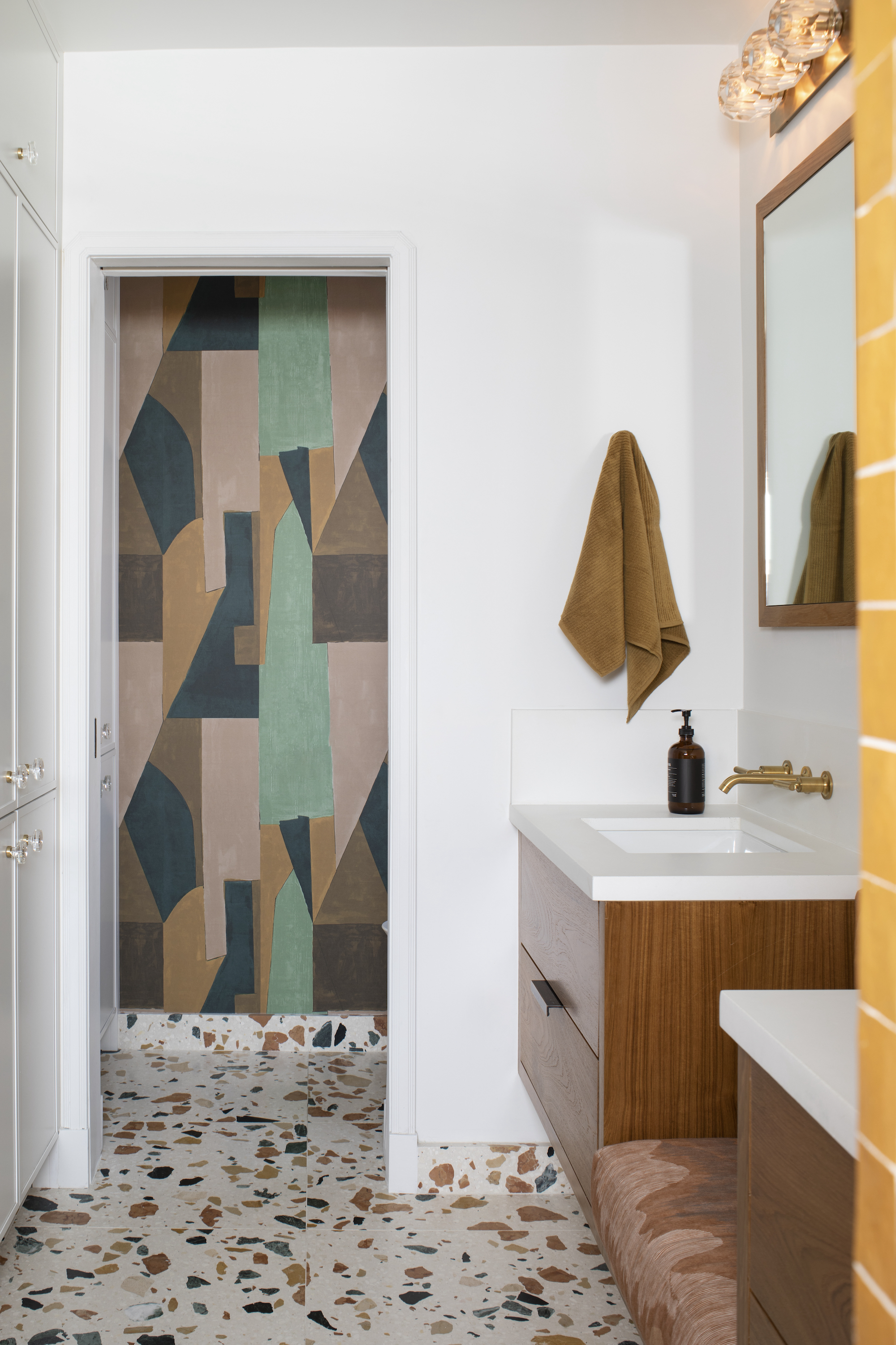
If you have a tiny space, it's so difficult to add interest in a way that doesn't make the room feel crowded. Using different tile materials and tile layout patterns is a clever way to do so, and to define different zones within the room.
'I layered a variety of materials to create this vibrant guest bath. The teak vanity, terrazzo floor covering and wallpaper are bold in scale and rich and warm in coloration,' says Karen Harautuneian, owner and principal designer at Hub of the House Studio.
5. Use one tile, two ways
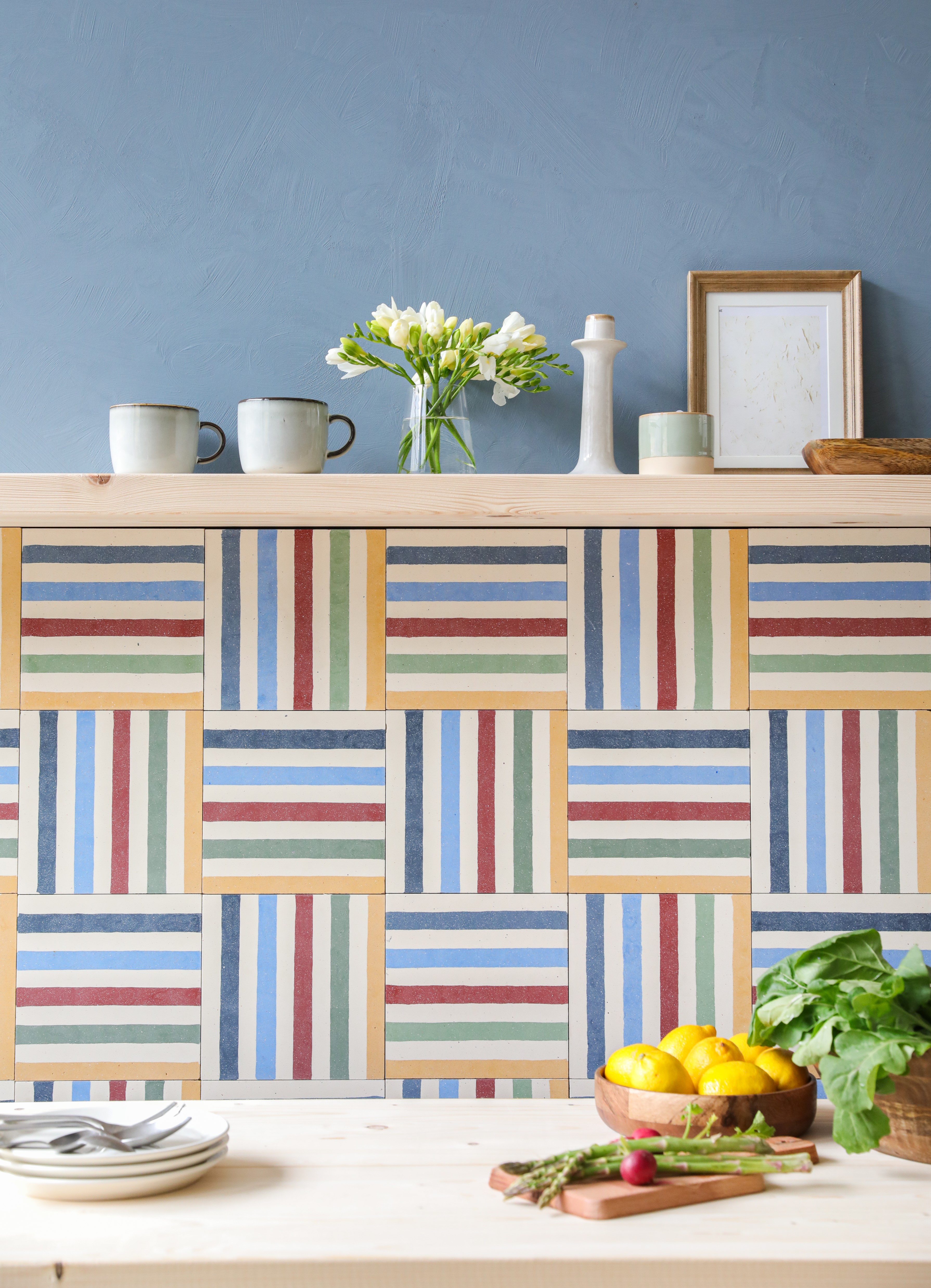
If you are looking to add interest to a kitchen but have a tight budget, you can create a more interesting look by taking one tile design and fixing it two ways, as this layout of Rainbow Stripe tiles from Otto Tiles suggests.
Instead of a simple stacked grid, the tiles are fixed horizontally then vertically, alternating on each tier, to create a checkerboard effect with a repeating step pattern of yellow.
6. Choose a random pattern for a laidback look
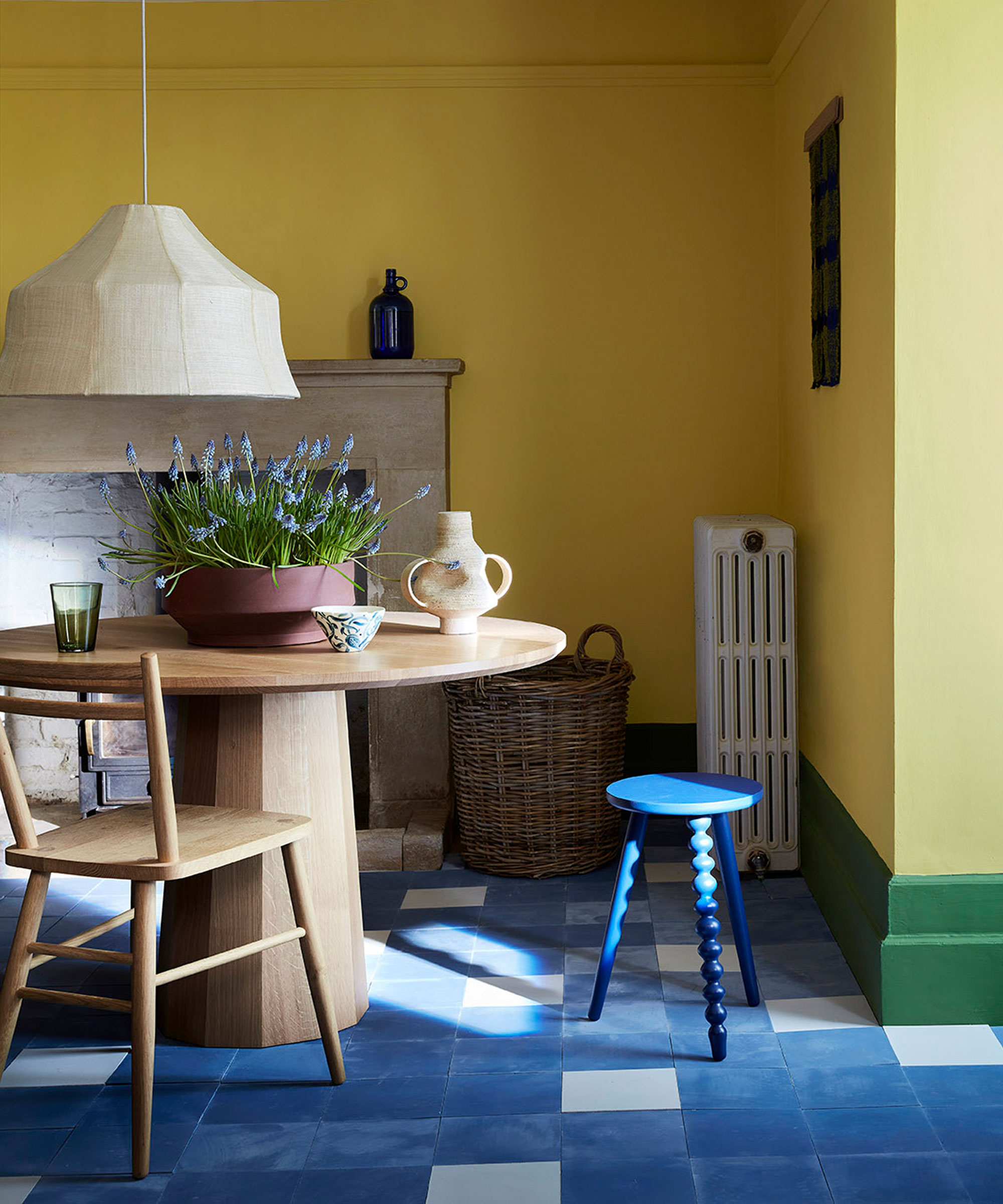
A purposefully random tile layout pattern will give you a relaxed look that's perfect for a rustic kitchen. However, no random pattern should ever be random – meticulous planning will always ensure the best effect, so do lay out the tiles before committing to tiling floors or tiling walls.
7. Create contrast with zoned tiling
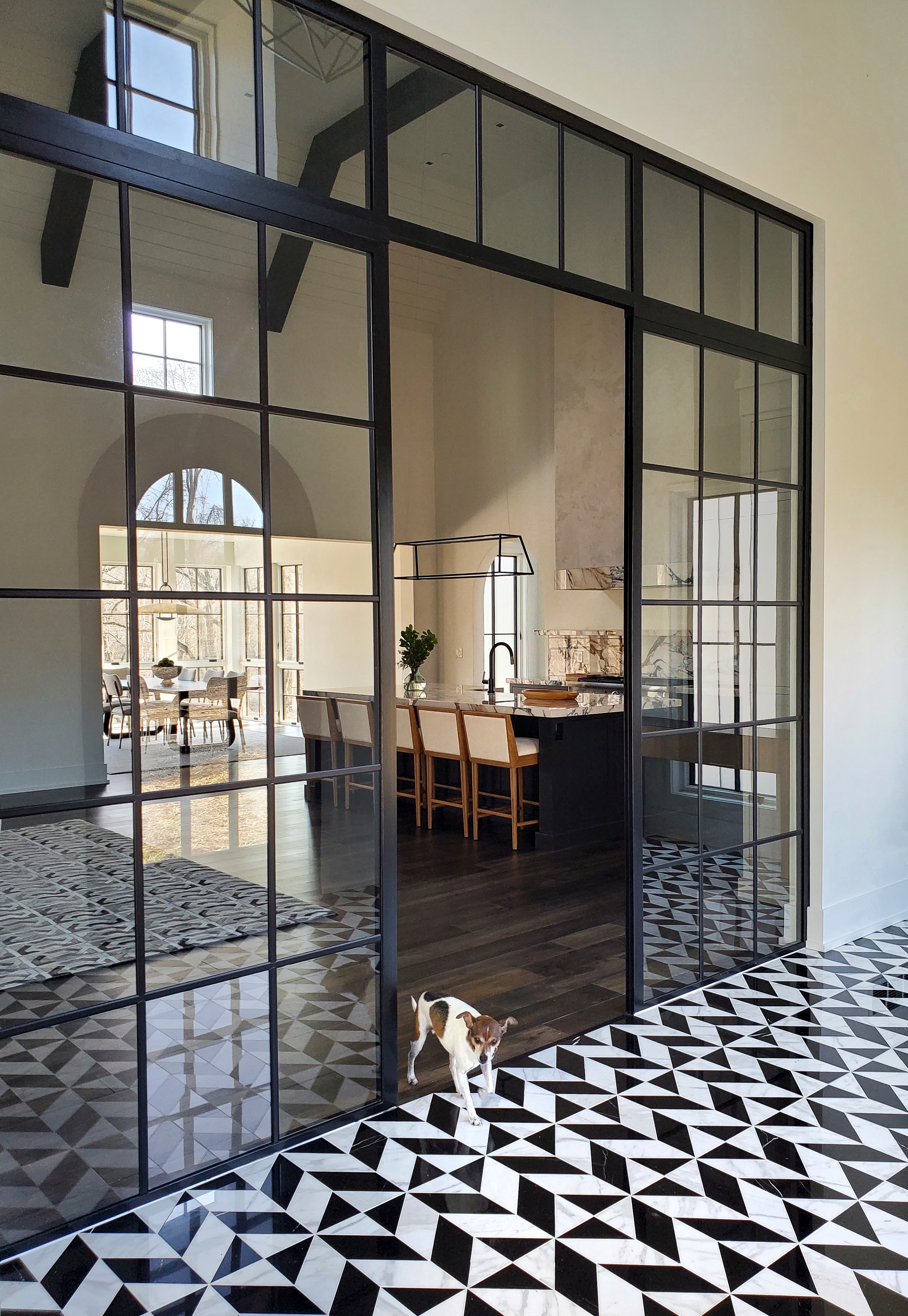
If you have an open-plan layout and want to create defined zones, one way to do so is to put patterned tile in one area, and plain flooring adjacent; highly patterned tiles can also be used to create surprise in an otherwise plain space.
A monochrome scheme always scores for its classic elegance, and is given an uplift here with a chevron patterned tile.
‘We love the graphic nature of this bold black and white pattern,’ says interior designer Elizabeth Reich, associate at Jenkins Baer. ‘The entire rest of the house is very minimal and quiet, we wanted a striking first impression upon entering the home – this was a nice juxtaposition against the wood floors and contemporary feeling throughout the home.’
8. Use tile layout to create a mural
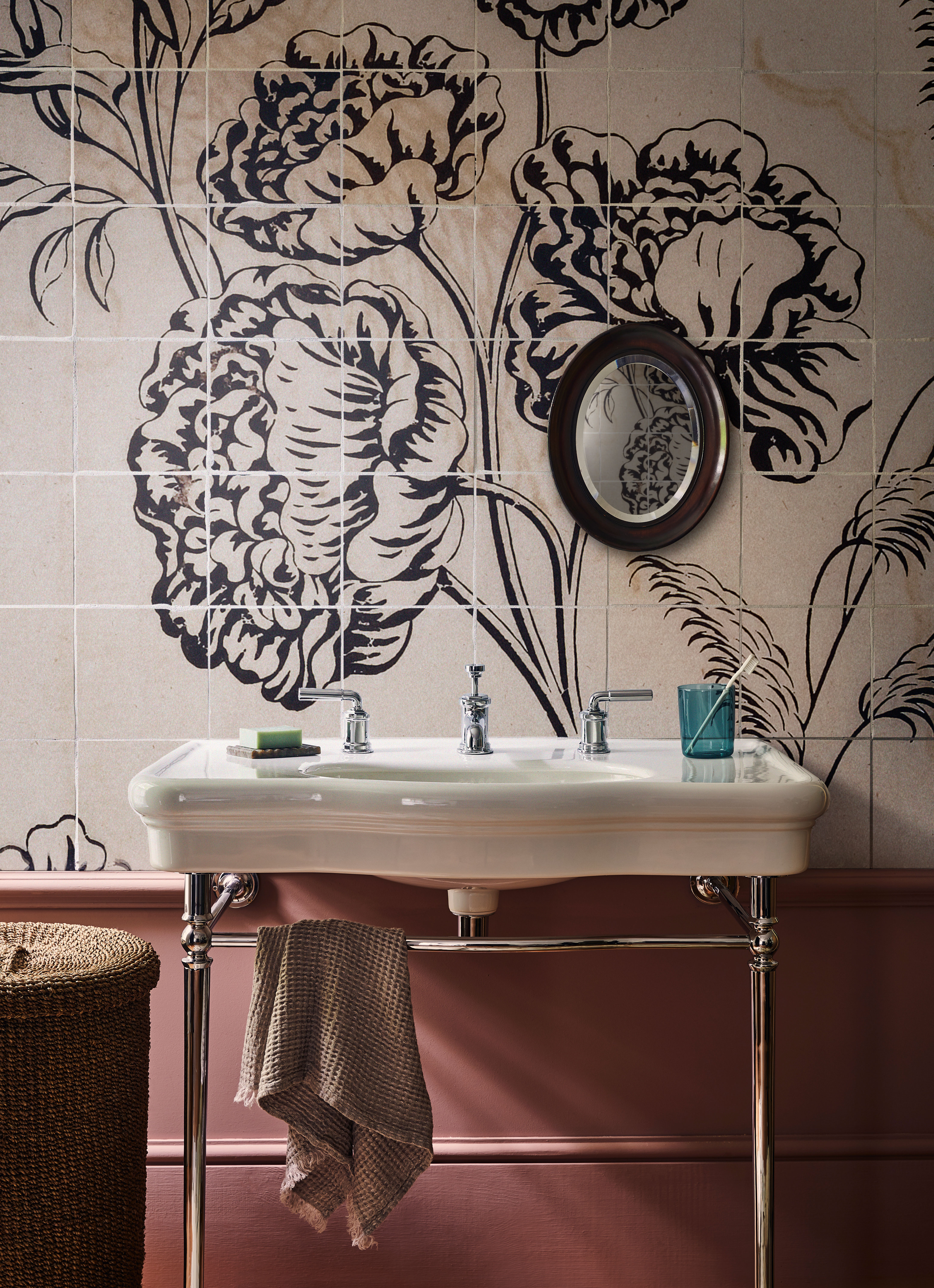
Looking for bathroom backsplash ideas with a difference? Wall mural ideas have been creeping into our bathrooms for some time now, and the trend shows no sign of abating.
'We love the over-sized nature of this tile pattern,' says Lucy Searle. 'It's perfect for a bathroom, but makes for ideal powder room wall decor, where interior designers tend to go for much more adventurous treatments.'
9. Play with a single motif
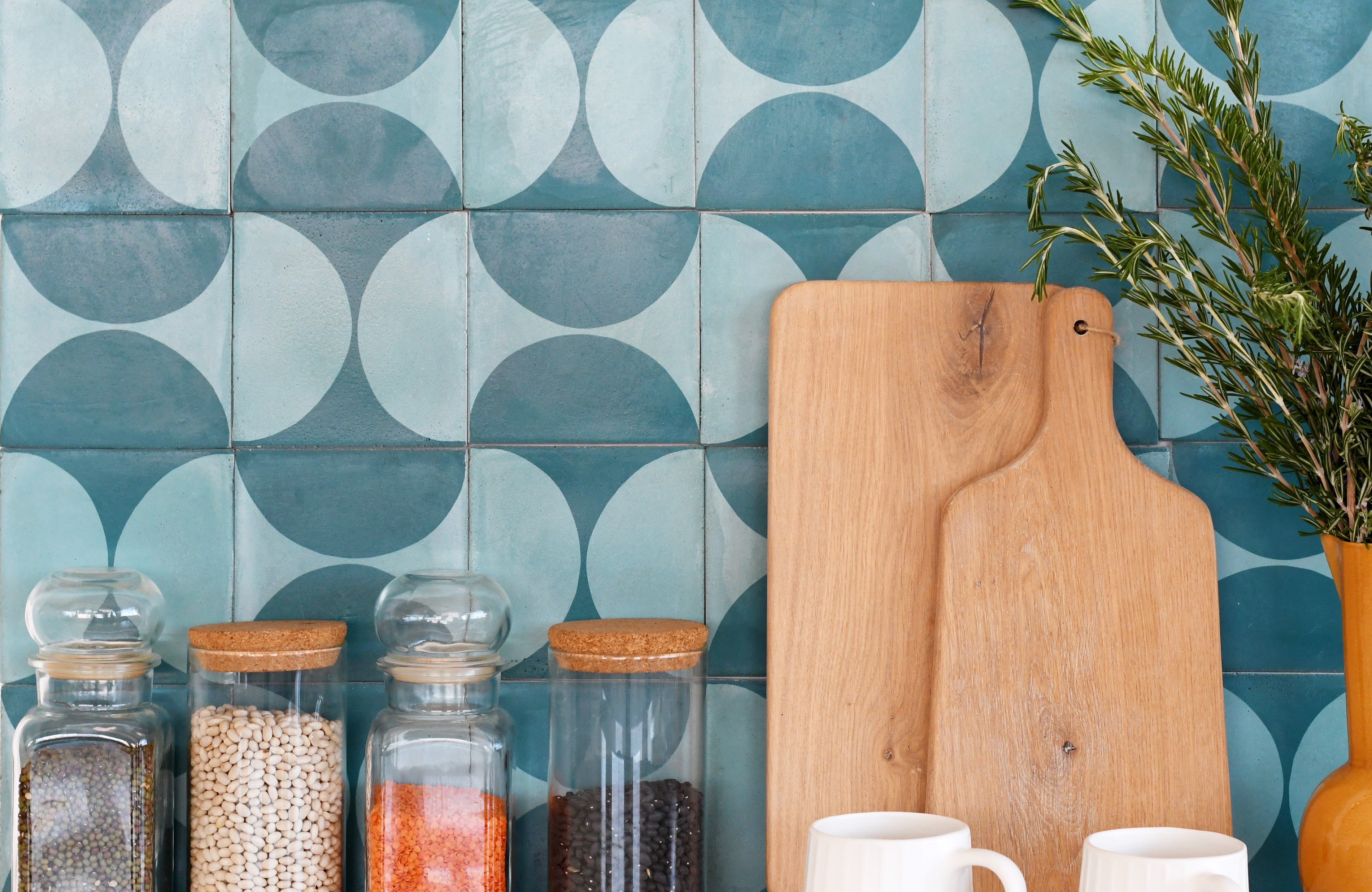
Founder and creative director of homeware studio Skinny laMinx, Heather Moore, is known for her clean, bold designs. ‘Patterns and shapes in architecture and urban landscapes have been a constant source of inspiration for me, but it was only when I started visiting Portugal that I saw that towns and cities could intentionally be covered in beautiful, colorful patterns – something that has stayed with me ever since,’ says Heather.
Her new tile collection for Concrete Studio includes a range of designs that can be built up to create more complex patterns, as you wish. ‘Last year, I set myself a creative challenge to spend 100 days creating patterns from small stamps that I carved and printed daily,’ she recalls. ‘The thrill of the exercise was to discover just now many patterns I could make, just using different combinations of a single motif. It was endlessly astonishing!’
10. Twisting the shape
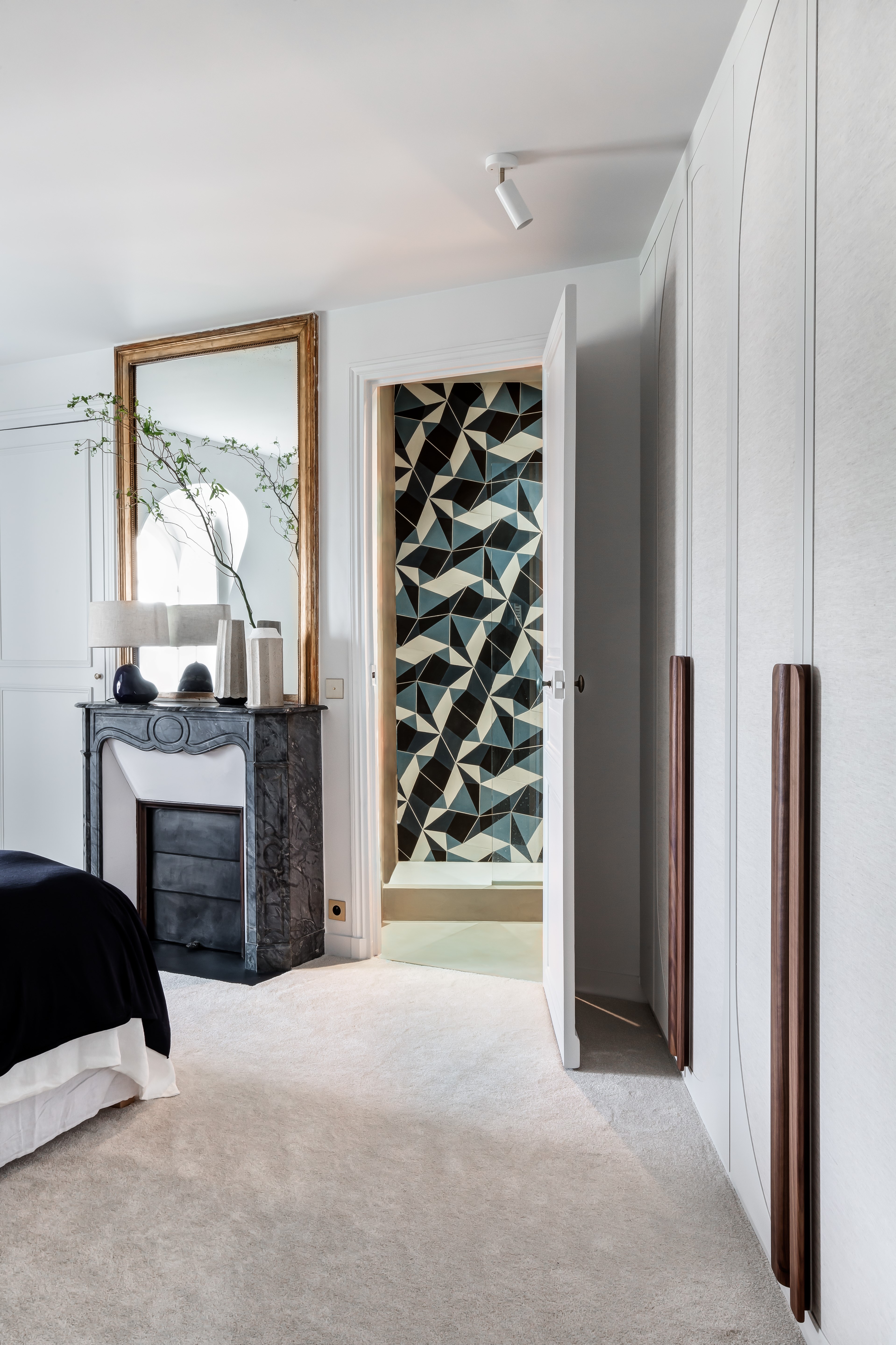
Looking for shower tile ideas with a difference? In a departure from classic squares and rectangles, look out for unusually-shaped tiles which allow for still more pattern possibilities.
Interior designer Barbara Bachmann of Bachmann Interior Design has used pentagonal Splinter tiles from Popham Design, alternating the upright color, to create a dramatic focal point in this ensuite shower room in Paris.
11. Create a tile pattern mix
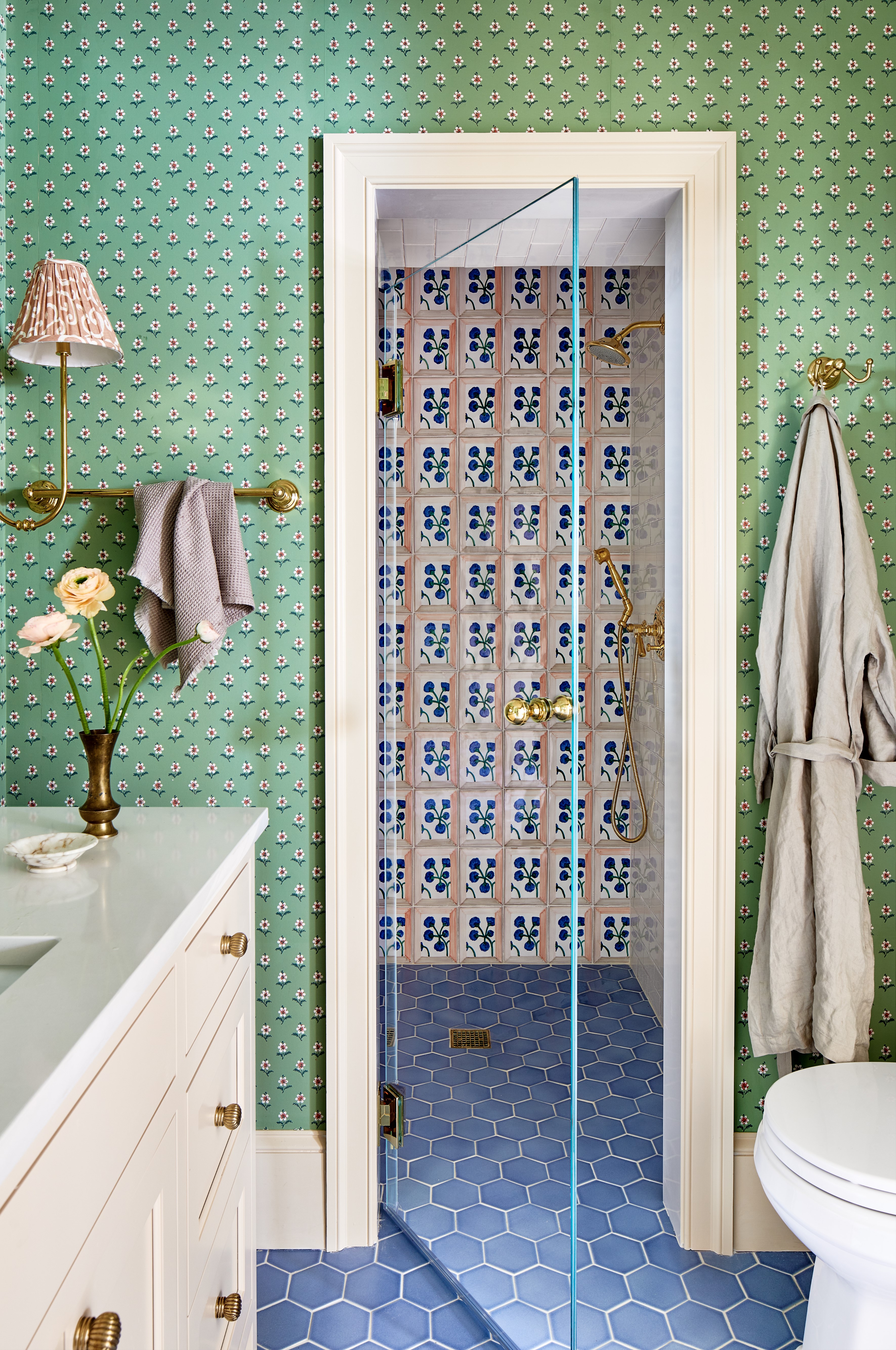
Proof that a combination of colors and patterns can work well together comes in the form of this elegantly bright and inviting bathroom by interior designer Cameron Ruppert, who teamed square wall tiles by artist Wayne Pate from Balineum with hexagonal floor tiles and daisy print wallpaper.
‘We wanted to play to the colors in the bedroom from some existing furniture which had tones of blues, greens, and apricots,’ says Cameron. ‘We found that Balineum tile and thought it was perfect way to marry all the colors.’
In tiling in a shower, you might want to follow this room’s lead with decorative wall tiles balanced by plain ones, seen right, so that the pattern doesn’t overwhelm the scheme.
12. Create height with statement stripes
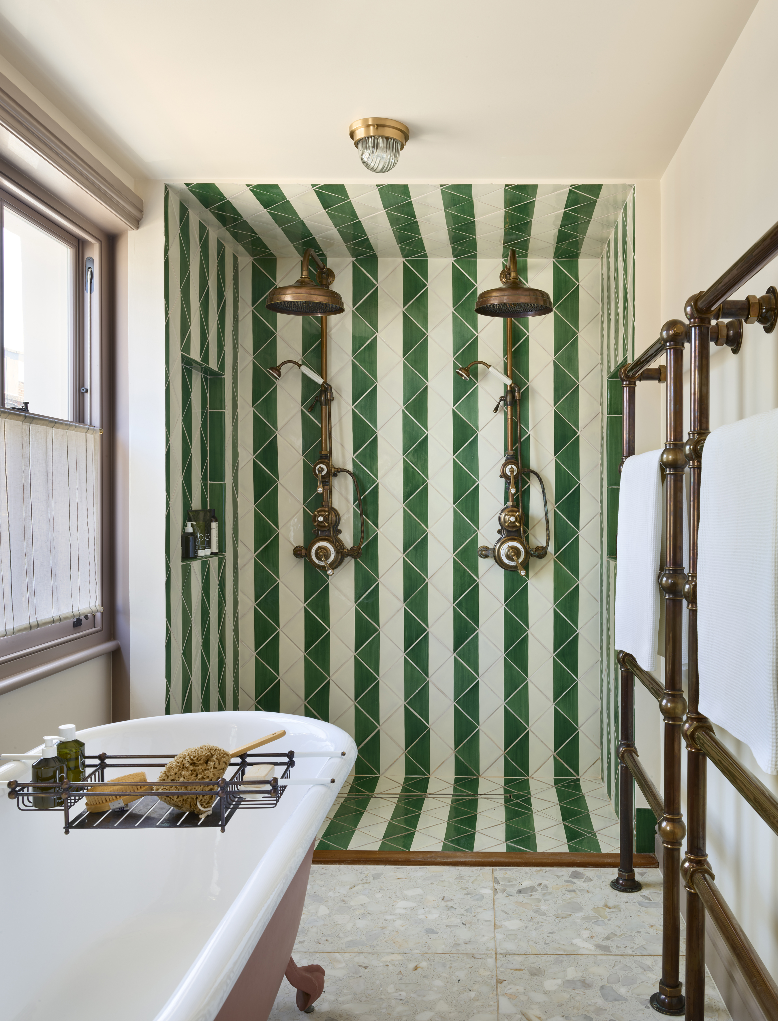
Simple square tiles with two triangles of color can create lots of visual patterns, depending on how you lay them.
Working with a similar color palette to the image above, interior designer Orla Read took tiles from Balineum to create this design featuring double Dalby showers from Drummonds. ‘Adding stripes is a great way to introduce a playful element without overwhelming the space,’ she says. ‘I took inspiration from the amazing bathrooms at The Hôtel Peter & Paul in New Orleans by Ash NYC and love the diagonal style of the stripe, which gives it another dynamic.’
13. Go for subtle interest
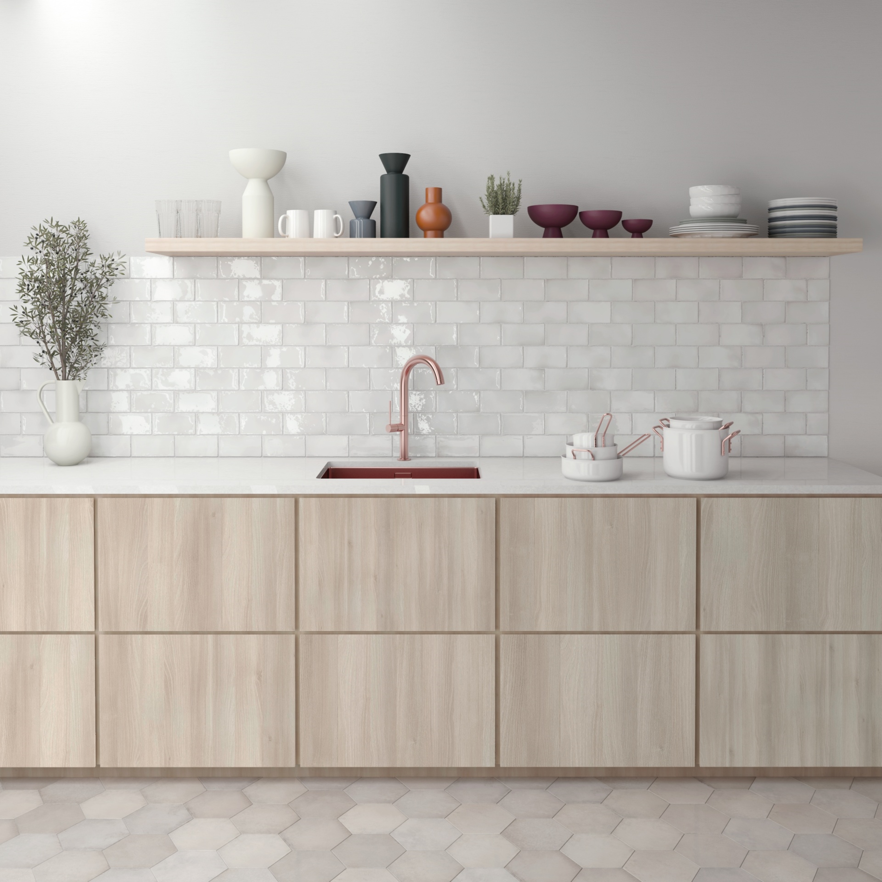
A simple subway tile idea offers plenty of opportunity for different tile layout patterns, from simple horizontal or vertical grids to complex basketweave designs. Even the staggered (also called offset or running bond) brickwork design can be varied: one third offset or half offset, as shown here.
‘Beautifully simple, start each tile at the centre of the one beneath it to create a wonderfully harmonious look,’ says Diane Hyde, marketing manager, Craven Dunnill.
14. Choose a bold herringbone style
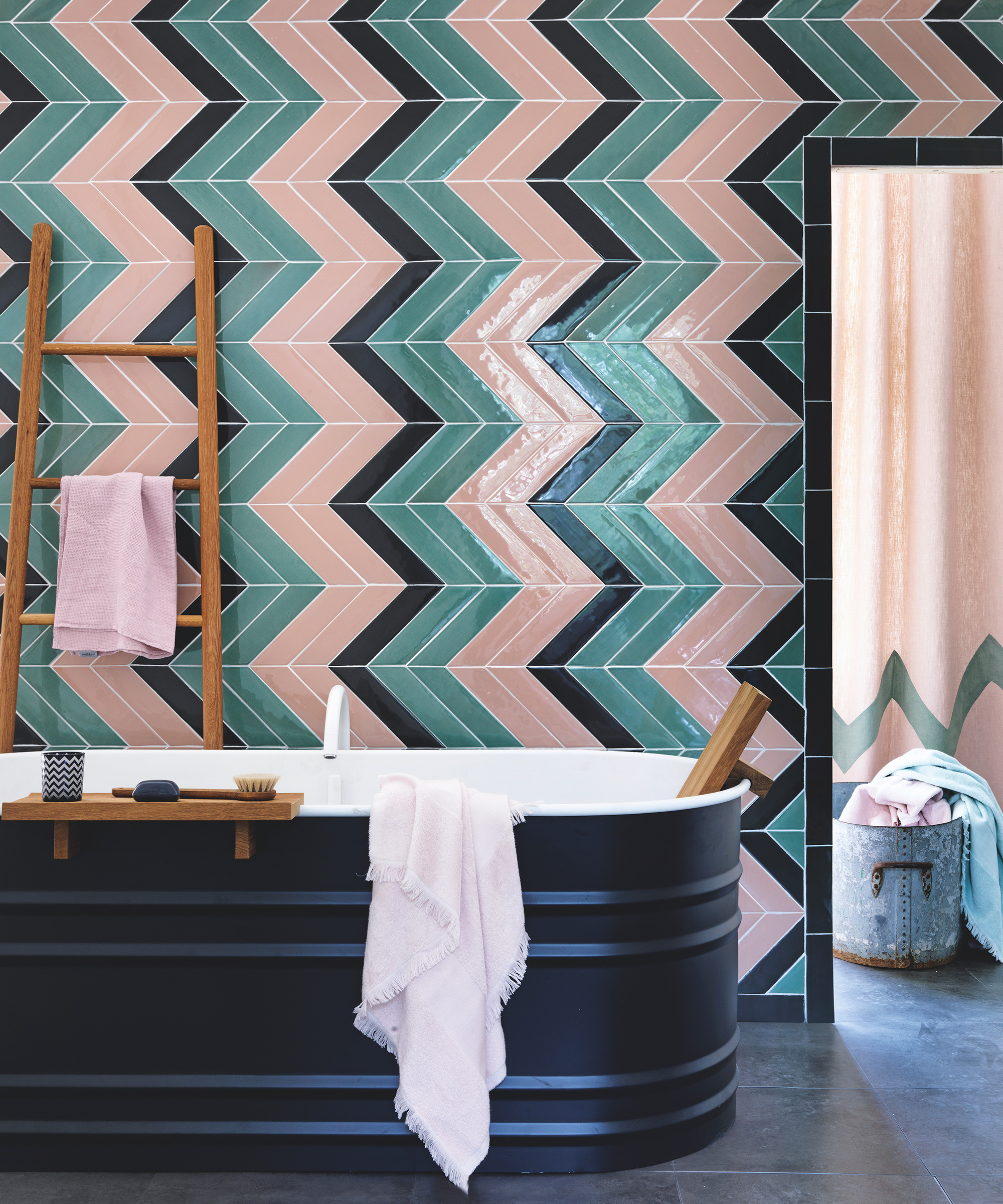
For added impact, consider taking classic subway (brick-shaped) tiles and fixing them in a herringbone pattern. A bold color will enhance the striking visual effect of the pattern, while a mix of two can be used to ramp up the drama of the design.
15. Add texture and drama with three tile types
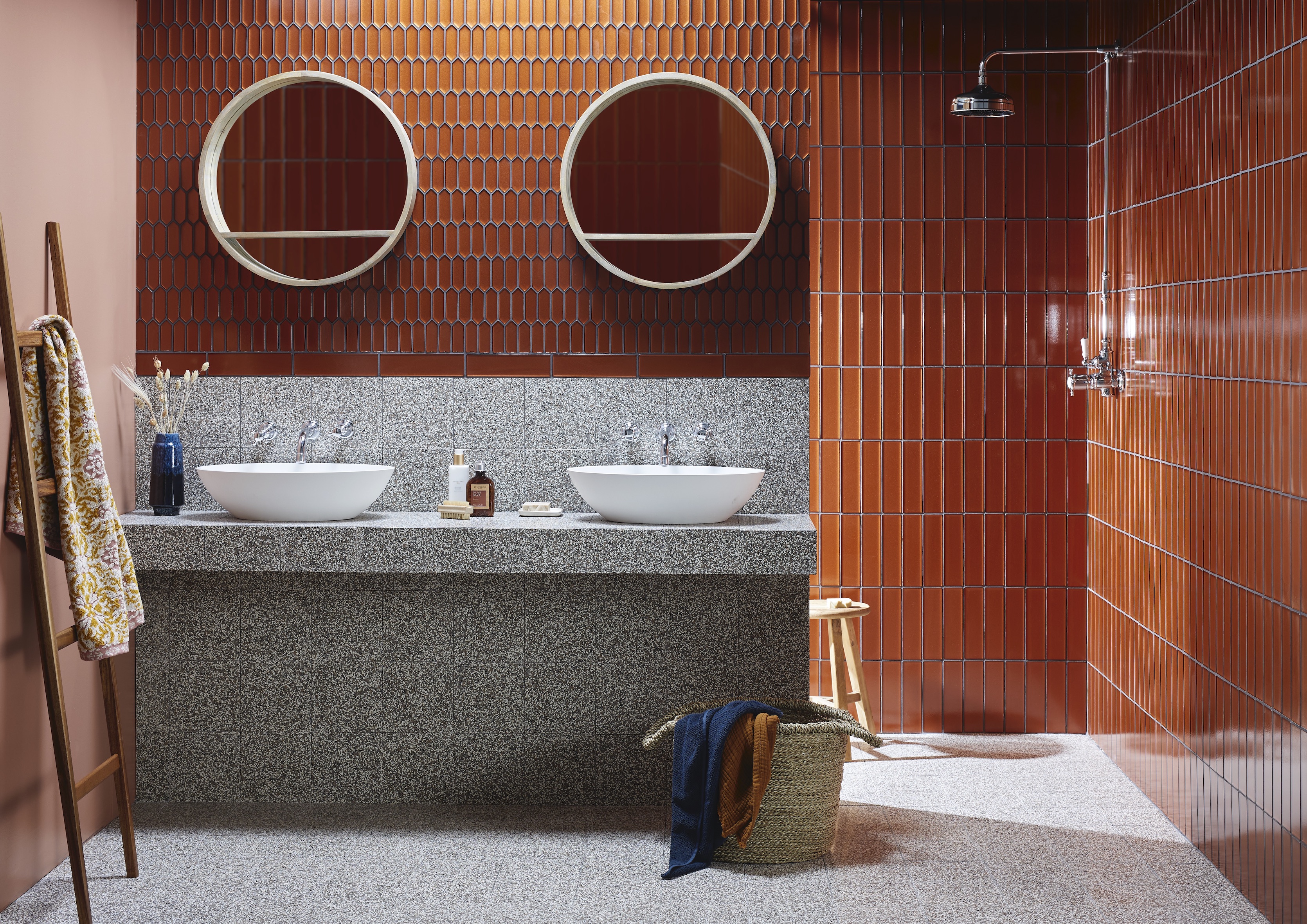
‘Tactile surfaces can really make a bathroom, ensuring that even the most compact space has plenty of visual appeal and a luxurious touch,’ says Colin Roby-Welford, creative director, Fired Earth.
Tile in three shapes has been used here to create a tile layout pattern with plenty of visual appeal: gleaming Kingfisher glass tile and mosaics reflect and catch the light, creating a warm and eye-catching contrast to the terrazzo bathroom tile. Elongated hexagonal mosaics have been fixed vertically, as have the brick-format tile, to introduce a decorative element to the scheme, while the square base tile brings balance.
16. Create a diagonal sweep
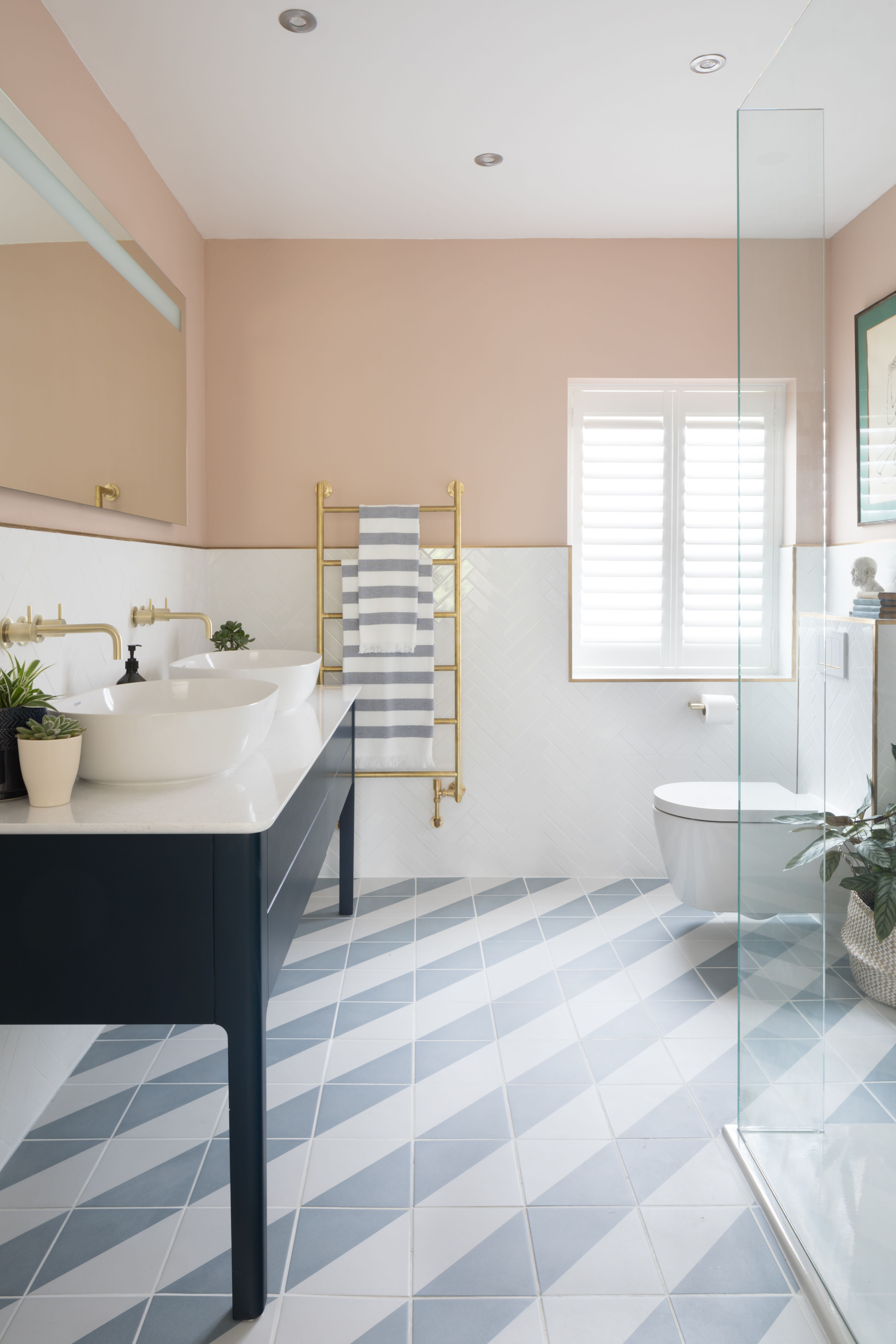
Laying wall tiles and floor tiles on the diagonal can make a room feel larger, as interior designer Emma Merry explains.
‘This layout draws the eye up and across the room, boosting the sense of space,’ she says. Here, two-color floor tiles have been laid to create a diagonal stripe, accentuating the impact of the design as well as the size-enhancing effect.
How can I make my room feel larger with tile?
Larger format tiles make for fewer grout lines – a less busy effect that can make a floor seem more expansive than it is. Another trick is to lay floor tiles on the diagonal, which can have the optical effect of making a space feel wider and longer, while fixing wall tiles in a vertical pattern to draw the eye upwards and make a room feel taller. Avoid ‘cutting up’ the space by choosing the same tile for the floor and walls if you want to boost a room’s spacious feel.
What is the best way to try my tile layout?
Before the tiles are purchased and fixed in position, it is a good idea to try the layout to see if you are happy with the effect, to avoid costly mistakes. It may be possible to work with a few sample tile and a sketchbook to see if you are happy with the combination. For a more complex design, some tile suppliers offer digital tile visualizers, with options to rotate the tiles and layout patterns, or work with a professional tile installer to create a detailed design and to calculate the quantity of tile required.
Sign up to the Homes & Gardens newsletter
Design expertise in your inbox – from inspiring decorating ideas and beautiful celebrity homes to practical gardening advice and shopping round-ups.

Amelia Thorpe is a specialist interiors and design journalist, covering every topic to do with homes from fabrics, furniture and lighting to surfaces, kitchens and bathrooms.
As the daughter of an antique dealer and a lifelong collector of old cookery books and vintage graphics herself, she also has a particular expertise in antiques, mid-century and decorative arts of all kinds.
Drawn to homes because of their importance in the happiness of our lives and the enjoyment they can bring, Amelia has been writing about the topic for more than fifteen years. She has interviewed some of the most influential designers of our time, from Piero Lissoni, Antonio Citterio, Jaime Hayon and Arik Levy to Nina Campbell and Robert Kime.
-
 5 surprising but brilliant ways to clean with old socks – from perfectly buffing stainless steel to deterring pests naturally and more
Tackle dust in tricky corners, clean your mirrors and even banish bad odors with those rogue single socks
By Andy van Terheyden Published
-
 How to grow astilbe – expert advice on cultivating this shade-tolerant flowering perennial
Shade-tolerant and pest-resistant - astilbe are hardy and tough perennials that can thrive in many settings
By Ellen Wells Published
-
 7 dorm room organizing rules for less clutter and more space
Experts offer their top tips for creating a well-organized dorm room, no matter the size, space, or layout.
By Ashley Chalmers Published
-
 How to maximize storage in a small or shared dorm room, according to pro organizers
Find out all the hidden storage zones you might never have noticed
By Ashley Chalmers Published