6 things designers warn can make your living room look cheap (and how to avoid them)
The design decisions that could be bringing your living room down
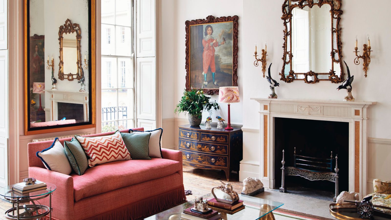

We talk a lot about ways you can elevate your living room, ways to make it look more chic, ways to make it look more expensive. But what about the design decisions that risk making your living room look cheap?
The key to a beautiful living room isn't about having an unlimited budget, it's more about creating a considered, subtly curated space. It's about what you choose to bring into your space not how much you spend on it. So it's entirely possible to design a living room on a tight budget that feels far from cheap.
No matter what your budget, however, knowing what to always avoid in your living room is good knowledge to have. So we asked designers to talk us through the things that they instantly notice in a living room that bring the space down. What tiny details can have an impact? And where should you always invest your money in order to prevent the room from looking cheap?
5 things designers say never to do in a living room
1. Oversized furniture

The design of your living room furniture will of course have an impact on the space, but the size of the pieces you choose can also have an effect, and designers warn going too big can bring down the aesthetics.
'Inappropriately scaled furniture is another trend that often negatively affects a room's appearance. A sizable sectional sofa may seem luxurious but can overwhelm a small room, making it feel cramped and unbalanced.' says designer Kati Curtis.
'Instead, choose furniture pieces that fit well within the available space and maintain the room's proportionality. This careful attention to detail can elevate the sophistication of your living room and avoid the pitfalls of transient trends, or your home looking like a college dorm.'
Dara Huang, founder of Dara Maison agrees, 'Ignoring scale and proportion can make a living room like cheap. Furniture that is too large or too small for the space can create a sense of imbalance and visual discomfort.'
To prevent this plan your living room layout, or at least plan in where the larger components like the the seating and the coffee table will go so you can have an idea of what sizes are going to work with the space. Literally, tape out your plan if you need to and walk about the space to check there's plenty of breathing space.
2. Undersized rugs
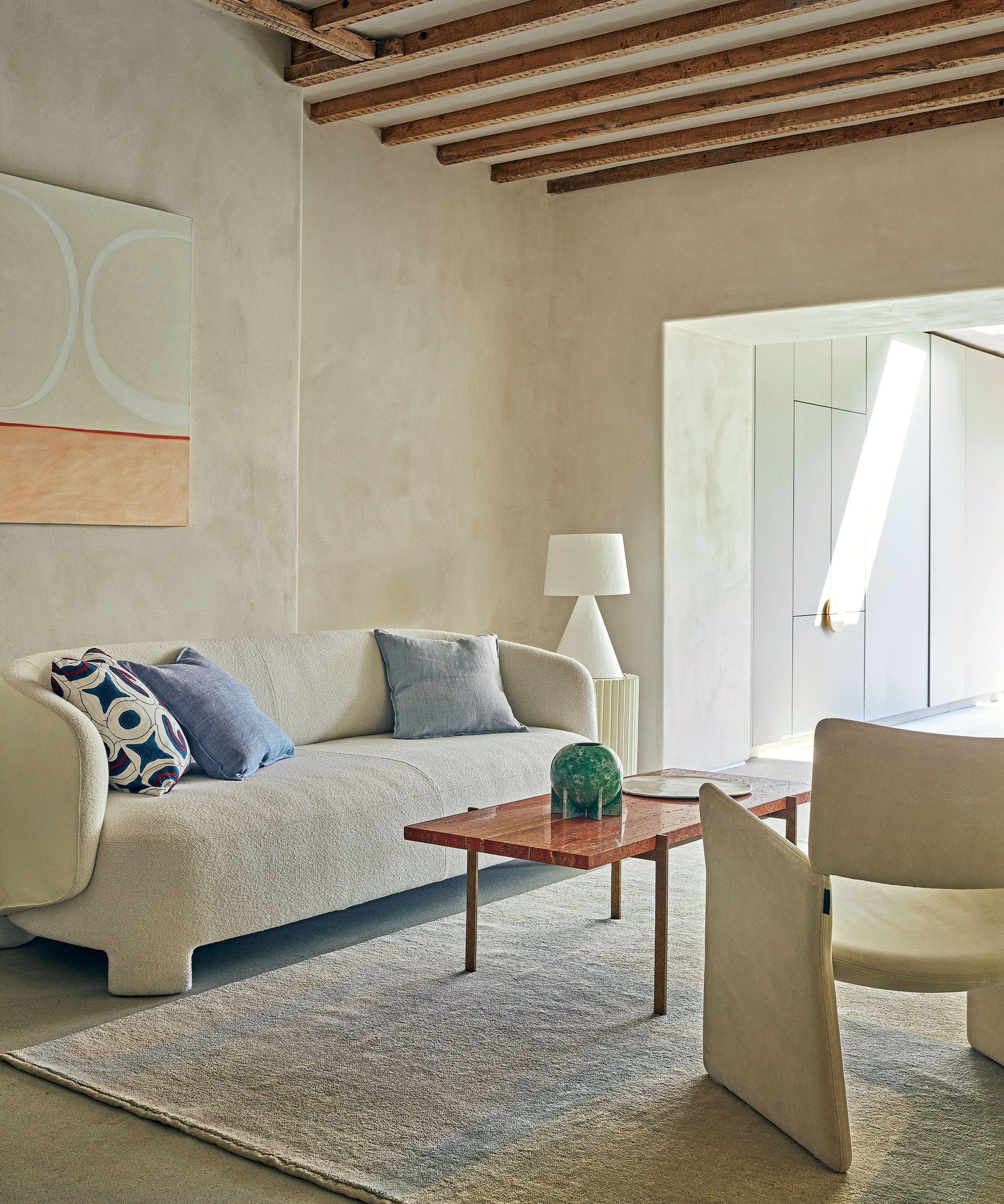
Nothing shrinks a room and makes it look cheap like a rug that's too small. Always opt for a larger living room rug that the majority of your furniture can sit on top of.
'Undersized rugs have to be the biggest mistake that we see people make in living rooms. Rugs are expensive so often it can seem logical to opt for a smaller cheaper rug, but it is a false economy.' says designer Cherie Lee.
'A rug grounds the rooms helping to add softness and texture. A good rule of thumb is that all key pieces of furniture need to stand on top of the rug, even if it's just the front legs of a stool or sofa. Rugs on top of carpets are also something best avoided. '
3. Faking architectural features
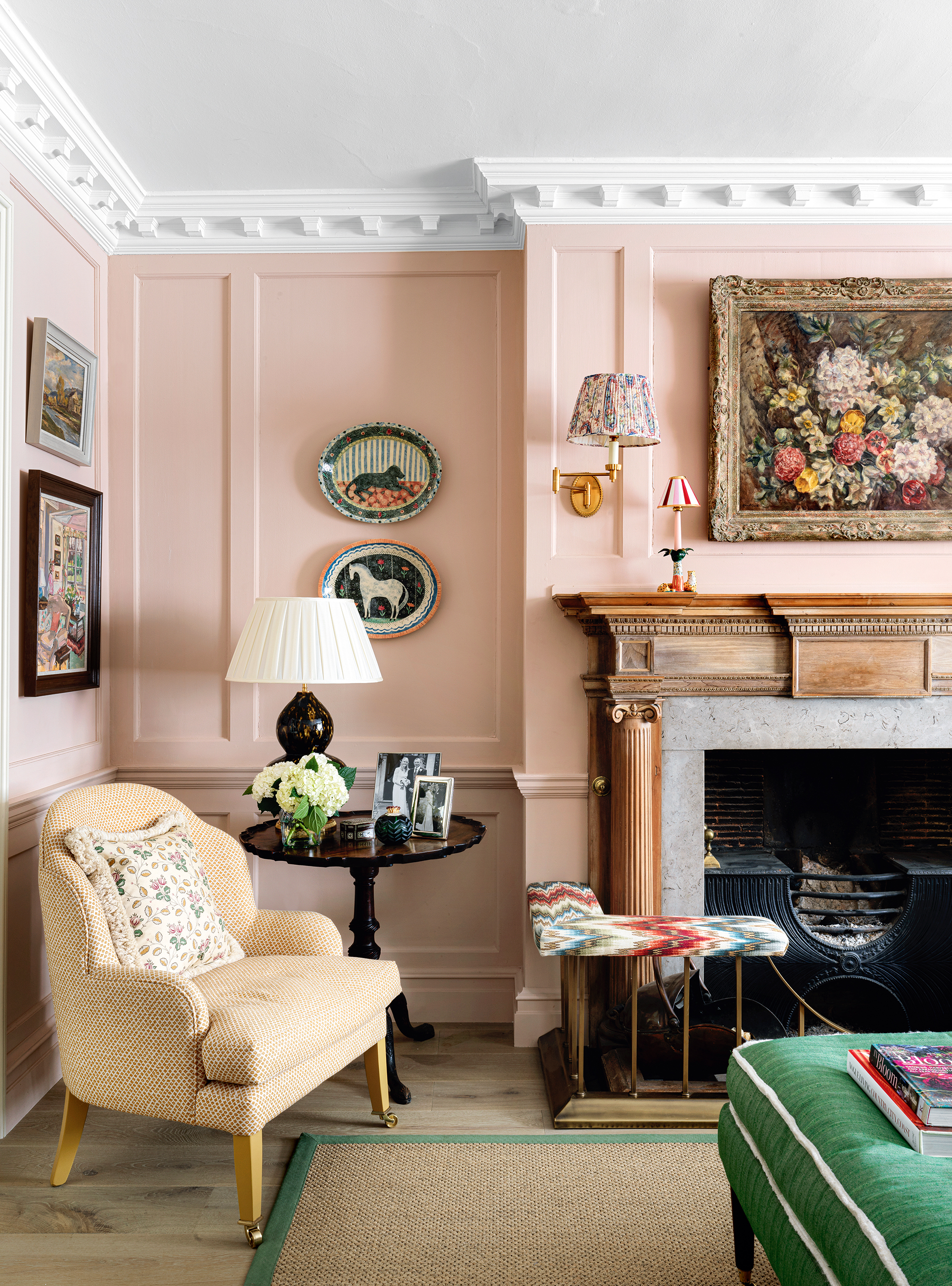
If you have the budget to really invest in adding architectural features to a living room, it can work to make a living room look more expensive, but get it even slightly off and it instantly cheapens a living room and can look really jarring.
'In my opinion, things that pretend to be something they are not or are fakes will look cheap in the living room. An example I see a lot is a fireplace surround, if the fireplace is not there and never was, don't try to emulate it unless you have the budget and the right space to do so.' advises designer and founder of Colombe, Marta Chrapka.
'Moldings are another example. They are usually a great decoration but must be made of plaster, not polyurethane otherwise they will look cheap. Any kind of wall panels that imitates stone too - ultimately, their cost is high and the effect is cheap. In the case of fabrics - the same rule with artificial fabrics - all natural ones, even simple linen, look noble and expensive, while polyesters, even the expensive ones, usually have a cheap effect/
4. Not investing in the key pieces
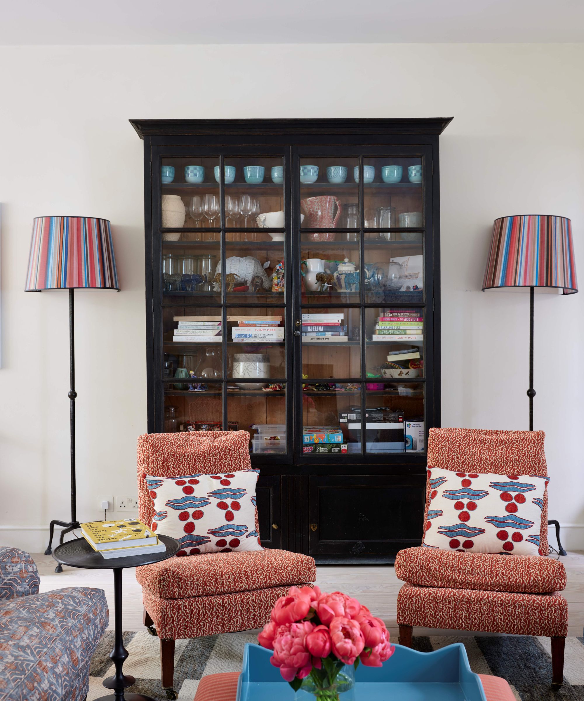
The rule of quality not quantity applies here. Easiest way to not make a living room look cheap? Invest in the key pieces that are going to be the focal point of your room. Save on the decor that doesn't need to last as long or won't be as noticed.
'My No. 1 piece of living room furniture shopping advice is to invest in high-quality anchor pieces that are built to stand the test of time both aesthetically and physically. I'm all about maximizing your budget and looking for the best price on items like sofas, sideboards, and coffee tables, but if cut corners with design and quality, it really does show, especially as your pieces age.' says designer Kathy Kuo.

Kathy Kuo is a celebrated interior designer and international guru within the home and lifestyle space. She has 20+ years of experience in the design industry.
5. Curtains in solid colors and cheap fabrics
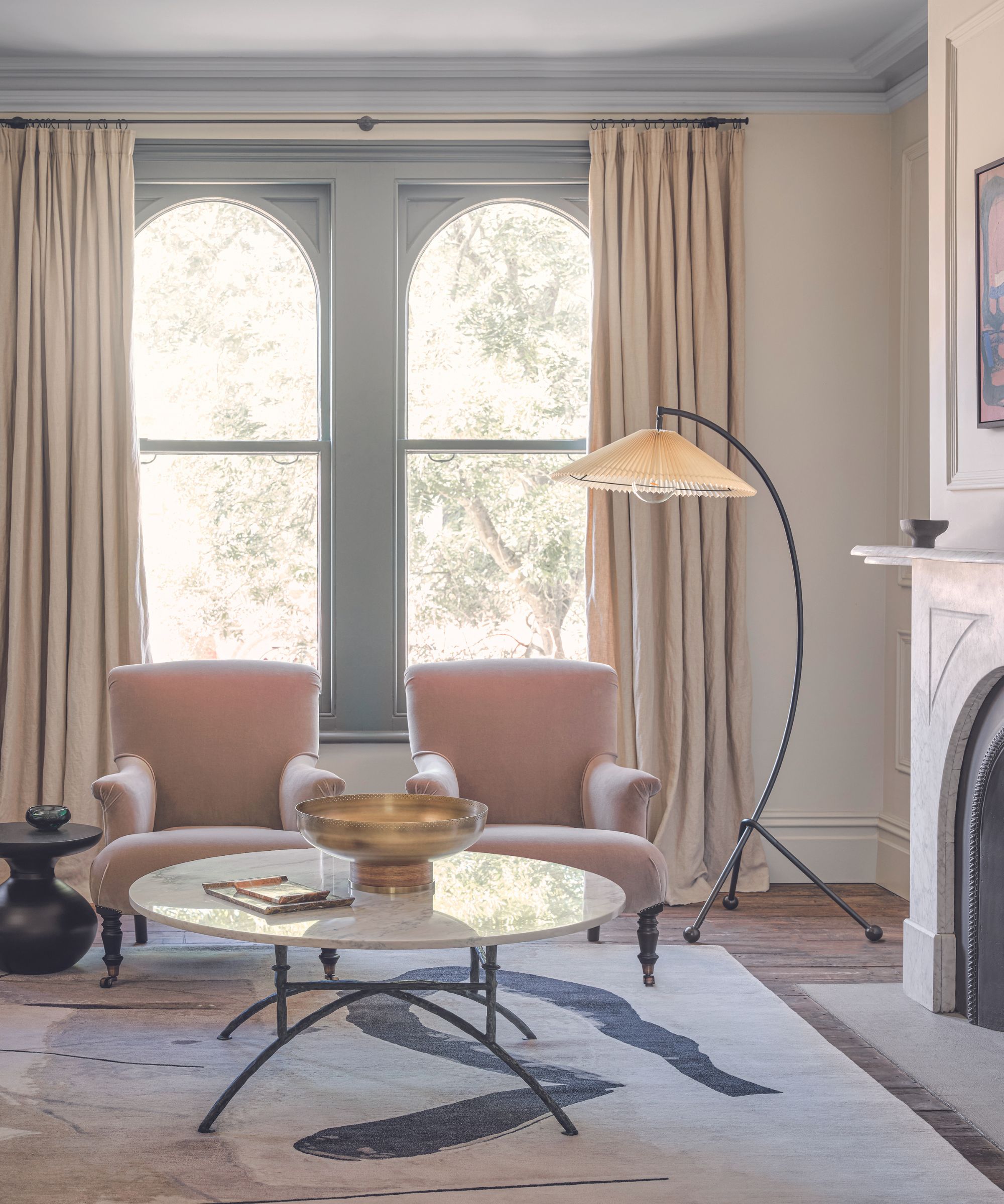
Living room curtains may not seem like a big part of your space, but get them wrong and you will really notice it. Going for cheap, block color drapes in a heavy, synthetic fabric will instantly cheapen your living room. With so many beautiful affordable options out there, this one is really easy to avoid too.
'Cheap, off-the-shelf curtains in solid colors, for example, can fail to fit your windows correctly, resulting in an awkward aesthetic and strange color blocking that disrupt the harmony of the space. Opt for custom-made curtains in textures or prints that perfectly suit your window dimensions and the room's overall style.' says Kati Curtis.
And it's about how you hang your curtains too. 'Incorrectly hung curtains or curtains that are too short. You can buy expensive fabrics and trimmings but if your curtains don’t frame your window correctly, they will instantly look inexpensive and date the look and feel of the room.' says Camilla D. Fischbacher, Creative Director at Christian Fischbacher.
'To ensure windows are dressed in a way which will elevate any space, hang curtains close to the ceiling and let them drape until they are approximately 1 inch from the floor. For linen curtains, they should be puddled on the floor as they can grow or shrink due to being a natural material with the humidity in the air.'
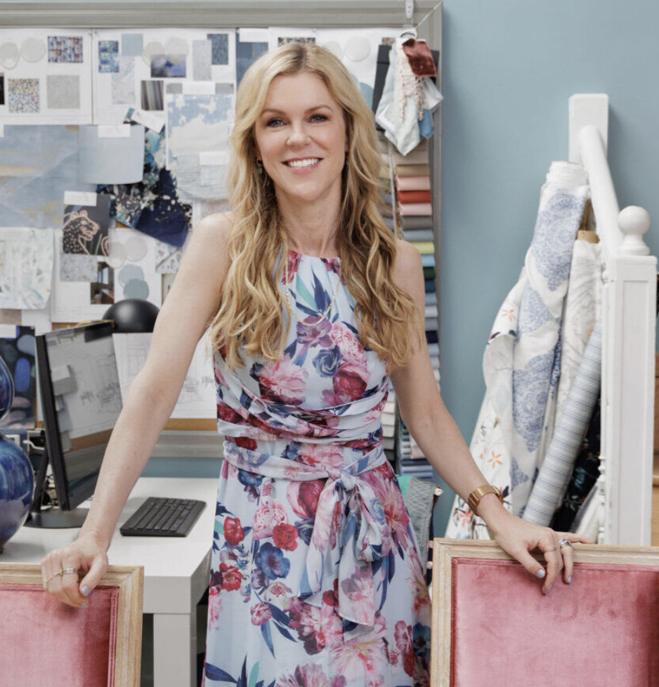
Kati Curtis is the founder of Kati Curtis Design, an design firm based in New York City specializing in classic design with a global influence. Kati founded the studio in 2005 after 12 years of working with international architecture and engineering firms.
6. Neglecting lighting
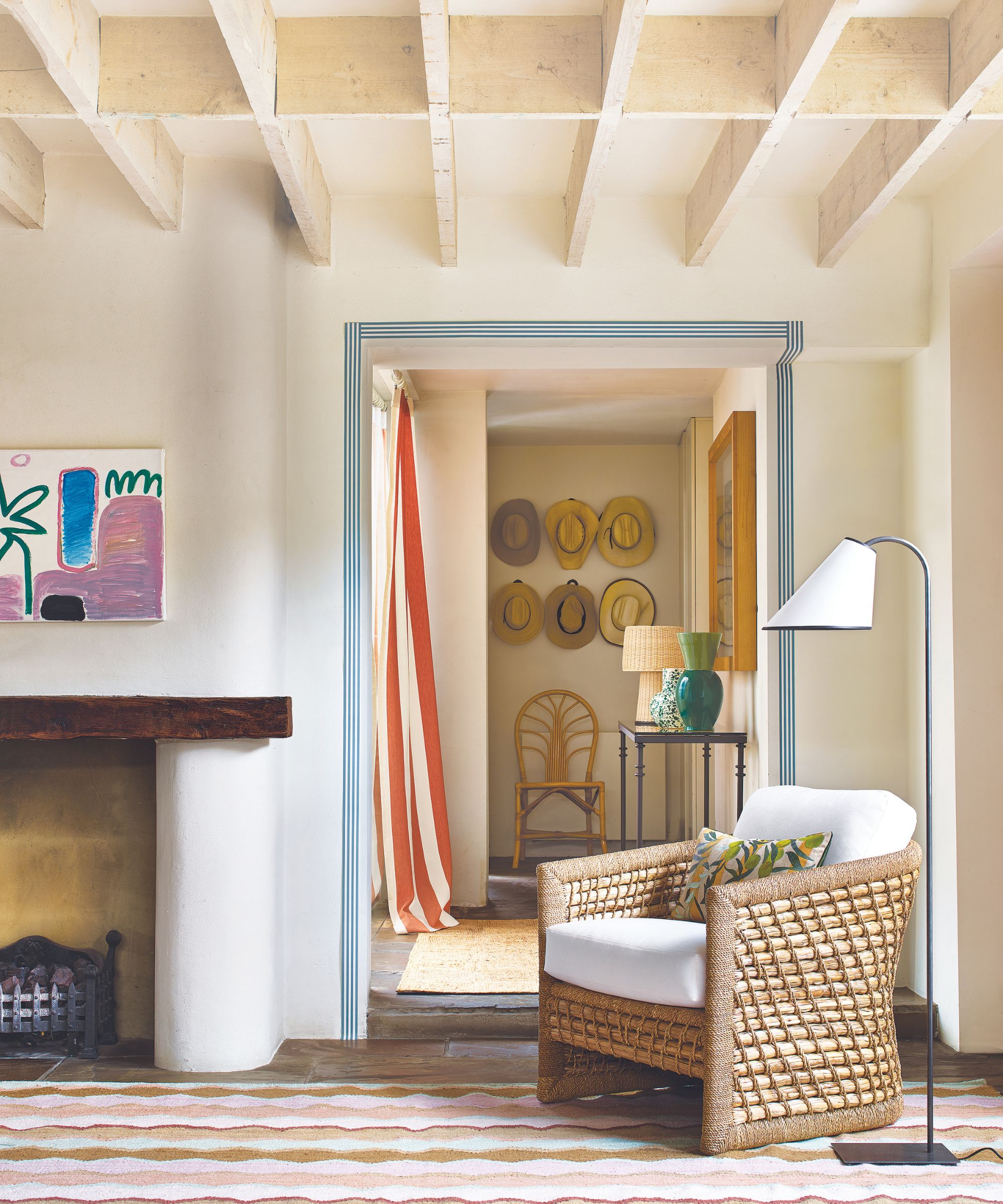
'Neglecting lighting can bring down the feel of a living room. Inadequate or poorly chosen lighting can diminish the room's ambiance and overall appeal.' says Dara Huang. Living room lighting sets the tone of the room, and is important as the color of your walls or the design of your sofa. Get it wrong and your room can feel harsh and cold, get it right and you create a space that's warm and welcoming. Plus, good lighting can hide a multitude of sins elsewhere in the room.
'To make a living room look and feel elevated always consider your lighting. Often, builder-grade lighting can make a space look generic or uninspired, but there are so many beautiful lighting options and resources at any price point. Further, there are plenty of ways to layer in lighting to create an ambient and welcoming environment.' advises designer Marie Flanigan.
'First, consider your overhead lighting options and if possible, incorporate a chandelier to make a gorgeous statement. Next, task lighting, like sconces or pendants, are a great way to add additional texture and finishes to a space. Lastly, there is no shortage of amazing table lamps, so find a style that speaks to your space and adds character. Good lighting can truly be the difference between good and great interior design.'
Sign up to the Homes & Gardens newsletter
Design expertise in your inbox – from inspiring decorating ideas and beautiful celebrity homes to practical gardening advice and shopping round-ups.

I am the Head of Interiors at Homes & Gardens. I started off in the world of journalism in fashion and luxury travel and then landed my first interiors role at Real Homes and have been in the world of interior design ever since. Prior to my role at H&G I was the digital editor at Livingetc, from which I took a sabbatical to travel in my self-converted van (not as glamorous as decorating a home, but very satisfying). A year later, and with lots of technical DIY lessons learned I am back to writing and editing, sometimes even from the comfort of my home on wheels.
-
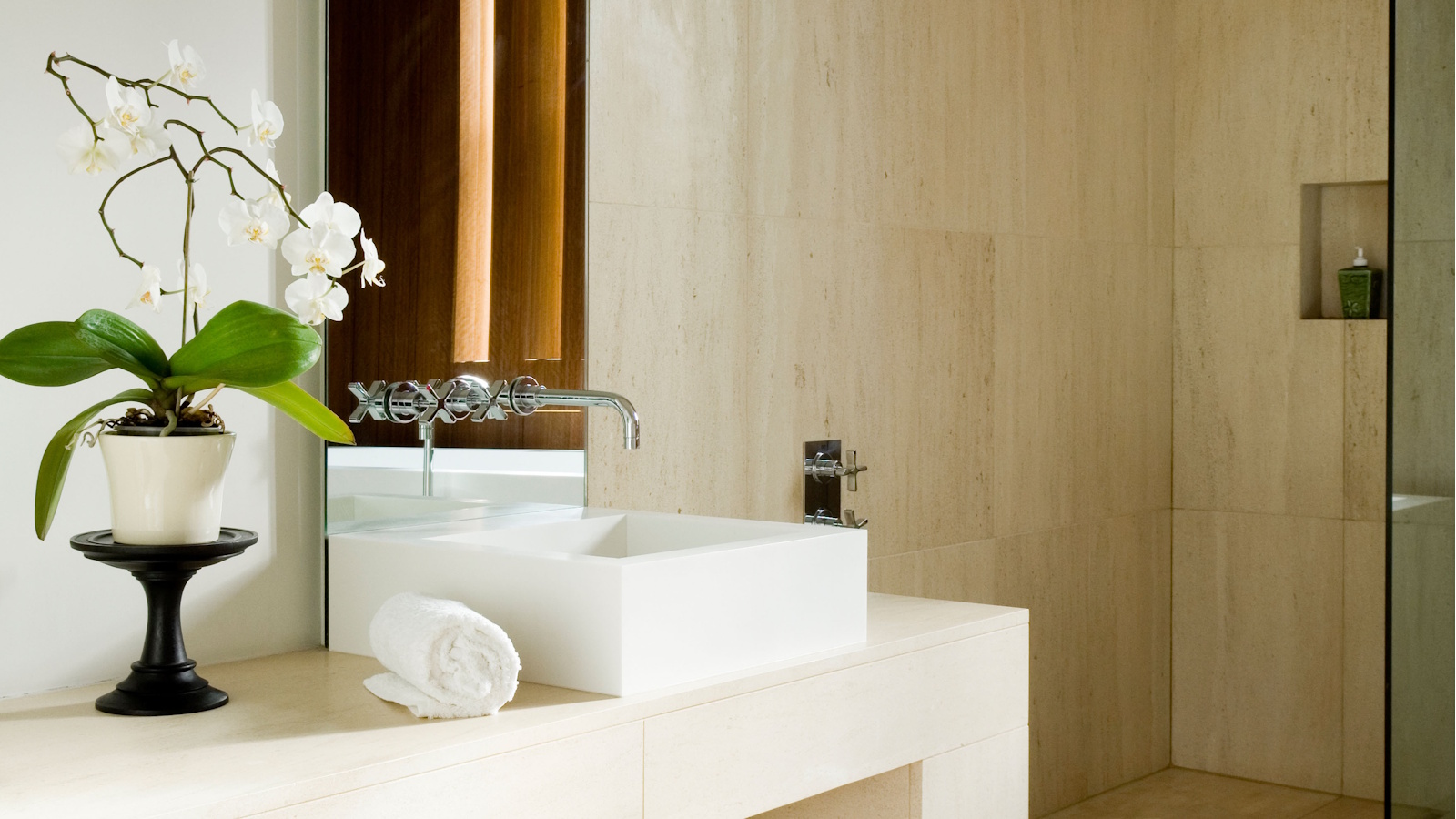 My orchid's leaves haven't wrinkled since moving it to this exact spot in my home – it's the easiest hack to keep these flowering houseplants hydrated
Dehydrated orchids can perk up again in the environment of a bathroom
By Tenielle Jordison
-
 Hailey Bieber's curvaceous toaster is an Italian design staple (with roots in the 1950s) – it blends retro style with modern capabilities
This toaster has stood on the countertops of 'It girls' since the '50s, and Hailey Bieber has just resurged the trend – you can follow suit for $250
By Megan Slack