10 things interior designers say you don't need in your home – and what to invest in instead
The experts say it's best to skip over these overrated design features when curating your forever home. Here's what they recommend to replace them

Designing the perfect home is a never-ending process – as your tastes and lifestyle evolve, your environment will naturally follow. On the quest to create a comfortable, serene home, our first instinct is often to add more. Bringing in new furniture, decor, or architectural features can sometimes feel like the only way to level up a design scheme. But designers say this couldn't be further from the truth.
Part of the design process is subtraction and refinement, opting against certain features and removing unnecessary bits. And the experts say that when your home needs a spruce, it's worth taking a second look at the space and making some considered edits.
Here, interior designers share the top 10 design features that your home could really do without. Plus, they share the alternatives that'll make your home feel like a sanctuary, designed with functionality and comfort in mind.
The 10 features designers say you don't need in your home
Designers say that doing away with these features is a fast track to a timeless design scheme. By streamlining your home decor and furnishings, you'll be left with a stunning space you'll never want to leave.
1. Clutter
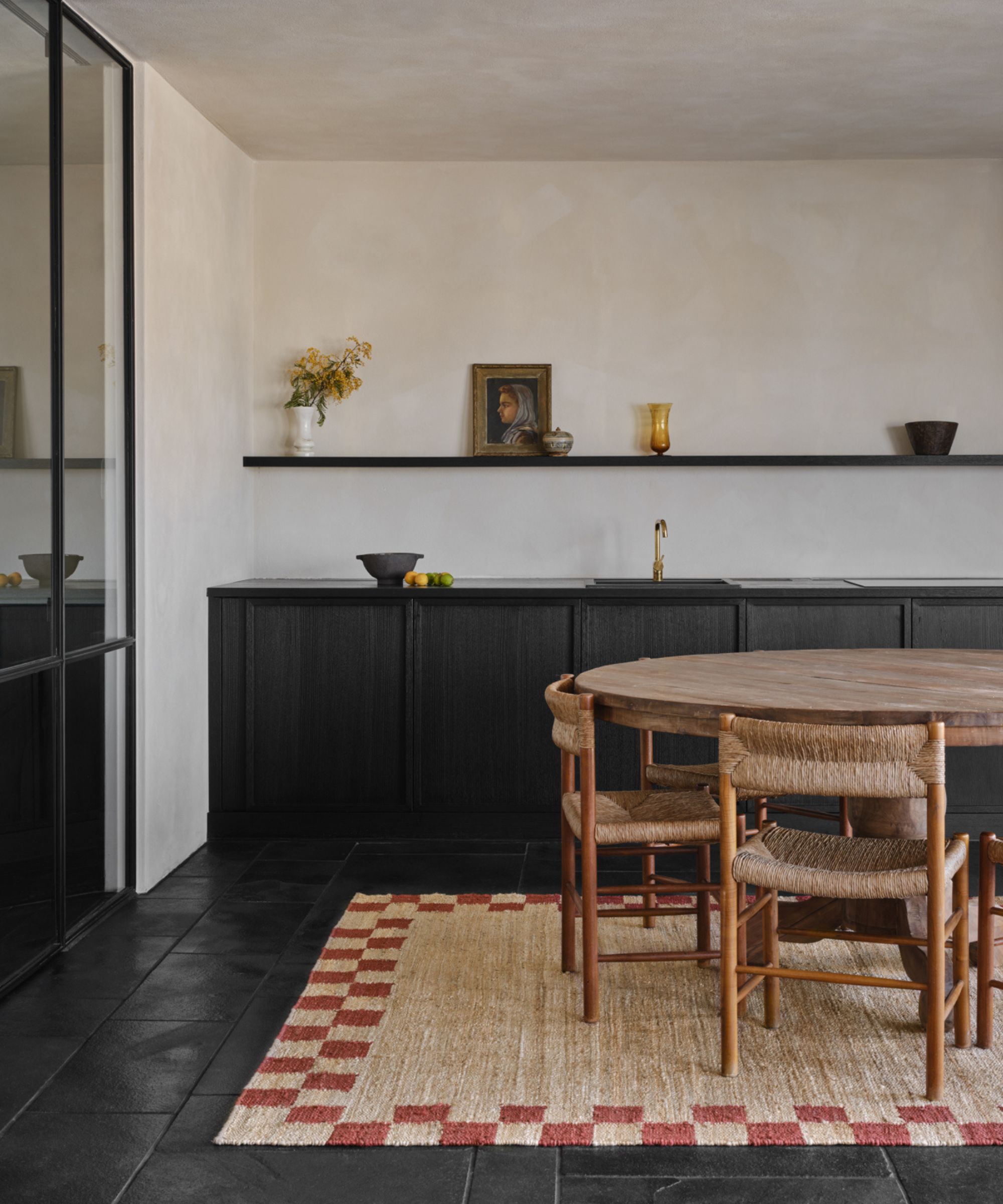
When taking stock of your space, the first feature to eliminate is quite simple: clutter. Alexis Elley, founder and principal of Textures Interior Design, says that decluttering is a necessary step to streamlining your space.
'People do not need clutter,' says Alexis. 'Make sure everything you own has a home and can be packed away when necessary. Clutter can make even the most perfectly designed room feel unfinished and sloppy.'
To avoid clutter buildup, invest in storage solutions and regularly tidy the small, hidden-away areas of your home that often get quite messy. Preserve your home's beautiful design scheme by making this a must-have part of your routine.
2. Excessive built-ins
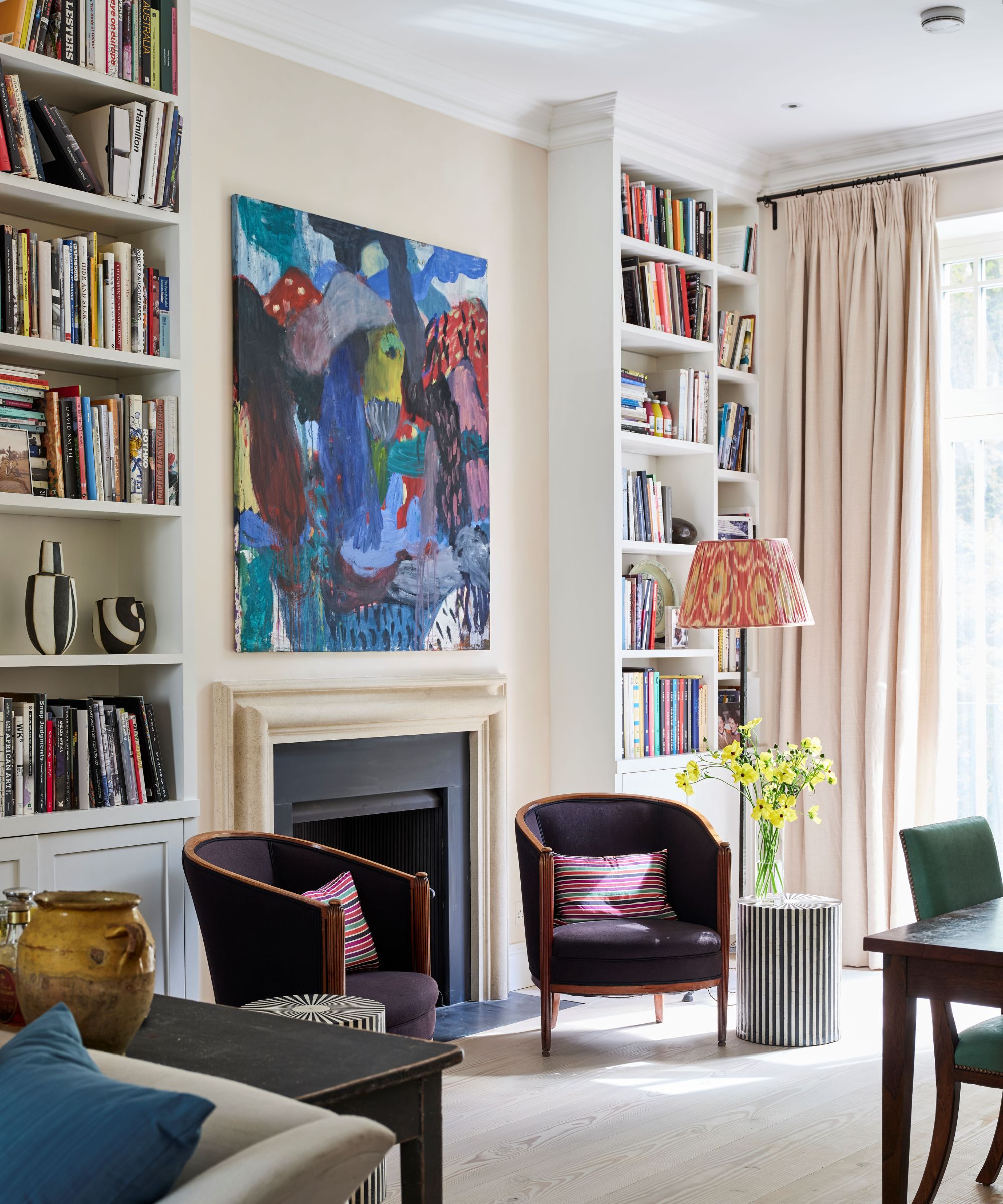
Built-in cabinetry and shelving can be a practical and eye-catching addition to your space, but Aman Than, creative director of Ontario-based Aman Than Interiors, says to proceed with caution. While built-ins look lovely in moderation, as in the light and airy living room pictured above, too many can quickly lead to design disaster.
'While they provide storage, too many built-ins can make a space feel cramped and limit future design flexibility, making it harder to adapt the room for different needs,' says Aman.
Pay attention to the size and layout of your living room before investing in built-in cabinets or shelves. The storage and extra character these features bring are well and good, but the benefits are easily outweighed if they create a confined and uncomfortable living space.
3. A navy blue kitchen
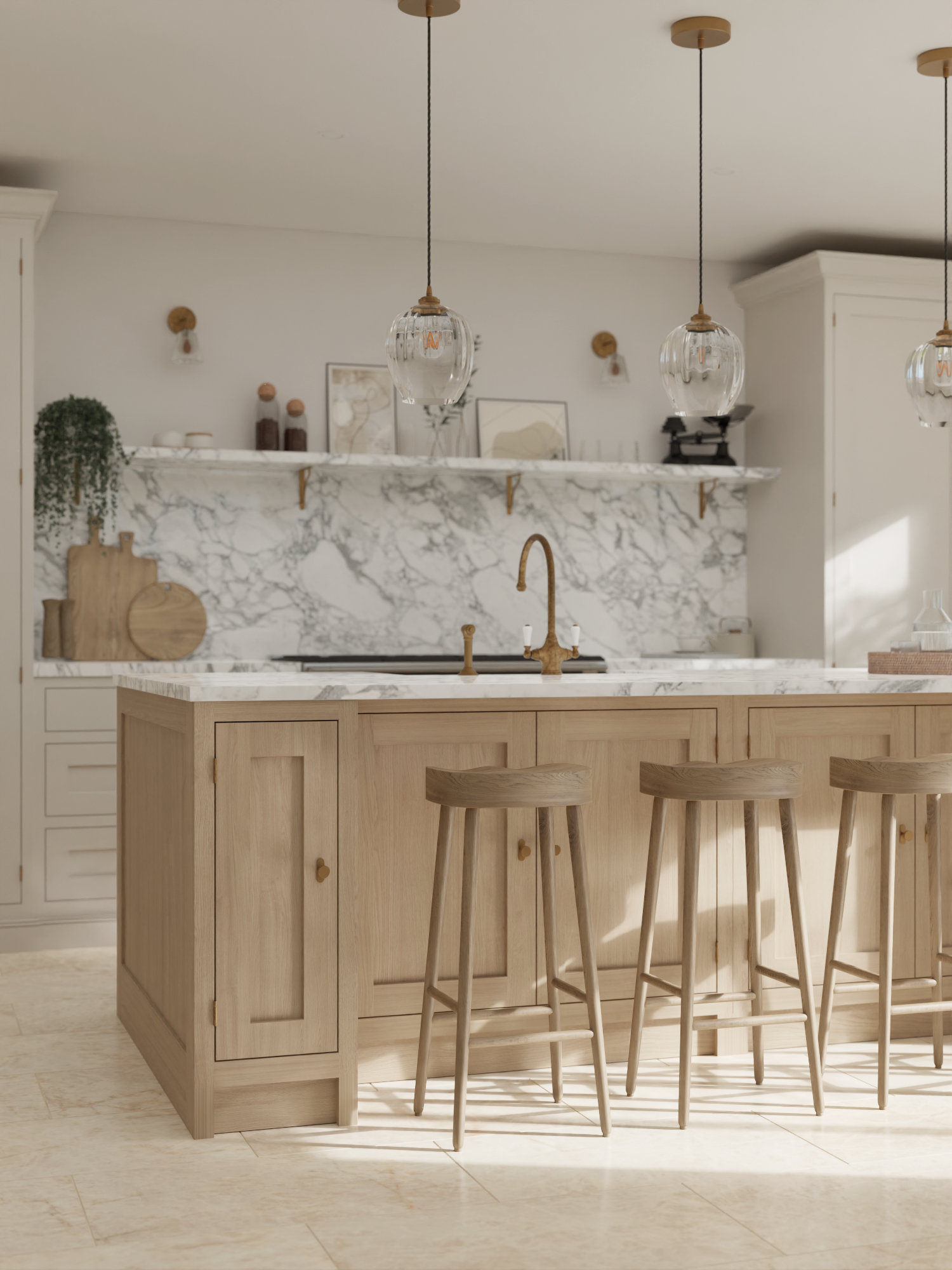
The kitchen is one of the most difficult rooms to design, as minor design features make the space look dated almost immediately. One of these, according to designers, is the color navy blue, which is steadily being replaced by dark green.
Alexis says that this kitchen trend is 'getting tired and overdone,' and advises people go with a different, less trendy color scheme: 'In kitchen design, I see navy as the color gray's brother – in five or so years, I bet many who have a navy kitchen island will have painted over it to give their kitchen a refresh.'
Ivan Pineiro, principal designer at Las Vegas-based Pimell Interiors, agrees that navy blue is overdone. But he says that kitchen islands of this color in an otherwise all-white space are particularly outdated.
'Nothing says DIY TV design show louder than this choice,' says Ivan. 'For an elegant, custom-designed kitchen, introduce wood textures or stone elements instead to create depth and interest.'
4. Trend-centric schemes
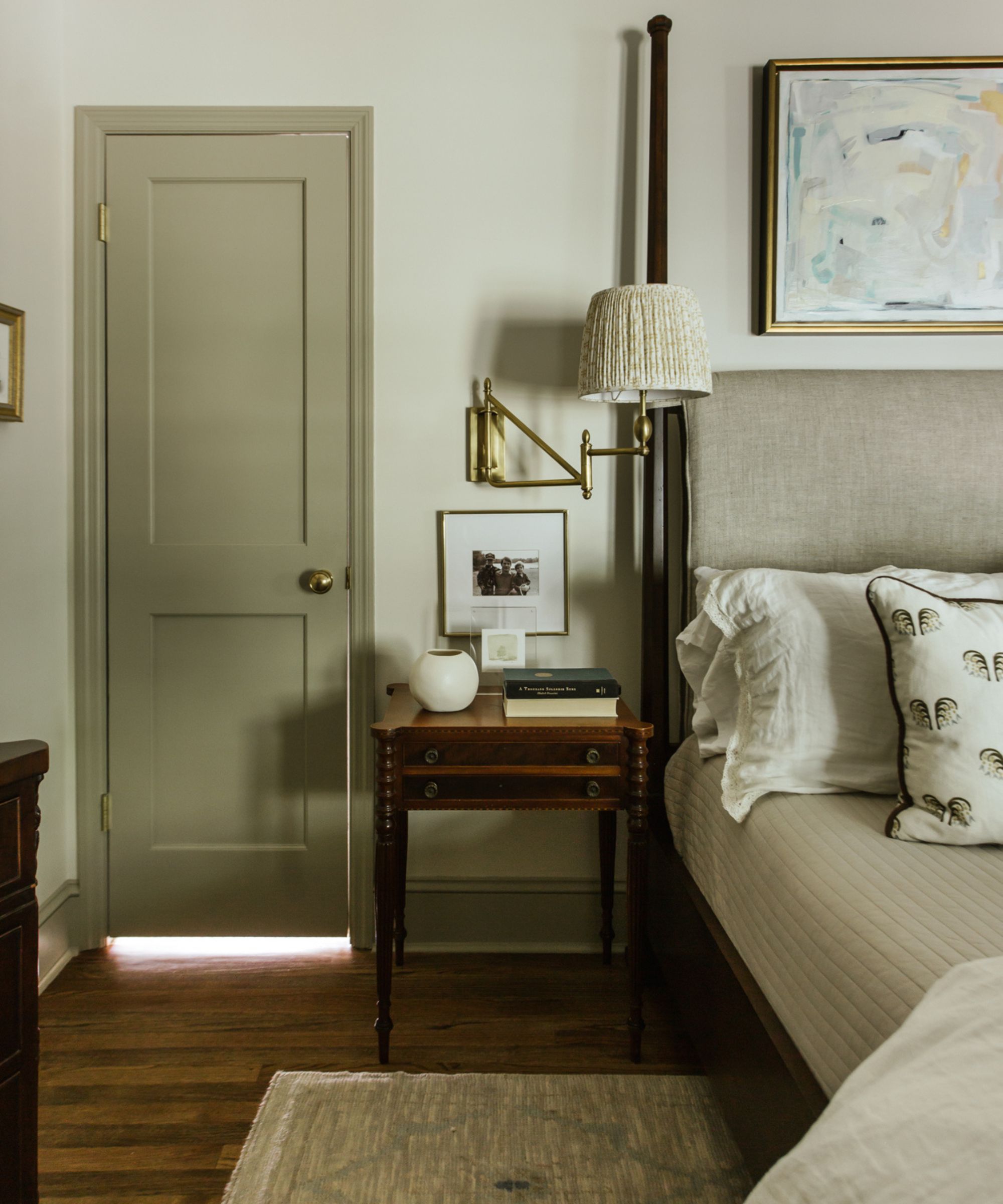
It's always exciting to follow short-lived trends (and this year's interior design trends have been especially intriguing) but designers say to take it slow. Aman says that trend-centric features tend not to last.
'These can quickly become outdated, leading to the need for frequent updates to stay current. They may also not appeal to future buyers, potentially lowering the home's resale value,' says Aman.
Instead of opting for a trending aesthetic, stick with something timeless and layer in complementary pieces that channel your current interests. Carolyn Cerminara, founder and principal designer of Nashville-based Cerminara Design, suggests choosing one interior design style as your base and building from there to avoid design overload.
'When designing a home, it's important to incorporate interesting design elements, but you don't need to include every style you've seen. Stick with a cohesive style and stay committed to it. Adding too many different styles can feel overwhelming and dilute the overall effect,' she says.
5. Bold paint finishes
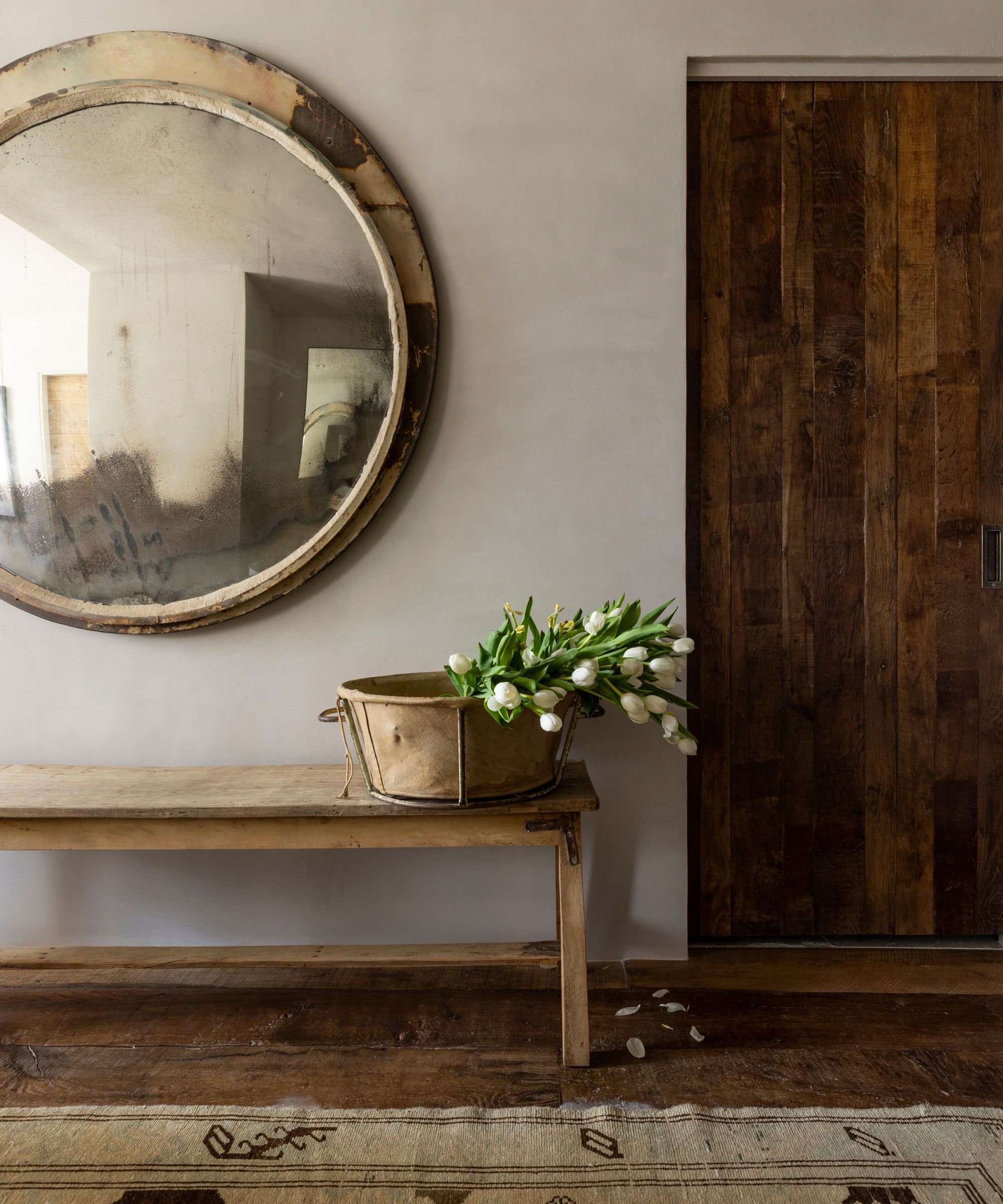
Eye-catching paint finishes add character to any space, and elevate even the plainest of painted walls. But going too bold or expressive can quickly overwhelm a space, and the finish you choose might not last through the year.
'High-gloss and other extravagant paint finishes may shine brightly now, but they often lack lasting appeal. What’s dazzling today can look dated tomorrow, and these bold finishes are notorious for highlighting every flaw and demanding constant upkeep, making them more of a hassle than a hit,' says Ayten Nadeau, founder and principal designer of North Carolina-based I-TEN DESIGNS.
Instead of something flashy, try out a plaster or limewash finish, as pictured above. These details add charm and texture to a space without veering into over-the-top territory. And with nature-inspired interiors on the rise in 2024, an organic feature is the perfect touch.
6. Alcoves and niches
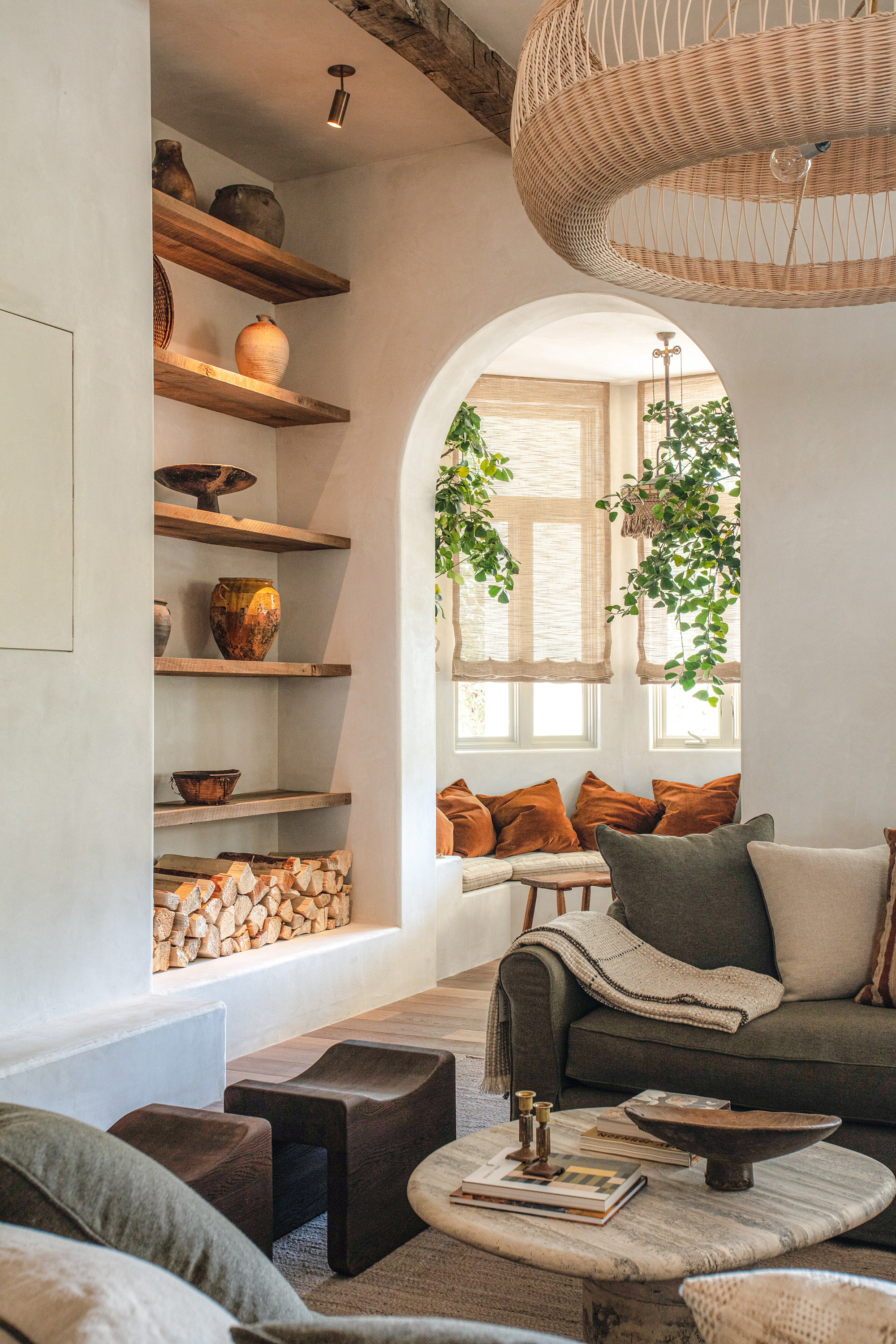
Architectural features often add value to a home, and a characterful alcove can elevate an entire space. In the comfort-forward living room pictured above, a light-filled niche behind a gorgeous arched doorway makes the entire room. But this stunning result isn't always the case. Ayten says that when not done correctly, adding alcoves or niches to your space leads to added messiness.
'Alcoves and niches used to be design superstars, but without a clear plan, they can quickly become the room’s biggest dust traps. Instead of stylish display areas, they often end up as awkward, clutter-prone corners, making your space feel more chaotic than chic,' says Ayten.
7. Formal living rooms
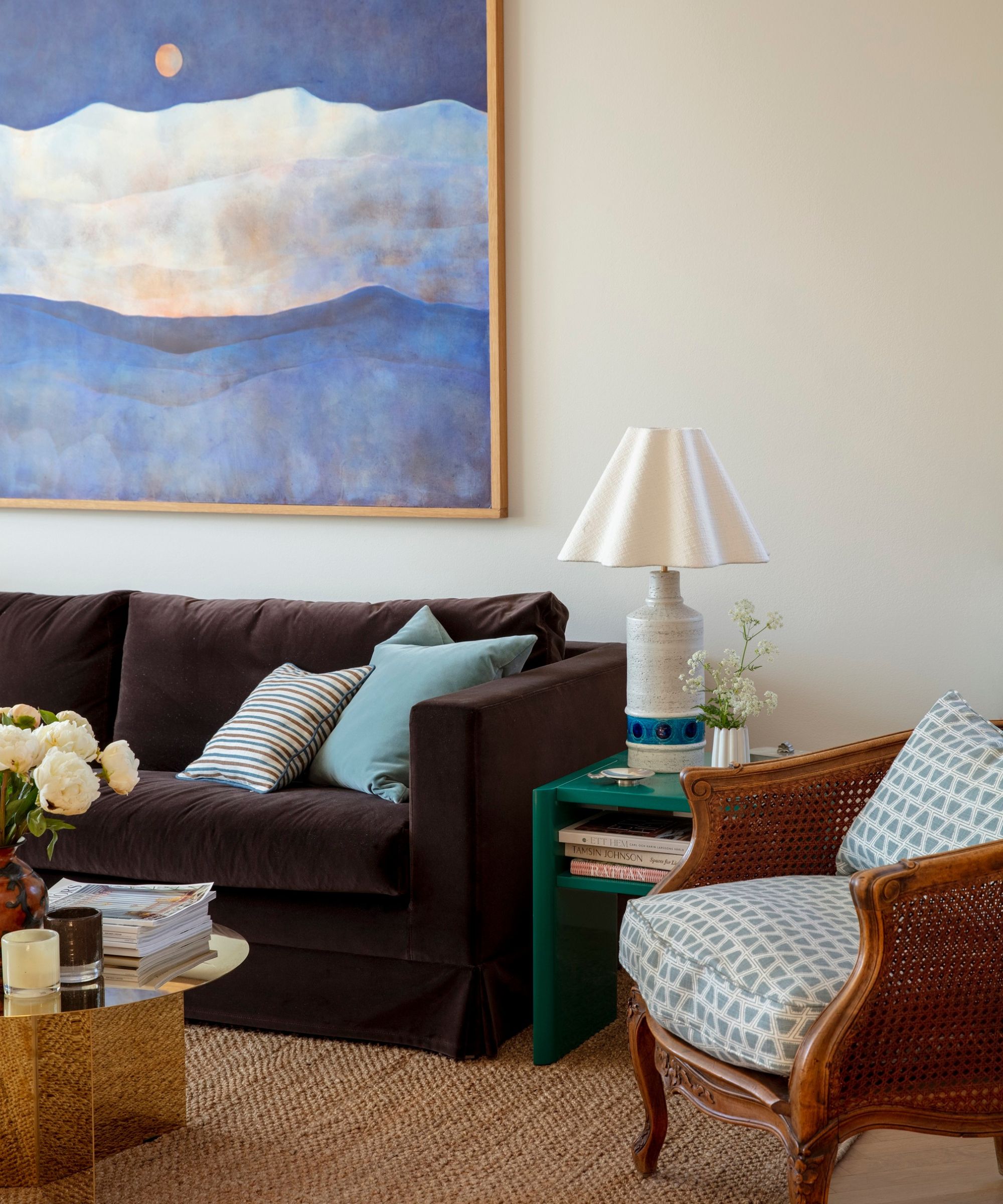
Once considered an interior design staple, the formal living room has taken a back seat as of late. Though these spaces are great for entertaining, and feature sophisticated, luxe design features, they often fall out of use quite quickly. Left to gather dust for most of the year, they're usually not a smart investment for a cozy home.
'Many people prefer open-concept spaces that are more practical for daily use. Formal living rooms often go unused, becoming wasted space in a home that could be better utilized for more functional purposes,' says Aman.
A living room that prioritizes comfort and a homey atmosphere, as pictured above, should be put before all else. Invest in your family's daily life before you spend on spaces you'll use once or twice a month.
8. Double kitchen islands
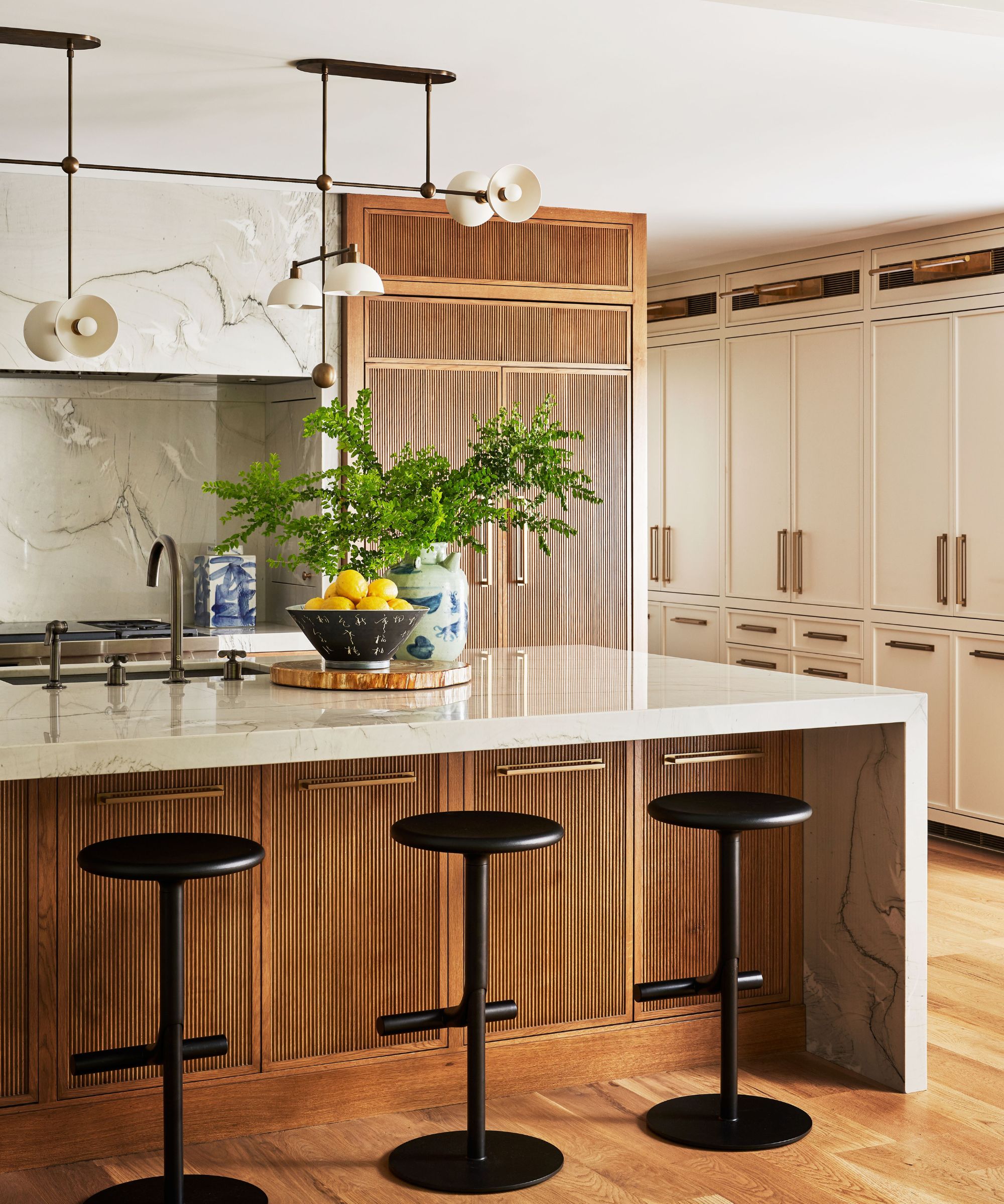
A double kitchen island is often considered a high-end addition, but designers say this duplicate feature doesn't have a place in most kitchens. While they bring extra counter space and a unique look, they often feel like overkill when featured front and center.
'Double islands might sound like the height of kitchen luxury, but they can quickly turn your cooking space into a culinary obstacle course! Instead of adding sophistication, they often clutter the area and disrupt the flow, making your kitchen feel more like a maze than a masterclass in design,' says Ayten.
If you're looking for more space for prep and cooking, consider expanding your current island or incorporating extra cabinetry. One island is usually more than enough, even for busy families.
9. Recessed lighting
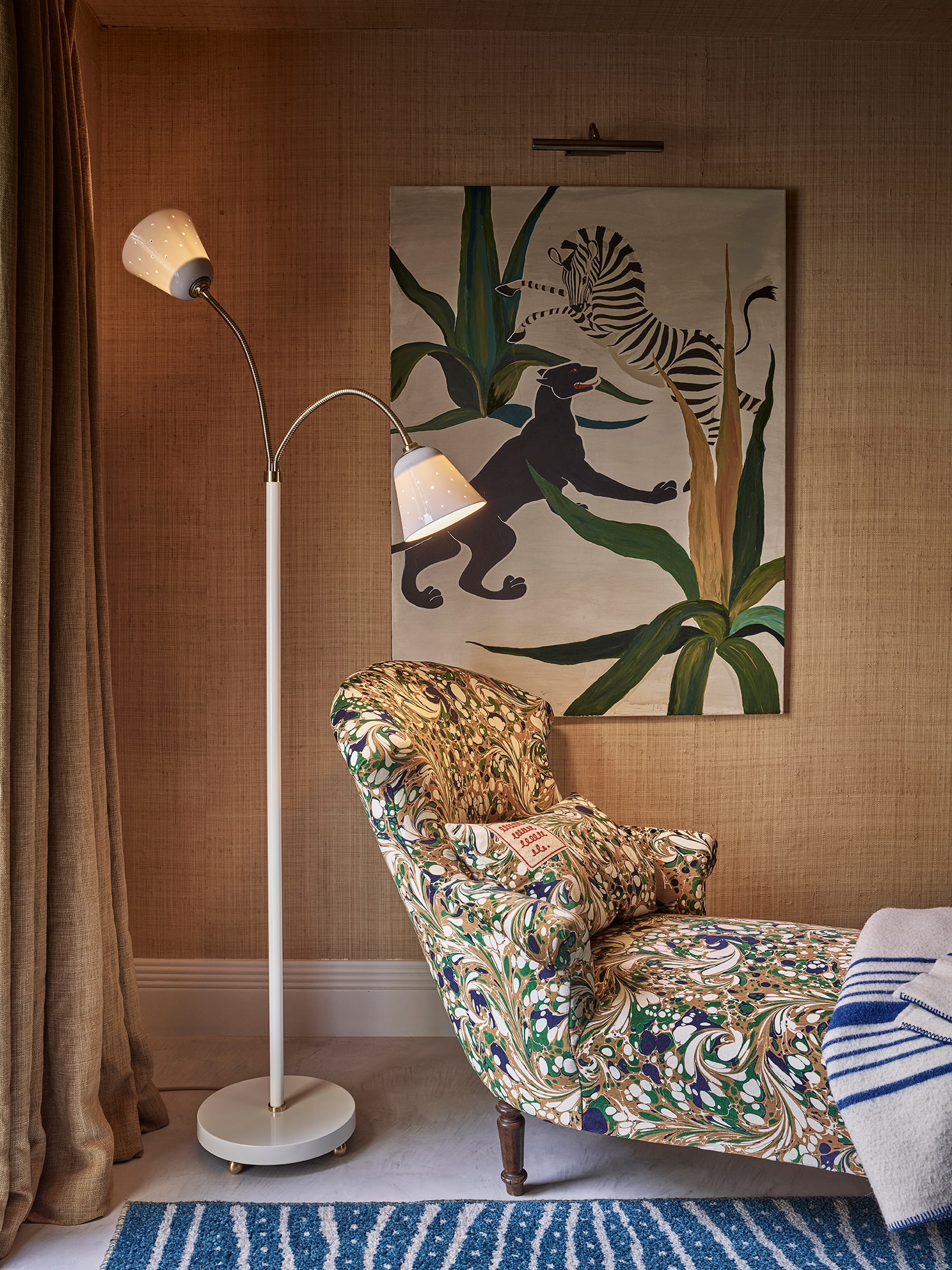
Although the majority of the interior design community seems to be in agreement about 'the big light' debate, recessed lights are still featured in a wide variety of spaces. And while some stand by this decision, others – like Ivan – are less than convinced.
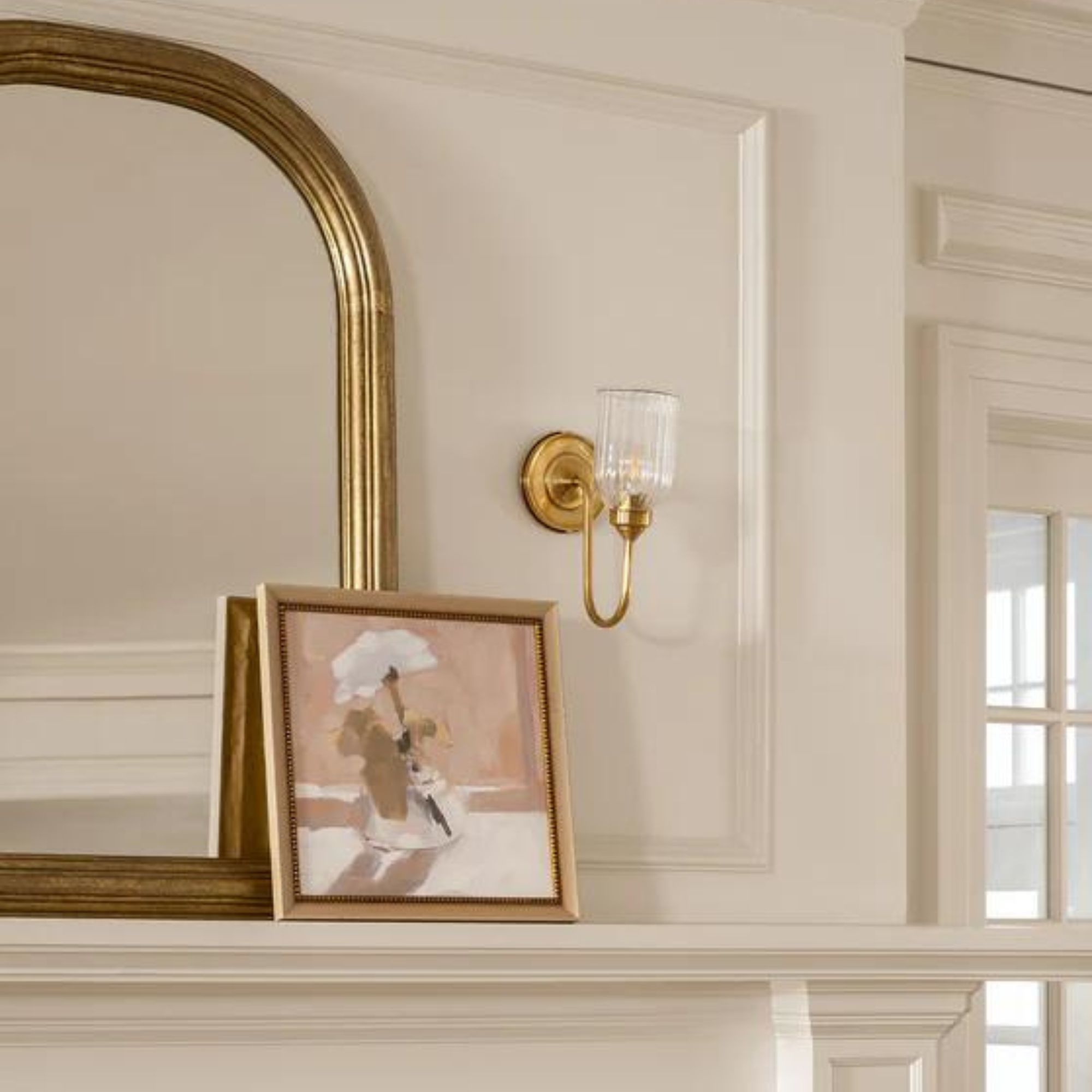
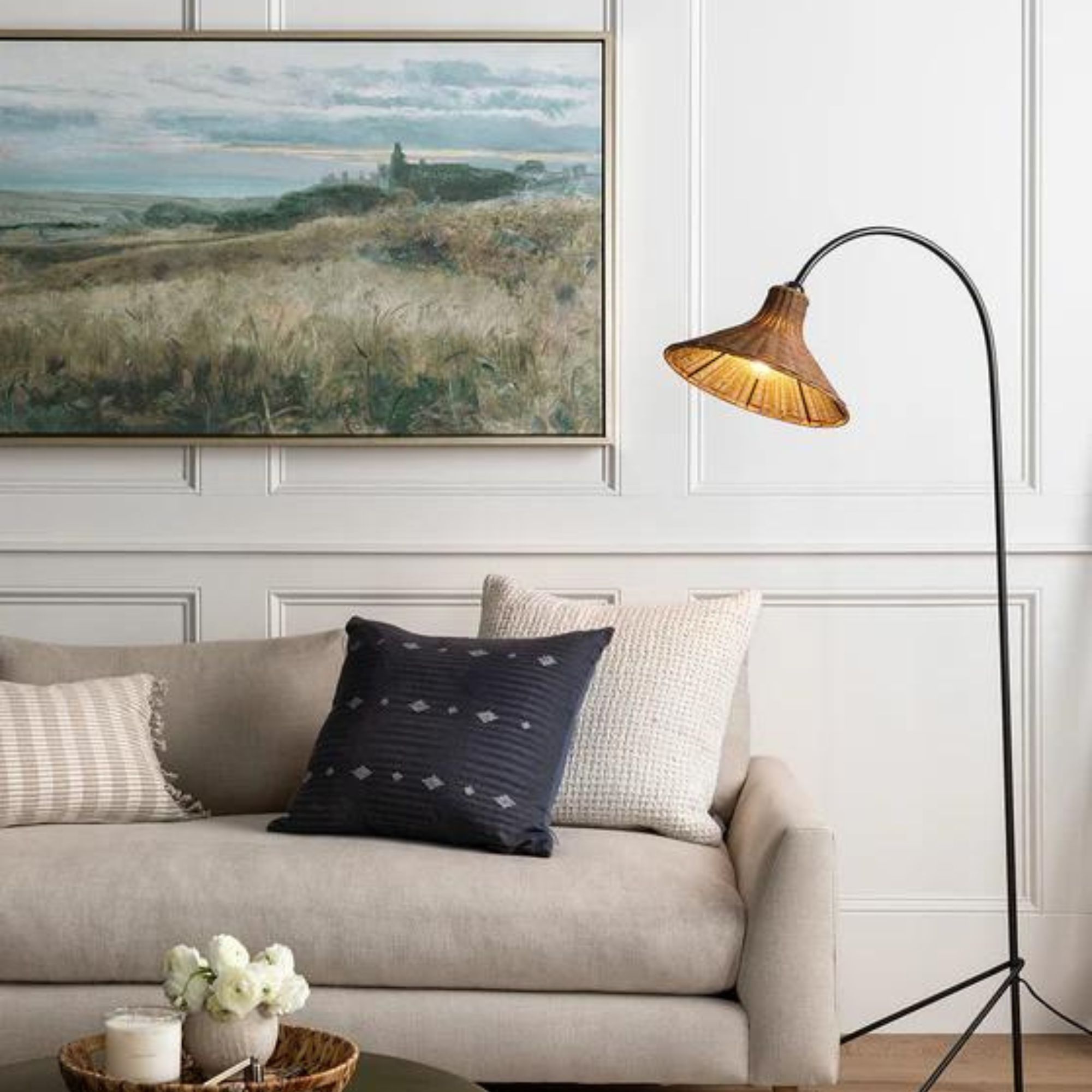
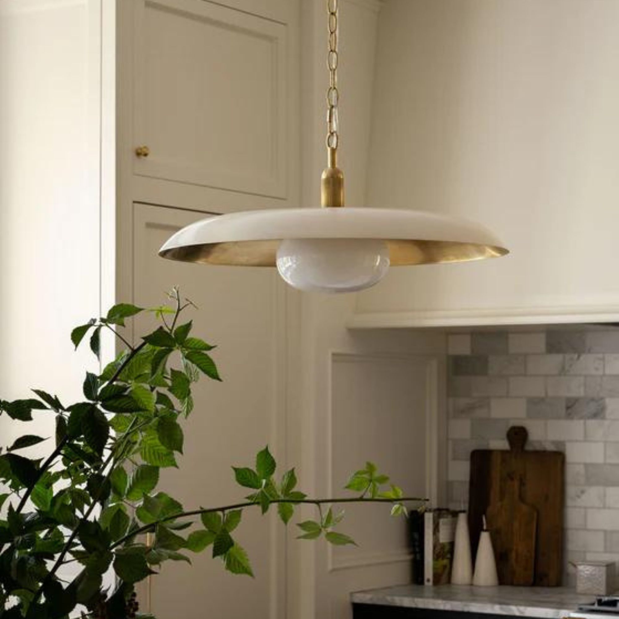
'These builder-standard lights often make homes appear dated and unimaginative. Choose designer lighting options such as table and floor lamps, chandeliers, and dimmable wall sconces with warm tones for a more sophisticated ambiance,' he says.
Instead of built-in, overhead lighting, opt for an ambient lighting scheme that prioritizes a cozy, cocooning atmosphere. Use a variety of fixtures scattered throughout your space, and focus especially on high-traffic areas.
10. Budget drapery
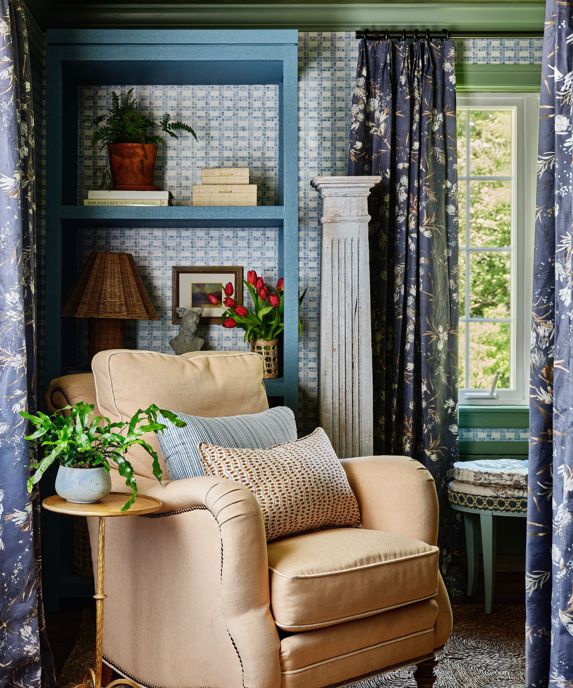
Some design features can be bought on a tight budget quite easily, but others are always worth the splurge. Alexis says that curtains fall in the second category.
'You can always tell when designers or homeowners cut corners around the windows,' says Alexis. 'For example, grommet drapery is a classic giveaway that make a room look hastily thrown together or cheap.
Prioritize your home's drapery for a high-end, put-together look that'll last. You won't want to replace your drapes in two or three years time, so invest in something bespoke and high-quality from the very beginning.
Instead of constantly adding on to your design scheme, take a step back and keep these tips in mind. Your space should only include things that make you happy, and eliminating the fluff makes achieving this goal much easier.
Sign up to the Homes & Gardens newsletter
Design expertise in your inbox – from inspiring decorating ideas and beautiful celebrity homes to practical gardening advice and shopping round-ups.

Abby was the Interior Design News Editor at Homes & Gardens and is now studying for her Master's degree in Journalism at City University, London. Prior to joining our team, she worked with Better Homes & Gardens, where she wrote and edited content about home decor, gardening tips, food news, and more. She studied Journalism and English Literature at New York University and moved to London to pursue her love of writing in 2023.
-
 Courtney Love's historic loft combines rock star luxury with raw New York bones – it's on the market for almost $9.5 million
The singer's former SoHo home features exposed brick walls, original wooden columns, a gas fireplace, and high ceilings – take the tour
By Hannah Ziegler
-
 Triangular shaped garden ideas – landscape designers share 9 ingenious ways to redesign your corner plot
Expert tips for planning, planting and finessing a triangular shaped plot, so you can savour the space year round
By Jill Morgan
