5 things designers say aren't worth spending money on – and what they do instead
If anyone knows what's needed and what's not in a home, it's interior designers. So here we asked them what they rarely spend money on when renovating
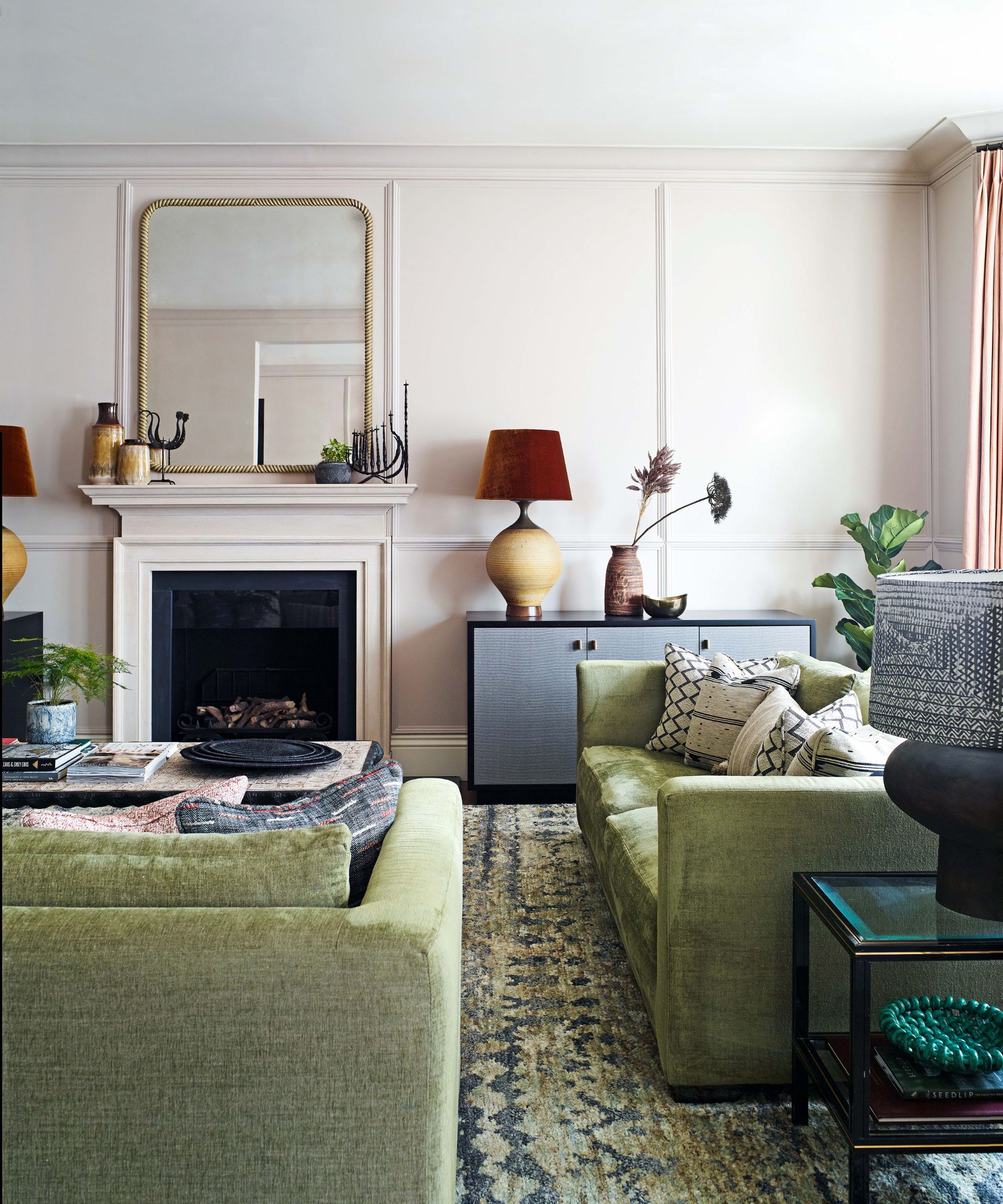
Being an interior designer is not just about finding some great furniture, putting it together, and picking a color for the walls, but about being a great editor. The best rooms work because of what has been left out of them.
So we asked some of our most trusted design experts what tropes and design trends they think we should all be saving our money on and leaving out of our homes. From pieces of furniture that often go underused to bigger design decisions like kitchen cabinets, here's what they had to tell us.
1. New furniture
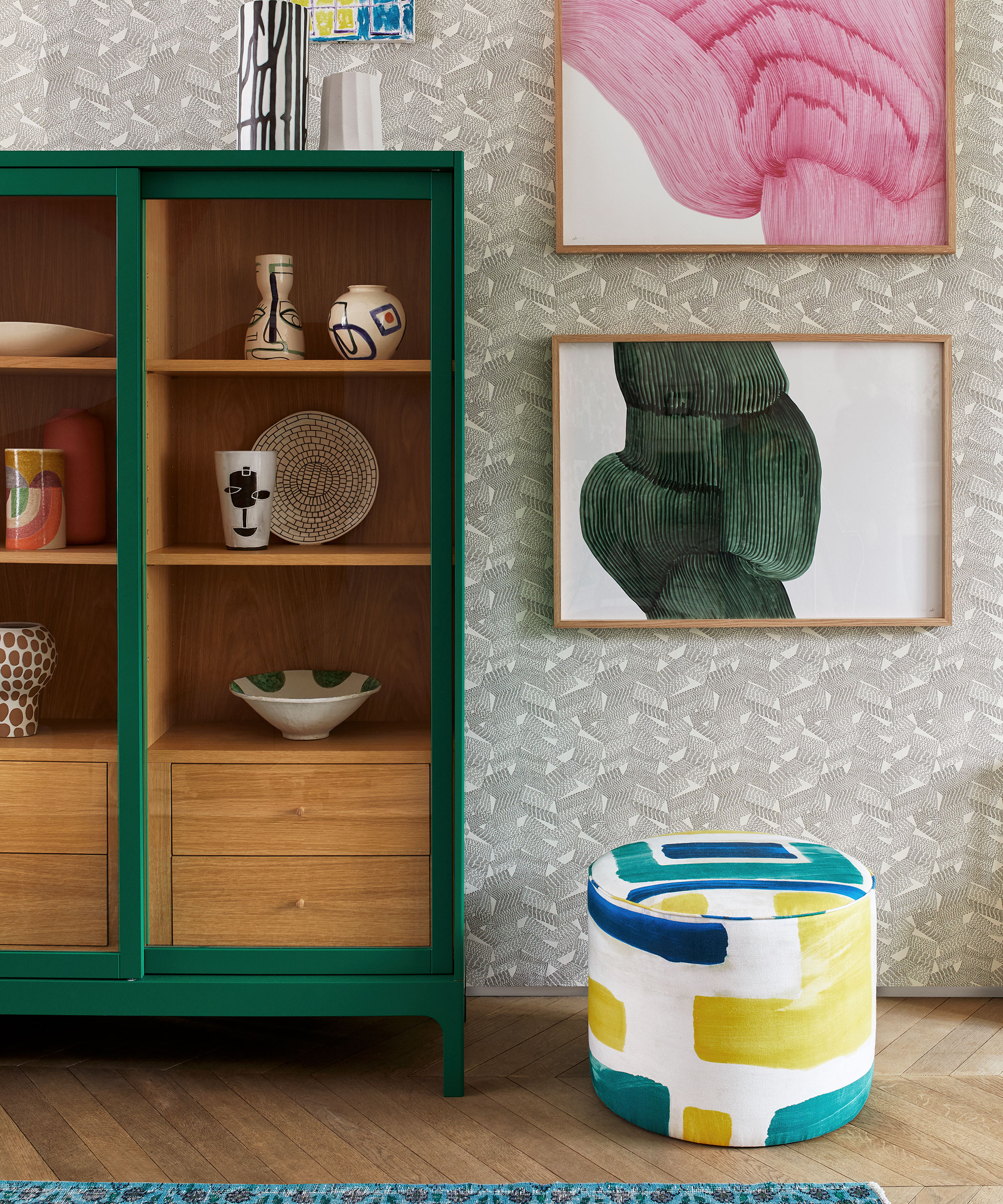
The designer Natasha Lyon of Appreciation Project has a surefire approach to making the budget go further, and not spend out needlessly. And that's to really take stock of what you already own, and try as hard as you can to give everything a new lease of life.
'Most furniture can be reupholstered or repainted, and this can save you a lot of money,' Natasha says. 'Plus, this makes the overall scheme so much more personal.'
She adds that this approach is not just limited to furniture, but reminds you how often you can just refresh the kitchen you already have to save a ton of cash. 'I come across this a lot with kitchens,' she says. 'Often, the carcasses can be reworked and redesigned with new fronts, meaning you don't have to spend on entirely new units.'
2. Wallpaper
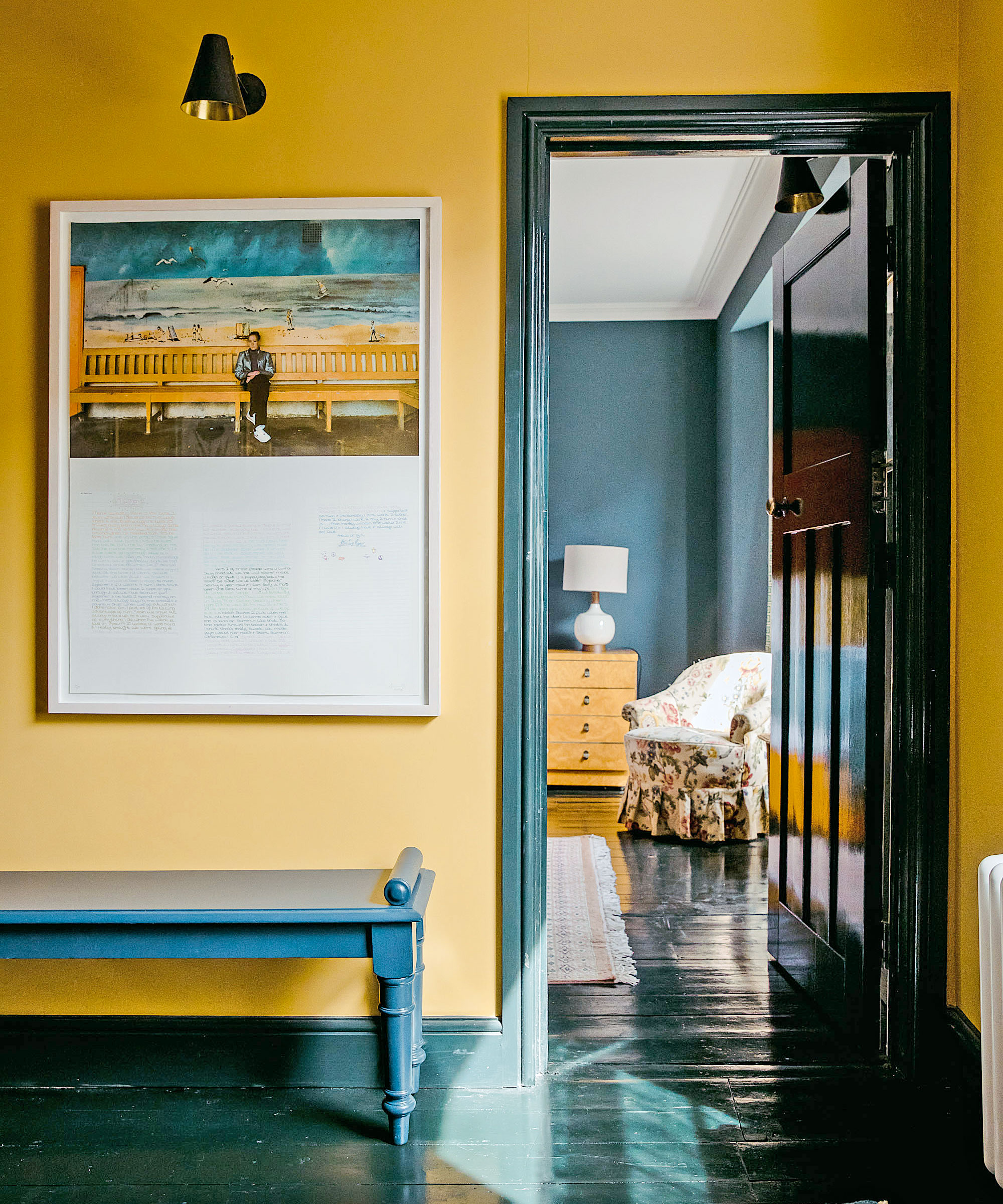
With so many incredible paint effects, paint color ideas and affordable art outlets available, it's hard to justify spending budget on wallpaper if that impacts what you have left to spend elsewhere. Wallpaper is pricey, and getting pricier, no longer the quick affordable update it once was.
'I don’t think wallpaper is an essential,' says the Washington, D.C.-based interior designer Zoe Feldman. 'You can do a lot with some great cheap art – random prints you've found or even drawings your kids have made – and use them to create eclectic and personality-filled gallery walls. Wallpaper is tricky as it can be so expensive, and is much more difficult to install than simply painting the walls.'
3. Bedroom chairs
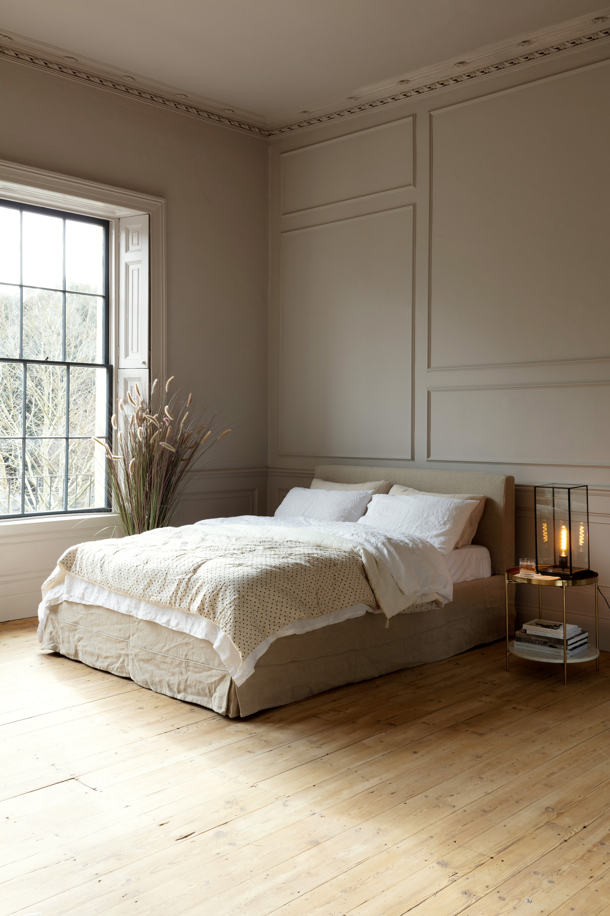
It always seems like a good idea to have a chair in a bedroom – a place to sit and gather your thoughts in the morning, or to relax and talk to your partner while they're getting ready for a night out.
But the reality, unless you're one of the strictest people to exist, is that they usually end up as a dumping ground for semi-clean clothes, laundry that needs to be put away, and magazines yet to be read. Save your money and invest in some storage that works for your lifestyle.
'Chairs and benches are not something I'd use in a bedroom, especially if I was tight on space,' says the San Francisco-based interior designer Regan Baker. 'Get rid to them. Instead, be more intentional about your storage, about building it into the room design.'
4. Avant garde furniture

Ok, so the Minneapolis-based designer Anne McDonald isn't against spending money on high-end designer furniture full stop, but because the spaces she creates tend to take a more relaxed, lived-in approach, she does avoid them in the majority of her schemes. And as her projects demonstrate you can create beautiful, elevated spaces without the need for expensive statement furniture.
She explains that 'In relaxing rooms, I avoid anything that hits you over the head, and consumes too much visual noise. Instead, you want rooms to feel easy, to be able to move around them well, for everything to flow together. Shapes that curve and are gentle are much better to make you feel held.'
5. Kitchen wall cabinets
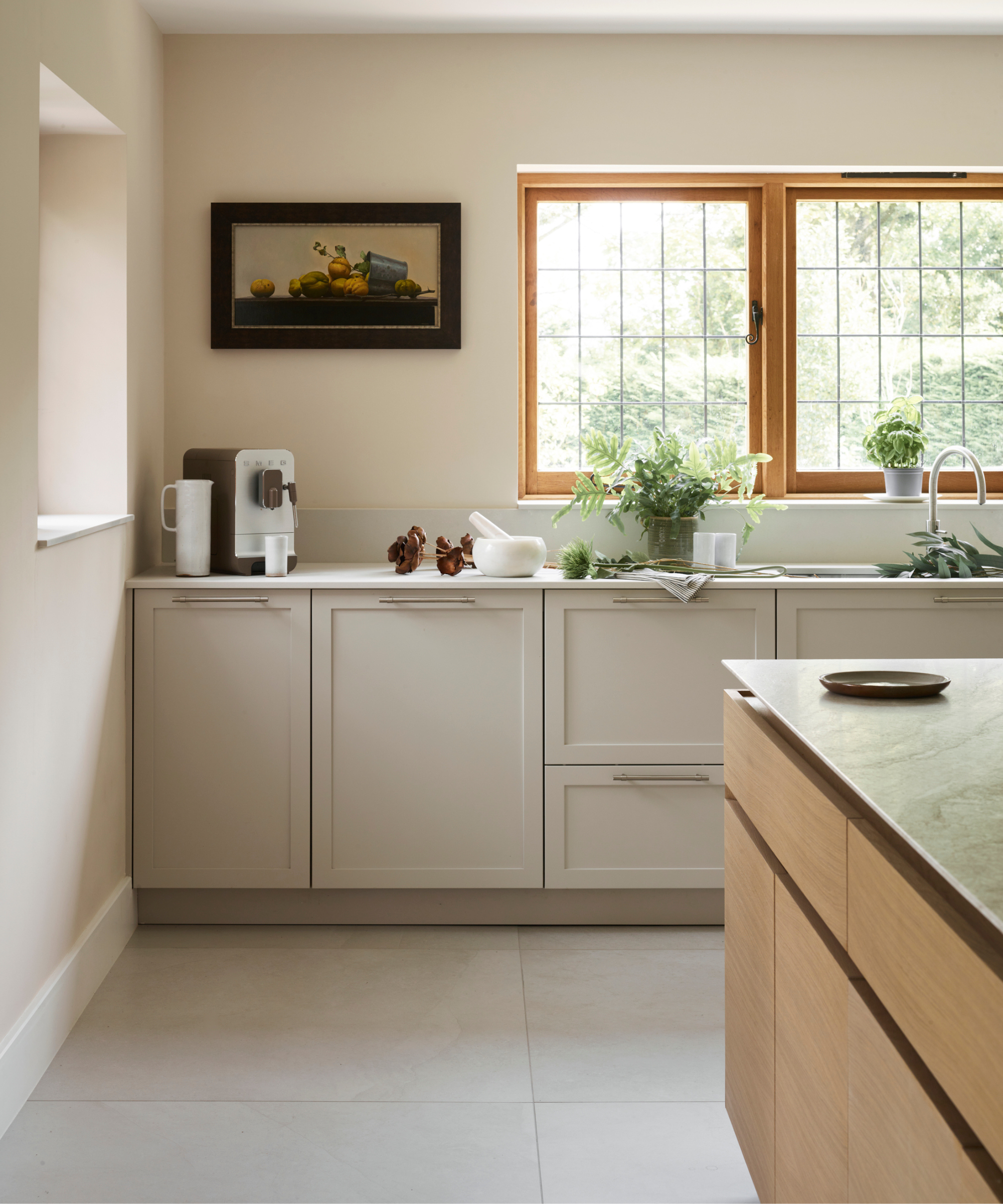
This is a controversial one and one that assumes the luxury of floor space. And the 'should you include kitchen wall cabinets or not' debate has been dividing designers. But Micaela Nardella of the design studio Duelle, purposely keeps all cabinets underneath the counter and says you can ditch the wall cabinets all together.
'Your kitchen will feel more soothing if you are able to maximize natural light during the day,' Micaela says. 'And to do that, we ensure our kitchen designs are not top heavy, opening up the upper parts of the space by keeping the majority of the cabinets under the counter and the island. This means making an island as large as you can, and filling it with storage that includes drawers for all your pans and racks for all your spices.'
Sign up to the Homes & Gardens newsletter
Design expertise in your inbox – from inspiring decorating ideas and beautiful celebrity homes to practical gardening advice and shopping round-ups.
Pip Rich is an interiors journalist and editor with 20 years' experience, having written for all of the UK's biggest titles. Most recently, he was the Global Editor in Chief of our sister brand, Livingetc, where he now continues in a consulting role as Executive Editor. Before that, he was acting editor of Homes & Gardens, and has held staff positions at Sunday Times Style, ELLE Decoration, Red and Grazia. He has written three books – his most recent, A New Leaf, looked at the homes of architects who had decorated with house plants. Over his career, he has interviewed pretty much every interior designer working today, soaking up their knowledge and wisdom so as to become an expert himself.
-
 Nate Berkus says slipcovered sofas are back on trend – and I just found a way to create this designer-approved laid-back look from just $86
This classic style is making a strong comeback, but did you know you don't have to buy a whole new couch to get this Nate-approved look?
By Eleanor Richardson
-
 Gardeners are putting pasta in bird feeders this spring – but there is one important warning you need to know before following suit
Cooked pasta can be a nutritious snack for birds, but serving it in the wrong way could cause them harm
By Tenielle Jordison
