The best colors for your bedroom, depending on the orientation
Create a perfectly-hued sleeping space

When designing your sleeping space, the bedroom colors you choose can be one of the most important parts of the process. Much like square footage and the shape of a room will determine furniture and layout choices, natural light levels throughout the day will impact which bedroom color to use.
Naturally, personal preference and the latest color trends should always come into consideration. Still, you will want to select your hues wisely based on the type and amount of light it gets.
Will warm or cool tones create the perfect sleeping space? To get clued up, we asked designers and color experts about the best colors for your bedroom, depending on the orientation.
A north-facing bedroom
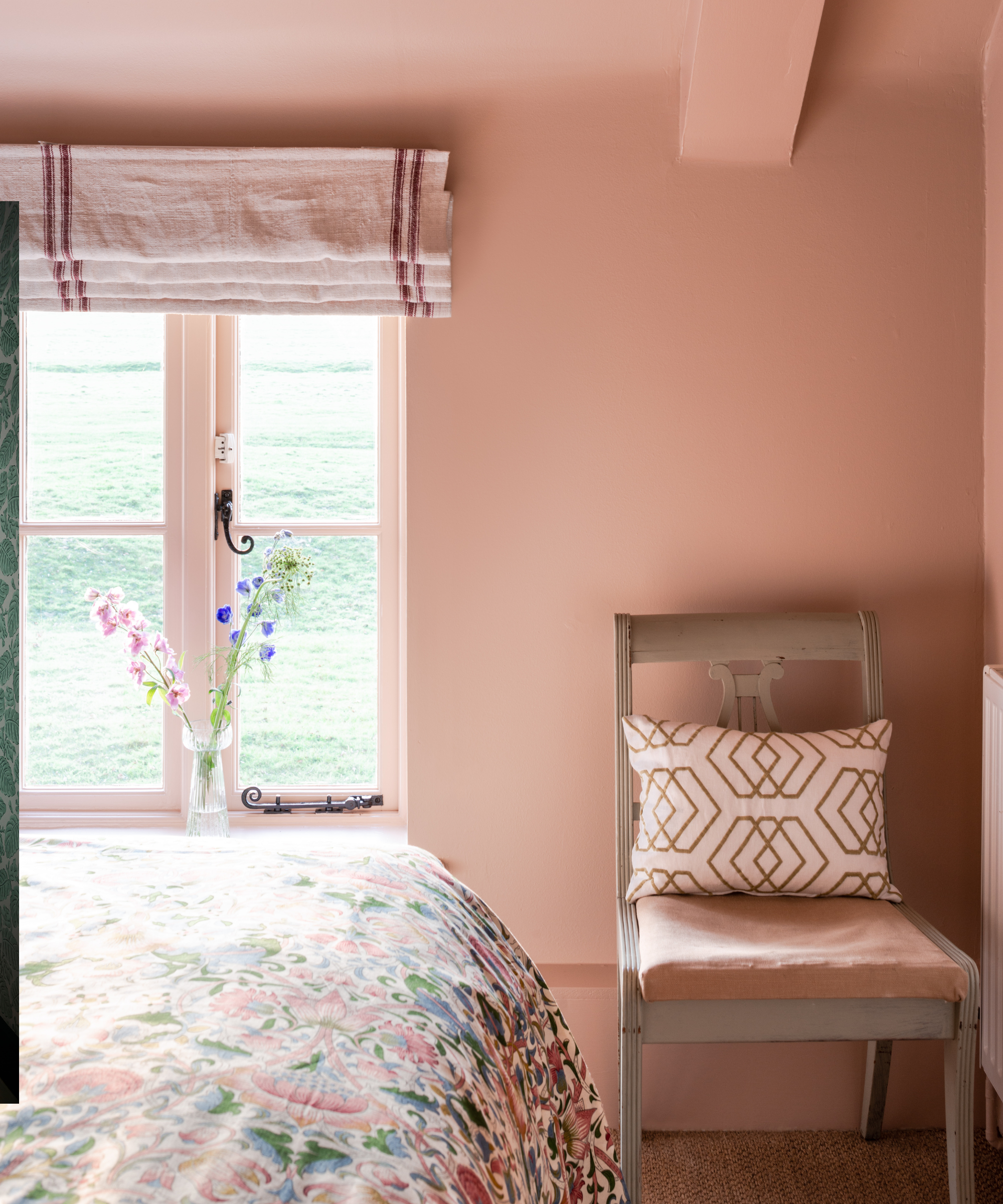
Room painted in Farrow & Ball Setting Plaster No. 231
For a north-facing bedroom color scheme, it is all about adding warmth to make the space inviting. Compensating for the lack of natural light is the challenge here, so you want to avoid or counteract any overly cool gray tones to make a bedroom cozy rather than cold.
'Pink is a great color for those poorly lit north-facing bedrooms,' says Patrick O'Donnell, Brand Ambassador of Farrow & Ball. 'Choose a smoky pink rather than a cool or hot pink (too much!) to deliver just a hint of warmth. Try our discreet Setting Plaster for a truly flattering shade, a nuanced pink that’s anything but sugary. It will layer beautifully with pretty florals and combine with so many shades from blues to greens and muted, stony browns.'
As we can see above, pairing smokey tones with pops of color works beautifully to add a little zest too. 'Terracotta, burnt orange, and warm gold offer a comforting glow,' says Lauren Lerner, CEO and founder of Living with Lolo. 'Rich reds and deep yellows bring liveliness. Soft neutrals like beige, taupe, or creamy whites reflect light, enhancing openness. Add touches of warm pinks or soft peaches for subtle warmth.'
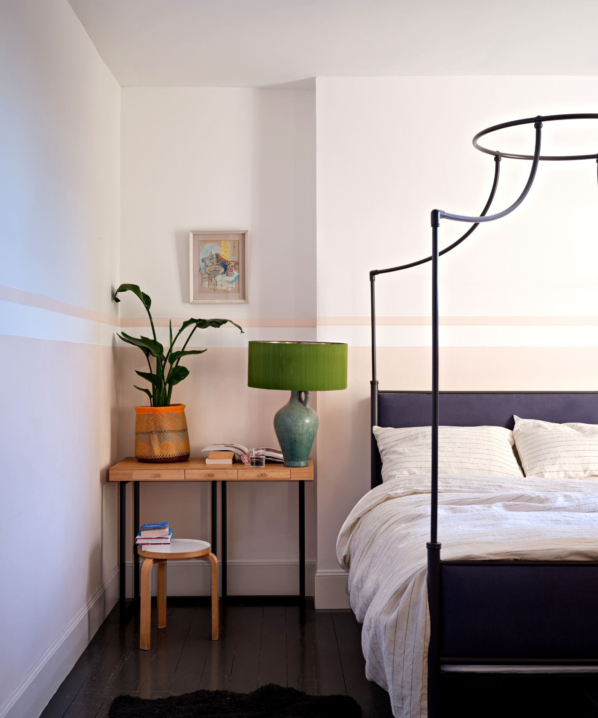
Warm pastel and creamier colors will look striking on north-facing walls too, perfect for creating different bedroom looks. 'You want something that’s cool and reflective,' recommends Michael Mitchell, Principal and Owner of Michael Mitchell Inc. 'I love the color Borrowed Light by Farrow & Ball or a north-facing room. Borrowed Light will look lovely with Wevet No.273 – it's complementary neutral' – or, paired with a deeper-hued color like Stiffkey Blue No.281 for a chic accent.'
'For north facing bedrooms, try some shades from the 2025 Colormix Forecast Kindred palette, featuring warm pastels, such as Icy Lemonade SW 1667, or Koral Kicks SW 6610 to instantly perk up a bedroom,' suggests Emily Kantz of Sherwin-Williams.
Contrary to its name, 'Icy Lemonade' boasts green undertones and so can work to lift all bedroom spaces, and those lacking in sunlight. 'To make sure your room is as bright as can be, try using a warmer white, Creamy SW 7012, to enhance any light coming into the space,' Emily adds.
East-facing bedrooms
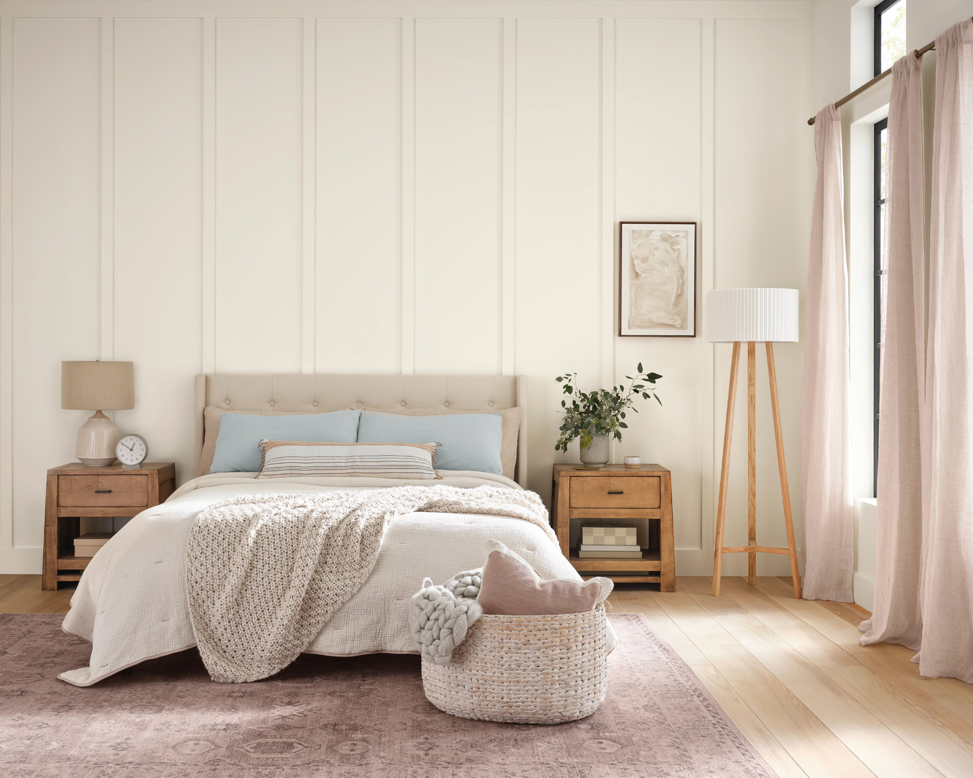
Bedroom painted in Sherwin Williams Albaster 7008
East-facing rooms will receive early morning sun that transitions into a cooler atmosphere throughout the day. To counteract cold notes, especially come the evening when a cocooning effect is preferred, choose colors with a hint of warmth without being too rich.
'Soft, warm tones like peach, light coral, and soft pink beautifully capture the morning light, fostering a gentle and welcoming ambiance,' explains Lauren Lerner. 'They infuse spaces with warmth and vitality, maximizing the sunlight's impact. For east-facing rooms, cooler hues such as pale blues and greens excel. These tones establish a serene and revitalizing setting as the sunlight wanes in the afternoon.'
Decorating with neutrals can create a variety of different moods and finishes, but for an east-facing space, keep them light, and airy, and avoid blue undertones. 'Harmonizing them with neutral shades like soft grays, whites, or taupes achieves a harmonious blend of the morning's warmth and the afternoon's cool light,' adds Lauren.
Specifically, creamy colors with hints of pink and yellow pigment can create the illusion of more light in an east-facing bedroom, without making it come across as sterile or lacking in personality. 'I like the idea of a soft, fleshy tone like Farrow & Ball’s Tallow in an east-facing room,' recommends Michael Mitchell. 'Soft tones will help reflect the warm, beautiful light throughout the day.'
For those who love a hint of brighter color, Emily Kantz encourages us to celebrate those first rays with herbaceous hues and pastels. 'For east-facing bedrooms, try a soft neutral or a light blue or green to balance the early morning sunlight when you first wake up and create a calming oasis at nighttime,' adds Emily Kantz. 'Try colors from our Paradox palette such as Egret White SW 7570, Alabaster SW 7008, or Slow Green SW 6456 to balance out the bright dose of sunshine.'
South-facing rooms
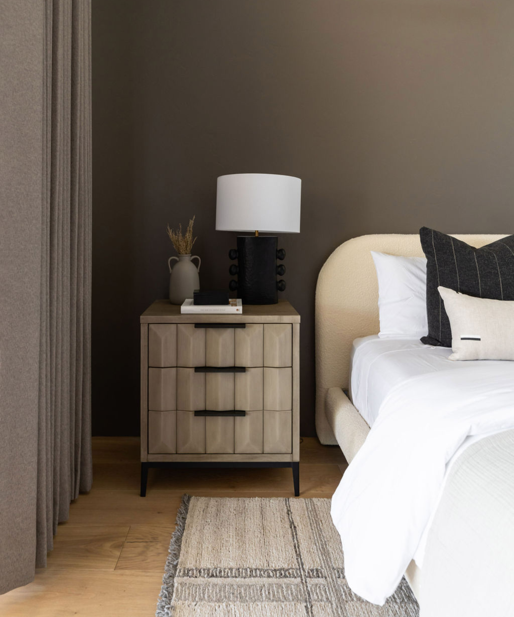
Much warmer and brighter in aspect, south-facing rooms will be bathed in sunlight for most of the day. It's a favorable bedroom orientation and an opportunity to be more playful with your room color ideas too. 'This sunlight allows for flexibility in color choice, using warm and cool tones effectively,' says Lauren. 'Warm hues like yellow, terracotta, or warm whites enhance brightness and coziness, while cool tones like blues or greens offer a refreshing balance, creating a calming effect. The generous natural light ensures even cooler shades look lively.'
For a punchier design scheme, choose colors that will change with the room's light levels throughout the day. 'A color like Farrow & Ball’s Inchyra Blue is a moody shade that can absorb and handle the sunlight during the day, while becoming inviting and cooler at night. The color will transition throughout the day. South-facing rooms need a color that can hold the light and sophistication during the day without feeling overly bright. At night, the attitude of that space will change quite a bit.'
Think about the atmosphere you want to create. Sumptuous and serene or loftier and more open: 'You can certainly lean into this type of light with a warm color to amplify the warmth of a room, however for a bedroom, one might want to lean into a cooler tone for a more balanced vibe,' continues Emily. 'Try selecting a cooler color in the green, blue, or violet family. To create a cocooning vibe, go bold and try a deep tone like Carnelian SW 7580 from our Chrysalis palette, or create a softer feeling by incorporating a quiet off-white such as Drift of Mist SW 9166 as delicate light gray to balance the warmth of a south facing room.'
West-facing rooms
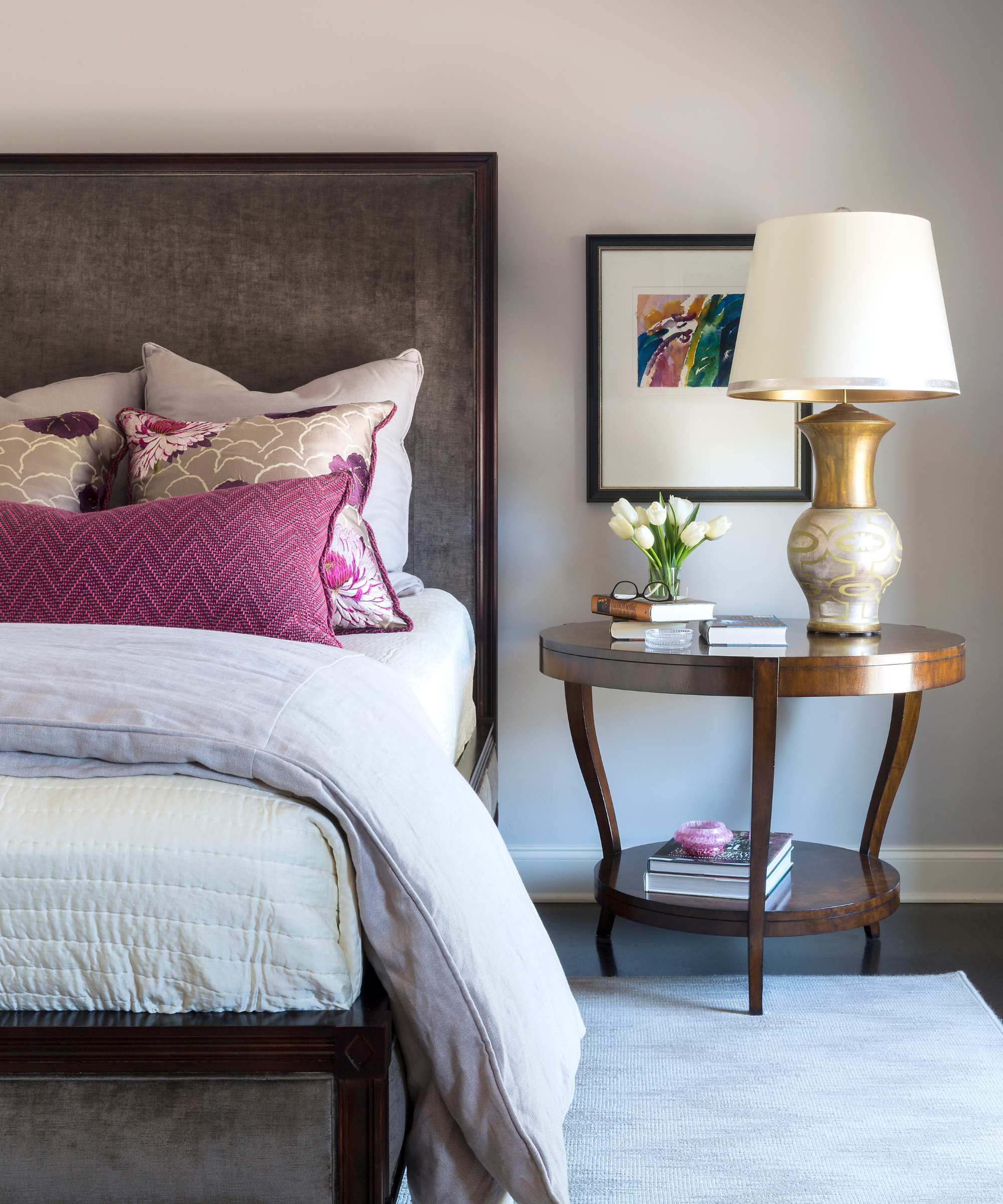
The final point on the color compass, west-facing rooms start the day in a cooler light and then enjoy warm, direct light from from the afternoon sun. Here, keep the color scheme neutral and adaptable.
'For a transitional west-facing bedroom, it is good to stick with off-whites, light neutrals, and blues to create that soft aesthetic as the sunlight becomes more intense throughout the day. Try a few colors from our Wellspring palette, including Oyster White SW 7637, Tres Naturale SW 9101 or Upward SW 6239 to create a comfortable bedroom interior no matter what time of day.'
If you prefer deeper hues, embrace more of the afternoon light with rich colors. 'Create a cozy atmosphere throughout the day with warm colors. Use warm neutrals like beige, taupe, and soft browns for a comforting backdrop,' says Lauren.
'As the sun sets, add soft pinks and corals for a romantic feel. Balance intense warmth with cool tones like pale blues or soft greens. Enhance afternoon light with rich golds and mustards for a vibrant space.'
From the color itself to the paint finishes, as well as your own personal taste, always consider the natural light that comes from your bedroom's orientation. 'Farrow & Ball’s Pink Ground would be great for a west-facing room,' says Michael. 'It’s a cool shade of pink, but it’s just warm enough to absorb all the sunlight for a beautiful glow while still maintaining a level of sophistication.'
The orientation of your bedroom, and the amount and type of natural light it receives will really make or break you paint choices. To ensure you get it right just be sure to always order swatches before you commit to a color – see how it looks in your bedroom and how it changes as the light changes throughout the day.
Sign up to the Homes & Gardens newsletter
Design expertise in your inbox – from inspiring decorating ideas and beautiful celebrity homes to practical gardening advice and shopping round-ups.

Camille is the former deputy editor of Real Homes where she covered a broad range of topics, including house tours, small space design, and gardens. She studied English language and Italian at the University of Manchester and during a year abroad studying linguistics and history of art in Bologna, Italy she started documenting her adventures and observations in a blog. Camille is always creating and spends her downtime painting, taking photos, traveling, and writing short stories.
-
 Ina Garten's storage pantry is an insightful window into all of the best cookware used by the chef – and it's easy to recreate on your kitchen shelves from $48
The beautiful dishware in The Barefoot Contessa's Hamptons pantry showcases the tools she uses most often to cook – this is exactly how you replicate it
By Sophie Edwards Published
-
 Extend the lifespan of your appliance with 5 simple but crucial washing machine maintenance tips
From cleaning the filters to keeping the door open, experts reveal the washer tips they swear by
By Andy van Terheyden Published