

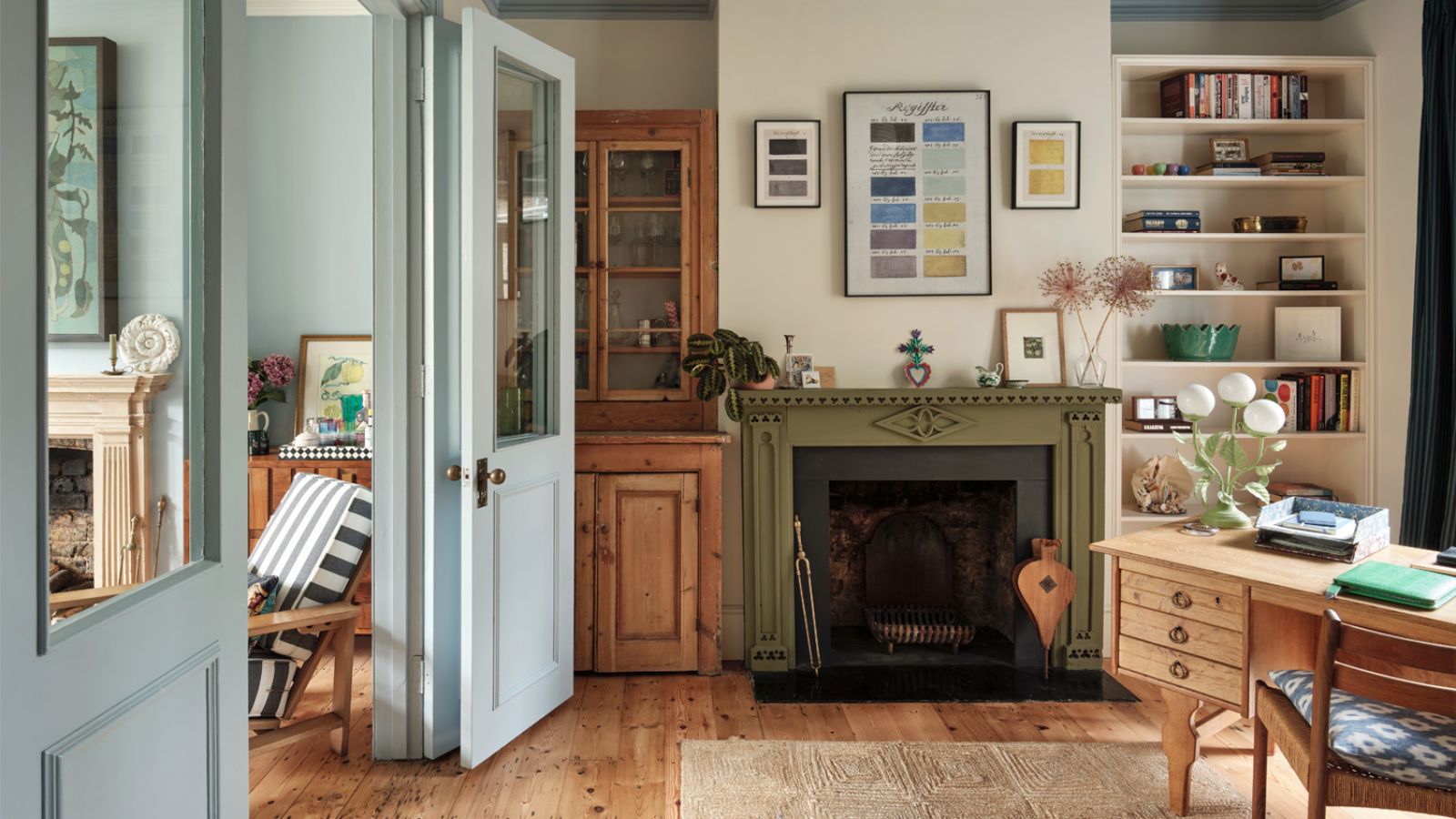
When designing a bedroom, most of us aim to create a space that promotes calmness – a retreat from the outside world to unwind at the end of each day – and your choice of colors is one of the most important steps in doing so.
Bedroom color ideas can have a significant impact on how restful the space feels, which helps to encourage a good night's sleep, so knowing which colors to embrace for your bedroom ideas and which to avoid is key.
We turned to the expertise of a color psychologist and interior paint experts who reveal below the best bedroom colors for sleep. Embracing these calming colors is the first step to creating a soothing sleep space – whether you stick to classic neutrals or go for something slightly more colorful.
The best bedroom colors for sleep
'Creating a calming environment is essential for good rest, so it feels pretty intuitive that choosing soothing bedroom paint ideas could aid in getting a better night's sleep,' says Lick’s Director of Interior Design and color psychologist, Tash Bradley.
'The paint colors of our bedroom walls have a huge impact on our mood, mental well-being, and how well we sleep. According to the principles of color psychology, certain colors can make us feel calm, and rested (and sleepy), whilst others can leave us feeling stimulated and anxious.
'So, when my clients ask me what color to paint their bedroom, I always ask them, ‘How do you want to feel in your bedroom?' Amongst the adjectives my clients choose are warm, calming, relaxing, safe, and cocooning – all feelings and moods that can be achieved through surrounding yourself with particular paint colors,' Tash explains.
Before we delve into the best bedroom colors for sleep, Tash begins by pointing out the room color ideas to steer clear of since they can be too stimulating in a sleep space: 'It’s important to highlight the colors that won’t encourage sleep. What you want to avoid is any color that's overly stimulating or highly saturated. If you’ve got one of those brains that simply won’t stop the chatter as soon as your head hits the pillow, then I advise swapping the electric blues, primary reds, and ‘brat’ greens for their more muted, softer counterparts.'
1. Soft blues

Lick's Blue 01
Decorating with blue is known to have calming qualities, making it a strong choice for a bedroom color scheme that aids with sleep.
'The most mentally calming color, I love a soft blue in the bedroom', explains Tash Bradley. 'In fact, the softer the blue, the more calming it is. Soft shades like Blue 01, Blue 02, Blue 03, and Blue 13 are perfect for a mentally soothing bedroom and can help you sleep better.'
'Pair your light blues with warm woods and natural materials like linen and jute for an easy-breezy feel. I’d recommend color-drenching your entire space, walls, and skirtings, to ensure you create a really expansive blue bedroom that reminds you of the sky and sea,' Tash advises.
2. Soothing pinks

Lick's Pink 01
'Whilst blues are mentally soothing, pink bedroom ideas are physically soothing,' Tash Bradley continues. 'Pink is the color of cuddles. So, if you go to bed every night with your shoulders up by your earlobes and your back in knots, then a cozy, nurturing pink will work wonders for your sleep.'
'I recommend opting for muted hues like Pink 07 or Pink 08. These dusky pinks are straight from nature. They are earthy and grounding, and that heavy dose of black pigment makes them feel really grown up. If you’re looking for a light and bright, barely-there paint, go for Pink 01 or Pink 02 – great alternatives if you’re after something more neutral,' says Tash.
Beyond paint ideas, it's important to think about how the rest of the colors in the room balance the space, and for a soothing feel, Tash recommends sticking to the same color family: 'To create a space that feels easy on the eye, opt for a tonal color scheme of cuddly pinks, reds, and pinkish-whites with warm wood or jute accents. What this will do is not only create tonal harmony but it will also create visual harmony, putting your mind at ease right before you nod off.'
3. Warm neutrals

Lick's White 05
While certain colors boast calming qualities, making them well-placed for bedrooms, decorating with neutrals can be just as effective, as Tash Bradley explains below:
'Neutral color schemes are undeniably calming. Brilliant white paints can feel sterile, so opt for warming whites like oaty White 05. Or, if you want to add depth, warmth, and texture to your neutral color palette whilst still keeping it very relaxed, beautiful Beige 02, Beige 03, and Brown 02 will do just this.
'Their yellow undertones inject warmth into a bedroom – especially Beige 03 for a dark north-facing bedroom – meaning they will help you get comfortable before bed. You could also opt for our earthy Taupe 03. Its red undertones give it a pinkish appearance and a nurturing feel similar to our pink paints, yet the effect is cozy and grown-up.
'The important thing to note when it comes to neutral color schemes is texture. Layer textures, materials, fabrics, and shapes to keep the space feeling cozy and not sterile.'
4. Restful greens

Lick's Green 02
Decorating with green is another go-to color choice for a bedroom scheme that encourages sleep. Green is an innately soothing color thanks to its association with the natural world, and Tash Bradley explains below that it's generally an easy color to process:
'Of all the colors, green is the least demanding on the eye and the most restful, because it is the easiest hue for the rods and cones located in your retina to process. In color psychology, it is the color of balance and harmony, connecting us to nature. It brings a little of the outdoors in and instantly makes you feel more relaxed, helping you slip into a deep sleep.
'So, if you’re looking to rest your eyes in your bedroom, reach for those restful green bedroom paints. The holy grail of greens – for its versatility in different light conditions – Green 02 is a great mid-tone to use in your green bedroom, whilst Green 04 is an excellent choice for creating an air of tranquillity and quiet reflection. If you want to go for something lighter, consider Green 09 or Green 14.'
5. Pastel tones

Benjamin Moore's Springtime Peach and Adam Green
To create an uplifting feel with your bedroom colors, look no further than pastel room ideas. Not only do pastel tones add design appeal to your sleep space, but Helen Shaw, color expert at Benjamin Moore says that they can help promote a calming bedroom environment:
'The bedroom is a space to find comfort – it should be a relaxing sanctuary where you can retreat to at the end of a day and wake up feeling positive the next morning. For a sense of calm and serenity, opt for light pastel colors that are associated with peaceful natural environments such as soft pinks, sky blues, or sage green. These shades can be used from ceiling to floor or combined with crisp whites and natural textures to create a smart Scandi-style interior scheme.'
Ashley McCollum, color expert at Glidden also recommends the use of light pastel colors to aid with sleep in bedrooms: 'Soft blues and muted greens are scientifically known to lower your heart rate and reduce anxiety. They promote a sense of harmony and peace, signaling your body to relax as soon as you step into the room.'
Similarly, 'Lavender or a dusty rose both evoke a romantic softness. Muted purples are often linked to relaxation and stress relief while soft pinks are known for calming and nurturing,' Ashley explains, recommending paint colors such as Lavender Haze -PPG1175-3 and Zen PPG1040-1.
6. Dark blues

Ceiling: Little Greene's Dock Blue, Walls: Little Greene's Royal Navy, Window: Little Greene's Smalt
Lastly, creating a calming sleep space isn't just about soothing light tones – a dark color scheme can be an effective way to create a cocooning and cozy space that helps you wind down.
'Dark blues are a fantastic choice for bedrooms – they create depth and intimacy which is perfect for a cozy and soothing space in which to retreat and relax,' explains Ruth Mottershead, Creative Director at Little Greene. 'Using different blue hues on various elements with a double drenching approach brings design interest to a bedroom, drawing the eye to architectural details whilst remaining calming and harmonious.'
'Pair the rich Royal Navy on walls with a related blue such as deep indigo Dock Blue on the ceiling and a pop of striking, vibrant blue Smalt on the window frame or door for a sophisticated layered scheme. The subtle contrasts created by the underlying variations in hue between Royal Navy and Dock Blue provide visual interest without being overwhelming. Each shade complements the other, creating a balanced and serene blue bedroom environment conducive to relaxation and sleep, whilst retaining character and personality,' Ruth advises.
While pale colors such as pink and green are generally known to be the most restful, you can go darker with your bedroom colors and still benefit from soothing qualities. Just don't go for anything too saturated or rich in undertones as you don't want the room to feel lively.
For more inspiration on creating the ultimate sleep sanctuary, we explore the most relaxing bedroom ideas in our separate piece.

You must confirm your public display name before commenting
Please logout and then login again, you will then be prompted to enter your display name.
-
 5 surprising but brilliant ways to clean with old socks – from perfectly buffing stainless steel to deterring pests naturally and more
Tackle dust in tricky corners, clean your mirrors and even banish bad odors with those rogue single socks
-
 How to grow astilbe – expert advice on cultivating this shade-tolerant flowering perennial
Shade-tolerant and pest-resistant - astilbe are hardy and tough perennials that can thrive in many settings

