'No matter the size of your home, you can always make it your own' – expert tips for designing studio apartments that don't compromise on style
With a bit of compromise and a careful eye, even the smallest studio apartments can feel high-end and homey. This is how interior designers tackle small spaces

Design expertise in your inbox – from inspiring decorating ideas and beautiful celebrity homes to practical gardening advice and shopping round-ups.
You are now subscribed
Your newsletter sign-up was successful
Want to add more newsletters?
Designing a studio apartment is notoriously difficult. With little space (and limited separation) to offer, they even pose a challenge to the most skilled and seasoned pros. But there's no overlooking these snug spaces – a big-city staple, studio apartments aren't going anywhere.
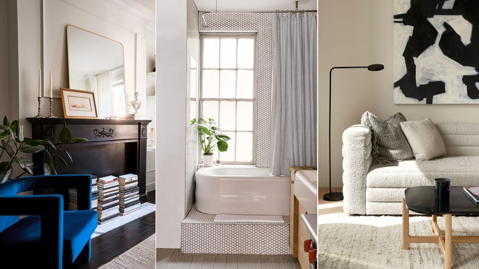
Despite the limitations of a one-room home, sleek style and a comfortable feel are still within reach. To hear more about designing around space constraints and delivering on a compact look (that still screams chic), H&G spoke with designers who have mastered the craft, making open-plan apartments feel cohesive. Here are four studio apartment projects to inspire, and what went into making them shine.
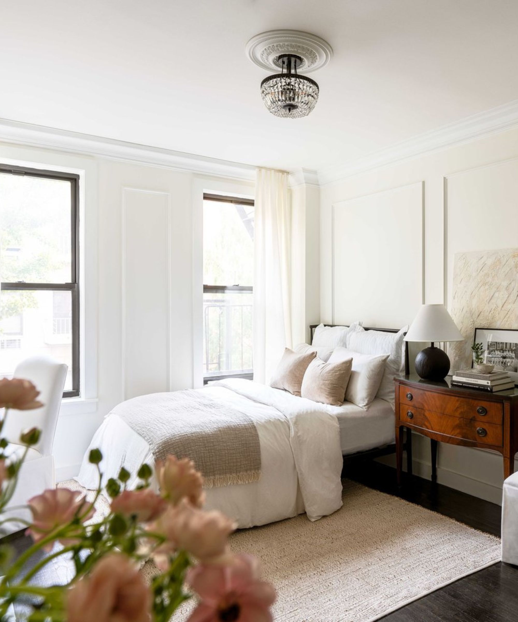
A 'feminine, classic, and inspiring' studio on the Upper East Side
What went into designing this space?
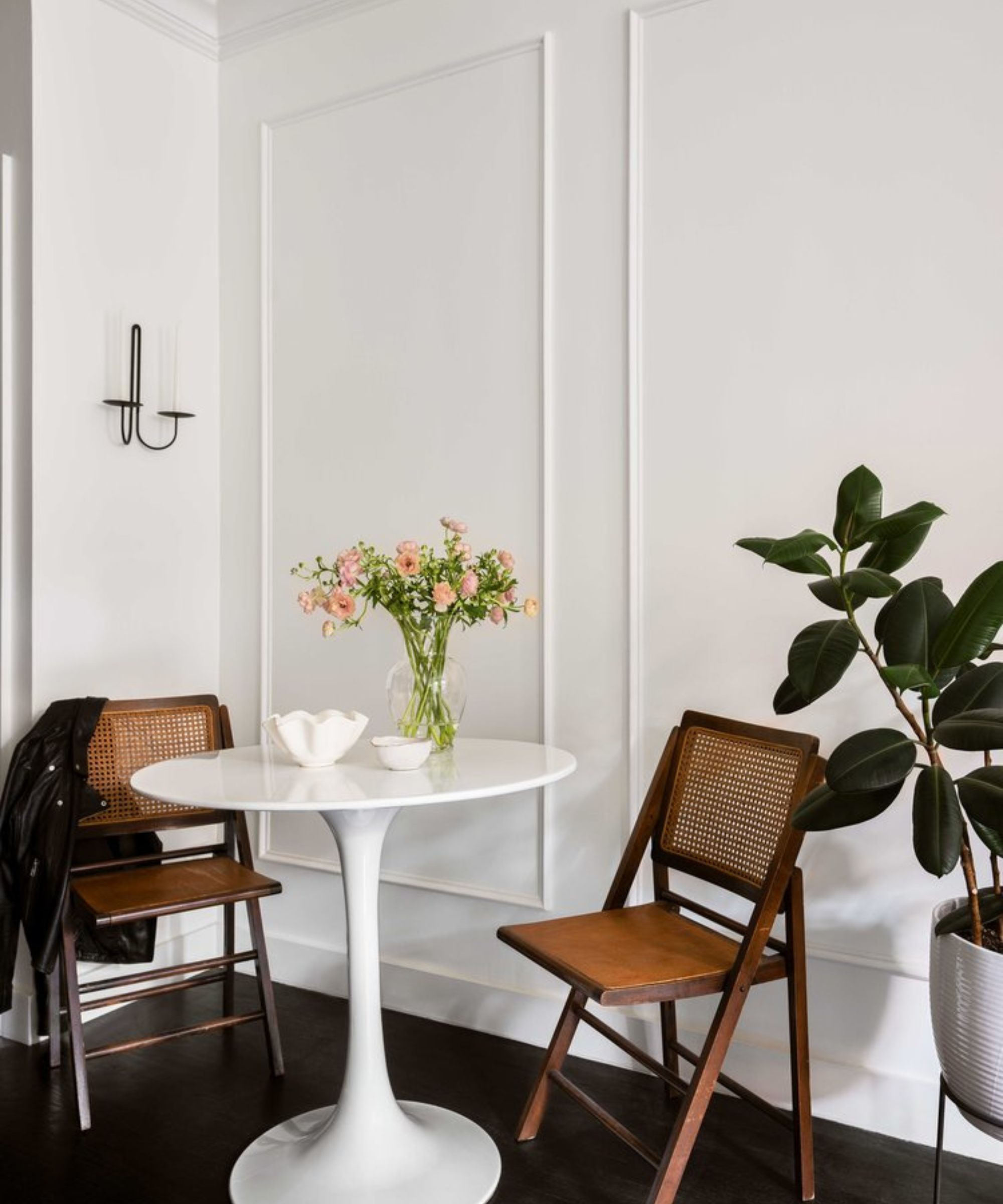
Article continues below'Editing was a huge piece of designing this space!' says Nicole Arruda, founder and principal of Toronto-based Nicole Alexandra Design Studio. 'Because of its size, I wanted to ensure I was intentional with everything I put in it. Months leading up to when I officially moved in, I gathered vintage finds and materials I knew I wanted to introduce.'
'My personal style is a merge of old and new so I had a blast finding that perfect balance in my own apartment. I love a challenge so making the most out of a studio apartment was right up my alley! My goal was to create a space that felt feminine, classic, and inspiring. I kept the color palette neutral with layers of contrast and warm textures.'
How did you create different zones within the space?
'This was the most important part! It’s crucial to understand how you want to utilize every inch, no matter the size of your home. Maximizing space comes down to a clear plan of how you will live in it.'
Design expertise in your inbox – from inspiring decorating ideas and beautiful celebrity homes to practical gardening advice and shopping round-ups.
'Space planning can often be centered around the TV. When I thought more about this I realized this wasn’t a priority for me. Not only would it change the overall flow of my space but I wouldn’t utilize it enough for it to make it worthwhile. Alternatively, I have a pretty large desktop computer which I often use in place of a TV. This brings me to my next point, multi-functioning pieces! Instead of filling your space with tons of furniture, opt for larger pieces that offer you more than one use. My vintage console triples as a nightstand, dresser, and catch-all zone.'
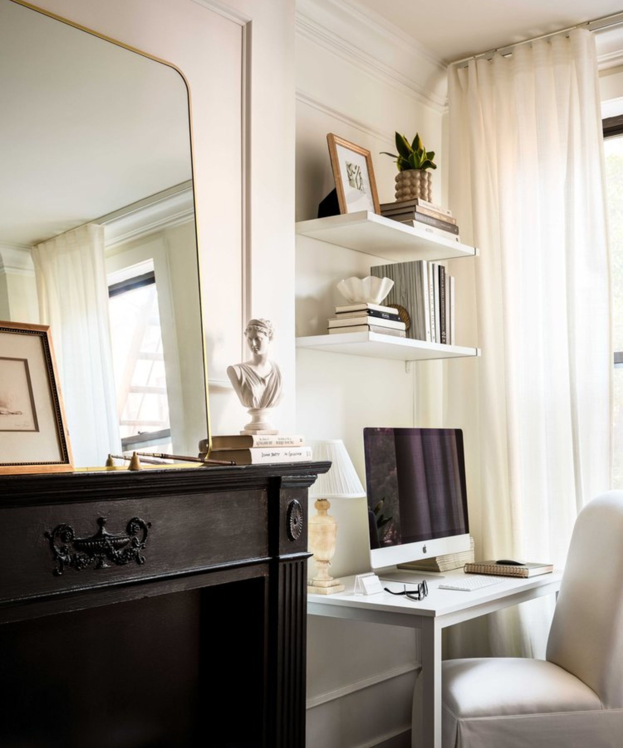
'I love working in natural light so my desk needed to be beside a window which fit perfectly beside the fireplace and across my bed. I created a dining nook across from the kitchen which made sense, it also doubles as additional counter space!'
Did you have to compromise on style or space at any point?
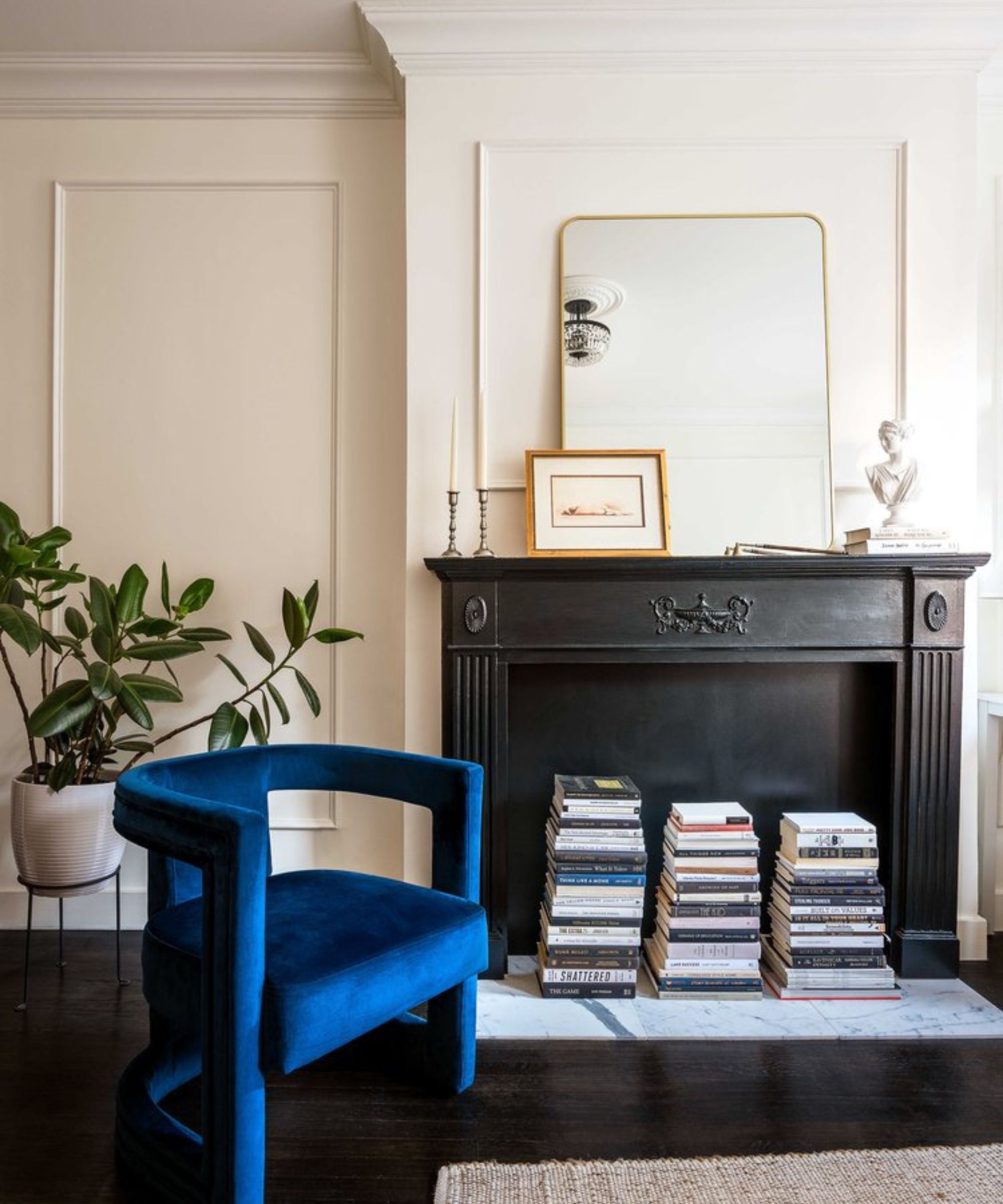
'Living in a small space certainly comes with compromises. The biggest one in my apartment was forgoing a sofa. Although it was something I would have loved, it got nixed when I really thought about how I would be using the space daily. Inheriting a fireplace was high on my wish list but I didn’t get so lucky in that department so I created my own! Sure, it’s not original but it gave me the focal point and charm I was looking for.'
'Most of the furniture and accessories are vintage, this helped keep costs down without forfeiting my personal style. I love decorating with vintage so it was a no-brainer for me to include one-of-a-kind pieces throughout my space. As we know, storage is always a dilemma in New York City, especially in a studio apartment. I’ve since added a clothing rack to help with that! It wasn’t my first choice but again, compromises!'
What are your biggest tips for making the most of a small space?
'The biggest takeaway is before you start getting excited and purchasing furniture for your space, think about the layout and how it will maximize functionality. Be intentional with everything you buy and ensure it serves a purpose! You don’t have the luxury of tons of rooms so edit down and prioritize what matters most to you. Once you have that down pat you can focus on the overall style and feel of your studio knowing exactly what you’re looking for!'
'Be excited! No matter the size of your home, you can always make it your own.'
An apartment renovation that proves 'bigger is not always better'
What went into designing this space?
'The project started out as a "refresh" of the existing apartment design with only a full renovation of the bathroom,' says Aaron Korntreger, founder and principal of New York-based Aaron Korntreger Design.
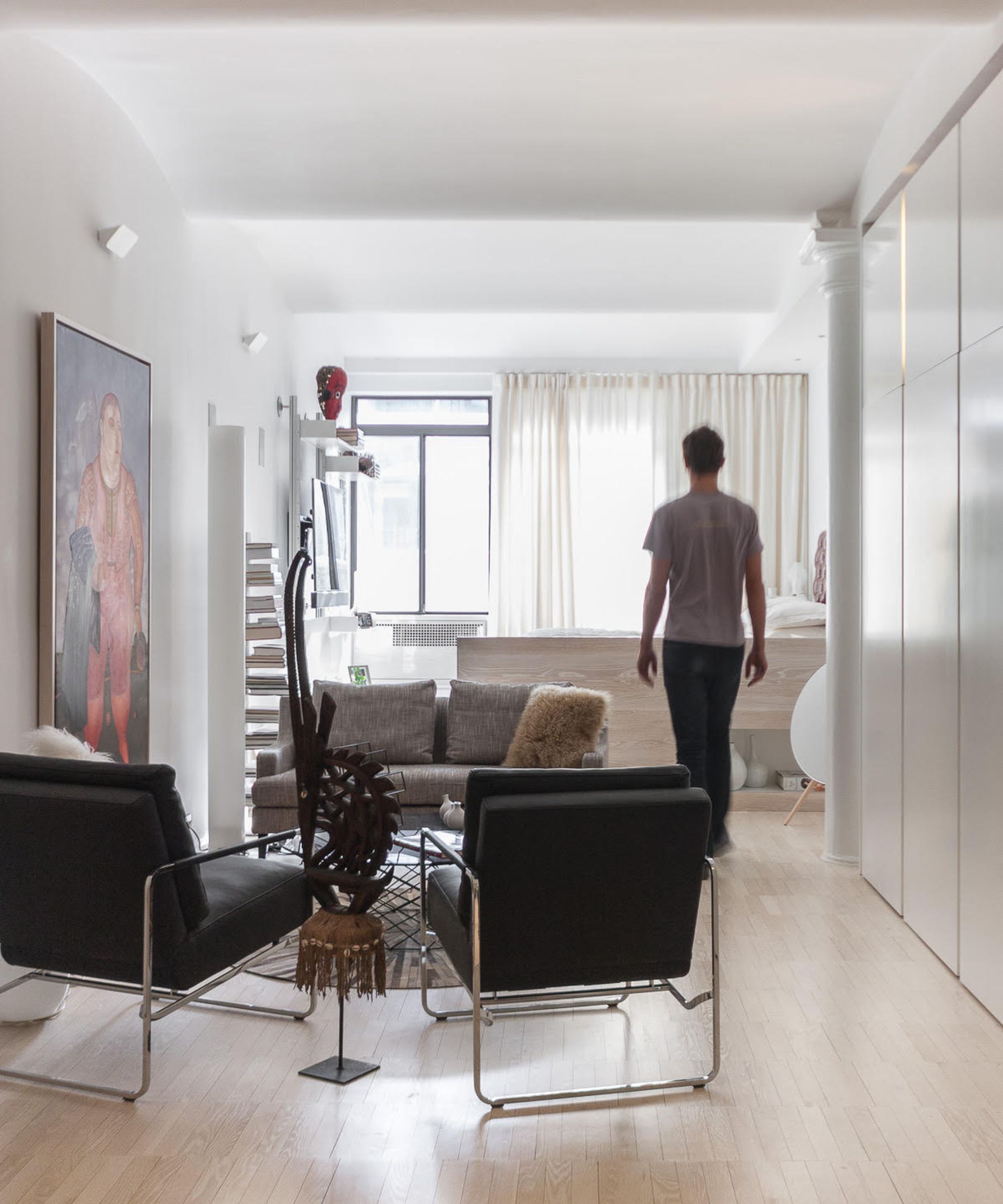
'As more time was spent in the space with the client, it became clear that drawing and framing the southern light through the (long and relatively narrow) apartment was the key design imperative, which was not correctly addressed in the existing plan. After pointing this out to my client, rather than put good money after bad, the project blossomed into a more comprehensive renovation.'
How did you create different zones within the space?
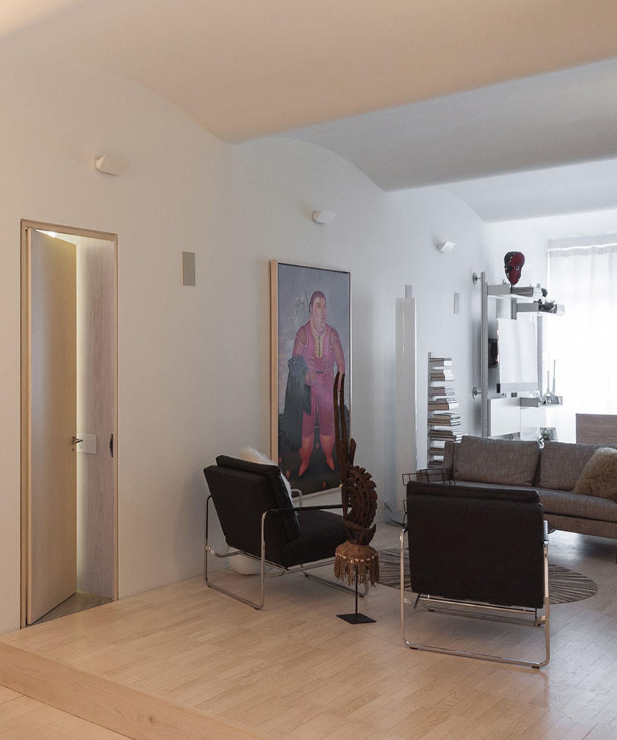
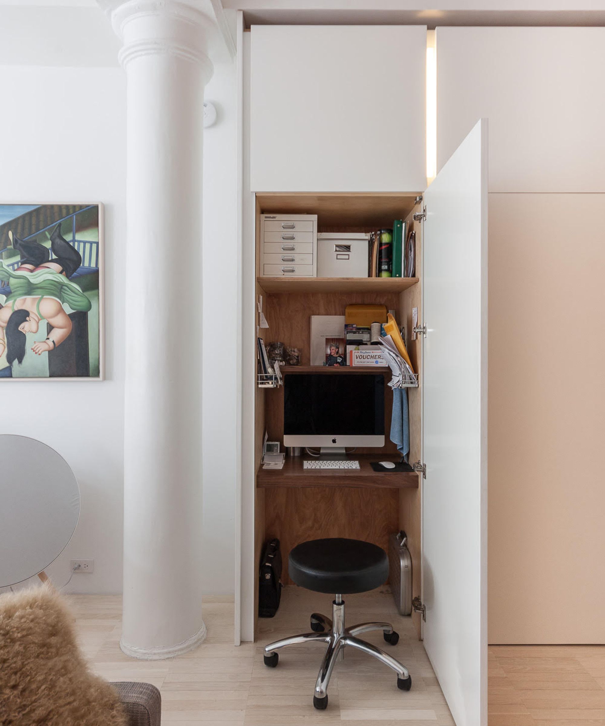
This studio apartment has an open-plan without proper walls that delineate the required spaces, exclusive of the full bathroom. Instead, different architectural devices were utilized to break up the three main spaces and uses.
'The bedroom area was placed closest to the window, with a partial height white-oak screen hiding some of the messier components of a bedroom. The screen also told visitors that they were not necessarily welcome in this area, even though it is in plain sight.'
'The living area is in the middle of the apartment on a lengthened platform raised one step above the adjacent spaces. This raised platform was required for some of the plumbing details in the bathroom, but also minimized the visual impact aforementioned bedroom screen. A row of full-height cabinets hug one side of the platform, and were placed between the two exposed structural columns.'
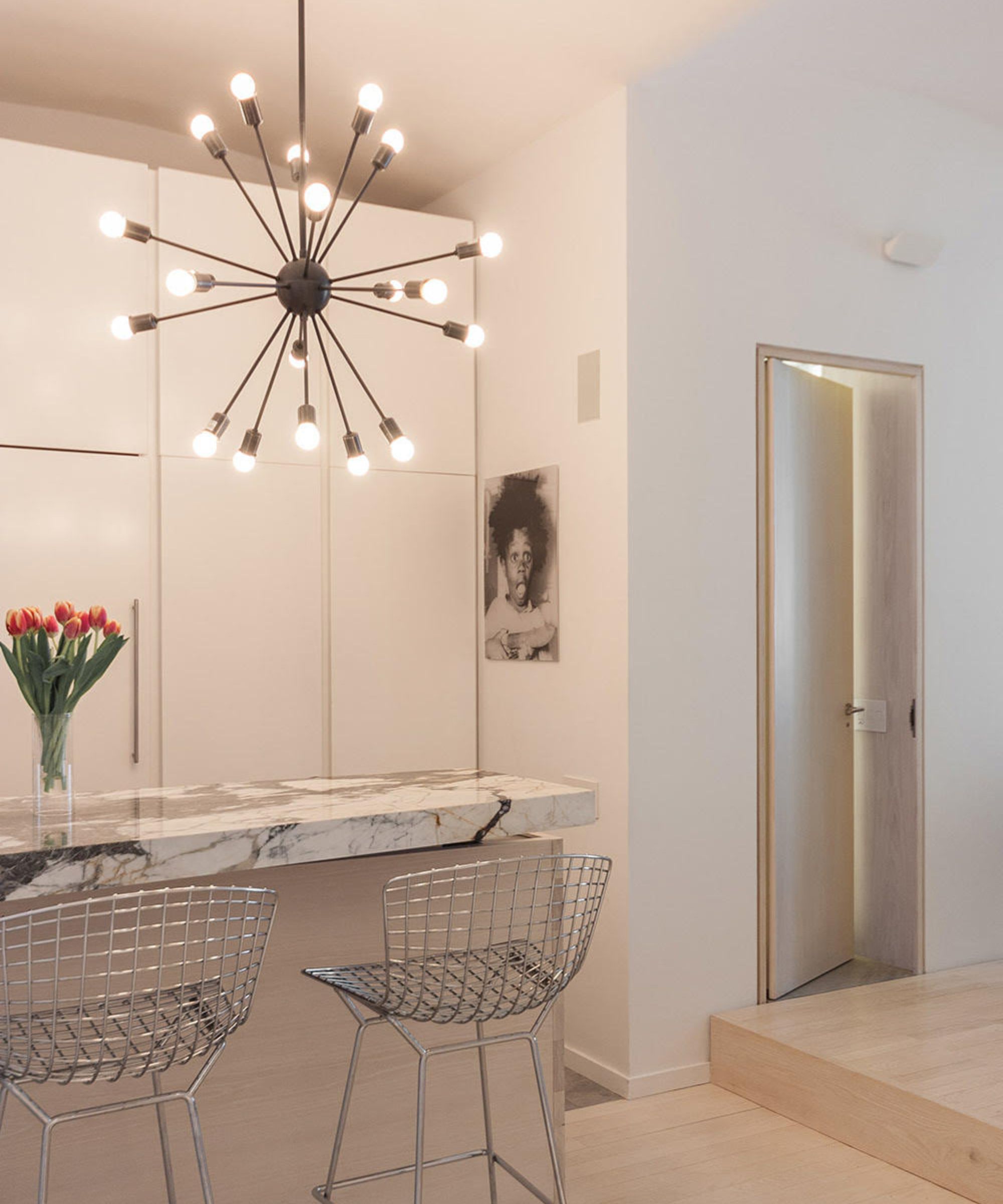
'The open kitchen (with additional seating counter) is towards the front of the apartment right after the entry hall. Like the bedroom area, a white-oak screen was used to hide the bulk of the lower kitchen cabinets. An expressive marble slab is used for the eating area, countering the subdued palette of the adjacent materials.'
Did you have to compromise on style or space at any point?
'The driving factor for all my designs, regardless of budget, style or square footage, is an efficient and legible architectural plan. This occurs through observing the nuances of each space and then working with the client to develop the program (what they need to actually have in the apartment) to complement their lifestyle. Once you have a good plan, you develop (and style) a cohesive material palette, add some furniture and art, and then hope the resultant apartment sings.'
What are your biggest tips for making the most of a small space?
'Designing smaller space is a balancing act of where to insert (mostly closed) storage systems and then where to leave other areas clear for loose furniture (sofas, chairs, side tables, beds, etc.) and art. You want your apartment to feel like a home, not a cabinet showroom. It is a fine and sometimes finicky balance.'
'Unless you buy the apartment next door, the studio apartment is never going to be a one or two bedroom, so be honest about that during the design process. Bigger is not always better, or even correct, and "small" is not a dirty word. Millwork, furniture items, plumbing products, and kitchen appliances come in an array of sizes – sometimes it can be as simple as choosing the right size for your space.'
In this Manhattan studio, 'compromise is a great friend'
What went into designing this space?
'This apartment is a special one, and dates back to 2016. I designed it for Krissy and myself while we were dating. It’s a space I found because I liked the building and asked around for the management contact. It ended up being a great deal for the location on Lafayette Street in SoHo,' says Nick Poe, founder of New York City-based 31 ARCH.
'The apartment was originally laid out as a one bedroom, which was quite dark since the bedroom held the main windows. I thought it best to completely open up the entire space, no walls aside from a toilet closet. The goal was to make the 400-square-foot-or-so space as bright and loft-like as possible, and continue a direct line of sight from the from to the back.'
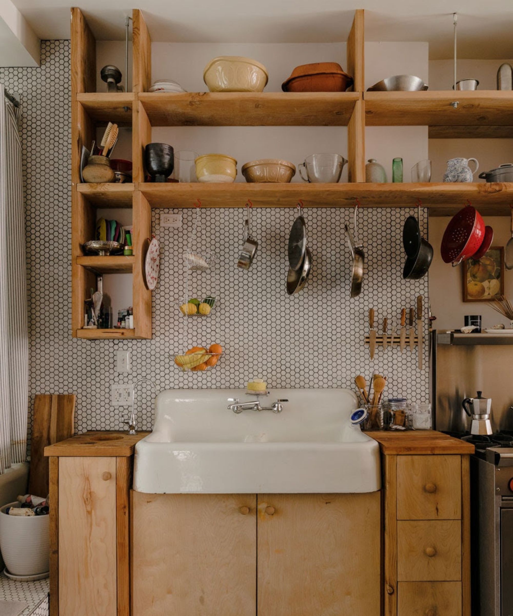
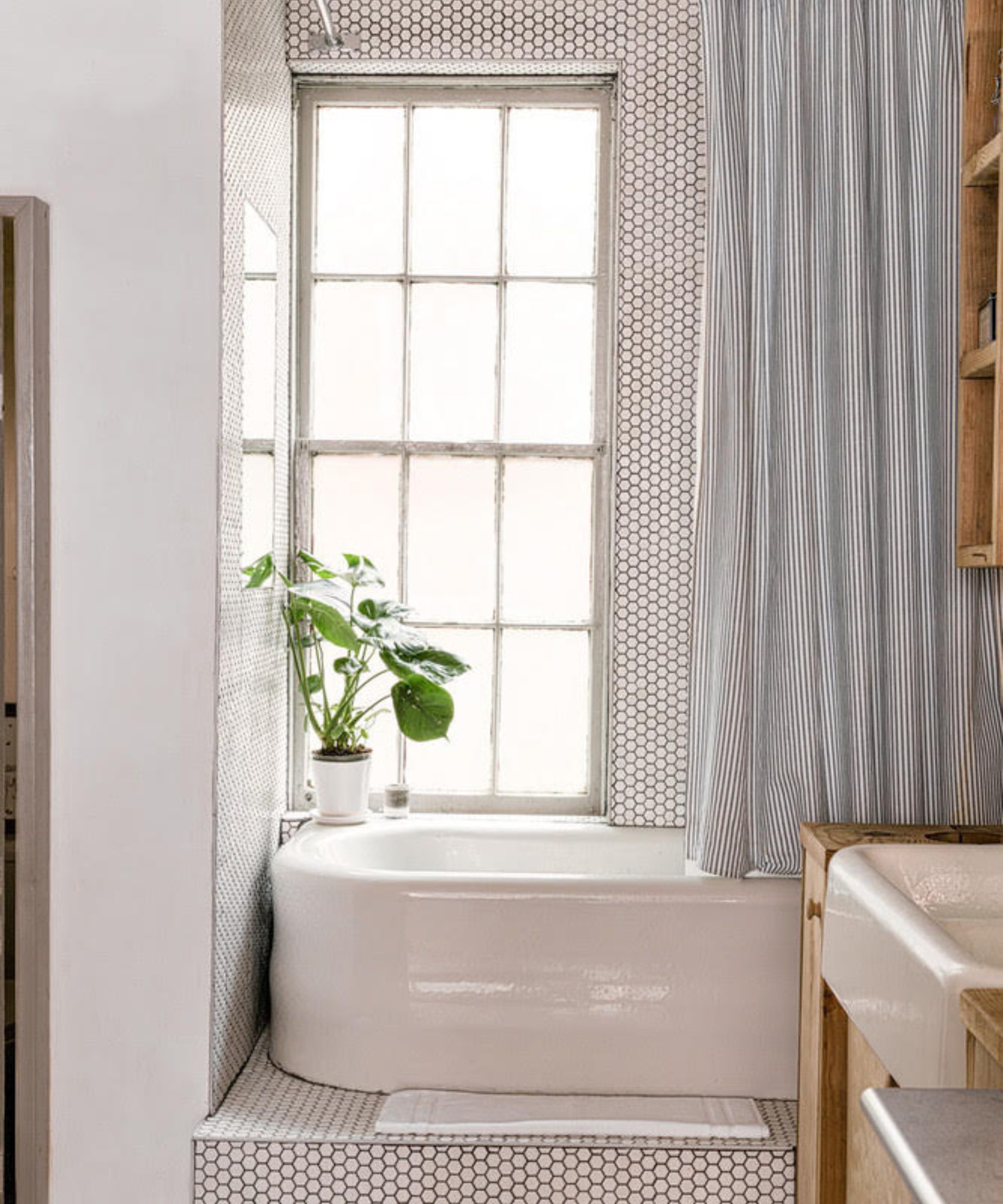
'The other requirement was a king size bed and a bathtub. This meant that all the storage would be a combination of wall mounted shelving and cupboards. I exposed the bathtub right in the center, next to the kitchenette. It’s a great experience to bath with a view, a shame so many baths are hidden away in small bathrooms really. Having just returned from a rather inspiring work trip in Marfa, we built all the shelving in Juddian fashion, with readily available from the local lumber yard.'
How did you create different zones within the space?
'Well, there were a few things established. Mainly, the existing plumbing lines restricted the kitchen, bath and toilet closet to the front area. It seemed fitting for the tub to be in front of the rear window, (which I textured for privacy). The kitchen items, materials and style of millwork designated the kitchen area, but with the tiling continuing on into the bathtub. I also stepped the tub up, partly for plumbing reasons, but also to give the tub a perch and the apartment some levels.'
'Most of the rest was achieved with furniture really. I designed a table repurposing scrap wood, as I found beautiful old-growth lumber inside of some of the walls we tore down. It was important the table was the perfect size given the limited space, so it made sense for that to be custom- especially as the table doubled as a cooking, dining and working surface, so got a lot of use and was central to the apartment.'
'I always found it sort of beautiful and poetic that the table was made from the apartment itself. The sleeping area was designated by, well, the bed. We placed mirrors near the windows to open up the space and bounce more light. I added a wall safe with a hinged painting in front, for valuables to be hidden in plain sight.'
Did you have to compromise on style at any point?
'I suppose with design, in some ways, it’s all compromise, right? Compromise is a great friend. For this apartment, with the goal of general openness and light, one compromise was the size of the toilet closet, which was rather tight. But given the (hopefully) limited hours in the loo, it seemed a worthy place to scale back. One necessary compromise was countertop space, but so be it.'
What are your biggest tips for making the most of a small space?
'I think natural light and openness is key, and a sense that you live well, despite limitations. Using mirrors near windows can really help to open spaces and bounce light. And if possible, strip everything back and only add what’s necessary. And keep height in mind, although the floor area may be small, there is quite a bit of volume – so verticality can be helpful. Use of the space directly above the doorway for cupboard storage can be helpful, as it’s not something you’d ever really notice as you pass through the door.'
'Something to keep in mind are the little things. Like where the wifi router goes. In this apartment, we mounted the wifi in a nook high up, something you’d rarely ever see or think about, and the blinking lights tucked away.'
The refrain 'don't fear big art!' influenced this studio's design scheme
What went into designing this space?
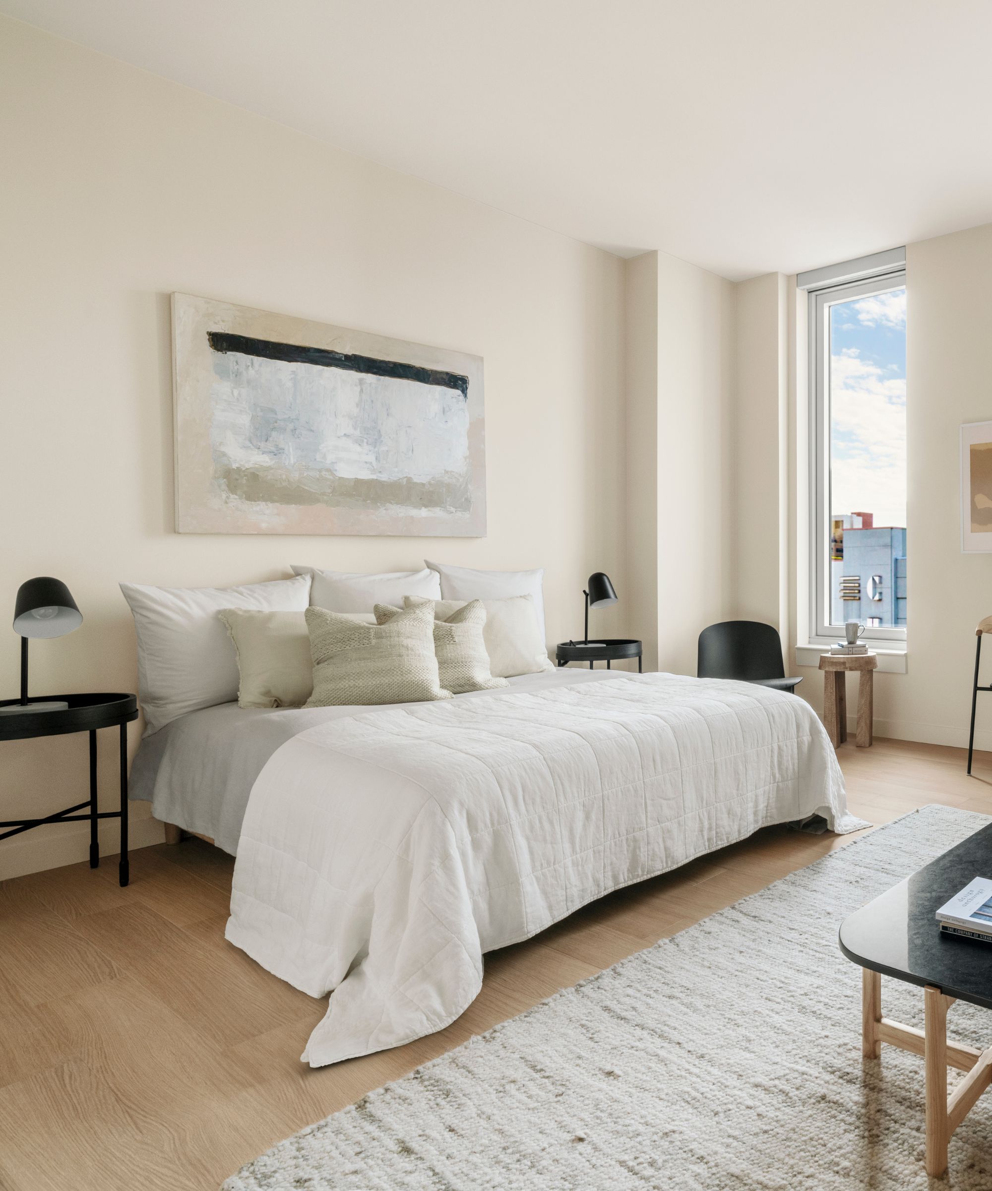
'Whenever we design studio apartments we really try to focus on the higher impact living room elements – not the bed,' says Porter and Hollister Hovey of Hovey Design. 'Of course, a bed will take up a large footprint in a one-room space, but we never want it to be the key feature, so we try to tuck it away as much as possible.'
'This apartment at Chelsea Canvas, a new luxury rental building in the Chelsea neighborhood of Manhattan that just opened, features a galley kitchen with a relatively large space for a credenza and small dining table along that entry hallway. It then wraps around along a large window to unveil the living and sleeping space.'
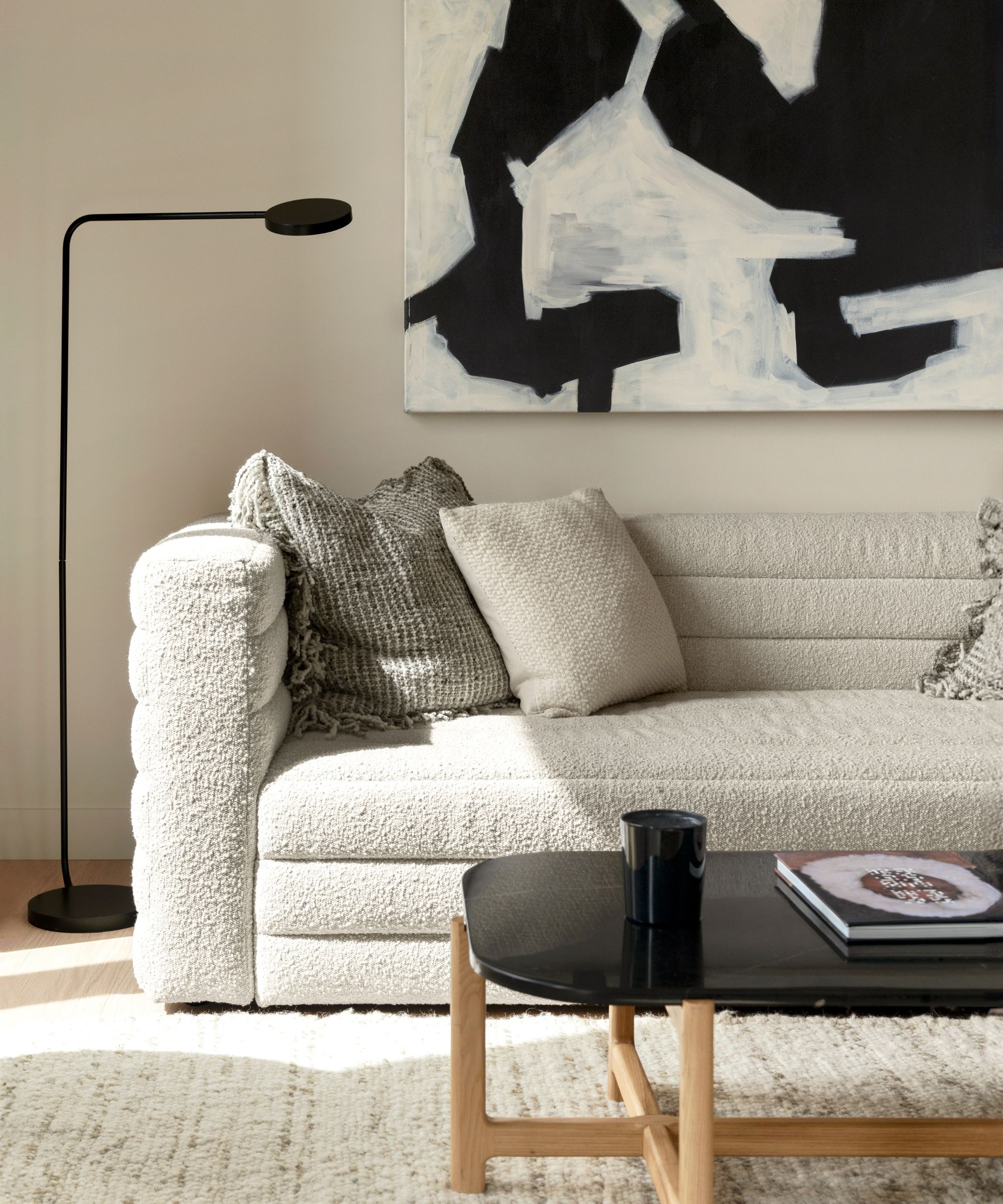
'We incorporated a very large painting over the credenza in the kitchen hallway to make that space interesting and functional. The art becomes a stand-in for a television that could be seen from the kitchen, dining table and sofa once the tenant moves in. After turning right from the hallway, the eye directly falls onto the view and the living room space where we incorporated a rich mauve velvet sofa, a black marble coffee table and another large painting (48x48”) in complementary peach and seafoam hues. We wanted the materials and pieces to feel grown up and sophisticated.'
How did you create different zones within the space?
'The art really helps delineate the various zones of the apartment and draws the eye to the entertaining areas. The queen bed got tucked into the back corner, a cozy place to sleep, but almost out of focus when entertaining (which is actually possible in this space).'
Did you have to compromise on style or space at any point?
'Because of their size, studios actually offer a great opportunity to invest in a couple of really high impact pieces that you can keep with you for the rest of your life. You don’t necessarily have to worry about buying in pairs; one side table or lounge chair is probably enough.'
'Materiality is really important. Here, at Chelsea Canvas, we used velvet and marble. Smaller spaces can be incredibly cozy and we wanted to lean into that in a very elegant way. It’s a similar principle to powder rooms; they’re often the smallest space in a home but look and feel best with moody wallpaper and rich materials.'
What are your biggest tips for making the most of a small space?
'Don’t fear big art! It can distract from other less attractive features and will make the space feel bigger. While we didn’t do it at Chelsea Canvas, we also love going dark with small spaces. Lean into the cozy!'
Designing a small space will always mean compromise, but these spaces prove that style doesn't have to go out the window when your floorplan is less-than-large. By making careful decisions and planning out every inch, you'll carve out a gorgeous home in any space you choose.

Abby was the Interior Design News Editor at Homes & Gardens and is now studying for her Master's degree in Journalism at City University, London. Prior to joining our team, she worked with Better Homes & Gardens, where she wrote and edited content about home decor, gardening tips, food news, and more. She studied Journalism and English Literature at New York University and moved to London to pursue her love of writing in 2023.