8 spring color ideas for living rooms – to make your home look fresher, brighter and bigger
Welcome in the warmer, lighter days ahead with bold bursts of fresh and vibrant color that inspire and delight
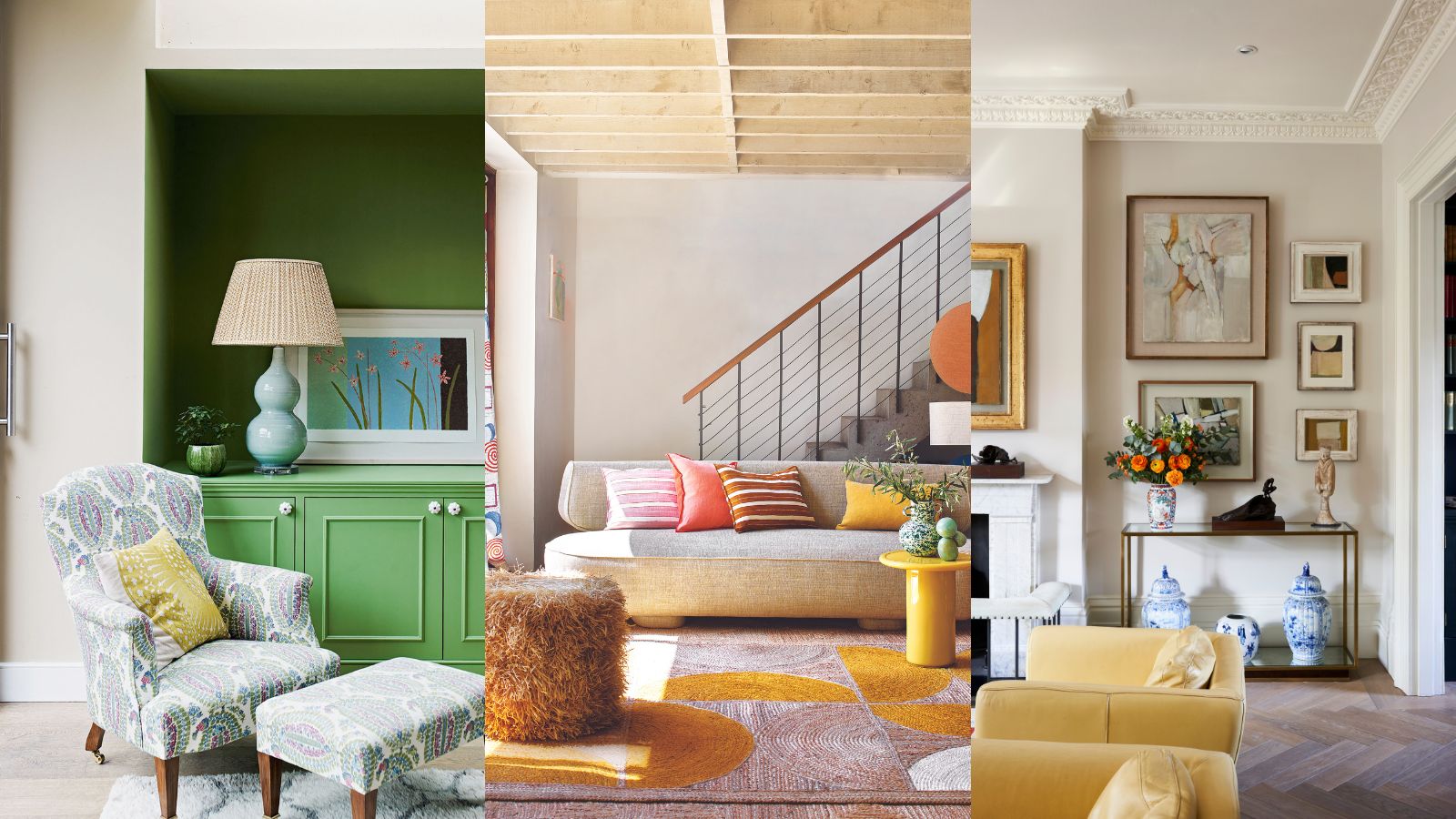

As we slowly leave behind the cold, grey days, and hibernation of winter, it is the perfect time to focus on spring color ideas for living rooms, and how you can give your home a joyful refresh for the season.
Color is key when it comes to curating beautiful spring decor ideas. Now is the optimum time to reflect these seasonal changes through palettes of bright colors and inspiration from the natural world, with a living room color scheme filled with uplifting shades and harmonious hues.
Here, color curators and experts reveal how to approach choosing room color ideas for this joyous time of year, from using the color wheel to creating strong color combinations, accent shades, and neutrals.
Spring color ideas
A quick look at your spring porch and spring door decor will help you curate a subtle palette of fresh, bountiful spring hues that would work both indoors and out.
Don't forget about summer decor ideas, as many of your chosen spring colors can go on to work in harmony with these, too.
1. Mix blue and green
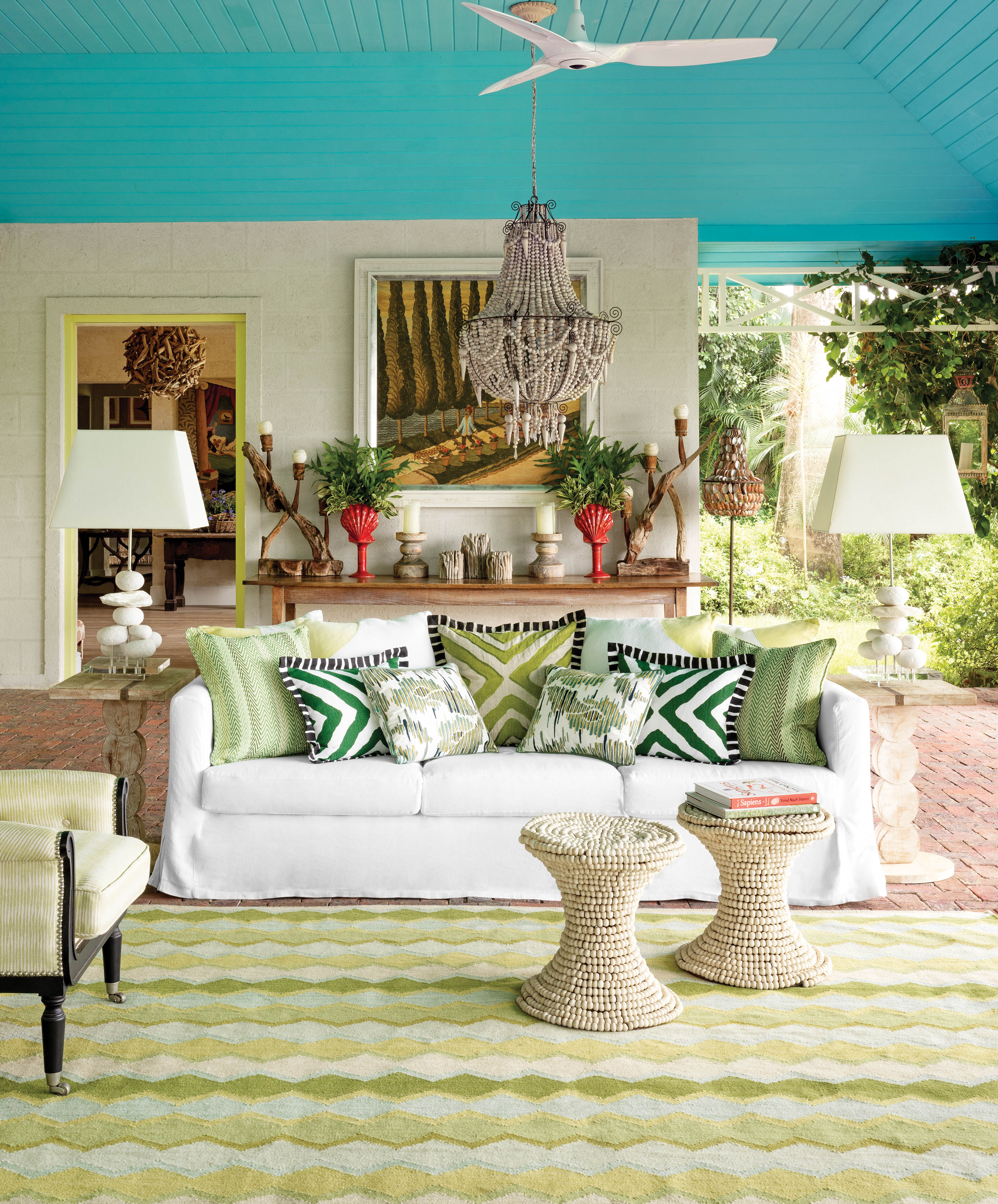
After a long winter, the light is starting to change and the bright green buds are starting to bloom on the trees, so what better time for a spring refresh than right now?
'Spring is a great opportunity to add some color and pattern to your space' says Kit Kemp, founder and creative director of Firmdale Hotels and Kit Kemp Design Studio. 'Pastel colors like an array of greens are a great way to soften a room and add tranquillity. But, don’t be afraid to play with strong features that will add character – you don’t want your home to look like a cotton candy shop! It is always fun to add a pop of color on an unexpected piece of painted furniture or why not paint the ceiling?'
2. Team subtle shades of pink and blue
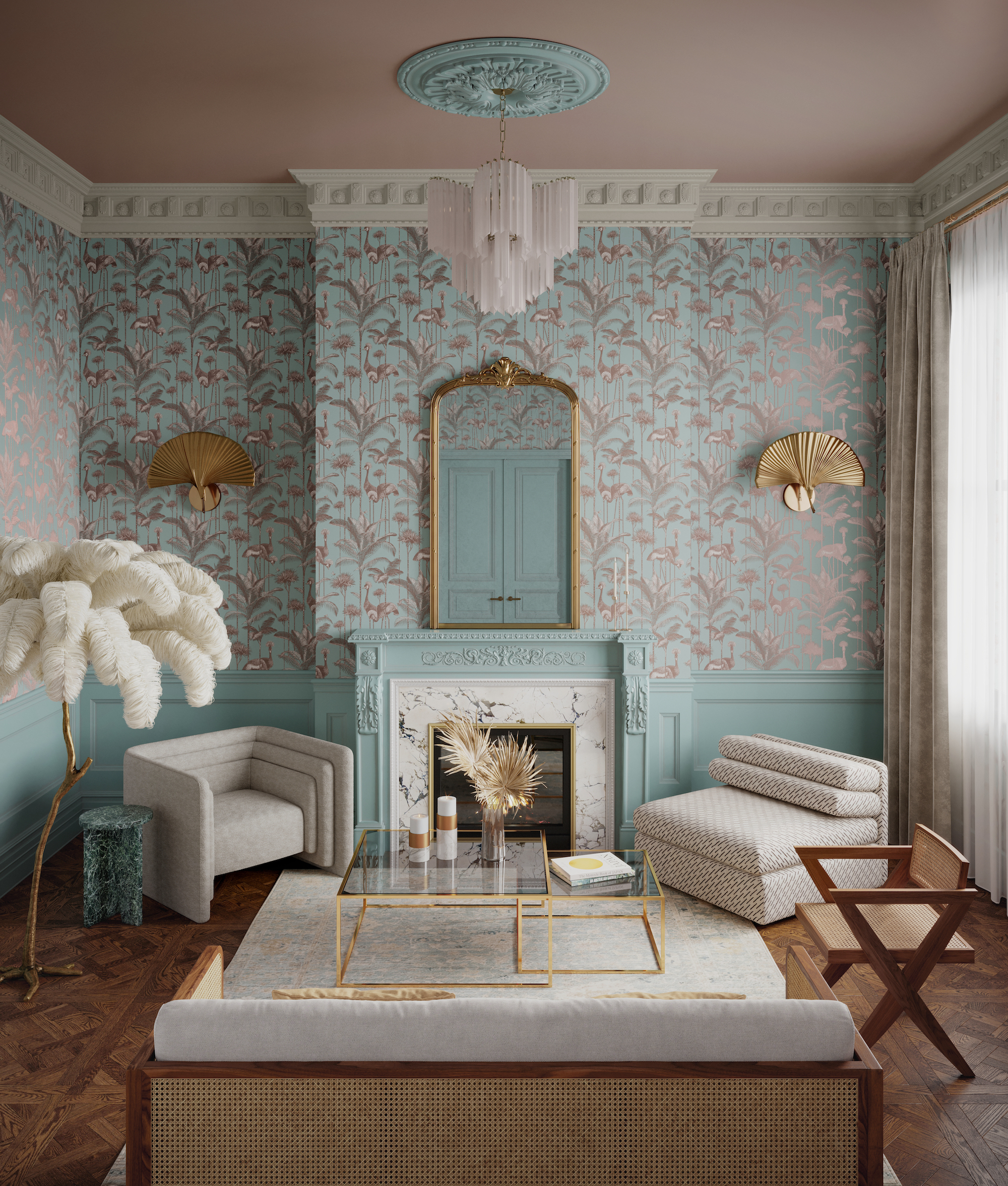
If you're looking for creative color combinations for rooms that inspire and delight, look no further than blue and pink. The cool, serene nature of this palette makes the perfect partner to the tranquil vibes of spring and the stunning wallpaper takes center stage whilst the flamboyant lighting adds a sense of wonder.
'Decorating with blue is our little secret for a spring refresh,' says Jamie Watkins, co-founder of Divine Savages. 'Blue might not seem like an obvious choice for the season of vitality, but it is both modern and elegant in equal measure.'
'In this light space, the stunning copper metallic detailing coupled with the grandiose gilded mirror in this room gives a subtle exuberance, reflecting light around the room and making the space feel bigger, brighter, and lighter. Perfect for the new season.'
'An easy yet very effective design trick is to add wood paneling to the lower half of the wall, or simply break it up with a dado rail, painted in a shade as close a match as possible to the wallpaper. It's a great way of injecting period detailing if you live in a more modern home and, in smaller spaces, helps to open up the space by drawing the eye upwards, making the room feel more spacious.'
3. Use earthy tones as a base for accent shades
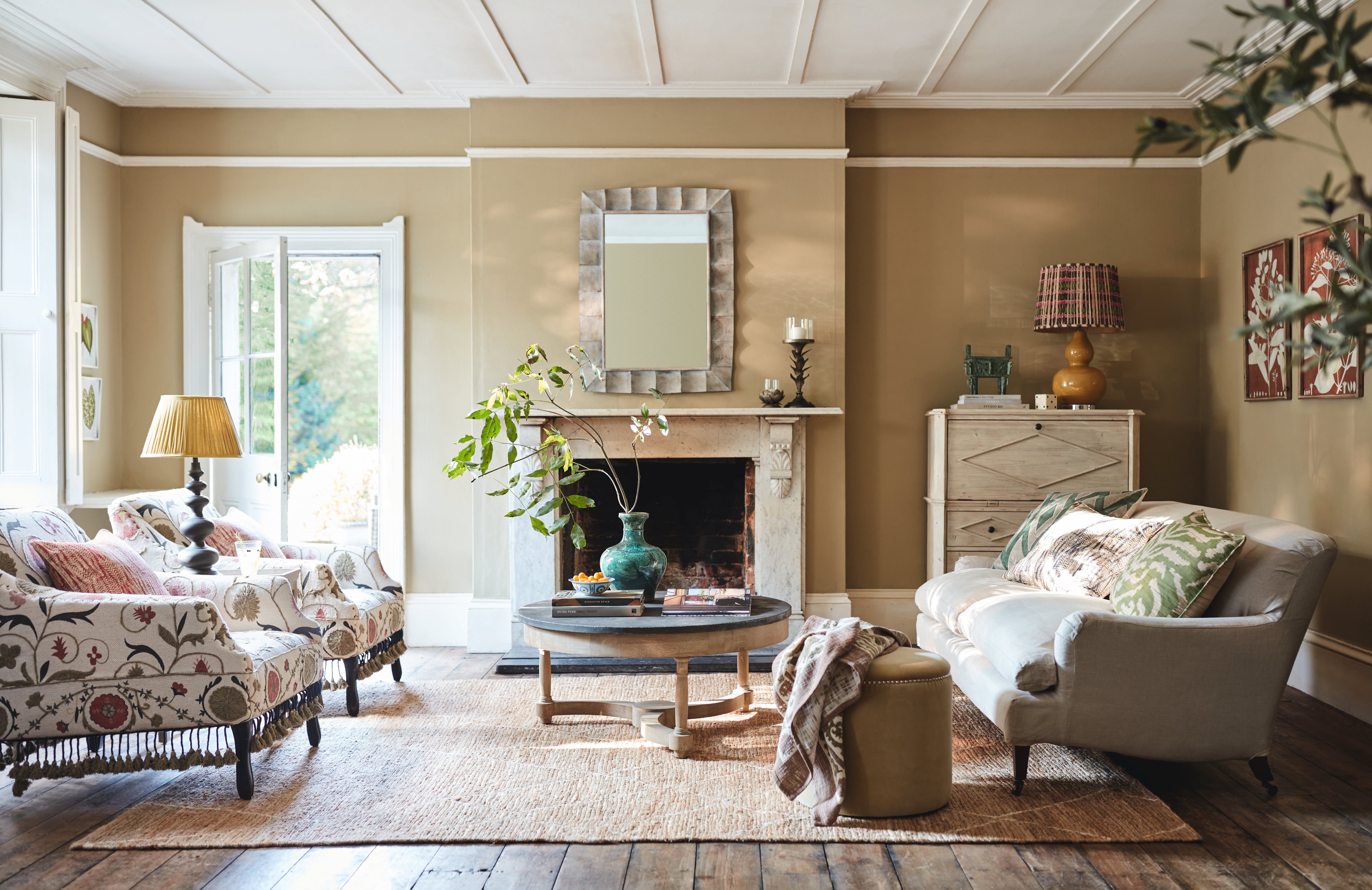
‘The key to using color is to be a bit daring and try unconventional combinations; earthy tones are usually the reserve of fall, but I think accent colors for beige can work all year round with the right accessories.'
'A lighter-toned color such as this really helps to maximize the proportions of a room and acts as a great backdrop for brighter accessories, which are the easiest way to nod to a new season. For spring, I’d bring in lamps, pillows, and pottery in more obviously seasonal colors, such as citrus yellow, terracotta, and green,' says OKA's co-founder, Sue Jones.
4. Go bold with a bright but warming red
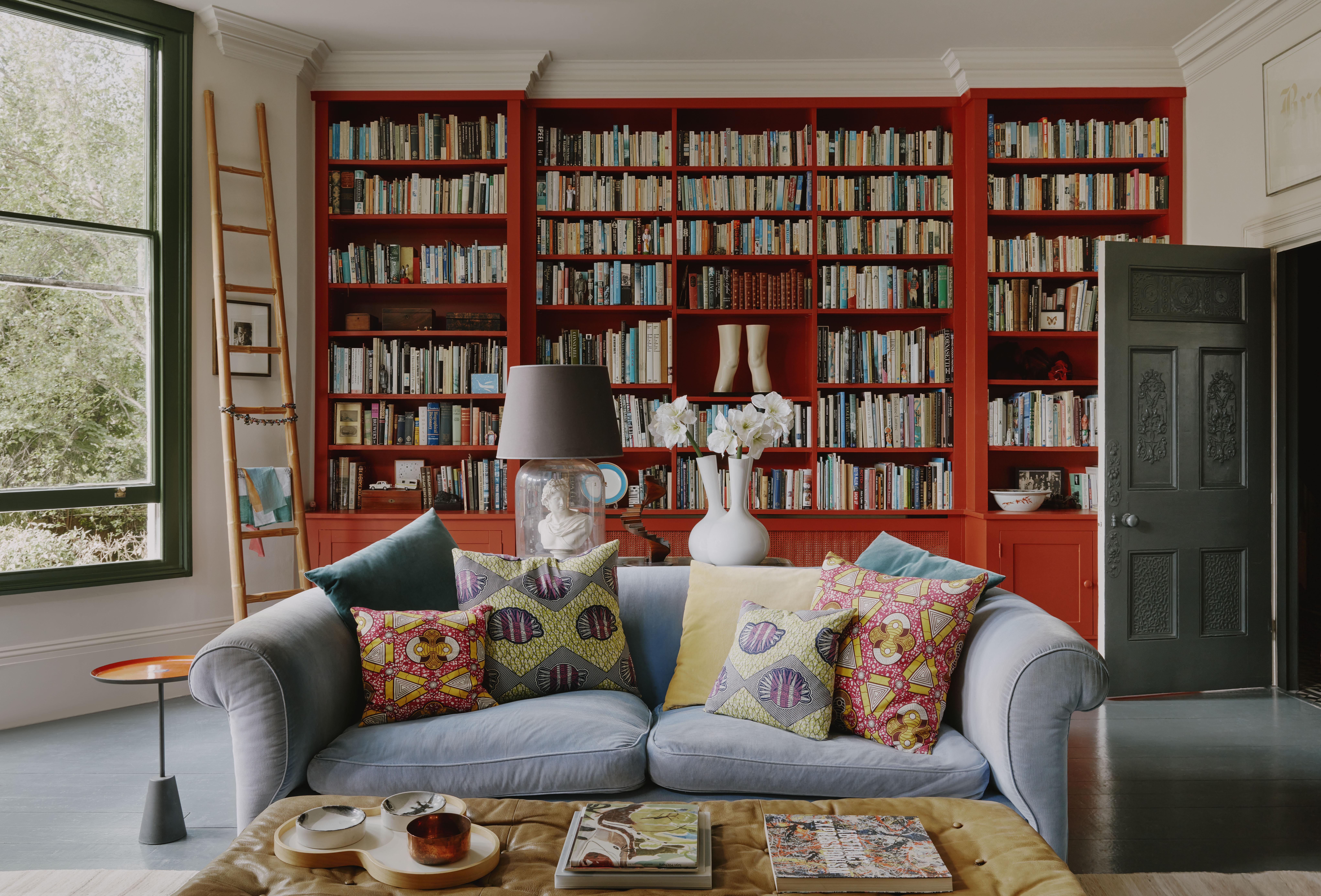
For a spring color update, you don't have to paint walls, consider a woodwork refresh like the window frames, furniture or a bookcase.
'Become braver in using strong colors, even if only in small amounts,' says Joa Studholme, color consultant at Farrow & Ball. 'For example, painting spicy Bamboozle on the inside of a cupboard to make you smile when you open it or adding earthy yellows, like India Yellow, to window frames to create a constant feeling of sunshine. And not forgetting the increasingly popular use of color on ceilings.'
'We want colors to be lasting experiences in our homes and reflect a little more of our personality. We no longer have to stick to only thinking about using color between the skirting board and ceiling. Color can enhance our lives in a myriad of ways, be it chequered floors, colored woodwork, two-tone walls or a gloss ceiling.'
'When it comes to a specific shade or color family, we’re being drawn to warmer, earthier tones that connect us to nature this spring. Without a doubt, reds, terracottas and browns are becoming some of the most important colors in interiors. They create a cocooning atmosphere, perfect to embrace us and make us feel safe. Red Earth, Picture Gallery Red and Broccoli Brown wrap rooms in warmth and offer a sense of well-being.'
5. Accent with bright color
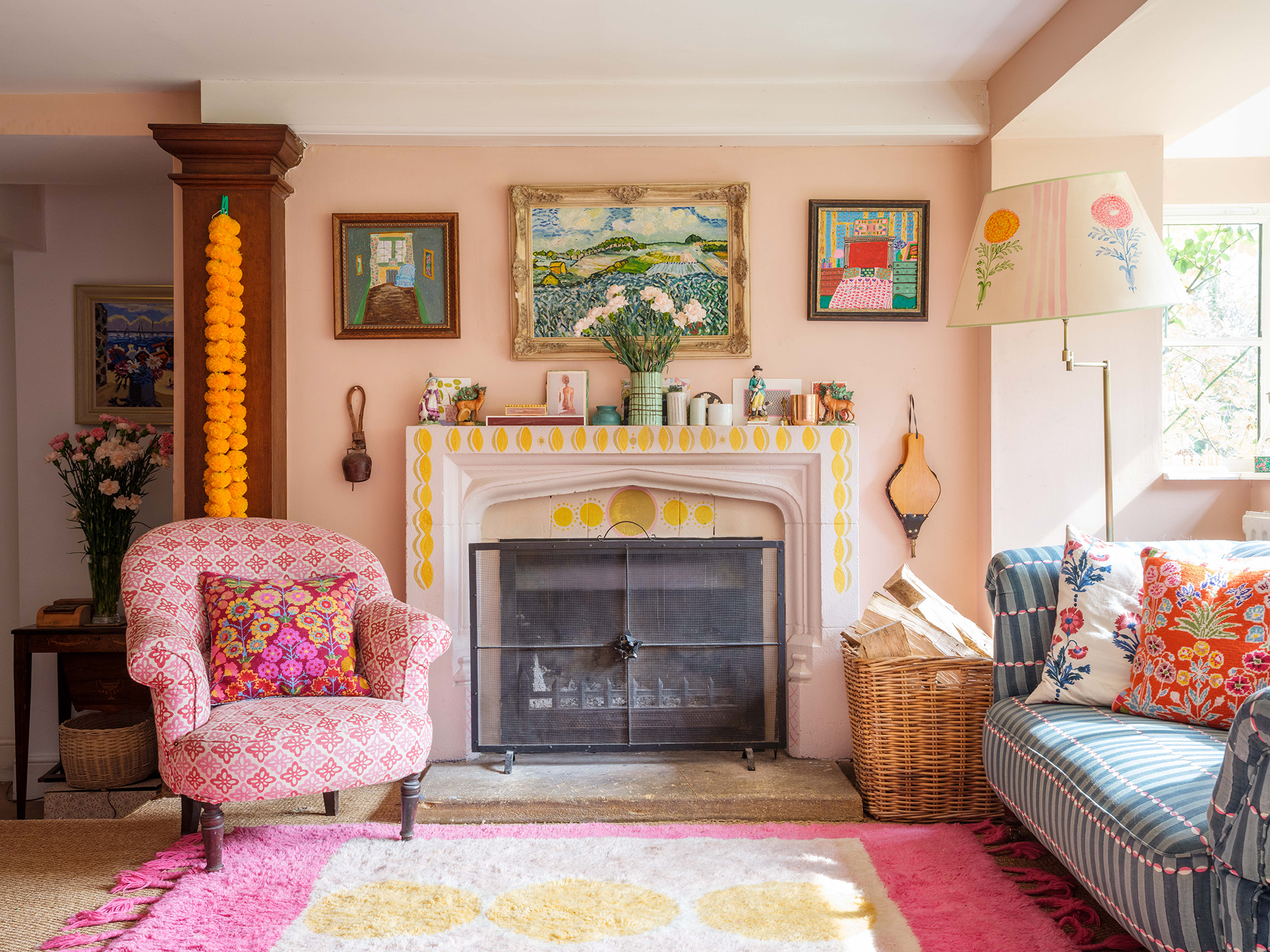
'I find working with spring colors particularly rejuvenating,' says Molly Mahon, block printed and textile designer at Molly Mahon. 'Putting different combinations of colors together makes me feel happy and some just make my heart sing – it’s important to find the colors and combinations that bring you joy.'
'I also firmly believe we are all creative. We all make decorative decisions about our homes, often without even thinking about it, and it’s important to nurture this connection to our inner creativity.'
'Just as we need to make time for exercise, we also need to make time to be creative – it feeds and nourishes the soul, and for this reason I always follow my heart to do what feels right for our house – whether that means painting the fireplace, hanging a string of brightly colored pom poms just because they make me happy, or printing fabric for my soft furnishings – all these things can be refreshed and updated seasonally to give your room the little lift it needs to help the space feel fresher and brighter.'
6. Lift a dark room with yellow
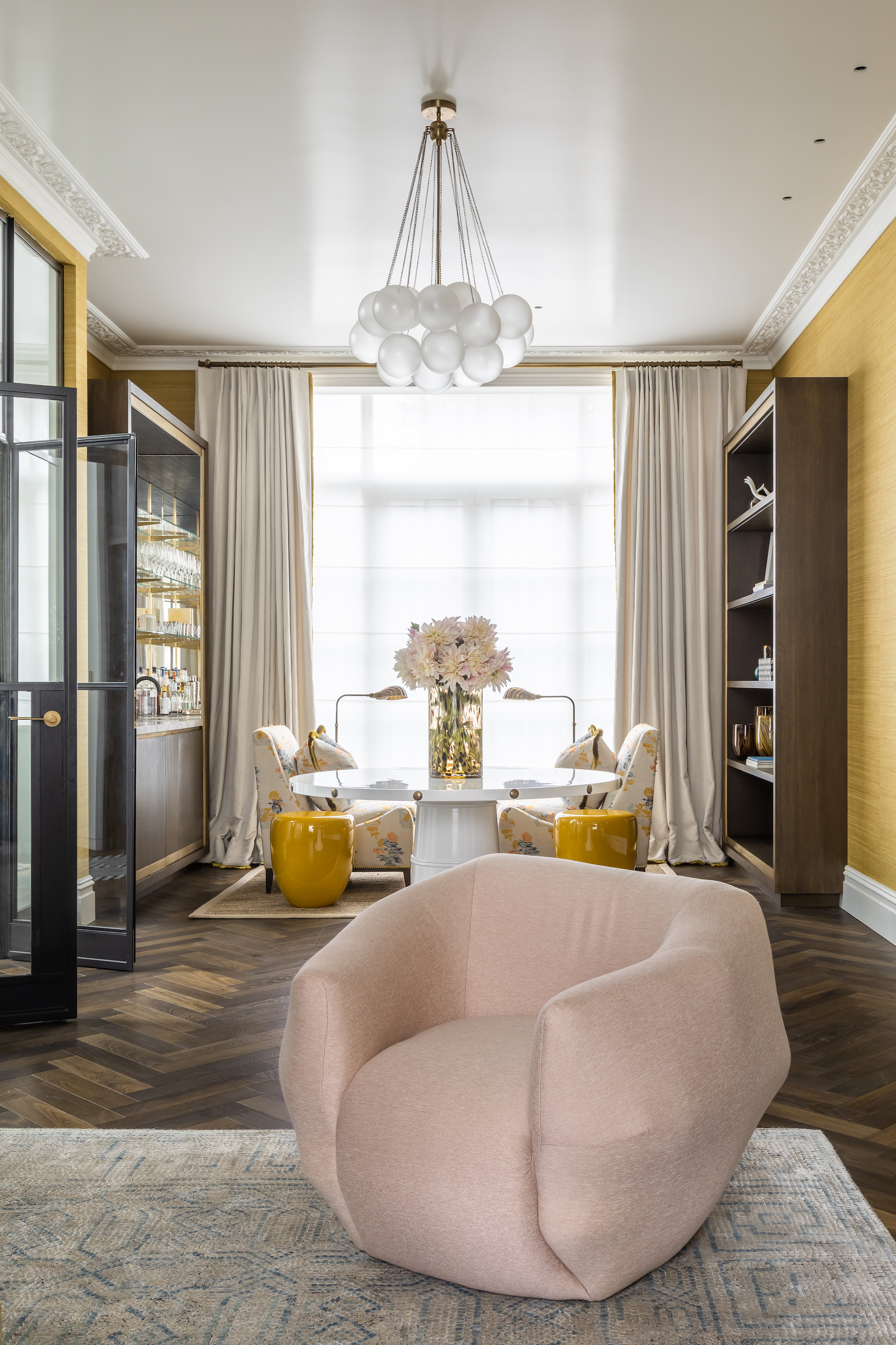
'A subtle marriage of dusty pinks and mustard yellow paired with iconic furniture oozes laid-back glamor in this sitting room,' says Samantha Todhunter, founder of Samantha Todhunter Design. 'It is all about layers – using base colors of mustardy gold, pink and white in a clash of different textures which all combine to give a room interest, depth, and warmth for spring. Even in the most pared-back interiors, a play on texture is enough to give the room atmosphere, and mixing the slight clash of pinks and yellow into a sorbet of color gives character and depth.'
'There are no hard and fast rules to spring color. Sometimes it's wonderful to take several tones of one color to fill a room and sometimes it's fabulous to clash colors throughout. What works is usually dictated by the room and the light.'
'This space is all about creating an atmosphere, the light is incredible so we used a high gloss on the ceiling to reflect it and enhance that sense of space and scale. The colors were picked to further accentuate that – the more golden tones of the mustard silk wallpaper create a sort of cocoon and are set off by the dusty pink giving the space a welcoming softness.'
7. Don't forget about grey
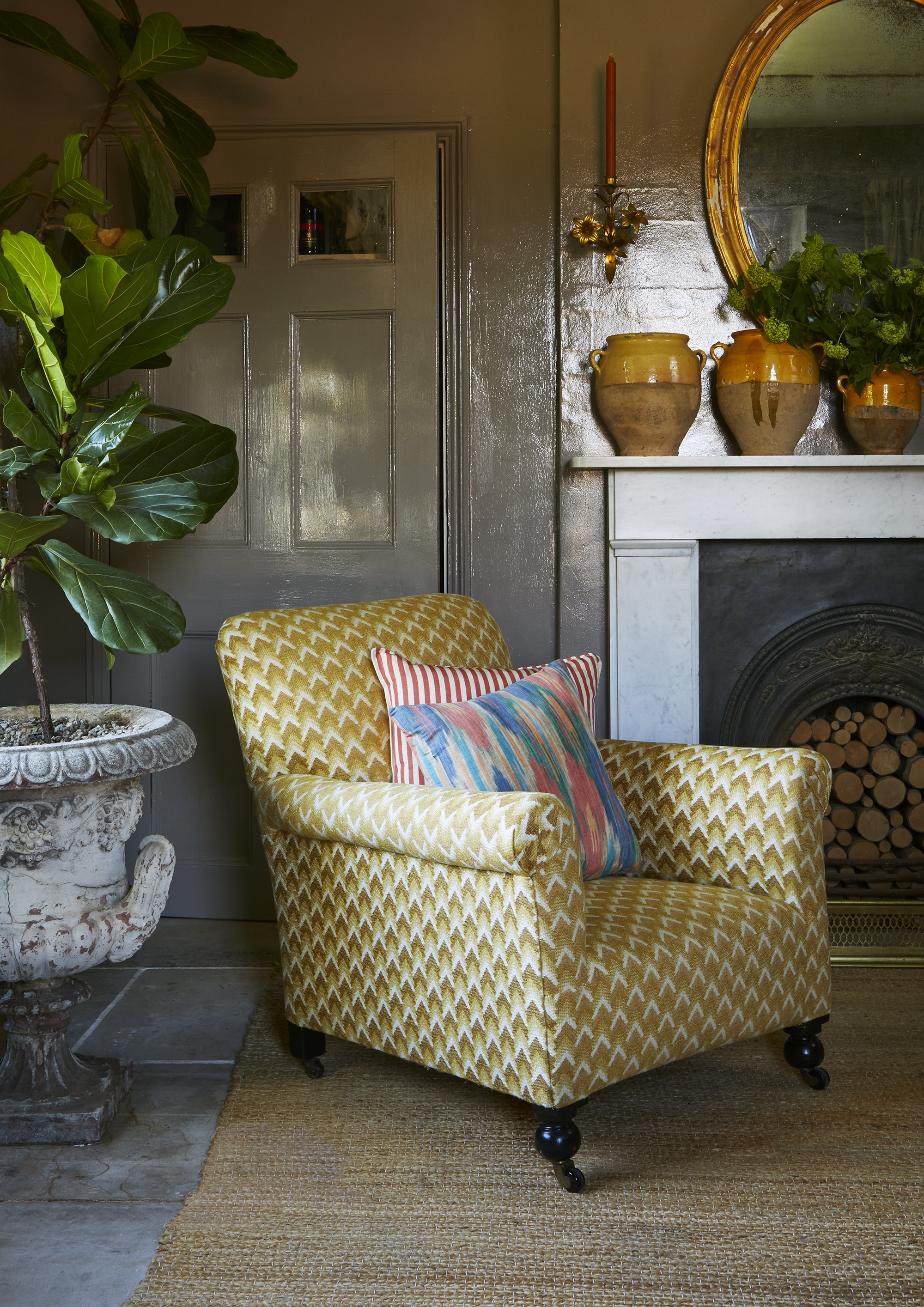
Grey – the perennial favorite that's incredibly versatile. It's a great seasonal neutral because it works with so many colors. For spring use it as a background for colors like turmeric yellow, and pastel shades.
‘Adding an instant upholstery refresh to a favorite armchair will ensure you can enjoy it for many years to come,' says Richard Smith, founder of Madeaux. 'Here, the spring-like palette of sunny yellow within the Bargello woven fabric, a color inspired by glazed Provencal pots, is in turn grounded with a touch of grey from the painted walls behind.'
'This graphic grey ensures the space has a harmonious feel, and it works so well when brighter colors are introduced, such as the yellow in the threads of the woven fabric, which really glows within this setting – allowing for an easy update without having to repaint the walls. Add a zingy and colorful cushion or two during warmer months or add a cozy throw with the arrival of cooler, darker evenings.'
8. Highlight architectural features
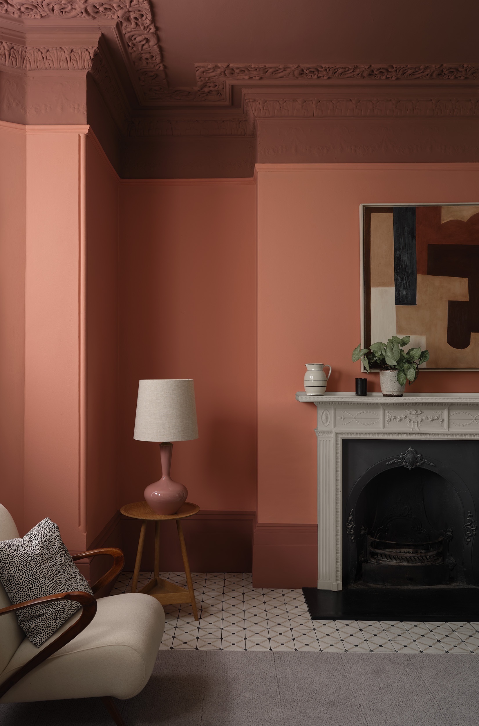
'Architectural features are a fantastic host for making a statement with color, be that skirting, paneling, and doors or rake and ceiling,' says Andy Greenall, head of design at Paint & Paper Library. 'Yet these elements are so often – by default – painted white, without consideration for how that affects the space.'
'Why not introduce paint across the architectural details to create an intriguing, welcoming space that exudes design and color interest? Here, the sultry ‘Kasbah’ on the ceiling, rake, and skirting, is paired with the cocooning pink ‘Jaipur’ on the walls – an intense color combination that sparks the imagination, evoking Eastern travel and romantic sunsets, bringing the promise of warmth, perfect for crisp spring mornings.'
Sign up to the Homes & Gardens newsletter
Design expertise in your inbox – from inspiring decorating ideas and beautiful celebrity homes to practical gardening advice and shopping round-ups.

Sophie has been an interior stylist and journalist for over 20 years and has worked for many of the main interior magazines during that time, both in-house and as a freelancer. On the side, as well as being the News Editor for indie magazine, 91, she trained to be a florist in 2019 and launched Flowers Inside My Head where she curates beautiful flowers for modern weddings and events. For Homes & Gardens, she writes features about interior design – and is known for having an eye for a beautiful room.
-
 This is the single best upright vacuum we've ever tested – and it's on offer with $130 off at Shark for a limited time only
You won't want to miss this one
By Dan Fauzi
-
 Nate Berkus says slipcovered sofas are back on trend – and I just found a way to create this designer-approved laid-back look from just $86
This classic style is making a strong comeback, but did you know you don't have to buy a whole new couch to get this Nate-approved look?
By Eleanor Richardson