

Molly Malsom
The beginning of spring provides lots to look forward to – from the longer evenings to the promise of sunnier days, and it's also the time of year when lots of us bring more color into our homes.
Spring decor, which can be as dramatic as a new wall color or as simple as a refresh of soft furnishings like bedding, reflects a palette of soothing hues that help our homes transition from the winter months, boosting them with a healthy and optimistic dose of color.
While pastel tones are among the most popular for spring, many other exciting spring room color ideas feel a bit more refined, from the currently trending butter yellow tones to timeless mossy greens. Below, we've rounded up the top spring color ideas for 2025, as explained by paint color specialists and interior designers.
1. Energizing yellow

Little Greene's Indian Yellow
If there's one color trend to stand out this spring, then it's decorating with yellow. Yellow room ideas are gaining plenty of appeal, bringing sunshine-inspired optimism into the home. And while this joy-giving shade works well year-long, it feels especially at home during the springtime.
'Yellow is a shade that provides positivity to a space, perfect for spring,' says Ruth Mottershead, Creative Director at Little Greene. 'It is a color that makes us feel uplifted, happy, energized, and invited. The perfect shade for a hallway, kitchen, living space, or front door, yellow provides a warm invitation to any home. It creates a feeling of warmth and coziness; it is sunshine in your home.'
'The warm and intense Indian Yellow and sunny mid-tone Giallo will inject joy into an interior and for a real burst of color, pair Indian Yellow walls with the bold green Hopper. Using multiple shades of inherently warm yellows in a double-drenching approach will create a layered look that provides a visually interesting base, allowing for the introduction of additional pops of color through furnishings, accessories, or painted furniture. Add a painted chair in Atomic Red for a more confident and unexpected scheme that will bring joy and design interest to a kitchen or dining space,' adds Ruth.
Interior designers are also championing yellow for spring. Meredith Ellis of Meredith Ellis Design says: 'A color I am really drawn to right now, and one I am seeing utilized more, is Marigold or a saffron yellow. It’s the perfect transitional color from winter to spring, or summer to fall. It’s bright without being loud, and it’s soft without being drab. I love pairing it with delft blues, rust, or green.'

That said, saturated yellows aren't for everyone, and they can quickly overwhelm rooms with their boldness. For a softer and more liveable take on this uplifting color, turn to buttery yellow hues.
'Buttery yellow is the perfect spring color because of its uplifting and inviting qualities, and it’s gaining popularity,' says Tash Bradley, Director of Interior Design and color psychologist at Lick. 'Butter yellow oozes all the qualities you want in a home; it is warm, optimistic, and sunny, without being too overwhelming. Whatever mood you are looking to create, our buttery yellow shades from Yellow 01 to Yellow 07 and Yellow 08 will create a welcoming environment.'
'When it comes to pairing butter yellow with materials, opt for chrome metallic finishes for a lovely contemporary feel, and dark woods like mahogany and walnut for a grown-up feel,' continues Tash.
2. Delicate pink

Benjamin Moore's Tissue Pink
Decorating with pink goes hand in hand with spring, adding warmth and a cheerful feel to the home. Think beyond overly sweet mid-tones and instead go for pale pink paints which essentially work as a neutral color in the home, much like this kitchen which is painted with Benjamin Moore's Tissue Pink 1163.
'A graceful blush, Tissue Pink gently adds light and softness to a space,' explains Hannah Yeo, senior manager of color marketing at Benjamin Moore. 'As we approach spring, it is easy to find similar rosy hues across the design industry including fashion, accessories, and packaging. Inside the home, this quietly colorful hue has a restorative quality while still feeling fresh and uplifting. Pair it with Paris Rain 1501, a soft green, for a flower-inspired room that evokes tranquility. Pale buttery tones and soft neutrals complete the look, creating a calming atmosphere infused with optimism.'
3. Natural greens

You can't go wrong with decorating with green during spring. It's a timeless and versatile color that holds its own in any season and design style, bringing the feeling of nature inside the home.
'Spring calls for Amazon Jungle, a fresh, nature-inspired green that can bring an uplifting, organic feel to any space,' says Erika Woelfel, VP of Color and Creative Services at Behr. 'Use it on a front door to add curb appeal or on cabinetry for a seasonal refresh. Pair it with soft neutrals like Blank Canvas for a balanced, airy vibe, and bring in natural textures like linen and rattan to enhance its organic warmth.'
'Like the spring bulbs sprouting up from the ground, we’re seeing lots of greens for spring 2025 spanning from deep olives to light and fresh lettuce tones,' adds interior designer Marcia Bryan of Bryan Design Group. 'It seems green is becoming the new neutral color in interiors through cabinetry and furniture and we are loving them all.'
4. Blue and green used together

If you're looking for a spring-appropriate color combination, look no further than blue and green. Both of these colors feel fresh and soothing, reflecting the colors that are beginning to emerge outdoors at this time of year.
'For spring 2025, we’re seeing a rise in analogous color schemes, particularly soft blues and greens,' says interior designer Sarah Hargrave, owner of The Collective. 'This pairing feels harmonious and deeply connected to nature, making it a perfect choice for fresh, serene spaces. These colors are trending as people seek calming interiors that promote well-being. To decorate with them, layer various shades of blue and green through paint, textiles, and decor, balancing them with warm accents like natural wood or brass for a grounded, inviting look.'
5. Pastels

Glidden's Jam Session
Decorating with pastels is a failsafe choice if you want to bring an obvious spring theme into your home. Below, Ashley McCollum, color expert at Glidden suggests two pastel paint colors to use in a bedroom for a soothing and fresh feel:
'Spring is the perfect time to breathe new life into your bedroom, and paint is one of the easiest and most affordable ways to do so. Focus on light, airy tones that evoke the feeling of the season.
'Consider hues like Jam Session and Limitless to create a dreamy atmosphere in the bedroom, especially when paired with soft textiles and floral accents.
'Introduce natural elements like wood, rattan, or bamboo through furniture pieces, accents, or decor items. These materials can add warmth and texture to the space while also bringing a touch of the outdoors inside.'
6. Warm clay tones

Not everyone enjoys bright paint colors in their homes, but there is always a neutral hue that feels fitting for every season. For spring, warm clay tones are having a moment – these hues offer a welcoming, brightening effect without the injection of vibrant color, perfect for more minimalist tastes.
Joa Studholme, color curator at Farrow & Ball, recommends their paint color Jitney, a muted earthy tone that pairs well will a multitude of other palettes. Described as having an 'extraordinary response to light', this paint color is perfect if you want to make the most of the spring morning sunshine.
In this living room, the walls have been painted in Jitney, while the ceiling and woodwork have been coated in Stirabout, a warm oatmeal shade. The result is a space that feels cozy and inviting while offering a wonderful glow when the spring sunshine casts light through the windows.
7. Brighter palettes

Moodier paint colors have dominated recent interior design trends, so this spring, many interior designers are embracing brighter and lighter hues. 'I think we’ve had a lot of earth tones and darker colors showing up the past few years and people are now coming out on the other side of that, wanting to brighten things up a bit,' says Kristin Harrison, interior designer and owner of Bungalow 10 Interiors.
Although there is still a place for these deeper tones, it's certainly time to introduce more uplifting paint ideas to interiors. 'I think we are going to see a lot of happy, brighter colors this spring,' she says, suggesting lilacs and pinks will be taking center stage.
'Boldness is taking over this spring!' agrees interior designer Sarah Latham of Latham Interiors. 'Dive in and embrace it by committing to something large in your room, whether it's the main upholstery or the entire room painted in a brilliant green.'
Which of these on-trend spring color ideas is your favorite? While there's always the opportunity to keep things classic with soothing pastel tones like lilac; butter yellow is perhaps our favorite for 2025, nodding to the joy of spring while feeling incredibly timeless for year-long appeal. Whichever you choose, remember that you can incorporate any color easily and affordably through simple decor swaps, without the need for a whole room re-design.

You must confirm your public display name before commenting
Please logout and then login again, you will then be prompted to enter your display name.
-
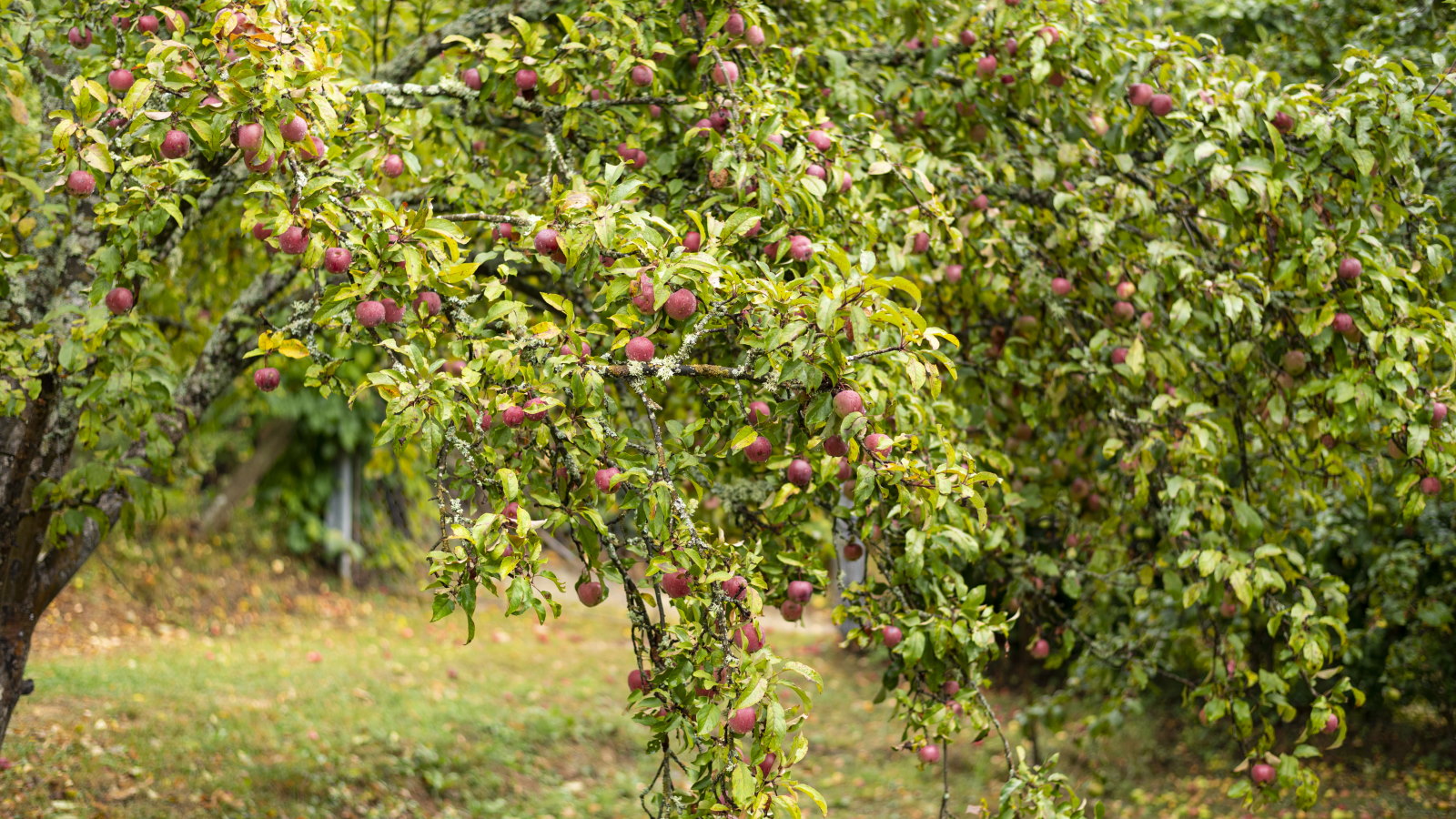 Plants never to grow next to fruit trees
Expert advice on which plants to keep away from fruit trees to encourage a healthy harvest
-
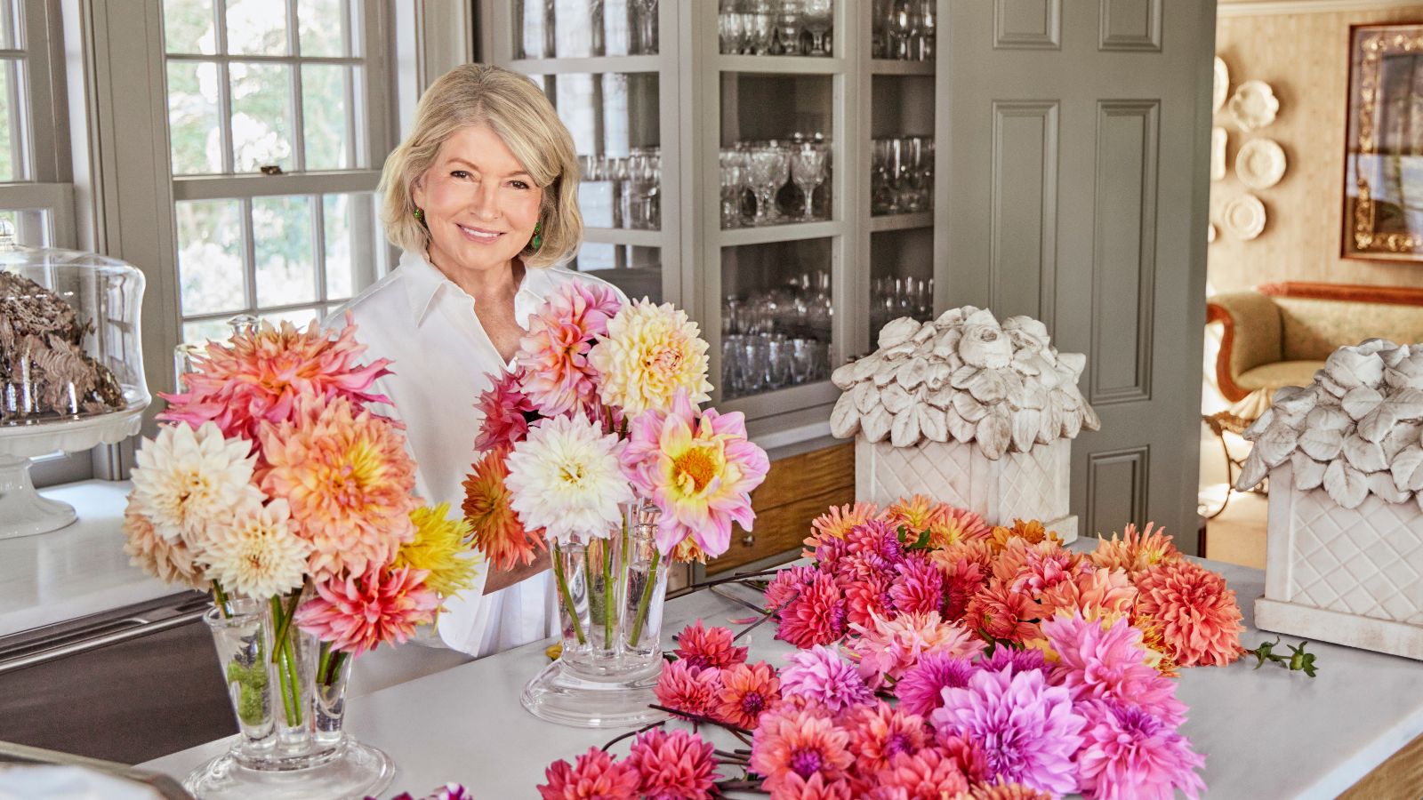 Martha Stewart's tips for arranging daffodils are unbelievably simple and effective – it's the only flower advice you need this springtime
Martha shows us that we can create gorgeous bouquets of this seasonal flower by simply trimming the stems and placing them in specific vases

