'You don't need a big bedroom' – and other top tips from the interior designer behind this space-savvy London apartment
Using a contemporary layout, bold color, and brave pattern, Lucinda Sandford transformed a tired space into a courtyard garden apartment with potential to become her client's forever home
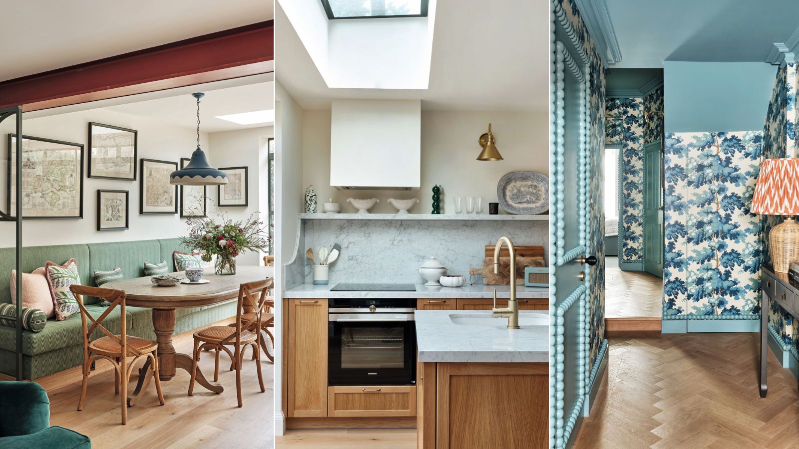
When envisioning the house design of a new project, Lucinda Sanford doesn’t follow an equation to find its simplest answer. Instead, she pushes boundaries, questioning how to use the space best.
Take bedrooms, for example; ‘I often suggest small bedrooms because it’s nice to have somewhere used for the sole purpose of sleeping,’ Lucinda says. ‘Whereas a larger room can be used as a boudoir. It’s an old-fashioned word, but by that I mean a space used for dressing and working where you’re likely to spend more of your time awake.’
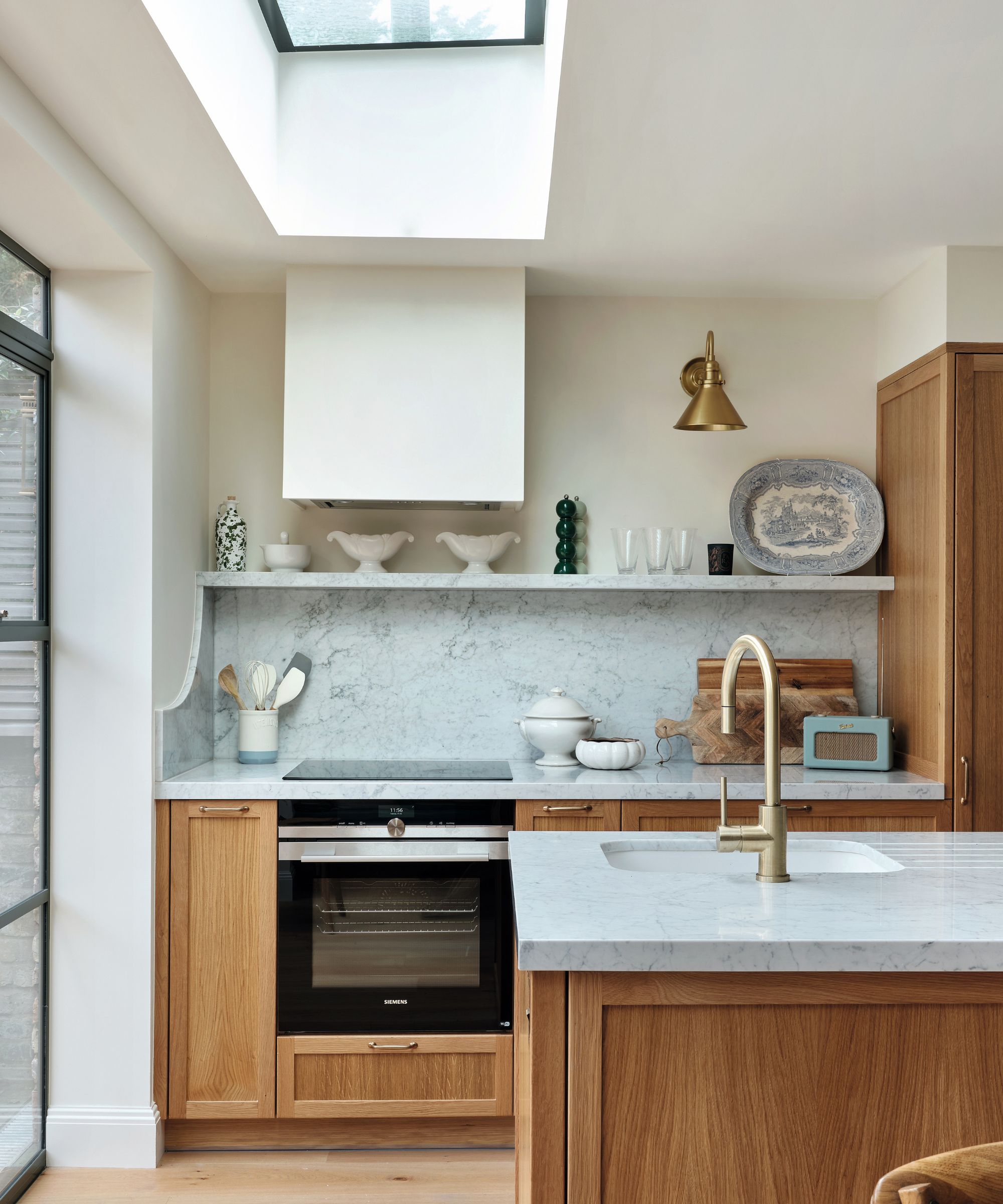
Bespoke cabinetry designed by Lucinda Sanford with Carrara marble worktops. Brass wall light, Pooky. Walls in Whiting, Edward Bulmer Natural Paint.
It's thinking like this that characterizes Lucinda's style. Responding to a premium on space and the need for a work-from-home setup in this Clapham project, the large former bedroom at the front of the house is now an office-turn-dressing room with a daybed for occasional guests. Next door is the owner’s much smaller yet cozier bedroom.
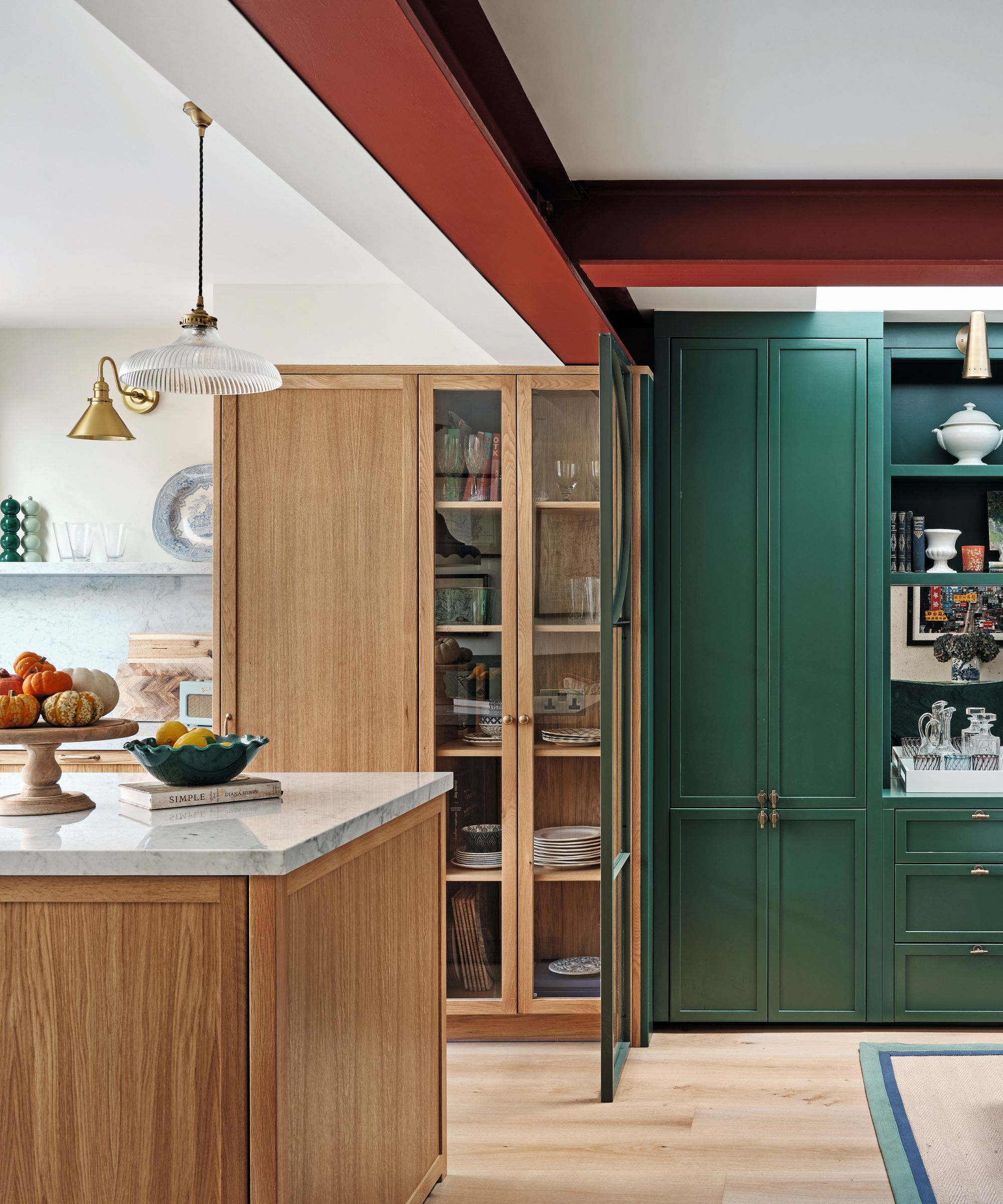
Bespoke cabinetry designed by Lucinda Sanford with Carrara marble worktops. Brass wall light, Pooky. Walls in Whiting, Edward Bulmer Natural Paint.
The homeowner had found Lucinda’s firm on Instagram and been drawn to her use of color. ‘She had been living in her two-bedroom garden flat for a few years, but decided she wanted to invest in it as a longer-term home.'
'It was a little sad, and slightly falling apart with a leaky roof, but we felt we could transform it into a really special place for her,’ Lucinda explains. She continues, ‘She had a good budget but was time-poor. She also had a creative outlook and wanted us to use plenty of imagination in the process.’

Bespoke cabinetry designed by Lucinda Sanford, in Hunter Dunn by Paint & Paper Library. Wall lights, Pooky. Bespoke ottoman in fabric by Guy Goodfellow Collection. Bespoke square stool in fabric by Colefax and Fowler. Rug, Unnatural Flooring.
A large component of the work happened towards the rear of the flat where the previously central kitchen was shifted back to look out over the courtyard garden. ‘She loves both cooking and being in the garden, so it made sense to put these two side by side,’ Lucinda says.
A restrictive column was taken out and larger supporting steels were put in. ‘I don’t like the look of boxed-in down stands and we were working with low ceilings, so we decided to make the steel more of a feature.
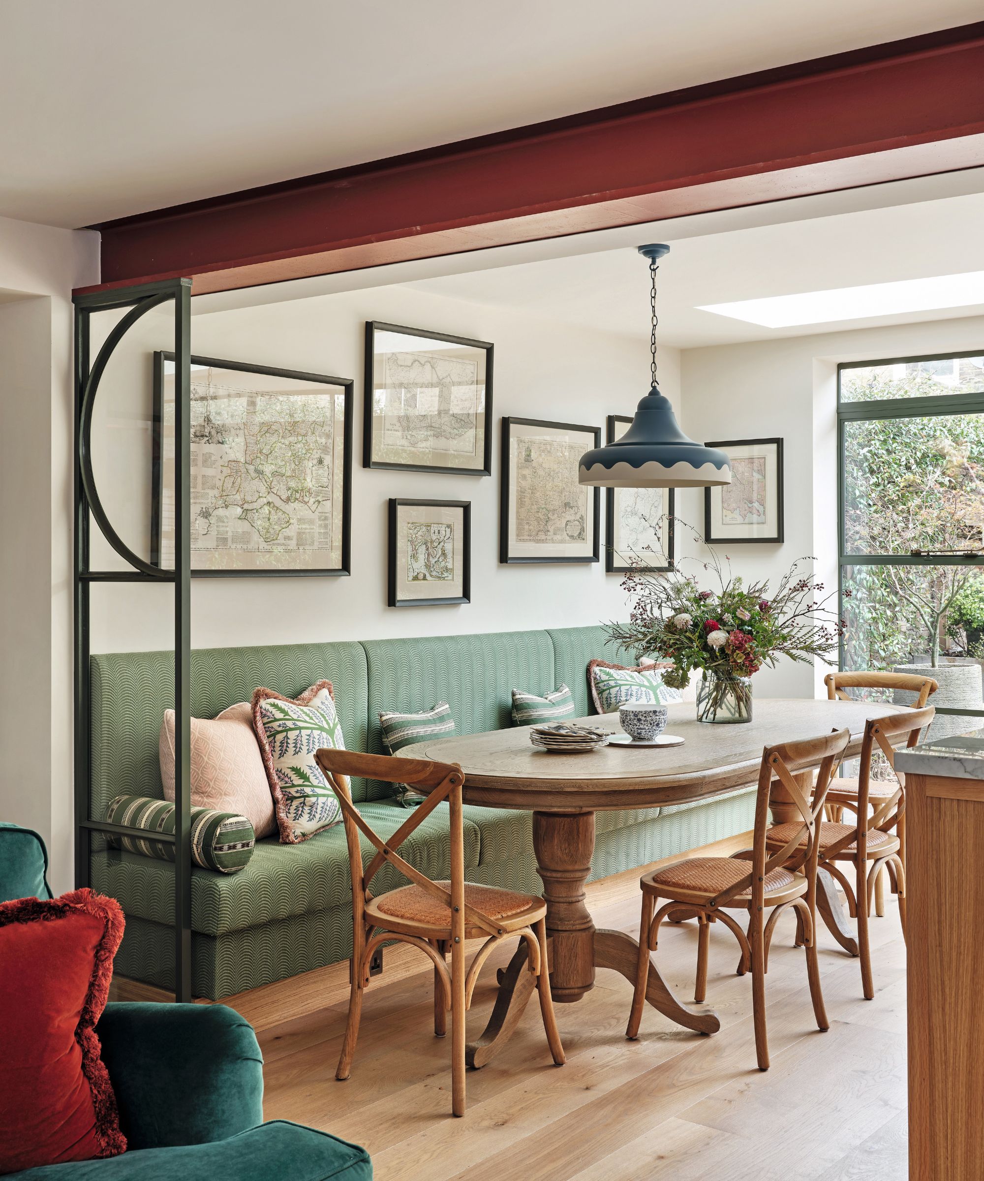
Banquette in fabric by Schumacher. Scallop pendant light, David Hunt Lighting. Belmont dining table, La Residence Interiors. Theodore chairs, Perch & Parrow. Sofa in Jade velvet, Sofa.com.
Lucinda continues, 'We thought we’d paint the steel support in white or green, but seeing it in the burgundy red it was supplied in made me realize this color would work. It was a happy accident.’
A pair of glass screens provide zoning between these two interconnected rooms. ‘They give a bit of separation on a decorative level, softening the join of the rooms. It made more sense to put the sitting room in the darker part of the house because if you are relaxing there, it’s likely to be in the evening anyway.’
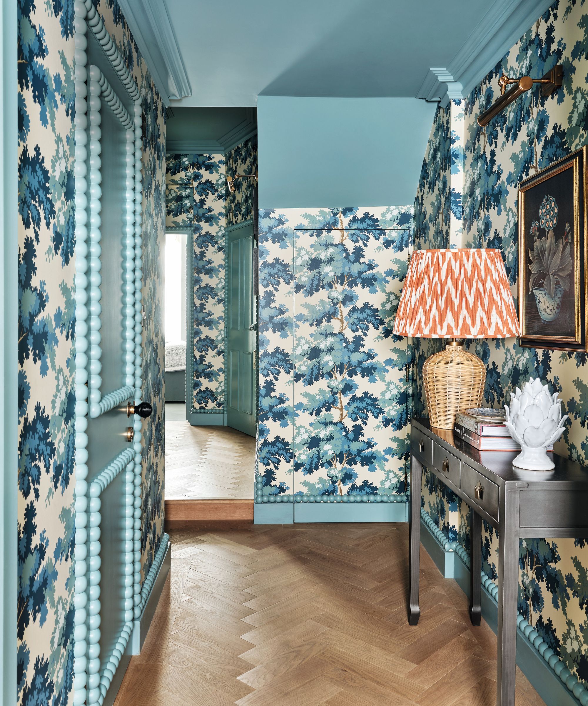
Raphael wallpaper in Blue, Sandberg Wallpaper. Bespoke bobbin doors in Vert de Mer, Edward Bulmer Natural Paint. Rattle table lamp and shade, Pooky.
The kitchen windows in a muted green offer a gentle framing of the courtyard garden with its bare brick wall. ‘It wasn’t in the initial plan as we hadn’t wanted to change the back elevation but once we got going everything was so exciting we just went for it.’
Perhaps the most visually arresting area of the house is the hallway, which Lucinda describes as formerly ‘dark and sad’. Ignoring the common choice of painting a small dark hallway white, Lucinda took an opposing position. ‘Sometimes I think you just have to embrace the darkness and make it so amazing in another way that people don’t think about whether it’s light or dark.’
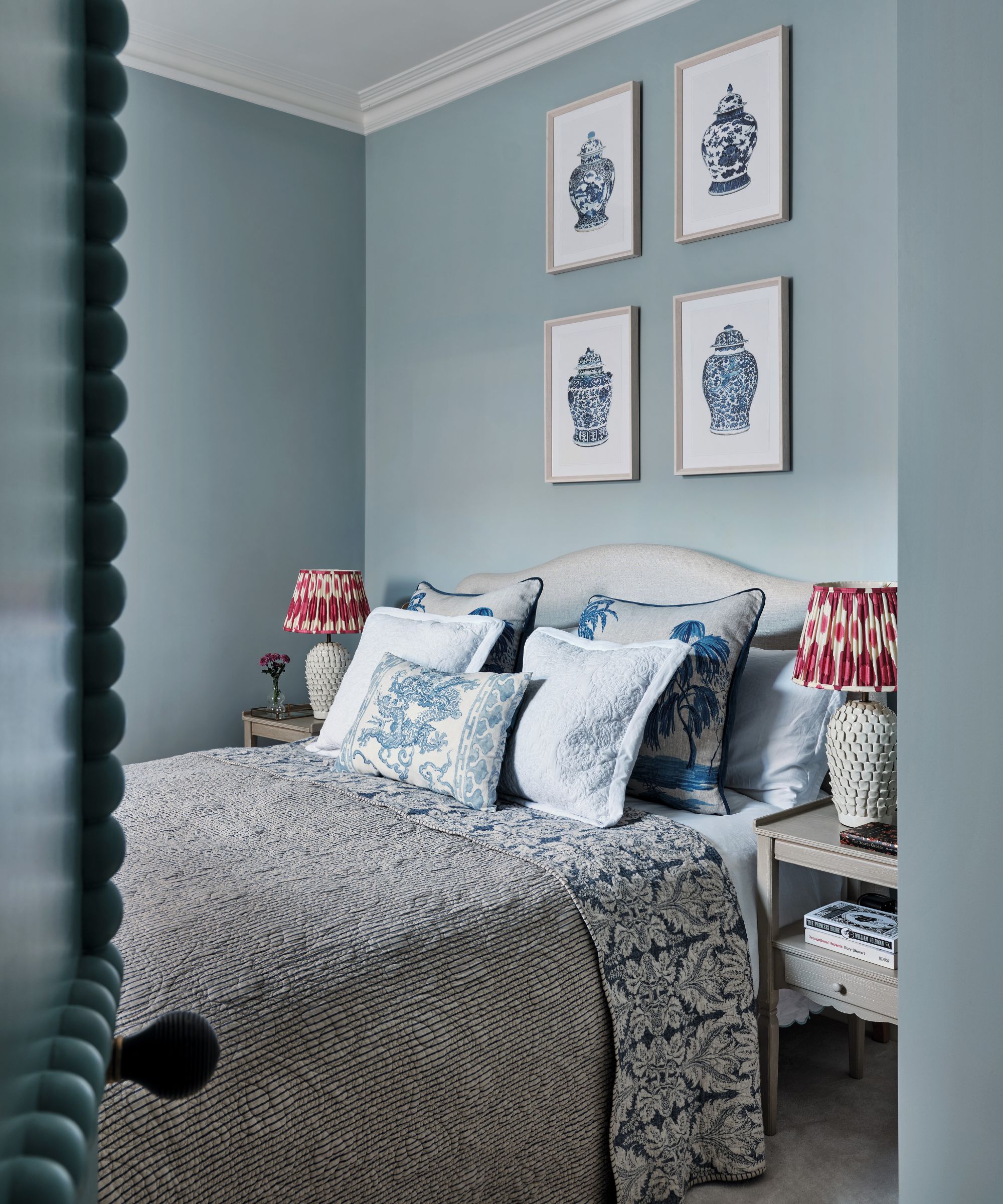
Walls in Aerial Tint, Edward Bulmer Natural Paint. Cushions, Oka. Find similar vase prints at Cox & Cox. Lamps and shades, Pooky.
She achieved this with a striking combination of illustrative tree wallpaper, bobbin detailing, and saturated blue ceilings. It’s a showpiece that performs as soon as the front door is opened. So, one thing’s for sure, no guest will ever leave this flat remembering its sad and gloomy hallway.
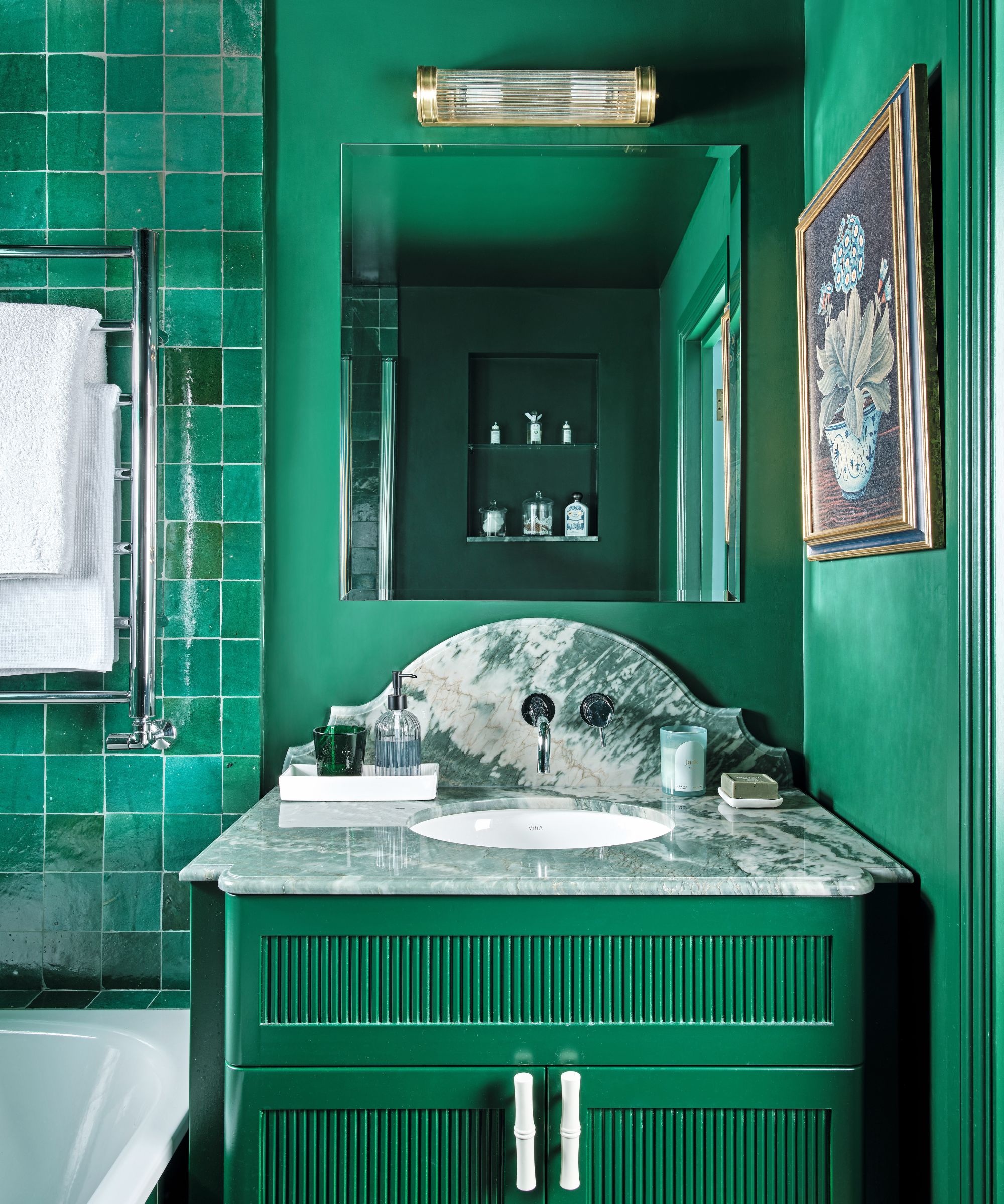
Bespoke vanity designed by Lucinda Sanford. Handles, Matilda Goad & Co. Tiles, Otto Tiles & Design. Walls in Puck, Little Greene. Wall light, Pooky.
Meet the designer
Lucinda Sanford shares her style inspiration
What part of the project do you consider the most successful?
The reinvention of the space at the rear of the flat.
What element did you splurge on?
The Crittall windows at the back.
Describe your style in three words.
Modern. Classic. Usable.
What one small change had the greatest impact?
Moving the door in the bedroom.
Do you have a go-to color?
Burgundy - it’s a dark classic.
Any design heroes?
Veere Grenney. He’s a genius.
What is your favorite building?
The Victoria and Albert Museum.
Can you reveal a secret address?
It’s not a secret, but you can create something bespoke by getting Sofa.com to upholster one of its products with fabric you’ve sourced.
What podcast are you listening to at the moment?
The Morning Meeting by Air Mail.
Sign up to the Homes & Gardens newsletter
Design expertise in your inbox – from inspiring decorating ideas and beautiful celebrity homes to practical gardening advice and shopping round-ups.
-
 This Michelle-Pfeiffer-approved chair is made of a forebodingly unusual material, opening the debate: Is it a rustic stunner, or a danger to sitters?
The actress took to Instagram with a chair made of a controversially sharp material – and fans are unsure of how they feel about it
By Sophie Edwards Published
-
 How to clean a patio – 6 different methods, and when you must use a chemical cleaning agent
From manual scrubbing, natural solutions or calling in the pros, industry experts reveal the benefits and considerations of each method
By Andy van Terheyden Published