

Summertime decor can quickly become dominated by the most saturated hues, from sunshine yellows to vivid greens. And while these colors can look great in the home if you want to make a statement, that's not to say they're for everyone.
If you fall into the camp of favoring slightly more pared-back colors, it can be tricky to know how to reflect summer color trends without compromising on your design style.
Thankfully, designers say muted room color ideas can work just as well during the summer, creating a subtle nod to the warm months in a way that feels fresh, timeless, and anything but saturated.
5 shades for a soft summer color palette
From coastal-inspired blues to muted greens, these soft summer colors reflect a calming quality, making them an especially good choice for a bedroom or bathroom. Rest assured that although these hues are designers' go-to's for summer decor ideas, they're timeless enough to maintain appeal all year long.
1. Light neutrals

If you're not sure where to start with your soft summer color palette, decorating with neutrals can provide a calming and versatile base for any room. 'For me, a soft summer color palette starts with neutral whites and beiges as the base,' says interior designer Soledad Alzaga. 'These shades create a light and airy foundation that feels clean and timeless.'
You can then layer subtle amounts of color through small accents, as Soledad recommends: 'From there, I like to incorporate soft blues, light pinks, and muted greens that add a soothing palette for a laid-back and easygoing feel of summer in your spaces. You can add these colors with pillows, throws, table settings, and accessories.'
This approach is demonstrated in this bedroom designed by Ashley Ferguson Interiors, where white is used as the room's dominant color, and hints of color are incorporated through the curtains, artwork, and flowers. 'Light linens, crisp whites, and pastels are all a match made in heaven,' says designer Ashley Ferguson.
2. Muted green

'I love a soft muted green for summer,' says interior designer Natalia Miyar, who used this calming hue to create this relaxing bedroom.
Decorating with green is widely known for its association with nature, giving it a tranquil feel when used in the home. 'I am endlessly inspired by nature, so it is not surprising that I am constantly drawn to green tones,' adds Natalia. 'It is a very soothing and calming color that works beautifully in so many different spaces.'
Choosing the right shade of green is crucial to mastering this popular hue. While light variations like the one used in this bedroom feel restful, more saturated and darker shades can create a dramatic look. 'A slight change in the hue can totally transform the ambiance,' says Natalia. 'It can evoke a restorative freshness or a sedate moodiness – making it incredibly versatile.'
3. Blue-gray

Blue is a go-to summery shade, but for those who prefer neutral schemes, blue-gray is a toned-down version of decorating with blue that feels endlessly fresh in living spaces.
Interior designer, Margaret Donaldson of MDI Luxury Design used a blue-gray paint across the paneled walls in this living room, creating a sophisticated and calming space that nods to summer.
'The calm blue-gray color, Benjamin Moore's Wickham Gray, is soft on the eyes; evoking a gray tone with buoyant blue undertones,' explains Margaret. 'The tone is repeated in the upholstery fabric, the background of the painting, and even in the stained glass at the bar.'
To complete the color scheme, Margaret adds that summer-inspired hues are layered elsewhere in the space to complement the blue-gray walls: 'The room is sprinkled with summer colors reminiscent of sand and peachy sunsets of summer.'
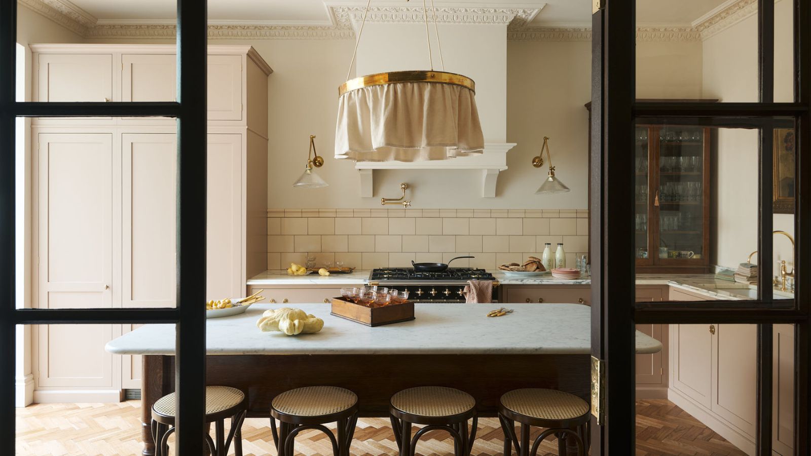
4. Muted pink

Pink room ideas during the summertime are a classic color choice, creating a warming and uplifting feel. But for a less saccharine take on this summer shade, reaching for muted and earth-toned pinks is an expert-approved color choice.
'Using soft pinks instead of bright pinks in a room can create a more soothing and calming atmosphere,' says designer Juliette Byrne. 'Soft pinks are versatile and can be used in various spaces, from bedrooms to living rooms, and even kitchens.'
In this kitchen designed by Alexandra Gater, Flax by Benjamin Moore is used across the kitchen cabinets, an example of a brown-toned pink that feels summery yet liveable.
'It’s a great pick for someone who doesn’t gravitate toward pastels but still wants a color that packs a punch,' says Alexandra. 'This muted tan color reads more purple than brown due to its mauve undertones, making it soft but still colorful. It pairs so well with a sage or pistachio green and could be warmed up for the colder months with darker accessories.'
5. Coastal blues

You can't go wrong with coastal-inspired blues during the summer months, especially when paired with white. 'This hue evokes a calm, coastal feel perfect for summer. It pairs well with neutrals and other pastels to create a serene, refreshing atmosphere,' says Karen Wolf of K+Co. Living, who used blue as an accent color in this calming living room.
'I'm seeing a myriad of coastal blues coming to light this summer,' agrees Gaelle Dudley, interior designer and founder of GLDESIGN. 'From ice blues to pale to chambray, the monochromatic blue palette is making a comeback. I love adding soft blue throw pillows and textiles to the space to make the blue feel more palpable.'
A soft summer color palette is a great way to reflect summertime inside the home, without going all out with the most saturated tones. If you usually favor neutral tones, this palette is a failsafe transition into the world of color.
For more inspiration and advice, we explore seasonal color analysis in interior design in our dedicated feature.

-
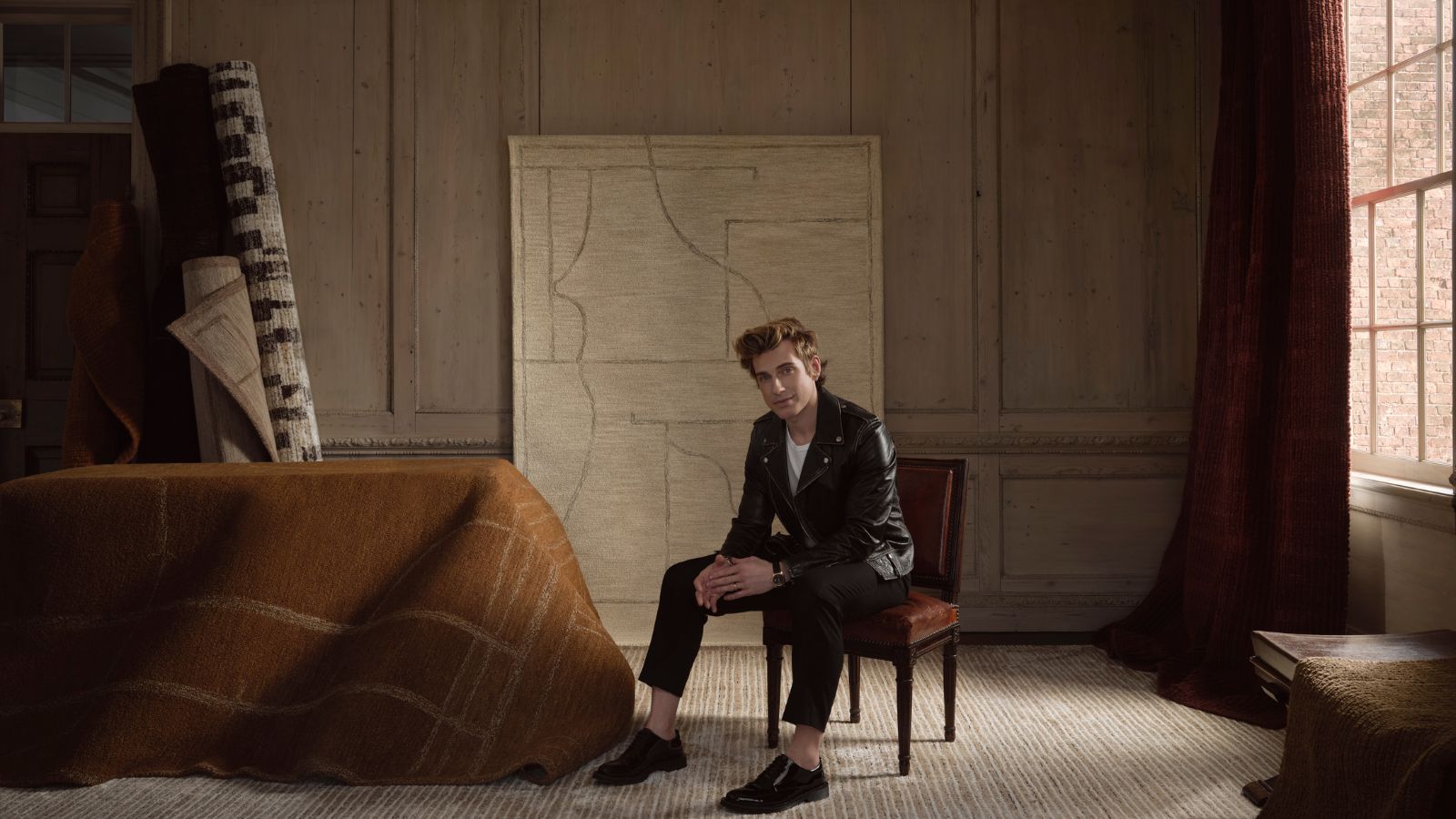 Jeremiah Brent's new NYC-inspired rug collection has got to be the easiest way to bring his modern Manhattan style into your own home
Jeremiah Brent has teamed up with Loloi Rugs to create a contemporary collection of home furnishings inspired by his city
-
 I tried this one easy dishwasher trick and made the annoying need for manual drying a thing of the past
If you hate those little pools of water left on your cups and crockery, this towel trick is for you

