7 small entryway mistakes that designers want us to stop making immediately
We spoke to a few of our favorite interior designers and decorators to find out the most common small entryway mistakes that we are making – and how best to avoid them
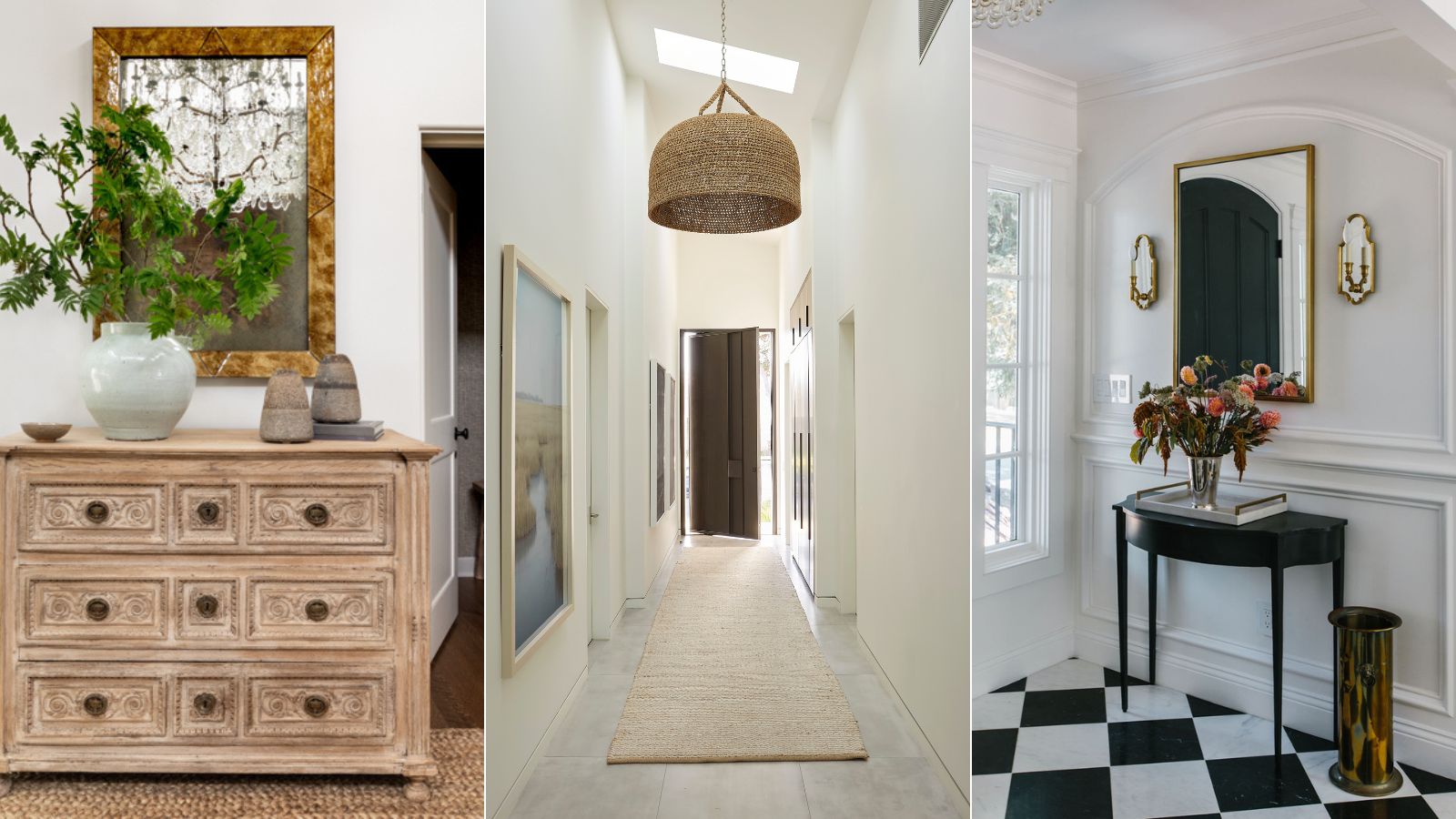
- Small entryway mistakes to avoid
- 1. Only using pale colors
- 2. Not pausing to think about a cold or harsh floor
- 3. Thinking about lighting too late into a remodel
- 4. Not including enough storage
- 5. Not creating points of interest
- 6. Under utilizing nooks and corners
- 7. Not making the most of wall space
- FAQs

Small entryways are often overlooked and under-utilized, despite setting the decorative tone for the rest of your home. Whether it's the first space any guest sees when they enter the house, or a circulation zone between rooms, all the entryways and hallways in your home demand serious design attention.
As well as looking inviting in its own right, your small entryway should set the tone for the rest of your home – and should be considered alongside entryway ideas and hallway ideas to ensure a coordinated feel, but it is all too easy to get it wrong. While there's certainly no one size fits all formula for decorating small rooms, there are still a few basic interior design rules we should master if we want to curate a beautiful small entrance to welcome in friends and family.
So when you're looking for inspiration for this compact space, think big. Whatever the size, shape, or configuration of yours, these small and narrow entryway ideas showcase how to take decor to the next level – because, after all, it’s the space that creates a first impression on your guests.
Small entryway mistakes to avoid
If your entryway is suffering as a result of the following mistakes, you're in luck. Our panel of interior designers and decorators has shared the most common mistakes to avoid, and how to remedy them, to inspire your entryway remodel, no matter the size.
Spaces for Living, Tamsin Johnson| $48.30 at Amazon
The first book from Australian interior designer Tamsin Johnson, known for her fresh interiors that evoke luxury and elegance, even in a small space.
1. Only using pale colors
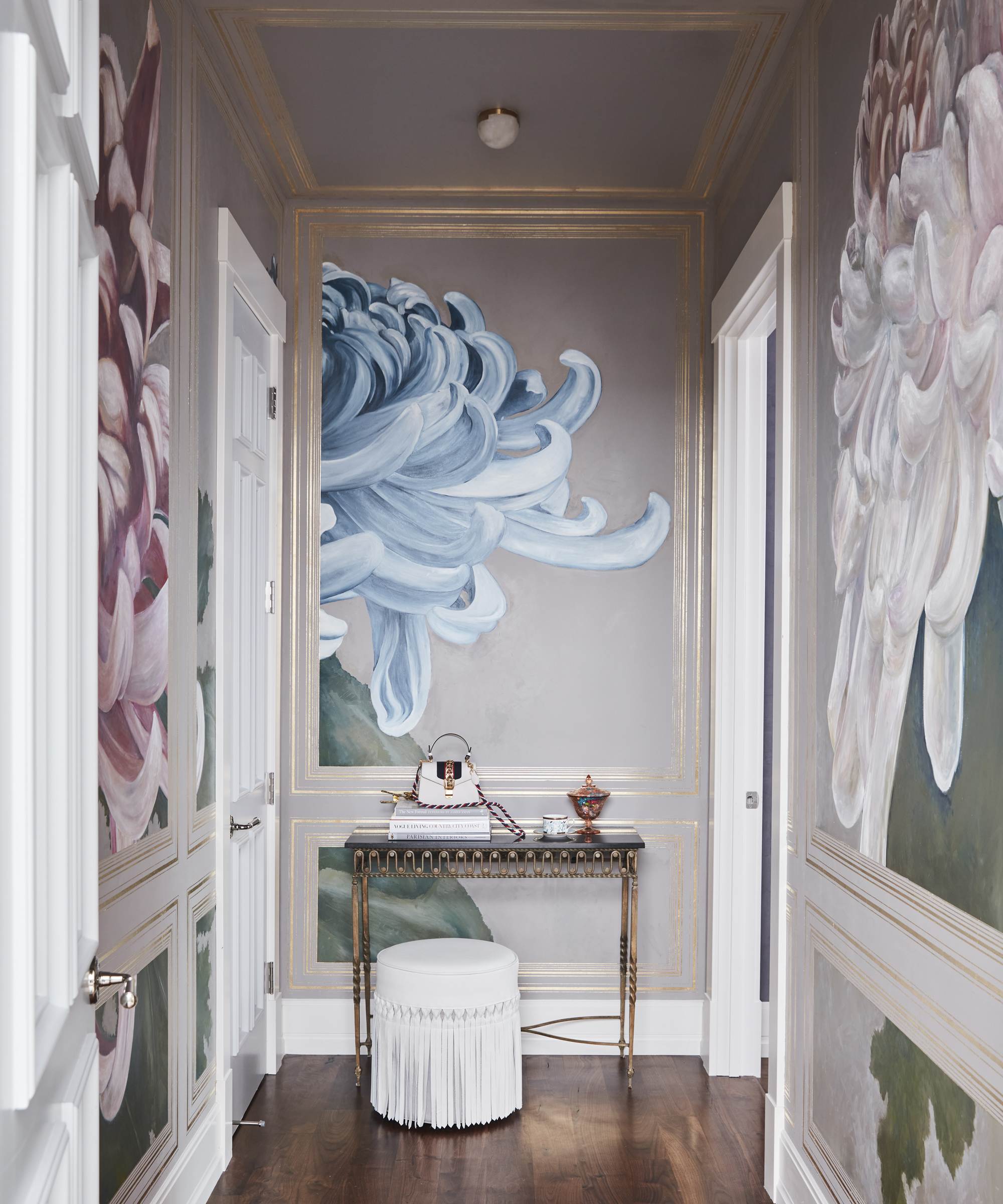
When it comes to decorating a small, dark hallway, many people make the mistake of thinking lots of light colors will help to lift the space, says Nicole Salvesen, co-founder of Salvesen Graham.
‘The truth is that some battles are just not worth fighting. If you paint the hallway entirely white, it has the effect of highlighting the lack of natural light rather than disguising it.’ Instead, the best option is to distract the eye.
‘Do something fun. Use a patterned wallpaper or opt for a dramatic paint color, and then hang lots of pictures on the walls. Make it a nice place to be, rather than somewhere to hurry through.’
This unassuming space, designed by Jessica Bennett of Alice Lane Interior Design, is a visual feast for the eyes. The floral mural truly takes your breath away.

Jessica started her creative journey at Utah State University. Her studies there led to her work in an ad agency as an art director but building her home brought back her earliest passion: interior design and trends.
2. Not pausing to think about a cold or harsh floor
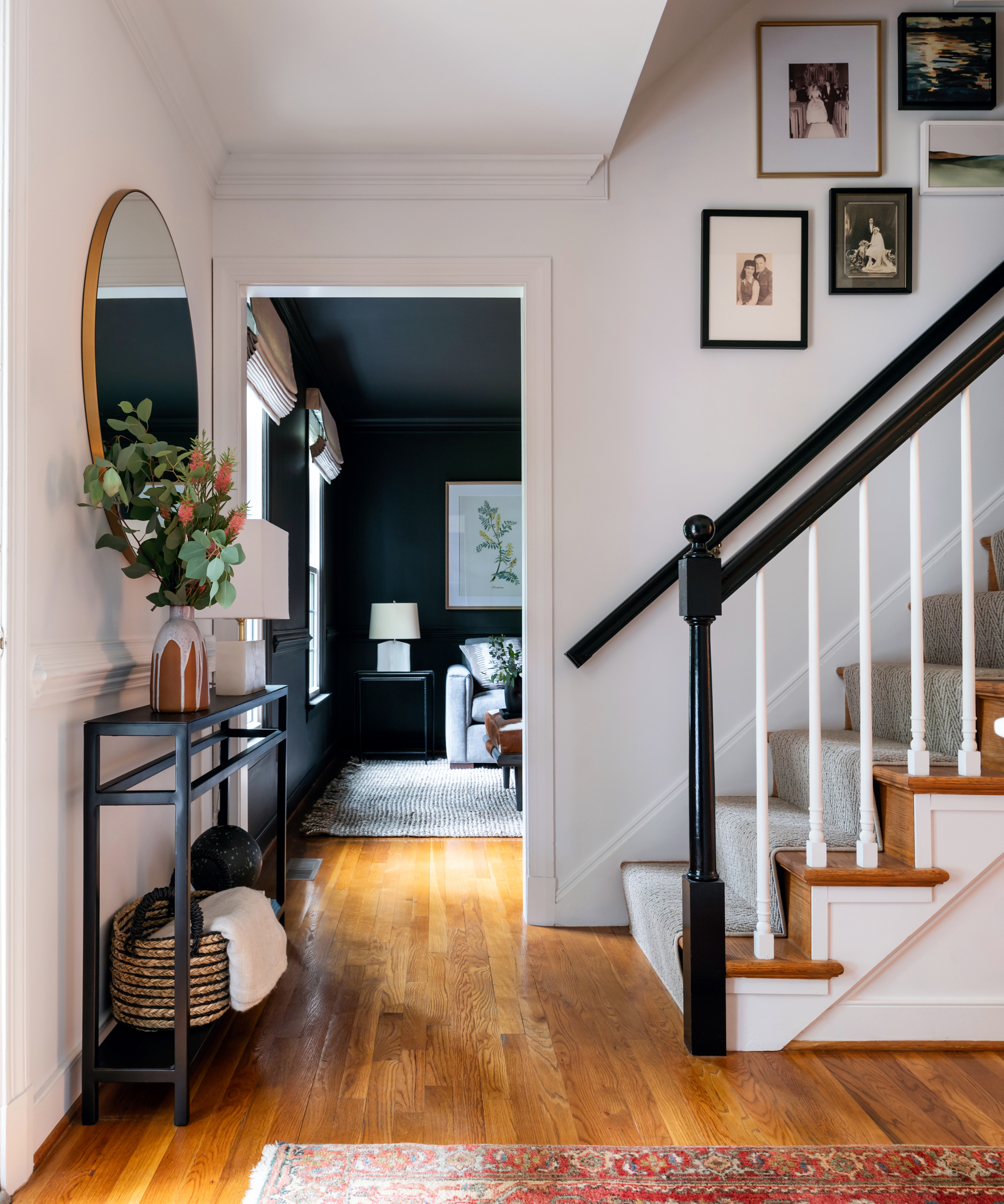
Tiled floors in small entryways are an extremely practical solution for the part of the house that everyone will walk through, but they can be harsh and rather cold. Warm things up by taking a different route, suggests Irene Gunter, director of Gunter & Co Interiors.
Options include real brick tiles laid in a herringbone pattern, a mansion-weave parquet jazzed up with inlaid marble, or a wooden floor with a large inset coir mat stained in a color that matches the timber. ‘Mid-tone colors do a better job at making the entrance feel clean, even when it’s not spotless.
Here, designer Jamie Ivey of Jamie Ivey Design used real wood flooring coupled with a red vintage rug to warm the area underfoot.
3. Thinking about lighting too late into a remodel
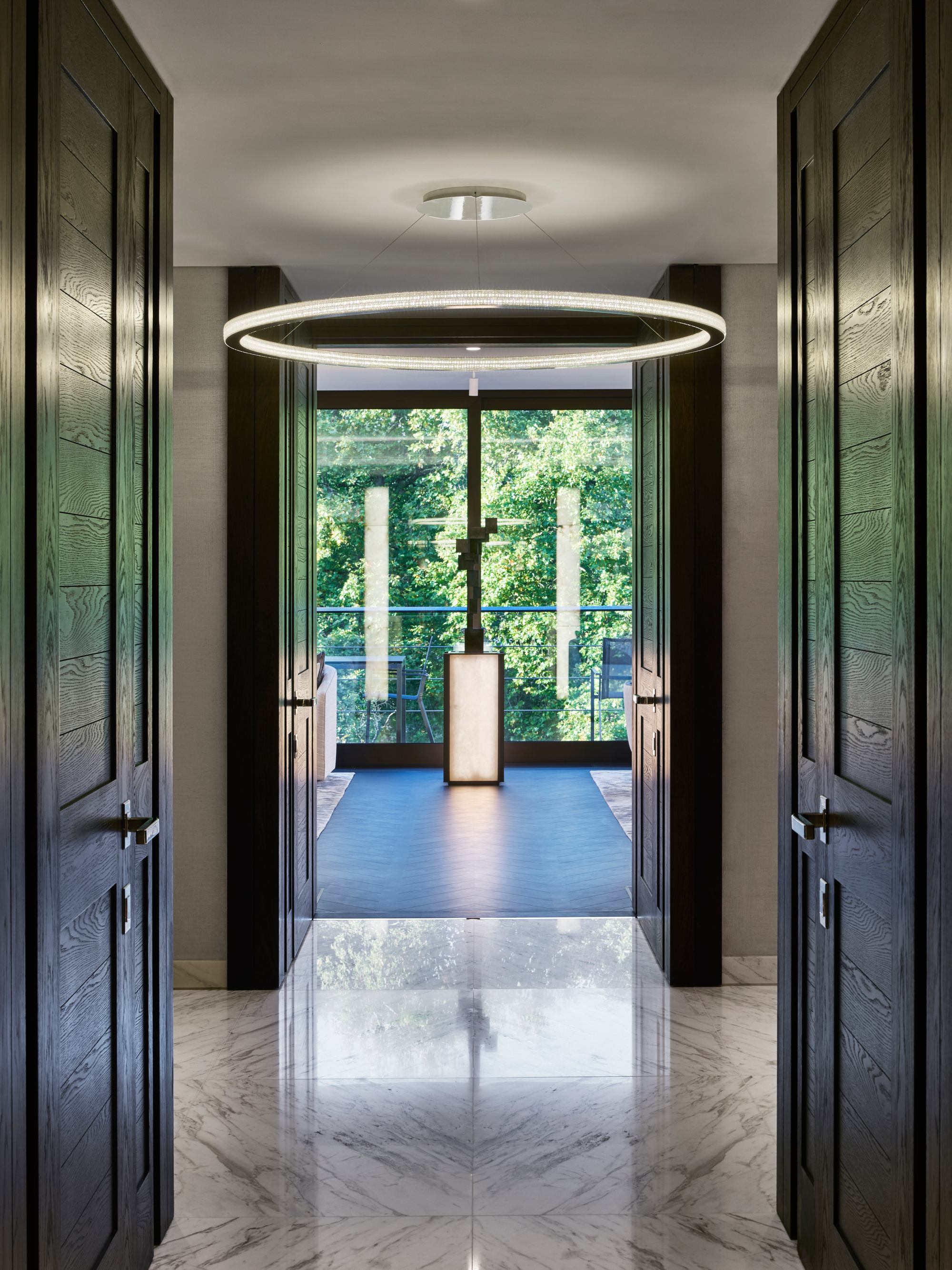
With their delicate interplay between function and form, all entrances benefit from a well-executed entryway lighting scheme – planned at the start of a project.
There are various lighting tricks available these days to make an entryway appear more exciting and feel more spacious, says Sally Storey, creative director of John Cullen Lighting. ‘It’s best to aim for drama, not symmetry, by layering the lighting effects in an entrance,’ she explains. ‘Add impact by hanging an oversized pendant and dimming it for mood, but use this in conjunction with downlights that can spotlight a picture on the wall or highlight flowers on a console table.’
Then add a contrast by using wall lights or a downlighter to create a wash along one wall. Another trick Sally recommends is to draw the eye down the entrance by lighting the half-landing or an object at the far end: this helps to foreshorten a long narrow space.
Made for Living: Collected Interiors for All Sorts of Styles, Amber Lewis | From $24.58 at Amazon
This national best-seller is a success for a reason: within the pages, interior designer Amber Lewis shares her most loved design secrets and know-how.
4. Not including enough storage
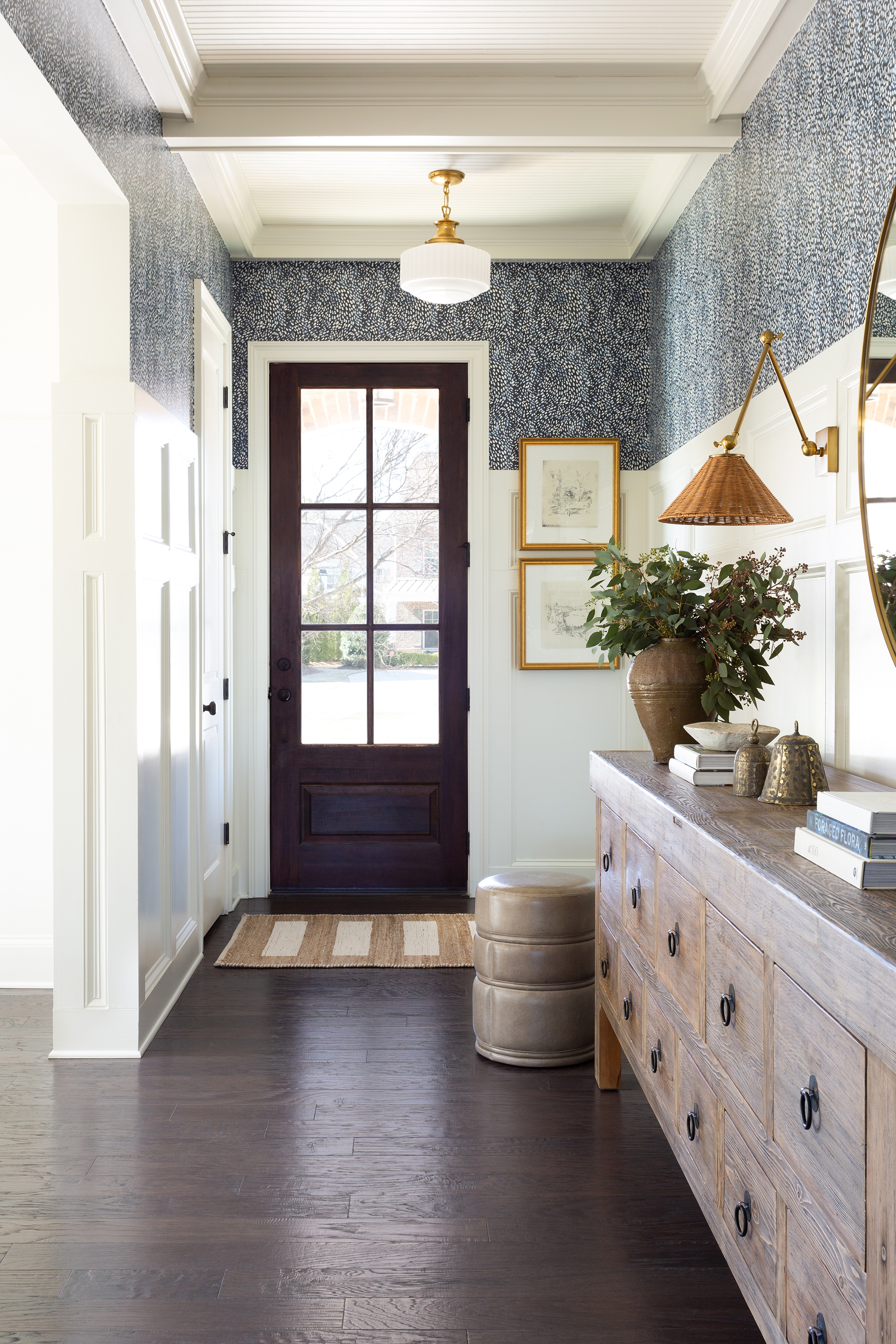
Good entryway storage is essential in a small entryway, and not considering this when designing an entrance would be an oversight.
This area tends to be a casting-off spot for everyone’s coats, bags, shoes, and keys, so be sure to find the best solution that makes the most of every available inch, be that built-in or standalone furniture. Another way to create the feeling of space in cramped entryways is to raise ceilings, says interior decorator Charlotte Hughes of Sutton House Interiors.
‘Removing the plasterboard to raise the ceiling can be very effective. If that reveals some rather ugly floor joists, ask whether your builder can replace them with some more attractive structural oak joists without affecting the floor above.’
5. Not creating points of interest

It is all too easy to shun decor in a small or narrow entryway but to do so would be a mistake. 'I like to treat the entryway as the backbone of the house,’ says Lucy Searle, global editor-in-chief, of Homes & Gardens. ‘Introduce colors, objects, or patterns you want to use throughout your scheme.'
‘One-off unique pieces create interest in awkward or small spaces,’ notes interior designer Natalia Miyar, who designed this scheme. ‘I have a few favorite locations for sourcing objects but I also design bespoke pieces that make a statement using interesting colors and textures. A strong piece of art is also a great way to draw focus to a space – often you need little else to bring life to the walls and it can create a talking point in a spot like a hallway where you pause to greet someone.’ If the space is large enough, do make sure to include a surface for the practicalities of everyday life, such as a pretty catch-all for your car keys or a decorative coaster if you always have a coffee cup in your hand.
In this space, designed by Tim Pfeiffer of Hoedemaker Pfeiffer, heirlooms include an 18th-century Louis XVI commode, which sits across from the iron staircase, along with a 17th-century Italian artwork depicting an epic hunting scene.
6. Under utilizing nooks and corners
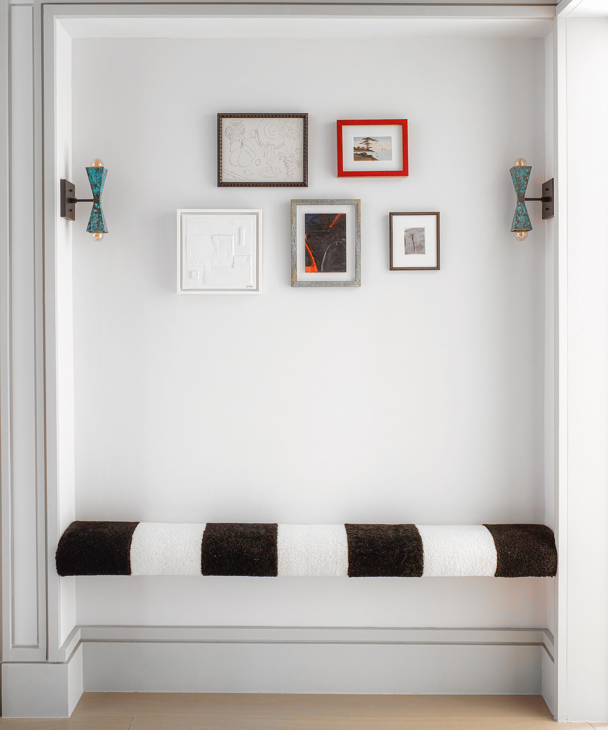
The corners, nooks, and snugs in our homes are some of the most riveting and underused spaces. They may seem redundant or pointless but redone in a creative way, these once unloved spots can be turned into a wonderful design feature.
Use a nook in your entryway to create a useful and attractive space to sit and take off shoes. Take inspiration from this small space in the home of interior designer Elnaz Namaki who paired a playful striped bench with simple but effective artwork and graphic wall lights.
7. Not making the most of wall space
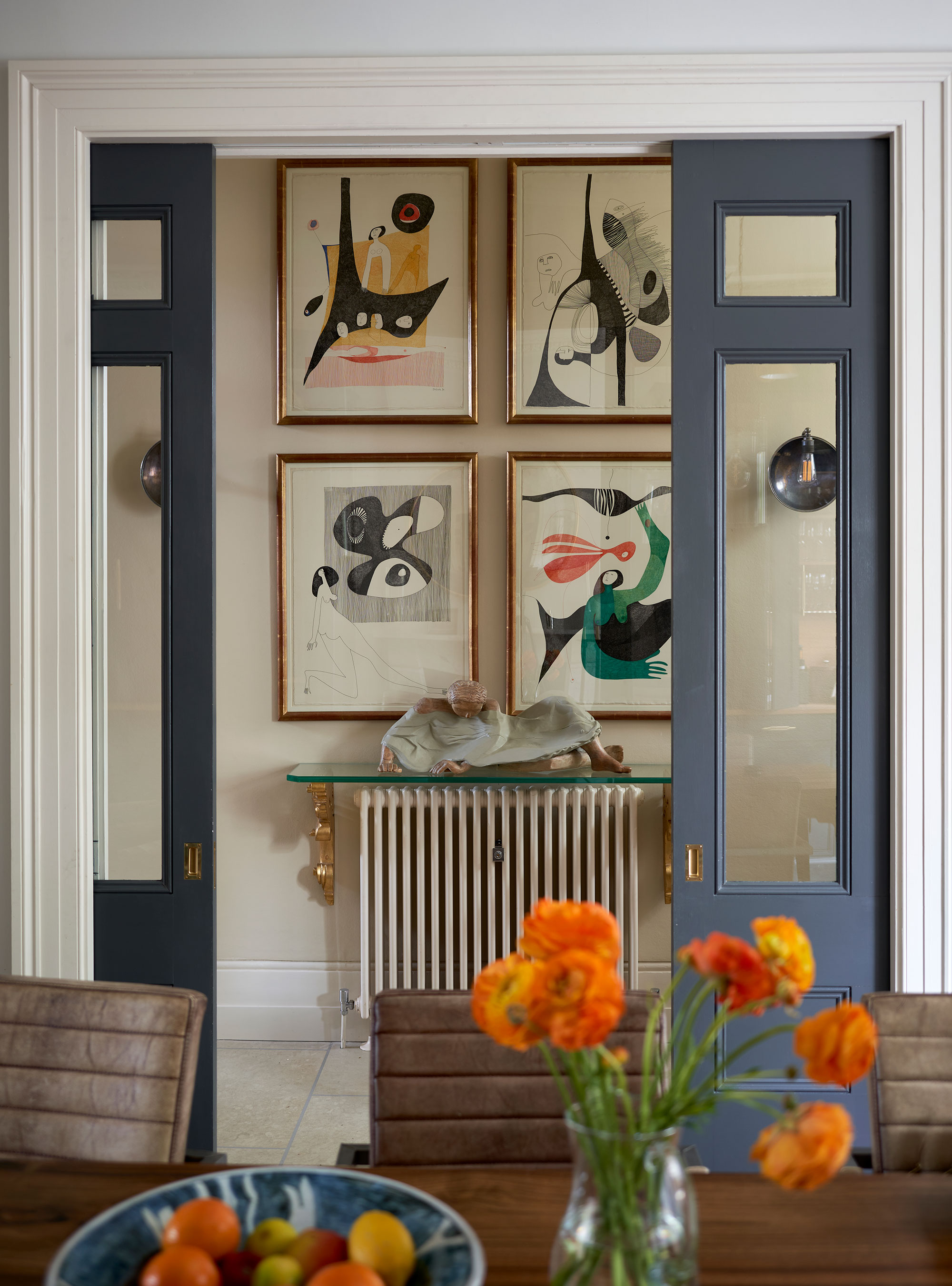
The walls in an entryway are often left bare, but in fact, doing so could give a small or narrow entrance a gloomy, tunnel-effect. With plenty of wall space on offer, entryways are an ideal place to layer up your favorite artwork.
‘There are two really effective ways to make a statement with art in a hallway,’ notes Camilla Clarke, creative director at Albion Nord. ‘The first is to play with scale. Make the most of the entryway wall space and choose a large-scale artwork that spans the full height of the wall. It will feel bold and impactful. Another interesting way to make a statement is to create an art wall. Play with a mixture of work in different sizes, colors, and genres.’
FAQs
How can I improve my small entryway?
If you want to instantly improve your small entryway, then you'll do well to turn your attention to entryway paint and color techniques that enhance and excite.
One trend which is currently being adopted in hallways is color drenching. ‘This contemporary, cohesive approach delivers high impact by painting woodwork, radiators, the ceiling and doors the same color as the walls,’ says Ruth Mottershead, creative director, Little Greene. ‘This will create a complete scheme, treating each element similarly, and will deliver a design statement when entering or viewing the hallway from other rooms within your home.’
Many rooms lead off the entryway, so the design not only sets your home's tone but also creates an inviting place for guests, so it is vital to avoid making these small entryway design mistakes if you want to curate a space that inspires.
Sign up to the Homes & Gardens newsletter
Design expertise in your inbox – from inspiring decorating ideas and beautiful celebrity homes to practical gardening advice and shopping round-ups.

Jennifer is the Digital Editor at Homes & Gardens. Having worked in the interiors industry for several years in both the US and UK, spanning many publications, she now hones her digital prowess on the 'best interiors website' in the world. Multi-skilled, Jennifer has worked in PR and marketing and occasionally dabbles in the social media, commercial, and the e-commerce space. Over the years, she has written about every area of the home, from compiling houses designed by some of the best interior designers in the world to sourcing celebrity homes, reviewing appliances, and even writing a few news stories or two.
-
 How to weed a garden quickly – professional gardeners reveal the five-minute weeding jobs to do now and get your yard summer-ready
Short on time? These time-efficient tasks will keep on top of problem plants
By Thomas Rutter
-
 Suddenly, every stylish room has this one simple piece of furniture in common – why designers are loving the versatility of the humble stool
Behold, the humble stool. A welcome addition to any room, stools are a much-loved household essential that interior designers love for these 5 reasons
By Eleanor Richardson
