Should living room flooring be lighter or darker than the walls? Experts weigh in
Discover how to consider the color of flooring against that of the walls in a living room. This is what the pros advise


The floor and the walls are two major elements of any living room color scheme and make a big impact on the finished interior. And a question that often arises when selecting the shades for these two important features is whether living room flooring should be lighter or darker than the walls.
It’s a dilemma whether your living room ideas feature a dramatic palette or one that’s more neutral and while wall color is relatively straightforward to update from time to time, living room flooring is a choice you may live with for many years to come.
To answer the question of whether flooring should be lighter or darker than the hue on the walls we asked interior designers to pitch in and explain their reasons to enable you to create an interior with confidence.
Living room flooring: lighter or darker than the walls?
The best type of living room flooring will depend on your interior design style and how and who uses the room – kids and companion animals place their particular demands on floors.
But whether you pick from wood floor ideas, living room carpet ideas, or another floor type, what’s crucial to consider is the floor’s color and whether living room flooring should be lighter or darker than the walls. The advice of interior professionals is right here to help you decide.
Expand the space
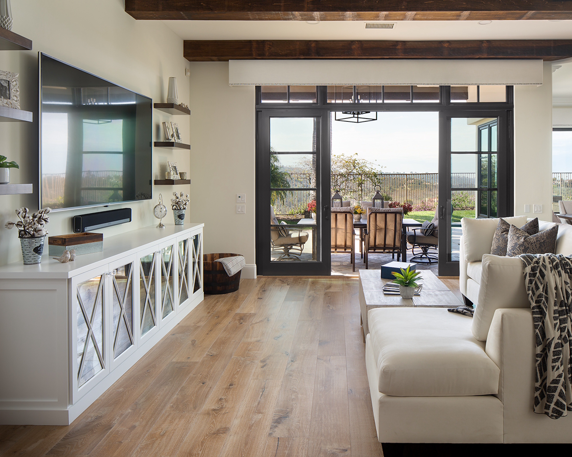
Choose darker floors if you want to pull off a clever visual trick, according to interior designer Robbie Maynard of Robbie Maynard Interiors in San Diego.
‘Darker flooring adds some contrast to the room and will typically make the space appear larger,’ she explains. ‘Another advantage to darker floors is they look cleaner longer than light flooring and require less maintenance. Medium to dark shades of wood flooring are extremely popular and frequently requested by clients,’ she adds.

Robbie Harbert Maynard is principal at Robbie Maynard Interiors. She is an award-winning interior designer specializing in new construction, kitchen design, major home remodels and timeless classic and modern décor.
Put the focus on the walls
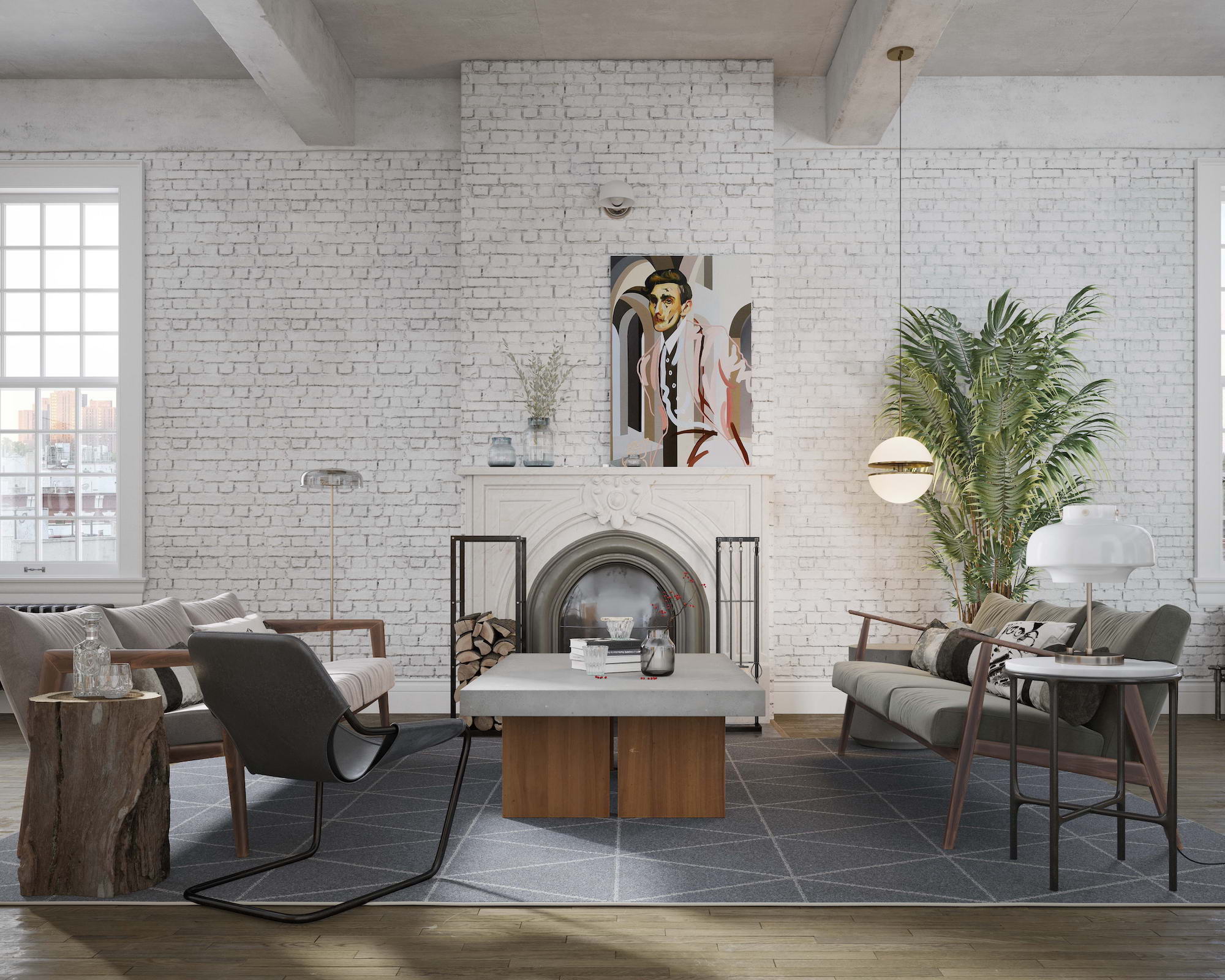
Want to put the focus on the walls? A dark floor can be the answer. ‘In this living room flooring darker than the walls was used to add tactility to the brickwork and draw attention,’ says interior designer Artem Kropovinsky.
‘If the walls should be a dominant element of a design, a dark floor color needs to be employed. This method makes the wall stand out and the highlighted texture differentiates the vertical surface further from the flooring.
‘The darker background of the flooring also serves as a robust accent to the furniture which may vary in color. As a result, furniture does not mingle with the floor color.
‘The tone to be applied will greatly depend on how you want to manage contrast,’ Artem adds.

Based in New York, Artem Kropovinsky boasts extensive global design experience spanning a decade. With a commitment to sustainability and authenticity, Artem, alongside his dedicated team, undertakes projects both in the US and internationally, earning recognition through prestigious design awards. Artem is the founder of Arsight, an esteemed global design firm known for its expertise in residential and commercial interior design.
Create balance
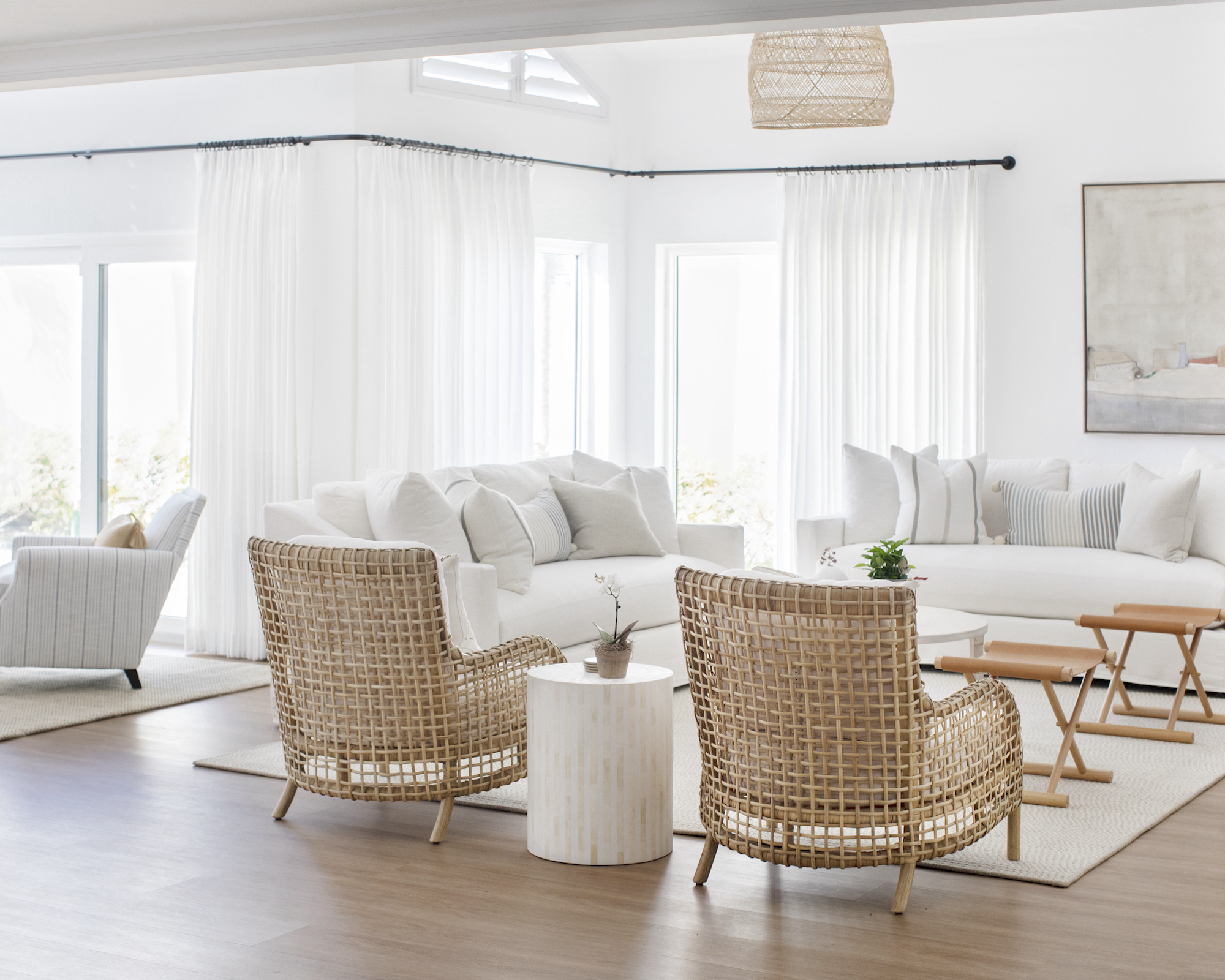
A darker-toned floor can create subtle contrast to the walls. ‘Paint color and flooring are one of the two largest selections when it comes to the renovation of your home,’ says Angela Hamwey, owner and creative director of Mackenzie & Co. ‘These are the two items that clients decide first and set the tone for their home. When selecting your walls and flooring, we always recommend a neutral palette and timeless selections. Therefore, we primarily suggest a neutral color on the walls, trim, and ceiling. For the flooring, we always recommend opting for a subtle contrast.
‘In our Pelican Bay project, located in Naples, Florida (shown above), the client wanted a white, bright, and coastal space. To achieve that, we designed white walls, soft neutral upholstery, and artwork with deeper-toned flooring for a slight contrast. With such a light and airy design, we wanted the flooring to bring a sense of balance and grounding to the living room. Not only for aesthetics, but in coastal locations, darker flooring can be more forgiving in terms of hiding sand and small imperfections, making it a practical choice for high-traffic areas such as living rooms.’

Angela Hamwey is the owner and creative director of Mackenzie & Co, a full-service interior design firm located in Massachusetts. After completing a fashion degree, a realization occurred that her passion for textiles and good taste went far beyond clothing. Her creative intuition soon led her to Rhode Island School of Design to pursue her true calling of interior design. Her vast education coupled with her Scottish heritage have laid the foundation for what is now an award-winning design studio located on quintessential Cape Cod.
Pull interiors together
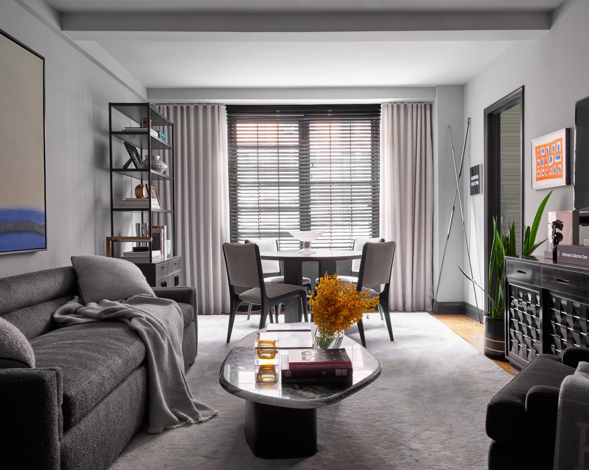
Another reason to choose floors that are darker than walls is when creating consistency in interior decor.
‘When designing a space, it’s important to keep the overall scheme of the home,’ says Eric Winnick, CEO of E Lawrence Design. ‘I generally like for the walls to be lighter that the floors. In the living room here, we aimed for a more masculine vibe. Therefore, we opted for medium-toned floors and softer, muted wall hues. To subtly enhance depth, we incorporated darker trim for a touch of contrast.’

Award-winning New York-based interior designer Eric Lawrence Winnick established E Lawrence Design to bring to reality his life-long passion and vision for providing what clients really want: high-end living spaces that serve a substantive purpose and tell stories with sophistication.
Think focus
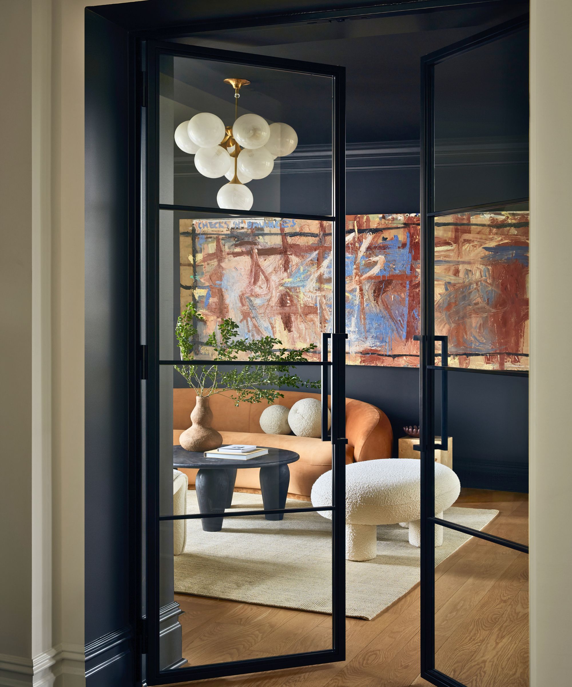
A way to approach the question of whether living room flooring should be lighter or darker than the walls is to consider where you want attention to go.
‘The color of the living room flooring really depends on whether you want the floor to blend in or stand out in a space,’ explains interior designer Luis Carmona. ‘Our eyes tend to be attracted to bold, darker colors. With a darker floor, say a shade of espresso, and lighter walls all around, your eye will gravitate to the ground as the darker floor acts like a void in the space. The darker floor will attract less light making it stand out in a more bright and airy environment.'
‘On the flip side, if the flooring was a lighter color, say a shade of natural oak, the walls could still be a bit darker while still complementing the adjacent floor surface. Since the walls are darker, your eye would tend to gravitate towards that surface and not towards the ground.
‘The more contrast there is between the flooring and the surrounding walls, the more the surfaces will fight for your eyes’ attention,’ he notes. ‘I would recommend selecting a flooring that is neutral enough to live throughout the entire home, with the exception of most wet areas. Opt for wall paint and tile that is in a complementary shade to the flooring so they do not compete against each other in the space. Let the art, furniture and light fixtures be in the foreground, as the conversation starters they are, while the flooring and walls provide the neutral foundation.’
Living room paint ideas should always be considered alongside flooring color whether you’re investing in both together, or changing the wall color in a room with an existing floor. Consider paint finishes, too, to get the perfect look for a living room. And if you’re painting a wall yourself be sure to protect the floor properly to avoid marking it.
Sign up to the Homes & Gardens newsletter
Design expertise in your inbox – from inspiring decorating ideas and beautiful celebrity homes to practical gardening advice and shopping round-ups.

Sarah is a freelance journalist and editor. Previously executive editor of Ideal Home, she’s specialized in interiors, property and gardens for over 20 years, and covers interior design, house design, gardens, and cleaning and organizing a home for Homes & Gardens. She’s written for websites, including Houzz, Channel 4’s flagship website, 4Homes, and Future’s T3; national newspapers, including The Guardian; and magazines including Future’s Country Homes & Interiors, Homebuilding & Renovating, Period Living, and Style at Home, as well as House Beautiful, Good Homes, Grand Designs, Homes & Antiques, LandLove and The English Home among others. It’s no big surprise that she likes to put what she writes about into practice, and is a serial house renovator.
-
 How to get rid of bean seed flies – a pest control expert reveals how to keep crops safe from these seed munchers
As their name implies, these insects primarily feed on bean crops
By Tenielle Jordison
-
 Sarah Michelle Gellar's kitchen cabinets are moody yet elevated – I've always used dark paint with caution, but they make bolder tones accessible
The actress's black kitchen cabinets are bold yet palatable, proving that this dark shade is a trendy yet timeless color pick
By Hannah Ziegler