Sherwin-Williams' new 'Woodland Retreat' color palette proves that spring decor is not just about pastels
Swap light pastels for sophisticated neutrals with this spring color palette


While pastels are usually the first colors to dominate interiors as soon as spring arrives, that's not to say these soft, colorful tones are for everyone. For some, pastel tones are too light and feminine for interior design tastes.
Proving that spring is not just about pastel colors, we're turning to the expertise of color specialists at Sherwin-Williams, who recently unveiled their March color palette named Woodland Retreat.
Far from the delicate pinks and yellows we often associate with spring color ideas, the palette comprises earthy, elevated neutrals, confirming the moody spring color trend for 2024.
A post shared by Sherwin-Williams (@sherwinwilliams)
A photo posted by on
Including eight Sherwin-Williams paint ideas, the spring-inspired palette is a fresh take on decorating with neutrals, from earth-toned browns to dark greens that nod to the outdoor world.
'The Woodland Retreat palette is comprised of gorgeous, earthy neutrals that make a statement despite the muted tones,' says interior designer Maire Flanigan.
Talking about the inspiration behind the palette, Sue Wadden, Director of Color Marketing at Sherwin-Williams tells H&G: 'March is that time of year when it feels like the earth wakes up to find itself green yet again. This woodland retreat-inspired color palette is more than just a design – it's a lifestyle where the delicate balance of modern comfort and the untamed beauty of nature meet.'
Arguably the standout shade from the collection is Roycroft Bronze Green, which serves as a new take on typical forest green with more of a muddy, brown undertone. Sue says of this shade: 'This versatile forest green effortlessly captures the calm serenity of the outdoors. The moody hue has an earthy character that envelops interiors with an easy, inviting feel perfectly fit for a modern rustic look.'
Sign up to the Homes & Gardens newsletter
Design expertise in your inbox – from inspiring decorating ideas and beautiful celebrity homes to practical gardening advice and shopping round-ups.
How to decorate with the Woodland Retreat palette
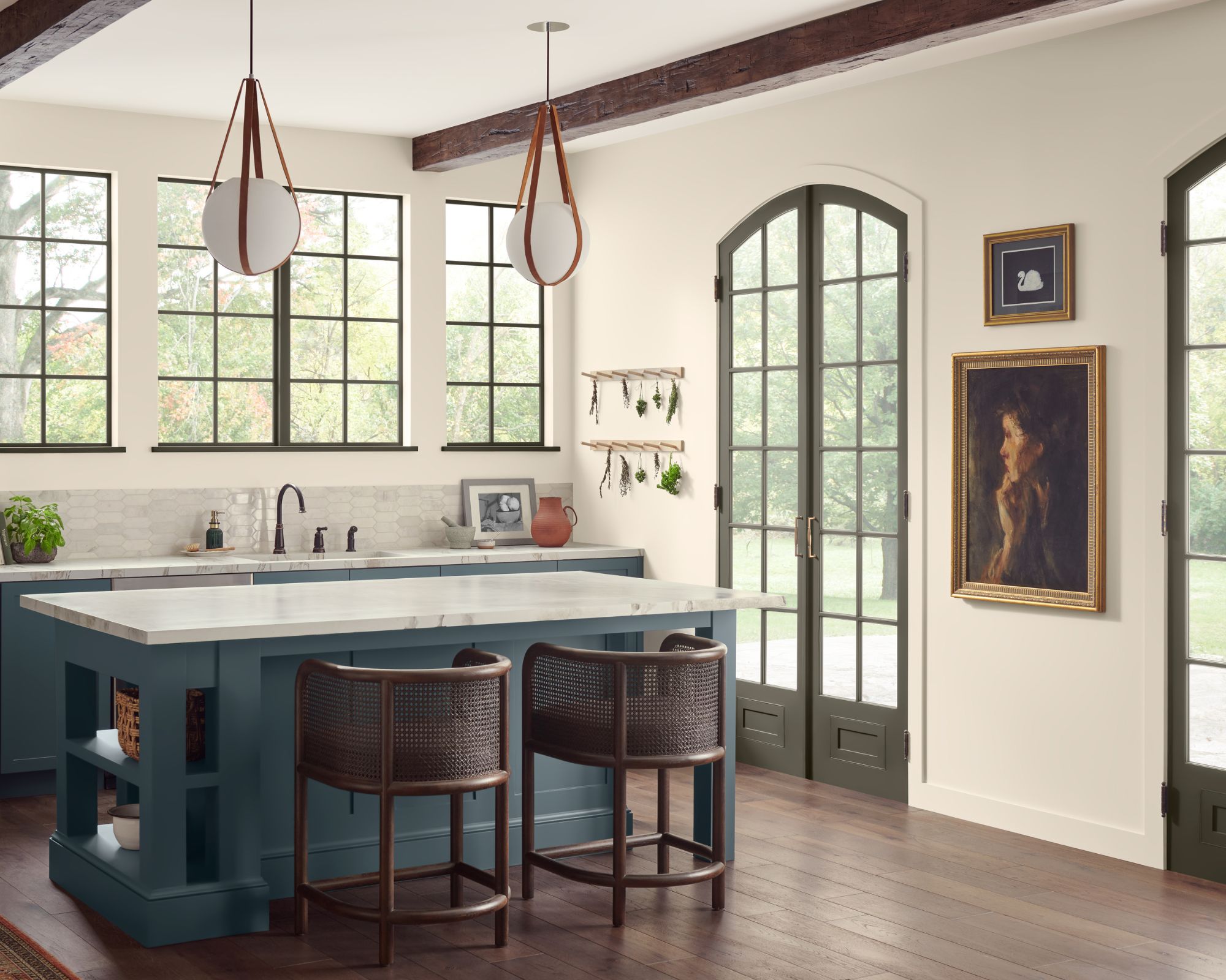
Since the selection of shades within the spring-inspired color palette is so versatile, there are lots of ways to incorporate the paints into your interior schemes. But, to spark some ideas, we spoke to designers to get their take on how they would style these elevated neutrals.
'The Woodland Retreat palette is perfect for a cozy, rustic-chic home that is full of organic elements and decorative accents inspired by the natural world,' explains interior designer Kathy Kuo. 'Pair this palette with furniture crafted from reclaimed wood, wrought iron, and natural stone, and bring in organic textures like jute.'
Starting with Tarragon, a deep, muted blue, interior designer Betsy Wentz says this would make a 'gorgeous kitchen cabinet color paired with white countertops.'
Willowleaf, a muddy sage green, 'would be beautiful on the ceiling in a living room,' while 'Roycroft Bronze Green would look great on the walls of a study,' continues Betsy. Marie Flanigan adds that Roycroft Bronze Green 'exudes lounge or home office vibes for a more moody and masculine space.'
Sherwin-Williams' Alabaster is a milky white paint, and along with White Sesame, Marie Flagnigan says both 'would make amazing wall colors for an open and airy living space.'
Wheat Penny is a terracotta paint that 'instantly elevates a space and could be used as a wall color in a formal living room with lots of tone-on-tone color saturation,' according to Marie.
Alternatively, if you're looking to tap into one of this year's biggest color trends: decorating with brown, then opt for either Twig Basket or Double Latte; both will add warmth to your space.
These moody, neutral paints are easy to integrate into your home and will maintain a sophisticated look this spring. They work all year round too, lighten then up for summer with soft pale fabrics and then create a real cozy vibe over fall and winter. This usable, yet dramatic hues are timeless and transitional.

Emily is a freelance interior design writer based in Scotland. Prior to going freelance in the spring of 2025, Emily was Homes & Gardens’ Paint & Color Editor, covering all things color across interiors and home decor for the Homes & Gardens website. Having gained specific expertise in this area, Emily is well-versed in writing about the latest color trends and is passionate about helping homeowners understand the importance of color psychology in home design. Her own interior design style reflects the simplicity of mid-century design and she loves sourcing vintage furniture finds for her tenement flat.
-
 7 of the best tomatoes for growing in pots - expert growers pick their top varieties ideal for large harvests from containers
You can enjoy bumper homegrown harvests in small spaces
By Drew Swainston Published
-
 Drew Barrymore creates a 'balanced' kitchen in 4 easy steps – her rules will make your small, compact countertops feel beautiful
Drew proves that with the right styling (and chic appliances), you can make even the smallest of kitchens look harmonious
By Hannah Ziegler Published