Sherwin-Williams' Sealskin is a trending dark brown paint – a sleek and chic shade for embracing the moody color trend
Here's all you need to know about decorating with this on-trend dark brown paint
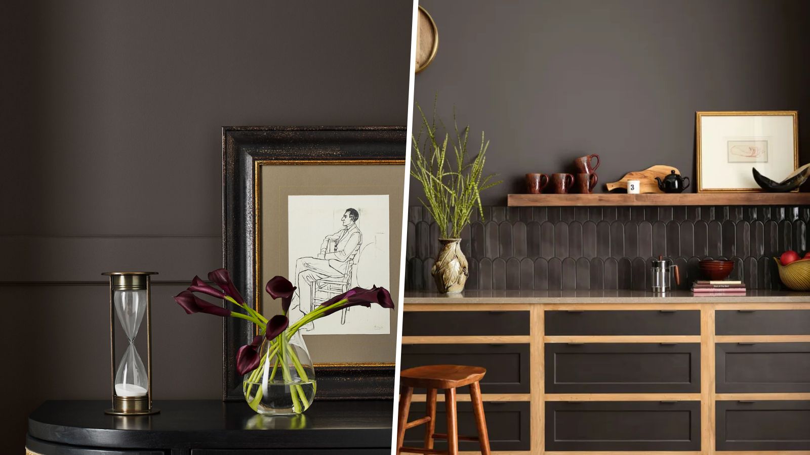

Last year we saw endless appeal for decorating with brown, filling homes with a moody and sophisticated look in place of lighter neutrals, and it's a color trend expected to reign supreme this year too.
It's no surprise then, to see dark brown paints trending right now, and Sherwin-Williams has some of our favorites, including Sealskin. An incredibly rich dark brown that doesn't shy away from making a statement, this bold neutral is a stylish pick for 2025.
Here, we explore all you need to know about this brown paint, from the best rooms to use it in, to the paint colors it pairs best with.
What color is Sherwin-Williams' Sealskin?
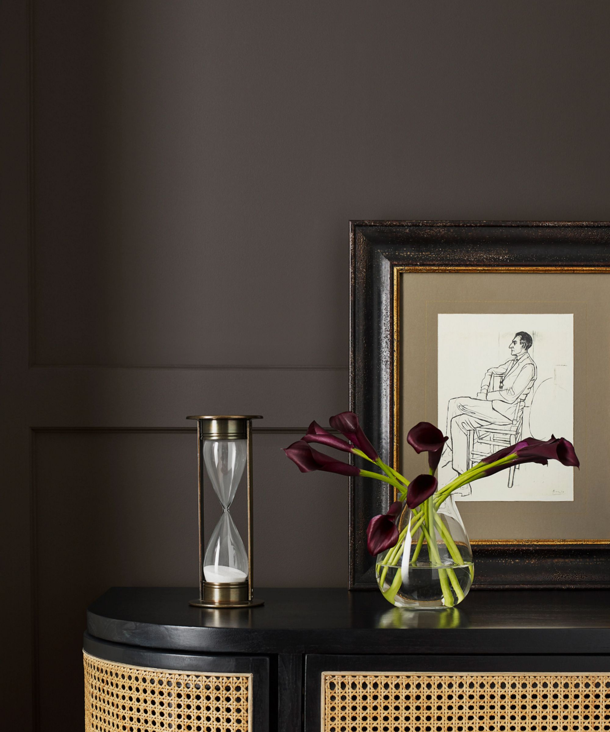
Sealskin by Sherwin-Williams
'Sealskin SW 7675, a shade from our 2024 Colormix Forecast, is a decadently deep and warm brown I like to describe as a timeless enfolding neutral that is both sleek and refined,' explains Emily Kantz, Color Marketing Manager at Sherwin-Williams.
While brown paints are versatile enough to be used year-long, the darkness and depth of Sealskin make it feel especially suited to winter decor, suggests designer Ghislaine Viñas:
'My reaction to Sealskin is certainly influenced by the cold weather – it’s the kind of color that feels warm and inviting, making it hard not to lean into. What stands out to me most is how this brown has a subtle chalky white undertone, giving it a matte-like finish.'
What are the best ways to decorate with this brown paint?
If you're looking to add more depth to your room color ideas, but don't want to decorate with bright and colorful shades, Sealskin makes a great choice. Dramatic and moody, this rich brown commands attention while sticking to a neutral palette.
And while paint colors so dark are often reserved for small rooms such as powder rooms or snugs, Emily says that this shade can work equally well in bigger and brighter rooms:
'One of the aspects I like the most about dark browns like Sealskin, is how well they work in different spaces,' says Emily Kantz. 'For example, this shade looks great in smaller rooms because it helps create a cozy environment, but it also works very well in well-lit larger rooms to create a sophisticated yet subdued space.'
'I love to see it in small TV rooms since the dark and boldness of the shade helps create a sort of “theater” effect,' adds Emily. 'However, with the rising trend of quiet luxury in the home, this shade would be an excellent choice for an elegant yet quiet room when paired with other elements, such as natural materials, minimalist artwork, and black decor accents.'
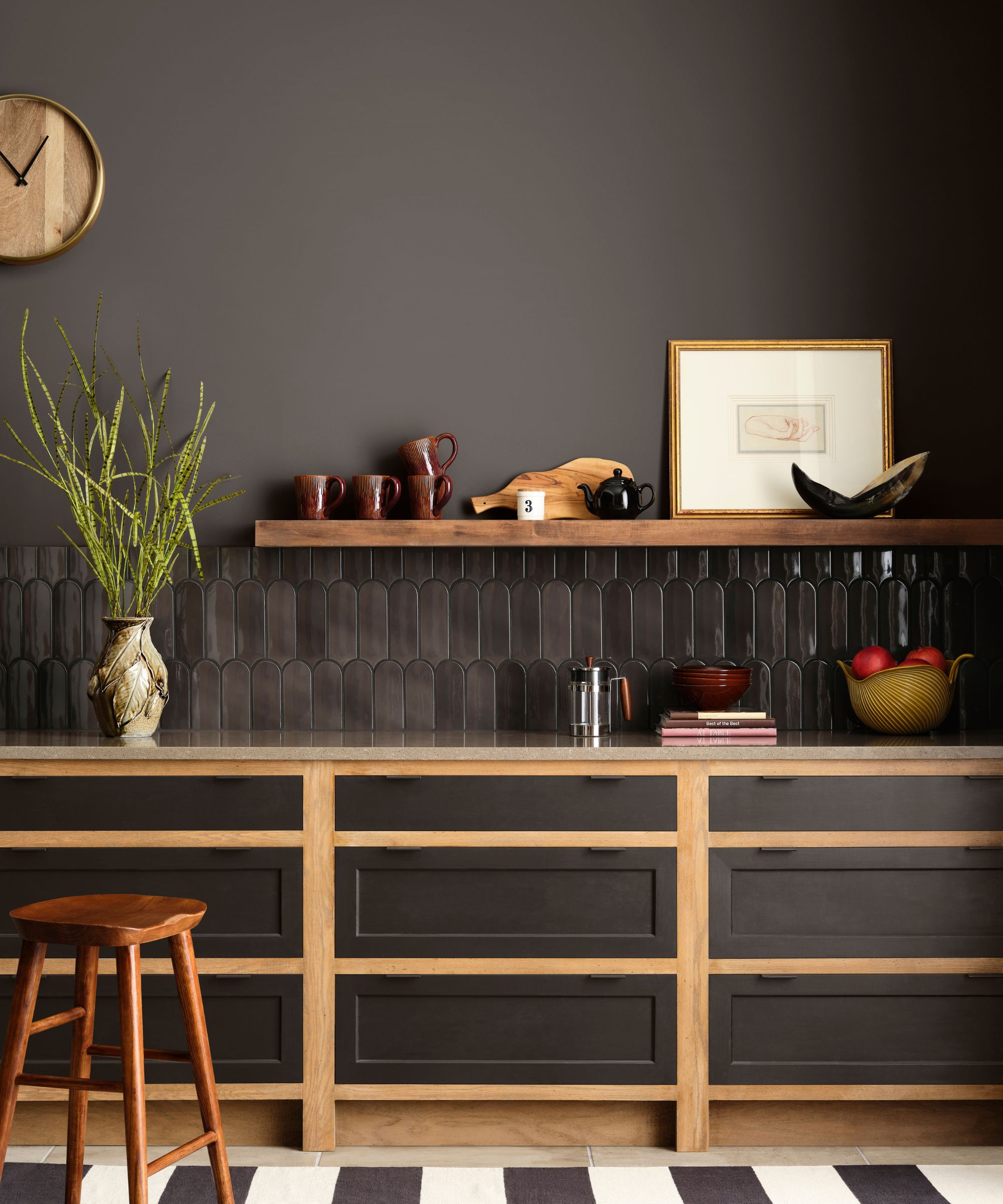
Clove by Sherwin-Williams
When choosing the right color combinations for this statement dark brown, light neutrals such as white paints and lighter browns can create a refined and timeless look, adding some brightness to the dark tones, as Emily suggests:
'I recommend pairing Sealskin with creamy whites to create the perfect balance between dark and light, such as Creamy SW 7012 or Origami White SW 7636. I also love pairing it with a similar yet lighter color, especially to create that quiet luxury vibe, such as Elephant Ear SW 9168.'
However, Sealskin can also work in more colorful contexts. If you're looking for a grounding base for brighter touches, this brown paint makes a timeless choice. 'It’s an ideal backdrop for a bold floral print or for creating a rich, jewel-toned space, like a powder room,' suggests Ghislaine Viñas.
'I’d pair it with unexpected touches of khaki mustard and some deep plum tones. I love creating strange and unexpected color combinations and Sealskin can serve as a great backdrop that complements nearly every hue,' adds Ghislaine.
If you're looking to embrace the color trend of dark and moody hues this year, Sherwin-Williams' Sealskin is an effective shade to use in many rooms, from powder rooms to living spaces.
Sign up to the Homes & Gardens newsletter
Design expertise in your inbox – from inspiring decorating ideas and beautiful celebrity homes to practical gardening advice and shopping round-ups.

Emily is a freelance interior design writer based in Scotland. Prior to going freelance in the spring of 2025, Emily was Homes & Gardens’ Paint & Color Editor, covering all things color across interiors and home decor for the Homes & Gardens website. Having gained specific expertise in this area, Emily is well-versed in writing about the latest color trends and is passionate about helping homeowners understand the importance of color psychology in home design. Her own interior design style reflects the simplicity of mid-century design and she loves sourcing vintage furniture finds for her tenement flat.
You must confirm your public display name before commenting
Please logout and then login again, you will then be prompted to enter your display name.
-
 Charred little gem with saffron dressing
This recipe with charred little gem is both easy to make and sure to impress guests. It's the perfect side for fresh spring menus
By Alice Hart
-
 Grilled asparagus with herb and pickled red onion
This grilled asparagus couldn't be easier, and it's a wonderful way to get the best flavor from our favorite spring veg. It's perfect alongside fish or lamb
By Alice Hart