Sherwin-Williams paint colors in real homes – 13 designer-approved shades, from neutrals to bolds
Gain room color inspiration with these Sherwin-Williams paint shades used by designers in kitchens, bathrooms, and more
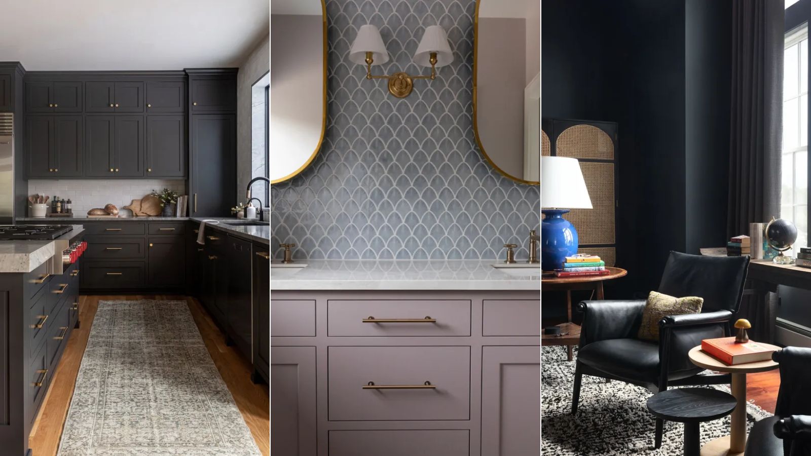

Sherwin-Williams has some of the most popular paint colors out there, used time after time by interior designers in decorating projects.
Within each color family, the range of Sherwin-Williams shades is vast – from warm-toned to cool; light to dark – catering to endless interior design styles and room types.
To help you on your way with gaining room color ideas for your next home decor project, we've rounded up a selection of Sherwin-Williams paint colors used in real homes, from firm favorite neutrals to more daring hues.
Sherwin-Williams paint colors in real homes
From dark and moody shades to classic white paints, there is much inspiration to take from the following rooms, whatever your interior design style.
1. Green Trance
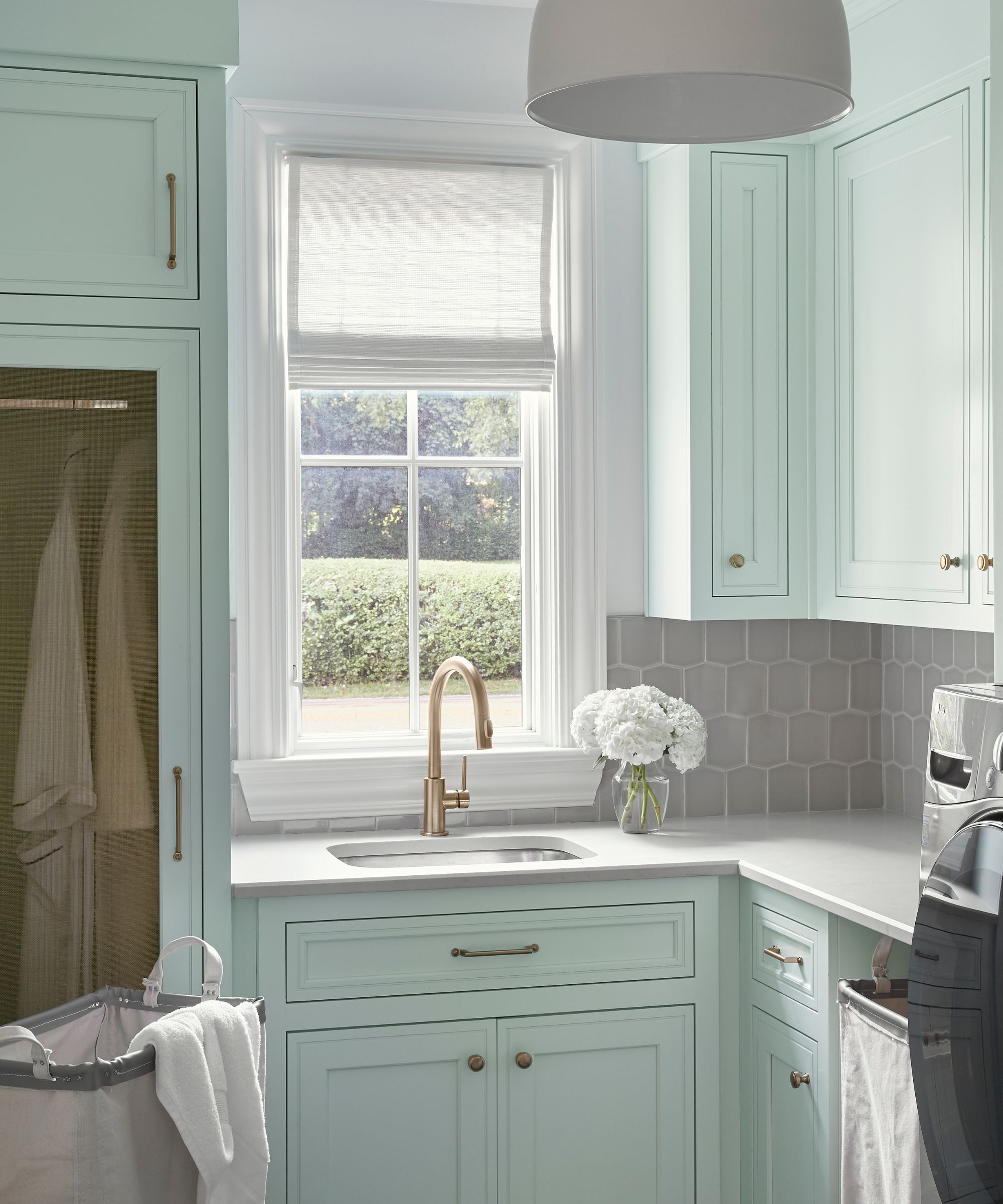
'We chose to go with Green Trance by Sherwin Williams, as it softens the room and brings a cheery feeling,' says Brad Ramsey, principal and founder of Nashville-based Brad Ramsey Interiors. 'Laundry rooms can often feel stale, so we wanted to create a happy and inspiring room for the client.'
'Green Trance paired perfectly with the plumbing fixtures, tile, and countertops and is really enhanced by the touches of brass in the space. The color is the perfect pale green with enough blue in it to soften it and make it a more universal color. It is uplifting without being too bold or bright and soft without feeling pastel or juvenile,' adds Brad.
2. Grays Harbor
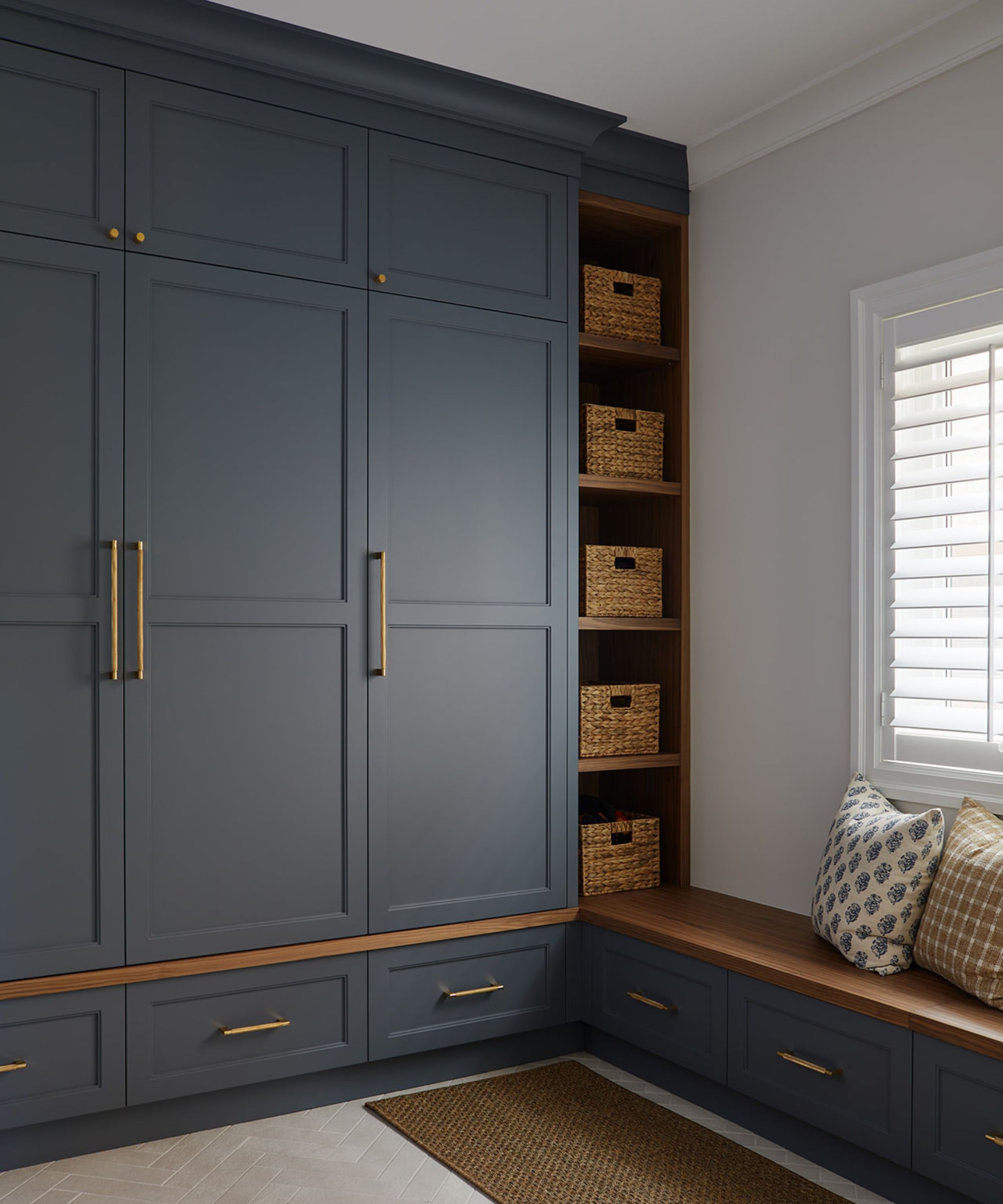
In this mudroom designed by Cornerstone Design & Build, the dark blue-gray paint Grays Harbor was used on the millwork.
'We selected this paint as it is a cooler blue hue that pairs beautifully with walnut, which we wanted to use in the design for the bench,' explains Lindsay Thornton, founder and creative director at Cornerstone Design & Build. 'We also wanted a cooler tone that would bridge the grey stone floors and the walnut. This color brings a ton of depth and adds a level of sophistication to any interior room.'
3. Chelsea Gray
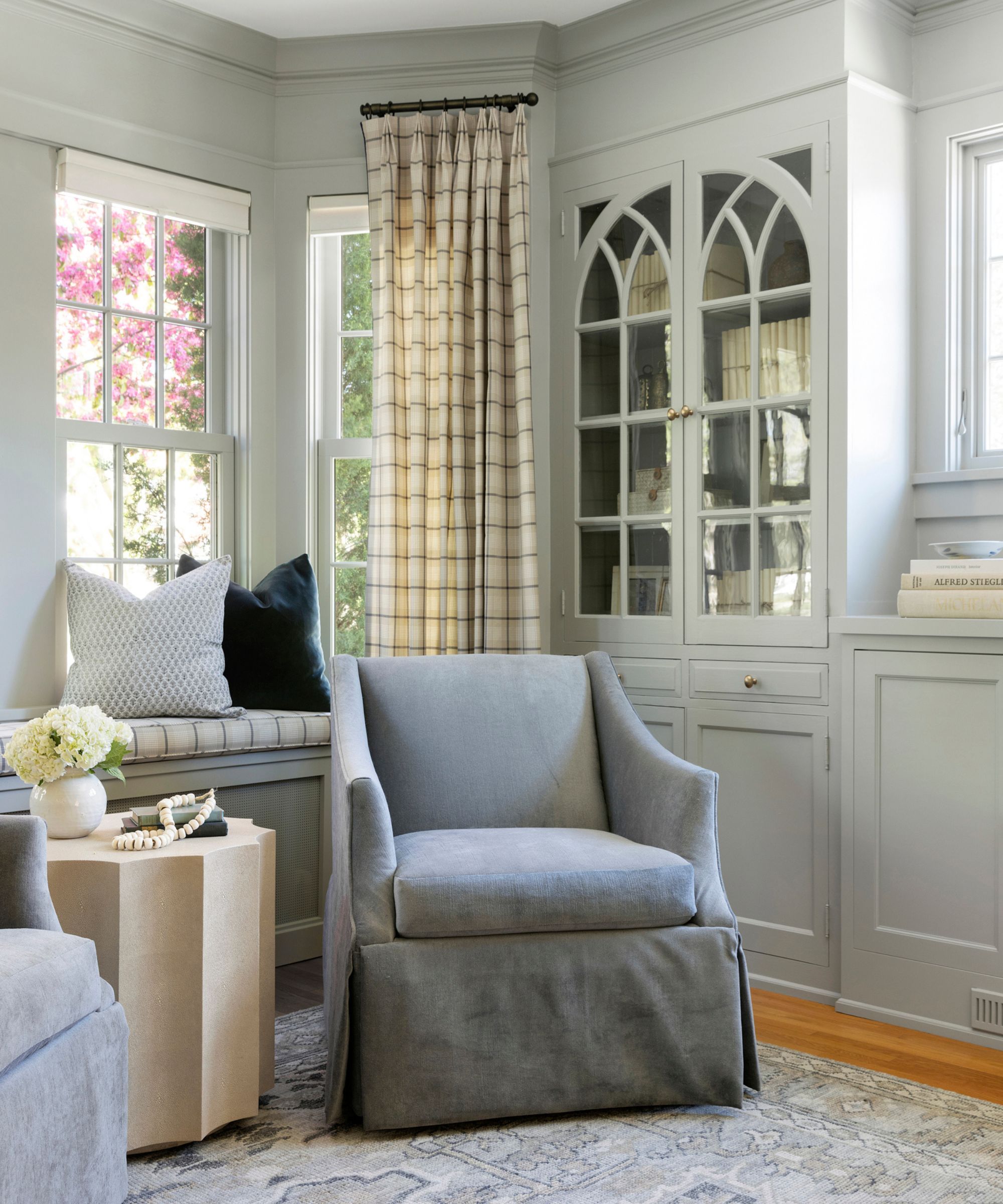
'We chose Sherwin Williams' Chelsea Gray for the color wash in this sitting room because it strikes the perfect balance between depth and softness,' explains Jennifer Davis, founder and principal designer at Davis Interiors.
'Its LRV (Light Reflectance Value) ensures that while the room takes on a rich, moody tone, it still feels light and airy, creating a sophisticated and inviting atmosphere,' adds Jennifer.
4. Energetic Orange
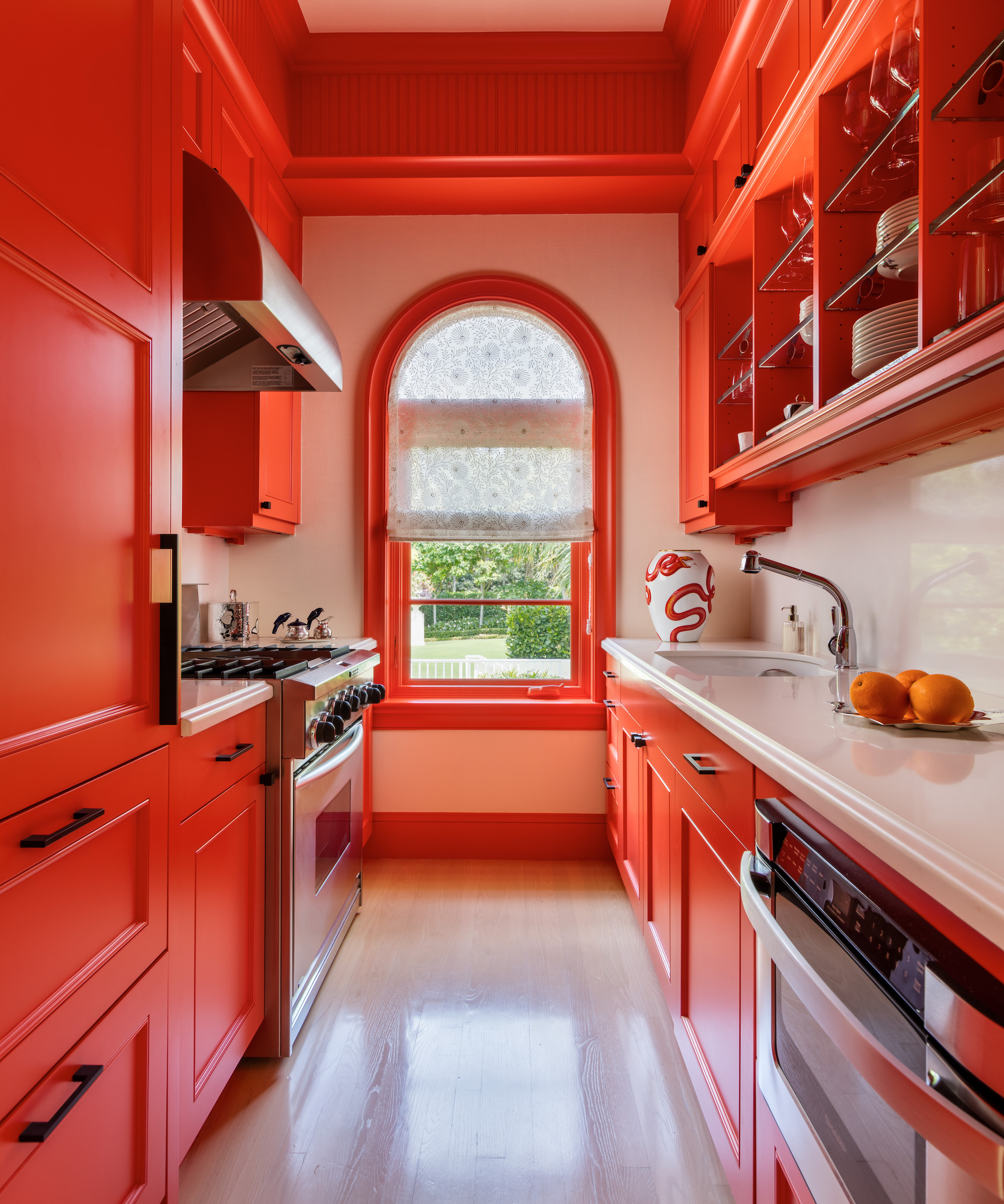
Sherwin-Williams' Energetic Orange is a vibrant orange paint that doesn't fail to make a statement, as seen in this modern kitchen designed by interior designer Matthew Boland of MMB Studio, used boldly to make a statement across the kitchen cabinets and woodwork.
'The color literally grabs your attention and allows your eye to travel the entire length of the space,' says Matthew Boland.
5. Iron Ore
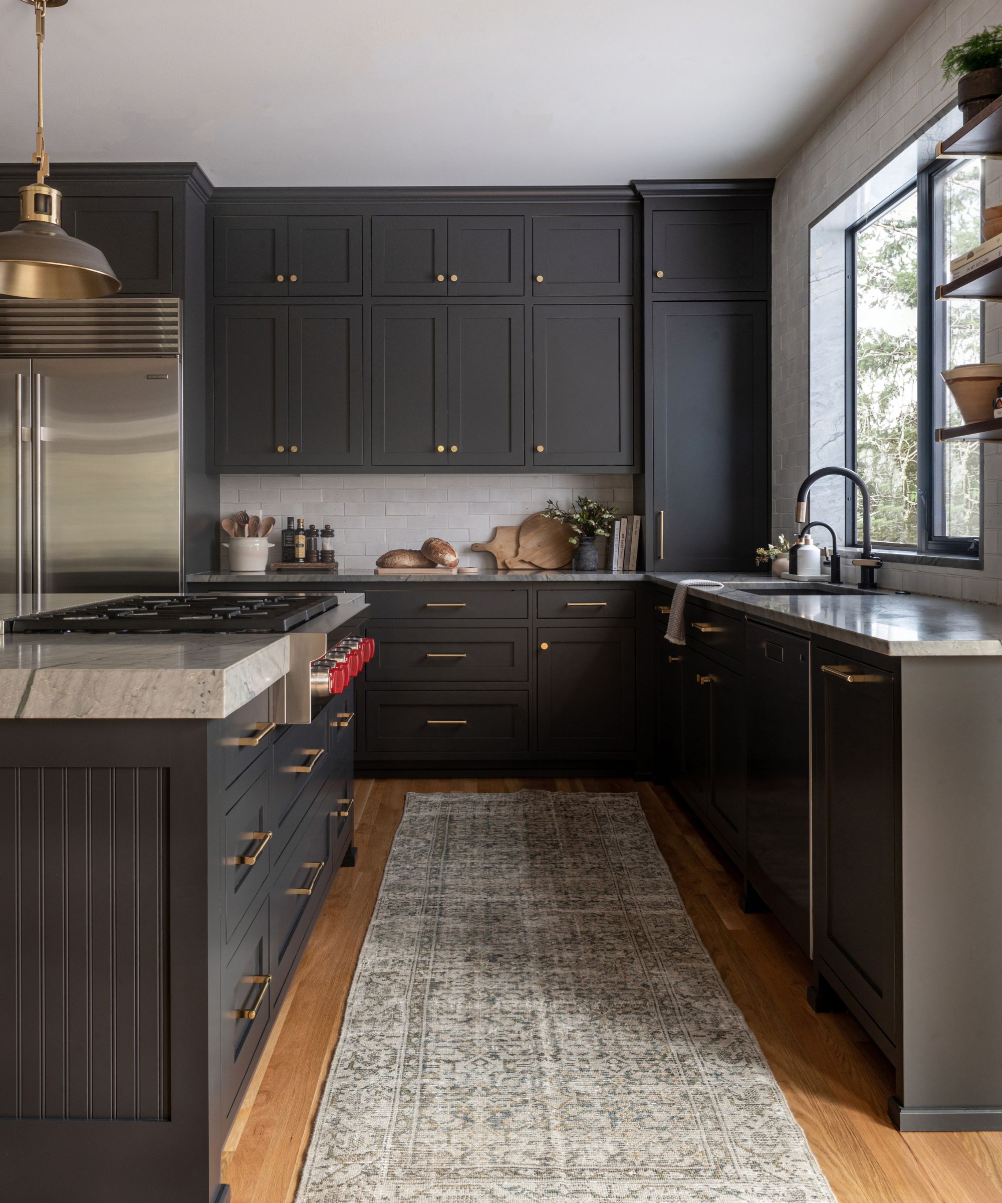
In this kitchen designed by Cohesively Curated, Sherwin-Williams' Iron Ore is used across the kitchen cabinets and kitchen island, making a sophisticated and moodier alternative to lighter neutrals such as white or beige.
'My client wanted a dark kitchen and they were considering black or navy. I proposed this dark charcoal gray that is a bit softer than black and has some blue undertones so it didn't feel harsh and would coordinate well with the color in the slabs we chose while still feeling timeless,' says Emily Ruff, owner and principal designer at Cohesively Curated.
6. High Reflective White
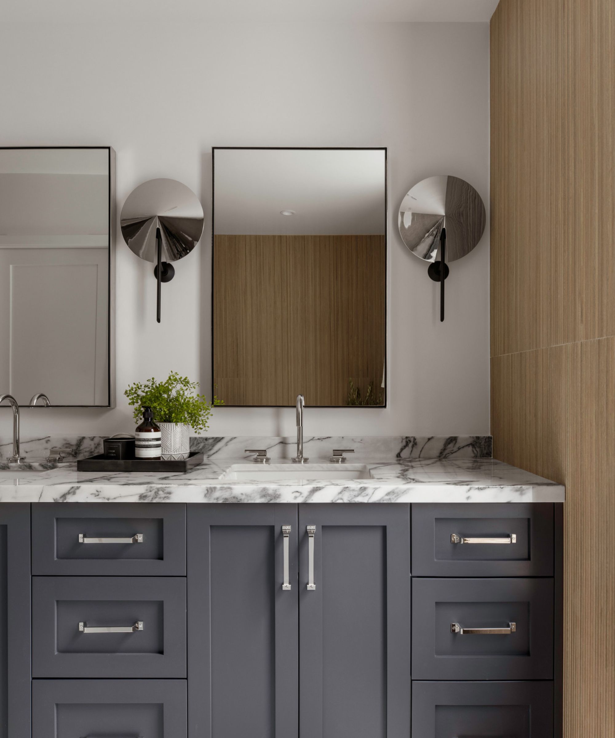
Sherwin-Williams has a wide range of white paints, ranging from warm to cool. High Reflective White is one such paint that reads as a bright white, used in this bathroom design and teamed with Peppercorn on the vanity.
'In the primary bathroom at one of our new-build projects, we used Sherwin Williams' High Reflective White on the walls and Sherwin Williams' Peppercorn on the vanity. Whites can sometimes feel sterile and hospital-like, so we chose this slightly warmer white to give a more inviting feel to the bathroom and complement the natural wood tone of the fluted wood tile. We then chose to pair this with 'Peppercorn' to add some depth of color while also staying neutral,' says Ethan Greenfeld, founder and principal designer at Ethan Charles Design.
7. Outerspace
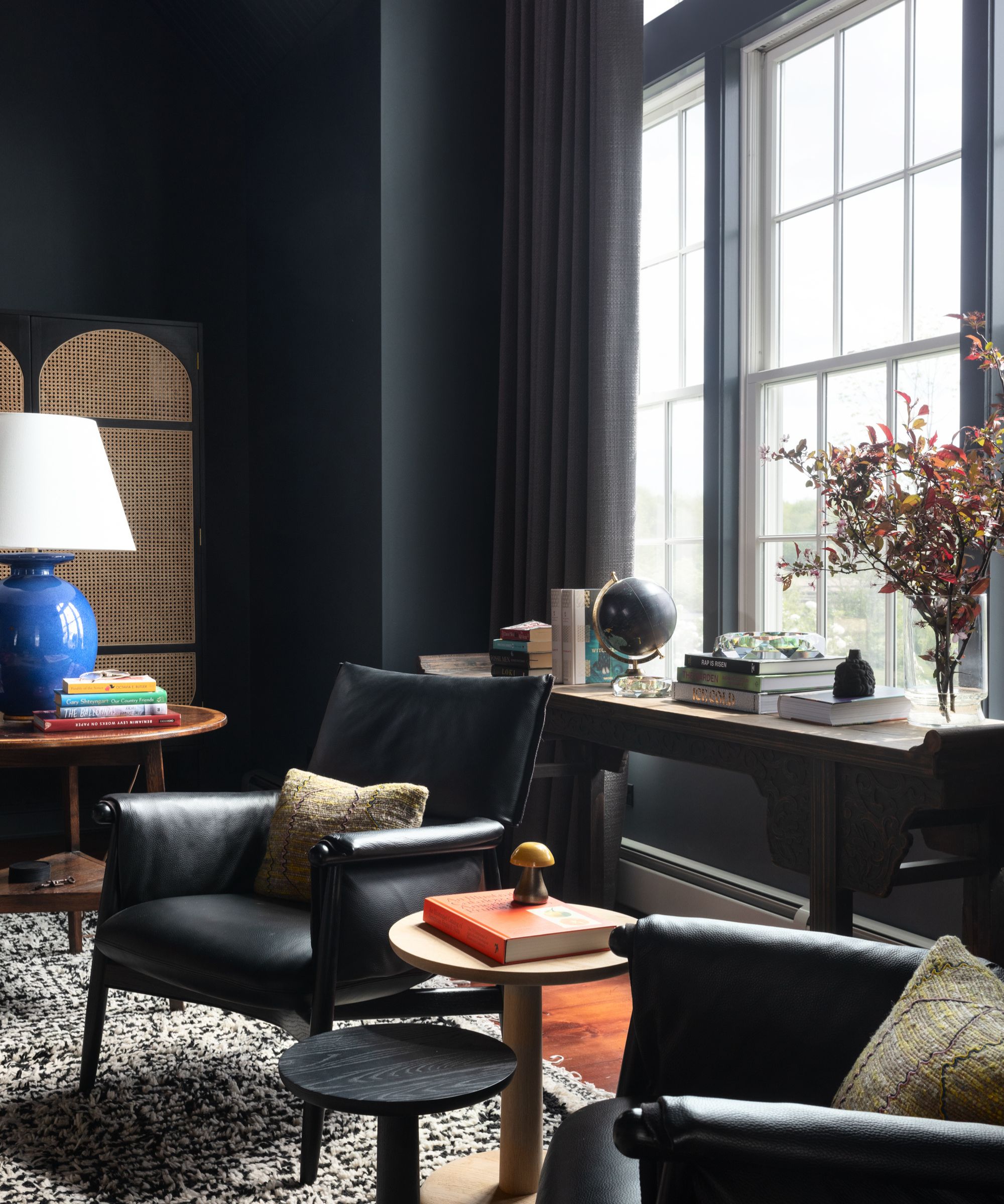
Sherwin-Williams Outerspace is a dark blue-gray paint that was used in this living space designed by Studio SFW. While it can be tempting to go for lighter neutral colors in rooms like this, this example shows just how effective a dark color palette can be, helping to create a relaxed and cozy atmosphere with its cocooning effect.
8. Sconce Gold
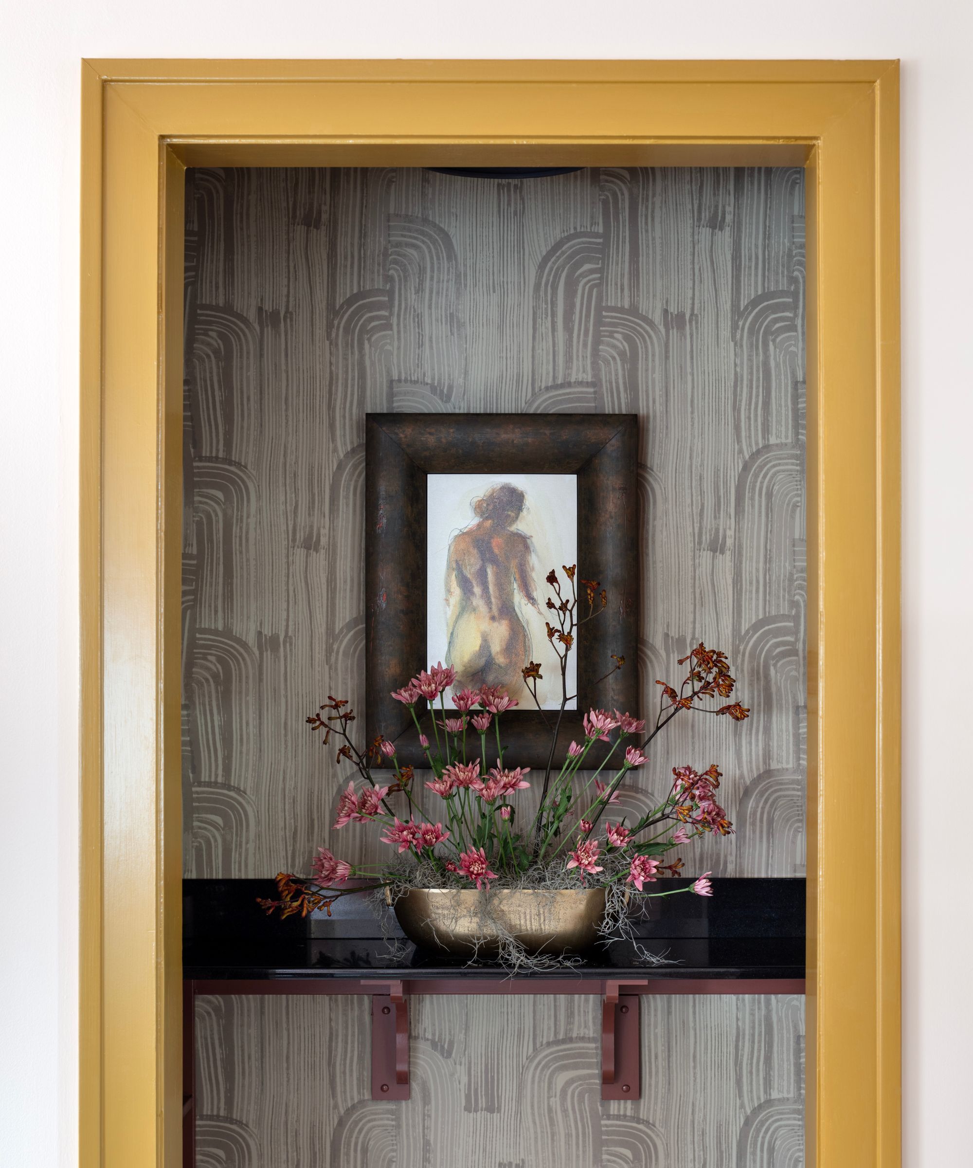
'Paint color can make a big statement in a small space as well as announce its intent. Sherwin-Williams' Sconce Gold on the wine pantry’s trim captures the rich gold of a California chardonnay and the interior shelving painted in Sherwin-Williams' Canyon Clay embodies the earthy red of a French Bordeaux. Combined, the two colors create striking visual interest in what could have been an overlooked design opportunity,' says Susan Jamieson, principal at Bridget Beari Designs.
9. Alabaster
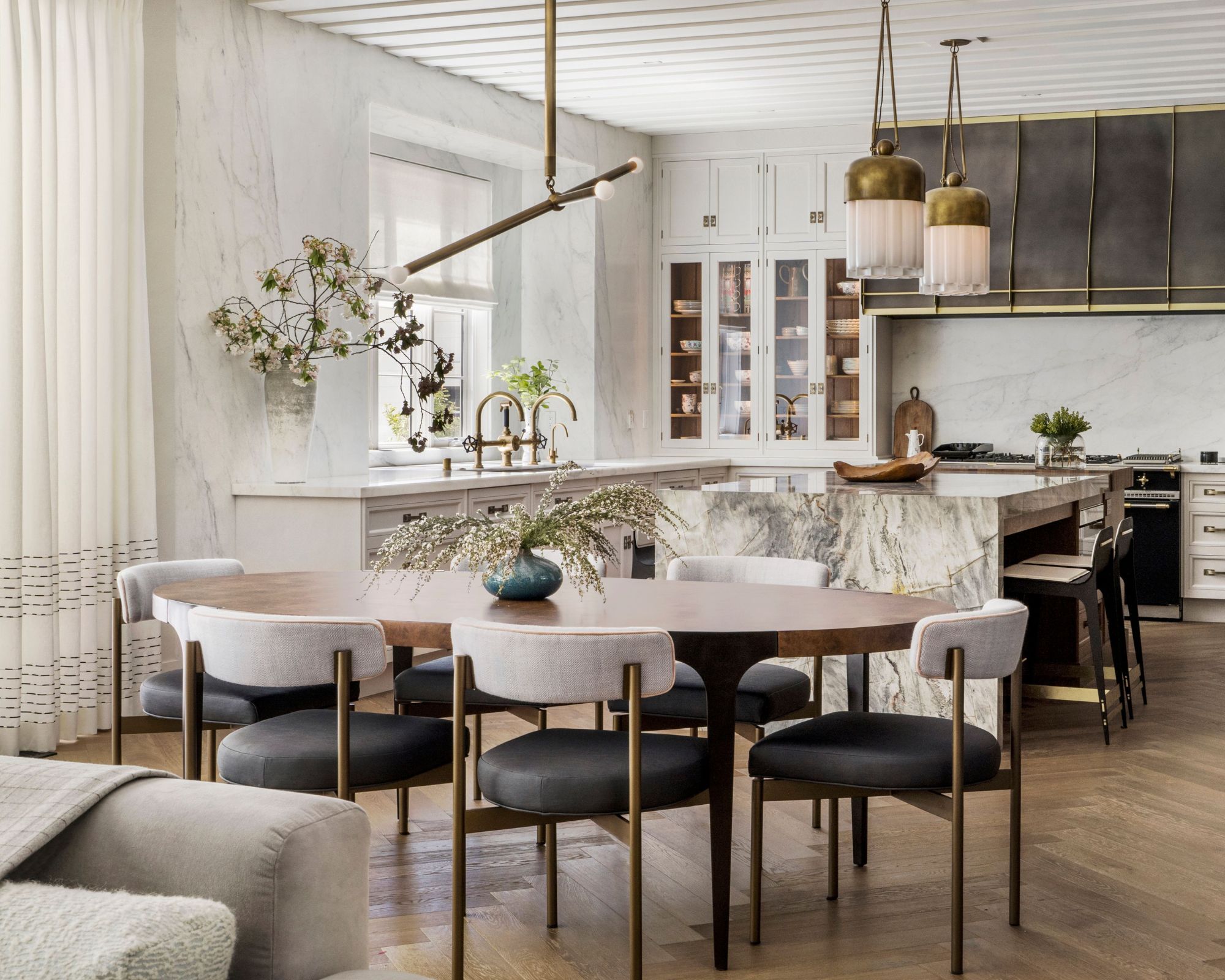
Alabaster is one of Sherwin-Williams' most popular paints, frequently used by interior designers in many different rooms. A warm white paint that doesn't lean too yellow but maintains a light and airy feel, it makes a popular choice for plenty of decorating styles.
In this neutral kitchen, Sabah Mansoor Design opted for Sherwin-Williams' Alabaster, pairing wonderfully with the marble, wood flooring, and brass details for a refined and timeless look.
10. Grizzle Gray
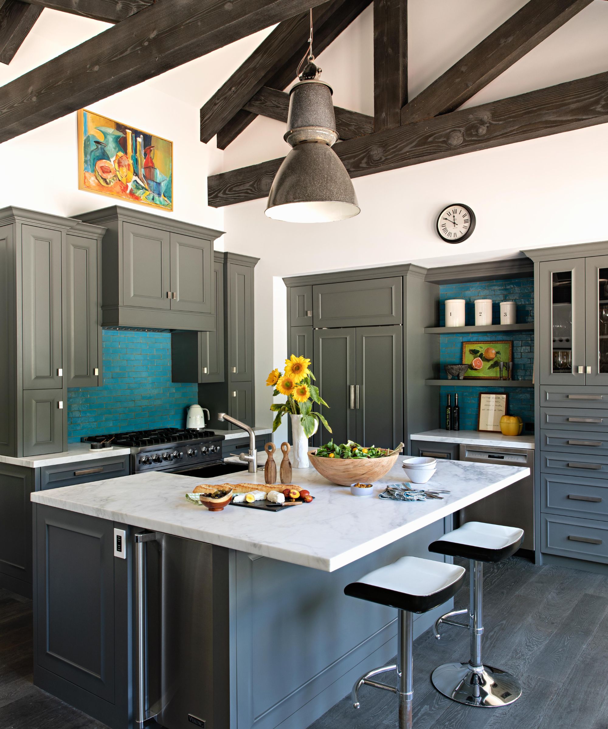
'Grizzle Gray is my go-to favorite grey paint color for cabinets and millwork in kitchens, mudrooms, and libraries. It has warm mocha undertones as opposed to blue undertones, so pairs well with cool colors as a balance of warm to cool, and is dark enough to anchor spaces that are swathed in white paint or pastels,' says interior designer Stephanie Hunt of The Flair Hunter.
'It also looks great with white oak flooring or lighter wood floors with visible character and wood grain. Additionally, it's a grey that can stand up to stronger colors in a room. It's kind of a unicorn and it works well with everything,' adds Stephanie.
11. Sea Mariner
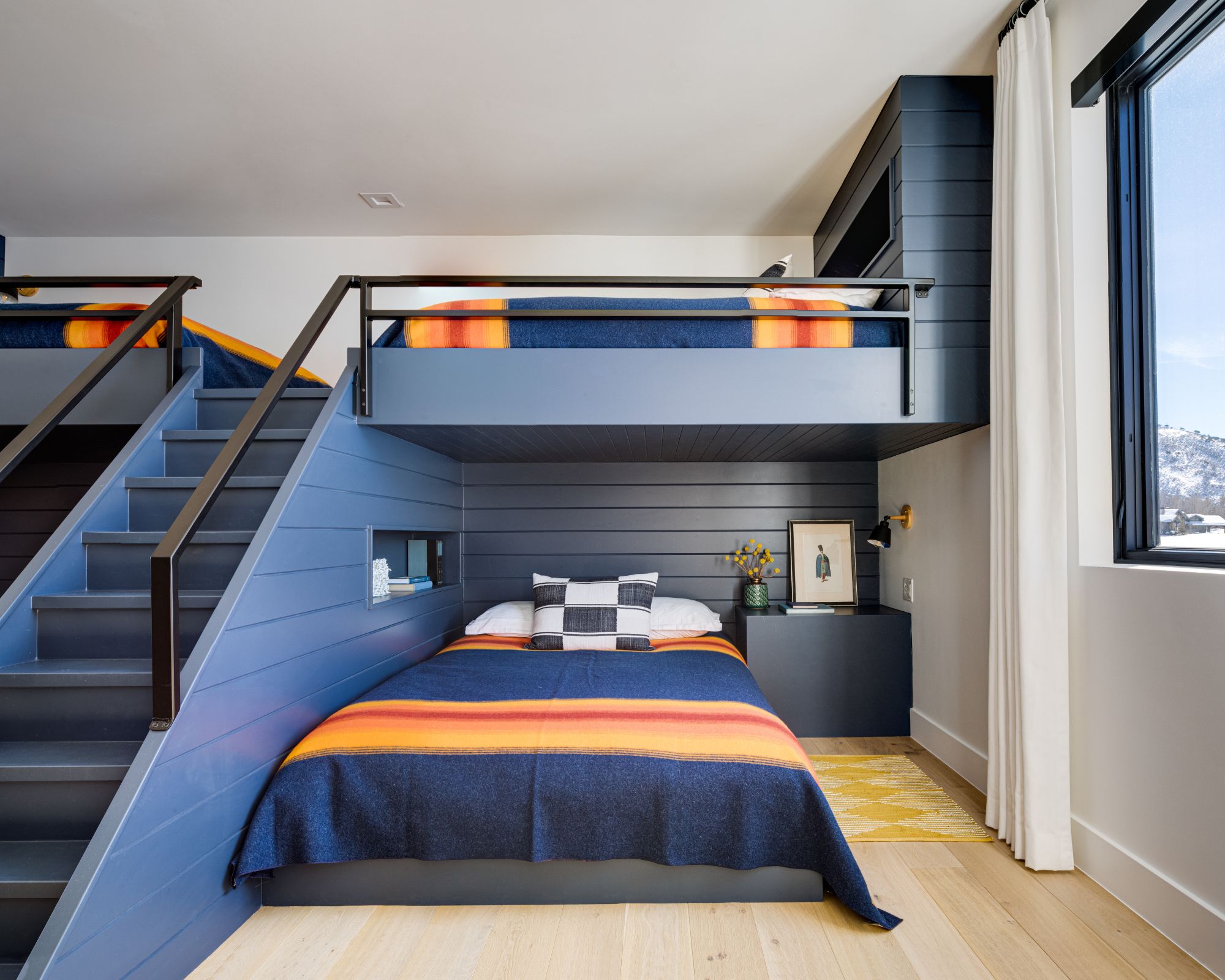
Sherwin-Williams' Sea Mariner is a dark blue paint that was used in this bedroom designed by The Flair Hunter, of which Stephanie Hunt says: 'I love it as my go-to 'indigo' paint color because depending on the light, it can almost look like a dark, dark indigo or denim.'
'It's incredible to paint an entire room in this color and have white upholstery throughout, or have a statement-making custom millwork bunk room with white bedding and pops of strong accent saturated colors in the decorative pillows and throws. This is a color I could (and have) happily painted kitchens, bath vanities, and mudrooms. It's not too nautical and it's a sophisticated blue,' adds Stephanie.
12. After The Storm
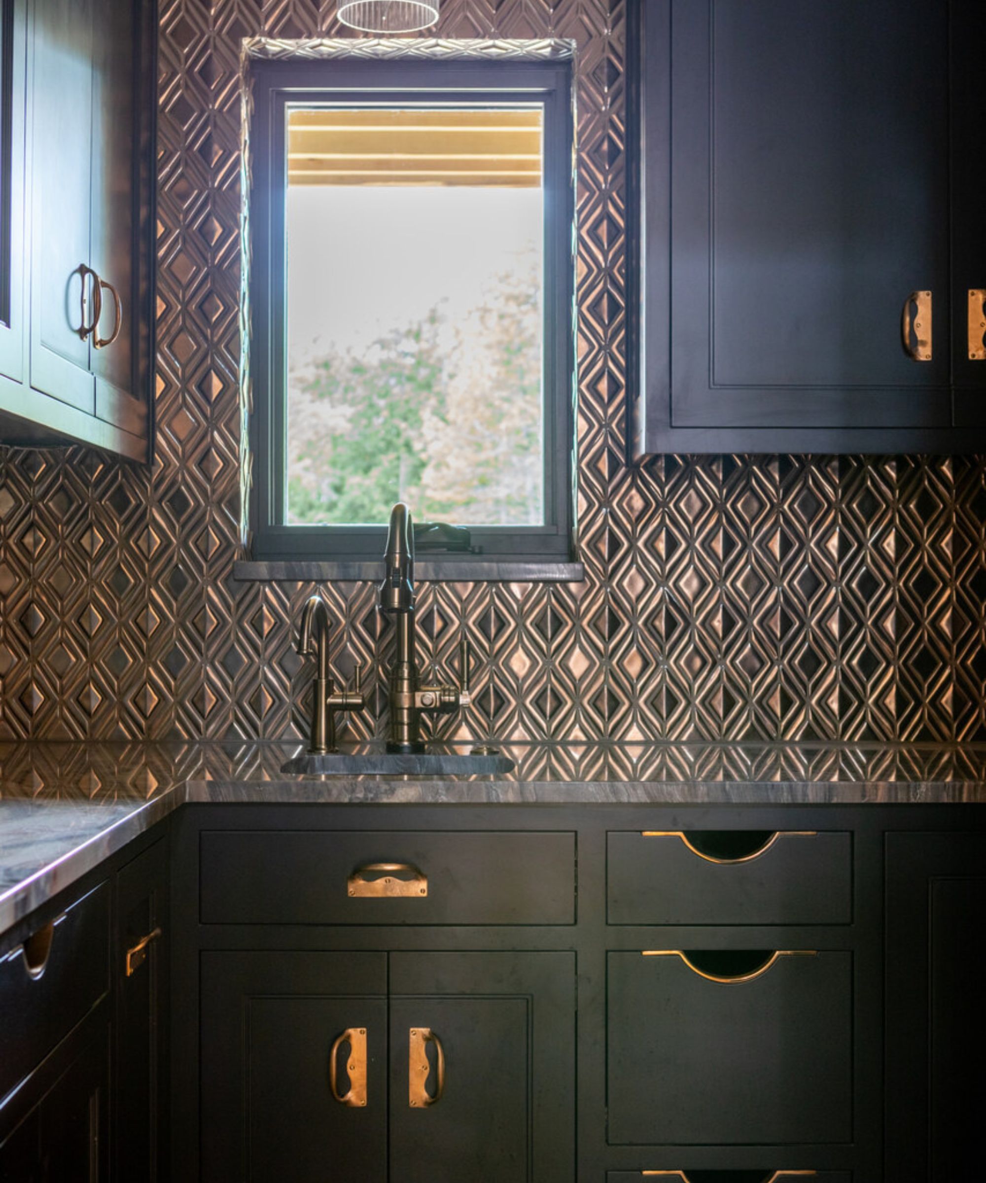
'After the Storm is an inky blue-black that accentuated the brass hand-made hardware in this pantry for an old-world feel,' explains interior designer Kelsey Haywood of Haywoodmade Interiors.
Although this paint color is dark and makes a statement, it's not as intense as true black which can feel too harsh, making it a great choice for the heart of the home or anywhere you want to create a moody atmosphere.
13. Truly Taupe
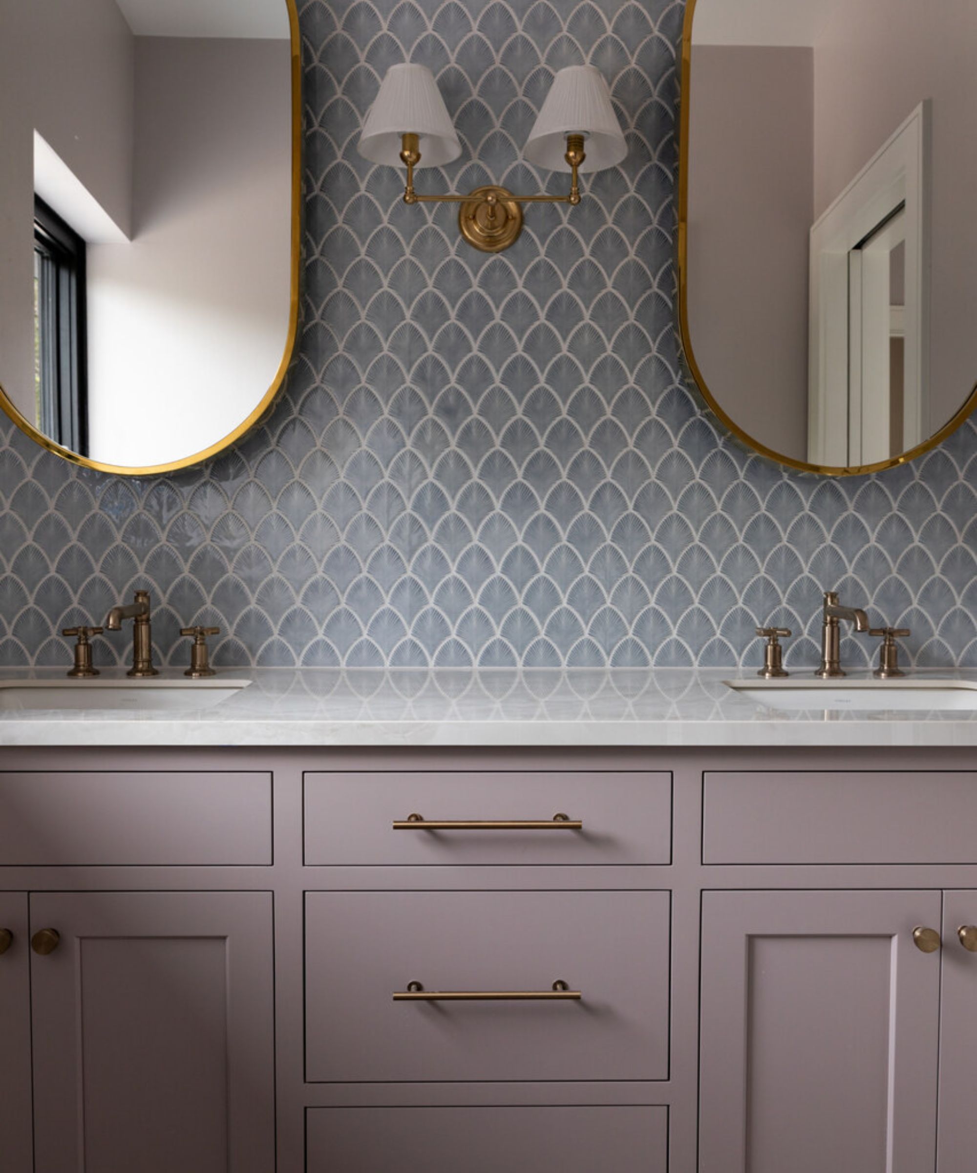
This bathroom was also designed by Haywoodmade Interiors, which features Sherwin-Williams' Truly Taupe on the bathroom cabinets. 'Truly Taupe was the feminine touch the guest room vanity needed paired with a quartzite countertop and blue fan tile,' explains Kelsey Haywood.
From timeless neutrals to richer shades, there are many Sherwin-Williams paint colors to choose from, catering to all types of homes and decorating styles. Whichever you're drawn to, make sure to test shades out as swatches so you can see how they look throughout the day.
Sign up to the Homes & Gardens newsletter
Design expertise in your inbox – from inspiring decorating ideas and beautiful celebrity homes to practical gardening advice and shopping round-ups.

Emily is a freelance interior design writer based in Scotland. Prior to going freelance in the spring of 2025, Emily was Homes & Gardens’ Paint & Color Editor, covering all things color across interiors and home decor for the Homes & Gardens website. Having gained specific expertise in this area, Emily is well-versed in writing about the latest color trends and is passionate about helping homeowners understand the importance of color psychology in home design. Her own interior design style reflects the simplicity of mid-century design and she loves sourcing vintage furniture finds for her tenement flat.
-
 Interior designers on the best piece of decorating advice they inherited from their parents and grandparents
Interior designers share the decorating advice passed down to them from their family – these are the key tips they've been carrying for years
-
 Can you paint a metal roof? Experts warn this could make or break your ‘worthy’ DIY efforts
Done right, it'll improve energy efficiency and avoid corrosion