Sherwin-Williams' October Color of the Month is a perfectly balanced green-toned dark blue – as a color editor tired of bland shades, here's why I love it
Neither too blue nor too green, Mount Etna is the paint color to know about for fall
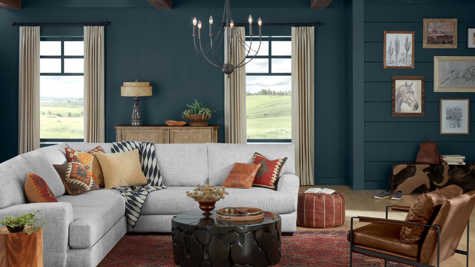
Dark paint colors have taken center stage this year. From dark forest greens to the deepest shades of blue; rich burgundies to sumptuous chocolate browns, there's been so much love for moody paint colors, and I predict their popularity will endure well into 2025.
As H&G's color editor, I've seen so many dark paint colors used throughout interior projects, but the latest to come to the fore is Sherwin-Williams' October Color of the Month: Mount Etna. Described as an 'ashy blue' with undertones of green and gray, it's a perfectly balanced blue that feels calming and sophisticated.
If, like me, you love the dark paint trend and are on the hunt for a stylish shade to complete your fall color schemes, read on to find out why I see this as the perfect moody color for the cozy season.
A post shared by Sherwin-Williams (@sherwinwilliams)
A photo posted by on
Both dark blue and dark green paints have been popular this year, and Sherwin-Williams' Mount Etna seems to combine both of these color trends. I'm a big fan of these 'in-between' hues that don't fall distinctively into one camp. Dark blue paints, for example, can appear outdated if they fall too far into the navy blue category, a trend that had so much appeal a few years ago; while dark greens can really dominate rooms with highly warm tones.
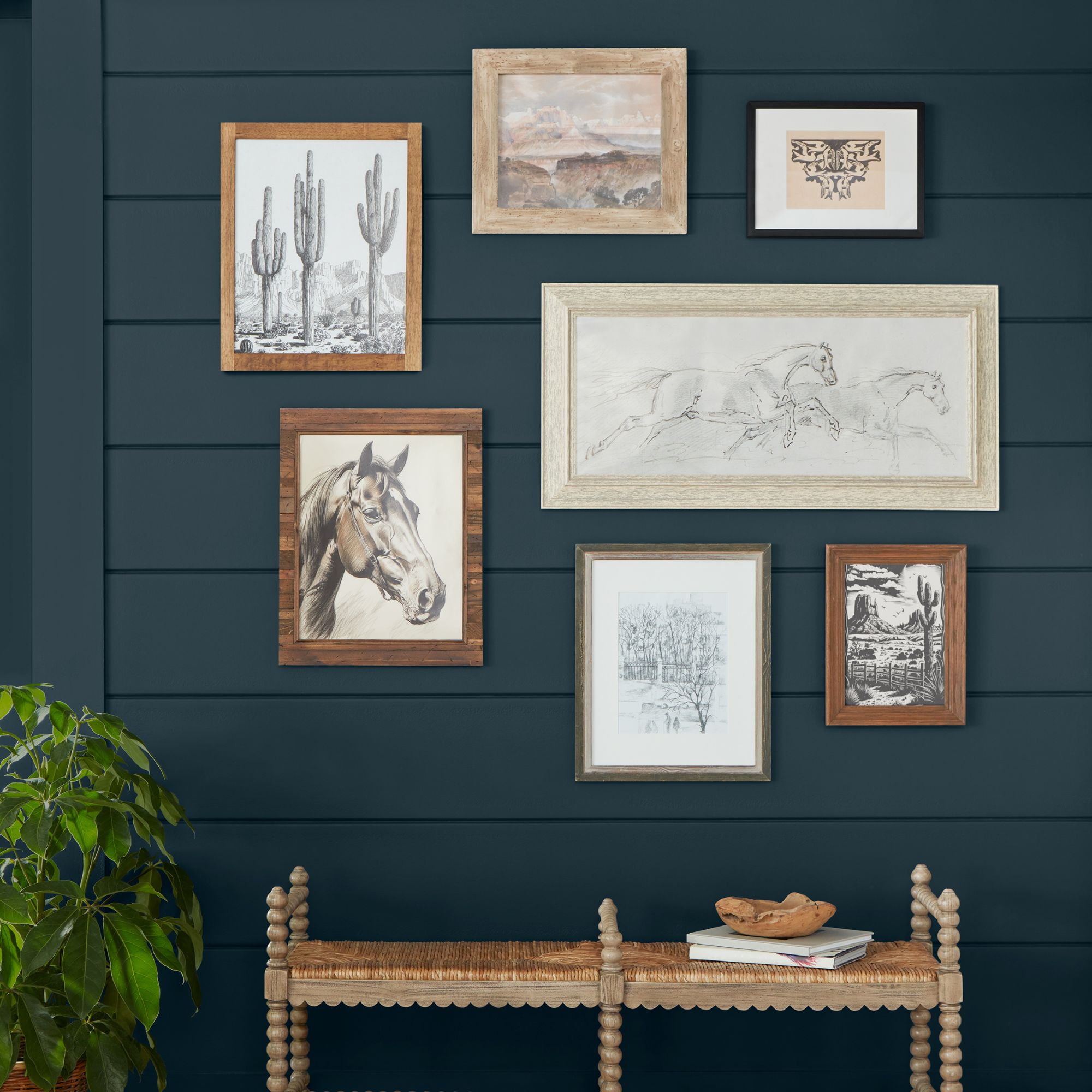
Providing a combination of blue, green, and gray, this paint color will add interest to your interior schemes – a fresh alternative to classic navy blue.
Mount Etna, on the other hand, has an incredibly liveable quality that I would argue provides a more timeless finish than a classic dark blue or dark green would. Since it features a unique blend of undertones that means it can't be defined as a singular color, it's less likely to date or feel overly trend-led.
Another reason I love this paint color is that it boasts a natural quality. Blue, green, and gray all conjure images of the natural world, and the subtlety of each hue gives it a calming, restful feel.
While dark paint colors like Mount Etna can be daunting to decorate with, especially if you're used to decorating with neutrals, there are lots of ways to successfully embrace this hue. Sherwin-Williams recommends using it as an accent color, including on cabinetry or on a fireplace for a pop of rich color.
Sign up to the Homes & Gardens newsletter
Design expertise in your inbox – from inspiring decorating ideas and beautiful celebrity homes to practical gardening advice and shopping round-ups.
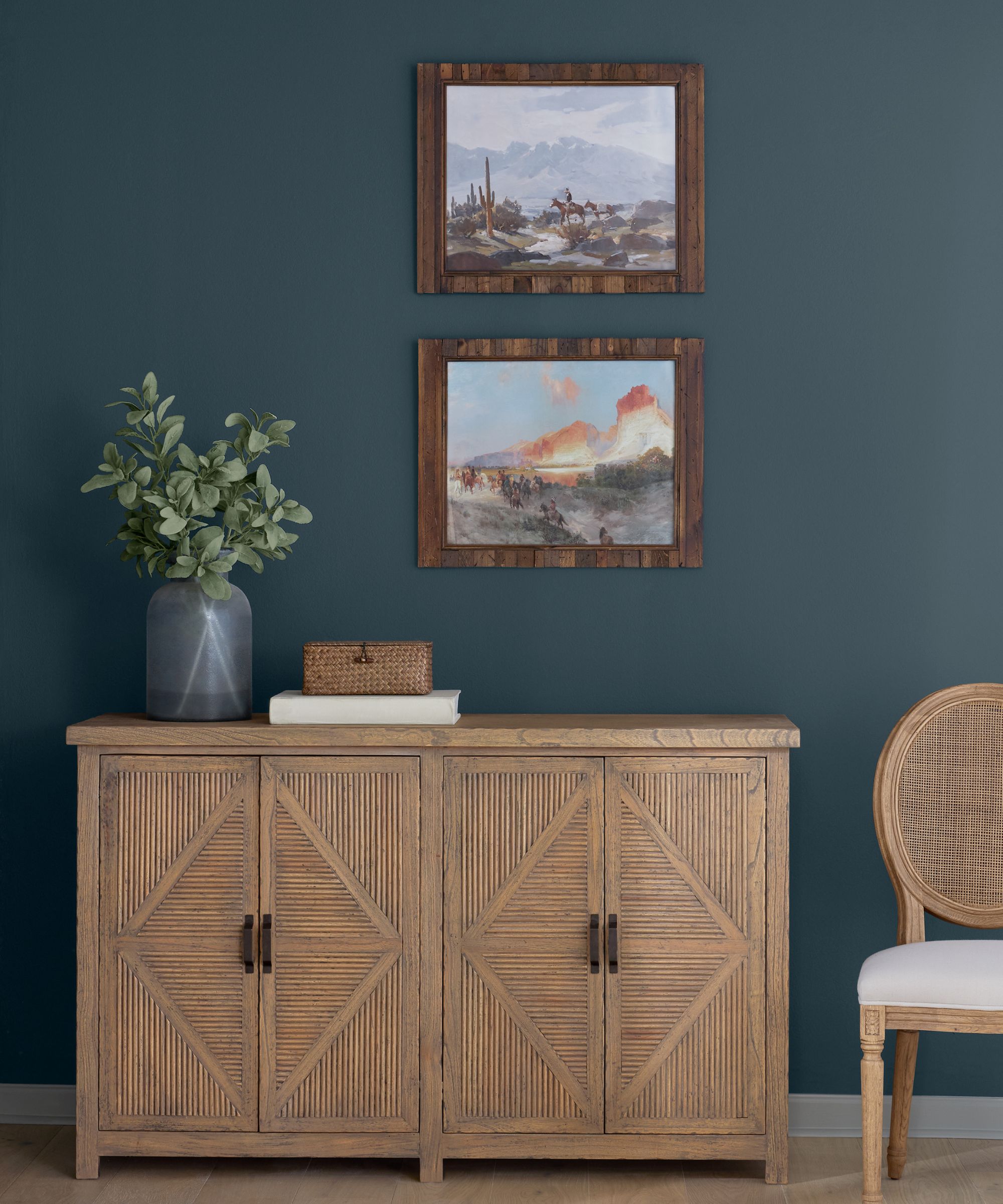
If you decide to use this color as an accent, it's important to pair it with the right paint colors. According to Sherwin-Williams, some of the most complementary are Extra White, a classic fresh white paint for a timeless look; Natural Choice, a creamy off-white for more of an organic, relaxed look; and Edgy Gold, a dark, rich yellow for a colorful scheme.
Alternatively, I envision this paint shade used for color-drenching ideas which is one of the most on-trend ways to embrace dark hues right now. Working especially well in small rooms such as bedrooms, homes offices, or even laundry rooms, take this color everywhere to include the ceiling, woodwork, and doors for a fully cohesive look. Complete the look with cozy textiles and you'll soon have a scheme ready for the winter months.
If you want to embrace the trend of decorating with dark paint colors while keeping the overall look timeless, colors like Mount Etna are a failsafe choice. Providing intrigue with its blend of undertones and a soothing quality with its natural world feel, use this color this fall for a cozy and stylish space.

Emily is a freelance interior design writer based in Scotland. Prior to going freelance in the spring of 2025, Emily was Homes & Gardens’ Paint & Color Editor, covering all things color across interiors and home decor for the Homes & Gardens website. Having gained specific expertise in this area, Emily is well-versed in writing about the latest color trends and is passionate about helping homeowners understand the importance of color psychology in home design. Her own interior design style reflects the simplicity of mid-century design and she loves sourcing vintage furniture finds for her tenement flat.
-
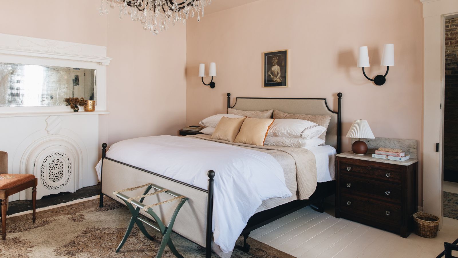 We asked 10 interior designers to share the colors they always tell clients to use in a bedroom – these were the shades that came up top
From soothing blues to soft pinks, these are designers' go-to shades for stylish and calming bedrooms
By Emily Moorman
-
 The fastest growing flowers to plant in spring
Sow these seeds now and be greeted with early summer color and repeat blooms in your yard
By Jacky Parker