Sherwin-Williams' November Color of the Month is a 'bold yet understated' take on the purple trend – here's all you need to know
This purple paint provides a liveable way to introduce this daring color
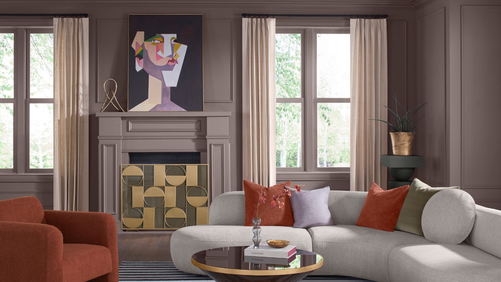

If you've been keeping up to speed with the latest color trends, then you'll no doubt have heard all about purple and its return to the world of interior design. An often daring and nostalgic hue, purple is the unexpected, need-to-know-about shade right now, and the latest paint brand to cement that is Sherwin-Williams.
Its November Color of the Month, Chinchilla SW 6011, is a muted purple paint, serving as a liveable and sophisticated way to tap into this prominent color trend. In addition to this standout hue, Sherwin-Williams has curated a wider color palette that has your cozy fall colors sorted.
Read on to learn about this grounding paint that's perfect for decorating with purple this fall, as well as the wider color palette, as explained by Emily Kantz, Color Marketing Manager at Sherwin-Williams.
A post shared by Sherwin-Williams (@sherwinwilliams)
A photo posted by on
'Chinchilla SW 6011 and its accompanying palette balance modernity and timeless charm thanks to the unique muted hues,' explains Emily.
'Chinchilla SW 6011 is a chalky purple that exudes effortless luxury and brings a sense of softness to any room. It is bold yet understated and creates a sophisticated canvas for layering with other textures and colors,' Emily adds.
In addition to the standout hue of Chinchilla, there are seven other paint colors within the November palette, all of which feel earthy and grounding. 'We’re calling this the 'Urban Aunt' palette because it is built on a foundation of neutrals and warmth with pops of elegant bolds,' explains Emily.
'It includes one of our most popular darks, Iron Ore SW 7069, creamier neutrals and grays like Mortar SW 9584, Skyline Steel SW 1015, and Homburg Gray SW 7622,' says Emily. 'The palette is rounded out with pops of olive green, terracotta, and deep burgundy in Twig Basket SW 9529, Roycroft Adobe SW 0040, and Rookwood Dark Red SW 2801.'
Sign up to the Homes & Gardens newsletter
Design expertise in your inbox – from inspiring decorating ideas and beautiful celebrity homes to practical gardening advice and shopping round-ups.
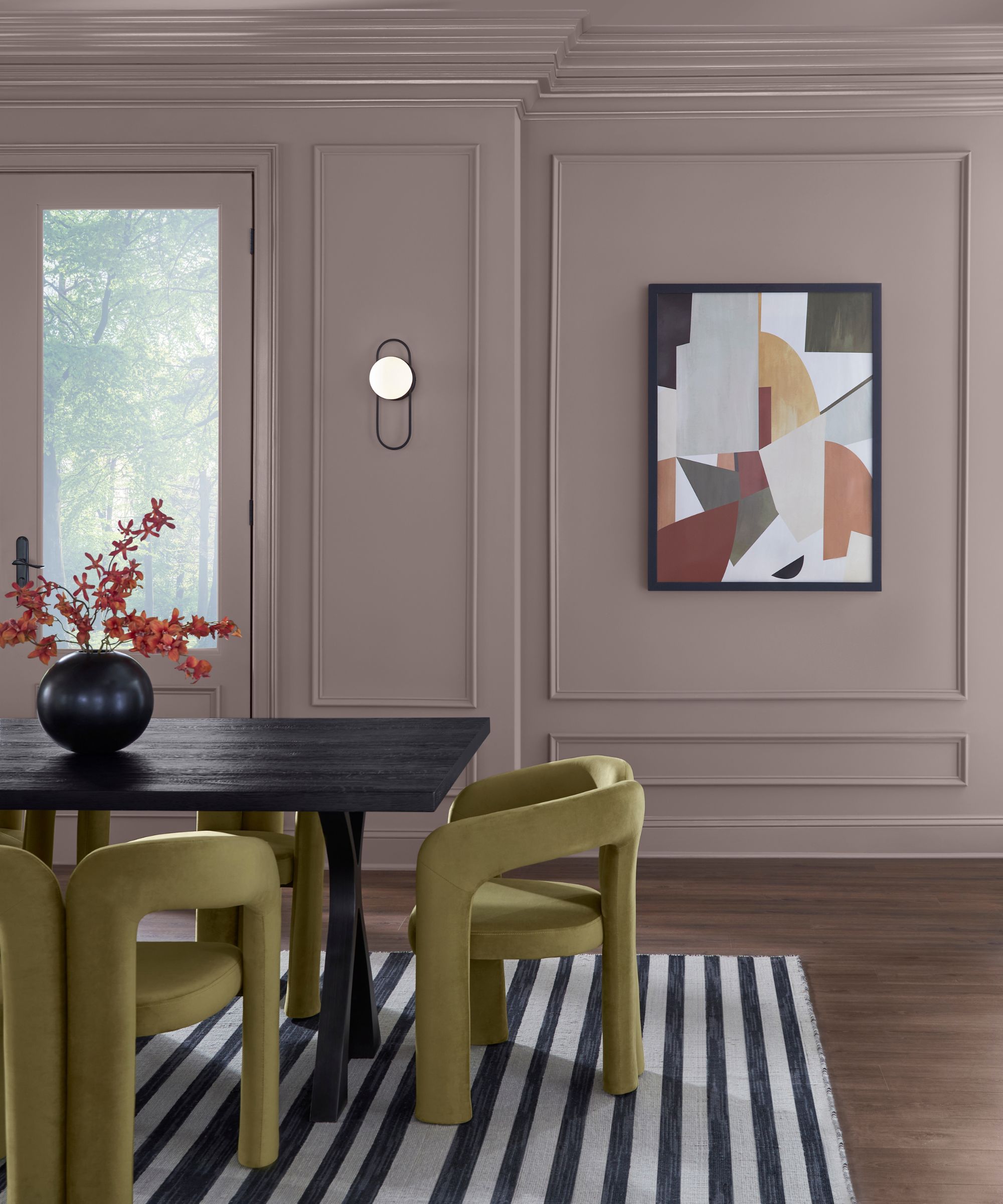
There are many ways to decorate with this palette, depending on how bold you want to go. Consider using shades such as Skyline Steel, a warm-toned gray on kitchen walls with Homburgh Gray, a dark green-gray across kitchen cabinets. The bolder, more dramatic hues within the palette like Rookwood Dark Red, a deep, brown-red, would work wonderfully as accent colors to uplift neutral rooms.
Alternatively, go for an on-trend look by turning to the palette's purple paint. Purple room ideas have been gaining endless appeal lately, and we predict this will be a color trend that will endure well into 2025. That said, purple isn't always the easiest color to decorate with, especially if you're someone who usually prefers a softer, more neutral look. Chinchilla, however, is a great way to dabble into this daring trend without going overboard – its relaxed and muted tones ensure a liveable look that's far from garish.
One expert-approved way to decorate with Chinchilla is to explore color-drenching ideas. Using the color generously in one room will help create a cozy feel that avoids harsh contrasts, perfect for fall color schemes.
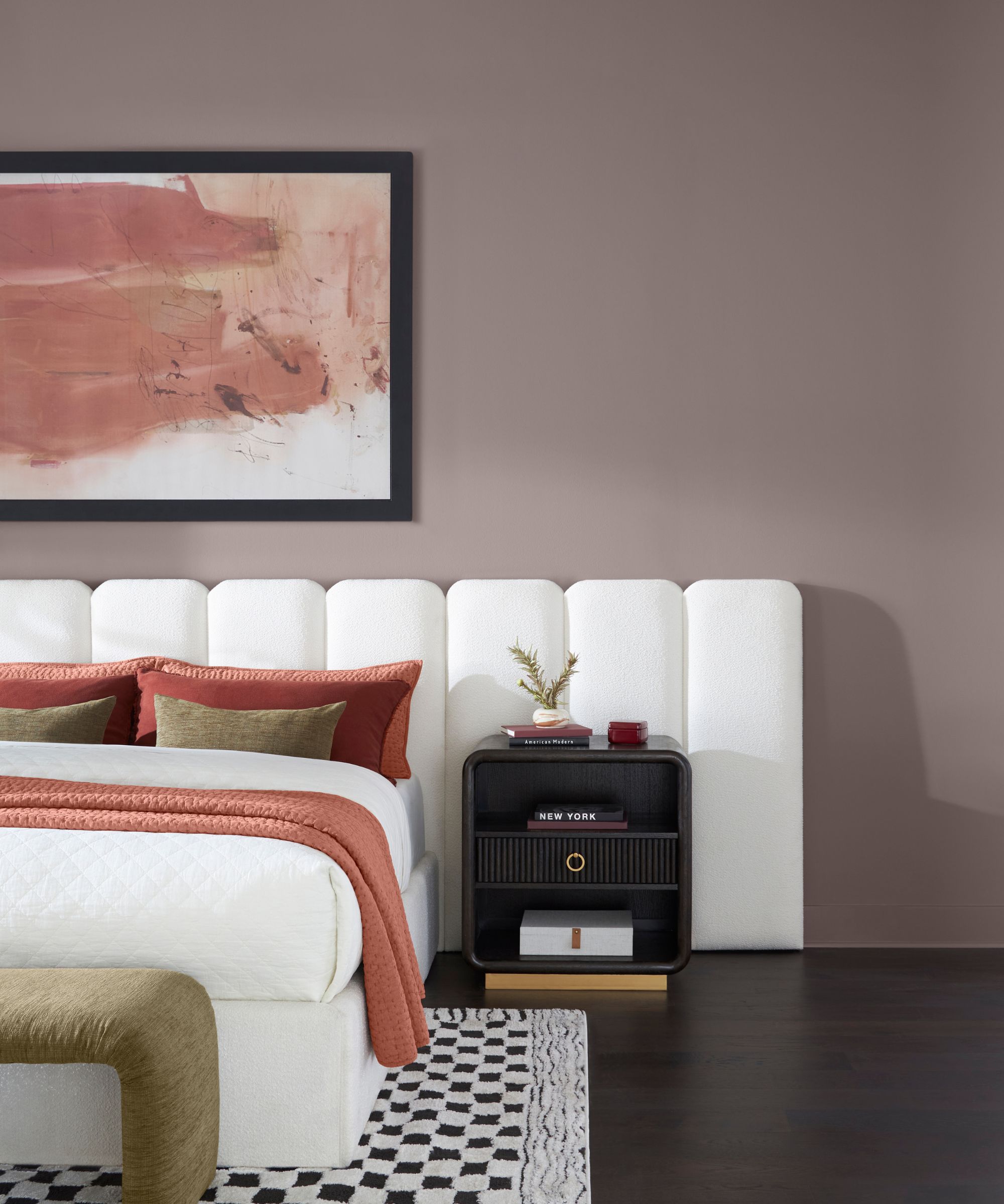
'We’ve been seeing the trend of color drenching really pop this year and I’d love to see a bedroom or living room color-drenched in Chinchilla,' says Emily. 'The natural light in a room will really show the depth and dimension of this dusty purple, giving your space so much personality. For a homeowner using this shade, I’d recommend adding shapely furniture with bold upholstery and eye-catching art pieces to bring a room to life.'
If your home is in need of a refresh through paint ideas, why not opt for a soft, muted purple like Chinchilla SW 6011 or other shades within the November palette? These grounding hues will add plenty of depth to your home and make a welcomed change from decorating with neutrals.
'This fall, we’re all about cozying up at home and finding tranquility in personal spaces and this color and palette give a touch of drama enveloped by weighted luxury,' says Emily.

Emily is a freelance interior design writer based in Scotland. Prior to going freelance in the spring of 2025, Emily was Homes & Gardens’ Paint & Color Editor, covering all things color across interiors and home decor for the Homes & Gardens website. Having gained specific expertise in this area, Emily is well-versed in writing about the latest color trends and is passionate about helping homeowners understand the importance of color psychology in home design. Her own interior design style reflects the simplicity of mid-century design and she loves sourcing vintage furniture finds for her tenement flat.
-
 Kevin Bacon and Kyra Sedgwick's rustic kitchen island is stunning, but controversial – designers say you can get the look without the hassle
A popular material finds an unorthodox home in the couple's kitchen, but experts disagree on whether it should be used – here's how to do it instead
By Sophie Edwards
-
 How to grow grapefruit for homegrown sweet and tangy, highly nutritious harvests – a fruit tree expert shares their planting and care tips
From planting to harvesting, this is all you need to know about grapefruit trees
By Drew Swainston