These are Sherwin-Williams' most calming paint colors – 5 delicate shades for a relaxing home
Create a restful home with these pared-back and gentle paint colors
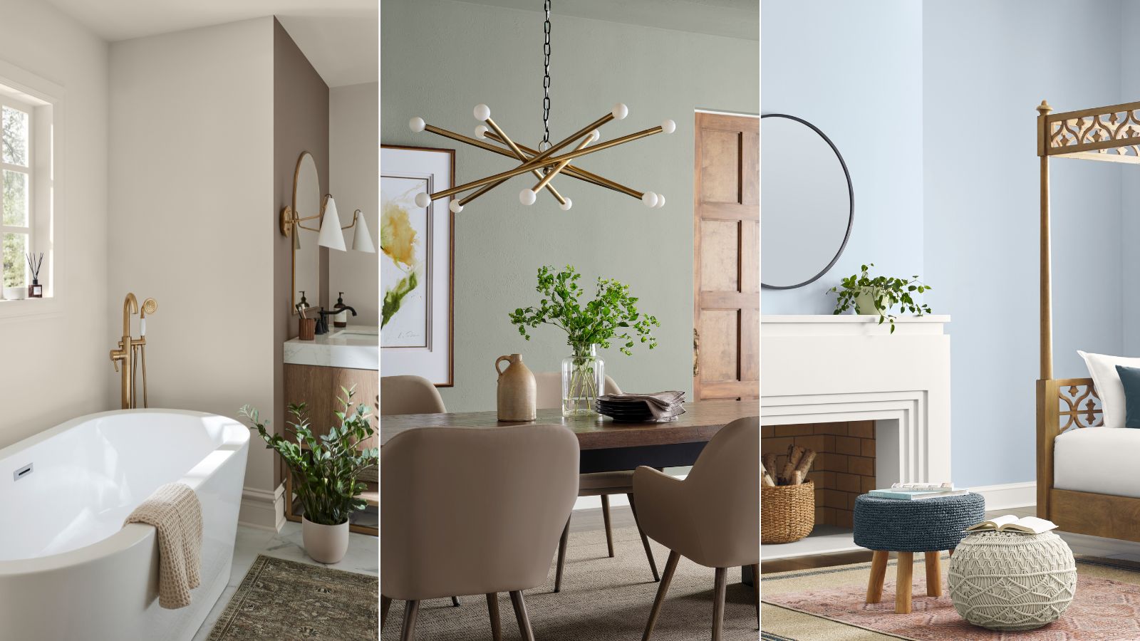

When it comes to shaping how your home feels, your chosen paint colors are one of the most, if not the most, important factors. While highly saturated shades feel energizing and muted tones feel more soothing, the right paint colors are key to setting your chosen mood.
In 2025, one of the most appealing moods for our homes is relaxed, and Sherwin-Williams is a go-to paint brand when it comes to undisturbed paint colors that work across many decorating styles and homes.
Below, we've rounded up Sherwin-Williams' most calming colors to give you some paint ideas for your next decorating project.
Sherwin-Williams' most calming paint colors
From off-whites that add subtle warmth to soft shades of blue and green, these Sherwin-Williams calming paint colors are versatile to use across many decorating styles.
Upward SW 6239
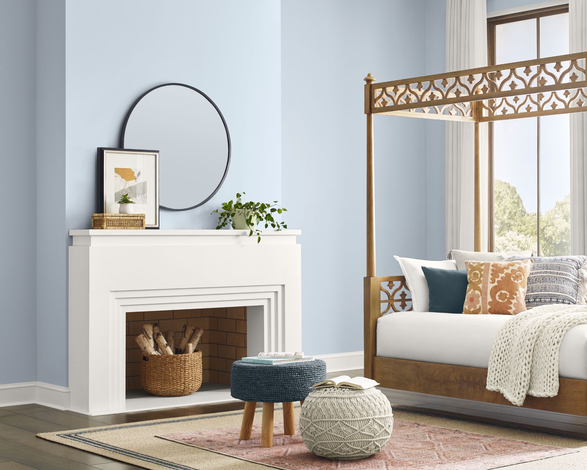
Blue paint is well known as a soothing interior color, especially light tones which help to create restful spaces to unwind in such as bedrooms and bathrooms. One of Sherwin-Williams' most calming colors is Upward, a gentle blue-gray which was used here.
'Our 2024 Color of the Year, Upward SW 6239, is a light airy blue that creates spacious and brighter looks, evoking feelings of calmness and serenity,' explains Emily Kantz, Color Marketing Manager at Sherwin-Williams. 'This uplifting blue breathes air into any space, and I especially love it in a bedroom as a retreat from the world.'
Drift of Mist SW 9166
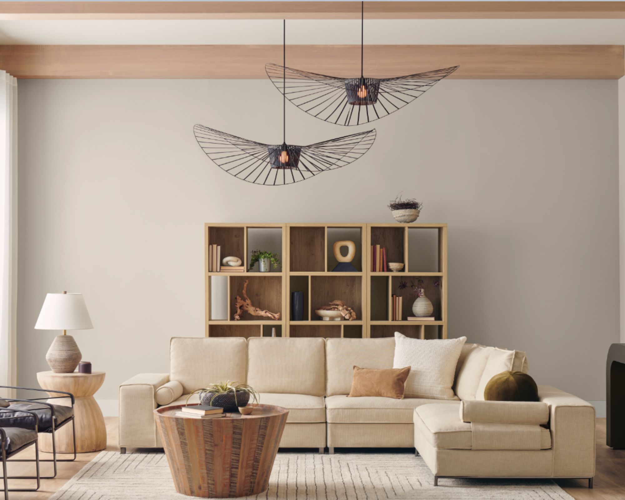
Although technically a gray paint, Sherwin-Williams' Drift of Mist doesn't feel drab but instead soothing and cozy, making it a great all-rounder neutral paint for many rooms.
'Warms and neutrals are also great for creating a sanctuary-like space that induces rest and relaxation,' says Emily. 'I recommend Drift of Mist SW 9166 in a bedroom or bathroom to create an in-home spa grounded in other neutrals and earthy tones. It is also a favorite of mine for spaces that lack natural light where you want to really open up the room.'
Alabaster SW 7008
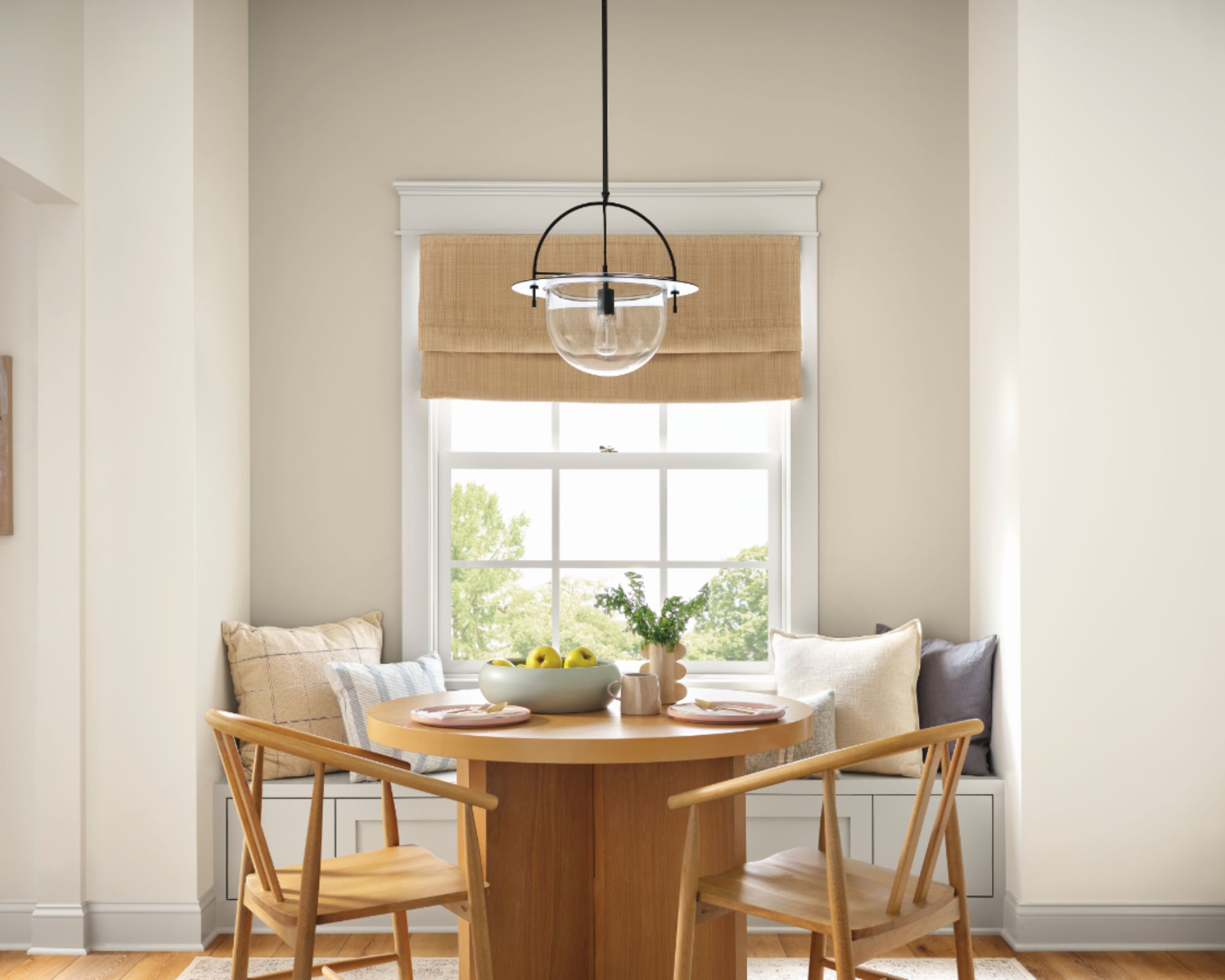
Sherwin-Williams' Alabaster is a popular white paint that's frequently recommended by interior designers. Its undertones ensure it doesn't feel at all stark but welcoming and soft, giving it a calming feel.
'Cool whites like Alabaster SW 7008 can also create a clean and calm feeling,' Emily explains. 'There is a stigma that whites are always bright and sterile when they can be bright without losing the warmth and earthiness. This shade would be great in a bedroom paired with natural accents or very light blues, greens, and pinks.'
Shoji White SW 7042
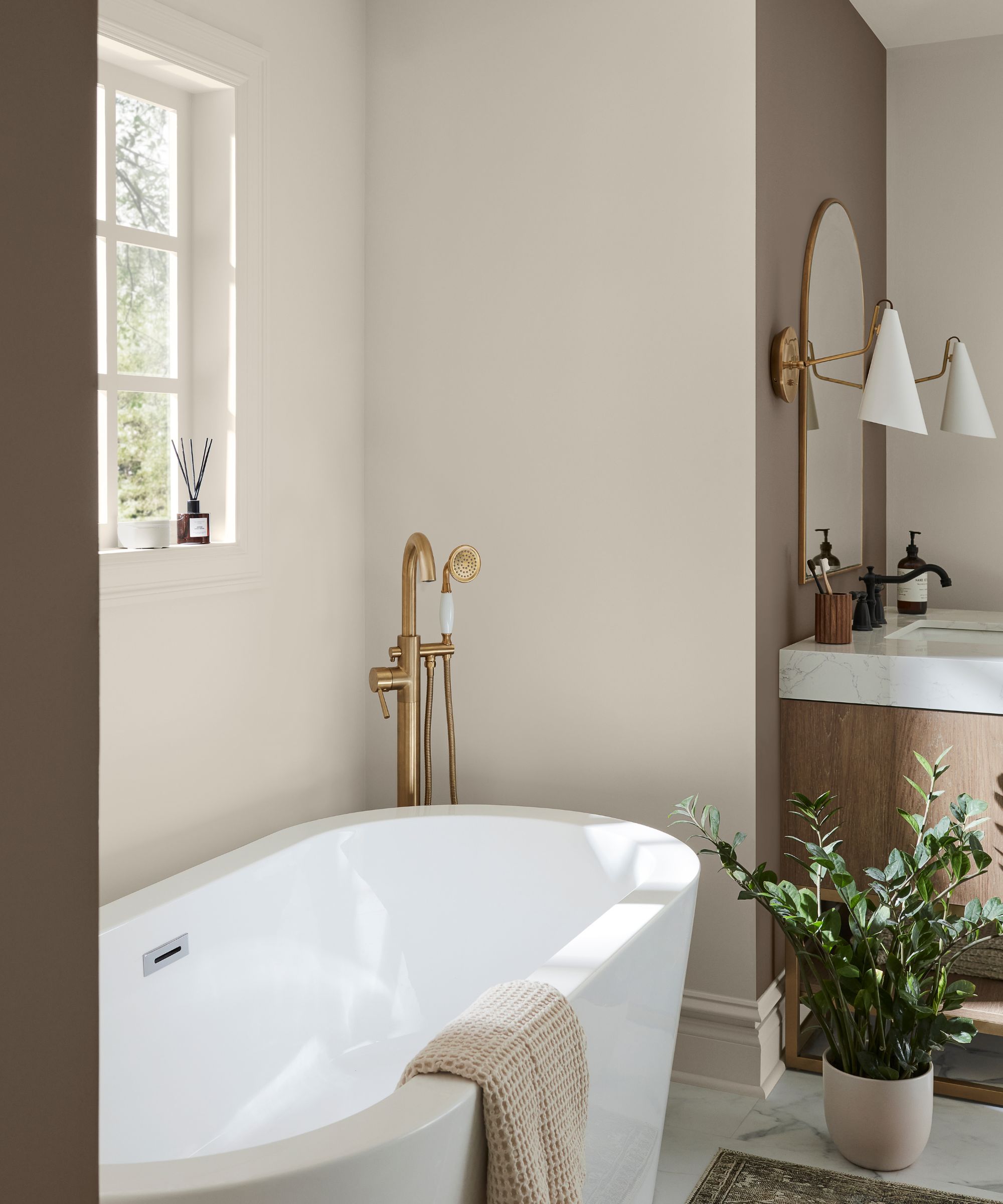
Another white paint by Sherwin-Williams that's said to feel calming is Shoji White. A warming hue, Shoji White adds more depth than a true white but doesn't lean too yellow, working well in many rooms.
'Shoji White SW 7042 is another crowd favorite that brings refuge and respite to any room,' Emily says. 'This warm and creamy white is simply modern yet soft enough to create a haven in a bedroom or bathroom, but also neutral enough to introduce to a kitchen or dining room.'
Evergreen Fog SW 9130
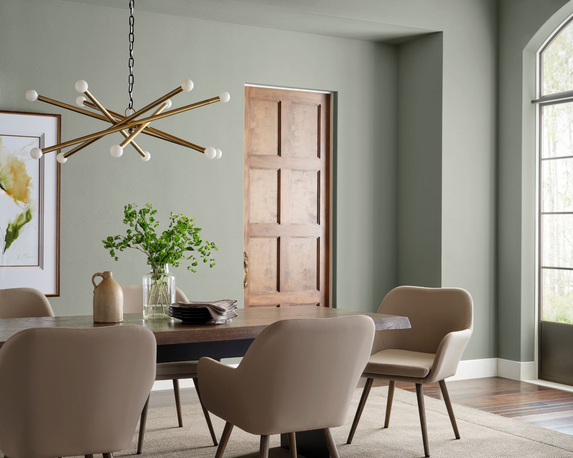
Lastly, if you want to inject more color into your calming scheme, go for Sherwin-Williams' Evergreen Fog, a soft and muted green paint with gray tones that feels instantly restful thanks to its association with the natural world.
'Evergreen Fog SW 9130, our 2022 Color of the Year, is a gentle green with gray undertones that we like to call the perfect green,' Emily tells us. 'It’s not too bold but great for homeowners that want to explore a little bit of color. Color drenching is all the rage and a great way to create a relaxing space that just engulfs you in peace – and this green is a wonderful choice.'
Which of these calming paint colors by Sherwin-Williams is your favorite? Not only are each of these shades relaxing, but they all feel timeless, allowing your room color ideas to look great for years to come.
Sign up to the Homes & Gardens newsletter
Design expertise in your inbox – from inspiring decorating ideas and beautiful celebrity homes to practical gardening advice and shopping round-ups.

Emily is a freelance interior design writer based in Scotland. Prior to going freelance in the spring of 2025, Emily was Homes & Gardens’ Paint & Color Editor, covering all things color across interiors and home decor for the Homes & Gardens website. Having gained specific expertise in this area, Emily is well-versed in writing about the latest color trends and is passionate about helping homeowners understand the importance of color psychology in home design. Her own interior design style reflects the simplicity of mid-century design and she loves sourcing vintage furniture finds for her tenement flat.
You must confirm your public display name before commenting
Please logout and then login again, you will then be prompted to enter your display name.
-
 Step inside this British stately kitchen that's steeped in country charm – a kitchen built for now, with the soul of another era
British kitchen designers Guild Anderson reimagined the layout of this characterful kitchen, crafting a bespoke kitchen design that honours the heritage and enduring charm of this historic Cornish home
By Caroline Moratti
-
 How to arrange flowers like a professional – these 5 rules are all you need according to floral experts
We asked floral experts for their advice on arranging flowers, whatever the season – create stunning floral displays all year round with these rules
By Katrina Harper-Lewis