Sherwin-Williams has revealed its most unpopular color, and why we should actually be using this unexpected paint more
It may be unpopular, but Sherwin-Williams' 'Loneliest Color' is endlessly sophisticated
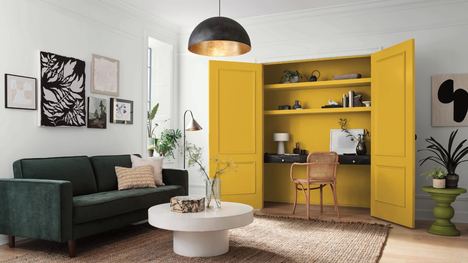

Within color trends, we're all familiar with the most prominent hues. This year, blues and greens are leading the way, not least having dominated many paint brands' Color Of The Year selections for 2024.
But what about the colors that aren't topping the color trends? Sherwin-Williams has the answer. Today, the Ohio-based paint brand launches The Loneliest Color, a first-of-its-kind color story focusing on the most unpopular paint colors.
The Loneliest Color has been initiated to prove that popularity should not be the sole driving force in determining home decor color schemes; shedding light instead on hues that are often overlooked amid the trend-topping paint ideas.
What is The Loneliest Color?
For its inaugural 2024, Sherwin-Williams' Kingdom Gold has been revealed as The Loneliest Color, officially the paint brand's 'least tinted' color. When demand is compared to that of shades generally regarded as more tasteful, it proves that mainstream popularity can hold back color choices based instead on personal tastes.
'After years of forecasting color trends of what will be popular for the year, or even years to come, we decided to take a step back and not only rethink how we celebrate color, but how we can be better stewards of building the confidence consumers need when choosing a color,' explains Brett White, Senior Vice President of Sales and Marketing at Sherwin-Williams.
'The Loneliest Color allows us to shed light on a hue that is unexpected and out of the ordinary for some,' continues Brett.
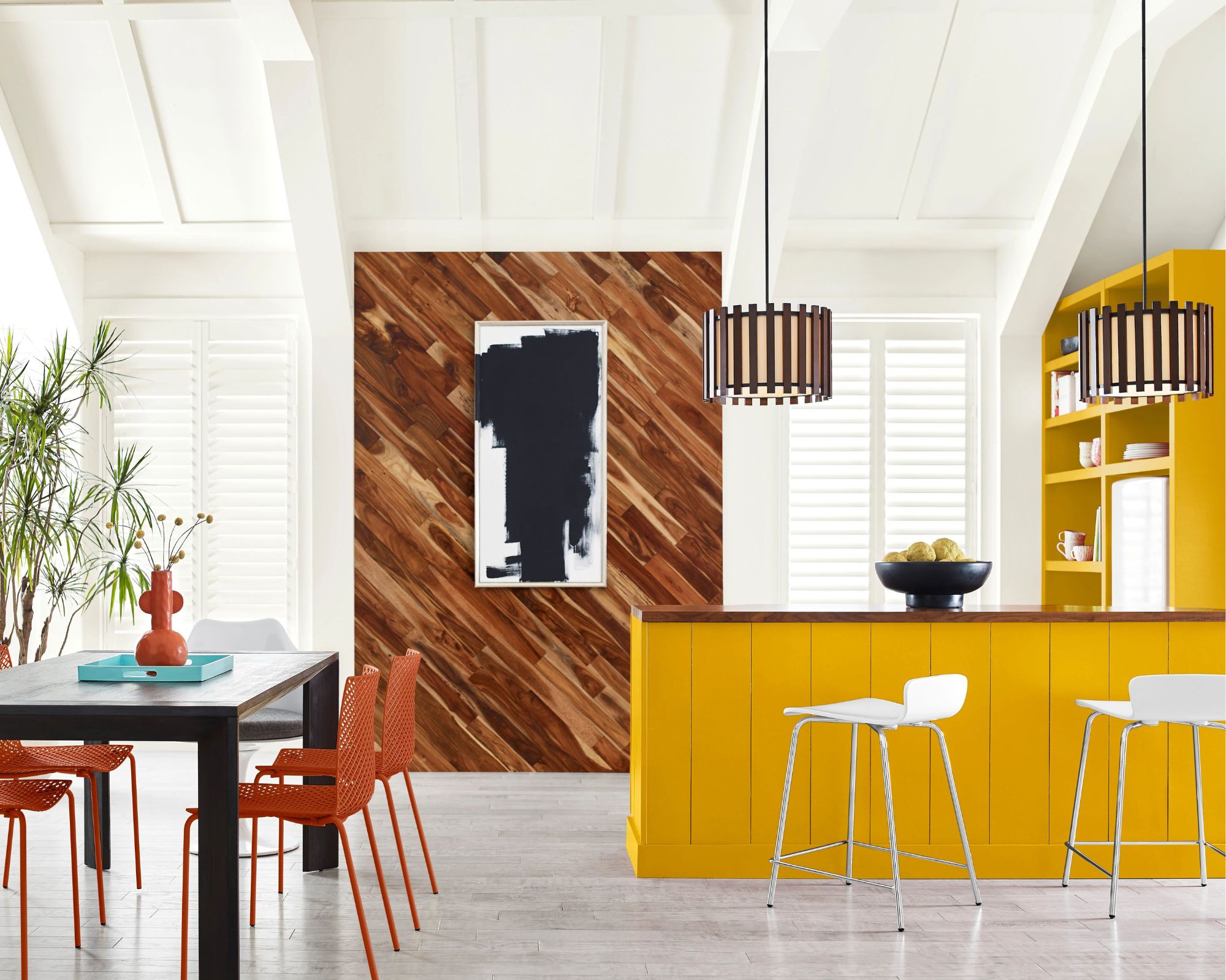
Sherwin-Williams has appointed fashion designer Dapper Dan to the role of Creative Director of The Loneliest Color. In collaboration with Sue Wadden, Sherwin-Williams' Director of Color Marketing, the designer has reimagined Kingdom Gold into a collection of 'wearable art' to mark the new color story.
Sign up to the Homes & Gardens newsletter
Design expertise in your inbox – from inspiring decorating ideas and beautiful celebrity homes to practical gardening advice and shopping round-ups.
'We’re thrilled to embark on this journey in partnership with Dapper Dan as Creative Director of The Loneliest Color,' says Brett. 'His expertise in design transcends fashion and is sure to bring new perspective to those considering bold colors in residential and commercial projects alike.’
What color is Kingdom Gold?
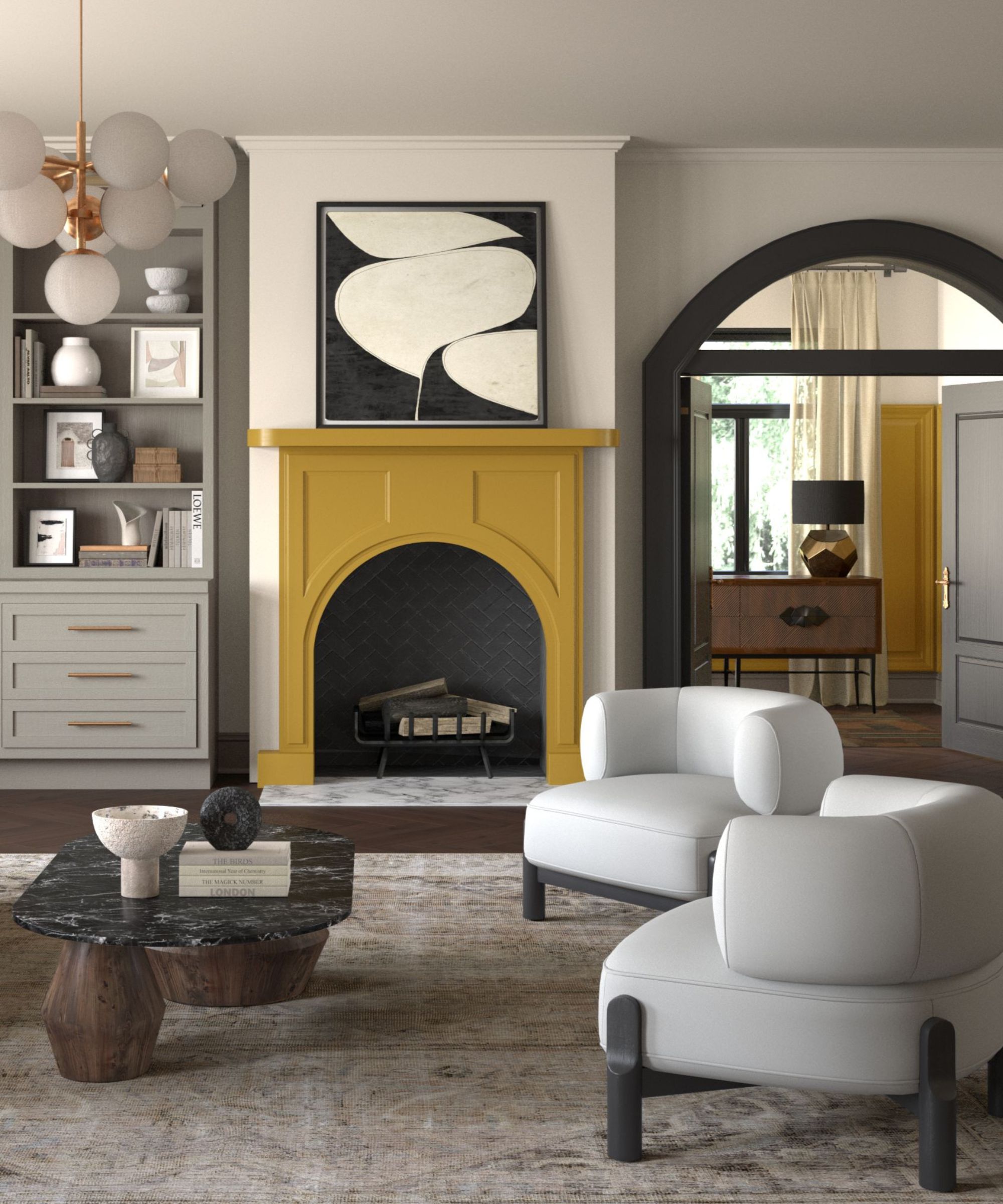
Kingdom Gold is described as a 'luminous' shade of gold, with a high saturation and green undertones.
Certainly a bold paint choice, Sue tells H&G that this color can typically take a bit more consideration for an effective look:
'These types of gold shades are not usually considered popular since using them in interior spaces can be challenging due to their intensity and potential for overstimulation.'
'While shades like Kingdom Gold are vibrant and uplifting, they may take experimentation to find the right palette and colors for someone’s style and taste,' continues Sue. 'The unexpected advantage of using this shade correctly is the touch of decadence and elegance it can add to a space while also highlighting architectural details in a space.'
How to decorate with Kingdom Gold
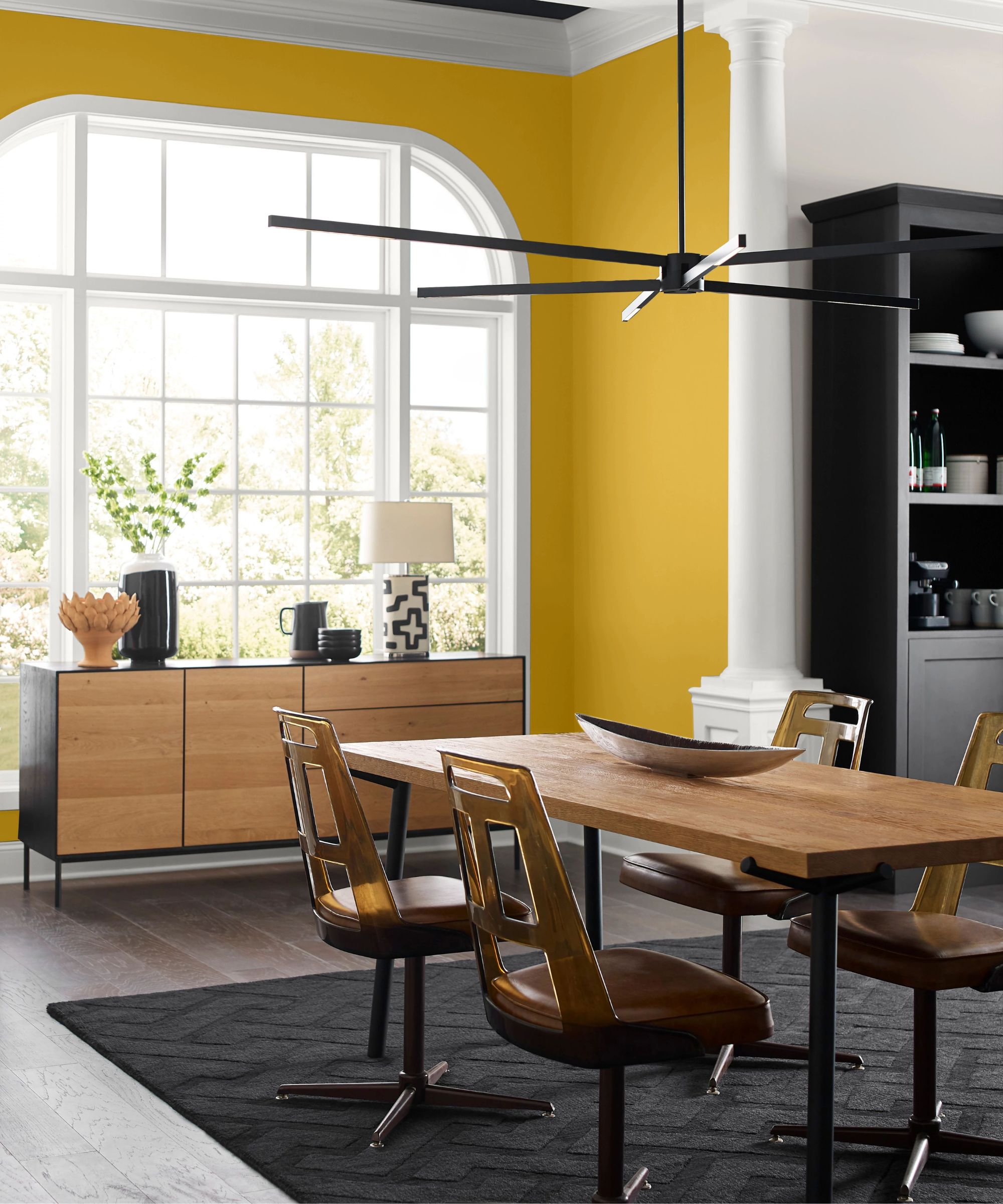
Decorating with gold may sound daunting, but it can indeed be an incredibly effective color choice for a sophisticated, timeless look.
To spark some ideas on how to incorporate this color into your home decor ideas, we asked Sue her favorite ways to decorate with Kingdom Gold.
'My favorite way to incorporate Kingdom Gold is through a feature or accent wall, says Sue. 'This approach works especially well in larger rooms or spaces with ample natural light, as it prevents the color from overpowering the space.'
In addition, if you want to lean into the sophisticated appeal of this gold paint, Sue advises using it primarily in social spaces: 'I recommend using the shade in rooms where homeowners host guests since it provides a touch of elegance and drama for entertaining like dining rooms, living rooms, or entryways.'
For a balanced look, it's important to pair Kingdom Gold with the right hues, as Sue explains: 'Pairing Kingdom Gold with complementary colors on other walls or in the decor can balance the look – like trending deep blues and purples for contrast, such as Sherwin-Williams' In The Navy and Carnelian; analogous warm oranges or yellows for harmony like Sierra Redwood; and neutral tones for balance like Stamped Concrete.'
When we asked Sue how to ensure this gold paint maintains a liveable feel and avoids overpowering an interior scheme, she reinforced the importance of using it in bright, open spaces:
'The best way to make this shade feel liveable as a wall color is by only including it in large rooms with ample natural light and in spaces where homeowners want that vibrant and dramatic energy.'
However, she adds that it will still add impact when used in smaller amounts, as a 'pop of color on accent walls, trims, doors or adjacent rooms.'
From today until April 14, The Loneliest Color wearable art collection will be auctioned on eBay, for US and Canadian residents, with 100% of the proceeds set to be donated to the charity Habitat for Humanity.

Emily is a freelance interior design writer based in Scotland. Prior to going freelance in the spring of 2025, Emily was Homes & Gardens’ Paint & Color Editor, covering all things color across interiors and home decor for the Homes & Gardens website. Having gained specific expertise in this area, Emily is well-versed in writing about the latest color trends and is passionate about helping homeowners understand the importance of color psychology in home design. Her own interior design style reflects the simplicity of mid-century design and she loves sourcing vintage furniture finds for her tenement flat.
-
 These are the 6 things designers say you should never put in a small living room
The items that should be banned from a small living room are right here along with what you should opt for instead
By Sarah Warwick
-
 I always get my small space storage from Wayfair – and these discounted $35 Martha Stewart storage boxes are the perfect fix for my tiny vanity
I'm going vertical for tiny space storage success with this Early Way Day 2025 bargain
By Punteha van Terheyden