Sherwin-Williams' latest color palette is inspired by Impressionism – combining 5 soft shades that are perfect for summer
These nature-derived tones create a sophisticated summer color scheme


Design expertise in your inbox – from inspiring decorating ideas and beautiful celebrity homes to practical gardening advice and shopping round-ups.
You are now subscribed
Your newsletter sign-up was successful
Want to add more newsletters?
As summer draws closer, it's the perfect time to decorate our homes with a fresh and seasonal color scheme. And while talk of summer may conjure images of extremely bright and vivid hues, that doesn't need to be the case, as proven by Sherwin-Williams with their latest color palette.
Taking reference from the rich, nature-derived colors from Impressionism, the Impressionist Period palette is the perfect inspiration for a slightly muted take on summer colors.
Here, we take a closer look at each of the paints included in the palette and share some expert-recommended ways to decorate with them throughout the home.
Article continues belowA post shared by Sherwin-Williams (@sherwinwilliams)
A photo posted by on
What colors are included in the Impressionist-inspired palette?
'The Impressionist Period palette is a take on a dreamy landscape depicting a bright blue sky and a grassy field drenched in summer sunlight,' explains Emily Kantz, Color Marketing Manager at Sherwin-Williams. 'The palette, like impressionist paintings, feels dreamy and whimsical – romanticizing all spaces.'
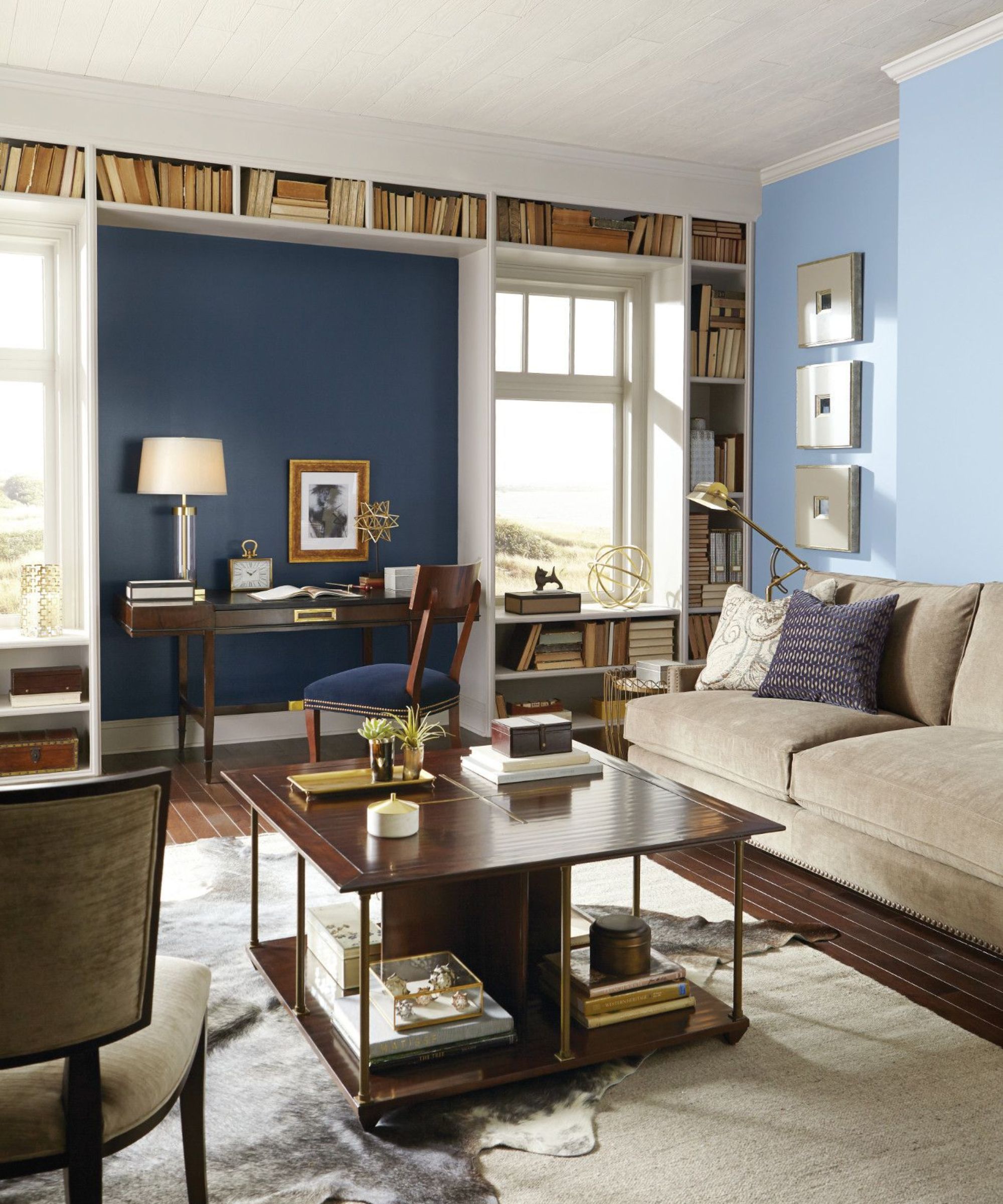
The Impressionist Period palette includes five earth-toned hues, from calming blues to off-white. Starting with Daphne, a mid-tone blue with warm gray undertones that feels calm and livable. 'I love Daphne SW 9151 because it has a hint of warmth that propels us toward spring and summer, providing a look that is fresh and different,' says Emily.
Anchors Aweigh SW 9179 is the second shade of blue within the palette but is much darker than Daphne, which Emily loves for its versatility. 'It is a dark rich navy that is tried and true and plays well with so many other colors even outside this palette,' continues Emily.
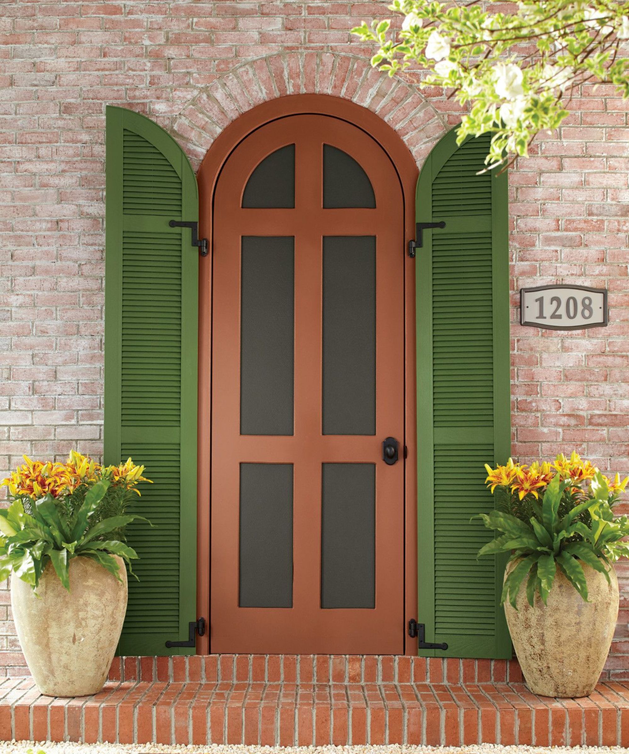
'Caribbean Coral SW 2854 is such a fun one because it is a gorgeous transition between red and orange that gives a terracotta feel but with a bit of softness.'
Design expertise in your inbox – from inspiring decorating ideas and beautiful celebrity homes to practical gardening advice and shopping round-ups.
The palette also includes Inverness SW 6433, a dark shade of moss green, and at the more neutral end, Crisp Linen SW 6378, a warm white paint with a peach undertone.
How to decorate with the paint colors
The Impressionist-inspired color palette is perfect for the soon-arriving summer months and lends itself to a coastal decor scheme. Emily shares below how she envisions the colors being brought to life throughout the home, as a 'refined' take on beach-inspired decor.
'We’re continuing to see this transition to a coastal style, but not the anchors and seashells we’re used to associating with this design style. This is a more refined take on the coastal palette and Anchors Aweigh is a great foundational deep tone. I’d use it on furniture or even use it to color drench – ceiling, walls, and trim in a home office for a full-color immersion.'

Daphne is the light blue in this living room, and Emily explains that it works particularly well in small rooms as well as those with limited light. 'Daphne is perfect for a fun pop of color in a space where there’s a lot of natural daylight. Try painting a hallway as a unique way to add color and welcome guests into the home.'
'Inverness would be great for color-drenching a powder room. It’s a fun and unexpected way to surprise and delight your guests.'
The brightest of the palette's shades, Emily says that Caribbean Coral works well as an uplifting front door color, as well as in large, bright rooms. 'Caribbean Coral has a really sunny quality that would look beautiful on a front door. It also plays really well with grays and whites, so try this terracotta-inspired hue in a bright space for an interesting pop.'
For those who enjoy decorating with neutrals, Crisp Linen is a timeless backdrop color for many rooms throughout the home, with slightly more warmth than classic white. 'Crisp Linen is a creamy white that has a yellow undertone and would add a delicate layer of warmth to a living room or dining room.'
If coastal decor isn't quite your style, then fear not; these shades also work with other decorating styles, such as French country decor. Interior designer Kathy Kuo adds that 'all of the colors in the Impressionist palette are actually very versatile and lend themselves to a variety of design styles.'

Another way to effectively use the palette is to opt to create an on-trend color pairing, such as green and white. Kathy recommends using Inverness (pictured above on the shutters) with Crisp linen, for a sophisticated and calming color combination.
'My eye was immediately drawn to the combination of the mossy green Inverness and the warm neutral Crisp Linen,' says Kathy. 'I love green and white tones together for a look that feels upscale but also fresh and idyllic. Green is also so nice for summer because it draws from the beauty of the natural world that is on display in full force during the summer months.'
A refined take on summer color schemes, Sherwin-Williams' Impressionist Period palette works all year round too, perfect for bringing a liveable amount of color into the home. Each of the colors can be easily integrated across different styles and rooms – from coastal to transitional decor.

Emily is a freelance interior design writer based in Scotland. Prior to going freelance in the spring of 2025, Emily was Homes & Gardens’ Paint & Color Editor, covering all things color across interiors and home decor for the Homes & Gardens website. Having gained specific expertise in this area, Emily is well-versed in writing about the latest color trends and is passionate about helping homeowners understand the importance of color psychology in home design. Her own interior design style reflects the simplicity of mid-century design and she loves sourcing vintage furniture finds for her tenement flat.