

We always look forward to finding out Sherwin-Williams' Color of the Month, and its December choice ends the year with the enduring appeal of neutrals, with Sand Dollar.
A beige paint that adds plenty of warmth, Sand Dollar is a classic, understated shade that doesn't feel trend-led but timeless and versatile. Amid the current appeal for the richest hues commonly associated with the holidays, this paint color returns to a simplified and refreshing palette, proving neutrals are always in style.
Below, we've rounded up all you need to know about this calming beige paint, as explained by a Sherwin-Williams color expert.
What color is Sand Dollar?

'Sand Dollar SW 6099 is a soothing warm beige that adds softness and comfort to any space. This relaxed velvety neutral provides understated elegance and allows us to indulge in a sense of cozy quietude,' says Emily Kantz, Color Marketing Manager at Sherwin-Williams.
While bolder, richer tones tend to top the color trends during winter for their cozy feel, neutrals like Sand Dollar make an equally good choice with their warm undertones. They're also known to be timeless with longevity, meaning that once the warmer months are here such paint colors work just as well.
'Sand Dollar SW 6099 is a balmy transitional shade perfect for encouraging homeowners and their guests to cozy up in warm and inviting spaces during the cold winter months,' adds Emily.
How to decorate with Sand Dollar
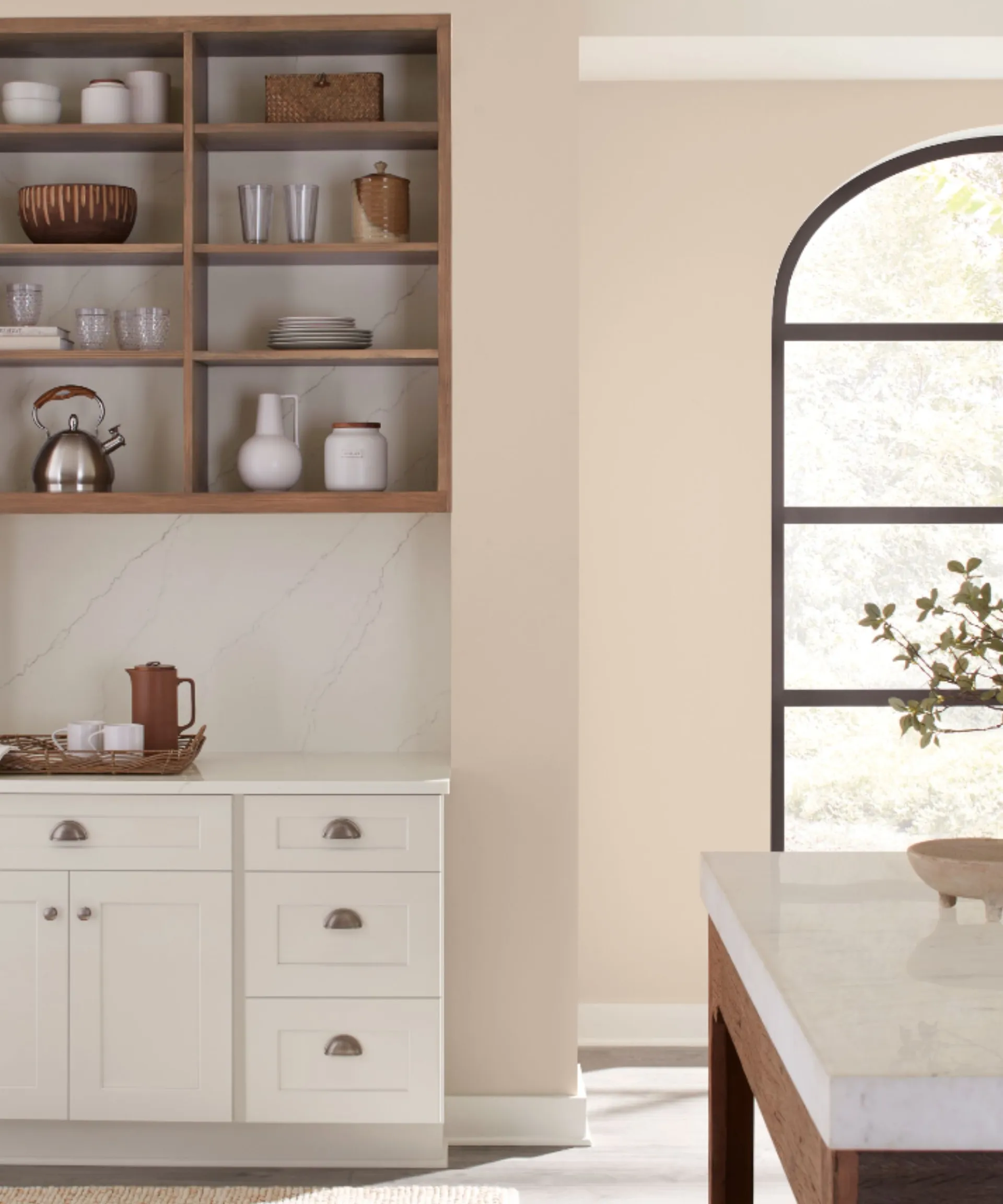
Decorating with neutrals allows versatility from room to room. Not only do neutral shades such as Sand Dollar complement many interior design styles, but Emily says they can also help make your space feel more calming:
'Sand Dollar SW 6099 has a versatility and practicality that allows it to transcend multiple rooms to establish tranquility throughout the home. It is especially calming in busy areas like kitchens, nurseries, and dining rooms where homeowners often find themselves recharging.'
While more daring paint colors are having a moment, especially in rooms such as kitchens, neutral paints are a great way to go if you want to create a distraction-free, comfortable space that doesn't quickly date.

When it comes to creating color combinations with Sand Dollar, you can get creative depending on how bold or subtle you wish to go. However, if you're looking for a fail-safe pairing that's just as timeless as Sand Dollar itself, opt for other neutral hues in varying tones and depth. Below, Emily recommends some of her top colors to do so:
'This month’s neutral shade is best complemented by café-inspired colors that are bursting with earthy flavor. This palette, dubbed Winter Warmth, includes lighter cream, beige, and gray shades like Cold Foam SW 9504, Hibernate SW 9573, Sticks & Stones SW 7503, and Taupe of the Morning SW 9590. It is grounded with deeper browns and grays like Hot Cocoa SW 6047, Rockweed SW 2735, and Garret Gray SW 6075.'
Whether used on its own or as a color pairing, rustic decor is a great way to make the most of this warming neutral, adding interest through texture and shape: 'Sand Dollar SW 6099 is best brought to life when paired with layered fabrics, wooden furniture, organic shapes, and textured upholstery and art,' says Emily.

A warm beige, this paint color is a classic choice that pairs well with many decorating styles.
If you're inspired to elevate your neutral rooms this December, Sand Dollar makes a go-to choice – a beige paint that will add plenty of warmth and create a sophisticated feel.

-
 Kevin Bacon and Kyra Sedgwick's rustic kitchen island is stunning, but controversial – designers say you can get the look without the hassle
A popular material finds an unorthodox home in the couple's kitchen, but experts disagree on whether it should be used – here's how to do it instead
-
 How to grow grapefruit for homegrown sweet and tangy, highly nutritious harvests – a fruit tree expert shares their planting and care tips
From planting to harvesting, this is all you need to know about grapefruit trees

