Sherwin-Williams' Accessible Beige is the 'perfect light shade of beige' – here's all you need to know about decorating with it
This popular beige paint is cozy and timeless, adding subtle warmth to any room
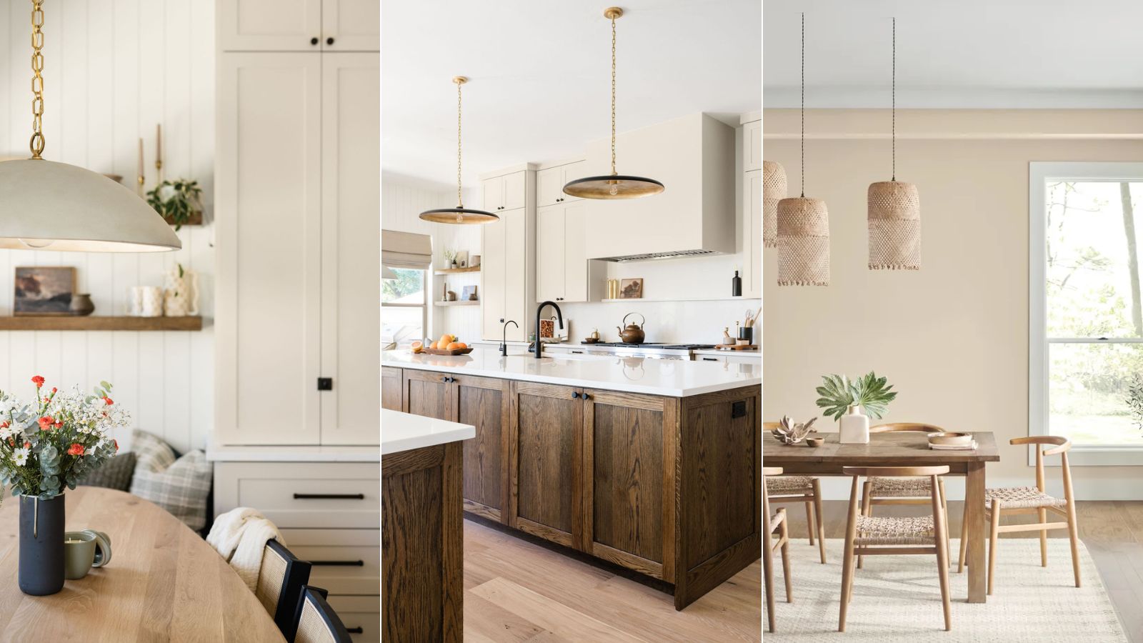

Beige paints are a timeless choice in the world of interior design. Adding more depth and warmth than white, but not leaning too far into the world of color, there's good reason for the enduring appeal of this neutral hue.
Sherwin-Williams' Accessible Beige is one of its popular beige paints that strikes the right balance of warm tones. Since too much yellow can soon make beige feel outdated, Accessible Beige is balanced with just the right amount of warmth.
Here, interior designers and a Sherwin-Williams color expert share all you need to know about decorating with this timeless paint – a go-to choice if you want to refresh your space with a neutral color.
What color is Accessible Beige?
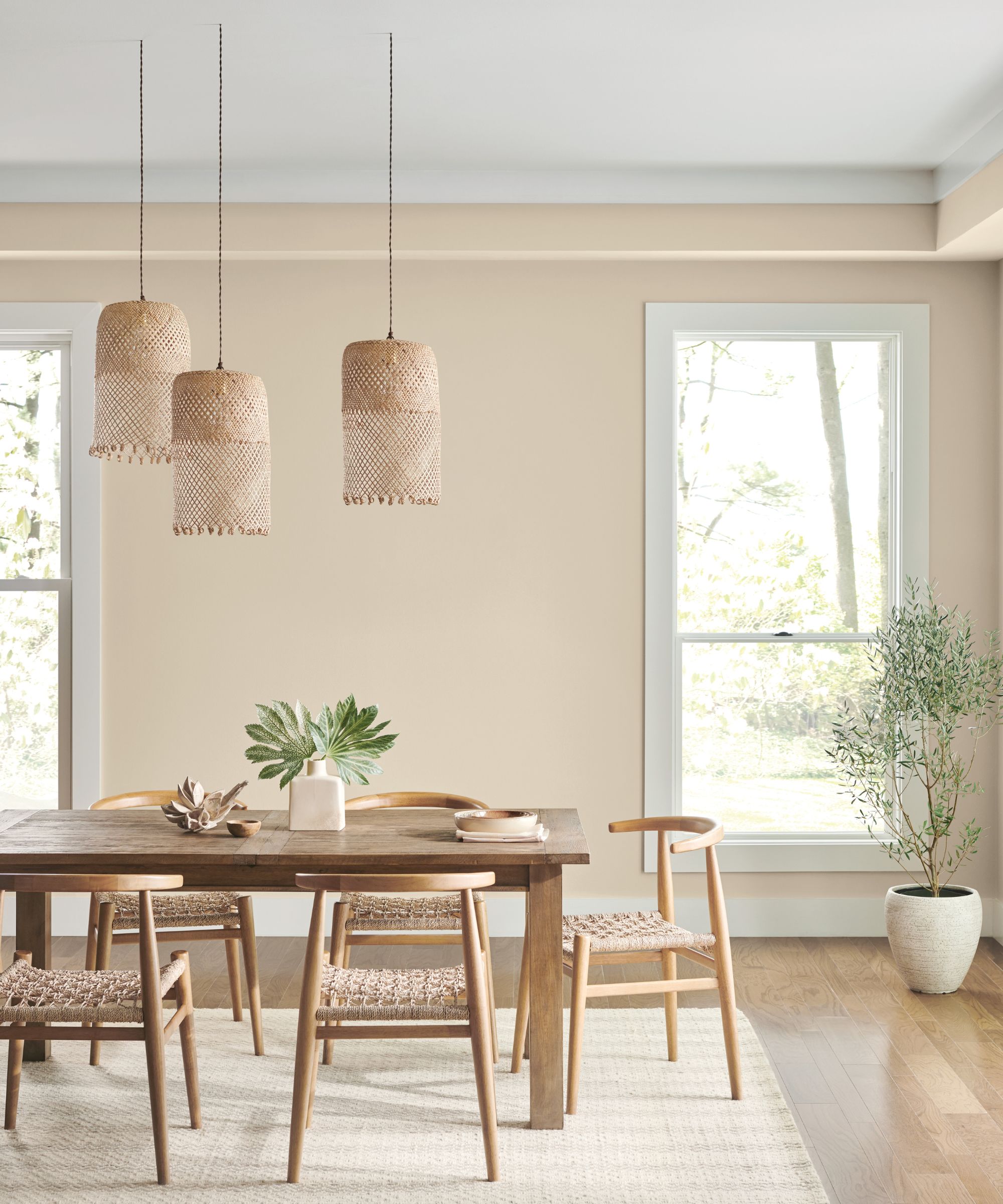
'Accessible Beige SW 7036 is a perfect light shade of beige for homeowners looking to add the timeless color to their homes. It’s not a surprise that this shade was one of our top-selling interior paint colors for 2023 because it can serve as the perfect complement to just about anything,' says Emily Kantz, Color Marketing Manager at Sherwin-Williams.
'Unlike many beiges, this color has undertones of gray that can give your space a warm, snug feel – making it ideal for bedrooms. Light neutrals such as Accessible Beige SW 7036 keep bedrooms feeling fresh with their light and airy yet cozy respite. I would recommend pairing the shade with earthy tones like Sanderling SW 7513, a warmer darker beige,' says Emily.
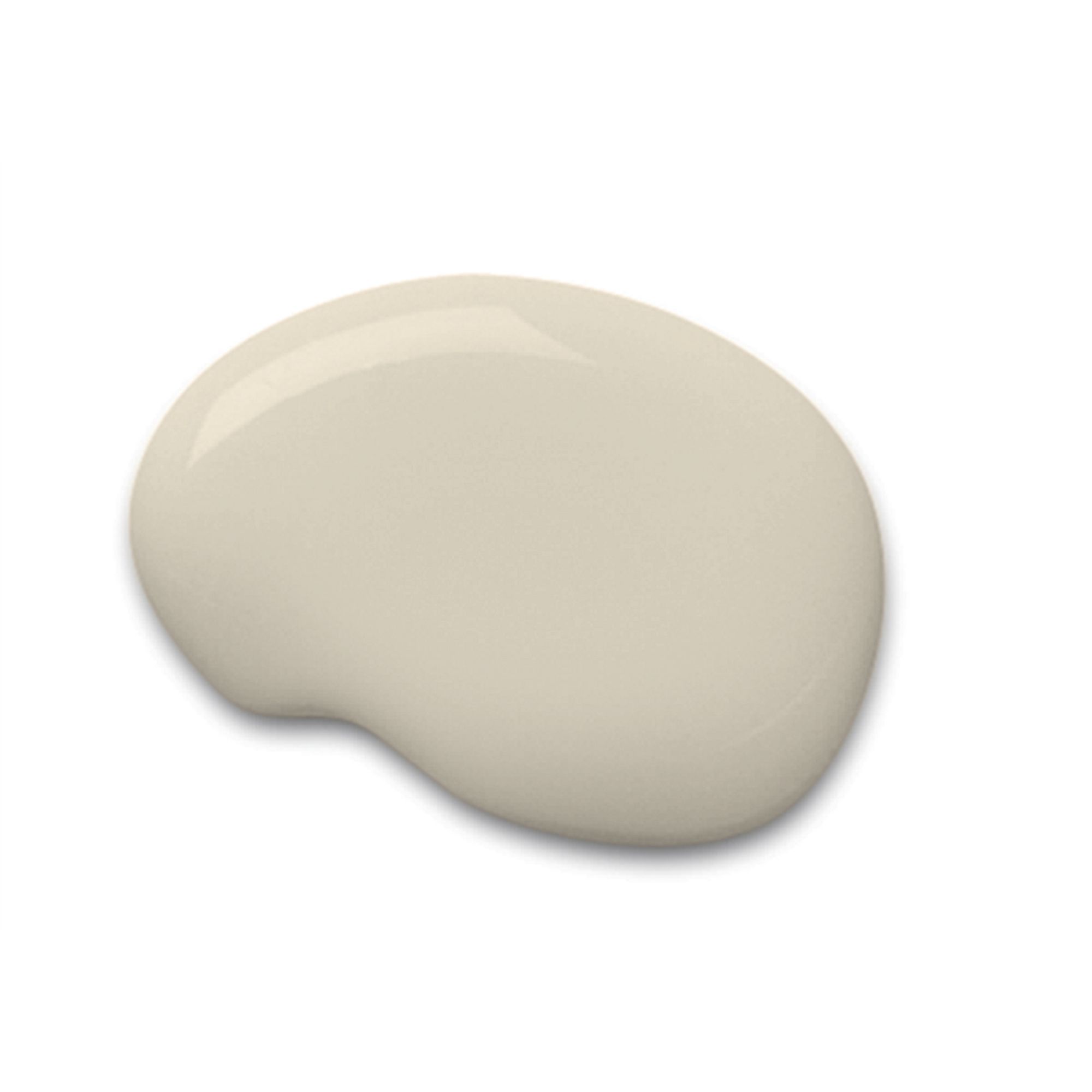
Accessible Beige is a beige paint with gray undertones, helping your rooms feel cozy and inviting.
How to decorate with Accessible Beige
Since Accessible Beige is a neutral paint, it naturally pairs well with many other colors, making it easy to incorporate into your home as a backdrop paint color.
With its gray undertones, it doesn't lean too far yellow, giving it a balanced feel, whether you pair it with warmer or cooler hues. Nick Cryer, founder of Berkeley Place elaborates: 'Unlike a lot of the more old-school beige paint colors that flash quite yellow or orange, Accessible Beige is more soft, subtle, and neutral as it leans a bit to the gray side.'
'Accessible Beige is delightfully accommodating and it will enhance any earth-tone colour scheme. It can pair up beautifully with dusky pinks and terracotta as well as creating a softer background for gray furnishings. So versatile!' adds Nick.
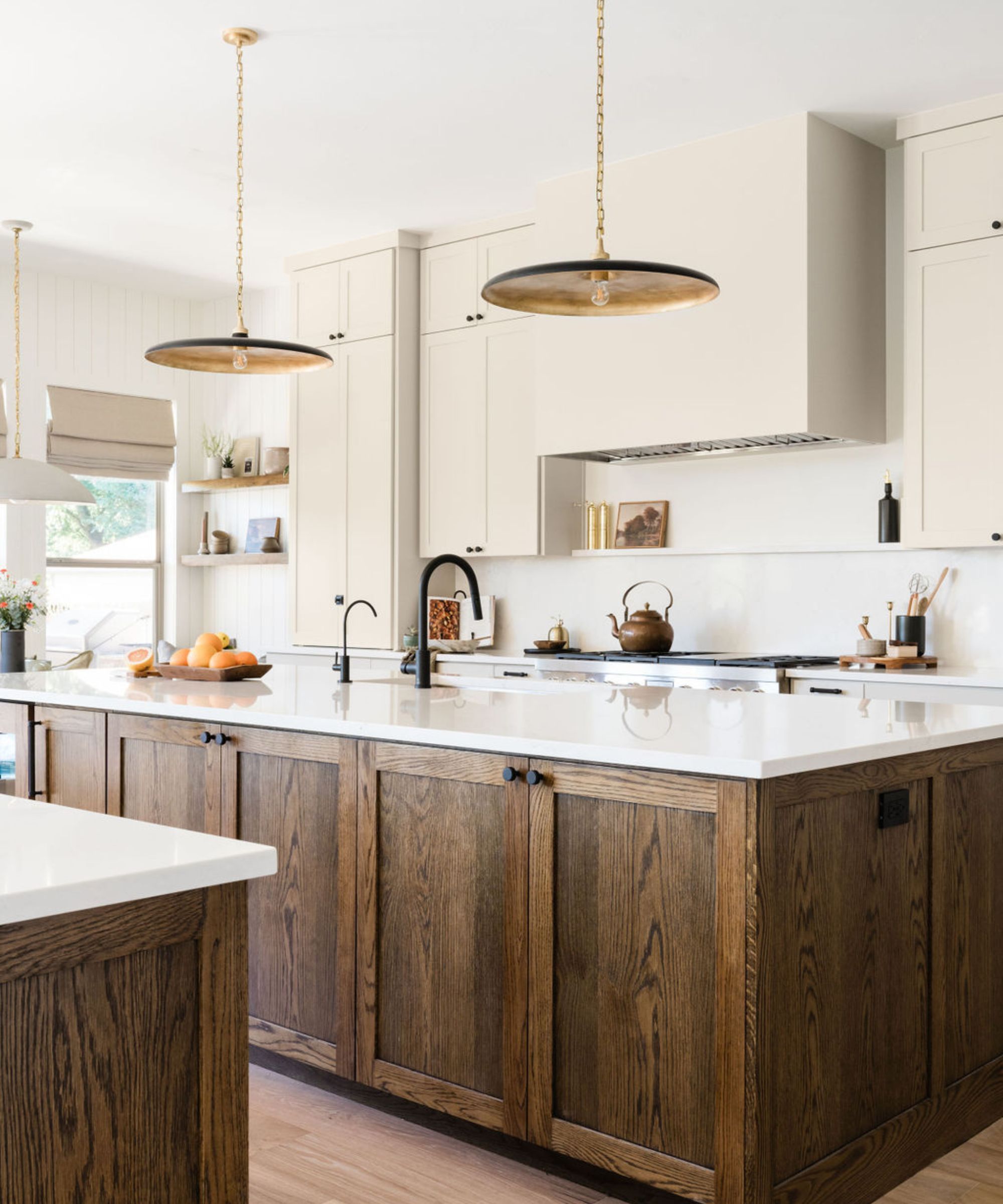
While there's no question about Accessible Beige's versatility, it works especially well with other neutral colors and natural materials for a slightly rustic decor scheme. In the kitchen of its Oak Haven project designed by ATX Interior Design, Accessible Beige pairs well with the wood tones and neutral color scheme.
'It is the best warm tone to go with any other paint colors and never leans too far brown or grey,' explains designer Laura Williams, owner of ATX Interior Design.
Interior designer Jenny Luck also recommends focusing on natural materials to make the most out of this beige paint. She explains: 'In order to accentuate this subtle neutral and really bring it to life I would be looking to decorate with relaxed, comfortable, and easygoing materials such as natural linens, sisals, and rattan. I would use light, natural stones such as marbles and porcelains for harder surfaces.'
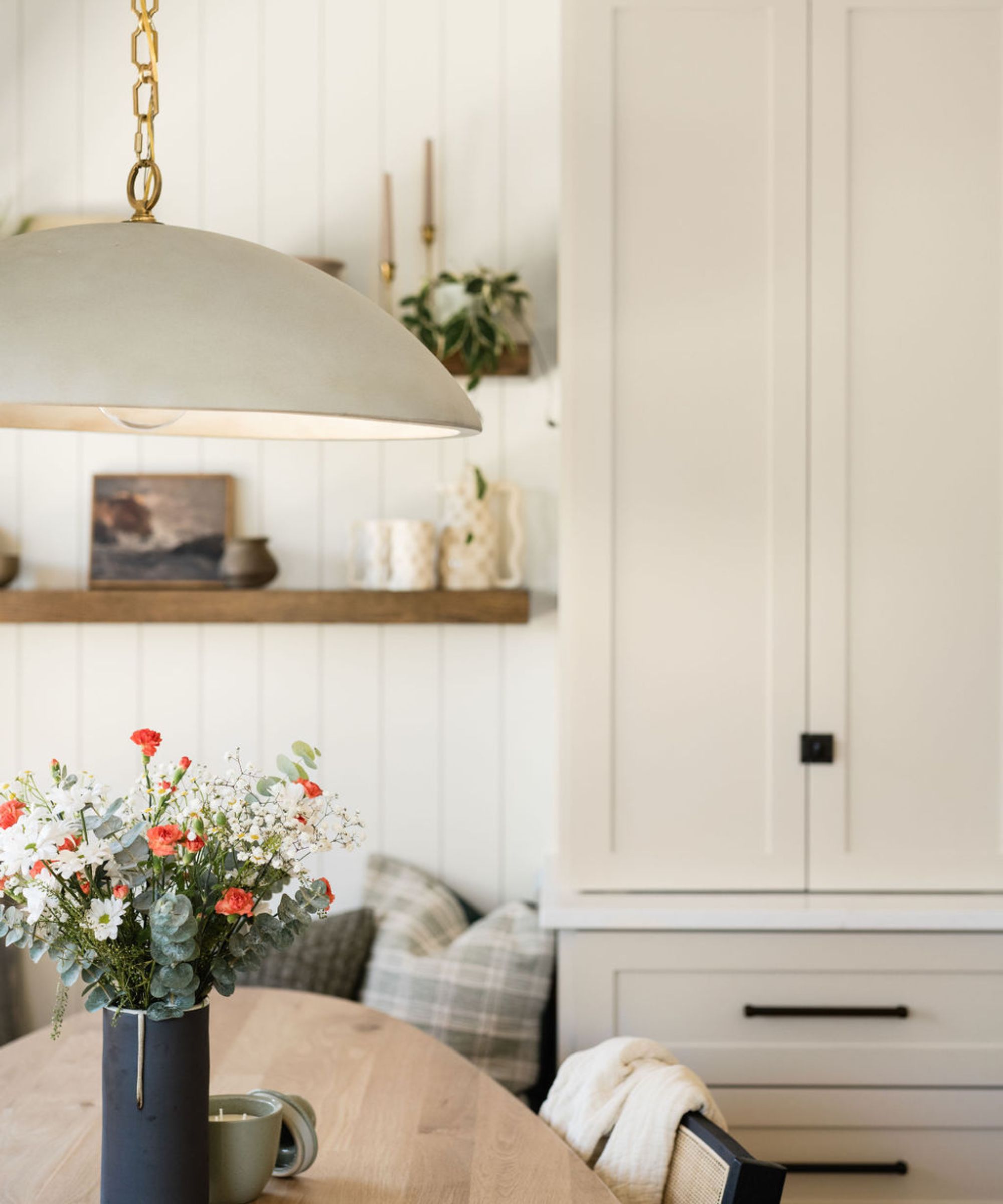
Not only is Accessible Beige easy to decorate with but it's aligned with the latest color trends. Warm neutrals such as this one feel cozy and grounding, replacing previously loved cooler grays and whites which can risk feeling stark. Whether you incorporate this hue into your living room or bathroom, you can be sure this beige paint feels modern.
'As trends move away from gray tones, warmer hues are becoming more dominant in interior design. Sherwin-Williams' Accessible Beige is an excellent choice for adding warmth to a space while still maintaining a neutral appearance. It would be a stunning option for cabinetry and can help to warm up stark white walls,' explains interior designer Bailee Roberts of House Rupert.
If you're looking for a cozy yet calming neutral paint, Sherwin-Williams' Accessible Beige is a great choice. This beige hue feels current, while also boasting a timeless quality that makes it a great all-rounder for many rooms.
Sign up to the Homes & Gardens newsletter
Design expertise in your inbox – from inspiring decorating ideas and beautiful celebrity homes to practical gardening advice and shopping round-ups.

Emily is a freelance interior design writer based in Scotland. Prior to going freelance in the spring of 2025, Emily was Homes & Gardens’ Paint & Color Editor, covering all things color across interiors and home decor for the Homes & Gardens website. Having gained specific expertise in this area, Emily is well-versed in writing about the latest color trends and is passionate about helping homeowners understand the importance of color psychology in home design. Her own interior design style reflects the simplicity of mid-century design and she loves sourcing vintage furniture finds for her tenement flat.
-
 Ina Garten's storage pantry is an insightful window into all of the best cookware used by the chef – and it's easy to recreate on your kitchen shelves from $48
The beautiful dishware in The Barefoot Contessa's Hamptons pantry showcases the tools she uses most often to cook – this is exactly how you replicate it
By Sophie Edwards Published
-
 Extend the lifespan of your appliance with 5 simple but crucial washing machine maintenance tips
From cleaning the filters to keeping the door open, experts reveal the washer tips they swear by
By Andy van Terheyden Published