Sherwin-Williams just released its 2025 color forecast – here's all you need to know
We're looking ahead to 2025 with four just-launched, on-trend color palettes released by Sherwin-Williams
It's already that time of year when we begin to look ahead to the new year in the world of design. That's especially true when it comes to paint brands, who eagerly anticipate the color trends set to define the year ahead.
Starting us off is Sherwin-Williams, who has today unveiled its 2025 color forecast named Capsules. At the same time, the paint brand has also announced the launch of its brand new podcast centered around all things color: Colormixology.
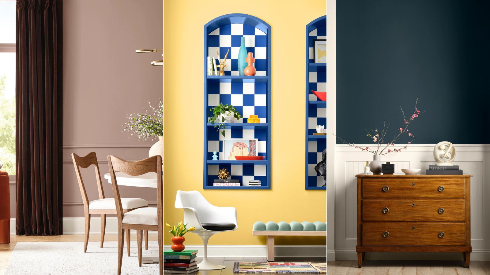
Spanning 48 hues, Capsules comprises four unique color palettes, each reflecting a different theme inspired by defining trends and influences, to provide designers and homeowners alike with on-trend paint colors for home decor projects throughout 2025.
Sherwin-Williams' 2025 color trend forecast: Capsules
Below, we take a closer look at each of the four color palettes included in Capsules, having spoken to Sue Wadden, Director of Color Marketing at Sherwin-Williams to uncover the inspirations that informed the 2025 trends.
'We look at a variety of influences ranging from art and culture, fashion, sustainability, and innovation, to tech and AI,' Sue tells us. 'Through this rigorous research and color analysis, we selected the 48 directional colors placed into four palettes that tell the story behind the main drivers going into 2025.'
'Each palette encompasses an overall theme that drives the color story behind each one of the capsules. Color has the power to amplify and unify a sense of storytelling and harmony within the home,' continues Sue.
Intrigued to find out more about these new color palettes? Read on to learn about each of them and the various home decor styles they work best in, catering to a wide range of styles.
Sign up to the Homes & Gardens newsletter
Design expertise in your inbox – from inspiring decorating ideas and beautiful celebrity homes to practical gardening advice and shopping round-ups.
Capsule One: Chrysalis
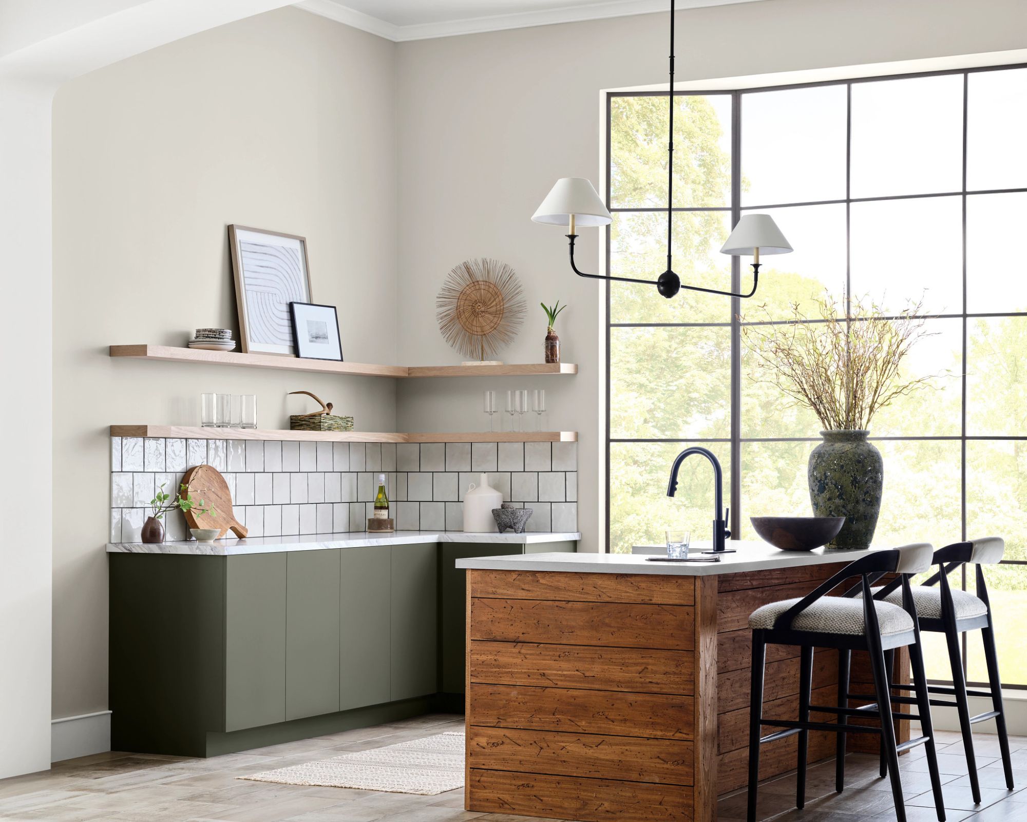
Drift of Mist SW 9166
The first palette within the 2025 color trend report is Chrysalis, which focuses on peaceful living, taking reference from the natural world with colors reflecting those of wood tones and sand, for example.
'The Chrysalis palette is the ideal choice for Japandi decor ideas since it’s based on creating sanctuary spaces and evoking peace in the home which relies heavily on earthy and grounding neutrals,' explains Sue.
Within the palette, a range of calming neutral paints are included, including Pure White SW 7005; Drift of Mist SW 9166; and Mindful Gray SW 7016 to name just a few.
'From the Chrysalis palette, my favorite shade is Grounded SW 6089, a rich and inviting hue that evokes a sense of comfort and stability,' says Sue. 'I recommend using the shade as an accent color on a feature wall in a living room or bedroom to add depth and coziness.'
Capsule Two: Paradox
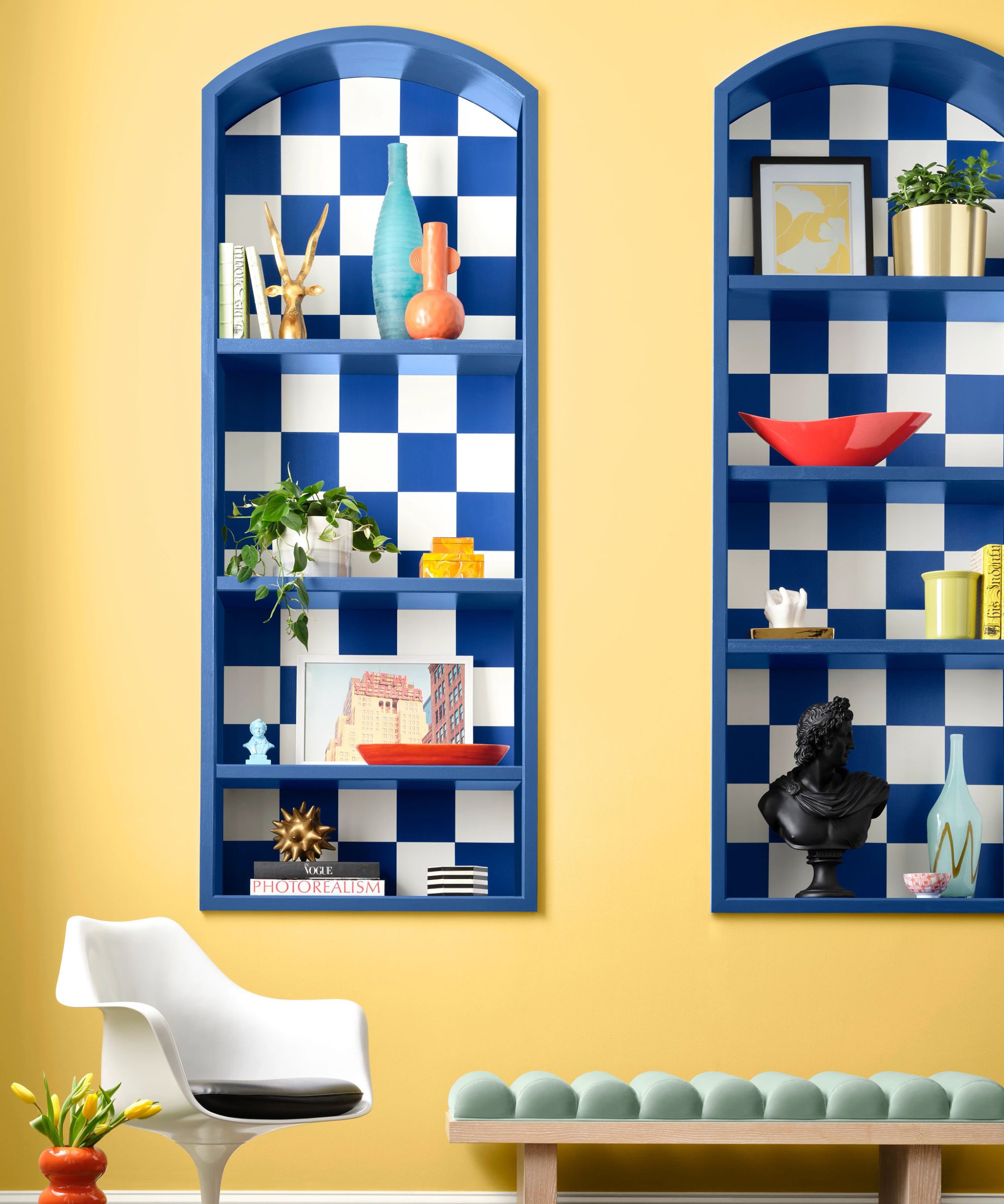
Quilt Gold SW 6696, Frank Blue SW 6967
Palette two, Paradox, is all about stepping away from the conventional with bold colors that evoke the essence of dopamine decor.
'For the Paradox capsule, we were inspired by the continued popularity of immersive experiences,' says Sue. 'People want emotional experiences that deliver feelings of wonder and joy, and that is what the Paradox palette encompasses; these bright optimistic shades of whimsy and delight.'
Within the palette, bold and colorful paint colors such as Dragon Fruit SW 6855 and Frank Blue SW 6967 are included, as well as neutral shades such as Alabaster SW 7008.
'The Paradox palette is a great choice to achieve an eclectic interior design style, focused on the unexpected and evoking dopamine through different colors like electric brights, grounding neutrals, and candy-coated colors,' continues Sue.
'From the Paradox palette, my favorite is Talipot Palm SW 6726, a vibrant and refreshing shade that brings a touch of nature indoors. Its lively undertones evoke growth and renewal, making it perfect for creating an energizing and revitalizing atmosphere in entryway ideas.'
Capsule Three: Wellspring
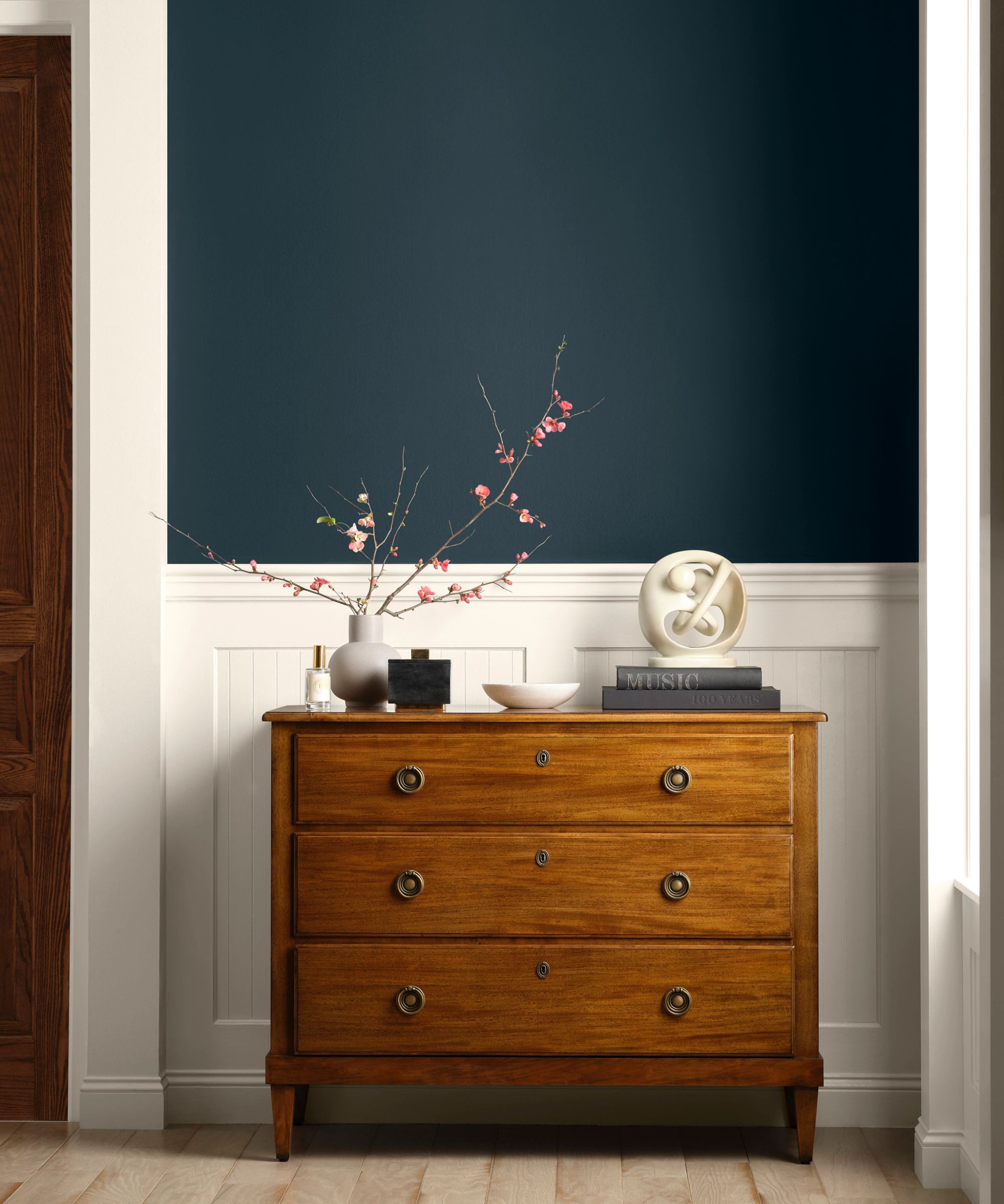
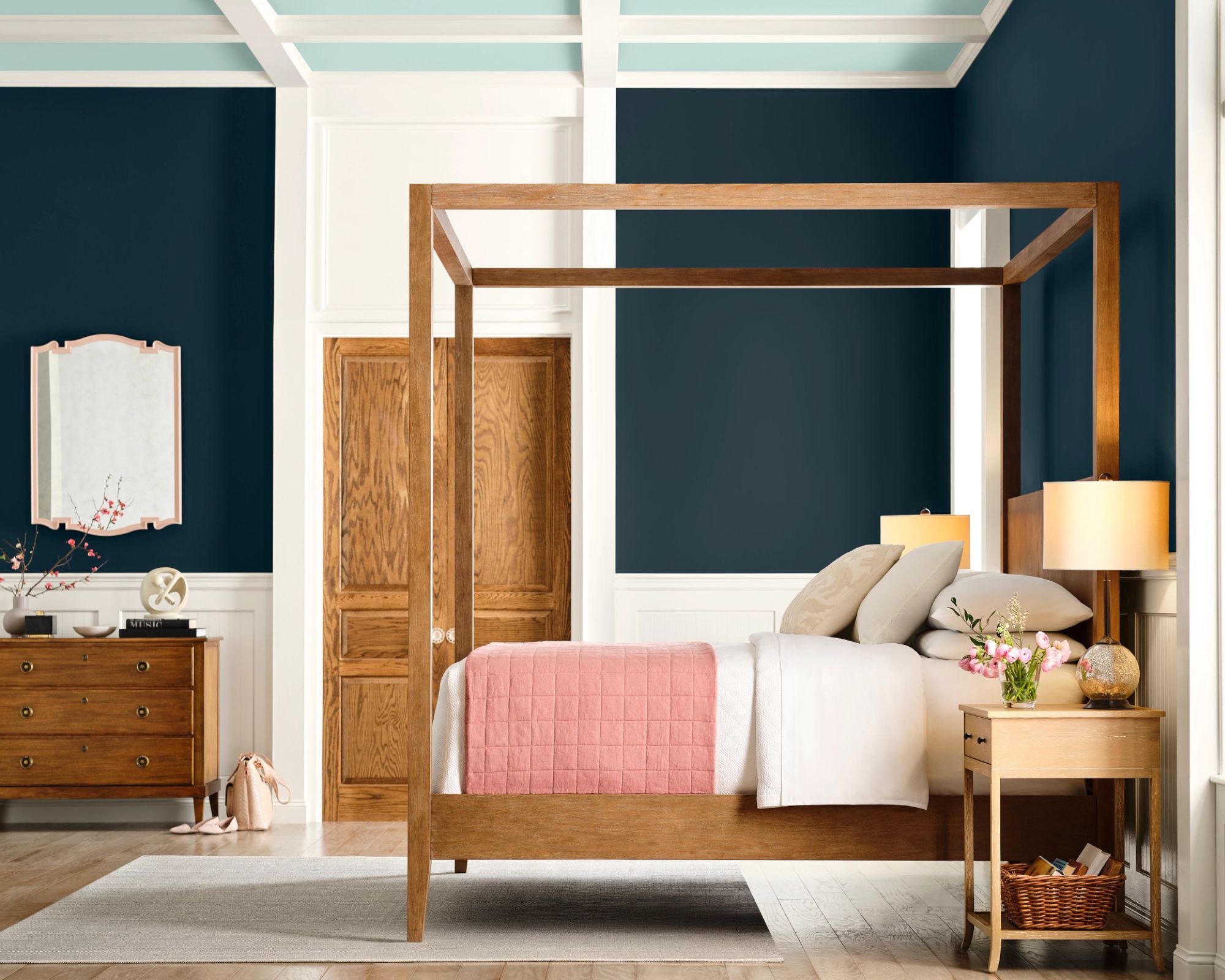
Dark Night SW 6237
Wellspring is a palette inspired by traditional decorating ideas, ranging from blues such as Upward SW 6239 to warm reds such as Borscht SW 7578.
'For the Wellspring capsule, we see a twist on traditional design and this seems to be in part because of this resurgence in new romanticism. In an age of digital fatigue, people are leaning into a more decorative traditional aesthetic within their interior environment to create a space full of beautiful decor pieces,' explains Sue.
'From the Wellspring palette, my pick is Dark Night SW 6237, a rich and sophisticated hue that brings a sense of depth and elegance to any space. Its dark undertones create a dramatic and calming atmosphere, making it ideal to use in a bedroom to create an intimate and luxurious feel.'
Capsule Four: Kindred
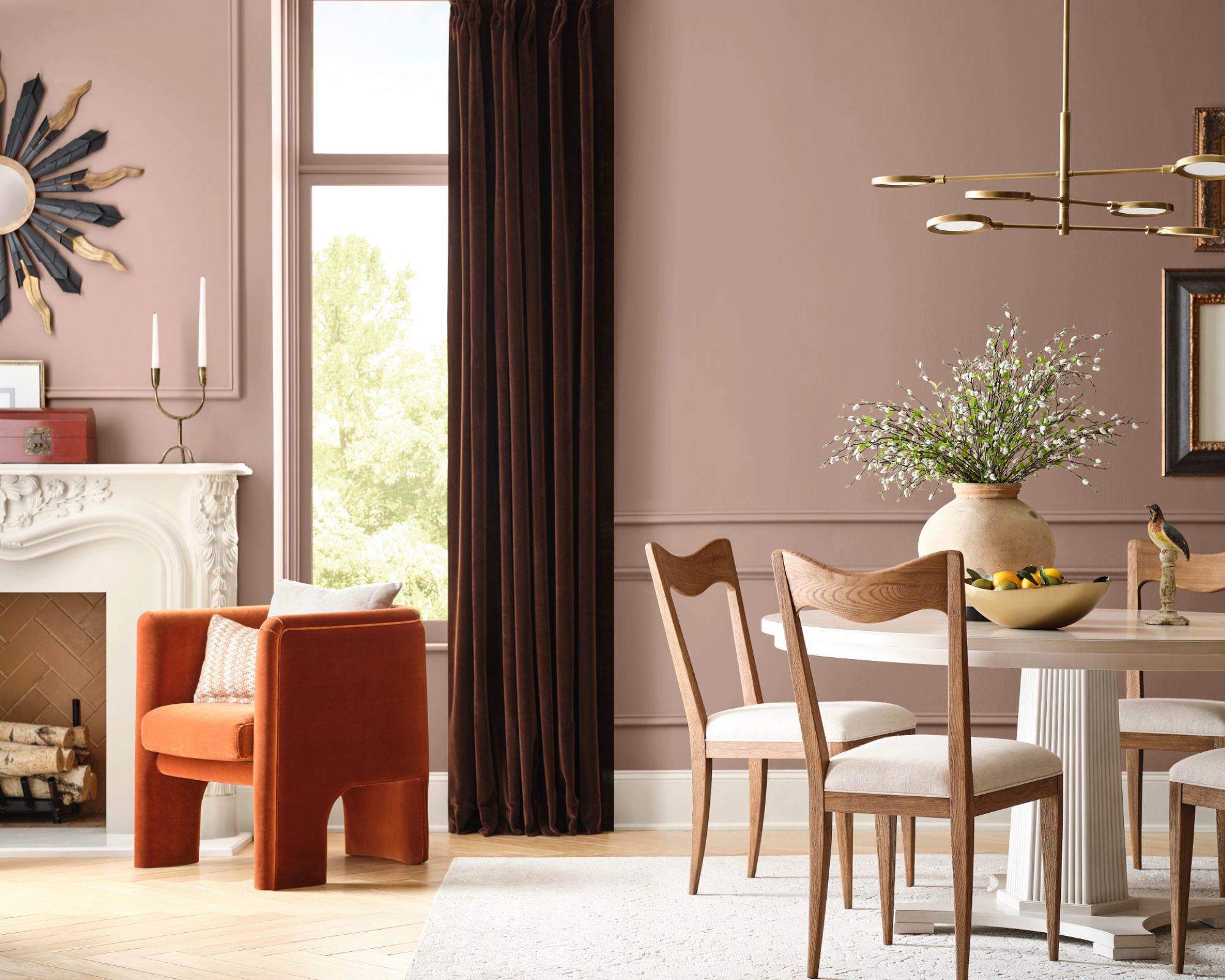
Redend Point SW 9081
Lastly, the final palette within the trend forecast is Kindred, a combination of all types of hues, from warm neutral paints to deep and dark shades, united with a focus on a 'mindset of openness and belonging'.
'The Kindred palette is perfect for maximalist decor ideas, as it’s filled with all different kinds of shades, from brights to pastels to darks, to create a beautifully diverse space,' explains Sue.
Standout shades from the collection include Redend Point SW 9081; Caribbean Coral SW 2854; and Rockweed SW 2735.
'From the Kindred palette, I love Koral Kicks SW 6610, a soft and cheerful color that adds warmth and a subtle pop of color,' adds Sue. 'Its gentle presence creates a friendly and inviting atmosphere, which is why I recommend using it in a home office to achieve a creative, yet focused space.'
Whether you prefer the calming neutrals of Chrysalis or the more adventurous hues found within the Kindred color palette, you can experiment with interchanging these paint colors as you please throughout your room color ideas.
'The forecast can be mixed and matched in one space, but it can also be used in different rooms in the same house,' says Sue. 'Or you might lean towards basing their entire home on one specific palette.'
If you're intrigued to learn more about the 2025 color trend report, check out the brand-new Colormixology podcast which is available to listen to on Spotify, Apple Podcasts, and various other podcast apps.
Hosted by Sue Wadden, Colormixology will feature monthly episodes starring industry guests, including interior designer Sheila Bridges, focused on various themes surrounding color and design. The first episode is all about Capsules, where you can learn more about the insights behind the trend report.
For more information about both the 2025 color forecast and the podcast, head to Sherwin-Williams.com.

Emily is a freelance interior design writer based in Scotland. Prior to going freelance in the spring of 2025, Emily was Homes & Gardens’ Paint & Color Editor, covering all things color across interiors and home decor for the Homes & Gardens website. Having gained specific expertise in this area, Emily is well-versed in writing about the latest color trends and is passionate about helping homeowners understand the importance of color psychology in home design. Her own interior design style reflects the simplicity of mid-century design and she loves sourcing vintage furniture finds for her tenement flat.
-
 These are the 6 must-have colors to decorate with in April 2025
What do retro-inspired yellows and beautiful blues all have in common? They're on our hot list for the season ahead
By Sophia Pouget de St Victor Published
-
 Plants never to grow next to fruit trees
Expert advice on which plants to keep away from fruit trees to encourage a healthy harvest
By Jacky Parker Published