Updating a heritage home? These are Shea McGee's top tips for blending historic details with modern charm
Interior designer Shea McGee has mastered the transitional style, mixing old and new with ease. These are six of her tried-and-true tips for bringing a heritage property back to life

If you've decided to flip a historic property, are moving into a home that's been in the family for quite some time, or are simply working with a less-than-modern foundation for an upcoming renovation, you will have already come across the significant challenges associated with restoring older properties.
Aside from the regular logistical issues you'll need to double-check for – structural damage, mold, and all the modern-day utilities, to name a few – it's likely that the home's style has dated a bit over time.
Designing the interior of your heritage home to include the perfect blend of old and new, and nailing transitional style is tricky – while architectural details like molding and millwork add character and charm, you'll need to be thoughtful about their place in the final project.
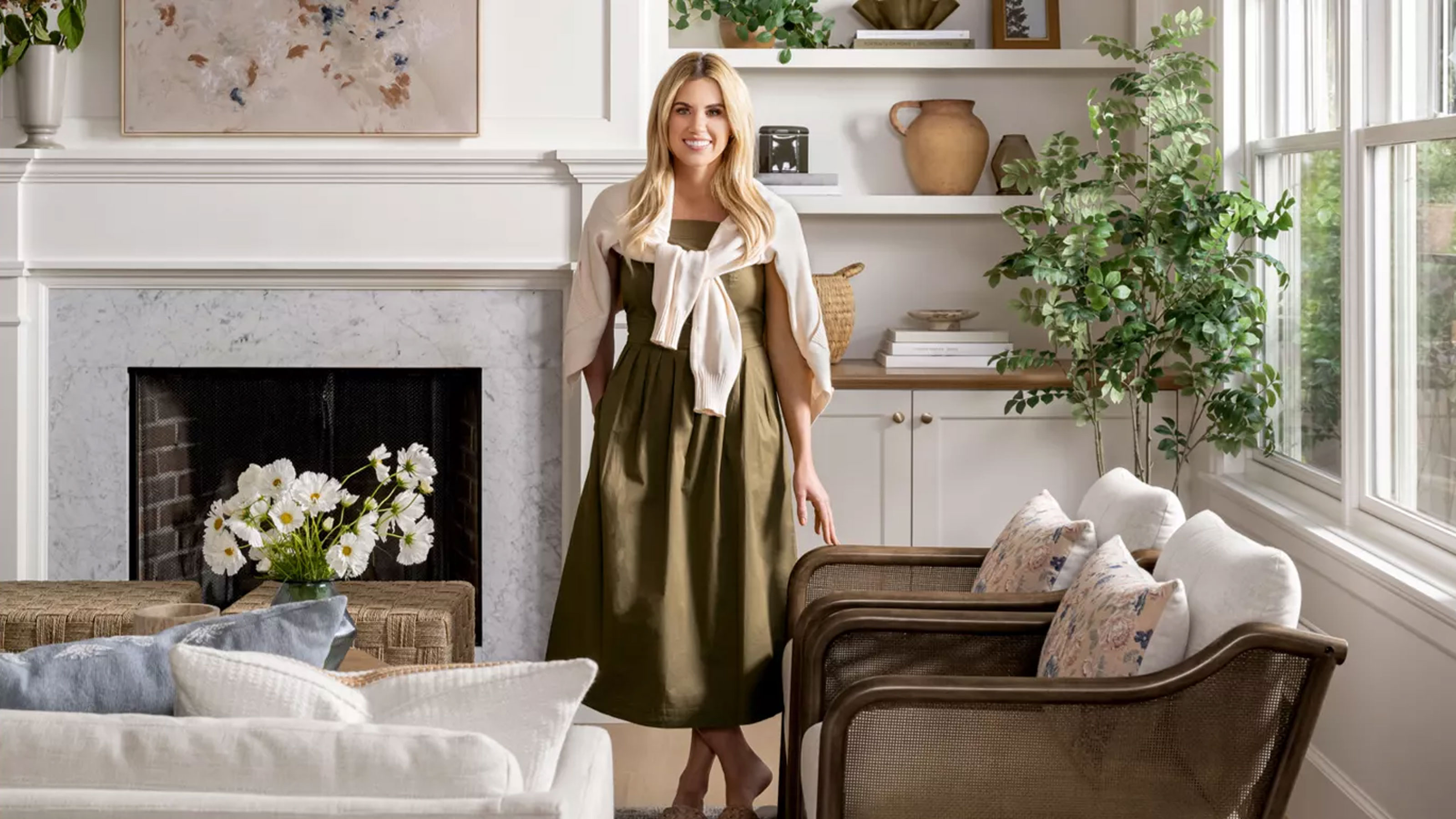
Interior designer Shea McGee ran into this challenge recently while completing Studio McGee's Maryland Heritage Remodel project. And luckily for those of us updating a historic home for modern-day living, she just shared six key takeaways that made the finished project shine. These are her top tips for designing a heritage home without compromising the property's storied appeal.
Shea's top 7 tips for updating a heritage home
A photo posted by studiomcgee on
In her Maryland Heritage Remodel, Shea was tasked with renovating and redesigning a client's childhood home, which she moved into with her young family (including three children under five). With 'a lot of time in the home to dream,' Shea says in a YouTube video unveiling the remodel, the client 'had lots of ideas on how it should function and look and feel.'
That's where Shea's team came in, along with architect Jonathan Rivera and Pyramid Builders. The home's exterior took on a 'simplified Cape Cod style that [the] client was in love with,' while the interior got the McGee treatment.
'We really wanted to honor the style of the home, which is traditional, but our client has a very clear vision of having everything simplified, and so you'll see that throughout every single selection. They're classic, they're timeless, and they're a bit pared back,' says Shea.
Sign up to the Homes & Gardens newsletter
Design expertise in your inbox – from inspiring decorating ideas and beautiful celebrity homes to practical gardening advice and shopping round-ups.
1. Add molding and trim
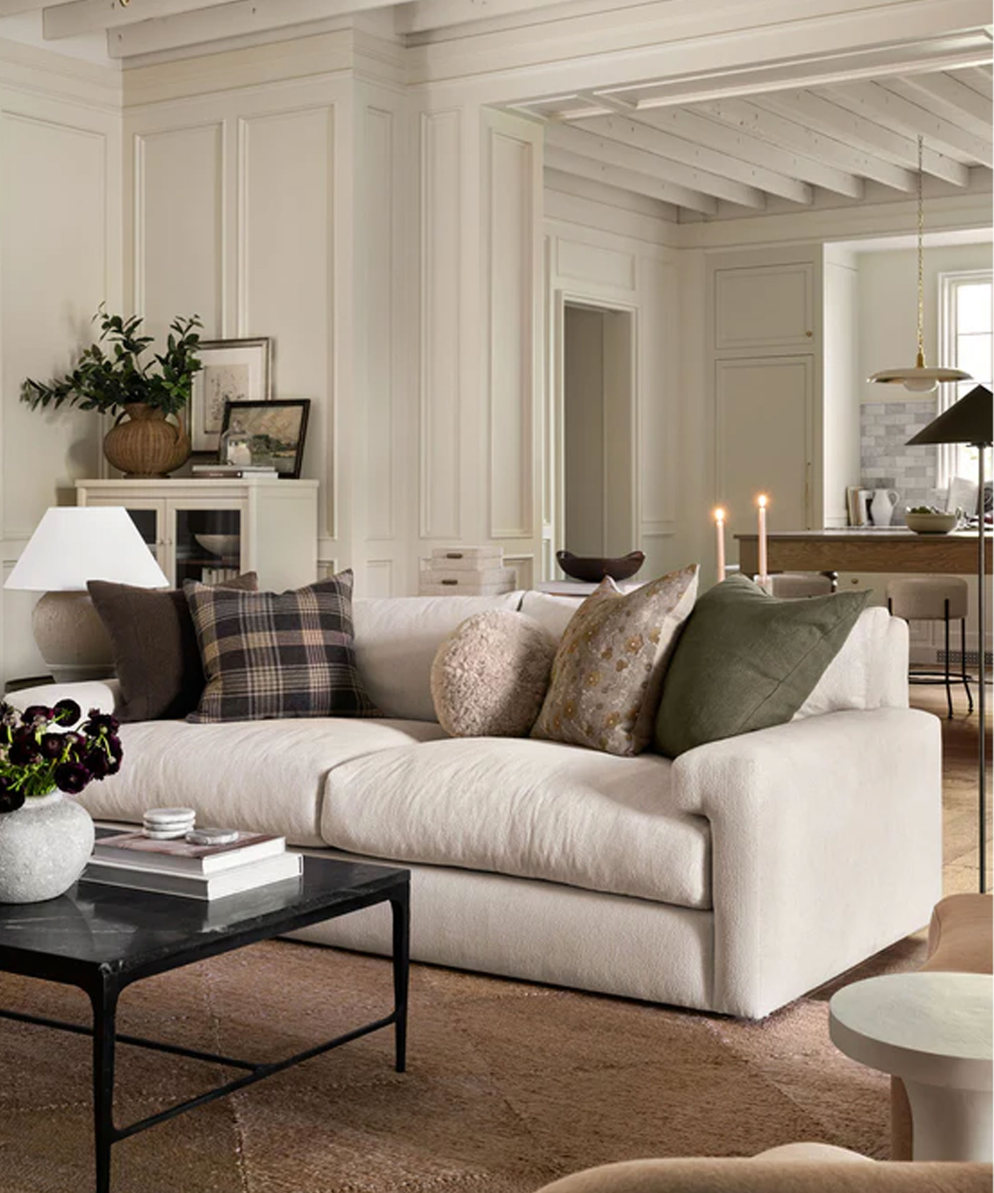
Shea's first tip for tackling a heritage remodel is emphasizing existing, and adding new, molding and trim to the interior design scheme. While many historic homes already feature these intricate, tone-setting details, highlighting and accentuating them only makes the impact greater. With tasteful additions of molding, trim and paneling, even the most ultra-modern room can take on some historic charm.
In the Maryland project, Shea used these design details to take the home's timeless entryway to the next level. Though the original staircase 'had great bones,' it 'needed a refinish, fresh paint [and] a new stain,' she says. Beyond those easy fixes, though, Shea took the refresh one step further.
'We did a new stair runner, and then we added molding to the walls – and this is a no-fail approach to elevating your entryway, adding trim work,' she says. The final result is elegant and sophisticated, but doesn't look dated at all.
2. Include surprising design features

Historic doesn't have to mean boring, and Shea says the element of surprise is more than welcome in a heritage home. In fact, a tasteful surprise can add charm and value to the space.
In this project, she opted for a statement archway above a concealed powder room entryway – an update that improved the home's flow and added visual interest all at once. Though not every home will benefit from a barrel arch like Shea's, remembering that a bit of design surprise takes any home to the next level will make the renovation process more exciting.
'We did update the experience from the entry into the dining nook and kitchen by turning that opening into a barrel arch that you walked through, and we also concealed a door into a powder bathroom through that space. So it felt more continuous and that you're getting more of that molding experience that elevated the entire entryway,' says Shea.
'I think anytime you can find an opportunity for a surprise in your home – it doesn't need to be a loud experience, but just something that feels really thoughtful ... In fact, the surprise is that it's concealed instead of being loud, and then you walk in and you have this beautiful wallpaper that is a really nice jewel box moment,' she continues.

Interior designer, Shea McGee founded her iconic design firm, Studio McGee, with her husband Syd in 2014. They later launched their e-commerce brand, McGee & Co, and starred in their very own Netflix show, Dream Home Makeover.
3. Opt for built-in cabinetry
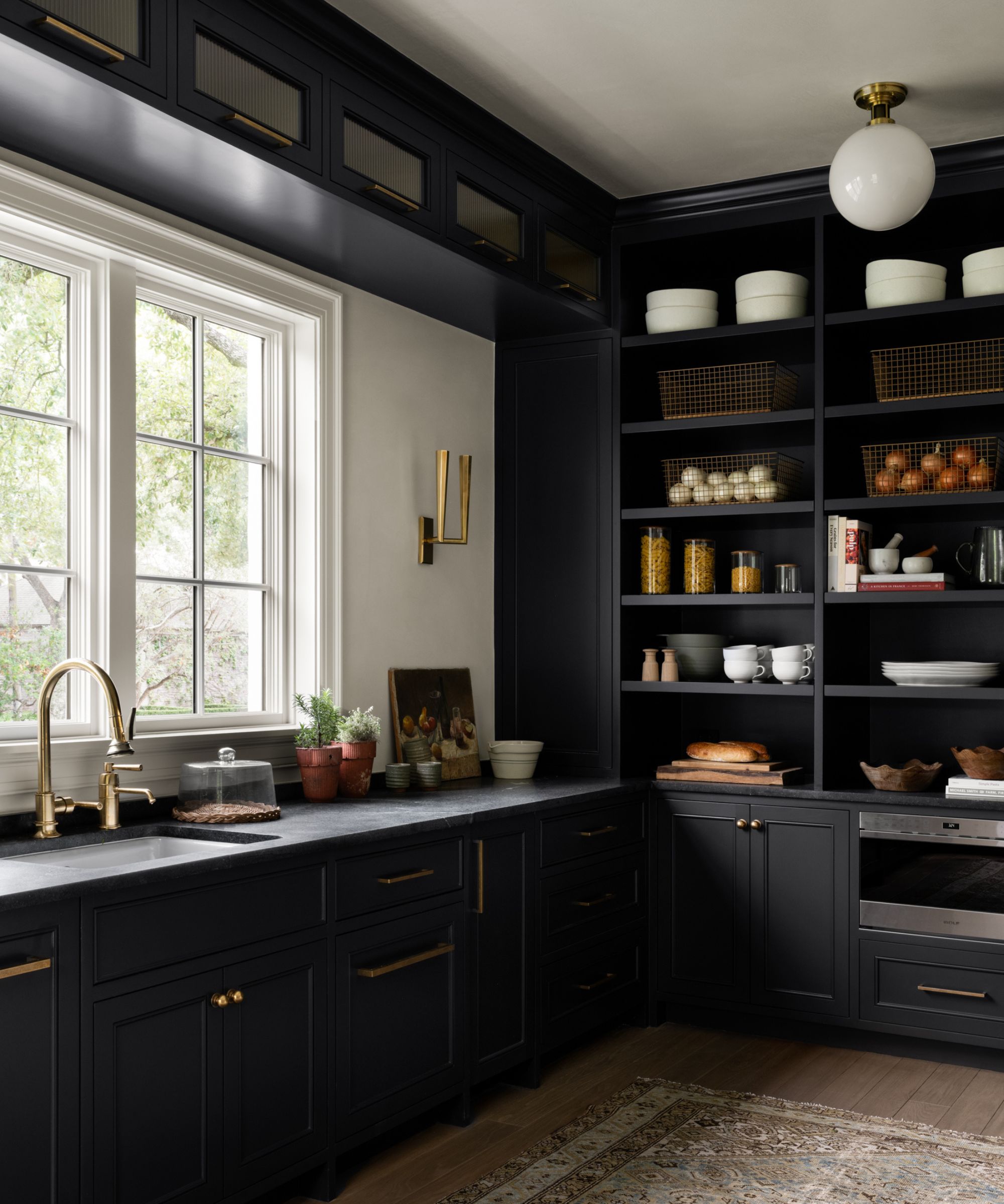
When possible, adding built-in cabinetry (and accentuating existing built-ins) makes a home feel bespoke and incredibly stylish. Though brand-new, built-ins often blend right in with a historic home, along with molding and millwork. And in this home's kitchen, Shea took the built-in cabinetry an extra mile. By adding a 'swooping' range hood, 'curvature onto the backsplash,' and a graceful oval window in addition to classic built-in cabinets, Shea made this white kitchen fit right in with the heritage home's storied atmosphere.
'You have the refrigerator and freezer panels that were also taken to the next level with thoughtful details, and we designed that to feel more like a piece of furniture or a hutch instead of just typical cabinetry. When you bring all of those things together, it really sings and feels timeless, but also thoughtful, all at the same time,' says Shea.
4. Mix historic and contemporary design elements
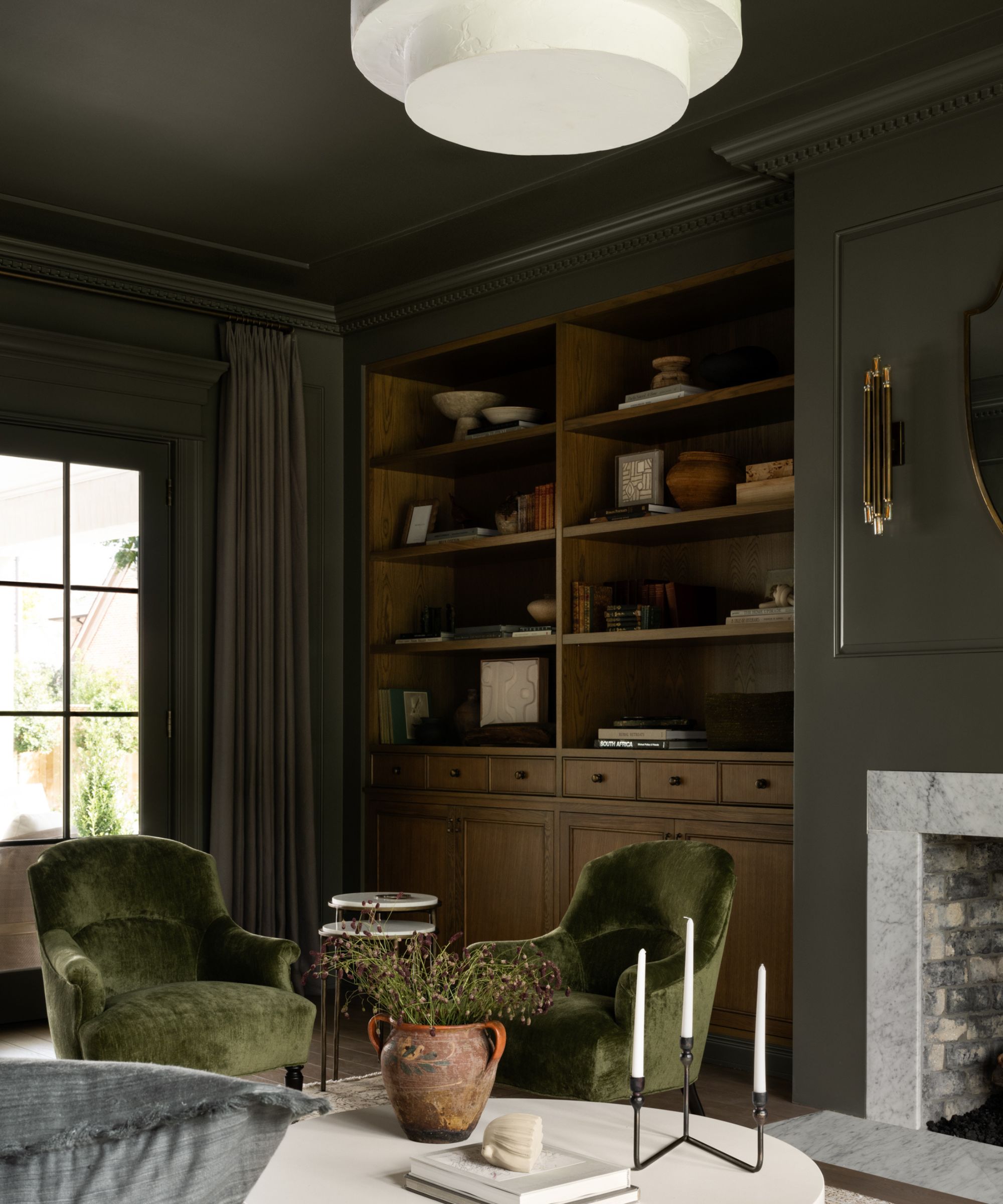
Blending traditional design features with contemporary ones is a surefire way to achieve a timeless, transitional style. And in this home, Shea found the perfect mix in each and every room. She shares that the team widened the entrance to the semi-formal living and dining rooms on the opposite side of the entryway to make the space a bit larger, adding beams for architectural interest.
The home had stunning existing windows, and the client had treasured items like a childhood piano, so Shea had 'a few points to really start from' when approaching the design. From there, she brought in more modern features and details that complemented the home's historic charm. In the living room in particular, she was tasked with combining fabric designed for modern life with sleek designs that are by no means new. The result is a tasteful, timeless blend of old and new.
5. Pay attention to the details
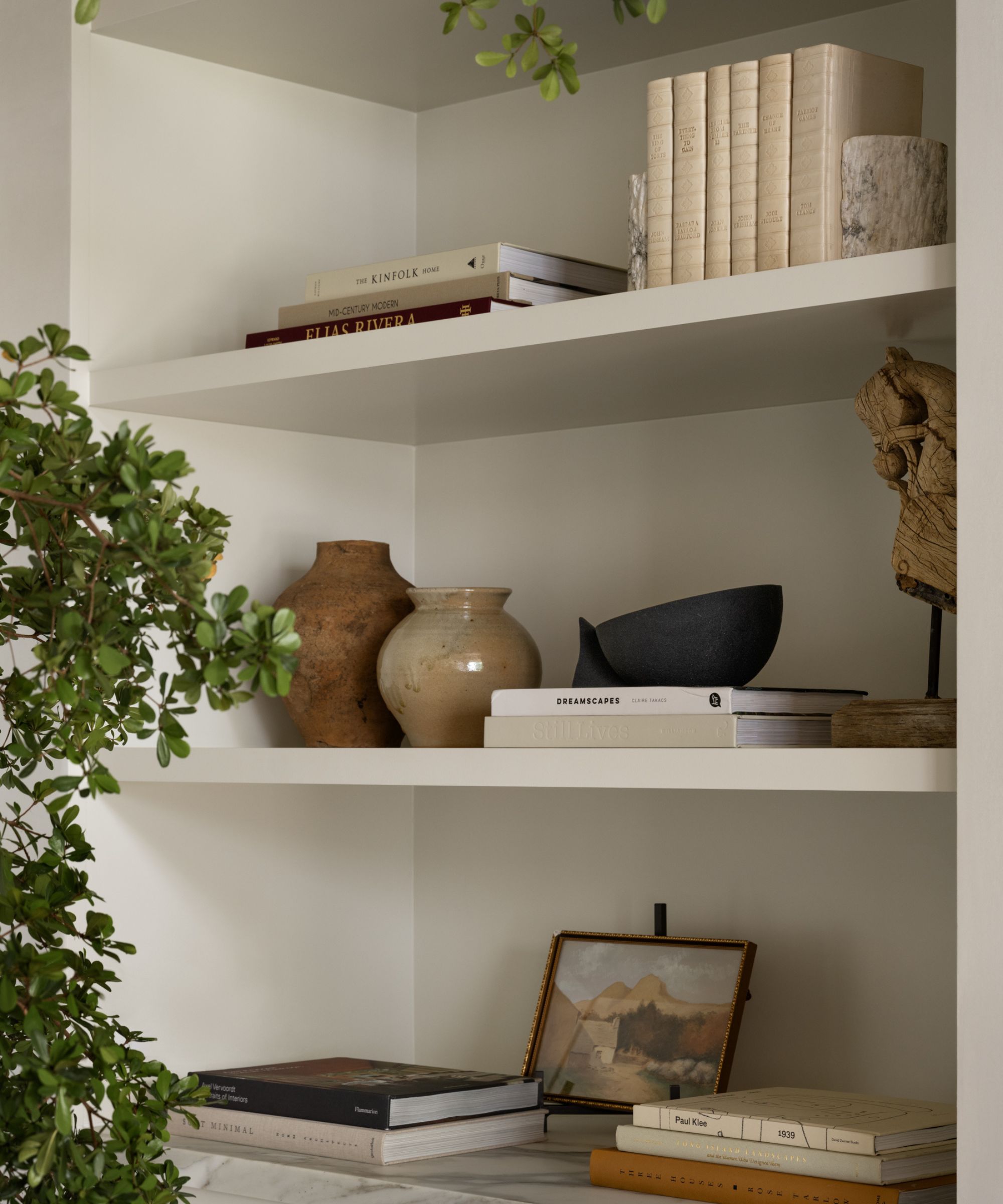
With so much focus on architectural details and grand statements, it's easy to forget that it's the details that really make a space. Even within a heritage home, Shea says small details make a huge difference. In this home, every room takes this advice to heart, but a thoughtful installation of striped wallpaper is the perfect example.
'We needed to add interest but in a light neutral, and so we did a really classic light stripe on the walls. And I love that this gives you pattern, and it gives you movement throughout the space, but it's not overwhelming ... When you're selecting a wallpaper and you have connection points between other spaces, just make sure that you're not only thinking about the one room that you're putting the wallpaper in, but that you're also considering what it connects to. You're going to be able to see it from multiple vantage points,' says Shea.
Also, consider how the colors, materials and design features you choose will work when they're all combined, Shea cautions. Especially if you have a solid grasp on your taste and design preferences, it's easy to curate a uniform room that lacks life.
'With specific taste, things can become redundant ... Lay out everything, like all your textile choices, and see how they connect together, but then make sure that every single space has one signature element that sets it apart from the rest. And then that way you'll get some connection, but then you'll also get differentiation between your spaces,' says Shea.
6. Consider asymmetry

In this home's kitchen, Shea played with asymmetry to get the upgraded white kitchen's design down. Especially when designing a heritage home, Shea says distorting the traditional rules of symmetry can create a characterful, timeless look that feels like home. When placing the range hood in this kitchen, she went for an asymmetrical look overall, placing it in the middle of the island rather than the wall.
'There are so many people that are faced with this question: "Do I center it on the wall or do I center it on the island?" And for me, the answer is typically always centered on the island, so you get this great focal moment with pendants and the range all balanced and symmetrical. And then you can kind of build out from there,' says Shea.
'Remodels are not easier than new builds. They often present challenges, but challenges present opportunities to be creative. And I also love it when clients have lived in the homes for a little bit because they've had time to think about how it should function for them. We've done this process many times, and when our clients have lived in the home, they really have an understanding of how they want it to feel, and this is a great example of that,' Shea adds.
Pay attention to how your heritage home feels before diving into renovations, and try to find that perfect blend between old and new. By honoring a home's history but still making it fresh for your day-to-day, you'll be left with a space that's one of a kind.

Abby was the Interior Design News Editor at Homes & Gardens and is now studying for her Master's degree in Journalism at City University, London. Prior to joining our team, she worked with Better Homes & Gardens, where she wrote and edited content about home decor, gardening tips, food news, and more. She studied Journalism and English Literature at New York University and moved to London to pursue her love of writing in 2023.
-
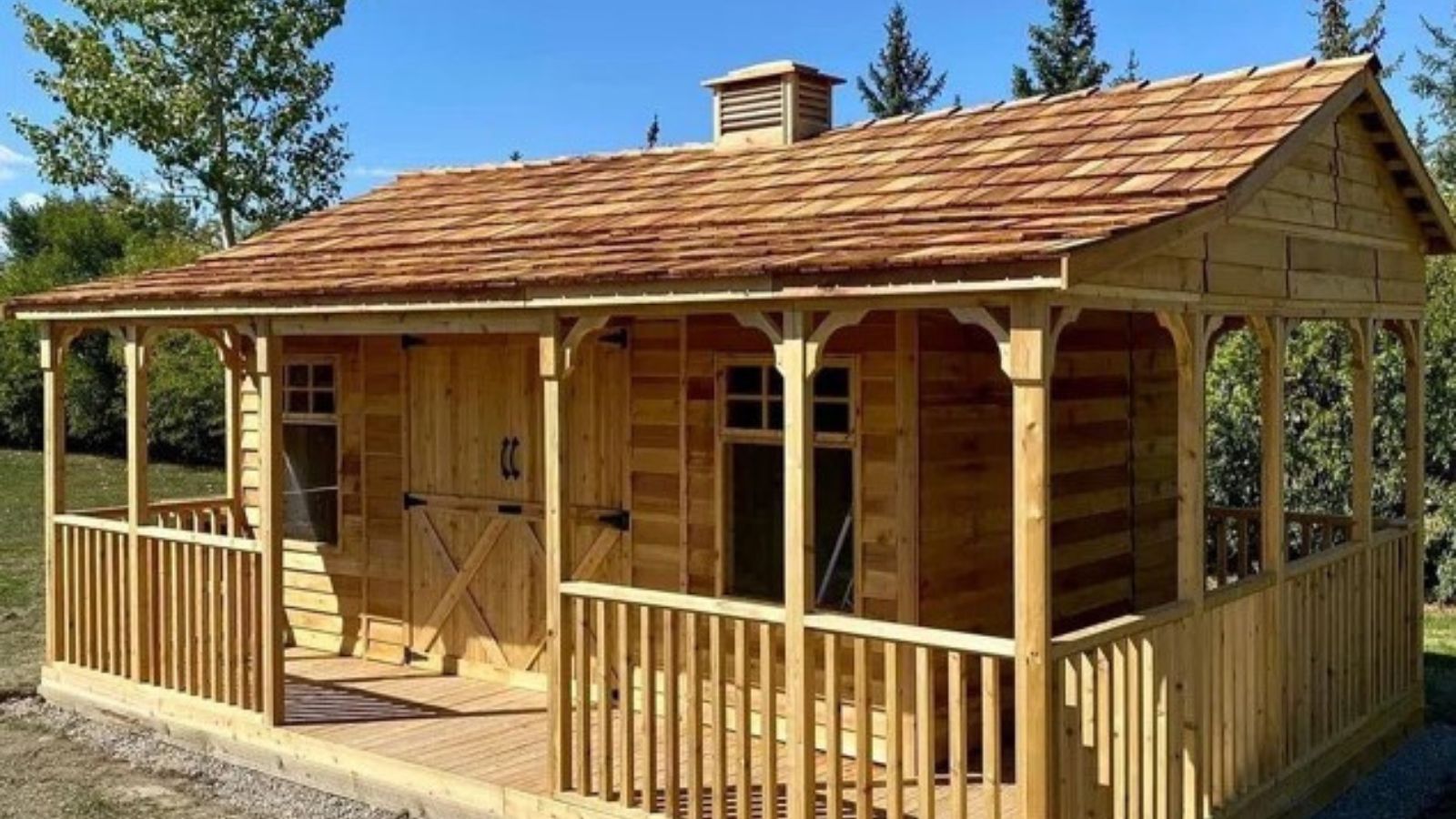 There's a rustic cottage hiding on Wayfair – it may seem unorthodox, but this tiny home taps into a growing nomadic trend (and it's under $16K)
This 'wonderful' wooden farmhouse perfects a growing trend that's changing how we see our homes – it's tiny, but somehow, it doesn't sacrifice comfort
By Megan Slack
-
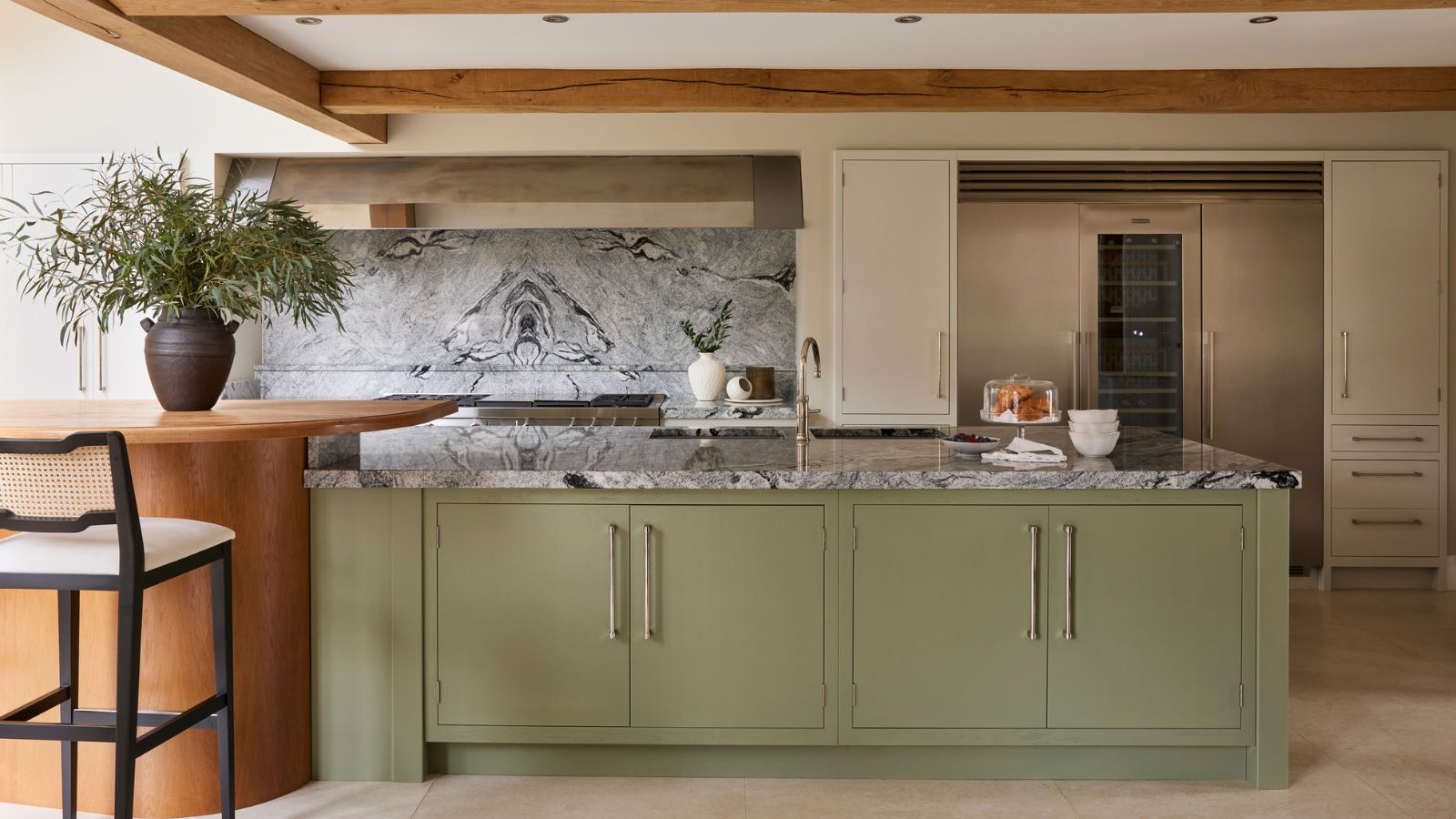 5 freezer cleaning mistakes you must avoid – or risk compromising your food quality and shortening the lifespan of your appliance
Avoid these blunders for a safer kitchen
By Seraphina Di Mizzurati
