How do you combine two rugs in one room? Shea Mcgee says the best formula is all about contrasts
Combining two rugs in one space has many pros, however it does take some consideration to get right. Here designer Shea McGee shares her easy-to-replicate formula


There are many reasons you might want to bring two rugs into one room. It's a great way to zone a larger space, subtly dividing a room it different areas. Or in a smaller room, layering rugs can make the space feel bigger as it can create the illusion of more floor space. It can also be an easy solve for covering an inherited not-so-lovely carpet.
But how do you pick two rugs that are going to work together in one space? Designer Shea Mcgee had to tackle this challenge in a large bedroom that included a seating area too, so would really benefit from some zoning. Her fail-safe formula is simple yet effective and a little unexpected too. Here's the wisdom she had to share.
A post shared by Studio McGee (@studiomcgee)
A photo posted by on
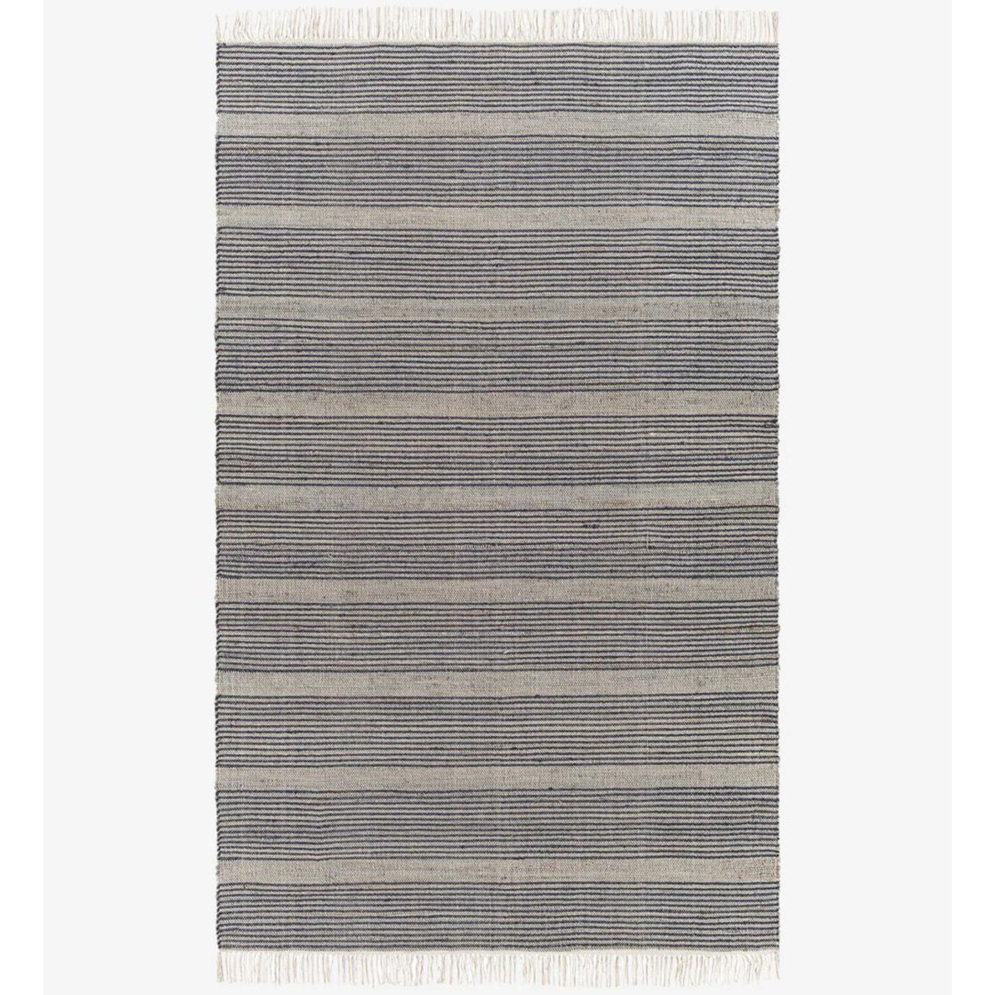
'When you are pairing two rugs in a room there are a few things that I like to pay attention to. One is the color palette and also the patterns,' Shea shares. 'So here you can see that we've got this slate blue and gray on the stripe and then we get a similar blue and neutral tones on the rug to my right.'
So far, so easy – pick two rugs that have the same shades running throughout. But that's just one part of Shea's formula. What's so key to combining two rugs in one space is as well as cohesiveness, you want to add contrast. Contrast in interior design is what makes spaces interesting, what gives them personality.
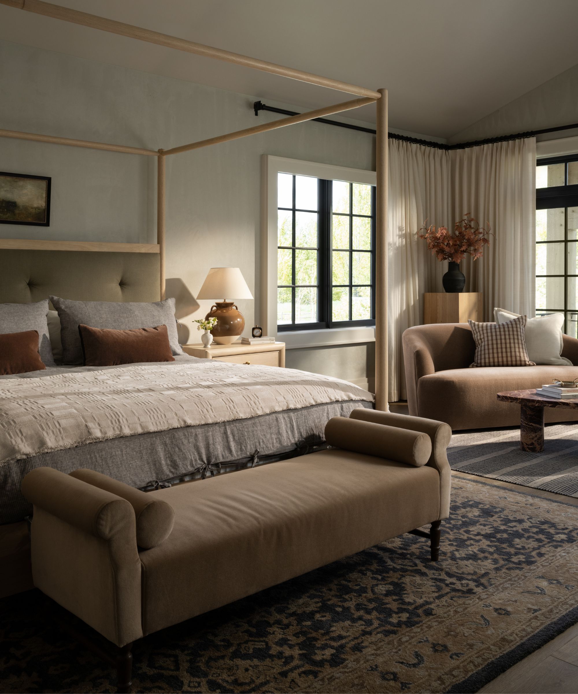
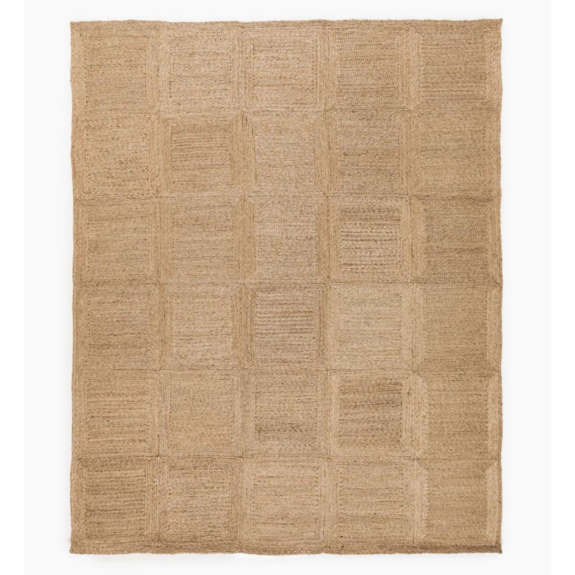
Shea continues '[This pairing] totally works because the colors are speaking to each other and also the patterns are very different.' So this is where the contrast comes in. Pick rugs that clash in pattern and even have a different style to them.
As Shea explains, 'We've got an organic shape on one and a stripe on another. It would also work to have a solid over on this side.' You've still got that same color palette, so the two patterns aren't jarring but there's a very purposeful mismatching of prints. It adds a ton of shape and interest but doesn't overwhelm the room.
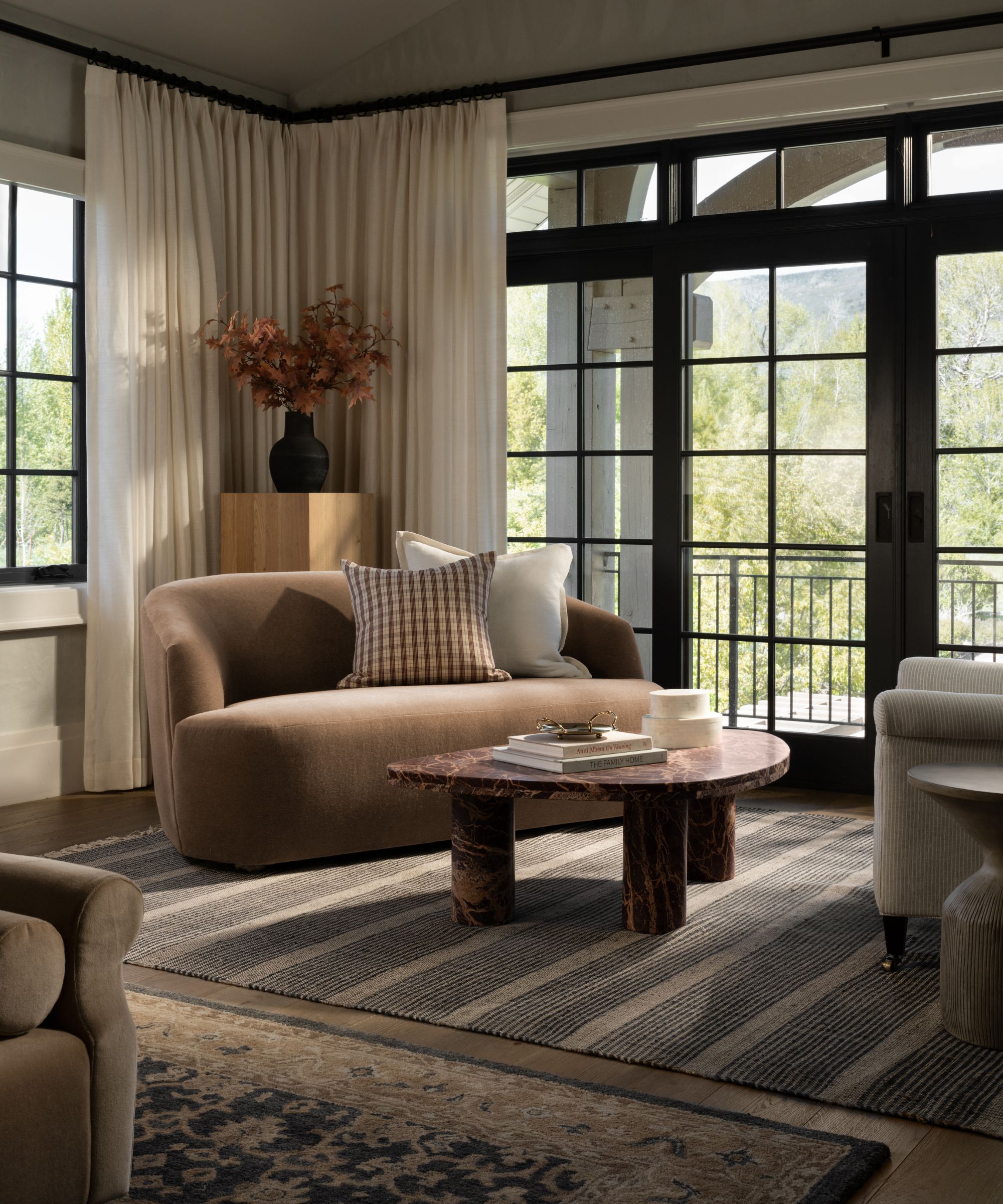
And the final part of the formula? Texture. 'The texture is also something to pay attention to,' adds Shea. 'I've got a tufted rug on one side, and a flat weave on the other. So it is all about a lot of contrast and then connection between the color palette.'
Sign up to the Homes & Gardens newsletter
Design expertise in your inbox – from inspiring decorating ideas and beautiful celebrity homes to practical gardening advice and shopping round-ups.
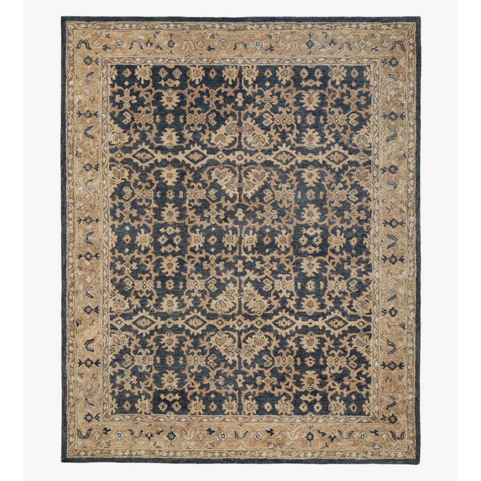
Don't let the busy pattern put you off pairing this rug with other solid color (or material) rugs or something in a more structured pattern like a checkerboard or a stripe.
The rule can be applied to more than just rugs too. It works for bedding and sofascaping, if you want to create a gorgeous layered look that looks curated rather than chaotic. And the advice about bringing two patterns into one space also works for wallpapers and prints too. In fact, cohesive but then contrast is a formula that works across so many aspects of interior design.

I am the Head of Interiors at Homes & Gardens. I started off in the world of journalism in fashion and luxury travel and then landed my first interiors role at Real Homes and have been in the world of interior design ever since. Prior to my role at H&G I was the digital editor at Livingetc, from which I took a sabbatical to travel in my self-converted van (not as glamorous as decorating a home, but very satisfying). A year later, and with lots of technical DIY lessons learned I am back to writing and editing, sometimes even from the comfort of my home on wheels.
-
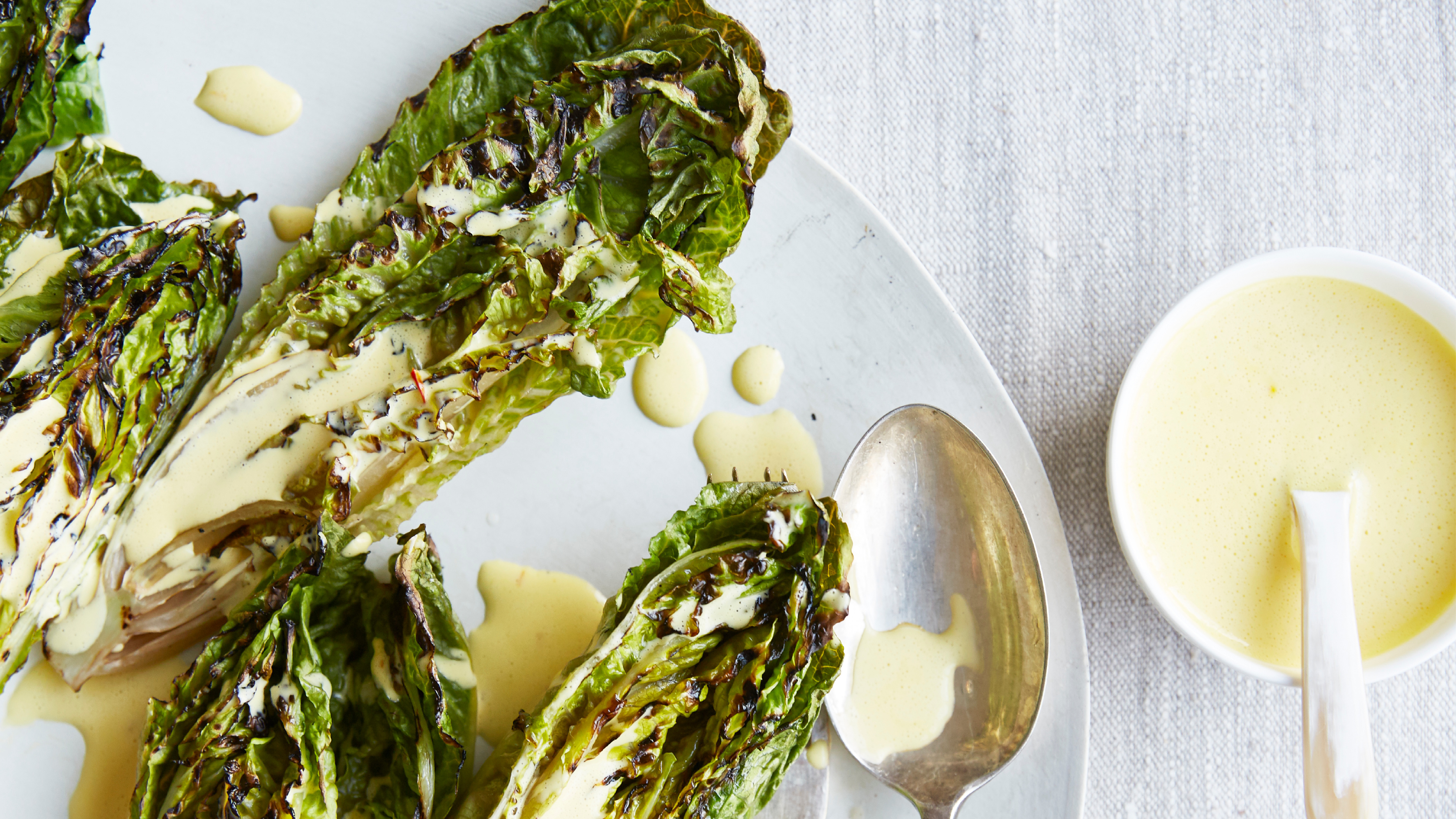 Charred little gem with saffron dressing
This recipe with charred little gem is both easy to make and sure to impress guests. It's the perfect side for fresh spring menus
By Alice Hart
-
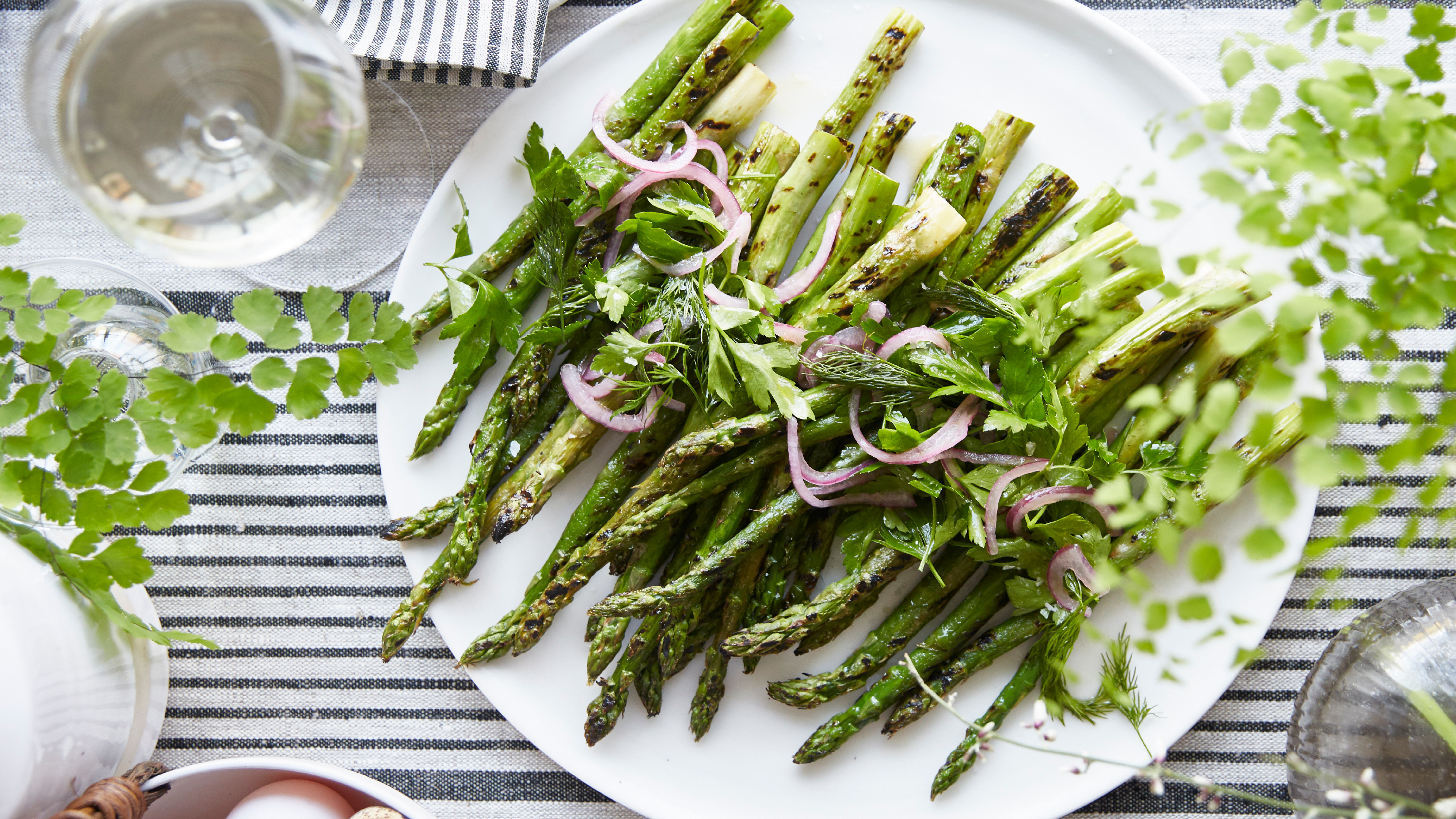 Grilled asparagus with herb and pickled red onion
This grilled asparagus couldn't be easier, and it's a wonderful way to get the best flavor from our favorite spring veg. It's perfect alongside fish or lamb
By Alice Hart
