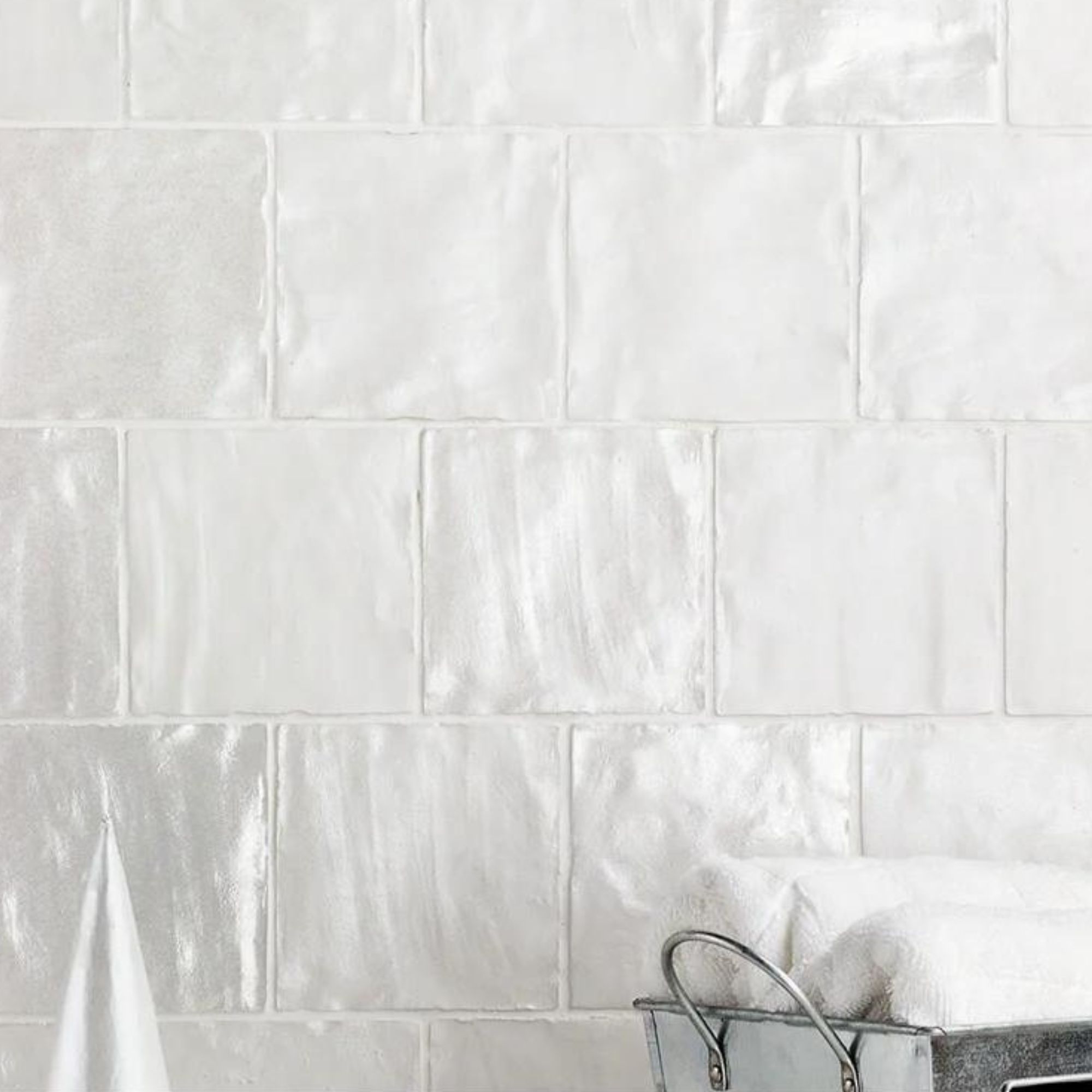
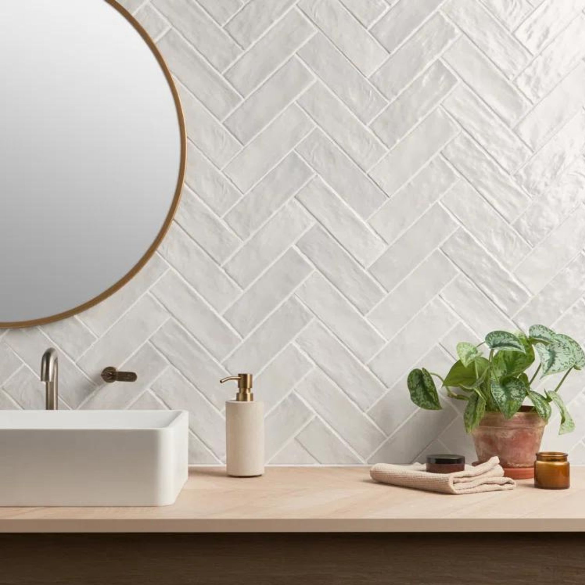
Shea McGee says tile is one of interior design's most versatile materials – this is how she made it shine in three distinct spaces
From the mudroom and the bathroom to the kitchen and beyond, tile has a place in nearly every design scheme. This is how designer Shea McGee recommends putting the timeless material to use
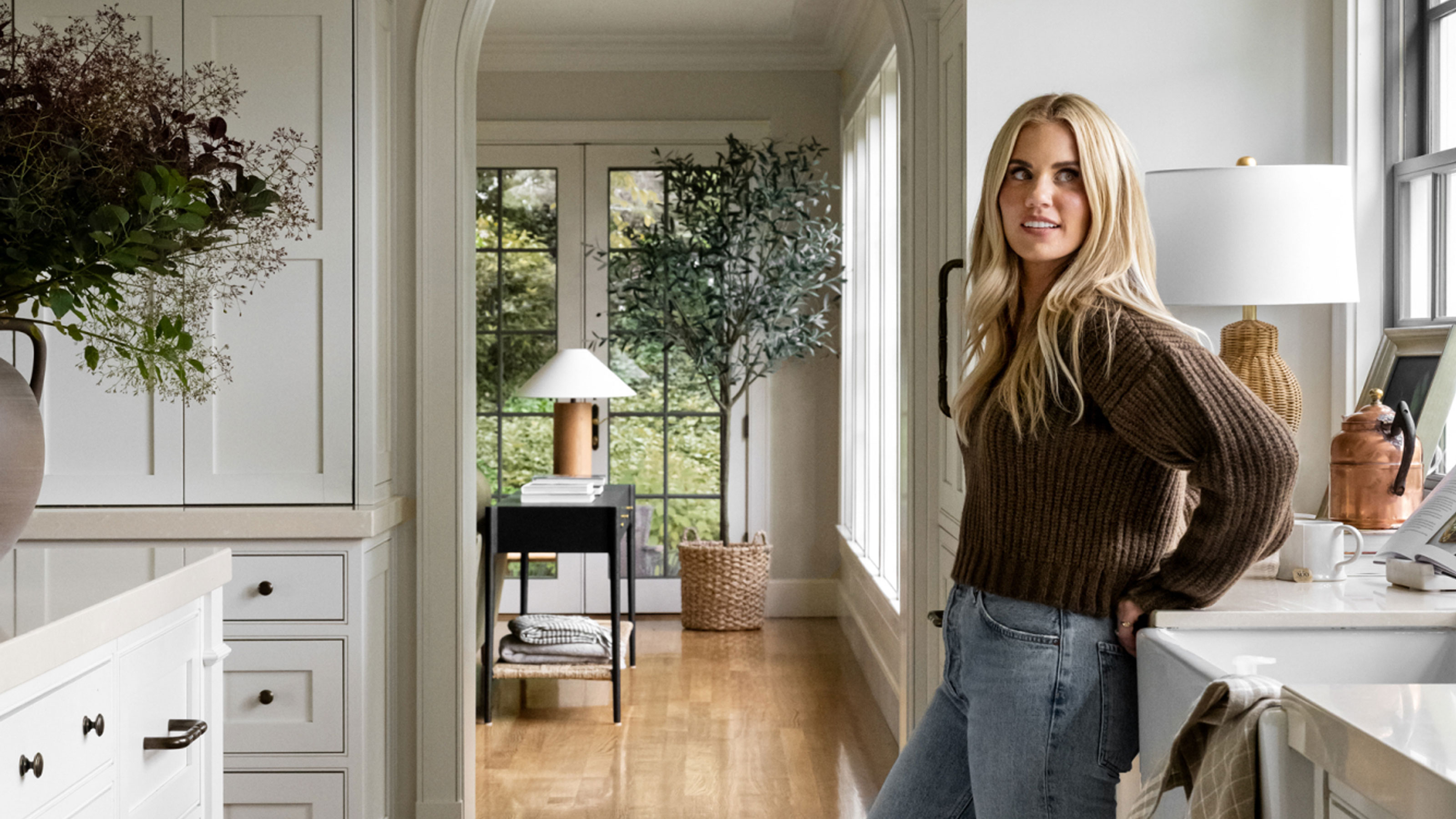

It's easy to overlook tile as predictable and mundane, but that couldn't be farther from the truth. With a myriad of shapes, colors, patterns, and textures to choose from, tile is one of the most multipurpose materials on the market. Compatible with design styles across the board, and appearing in nearly every room of the home, tile is timeless for good reason.
Interior designer Shea McGee has established herself as a reliable voice in interior design, and a recent collaboration with tile, stone, and plumbing brand Ann Sacks further cemented her tile expertise. If you require some tile-paved inspiration, Shea just shared how she styled three unique tile ideas – and the rundown includes both classic looks and out-of-the-box arrangements. This is why Shea says tile is 'one of the most versatile materials,' and how to use it throughout your whole home with style.
A photo posted by studiomcgee on
'When designing with tile, I love to select designs that feel classic and can stand the test of time. Tile is one of the most versatile materials because there are so many different applications, from the floor of your entryway to your kitchen backsplash or the tile in your bathroom. And you have so many options when it comes to layout or grout to add your personal style,' Shea says in a recent YouTube video, taking a deep dive into her collection with Ann Sacks.
As part of her collaboration with the brand – which includes selections in bespoke ceramic, dry-pressed tile, geometric marble mosaic, and dry-press porcelain – Shea styled three stunning set designs that make the most of tile. And lucky for us, the designer took the time to walk us through all three, pointing out the many uses for the material she took advantage of when designing.
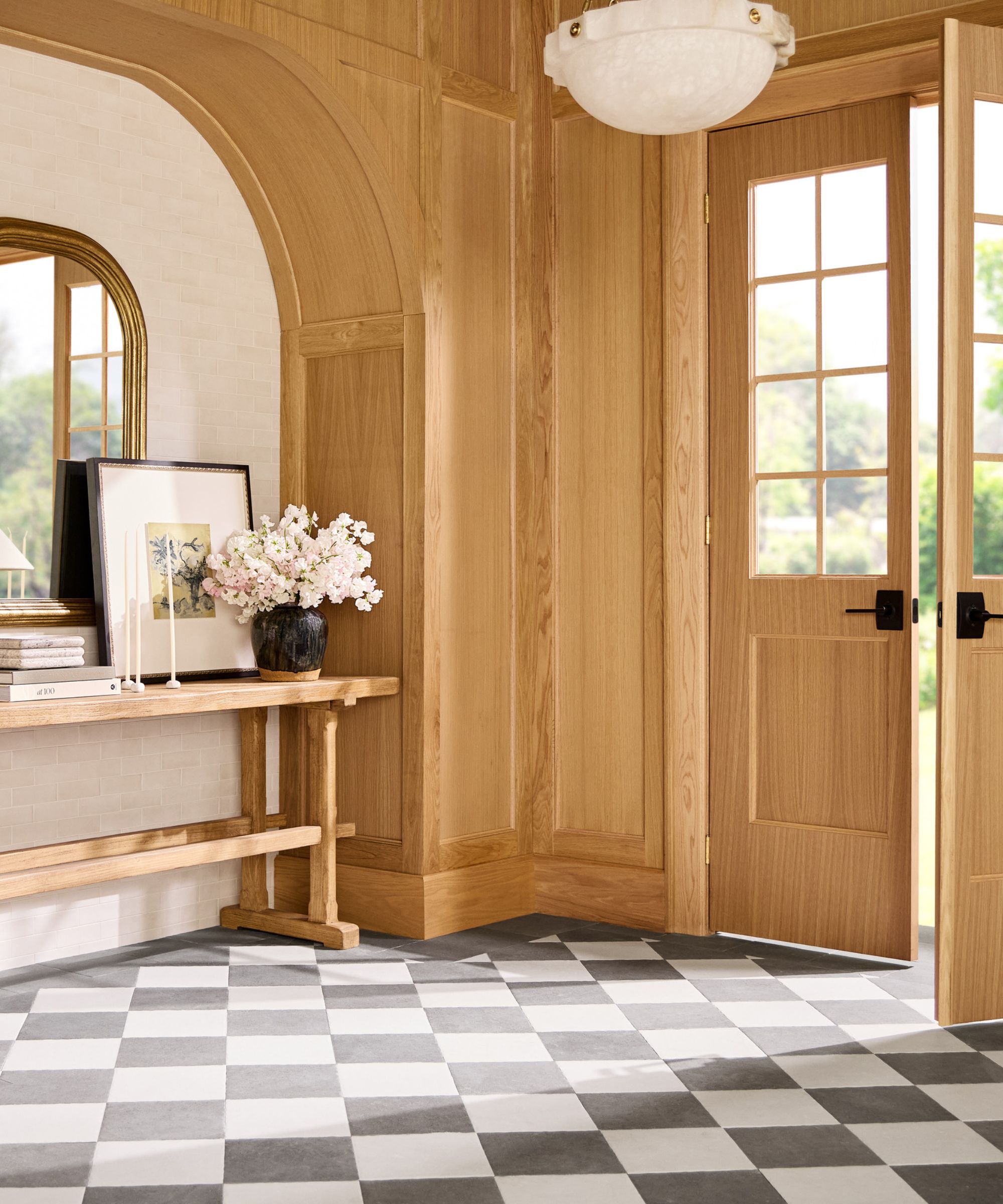
The first space Shea designed is a sophisticated entryway with muted black-and-white checkered flooring and a standout wooden archway built into the wall. A stylish console table with a considered vignette and a larger-than-life potted tree complete the look. The tiled floor is impactful and bold, but still blends with Shea's gorgeous signature style.
'I love a statement diamond pattern on the floor, and I love it in an entryway. And we created this diamond pattern, but we actually did a border along the edge. This is a really great way to finish off a space – it feels more elevated I think, and a bit more traditional to have the border. But it also does something else – it creates a nice transition,' says Shea.
Beyond simply looking nice on its own, this border allows for seamless flow between rooms. Though the tile doesn't continue on into neighboring spaces, the subtly integrated black border ensures the difference doesn't feel jarring: If you have an entry space or a kitchen that connects to other rooms of your home and you only want to do tile in one, having this border makes it feel like it's very intentional and it doesn't just but up to the other floor that you have,' Shea adds.
Sign up to the Homes & Gardens newsletter
Design expertise in your inbox – from inspiring decorating ideas and beautiful celebrity homes to practical gardening advice and shopping round-ups.
Because the diamond pattern makes such a bold statement, Shea says she wanted to keep the walls a bit simpler. With oak paneling that extends across the front door and walls, and across an expansive archway, she creates a neutral yet stunning backdrop for the rest of the room. And hidden behind the arch is yet another tile application: the Canyon Lake collection in Antique White.
'I love that you're getting a little variation in the tone of the tile, but it's very subtle, and the matte feels right for an interior space that's outside of, say, a bathroom, kitchen or mudroom. It just adds a textural backdrop to all of the styling that we layered on top of it. It also ties in really nicely with this tumbled finish that we have on the flooring,' says Shea.

Interior designer, Shea McGee founded her iconic design firm, Studio McGee, with her husband Syd in 2014. They later launched their e-commerce brand, McGee & Co, and starred in their very own Netflix show, Dream Home Makeover.
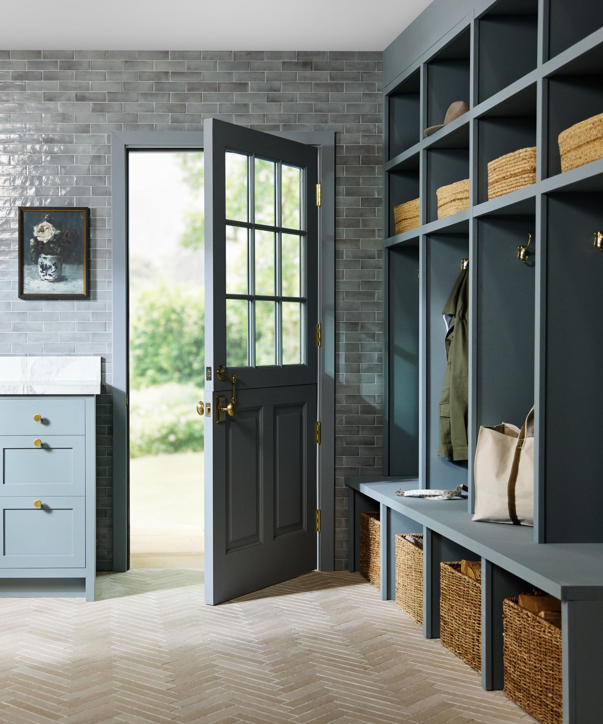
The next space Shea explores is a light, pastel blue mudroom with built-in shelving and a white basin sink. With tile on the floor and walls both, this room is a perfect example of the material's ability to blend with different styles and applications.
'I absolutely love how this mudroom turned out for a few different reasons – one, because it showcases how to incorporate durable materials in a very elevated, design-forward way, starting with the floors,' says Shea.
The mudroom's floor is made up of the Studio McGee x Ann Sacks' Novah Tile in the color Sand, laid in a herringbone pattern. Shea says this layout creates 'great movement throughout' and 'dimensionality, so it looks very authentic.' And in addition to chic style, the material is functional and fit for daily chaos mudroom tile sees. Shea also shares that the Canyon Lake Tile in the color Gloss on the walls contributes to the bold yet pared-back color that defines the space.
'This room shows that you can mix and match tiles together in all sorts of cool ways. There is a matte finish on the floors, but on the walls we have the gloss finish ... I didn't just want to do a little backsplash or a small hint of the blue – I wanted you to feel completely immersed in the color,' says Shea.
'For me, when I'm designing, I want to do a pattern with my tile, I tend to just choose one surface where I go bolder with the pattern and then a more classic pattern on the other surface. So I did herringbone here and then a brick lay on the wall and I think that that allows the pattern on the floors to really shine,' she continues.
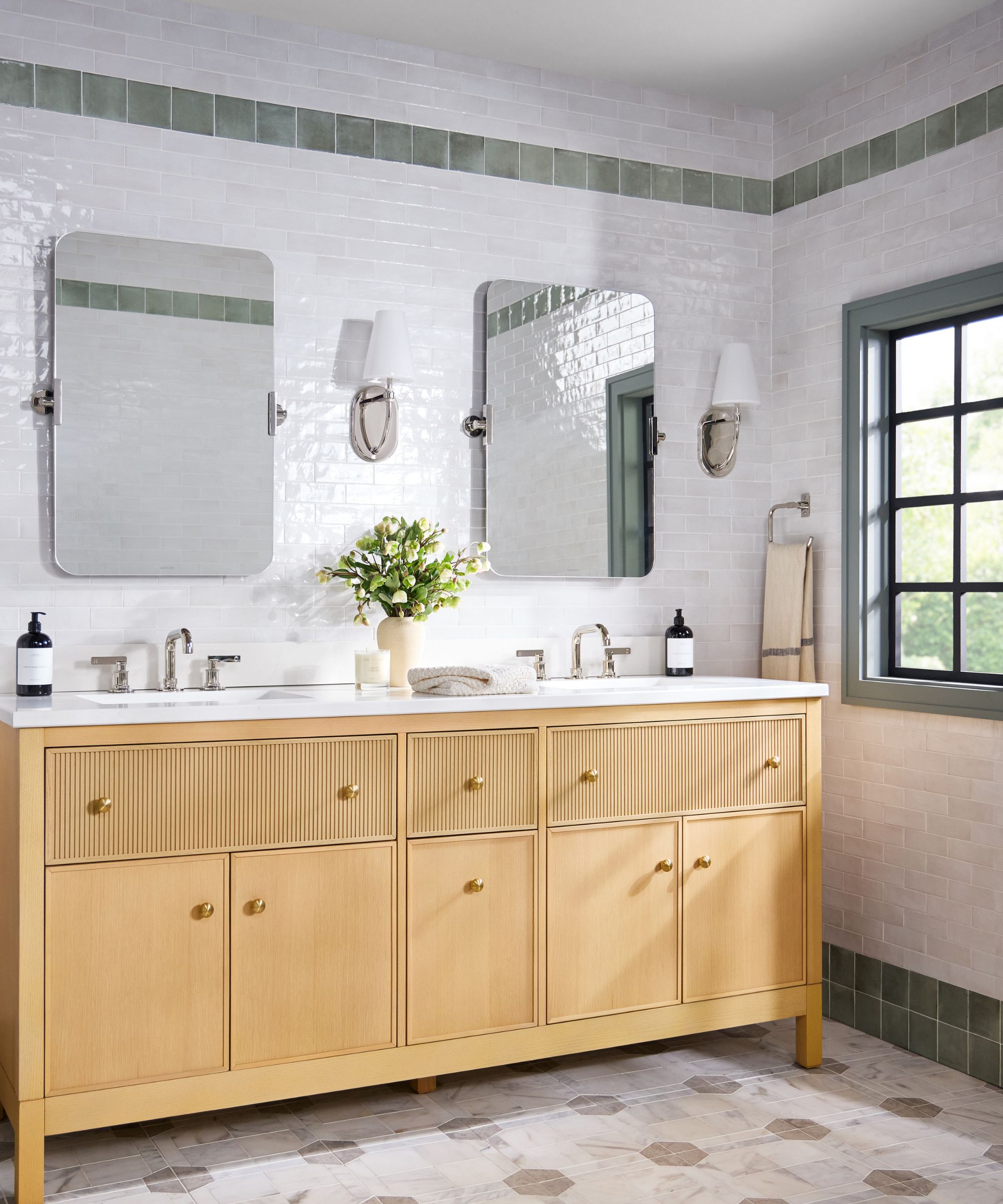
Shea says she often gets requests for 'clean and fresh bathroom' designs, and she did just that in the third and final set. But she makes sure to clarify that 'clean and fresh' doesn't have to mean 'all white' or 'flat.'
'There are so many interesting details that you can add in your bathroom designs, especially with tile. I love to add stripes and borders and mix and match things throughout every bathroom space that we design,' she says.
On the bathroom floor, she used the Rylee marble mosaic on the floors with the Brittania beige marble as an accent. For the walls, she says she was inspired by the green Canyon Lake tile in the color Sea Salt, which makes up two colorful tile stripes that run across the rest of the Antique White tile. The two stripes mirror each other, with one near the ceiling and another near the floor.
'This is a very signature Studio McGee look to do these stripes and these color accents because you're getting the color, you're getting that statement, but the bathroom still feels really classic,' she says.
Another tile tip that Shea took in stride in this space involves mounting mirrors, sconces and other decorative accents directly onto the tile, instead of the preexisting wall behind: 'This is a very designer look – you're not afraid to take risks, you just mount it to the tile and you get that whole impact,' says Shea.
There's so much you can do with tile, and Shea's gorgeous spaces prove it. Different patterns and textures are right at your fingertips, and they're ready to elevate any room or style.
'I designed this Ann Sacks collection to be classic and timeless, but also give you the optionality of being playful with the pieces as well. Tile allows you to give your space an expression that's unique to you for years to come,' adds Shea.

Abby was the Interior Design News Editor at Homes & Gardens and is now studying for her Master's degree in Journalism at City University, London. Prior to joining our team, she worked with Better Homes & Gardens, where she wrote and edited content about home decor, gardening tips, food news, and more. She studied Journalism and English Literature at New York University and moved to London to pursue her love of writing in 2023.
-
 How to clean a patio – 6 different methods, and when you must use a chemical cleaning agent
From manual scrubbing, natural solutions or calling in the pros, industry experts reveal the benefits and considerations of each method
By Andy van Terheyden Published
-
 Kris Jenner's favorite air fryer, the Ninja Crispi, is the perfect small kitchen solution – it deserves a place on the most compact of countertops
Kris approves of this compact yet powerful air fryer, and so do our own kitchen appliance experts, praising it for its multifunctionality
By Hannah Ziegler Published
