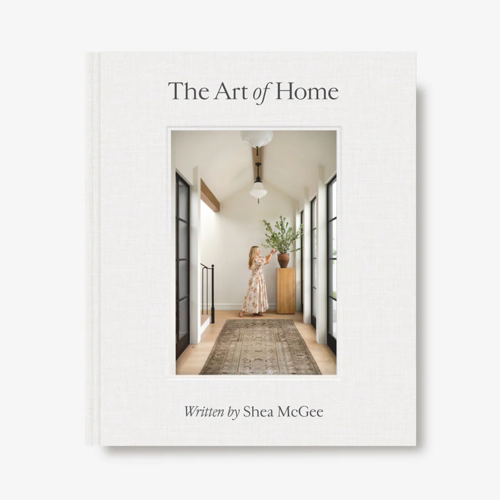
'There are a lot of things I still love that I did in the early days' – Shea McGee reflects on a decade since the launch of her design studio
Celebrating ten years of Studio McGee, we spoke with Shea to learn all about the evolution of her design style
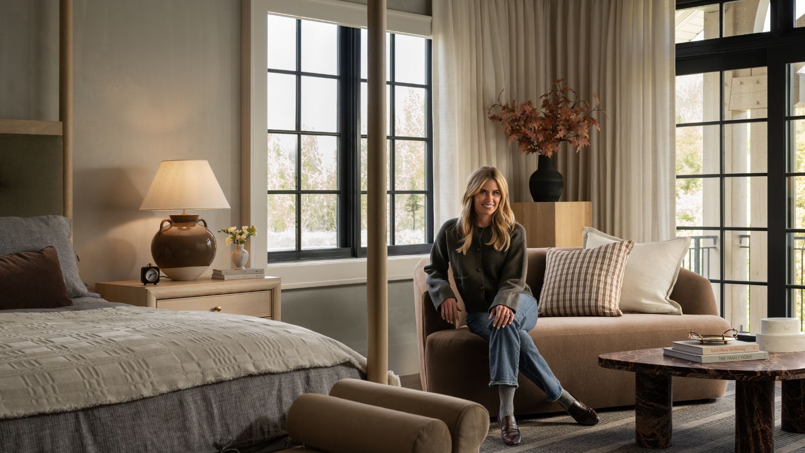

To say that Studio McGee has made its mark on the design world over the past decade would be an understatement. Indeed, the interior design studio founded in 2014 by husband and wife Syd and Shea McGee has evolved greatly to become a go-to destination for its coveted modern-meets-rustic style.
Epitomizing the 'modern heritage' aesthetic, Studio McGee's design projects are equally balanced between contemporary and classic, boasting timeless appeal through rich neutral color schemes and a relaxed feel for modern living.
To celebrate ten whole years of the design studio, we sat down with Shea to discuss all things Studio McGee, and how her design style has evolved since the beginning of her career as an interior designer.
A post shared by Studio McGee (@studiomcgee)
A photo posted by on
'I started my business in my early twenties,' Shea tells me. 'Between starting Studio McGee and now, I have had the opportunity to start with smaller projects, and as they've grown, I've learned with every single one of them.'
While Shea's approach to designing homes has naturally evolved in several ways over the past ten years – thanks to the breadth of projects she's worked across – how she decorates with color stands out as perhaps the most significant.
Cast your mind back to 2014, and images of high-contrast schemes are quickly conjured up for most of us. Indeed, decorating with neutrals has come a long way in recent years, and for Shea, it's seen a noticeable shift from bright whites to softer, warmer tones.
'When I first started, my style was a lot brighter in the bright white family,' she explains. 'I love a neutral, but I think that it's become a bit warmer over the years. I think I probably use a little less strong black and white than I did in the earlier parts of my career.'
Sign up to the Homes & Gardens newsletter
Design expertise in your inbox – from inspiring decorating ideas and beautiful celebrity homes to practical gardening advice and shopping round-ups.
'I also appreciate more depth of color than I did in the beginning,' the designer adds.
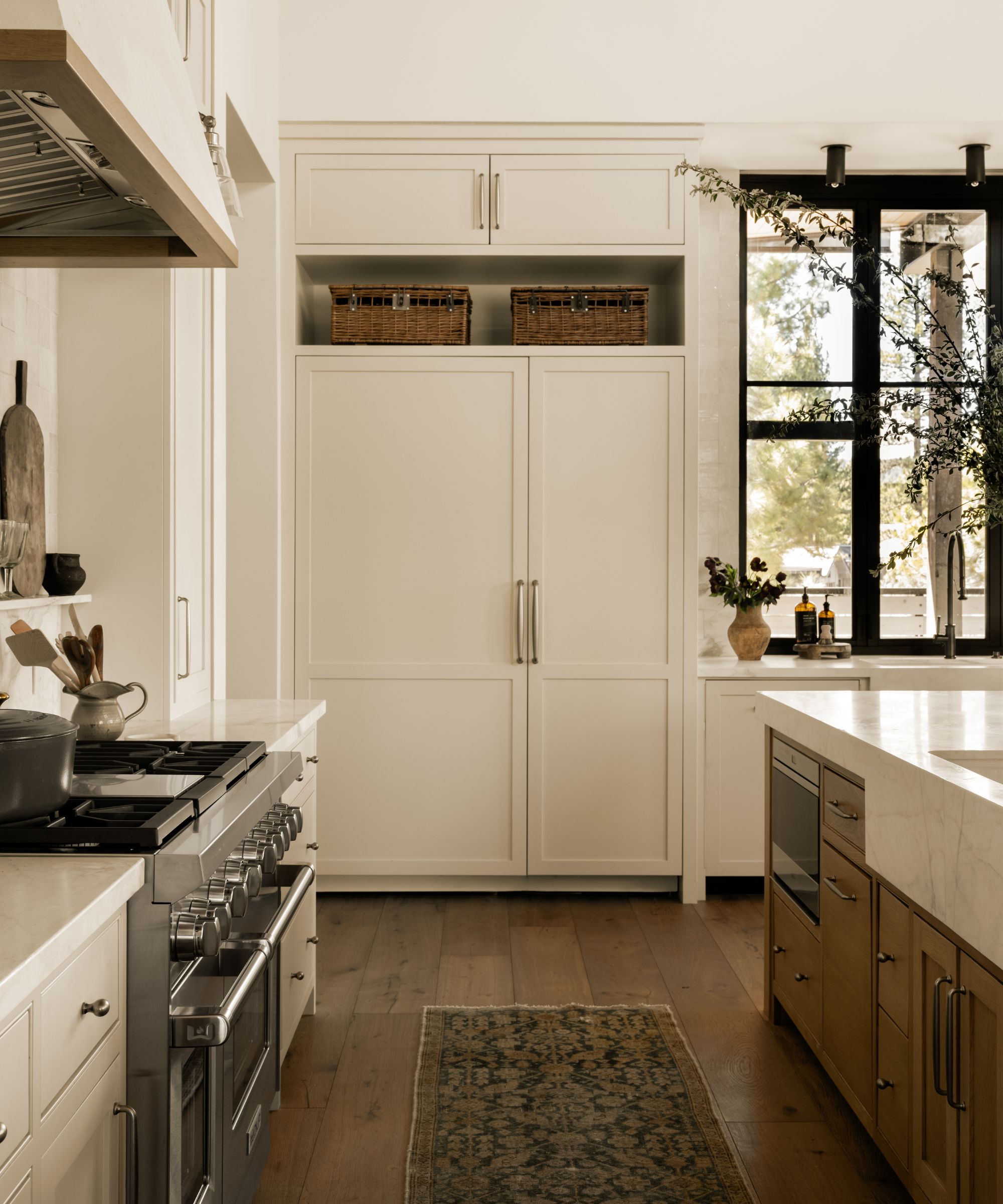
Tahoe Pines Kitchen
Shea's approach to decorating with color has become an inspiration source for many, with projects often channeling nuanced neutrals that strike the perfect balance between light and airy and cozy and welcoming. For example, the design studio's recent Tahoe Pines project channeled a host of warm neutral paint colors, much like Benjamin Moore's Creamy White used on the kitchen cabinets.
Beyond her focus on color in interior projects, there's another prominent shift Shea observes, and that's her approach to interior design trends, or more specifically, her confidence to pass on trends that don't resonate with her.
'Over time, you get more confident in your style,' Shea comments. 'I know what trends that I want to embrace and which ones I will just kind of skip over.'
This speaks to the core appeal of many Studio McGee projects: succeeding in maintaining a timeless quality by transcending quickly passing trends. 'When you're running a design firm, you're thinking of the clients themselves and what is going to be a true reflection of them,' adds Shea.
'If something is trending that really reflects their personal style, regardless of the trend, I'm only going to do it if I think it's a trend that still has some staying power.'
'At the end of the day, there are a lot of things that I still love that I did in the early days,' concludes Shea. 'I've always loved spaces that feel really airy, and I still love that to this day.'

Emily is a freelance interior design writer based in Scotland. Prior to going freelance in the spring of 2025, Emily was Homes & Gardens’ Paint & Color Editor, covering all things color across interiors and home decor for the Homes & Gardens website. Having gained specific expertise in this area, Emily is well-versed in writing about the latest color trends and is passionate about helping homeowners understand the importance of color psychology in home design. Her own interior design style reflects the simplicity of mid-century design and she loves sourcing vintage furniture finds for her tenement flat.
-
 Kevin Bacon and Kyra Sedgwick's rustic kitchen island is stunning, but controversial – designers say you can get the look without the hassle
A popular material finds an unorthodox home in the couple's kitchen, but experts disagree on whether it should be used – here's how to do it instead
By Sophie Edwards
-
 How to grow grapefruit for homegrown sweet and tangy, highly nutritious harvests – a fruit tree expert shares their planting and care tips
From planting to harvesting, this is all you need to know about grapefruit trees
By Drew Swainston
