Shea McGee's latest project is a moody mountainside home in Park City – these are her 5 favorite design moments from the space
Each detail of the 10,000-square-foot vacation home was carefully selected, but these five features stand out the most, says Shea


We've never been let down by a Studio McGee project reveal, but the celebrated design studio's brand-new build stands out from the crowd. A 10,000-square-foot vacation home in Park City, Utah (that's surrounded by stunning views of the Rocky Mountains), the Summit Estate project took four years to perfect. And the end result was more than worth the wait.
With five bedrooms and seven bathrooms to boast, the ski retreat was a significant undertaking, but founder Shea McGee perfected each and every detail. From bespoke and personalized artwork to statement furniture that reflects her client's eclectic taste, no stone was left unturned in this mountainside remodel.
Choosing our favorite design moments from the space would be quite the challenge, as every room has a wide range of outstanding details. Thankfully, Shea has saved us some time. The designer just took to Instagram to share her top five favorite features of the Park City home, and they all combine Studio McGee's transitional style with whimsical decor and moody charm. Here are Shea's selections.
1. Coffee table
A post shared by Studio McGee (@studiomcgee)
A photo posted by on
The Summit Estate project's open-plan living room features a double-sided stone fireplace, floor-to-ceiling outdoor views, and comfort-forward seating. And in the middle of the space, a whimsical, sculptural, and eye-catching coffee table makes quite the splash.
With an irregular shape and soft, curved edges, the wooden table brings heaps of character and charm to the living room. Shea has styled the organic-shaped coffee table with finesse, and it provides the perfect central island to ground the mountainside home's living space. It's no surprise that it has become one of her favorite features across the whole home.
'When we are designing these custom homes for clients, it's really awesome to get to a place where we understand their aesthetic enough where we can present something that we know they're going to be excited about, and where we're also going to be able to deliver on the Studio McGee style that they came to us for,' Shea says in a home tour posted to YouTube.
'This coffee table is one of those moments. I think that it becomes this statement that our clients were looking for, but also feels just like a natural fit with every other selection,' she continues.
Sign up to the Homes & Gardens newsletter
Design expertise in your inbox – from inspiring decorating ideas and beautiful celebrity homes to practical gardening advice and shopping round-ups.
2. Moody office
A post shared by Studio McGee (@studiomcgee)
A photo posted by on
Another of Shea's favorites is an entire room, and perhaps the moodiest room of the lot: the home office. Painted in a dark, charcoal hue and fitted with floor-to-ceiling built-in shelving, the office is a homey, welcoming workspace made for both working and lounging.
Shea shares in the final tour that the Studio McGee team 'wrapped the walls, ceiling, and the floors in a wood stain,' adding herringbone detailing on the floors and vertical paneling behind the shelves.
'I love the warm effect that you are in here. It feels cozy, and then you look out the window and you see these snow-covered mountains. It's gorgeous,' says Shea. 'We decided to paint the built-in a charcoal gray. And we wanted that to break up the wood stain but not overtake the impact of the wood stain, so we still kept the back of the built-in wood, and also the countertop.'
3. Triple bunk beds
A post shared by Studio McGee (@studiomcgee)
A photo posted by on
Shea shares that she designs rooms featuring bunk beds often, but with this space she was tasked with creating something a bit different: 'Our clients, when they came to us, they said, "We like funky things, and we want our house to feel bold. And unlike anything that you've done before,"' says Shea.
The designer felt that this kids' room was the 'perfect opportunity' to 'go big with a bold pattern on the walls,' and finally landed on a statement swatch from Quercus & Co.
'We showed our client a lot of options for wallpaper, and this is the one that they fell in love with. And then we used that as a jumping-off point for the rest of the design. I love that you're getting this dark and moody effect, especially with the additional layers that we paired with the wall color. So we have these plaid blankets and then the dark pillows, and that layering feels very mountain home but it is not a generic mountain home. It has a lot of personality,' says Shea.
Including three bunks, complete with six beds, isn't easy no matter how large the space, but Shea went in with a strategy. Placing the bottom bunks perpendicular to the top bunks, she created nightstand surfaces between each of the bottom beds, and added visual interest.
4. Home bars
A post shared by Studio McGee (@studiomcgee)
A photo posted by on
The finished Park City project has not one, but two home bars – one in the living room and one in the game room. The two spaces bring their personalities, but certain design elements are pulled through. The living room bar is fully built-in, with an enclosed area behind a gorgeous blue half-wall fitted with a marble countertop.
Dark, moody tiles – 'inspired by a color-blocking effect' – make up the back of the bar, while a gold shelving unit and English-style taps accent the deeper hue. Instead of incorporating bar stools, Shea brought in a small bistro table and upholstered swivel chairs, which are placed just in front. Within the open-plan space but still fully incorporated, this space is a considered luxury addition to the living room.
5. Dining table
A post shared by Studio McGee (@studiomcgee)
A photo posted by on
The fifth and final design moment that Shea calls out is the dining table, a long wooden piece from McGee & Co. that spans the entire length of the room.
Sitting parallel to a large kitchen island, the table seats 12, with seven chairs and two custom upholstered benches on all sides. Perfect for large dinner parties or multifunctional use, the table is elegant, high-end, and a fitting size for such an expansive space.
'We do a lot of long tables at Studio McGee, and [for] a client, we can customize all of these McGee & Co. pieces that you see. And so this is our Orville Extension Table, and we've just done it in a very, very long length,' says Shea of the dining room.
Get the look
These five standout moments from the Summit Estate new build are just the beginning – the rest of the home is just as stunning. With mountainside views all around, it'd be hard to go wrong, but Shea has only added to this vacation home's timeless appeal.

Abby was the Interior Design News Editor at Homes & Gardens and is now studying for her Master's degree in Journalism at City University, London. Prior to joining our team, she worked with Better Homes & Gardens, where she wrote and edited content about home decor, gardening tips, food news, and more. She studied Journalism and English Literature at New York University and moved to London to pursue her love of writing in 2023.
-
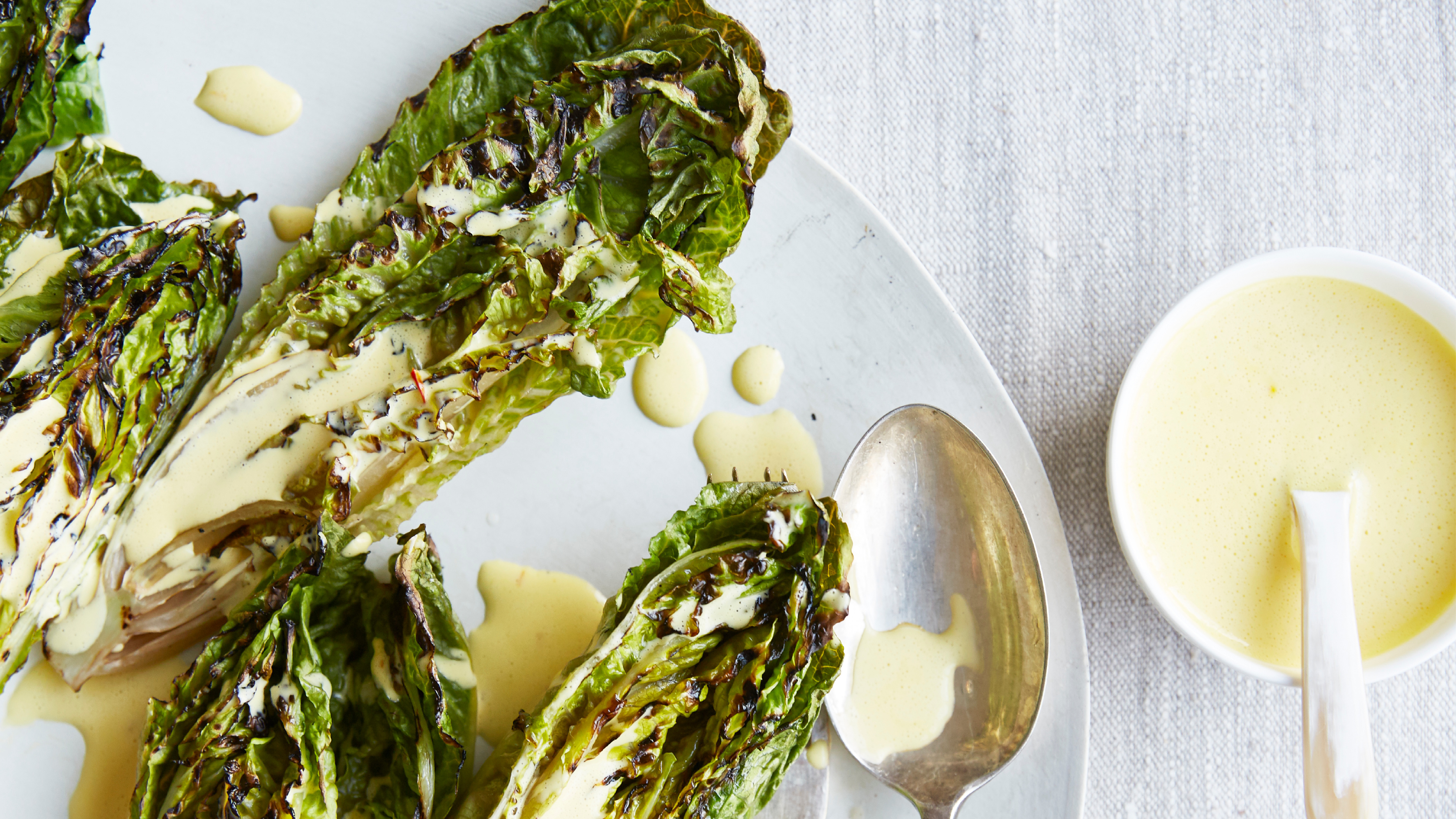 Charred little gem with saffron dressing
This recipe with charred little gem is both easy to make and sure to impress guests. It's the perfect side for fresh spring menus
By Alice Hart
-
 Grilled asparagus with herb and pickled red onion
This grilled asparagus couldn't be easier, and it's a wonderful way to get the best flavor from our favorite spring veg. It's perfect alongside fish or lamb
By Alice Hart
