6 tips from Shea McGee to transform children's bedrooms – playful patterns and plenty of storage are essential
Shea McGee has designed her fair share of children's bedrooms, and now she's sharing her top tips. This is how to design a fun (yet still functional) space for kids


It's no secret that designing kids' bedrooms is no simple task. Between making room for toys and clutter, finding a balance between function and fun, and allowing for your child's tastes to change over time, there are so many important considerations to keep in mind – if you're overwhelmed, you're not alone.
Luckily, Shea McGee – renowned interior designer and owner of homeware brand McGee & Co. – has racked up quite a bit of experience designing kids' bedrooms. With three children of her own, and dozens of projects with Studio McGee under her belt, she's learned a thing or two about what makes these exciting, vibrant spaces successful.
Now, she's taken to social media to share her top tips for kids' room redesigns. After completing her stunning Holladay Haven Project for a family with five kids, she's taking us through each and every space, revealing the behind-the-scenes decisions that went into creating the final look.
'We are asked a lot about designing kids' spaces, and I think that should is a word that I often hear from people – like "How should you design kids spaces?" And the reality is you need to do what's best for you and your family. But I'm going to share some of my tips that I've learned through designing dozens and dozens of kids' spaces over the years,' says Shea.
1. Display books creatively
A post shared by Studio McGee (@studiomcgee)
A photo posted by on
The first space Shea shows off is 'The Reading Loft,' a long, narrow room on the second floor that opens up to the home's family room. To decide what to do with the awkwardly shaped space, Shea says the Studio McGee team listened to their clients' interests and discovered the perfect solution. Avid children's book collectors, the family loved the idea of a reading loft layout, and a floor-to-ceiling built-in with slanted display shelves did just the trick.
'If you're a book collector, I cannot recommend these slanted shelves for children's book storage enough. This is a design detail that we incorporate into a lot of homes – not just kids' spaces. We've done this in offices, in living rooms, and used coffee table books to display. This is a really sophisticated way to organize children's books, and it makes it easy for kids to reach and grab their favorite book, and for you to swap out. And then the book covers act as art itself,' says Shea.
2. Layer patterns on patterns
A post shared by Studio McGee (@studiomcgee)
A photo posted by on
Shea then takes us into the girls' room – a large space with another lofted area, shared between two sisters. 'This room has a lot of square footage to work with, and when we started out, we knew that we had a lot of space. We needed to fit two beds, a desk, additional closet storage, and then update the loft behind me,' says Shea.
By adding a railing to the loft, built-in shelves, a window seat, and a ladder, Studio McGee gave this space an adorable makeover. Patterned curtains hung behind glass-paned closet doors and loads of floral patterns make this space feel feminine and inviting – every detail was intentional. When designing children's rooms, Shea suggests you lean into layering pattern – the normal rules don't necessarily apply.
'One of my big rules for designing kids' spaces is that there are no rules when decorating with patterns. I have like five floral prints in here, and I would probably tell you to not do that in your main living space – unless that was the look that you're going for. But in here, it's just like, "Let's go for the scallops let's go for the stripes let's go for the plaid, let's go for five florals." And it all works. That, for me, feels playful and interesting and then still allows you to get some level of sophistication in the overall design,' says Shea.
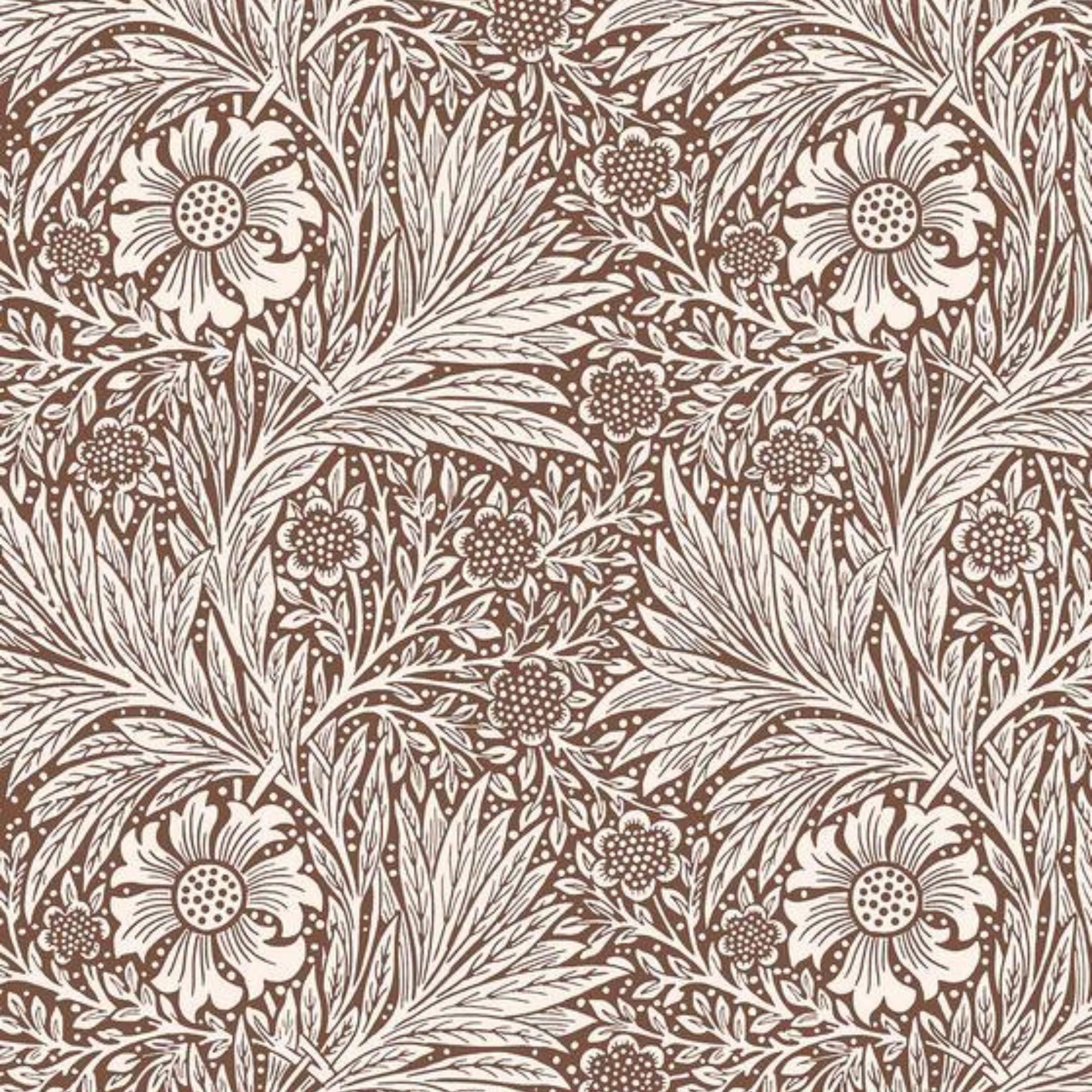
The wallpaper, the Marigold Umber print from McGee & Co.'s collection with Morris & Co., brings the main pattern into this space: 'You have seen it in a powder bathroom, but it takes on a whole new life in this girls' space. I loved that we got a high contrast, and then the floral element in it really adds that femininity for this bedroom,' Shea adds.
3. Include plenty of closed storage
A post shared by Studio McGee (@studiomcgee)
A photo posted by on
Designing nurseries and rooms for toddlers is perhaps an even bigger challenge, as you'll want to ensure they won't grow out of the room's look before the design process is done. But the next room Shea tours is a gorgeous example of transitional decor done right. Designed for a toddler close to outgrowing the nursery, this serene bedroom fits the bill. Decked out in McGee & Co.'s Sea Houses Wallpaper in green, the room has a 'fantastical, dreamy' look that still feels quite calm, says Shea.
'I love to embrace daybed ideas when we're designing for toddlers, because this is a great way to push up the bed against the wall, and also gives them this feeling of still being in a crib but we're transitioning to a big kid bed,' she adds. In all children's rooms, but especially in toddlers' rooms, Shea says incorporating plenty of closed storage options is vital to maintaining a clean, clutter-free environment.
'We like to give lots of opportunities for closed storage for parents to be able to take all the stuff that is inevitably scattered all around the kids' floor and then hide it away. And then your room feels clean again, and then the kids get all of it out again, but this gives us a fresh start every day today. And then opportunities for display – you're still getting a kids' space, but it has a more designer look,' she adds.
4. Experiment with playful bathroom details
A post shared by Studio McGee (@studiomcgee)
A photo posted by on
Two of the bedrooms included in this project are connected by a Jack and Jill bathroom, and Shea successfully pulled design elements from each connecting bedroom into the communal space. By having a bit of fun with tile layout and colorful vertical paneling, she created a functional space that still feels whimsical and fun. Though she suggests getting creative in kids' bathrooms, she also notes you'll want to keep some features on the timeless side.
'I think that when you are updating a bathroom and you are designing for kids, I would still make sure that you're really doing a classic vanity design that can grow. That's not something that you're wanting to replace like you are pillows. I think you can play with color – we have this really great green in here that ties into both bedrooms. This is kind of like the point of connection between them. And then have fun with the tile – you can take classic tiles and change up the colors and the borders and the patterns,' she says.
5. Design within a color family
A post shared by Studio McGee (@studiomcgee)
A photo posted by on
'So we've got two bedrooms down, and two to go... Sometimes when you have multiple bedrooms to design, you have to decide, "Is every single one of these bedrooms in the house getting a pattern, or are we going to break it up a little bit?" And we decided to break it up a little bit and do this chocolate brown grasscloth wallpaper on the walls, and then add the pattern into the fabric behind the bed,' says Shea.
The chocolate brown tone gives a warm and welcoming feel to the room, and provides a perfect jumping-off point for the rest of the space. Shea incorporated a plaid, flannel fabric and a pillow with a fishing-inspired fabric to cater to the kids' interests. She also layered several green tones, pulling through from the bathroom vanity, to the quilt, to the nightstand, and to several decorative accents.
'I think that some people, when they're starting to design and they're a little overwhelmed, their instinct would be to match every single green. I don't think that you have to match every single green, but what you do need to do is make sure that they play well together,' says Shea.
'I love to layer monochromatic colors on top of each other because you get more drama and more punch with that color. But a trick that you can use is opening up a paint swatch deck and looking at the cards, and saying like, "Could all of those colors kind of fit from light to dark on that paint swatch?" And if they can, then they can play really well together in the space,' she adds.
6. Pay attention to the details
A post shared by Studio McGee (@studiomcgee)
A photo posted by on
Details make a good space great, and kids' rooms are no exception. In the last of three bedrooms, inspired by the kids' love of cowboys and basketball, Shea points out several small details that make this space kid-friendly and characterful. Although the overall color scheme is simple and classic, a second look at the bedding reveals Shea's signature attention to detail.
'When you really zoom in, you'll see the level of detail that we do in these Studio McGee projects. The sheets have little stars on them, the custom pillow has this little fringe detail, we've got a wool pillow with a contrast edge, and then we have this blanket here that even is sports-inspired. We've done fish sheets, we've done trains and stars – we've done all of it – and it's a really fun way to incorporate something a bit more playful and then still have some sophisticated bedding layered on the top,' says Shea.
As in the girls' room, a customizable pinboard hangs above a desk in this space. Shea says this detail 'goes a really long way' because it allows kids to hang their artwork, keepsakes, and more. She points out a hand-written sign hung on this one that says, 'Dutch, do not come in,' and laughs – 'I know my kids have similar sentiments on their doors,' she says.
'I hope you enjoyed, and are inspired to go into your own kids' spaces and make them your own,' Shea concludes. 'Don't forget that you shouldn't use the word "should," because you just got to do what works for you and your family. Listen to your kids' interests and draw inspiration from that.'
Sign up to the Homes & Gardens newsletter
Design expertise in your inbox – from inspiring decorating ideas and beautiful celebrity homes to practical gardening advice and shopping round-ups.

Abby was the Interior Design News Editor at Homes & Gardens and is now studying for her Master's degree in Journalism at City University, London. Prior to joining our team, she worked with Better Homes & Gardens, where she wrote and edited content about home decor, gardening tips, food news, and more. She studied Journalism and English Literature at New York University and moved to London to pursue her love of writing in 2023.
-
 This is the single best upright vacuum we've ever tested – and it's on offer with $130 off at Shark for a limited time only
You won't want to miss this one
By Dan Fauzi
-
 Nate Berkus says slipcovered sofas are back on trend – and I just found a way to create this designer-approved laid-back look from just $86
This classic style is making a strong comeback, but did you know you don't have to buy a whole new couch to get this Nate-approved look?
By Eleanor Richardson
