'I am seeing this unexpected color combination everywhere' – here's why designers love the 'should never be seen together' pairing of sage green and pale blue
Pale blues paired with subtle shades of green is the coolest new pairing to bring tranquility to your room
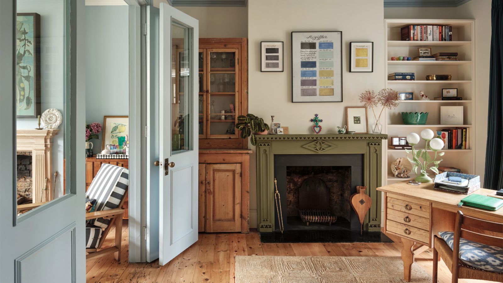

Both blue and green are renowned for their calming and grounding qualities. Green, with its deep ties to nature – think lush leaves, vibrant plants, and sprawling meadows. In contrast, blue casts our mind to ocean waves and serene lakes.
Like every color, blue and green span a spectrum from light to dark, and from subdued to vibrant, but opting for softer, more muted tones and blending them together creates an exceptionally harmonious color combination that is the very embodiment of serenity. In my opinion, you couldn’t pick a more calming duo for your room color ideas.
As interior designer Laure Nell says ‘Together, these two shades create a subtle but layered color palette that feels timeless, adaptable, and just unexpected enough to feel new. Blending harmoniously in various spaces, from minimalist modern to more traditionally layered interiors.’
Personally, I’m an avid advocate for the calming effects of green; various shades, from deep forest to soft sage, find their way into my home, complemented by muted blue accents in my bathroom and kitchen. And as someone who primarily works from home, it’s essential to cultivate an environment with colors that foster tranquility and mindfulness.
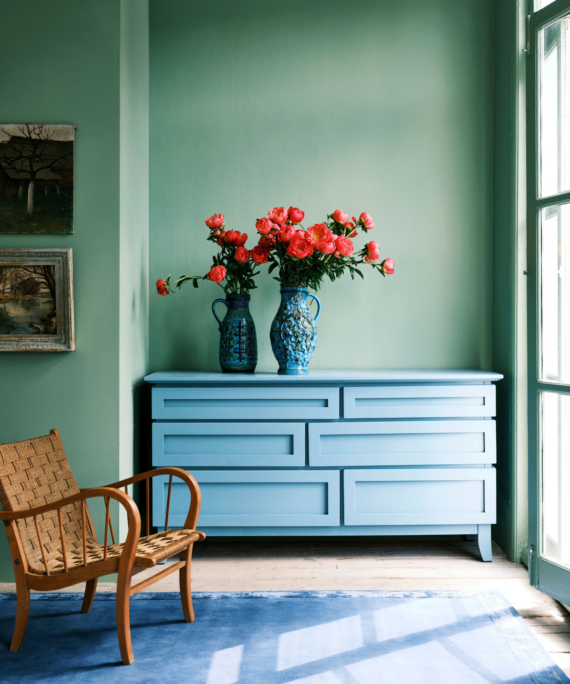
While the old adage ‘blue and green should never be seen’ may be familiar, I, along with a panel of expert interior designers who back my opinion, firmly believe that this earth-and-sea color pairing is a total dream combo.
Nina Lichtenstein explains that 'although they belong to cool tones, these shades offer a subtle contrast that complements rather than competes. Sage green brings an earthy warmth that grounds a space, while light blue adds an airy, expansive feel, evoking wide-open skies and calm waters.'
'Together, they create a serene environment without the chill sometimes associated with cooler colors. This combination is versatile enough to work in any room, from light-filled living spaces to cozy bedrooms, making it a go-to for designers wanting to add character without overpowering a space.'
To prove just how well these shades work together, I asked designers how they would bring these two colors together to create a trendy, yet timeless space.
1. Creating calm in the kitchen
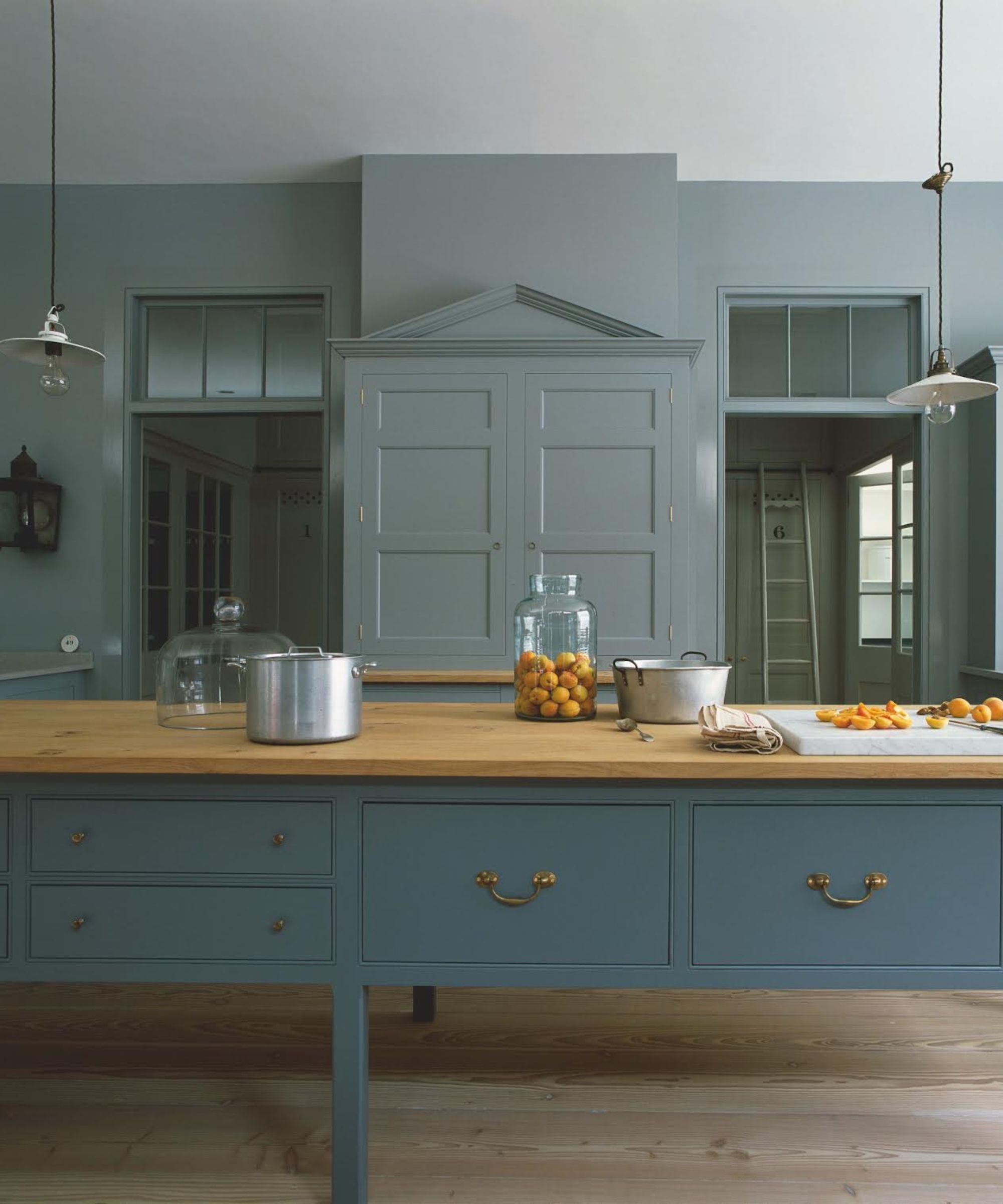
The kitchen is often described as the heart of the home. A vibrant hub where people gather, conversations flow, and activity thrives. While kitchen trends have traditionally favored sterile whites and blacks, a shift toward color has emerged over the past few years, with many embracing a more bespoke and personal approach to this bustling family space.
With all that energy and chaos that happens in a kitchen, Plain English Design chose a soothing combination of muted blue and sage green for their country-style design. As Merlin Wright, Design Director at Plain English Design, explains, ‘Green is a popular color for interiors because it is intrinsically linked to the natural world, offering a calming and uplifting effect. When we envision a landscape, we see how beautifully green complements other natural hues like blues, browns, and grays. We often employ tonal schemes featuring subdued variations of the same color to replicate nature’s serene effects.’
In this particular space, the design features a two-tone blue for the island and walls, while the pantry rooms in the background are painted in a subtle sage green that closely mirrors the blue.
2. Connecting spaces
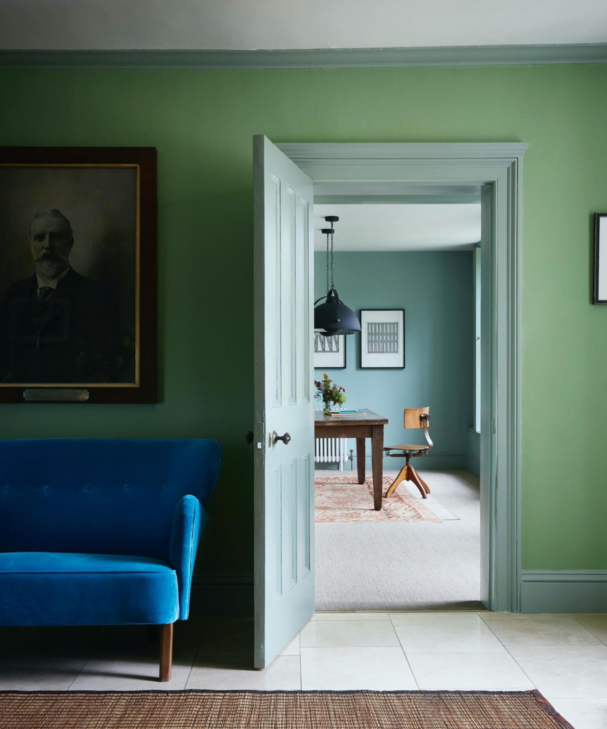
In this room, interior designer Nicola Harding cleverly connects the spaces by mirroring the color used on the architrave, skirting and door, with the walls in the adjoining room.
By weaving in similar tones, textures, and finishes throughout the home, Nicola creates a cohesive feel that allows each space to feel distinct yet connected. Here, the walnut accent furniture harmonizes perfectly with the blue and green palette, bringing home that naturalistic feel, while a striking piece in strong blue finds its perfect place alongside complementary shades.
Nicola notes, ‘This generous Georgian country house has been re-energized for family living. On the ground floor, the entranceways and connecting spaces are painted in vibrant blues and greens. In the entryway, the walls feature Chelsea Green II, with the woodwork in Salvia by Paint & Paper Library.’
I've taken this approach in my own home too. I’ve found that subtle tones of green serve as a unifying color, bringing the entire space together. Each room has its own unique character, yet they are synchronized by a familiar palette that ties in beautifully with adjacent spaces.
3. Mix and match with tiles in a bathroom space
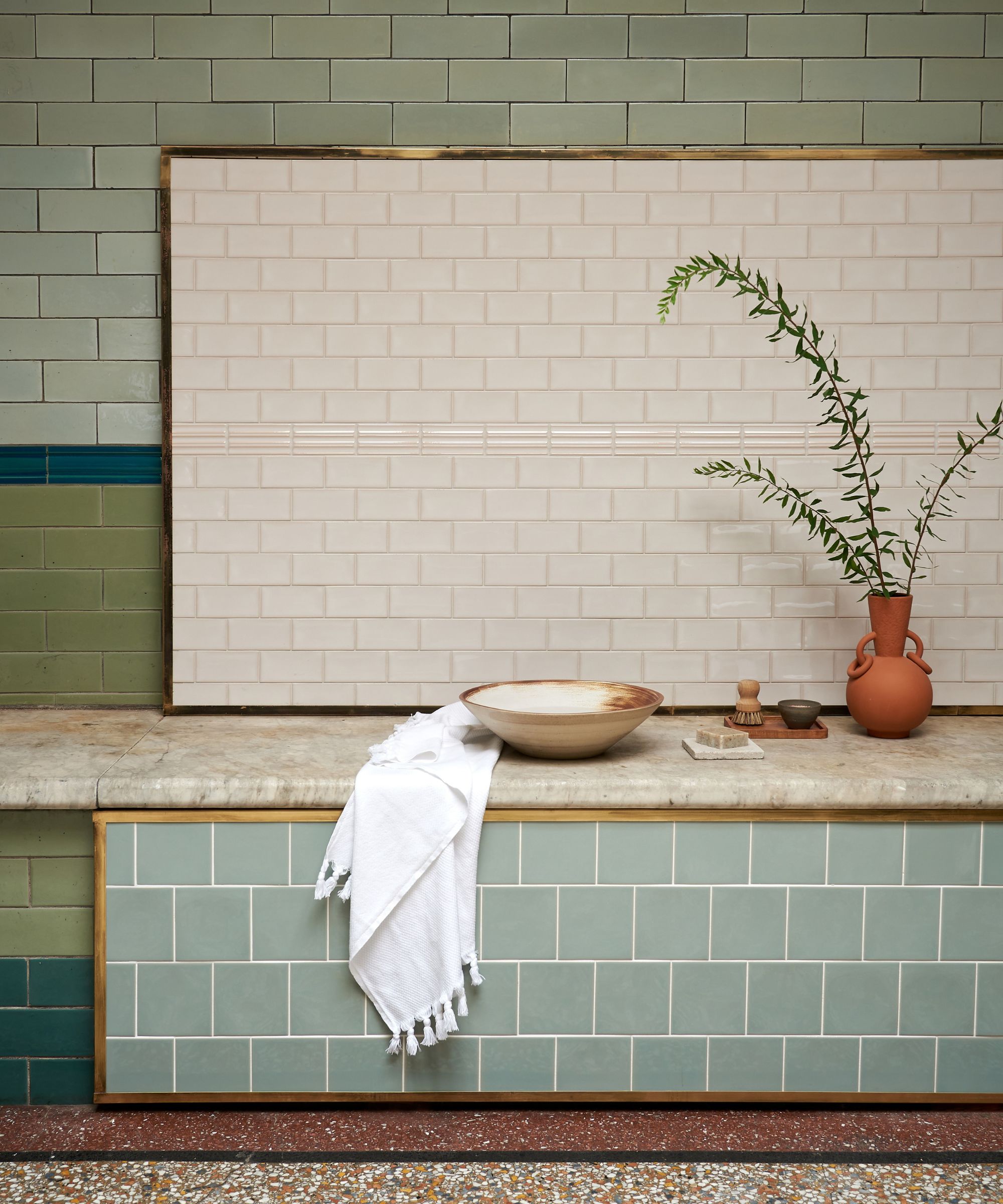
It’s not just about paint when it comes to incorporating blue and green into your home. When you're looking into bathroom design schemes this tranquil combination really shines, thanks to its natural association with water. There are countless tiles available in every imaginable shade, making it the perfect place to experiment.
Soft, muted tones work beautifully together, and for a layered look, play around with tiles in various shapes and shades that are closely related. White tiles can serve as a grounding neutral, tying everything together.
Nina Lichtenstein explains, ‘Designers are embracing this pairing in clever ways. In bathrooms, sage and light blue tile backsplashes create a unique color story that feels fresh and inviting, evoking a spa-like atmosphere without relying on standard neutral’. This calming duo pairs wonderfully with natural textures like marble and stone, and for a touch of glamor, a hint of brass complements the colors beautifully.
When it comes to incorporating color into my home, tiling is by far my favorite choice. Tiles offer a unique versatility in terms of shape, finish, and pattern, allowing for a completely personalized look.
4. Subtle patterns with botanical inspired wallpaper
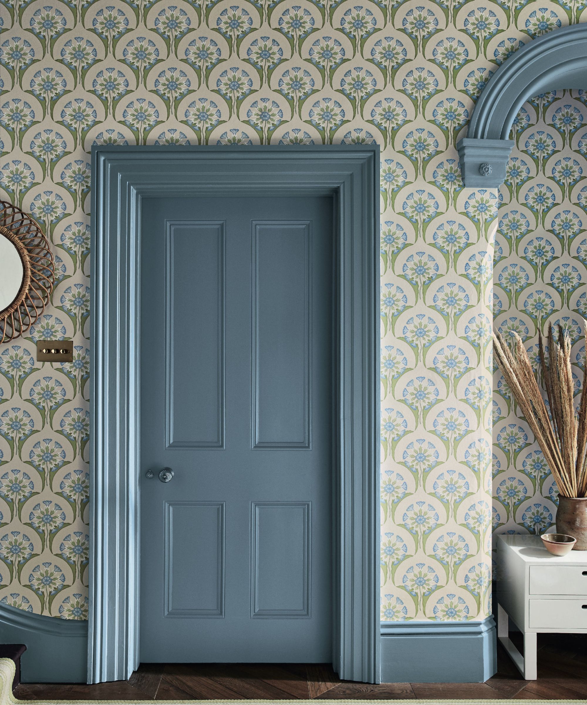
Color-drenched walls and bold paint-on-paint techniques certainly make a statement, however, sometimes a more subtle approach is needed, and wallpaper can be a fantastic way to introduce a color palette without overwhelming a space, especially in smaller or narrow areas of the home.
For rooms where space is at a premium, following the 70-20-10 rule can be a helpful guideline to stick by; using a light neutral as your base color can create an illusion of openness.
When using this design strategy with pale blue and green hues, embracing nature feels instinctive. As Ruth Mottershead, Creative Director at Little Greene, points out, 'The Hencroft wallpaper in the Blue Primula colorway features stylized cowslips in shades of green and blue, perfect for adding personality and character to a space.'
This botanical combination blends beautifully with natural materials like timber or stone flooring and rattan furniture. It works wonderfully in a hallway. Open the front door and it's an immediately inviting and welcoming atmosphere that sets the tone for the rest of the home.
5. Painting accent furniture
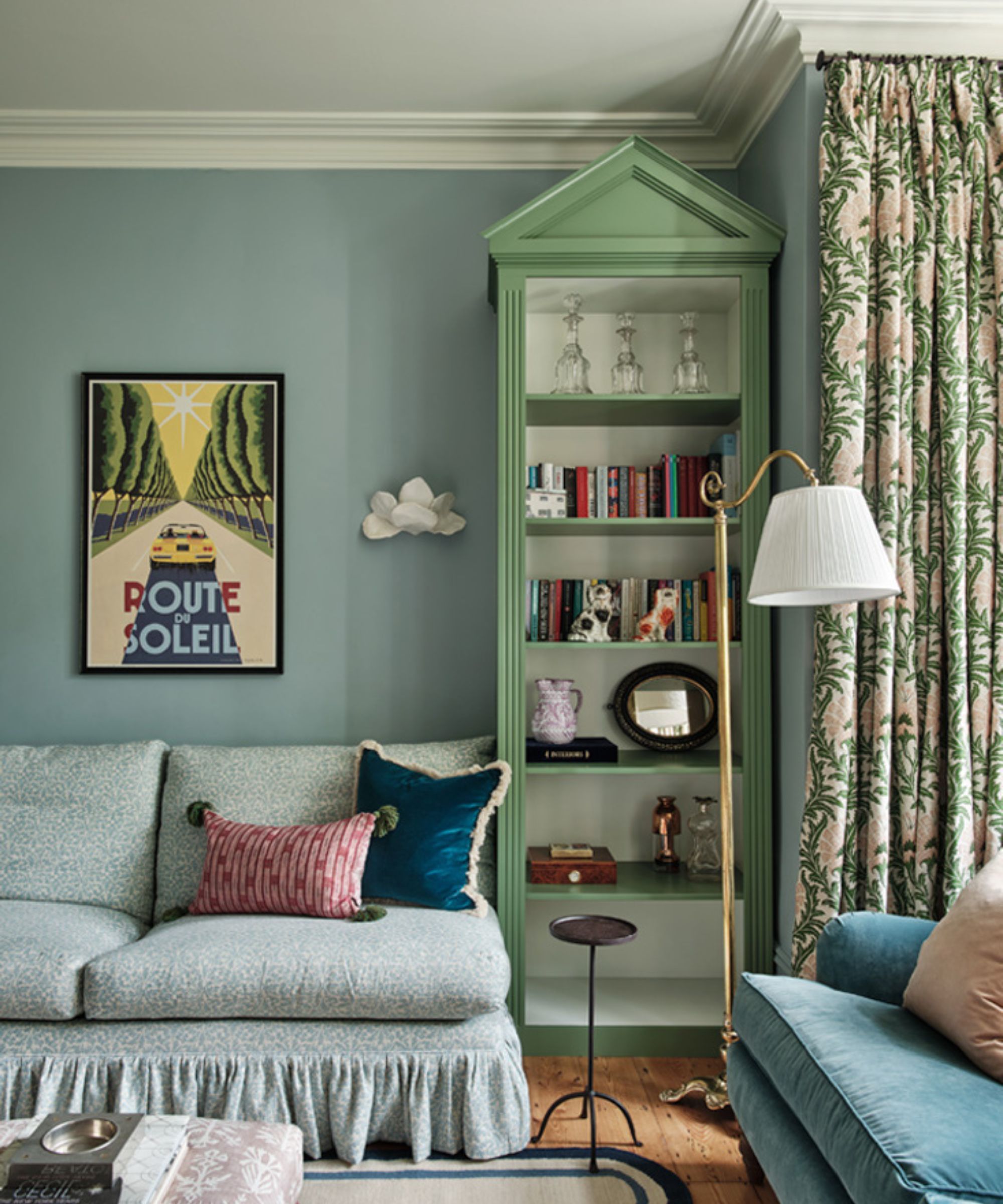
There are countless ways to introduce a color combination into a room, and painting accent furniture is one of the simplest methods.
For those who prefer a more understated wall scheme with a dominant color, adding a piece of furniture in a contrasting hue can incorporate this trend without the long-term commitment of painting a wall, and all the hassle that goes with it if you change your mind.
If you happen to stumble upon the perfect piece in just the right color, consider yourself fortunate/ If not, why not take on a DIY project to customize it to your liking?
Interior designer Pandora Taylor embraced this approach, selecting a stunning hero piece painted in Farrow & Ball's Calke Green, which complements the calming Parma Gray walls (also by Farrow & Ball).
As Pandora explains, ‘This room features a pairing of light blue and green in a dusty, sophisticated tonal family. These slightly muted tones are a wonderful way to add color without overwhelming the space. Green and blue evoke such joyful imagery. Think blue skies and lush countryside, this winning pair can truly brighten a room and make it feel more inviting.’
All of these dream-like spaces prove how well muted greens and blues can work together. It's a scheme that feels very on-trend for right now, but there's a timeless and liveable feel too. As Emily Kantz, color marketing manager at Sherwin-Williams reminds us 'Sage green and light blue is everywhere, from spa-like bathrooms, light and airy living rooms to quiet and relaxing bedrooms, this color combo is having a moment!'
Design expertise in your inbox – from inspiring decorating ideas and beautiful celebrity homes to practical gardening advice and shopping round-ups.

Isabella is a freelance interiors journalist based in London. Her journey into the world of interiors began as a stylist assistant and researcher, working with some of the leading UK interiors stylists.
Over the past few years she has contributed to various prestigious titles, working on features, news, buying guides, trend pieces and more, bringing forth expertise and a unique perspective on the ever-evolving world of home decor and design.