5 room-elevating color schemes that designers swear by and are so simple to replicate
Finding the perfect color scheme can be tricky. Our experts weigh in on their tried and tested favorites to elevate any room
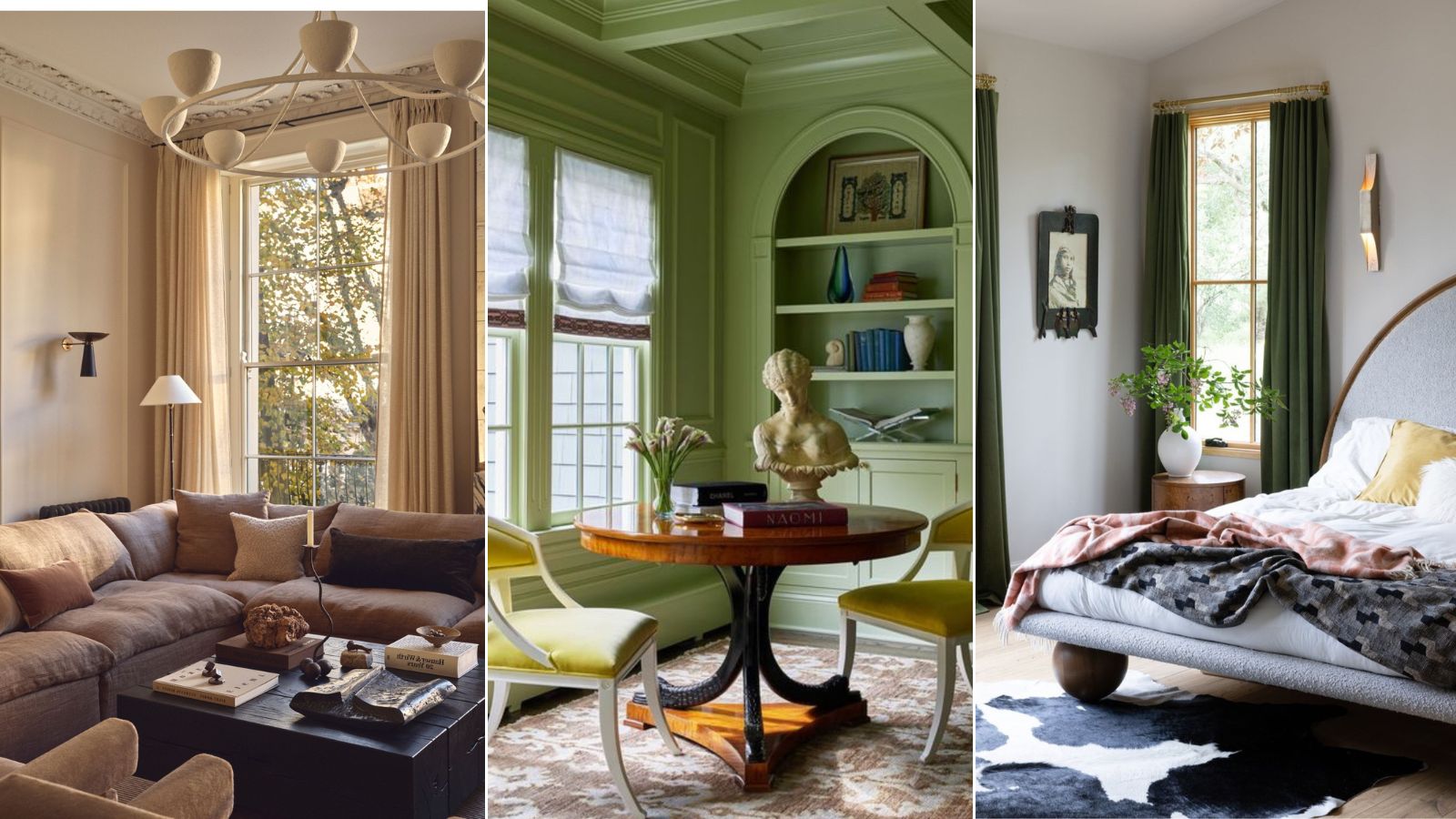
Choosing a color scheme for your home can feel like a daunting task. With countless ideas to choose from, narrowing down the perfect one, can often leave you feeling overwhelmed.
It’s no surprise that for most, it becomes a journey of trial and error, with many opting for neutral walls and safe furnishings as a fallback. However, a thoughtfully chosen color scheme has the power to really elevate a room, often more so than the furniture and decor you put in it.
The right palette can make a room feel open and airy, snug and cozy, energizing, or calming. It can tell a story, reflect your personality, or create a serene, neutral backdrop. With so much riding on this decision, it’s no wonder choosing the right colors can feel high stakes.
To lend a helping hand, we’ve consulted a panel of interior designers to share their room-elevating color schemes and paint ideas to help you choose a scheme that's really going to change your space for the better.
How to choose colors to elevate your rooms
With color schemes and design strategies in their hundreds, choosing the right palette for your home can feel like an uphill trek.
From choosing between analogous color palettes or bold complementary schemes, muted shades or vibrant pops, to double drenching versus accenting with furnishings, the possibilities are endless.
So we asked color experts and interior designers what are their tried and tested colors that always elevate a room? Making it look more sophisticated, more elegant and more expensive.
1. Cream and sand
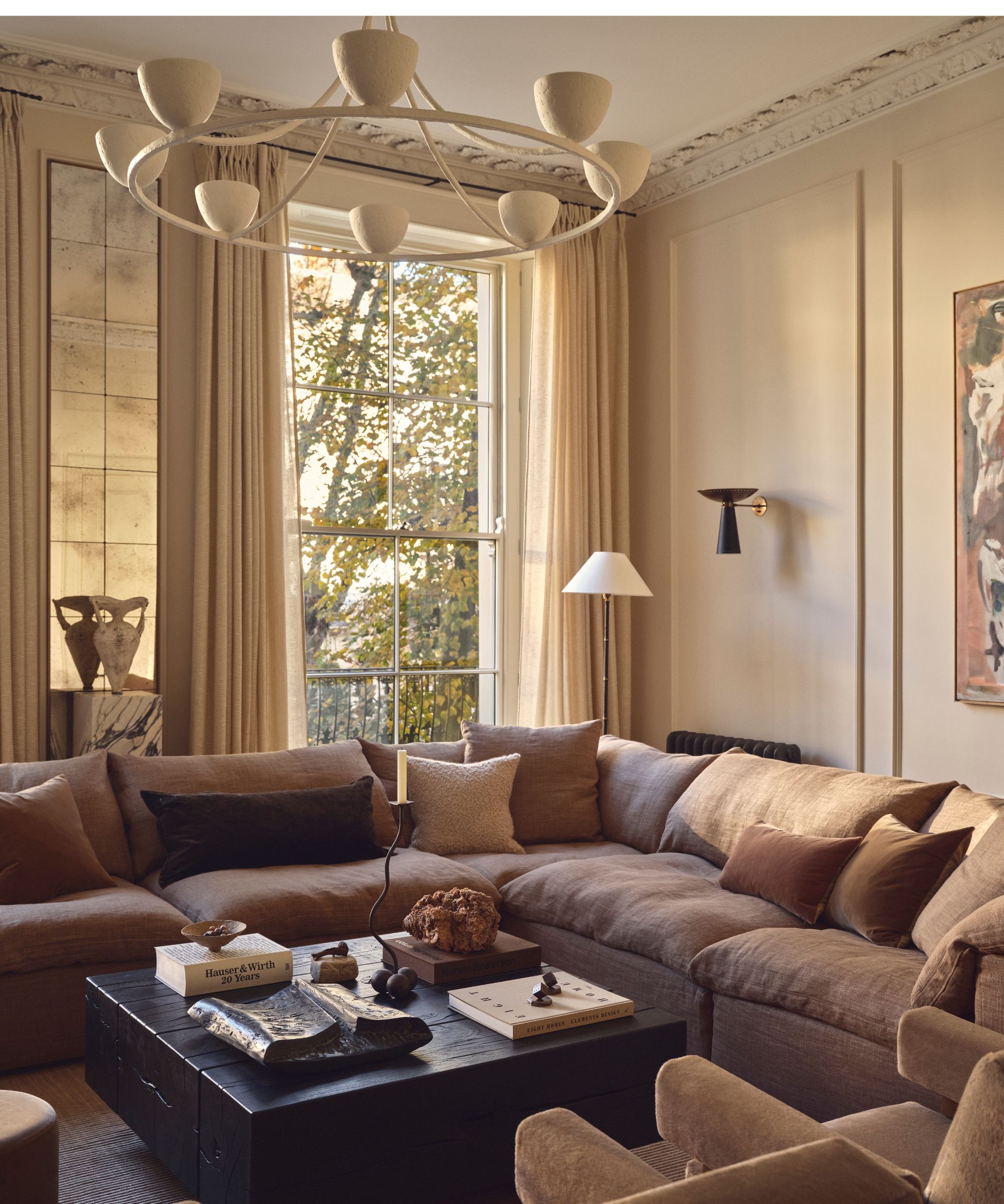
Decorating with neutrals is a timeless choice for a very good reason. These grounding palettes are celebrated for their versatility and enduring appeal, but they needn't be boring and are in fact a sure-fire way to elevate any room.
Earthy neutral paints, provide a perfect backdrop that transitions seamlessly through seasons and moods, and they’ve become a staple favorite among designers and homeowners alike.
The adaptability of earthy neutrals allows for effortless updates, whether you're dressing the space up or toning it down, and remains a reliable foundation for evolving styles.
Interior designer Murude Katipoglu often turns to earthy tones as the cornerstone of her creations. As she explains, ‘One of my favorite schemes involves pairing a light, neutral backdrop with warm sandy hues, then layering it with earthy browns and rich, rusty tones. This combination creates a space that feels both grounded and sophisticated, offering a serene yet luxurious ambiance.’
2. Pistachio and chartreuse

On paper, some color combinations might seem outrageous or impractical. This perception often stems from a tendency to play it safe with our living spaces.
However, unexpected color pairings, like a soft green teamed with chartreuse, a vibrant hue that sits perfectly between green and yellow, can result in a cheerful, playful aesthetic for those who are looking to inject personality and flair into their home.
This combination adds just the right amount of color to a space, offering up joy and vibrancy without crossing into garish or overly juvenile territory. Unexpectedly, it's an ideal choice for a historical home and classical furnishings that are in need of a refreshing touch of character and something a little bit different.
Decorating with green is still a popular choice amongst interior designers and pistachio tones, in particular, are a warm and comforting shade to work with. When uplifted with subtle accents of chartreuse, the result is a space that feels both soothing and invigorating.
3. Burgundy
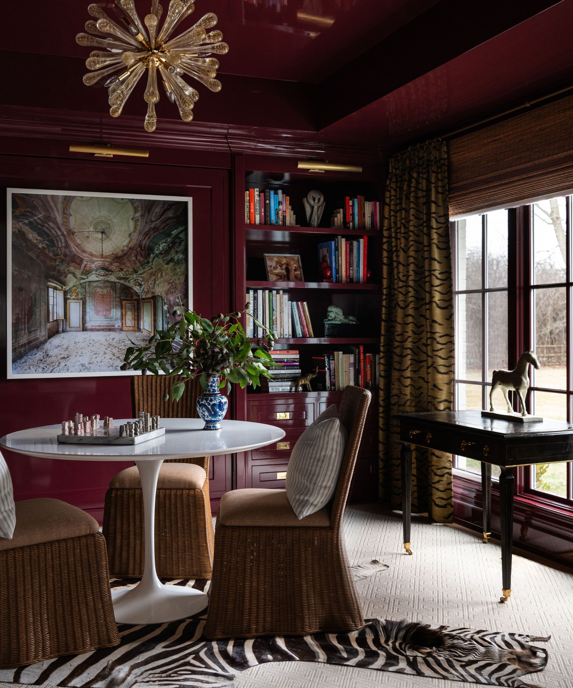
If your personal style is peppered with a penchant for opulence, incorporating burgundy into your color scheme is a rewarding choice. This deep, sumptuous shade drenches a space with an understated sense of grandeur that's always going to elevate any room you use it in.
Burgundy paint is particularly suited to those who appreciate the historic charm of older homes and aren't afraid to embrace dramatic tones. It pairs beautifully with traditional dark wood furniture and antique pieces, while also serving as a backdrop for gold accents, ornate accessories, and luxurious furnishings. Burgundy allows these elements to take center stage, without tipping into overly bold or brash territory.
Contrary to common belief, dark colors can work wonderfully in small spaces and burgundy is the perfect dark color for smaller rooms. Not every petite space needs to be made to feel larger, and enveloping the space in a deep warm shade can create an intimate atmosphere that's particularly enchanting under the soft flicker of candlelight.
Interior designer Sarah Vaile, known for her masterful use of color, tells us, ‘I will always love burgundy. This color exudes richness with its bold hue that embodies the brightness of its primary cousin but also the sophistication that comes with being slightly off-palette. A deep burgundy will immediately take an otherwise ordinary room and elevate the space.’
4. Forest green and ice blue
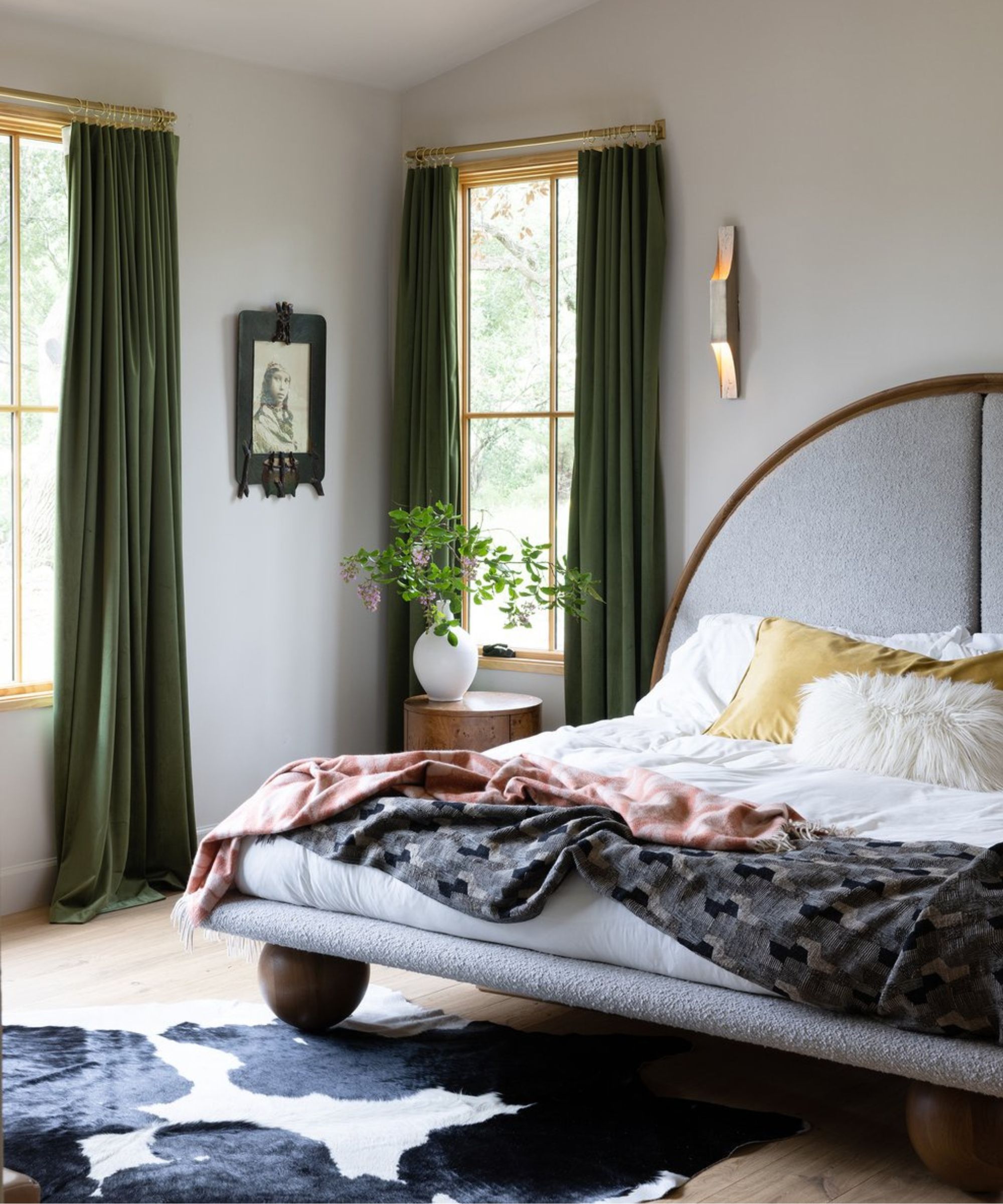
There’s a growing movement to break away from outdated rules when it comes to elevated color schemes. Take the old saying ‘blue and green should never be seen’ a rule which is actually rooted in the nautical world, not interior design!
In reality, these two colors, both drawn from nature, can create a haven of serenity when used together. Both blue and green are championed for being relaxing colors to live with.
Colors generally fall into two categories, warm or cool. Pairing hues with similar temperatures, often referred to as an analogous color scheme results in a balanced space. For example, blues and greens, both cool tones are neighbors on the color wheel, complement each other without even needing to try.
It’s particularly trendy at the moment to use complementary tones on the color wheel, and whilst they can make a bold and brilliant statement, opting for adjacent hues with similar temperatures is an excellent way for those new to color to ease into incorporating it in their spaces. When applied in muted tones, blues and greens create a tranquil atmosphere, while brighter shades bring a lively, vibrant energy without clashing.
Interior designer Amy Pigliacampo has her own approach to pairing colors. As she explains, ‘For me, color is all about creating a vibe that feels personal, refined, and just a little bit unexpected. I love taking two colors but here is the twist; I take one and make it deep and moody, then lighten the other until it’s soft and airy. A deep forest green paired with a soft icy blue for something fresh. This little trick adds just the right amount of tension and harmony to a space, giving it personality without trying too hard.’
5. Rust orange and mustard
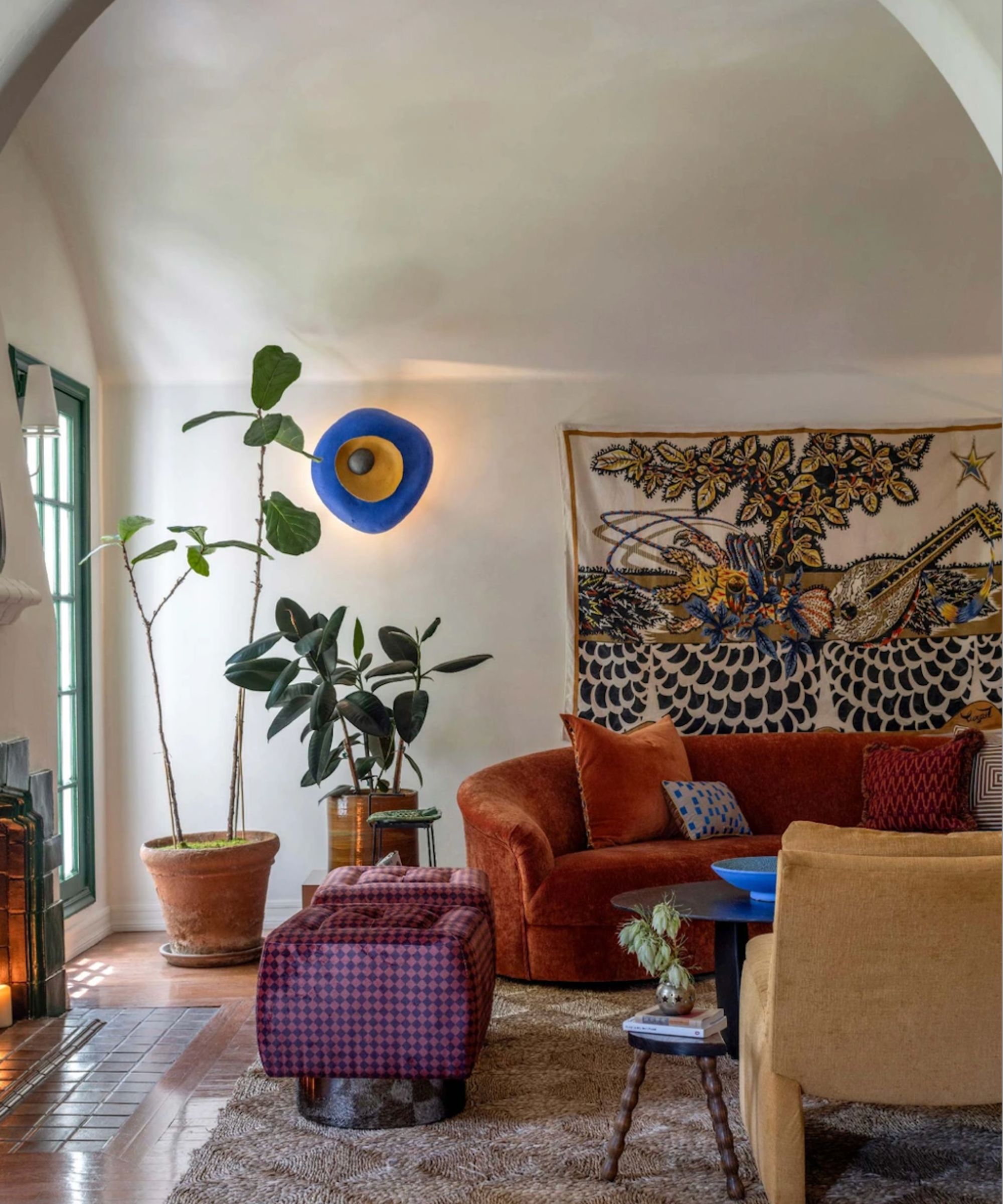
Rustic palettes remain a popular choice for their ability to instantly create a warm and inviting room. A vibrant shade of orange and yellow may sound on paper a little overpowering but opting for their softer, more muted siblings offers up a more everyday liveable tone that adds just the right amount of color to your home decor ideas.
Kristina Khersonsky, founder of Studio Keeta champions this approach. ‘We love using an orange, more particularly a rust tone,' she explains. 'It adds a statement and can look great on a curved silhouette sofa. Once the perfect shade of orange is found, it can be paired with cool tones like a cobalt blue for contrast but looks wonderful layered with more warm hues like mustard yellows or rusted reds.’
To complement rust orange, pair it with a muted mustard yellow. These tones make excellent accent colors in neutral spaces, offering up a subtle yet impactful way that administers just the right injection of color.
Hitting the right note with the perfect color scheme can feel like a challenge, especially if you’re stepping away from a safe, neutral palette to explore something more dynamic and fresh. Embracing color fearlessly, however, is where the magic happens. Take the leap and you’ll find the payoff is well worth it to create rooms that feel elevated and energized.
Sign up to the Homes & Gardens newsletter
Design expertise in your inbox – from inspiring decorating ideas and beautiful celebrity homes to practical gardening advice and shopping round-ups.
-
 This is the single best upright vacuum we've ever tested – and it's on offer with $130 off at Shark for a limited time only
You won't want to miss this one
By Dan Fauzi
-
 Nate Berkus says slipcovered sofas are back on trend – and I just found a way to create this designer-approved laid-back look from just $86
This classic style is making a strong comeback, but did you know you don't have to buy a whole new couch to get this Nate-approved look?
By Eleanor Richardson