Retro color trends are making a comeback – here's how the experts bring them up to date
How the colors of the past are creating a look that's very now – designers share their insights on the retro color trend
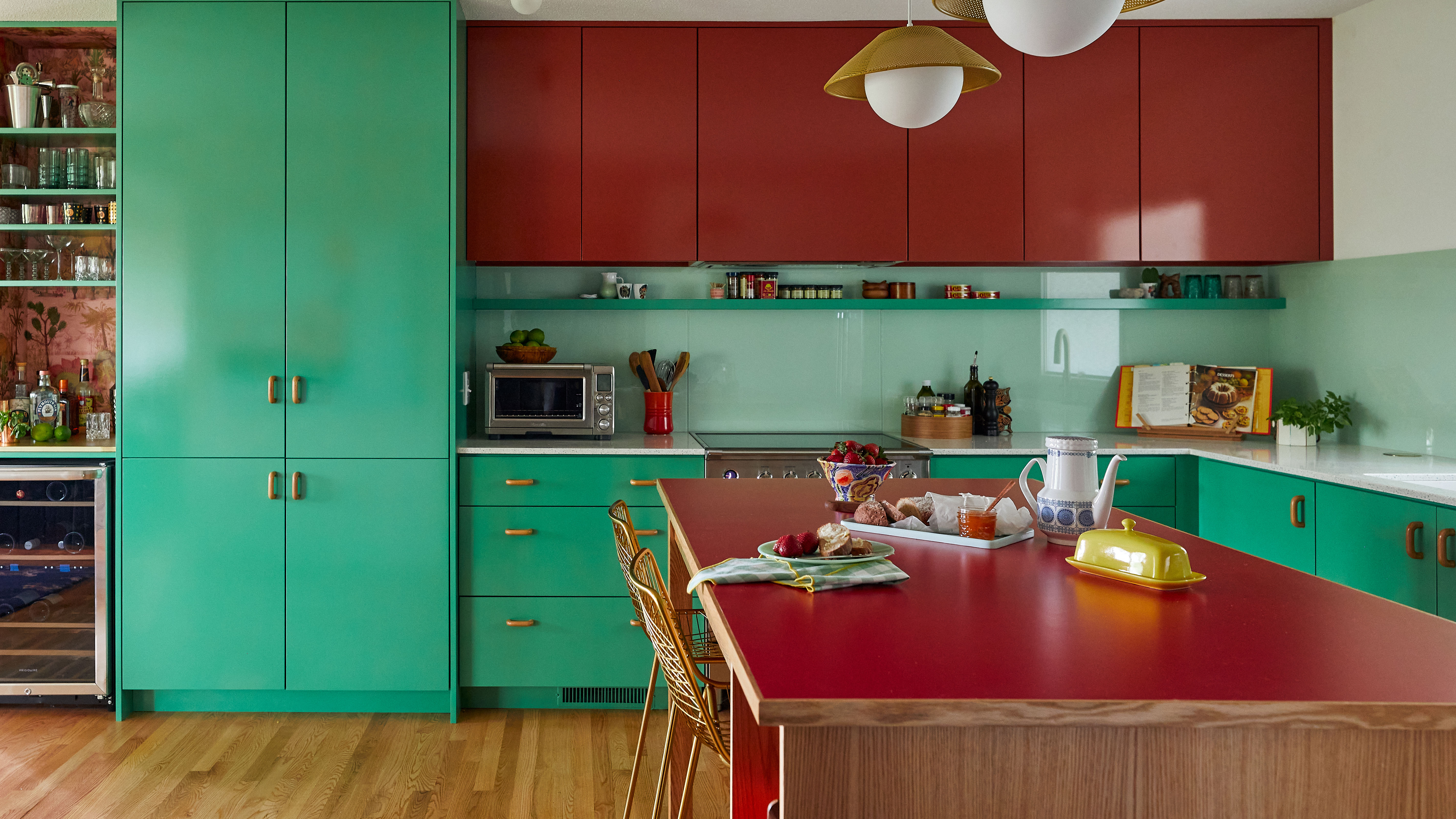
Do you ever get the feeling we've been here before? First in fashion and now in home furnishings, there's an unmistakable shift toward retro colors.
Anyone keeping an eye on color trends will know that the browns, beiges, oranges, yellows, and some green shades currently finding favor in our home decorating schemes are an unashamed throwback to the bright and earthy tones that have their roots in the early 1900s and became all the rage in the 1970s. So what's the best way to revisit these shades to create a look that's very now?
We asked interior design experts about the retro color resurgence and they share their thoughts below on what's behind this new-old interiors trend.
Decorating with retro colors
We may be talking retro, but there's nothing old-fashioned about revisiting this trend. It's simply a question of classic and enduring appeal, with a hint of healthy nostalgia for good measure.
Want to follow the retro trend with your room color ideas? We look at the key colors to get the look, whether that's by selecting just a couple of shades for a hint of retro in the furniture, as in the mustard accent chairs in the Dmar Interiors scheme above, or by going full-on wall-to-wall 70s.
What are retro colors?
Retro colors are the distinctive bright and earthy shades familiar to our younger selves or to our parents or grandparents, in the furniture, rugs, curtains and wall colors. All shades and tones of beige, brown, orange, yellow and green are the key players, with the 1970s being the go-to decade for the current retro revival.
'What’s old is new again – retro color tones are back,' says interior designer Kendra Nash, who says that green is one of the key go-to retro shades for 2023. 'It’s nostalgic, yet it’s also the warmth that is bringing people back for more.' Nash says that fashion and interiors are mirroring each other with this trend, as is so often the case. 'Not only are we seeing various tints of green in the latest fabrics from Schumacher, Osborne & Little, and Stroheim, but we are seeing these tones on the runways of the biggest fashion houses – Fendi, Bottega Veneta, and Givenchy. Clients want to follow the trends and welcome pops of color and rich deep tones all combined.'
Some of the shades we're classing as retro colors can be traced right back to the early 20th Century, and Devika Kanadé, the founder of boutique interiors store The Itihāas Company, says the inspiration for these shades comes from the 1930s right through to the 1980s. 'Usually bold and bright, retro colors are a great way to play up maximalism (think 1980s-style funky layered interiors) or play down with minimalism (think mid-century modern).'
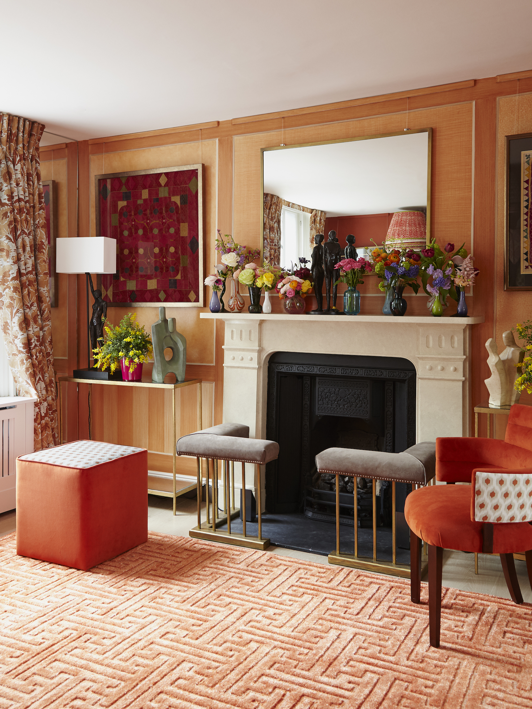
Designer Nastassja Bowman of Kristen Elizabeth Design says that there are two sides and two origins to what we term retro colors. First the natural brown and beige shades of the 1950s and 60s mid-century modern furnishings, then, says Bowman, 'The more modern colors exemplified in the iconic work by artists like Andy Warhol and his Campbell's Soup art in the 1960s. Art very much influenced design in this era. By the 1970s the two styles were mixing into what we know as the retro style we see today.'
Bowman picks out Benjamin Moore's Mississippi Mud and the company's Smoldering Red as typical of these two different facets of the retro era.
Why were retro colors popular in the 1970s?
There are many reasons why people were drawn to use these shades for their homes in the 1970s, one big factor for the earthy shades, says Nastassja Bowman, was the 'social justice impact of the 1970s, which leaned towards an appreciation of natural materials and tones like Benjamin Moore's Cloud Cover, Sussex Green, and Clay Beige.'
Meanwhile, Devika Kanadé believes there's an equally valid socio-political reason for the brighter colors becoming popular during the 70s: 'It all symbolized freedom. The freedom to be creative, to break away from rigid "typical" colors and shades that were used in spaces. The 70s were synonymous with laid back and relaxed living while being funky and cool at the same time.'
Design studio Rincon Rd's Melinda Trembly says it's no surprise these colors were popular the first time round and perfectly natural that we're seeing a resurgence.'I think people have always been drawn to color,' she says, 'it's a way we can stand apart, belong, express our feelings, and truly personalize our homes.'
Which 70s colors are coming back?
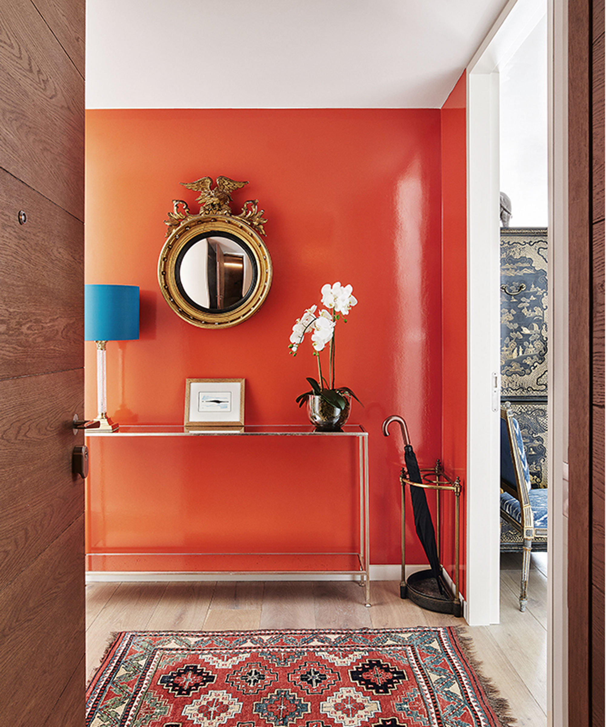
You can't have failed to notice it, the warm, cozy glow of 1970s shades starting to permeate our 2023 homes. 'The colors on the rise are definitely the earthy warm tones so reminiscent of the 70s,' says designer Kanadé. 'Think so many shades of brown, coral peach, sunset shades of orange, mustard yellows and moss avocado greens thrown in for good measure and balance.'
Kanadé explains that the shades in question are usually from secondary colors, not necessarily primary colors. 'So teal blues, moss/avocado greens, peach coral, brownish orange, burnt orange, harvest corny gold and never forgetting the browns,' she adds.
Warm color schemes are easy to work with and even easier to be around. If you use a combination of earthy retro colors for walls, floors, furniture and accessories your home will feel grounded, relaxed and welcoming. Slot in some of the brighter hues and you'll benefit from their energy too.
Why are we turning to the 1970s for our color inspiration?
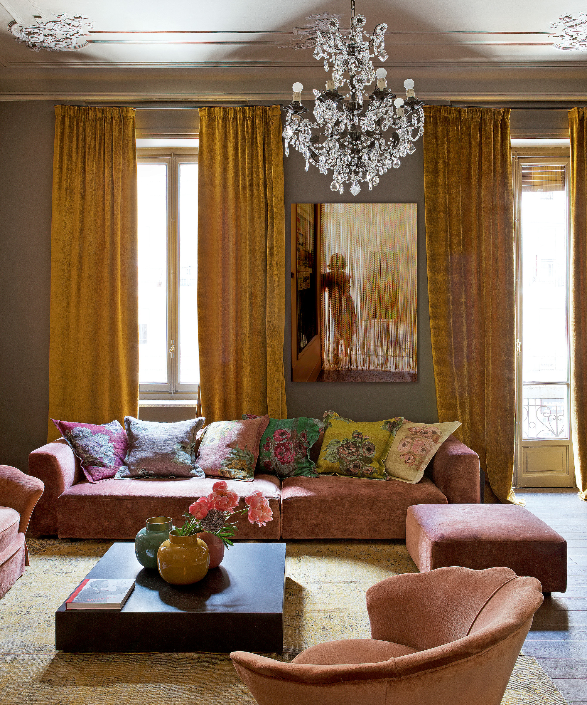
What is it about today's world that's making us seek inspiration from the 1970s? Could it be, as Devika Kanadé believes, a post-pandemic phenomenon? 'The break away from neutrals and 100 different shades of white and beige needed an upgrade after the quarantine and working from home period,' she says. 'What better way to make a space feel refreshed than the fun yet relaxed colors and look of the 70s-era design? Calming colors of sunset, and earth tones, with accents of graphic and funk thrown in for good measure. People want their environment to say chill but with personality, grounding but eclectic all at the same time. Nothing says that better than the 70s style and colors.'
There's an element of nostalgia too, with a yearning for what we might perceive as simpler times.
'The sentimental longing for something past is definitely on the rise,' says Kanadé. 'Looking back at the distinct design periods over the last century, people are looking to things that made them happy and smile, and feeling nostalgic is definitely a way to evoke that. The simplicity, the grounding memories or familiarities we experience when going down memory lane, in a way, takes away the last few years of a steadily escalating sense of foreboding felt all around the world.'
Nastassja Bowman thinks it's not about nostalgia, but more about history repeating itself. 'Since the youth guide our style and design direction, they are looking for inspiration from the past and the retro wave is brand new for them to explore,' she explains. 'This trend is less nostalgia and more of a renaissance of the late 1900s. In the past hundreds of years we have repeated history in design and style, but as everything moves at warp-speed these days, so does design.'
On that basis, it should be only another 45 years until we see 50 shades of gray again then.
Sign up to the Homes & Gardens newsletter
Design expertise in your inbox – from inspiring decorating ideas and beautiful celebrity homes to practical gardening advice and shopping round-ups.
Karen sources beautiful homes to feature on the Homes & Gardens website. She loves visiting historic houses in particular and working with photographers to capture all shapes and sizes of properties. Karen began her career as a sub-editor at Hi-Fi News and Record Review magazine. Her move to women’s magazines came soon after, in the shape of Living magazine, which covered cookery, fashion, beauty, homes and gardening. From Living Karen moved to Ideal Home magazine, where as deputy chief sub, then chief sub, she started to really take an interest in properties, architecture, interior design and gardening.
-
 The 11 British interior design styles you are going to want to bring into your home – no matter which side of the pond you live on
Interior designers share their favorite British design trends and how to recreate them in your own home
By Pippa Blenkinsop Published
-
 7 ways to decorate with wood – designers share the best ways to make the most out of this versatile material
This is how the design experts embrace the timeless natural beauty of decorating with wood
By Karen Darlow Published