My rented apartment follows the key rules of color psychology – here's why I'd never go back to an all-white home
I've witnessed firsthand how the right colors not only add visual appeal but alter the mood of each room

Design expertise in your inbox – from inspiring decorating ideas and beautiful celebrity homes to practical gardening advice and shopping round-ups.
You are now subscribed
Your newsletter sign-up was successful
Want to add more newsletters?
Earlier this year, I moved into a new apartment, and unlike the all too often white-washed spaces upon which renters seek to imprint their personality, it embraces a range of colorful hues.
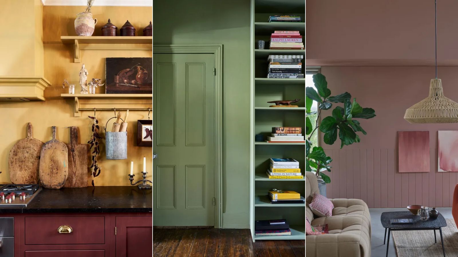
While the paint ideas that range from the yellow kitchen to the plaster pink living room make for stylish room color ideas, it wasn't until recently, when I wrote about colors to decorate with depending on the mood you want to create, that I discovered many of the rooms follow the rules of color psychology.
So much so, living here and enjoying the mood-altering effects of color – from calming to energizing – has made me a convert to a colorful home in place of my previous pull toward neutral rooms.
Article continues belowColor psychology lessons learnt since living in a colorful apartment
Below, I've rounded up three examples of how the colors in my apartment help to create various moods. If you're considering going bolder with your color choices in 2025 and want to add more distinction between each room, read on.
'The way that we see color isn't just visual, it’s emotional as well,' explains Tash Bradley, Director of Interior Design and Color Psychologist at Lick. 'There are certain colors that are calming, there are some colors that are energetic, there are some colors that you feel more mentally soothed by.'
'So when we’re looking at different rooms and different feelings that you want different rooms to have, certain colors definitely benefit from being in those rooms,' says Tash.
1. Warm and bold colors energize
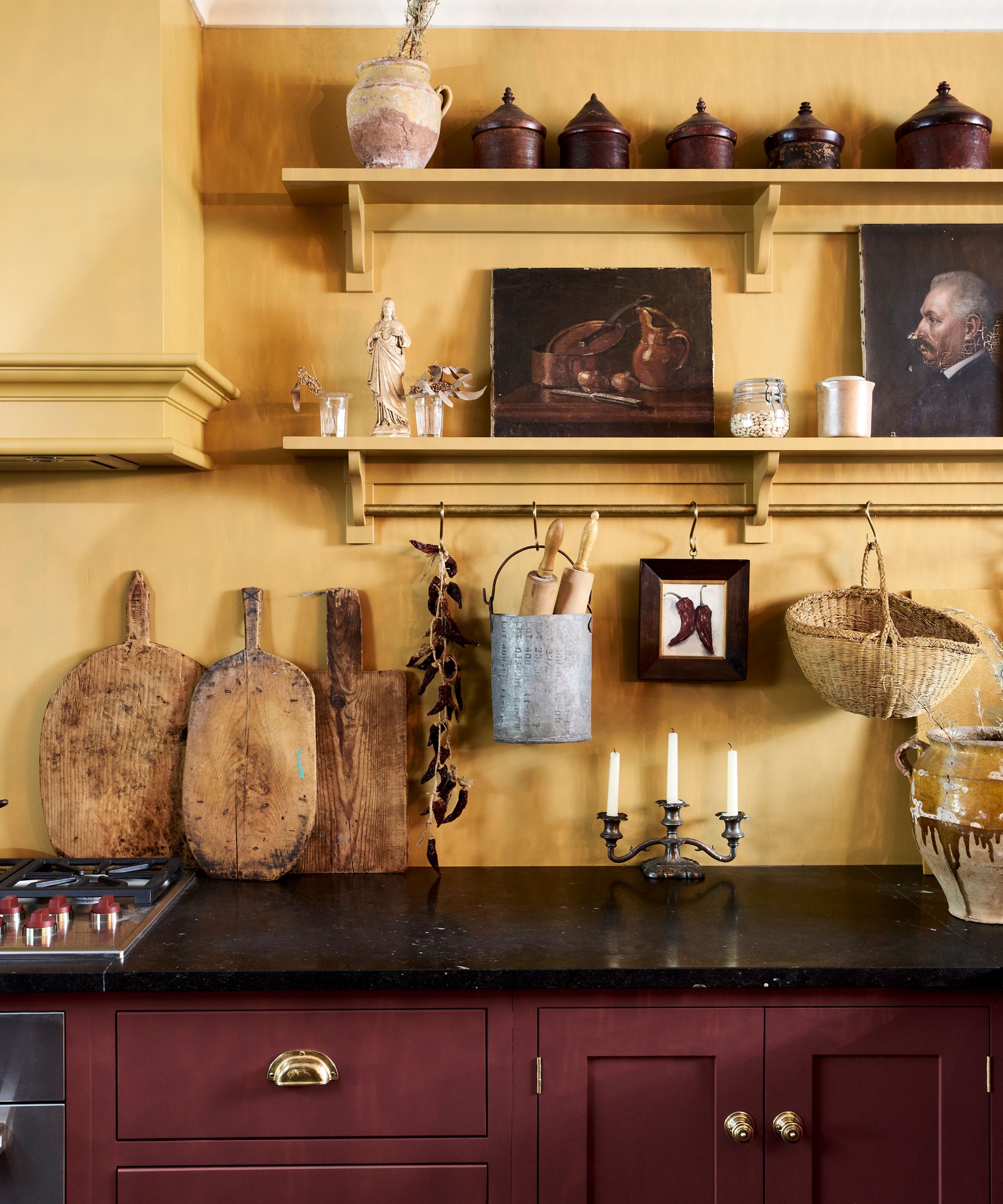
The boldest room in my home, the kitchen features a rich mustard yellow within its color scheme, a color that's known to be one of my most uplifting and energizing. Paired with white so it's not overwhelming, I'm convinced that a pop of yellow is the best way to add zeal to the heart of the home.
Design expertise in your inbox – from inspiring decorating ideas and beautiful celebrity homes to practical gardening advice and shopping round-ups.
'We have moved away from those clinical kitchens where it was very stark and very white,' Tash tells me. 'Now, they are places that people are really introducing those colors that make their hearts sing. They deserve colors that have a lot of vibrancy to them, that have energy.'
I spend most of my time at home in the kitchen, so I've seen the benefits of its mood-boosting color scheme. The yellow feels instantly happy throughout the day, and it separates the kitchen as the main social space, while the rest of my home is more restful.
Many yellow paints can be used to make a kitchen feel uplifting, such as Farrow & Ball's India Yellow and Sudbury Yellow, but you could alternatively turn to red paints for a stimulating effect.
2. Soothing greens boost focus
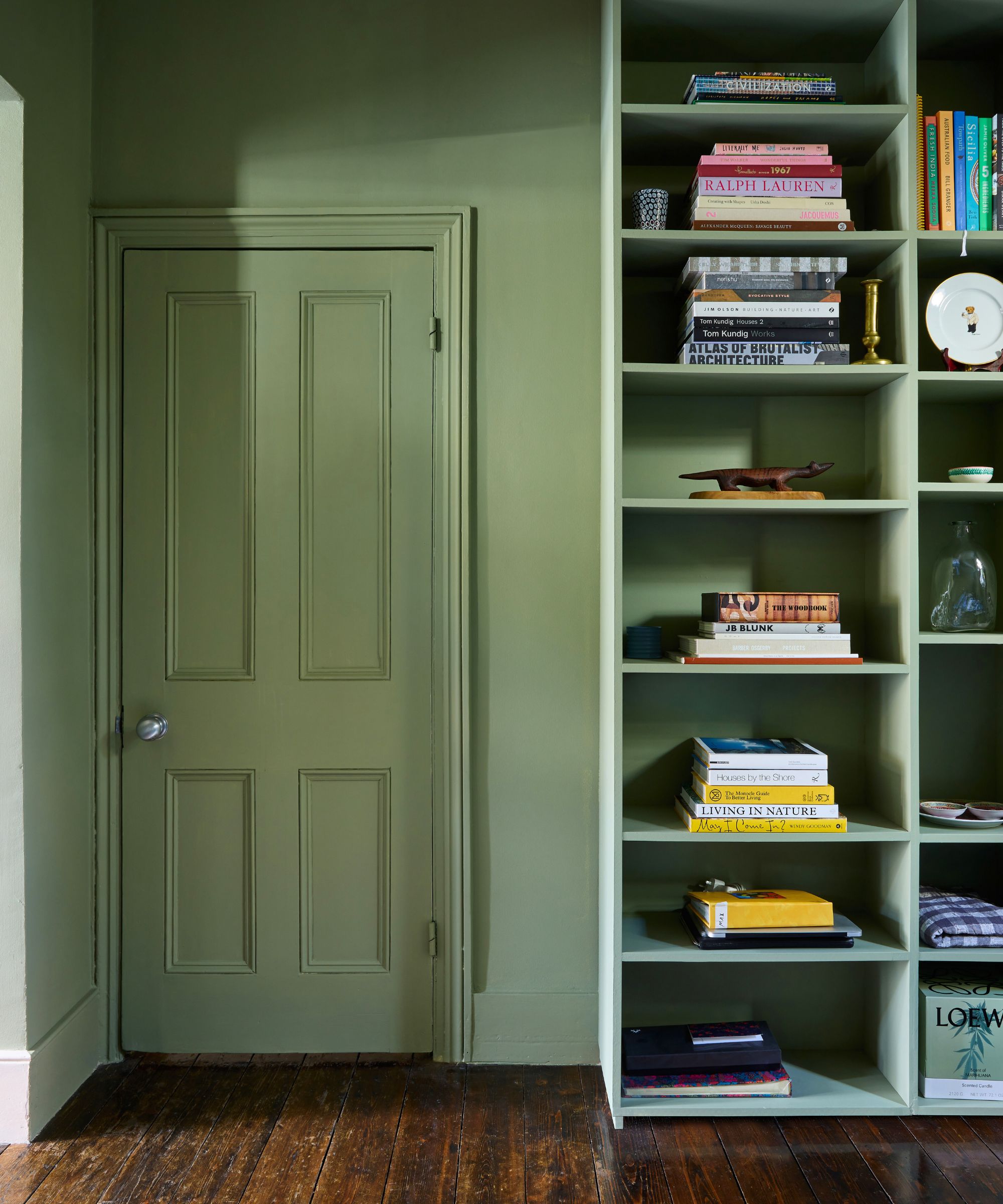
Decorating with green is widely known to be one of the most calming colors thanks to its association with the natural world. I can vouch for this since my home office is decorated with a muted, mid-tone green that promotes a feeling of focus and calm.
Tash Bradley adds that decorating with blue can have a similar effect to green, making blue and green two of the best home office paint colors:
'Anything like our Teal 03, Teal 01, Green 04, Blue 07 – these are really good focused but calming colors – anything that has a light blue or a dark blue or a green with a blue are really good colors for a home office.'
3. Plaster pinks feel cozy
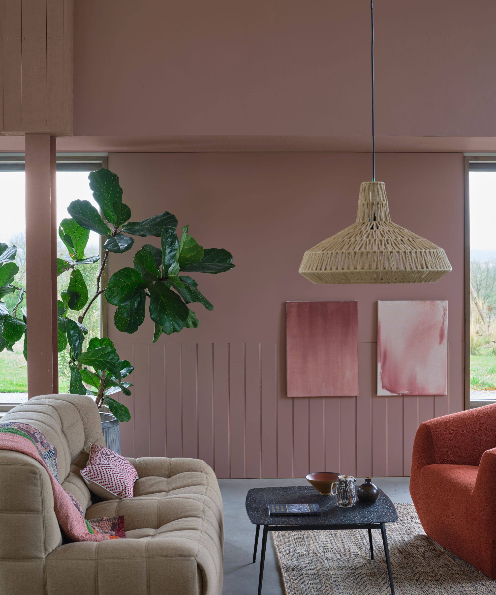
Plaster pinks have come to the fore in many homes, thanks to seemingly universally flattering shades such as Farrow & Ball's Setting Plaster and Templeton Pink.
In my living room, the walls are adorned in an earthy shade of pink paint, giving the space a cozy, soothing feel to unwind in at the end of each day. While I typically would have been drawn to a warm white paint for a room such as this, I now realize how much more depth plaster pinks add – snug without feeling too bold.
'The more diluted the red becomes – so the more white and brown and black pigment that you add to a red to make it into an earthy pink – that is going to become more physically soothing,' Tash Bradley explains.
Safe to say, I've witnessed firsthand how color can shape not only how a room looks, but how it feels. While neutral colors add balance, the right colorful hue used in the right amount can transform a room, whether you want it to feel more lively, calming, or focused.
If you're looking to bring more color into your own home in 2025, take a look at these easy-to-use bold colors, which paint experts say are surprisingly liveable.

Emily is a freelance interior design writer based in Scotland. Prior to going freelance in the spring of 2025, Emily was Homes & Gardens’ Paint & Color Editor, covering all things color across interiors and home decor for the Homes & Gardens website. Having gained specific expertise in this area, Emily is well-versed in writing about the latest color trends and is passionate about helping homeowners understand the importance of color psychology in home design. Her own interior design style reflects the simplicity of mid-century design and she loves sourcing vintage furniture finds for her tenement flat.
