5 reasons why Barbiecore-haters should recant – ahead of Greta Gerwig's celebration of all things pink
Starring Margot Robbie, 'Barbie' has accelerated the most provocative trend of 2023 – here is how to play with pink professionally
Barbiecore, the fun-filled, flirtatious design movement of the moment, is not for the faint of heart. Its audacious style has dominated social media since last summer, but the anticipation behind Greta Gerwig's film Barbie (staring Margot Robbie and Ryan Gosling) suggests this trend shows no signs of wavering.
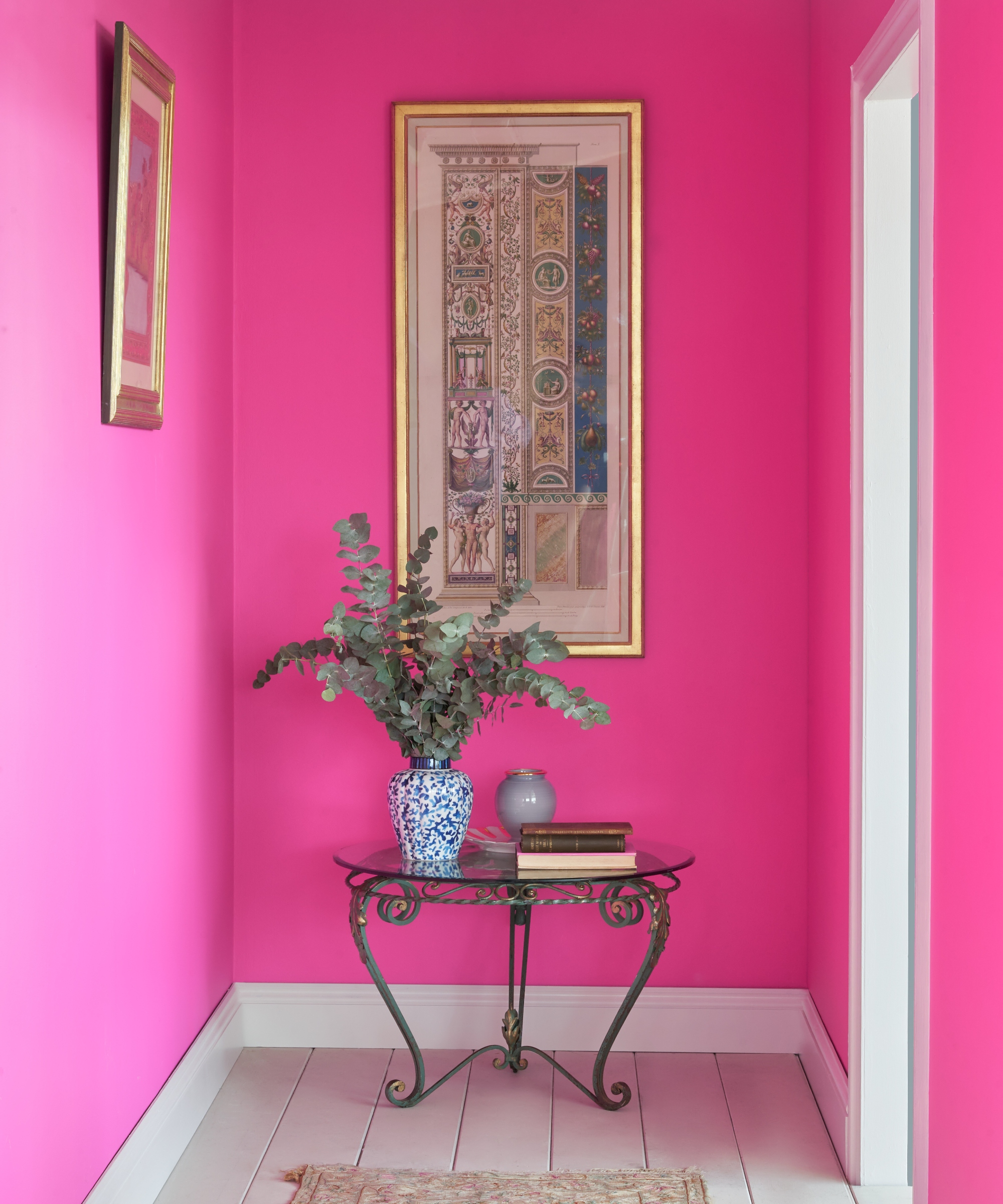
'From fashion to interiors, interest in hot pink hues is always strong, but a sharp increase over the last few months can be attributed to the rise of Barbiecore,' the color house announces,' says Mylands House of Color, who announced FTT-006 as their Color of the Year for 2023.
The hue (seen below) is an apt choice for the label, who revealed that the Barbiecore movement was one of the main reasons for their selection. 'From fashion to interiors, interest in hot pink hues is always strong, but a sharp increase over the last few months can be attributed to the rise of Barbiecore,' they say. And the release of the film will only accelerate the color trend further.
It is clear that decorating with pink is one of the trendiest design decisions you can make, but are you convinced? Experts suggest how to make this tone work in every home.
5 reasons why Barbiecore-haters should recant – according to experts
1. Barbiecore doesn't need to be overwhelming
It is easy to associate Barbiecore with indulgence and excess, but you don't overwhelm your space to embrace its aesthetic.
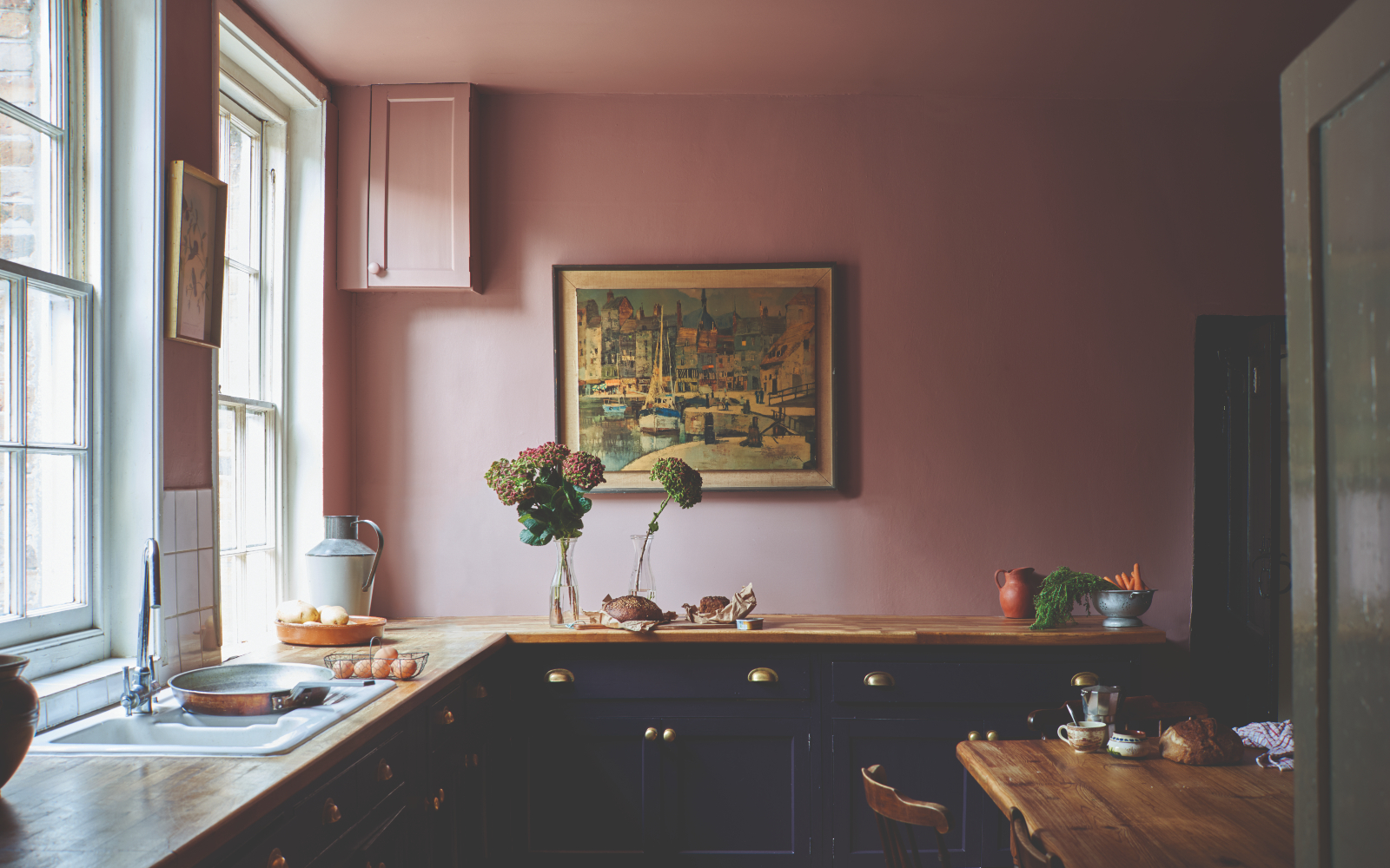
'If painting an entire space feels intimidating [you can paint] details within a space,' Mylands suggests. For example, the experts recommend accenting the room with bold pink skirting, a doorway, or a piece of furniture for dramatic contrast (such as in the kitchen pictured below).
'Slightly darker and less feminine than more pastel pink hues, FTT-006 pairs well with soft neutral tones for a toned down scheme, or pair with pale shades of pink or lilac or crisp white for something bolder,' the add.
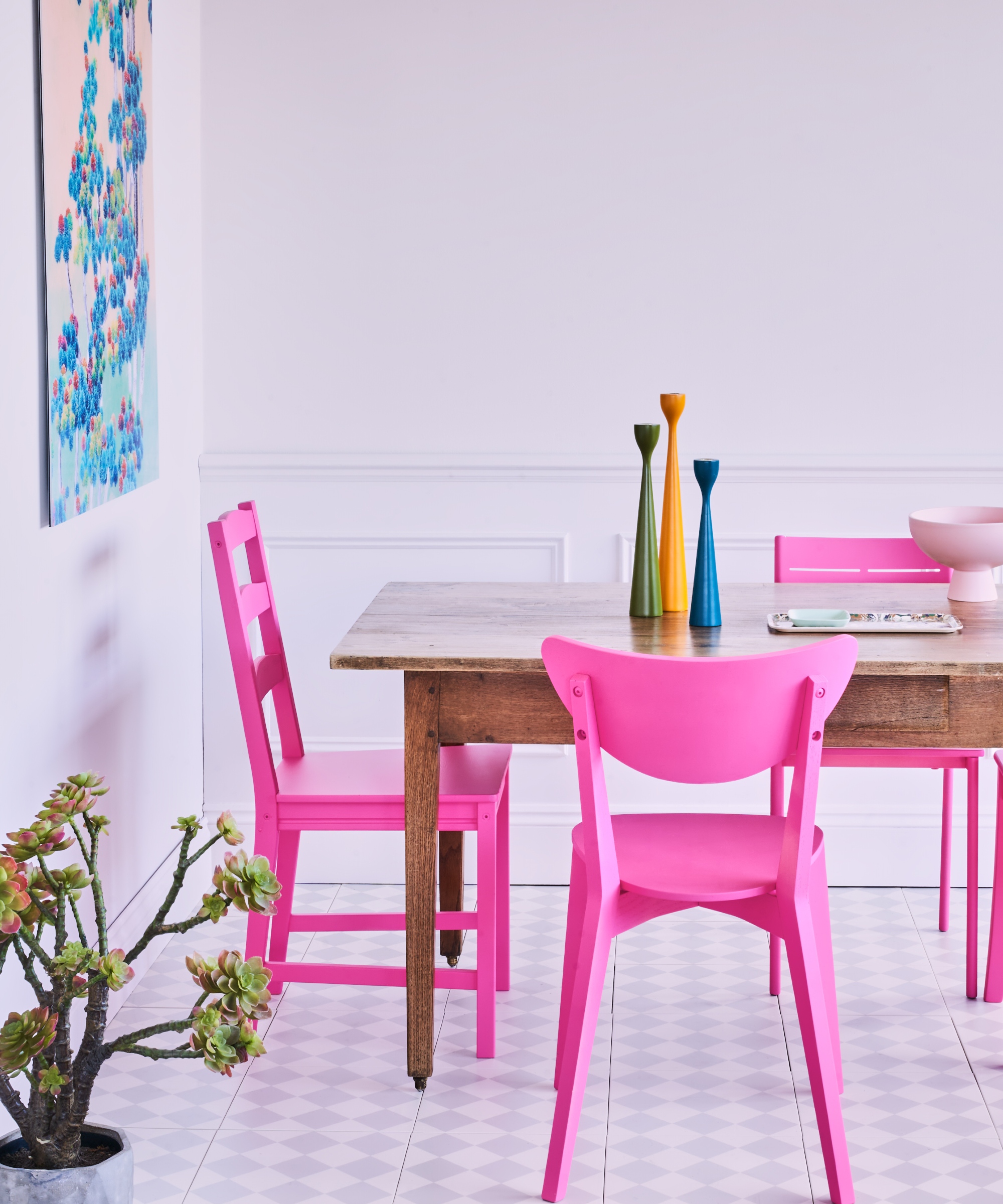
2. Pink pairs well with various textures
As Maryland's experts suggest, Barbiecore doesn't necessarily mean color-drenching your space. Plus, Meggan Fadden Wynja, an interior designer, design director, and co-founder of Color Cord Company, agrees. She suggests opting for a more pastel palette through your furniture and accessories – to nod to the trend subtly.
'Employing numerous textures softens the color if full retro isn't your scene,' the designer says. We love this shade from Backdrop, who worked with Barbie to create the perfect Barbiecore shade.
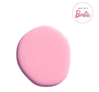
Barbie Dreamhouse Pink – from $49 on Backdrop
If you think this pink looks familiar, you're probably right. Paint company Backdrop paired up with Barbie to bring the identical color of the iconic Barbie Dreamhouse to life. And we think it celebrates the trend perfectly.
3. Energize your most intimate spaces
Whether you opt for a Mylands' FTT-006 or another pink tone, there is no denying that pink is one of the most energizing room color ideas you can choose. Meggan Fadden Wynja recommends bringing the color into your bathroom alongside gold accents that will balance the space – giving the room both 'energy and a sense of luxury.'
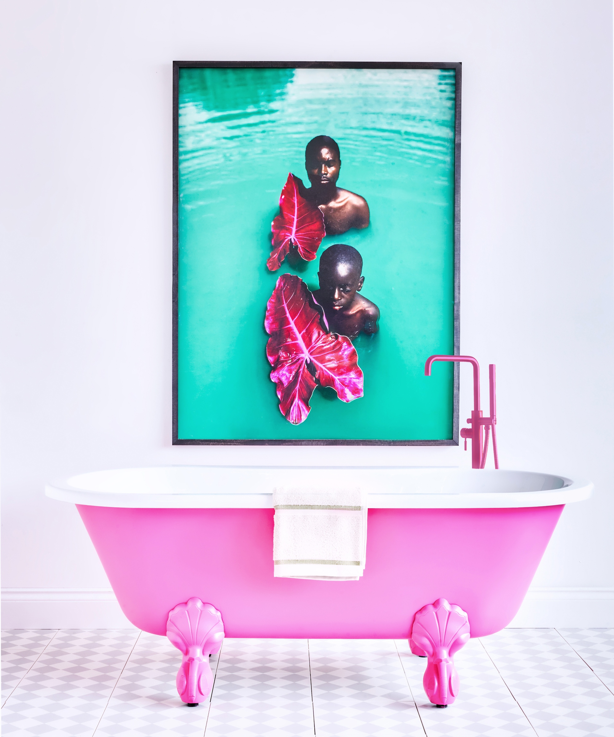
4. Create an eternal statement
Pink may be officially the most beautiful color for a room, but it's also the most provocative. So, if you're looking to create a talking point (whether in your living or dining space), this trend is the solution. What's more, this color isn't set to go out of style anytime in 2023.
'FTT-006 is an unfailingly cheerful and bold pink that's proving not only to be incredibly popular but also more enduring than just another trend or fad. It's a confident shade with the power to completely transform a space, and its intensity makes it hard to forget, says Dominic Myland.
'Hot pink is playful and eye-catching, and though it's the color of the moment, it's a stylish shade you won't get tired of any time soon.'
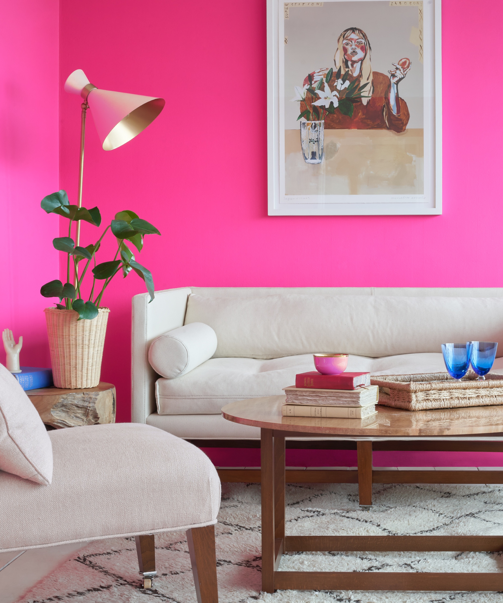
5. Barbiecore complements other color trends
The best color combinations for rooms are those that are the most unexpected, and this is the case with Barbiecore. Meggan Fadden Wynja suggests pairing bright pink with browns and other earthy tones to create a combination that works 'surprisingly well' in all types of homes.
'It’s a nice way to infuse a colorful look in a darker dining room or library without it being too jarring for those who don’t fully embrace the Barbiecore trend,' she says. 'Ultimately, have fun with it because, at the end of the day, don’t we all want to have fun?'
Sign up to the Homes & Gardens newsletter
Design expertise in your inbox – from inspiring decorating ideas and beautiful celebrity homes to practical gardening advice and shopping round-ups.

Megan is the Head of Celebrity Style News at Homes & Gardens, where she leads the celebrity/ news team. She has a history in interior design, travel, and news journalism, having lived and worked in New York, Paris, and, currently, London. Megan has bylines in Livingetc, The Telegraph, and IRK Magazine, and has interviewed the likes of Drew Barrymore, Ayesha Curry, Michelle Keegan, and Tan France, among others. She lives in a London apartment with her antique typewriter and an eclectic espresso cup collection, and dreams of a Kelly Wearstler-designed home.
-
 Ina Garten's storage pantry is an insightful window into all of the best cookware used by the chef – and it's easy to recreate on your kitchen shelves from $48
The beautiful dishware in The Barefoot Contessa's Hamptons pantry showcases the tools she uses most often to cook – this is exactly how you replicate it
By Sophie Edwards Published
-
 Extend the lifespan of your appliance with 5 simple but crucial washing machine maintenance tips
From cleaning the filters to keeping the door open, experts reveal the washer tips they swear by
By Andy van Terheyden Published
