7 reading nook mistakes, plus expert advice on how to get the design of this tiny space just right
A reading nook is the ultimate indulgence for bookworms –interior designers advise how to get this space just right
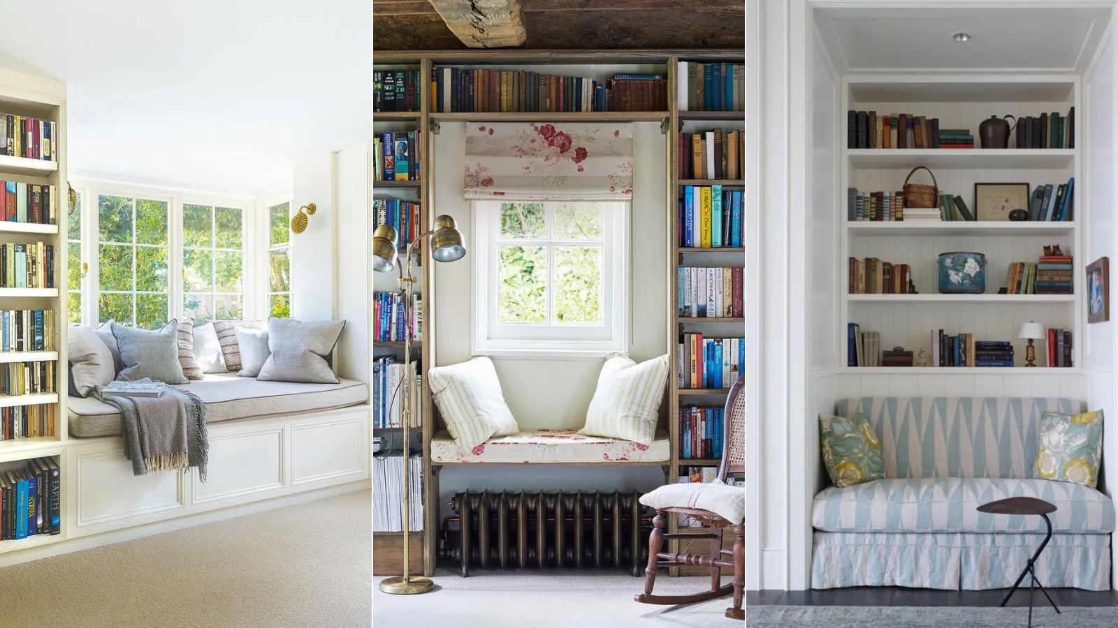
Having a dedicated space to enjoy a good book is a great luxury in any home, but it's important to get the design just right. So what are the reading nook mistakes to avoid when planning this cozy spot? We asked leading design experts for their reading nook ideas, and for their insights on where things can sometimes go wrong.
Forewarned is forearmed and following the design tips below will help avoid the common reading nook mistakes and create aesthetic room ideas for a space to enjoy and be truly proud of.
What are the most frequent reading nook mistakes?
It's great to find a quiet, tucked-away corner of the house to create a reading nook –and by all means make it cozy – but it's no good if it's dark and gloomy. For the interior designers we asked, having a dark space was one of the main reading nook mistakes to avoid and so natural daylight or good lighting ideas really are a key requirement. Other considerations that are sometimes overlooked are, surprisingly, comfort, style, practical additions, and simply making time to enjoy the space.
Read our experts' tips below to discover how to avoid reading nook mistakes. Then start planning the perfect place to shut out the world and curl up with a good book.
1. Get the lighting right
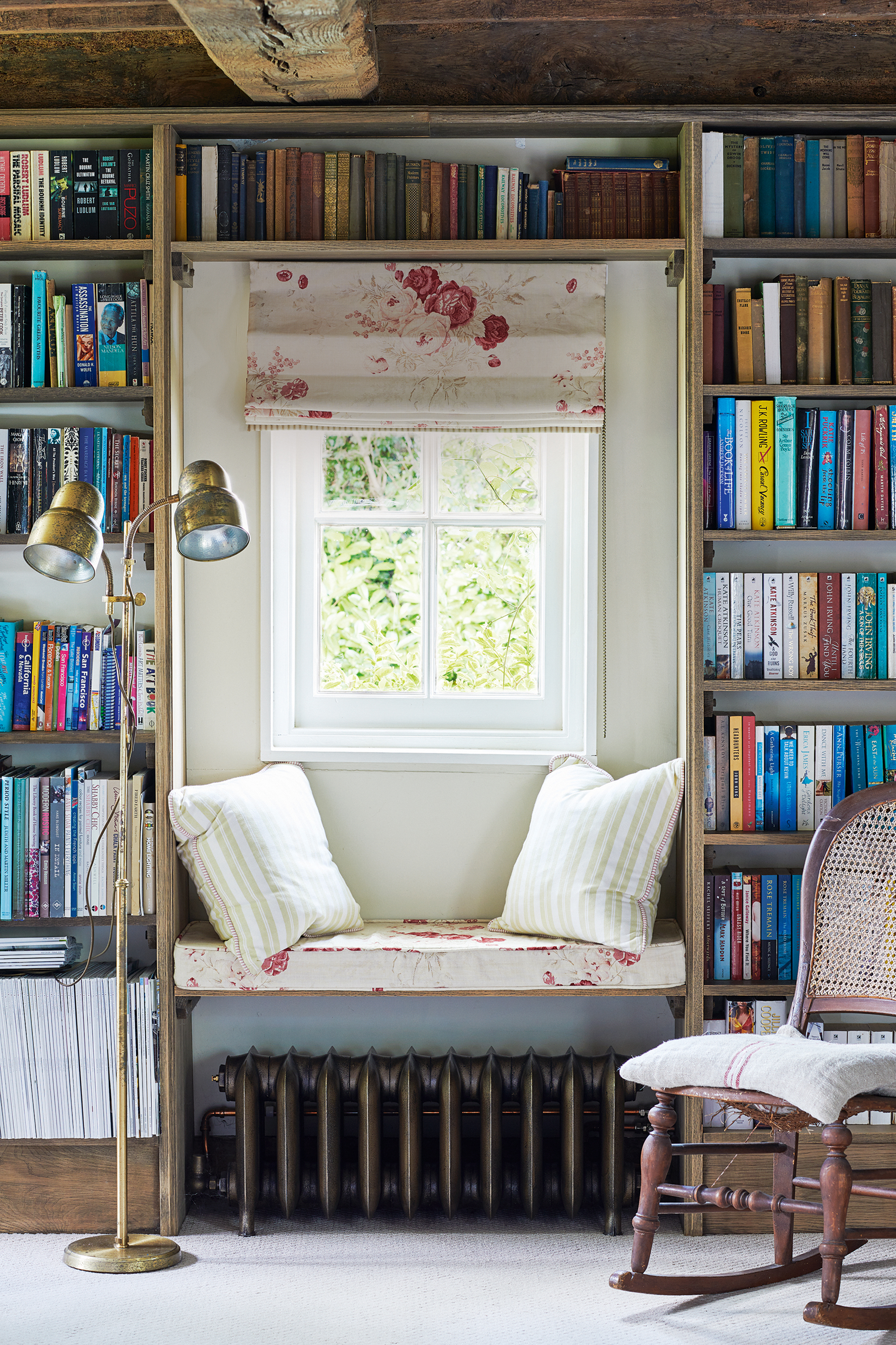
In a space where reading books is the main activity, poor lighting or insufficient daylight is quite a problem. To avoid this reading nook mistake, it's important to seek out a part of the home where natural daylight is abundant or invest in good reading lamps for darker spots and evening readers.
If window seat ideas are part of the plan for the reading nook then daylight should be abundant. Coupled with a pleasing view to enjoy as you occasionally look up from your book, window seats can be turned into perfect reading nooks.
On the subject of reading nook lighting, 'One of the most prevalent mistakes is choosing the wrong lighting,' says interior designer Marie-Claire Mrad. 'Harsh, direct, or overly bright lighting can be a major mood spoiler. Opt instead for soft, warm white lighting positioned behind the reader, creating a soothing ambiance that encourages relaxation. Consider adding an additional wall light or table lamp for added flexibility and control over your reading environment.'
Brooklyn-based designer Charlene Miranda, founder of Miranda & Co., agrees that flexible lighting is essential in a reading nook. 'You need both ambient lighting (maybe a few high hats that are in the room) preferably on a dimmer, as well as task lighting. Having natural light is ideal, so placing the nook near a window where possible, is best.'
There's a note of caution from Valentina Piscopo, interior stylist and founder of Kuky, who says: 'The most common mistake clients make is sourcing table lamps for their reading nook, most of these will shine light upwards and below but not on your reading material. Place a wall light with an adjustable arm or a floor lamp instead, this task lighting will create a comfortable mood for reading while also illuminating the right area.'
And if you're choosing wall sconces, here's how to get them right, according to Maryland designer Laura Hur, founder of Lorla Studio, 'The scale of the fixture, and mounting height have to be just right. It is not uncommon to see lights mounted too low or too high, or a light that does not project far enough from the wall to provide ample reading light. It's important to consider the human body at seated height to get these details right.'
2. Make sure you're sitting comfortably
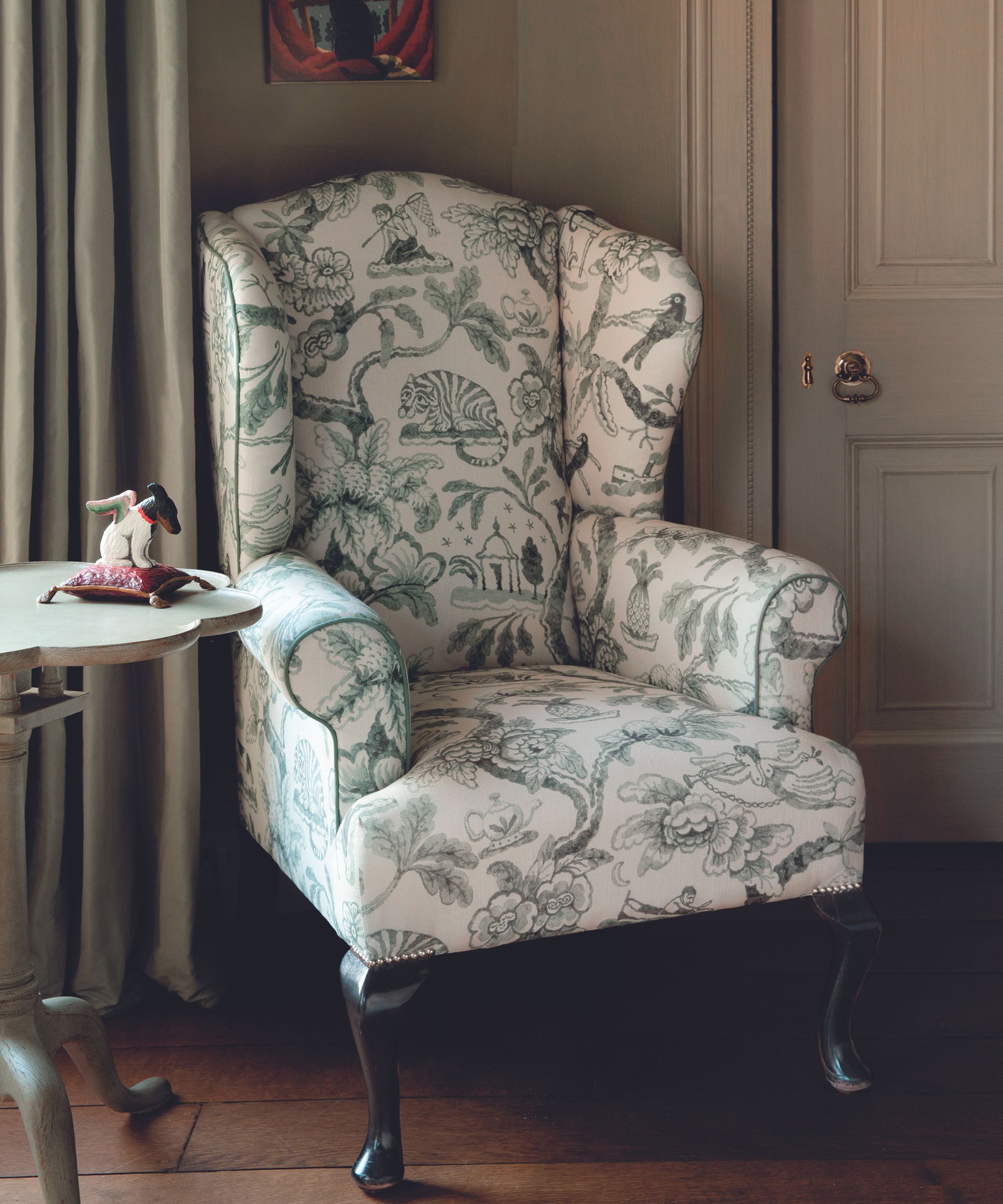
Reading nook mistake number two is getting the seating wrong. Consider your choices carefully, and try armchairs or sofas in person to check you're happy with them and avoid making an uncomfortable mistake.
Designer Charlene Miranda stresses the importance of trying before you buy: 'Buying an armchair or a lounge chair off of the internet without having sat in it and tried it out is a risky mistake,' she says. 'A reading nook by definition has to be very comfortable and cozy. And although these days we tend to shop online for everything, I always make appointments at showrooms for clients to try out specific lounge chairs, dining chairs, sofas, etc. as these are investment pieces that need to be comfortable.' So when it comes to reading nook seating, it's not only what you buy, but how to buy the right couch that you need to think about.
Marie-Claire Mrad adds 'A reading nook should be a sanctuary of comfort, so prioritize ergonomic seating that supports various postures for extended reading sessions.’
Meanwhile, Valentina Piscopo warns against choosing style over substance, saying: 'While a petite armless boucle corner chair will simply look amazing in your space, chances are you will be uncomfortable sitting on it for extended periods of time. Look for a chair that has a tall curved back and armrests, a recent personal favorite is Athena Calderone's Le Tuco armchair for Crate & Barrel.'
3. Create a distinct, characterful space
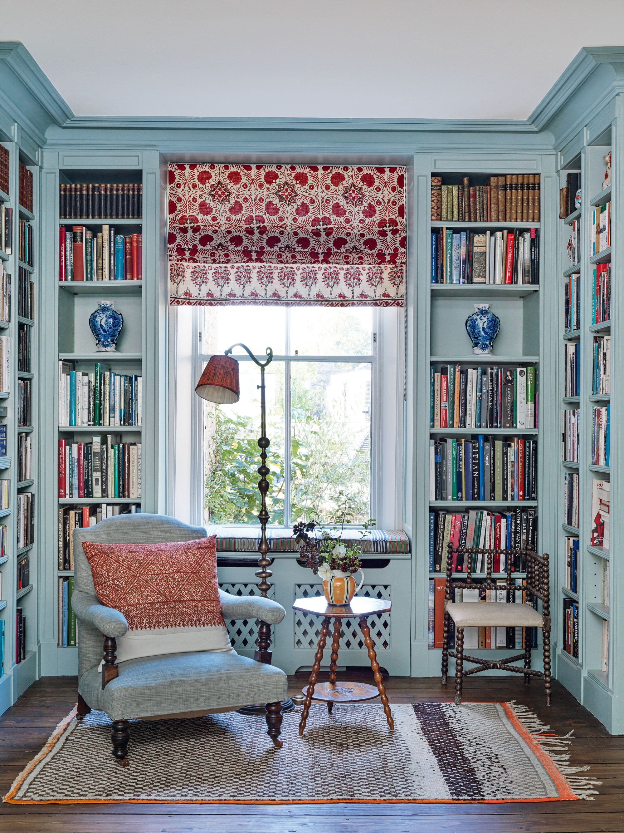
Part of the joy of having a dedicated reading sanctuary is that it should feel a little removed from the rest of the home, whether that be in its physical location in a hidden away corner, or whether it's more about marking a distinction through its décor. Creating a reading nook could well turn out to be a key part of learning how to be happier at home, so it's worth giving its position and décor careful thought. This reading corner, designed by Kate Guinness, is the perfect mix of practical and characterful design.
Setting one ordinary armchair aside in the main living room just isn't going to cut it as a reading nook. Not making it distinct or special enough, is therefore our third reading nook mistake.
Gonzalo Bueno, interior designer and co-founder of Ten Plus Three says: 'Finding the perfect nook where you can disconnect from the daily activities in any home is so important.' It works best if there is some physical distance between the nook and the busiest parts of the home so away from the kitchen, for example.
Gainesville GA-based interior designer Maggie Griffin agrees, saying: 'Consider a spot that is more tucked away, and not in a high-traffic area. We desire privacy and coziness for a reading nook and the main areas in a home can be very distracting!'
It's also possible to set your reading nook apart from the rest of the home simply by giving it a very different look and feel, as Marie-Claire Mrad explains: ‘It's a common misconception that a reading nook should seamlessly blend into its surroundings. On the contrary, it's an opportunity to infuse a touch of personality and uniqueness,' she says. 'Dare to be different, embrace funky designs, and let your reading nook stand out as a delightful departure from the rest of your space, making it a true focal point for literary escapades.'
4. Accessorize to maximize style and comfort
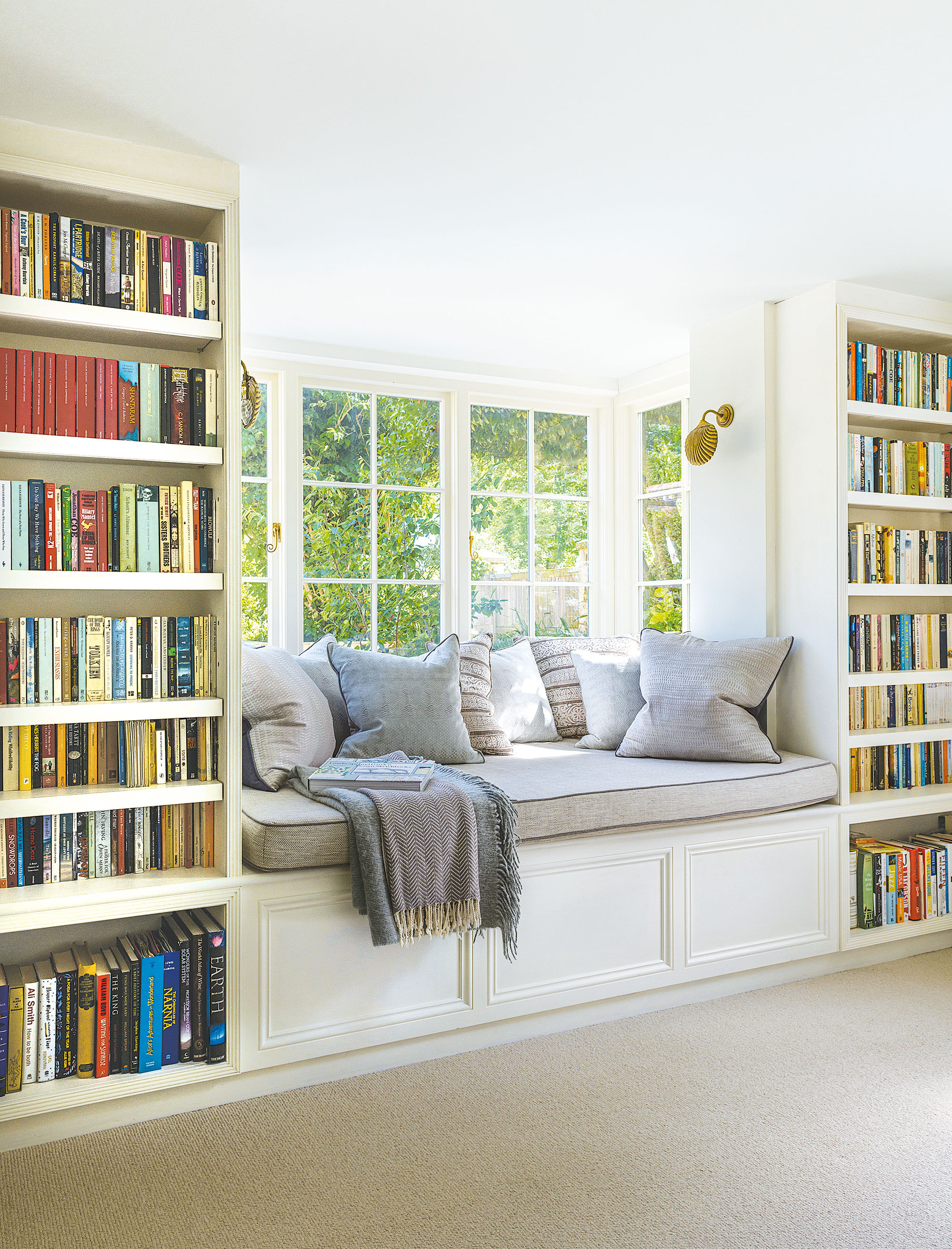
Following on from the idea of giving the space its own character and identity, another important element of a cozy reading nook's interior design scheme is using accessories to bring the space to life, adding style and comfort. Forgetting about the important details is another common reading nook mistake, but one that can easily be put right at any point.
'Do not skimp on the accessories,' says Charlene Miranda. 'Invest in a beautiful, luxurious throw. Mohair or cashmere will keep you cozy and warm.'
Some pillows for the window seat or armchair will also add to the reading nook's style and comfort, and a cozy rug will keep your toes warm on winter evenings.
Layering a few well-chosen accessories in this way is essential in signposting the space, as Houston-based designer Margaret Naeve Parker explains, 'Creating a good reading nook is all about putting together a carefully curated vignette; it is much more about the quality than the quantity of items.'
5. Remember to add a table
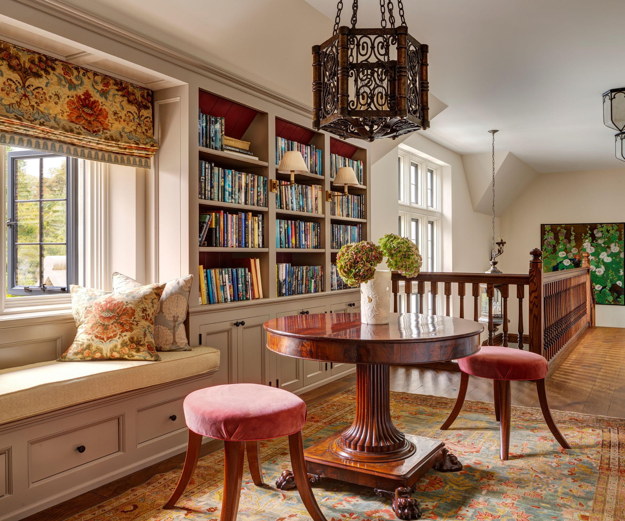
If you don't have a table in your reading nook, where will you put your coffee, or indeed your book if you're interrupted mid-chapter (perish the thought!)? And while thinking about coffee table décor ideas, make sure it's big enough for a vase of fresh flowers for the finishing touch.
'A round side table works well,' advises Charlene Miranda, 'as it can tuck in nicely and doesn’t take up too much space. These are essential to the functioning of a reading nook as it holds the very important wine glass and of course the books!'
'And have fun with the material for the table,' adds Margaret Naeve Parker, 'think unlacquered brass or seeded glass.'
6. Include book shelves if space allows
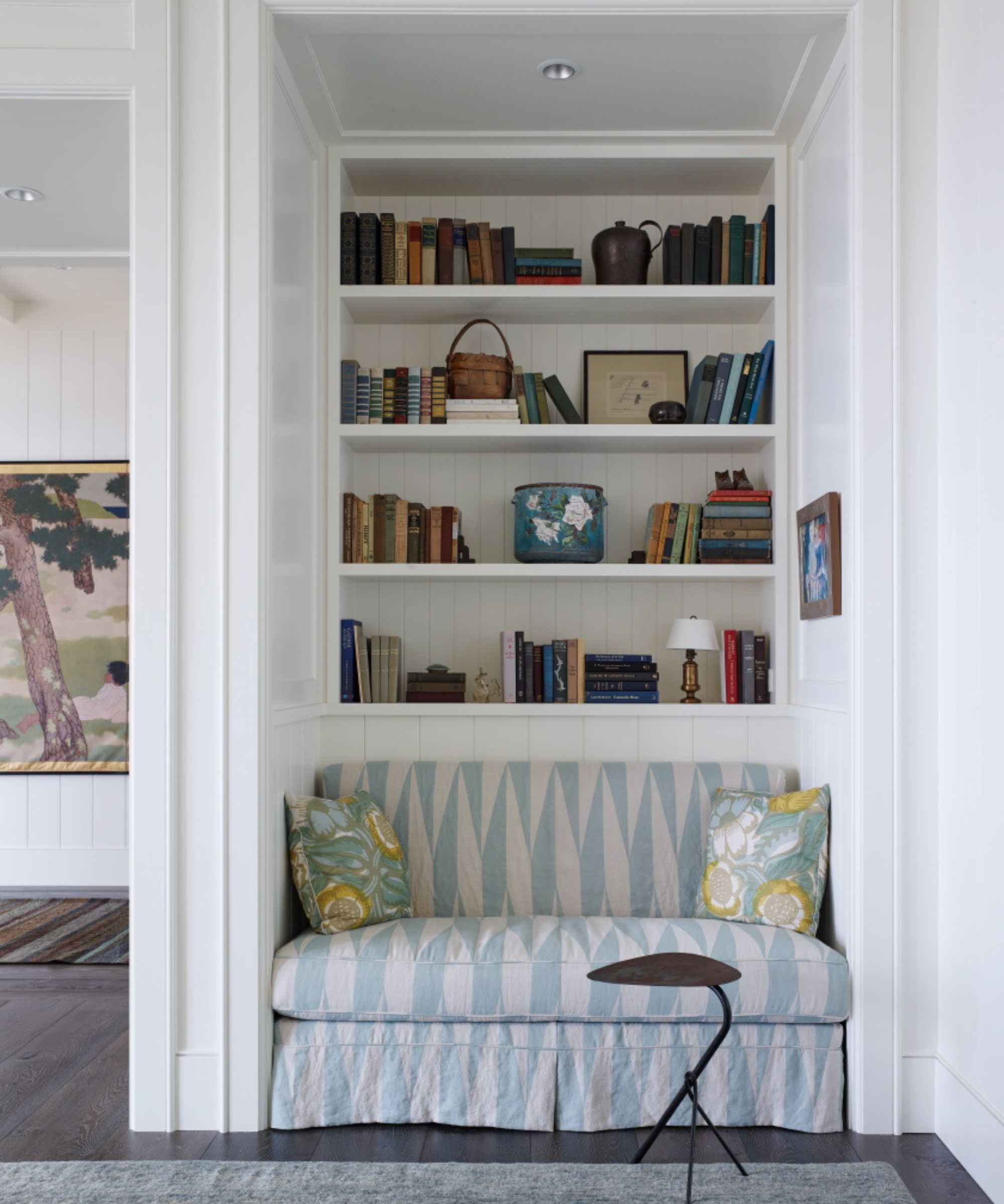
Strange though it may sound, bookcases are not an essential element of a reading nook, although they are often included in the space. Not having somewhere to keep at least a handful of books, however, is a reading nook mistake. So whether it's a full-height bookcase, a shelf under a coffee table, a small side table, or even a magazine rack, a dedicated place to keep the current reading matter to hand is very useful.
'I love a reading nook to have shelves with books or a window with a lovely view to daydream,' says Celeste Robbins, architect and principal of Illinois firm Robbins Architecture, whose beach house reading nook is pictured above. Tucked away in an alcove, and with a deeply upholstered built-in seat, this reading space is calling us!
7. Make time to enjoy the reading nook
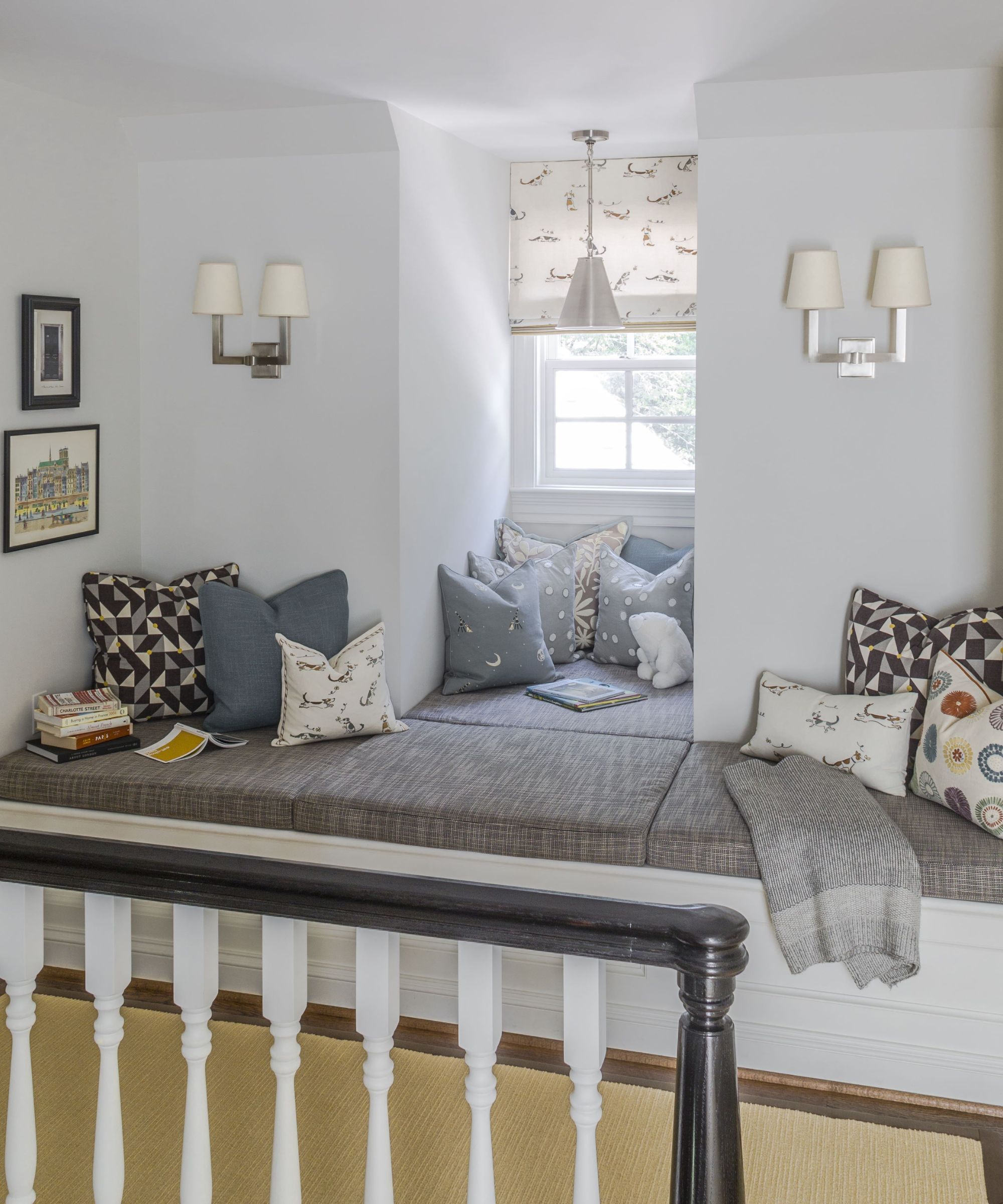
Of course, all the effort of designing a dedicated place to read will be wasted if you don't make time to enjoy it and it's not doing its job if it doesn't entice you to spend time there.
Interior designer Jennaea Denhardt, who's based in Minneapolis and Baja, Mexico, agrees. 'For me, the only mistake you can make with a reading nook, or any space really, is if it looks incredible, but you don’t use it,' she says. 'You can have the obvious pieces for the space, a chair for sitting, ambient and direct light sources, and a place to set down a drink and a particular book, however, if those look amazing but don’t actually invite you to sit and linger, you might need to rethink it.'
Denhardt goes on to explain that for her one of the key elements for making a reading nook work, is deciding what you want from the overall look or character of the space. 'Does a moodier space surrounded by books with a reading lamp, a textured blanket on an embracing chair and a small spot to set your things down in an area surrounded by books call you?' she asks. 'Or would a bright space where natural light is everywhere, with a more upright chair, and a bigger table for multiple books or a place to write make you move toward it more? The key is figuring out what pulls you to actually use the space and not want to leave it.'
Designer Skip Sroka's landing reading nook, above, part of a Virginia new-build, is certainly one I wouldn't want to leave in a hurry.
FAQs
Why have a reading nook in a home?
Some would say it's an indulgent use of space, others might see it as an essential part of the home to promote calm and all-important me-time. And, no surprises, we're with the 'essential' group!
Whichever way you look at them, however, reading nooks adds another welcome and contrasting element to the home as a whole. For architect Celeste Robbins it's also a question of balance, as she explains why reading nooks matter in this day and age: 'Within a modern home of open spaces and rooms to gather,' she says, 'it’s important to create smaller moments and provide a welcome layer of scale and warmth to the life of a home.'
So although the days of grand country house libraries may be long gone, with a reading nook we can all be a little more Downton Abbey, albeit on a smaller scale.
Sign up to the Homes & Gardens newsletter
Design expertise in your inbox – from inspiring decorating ideas and beautiful celebrity homes to practical gardening advice and shopping round-ups.
Karen sources beautiful homes to feature on the Homes & Gardens website. She loves visiting historic houses in particular and working with photographers to capture all shapes and sizes of properties. Karen began her career as a sub-editor at Hi-Fi News and Record Review magazine. Her move to women’s magazines came soon after, in the shape of Living magazine, which covered cookery, fashion, beauty, homes and gardening. From Living Karen moved to Ideal Home magazine, where as deputy chief sub, then chief sub, she started to really take an interest in properties, architecture, interior design and gardening.
-
 Orange and green is the bold color pairing quietly transforming homes in 2025 – here's 4 reasons why
Interior designers are making the orange and green combination work wonders – this is how you can too
By Sophia Pouget de St Victor Published
-
 This Michelle-Pfeiffer-approved chair is made of a forebodingly unusual material, opening the debate: Is it a rustic stunner, or a danger to sitters?
The actress took to Instagram with a chair made of a controversially sharp material – and fans are unsure of how they feel about it
By Sophie Edwards Published