'I have never had a client reaction like the one I got for this project' says the designer of this quietly luxurious London home
Paolo Moschino and Philip Vergeylen said a dose of humor was the key to finessing the beauty and charm of this house just off Regent's Park
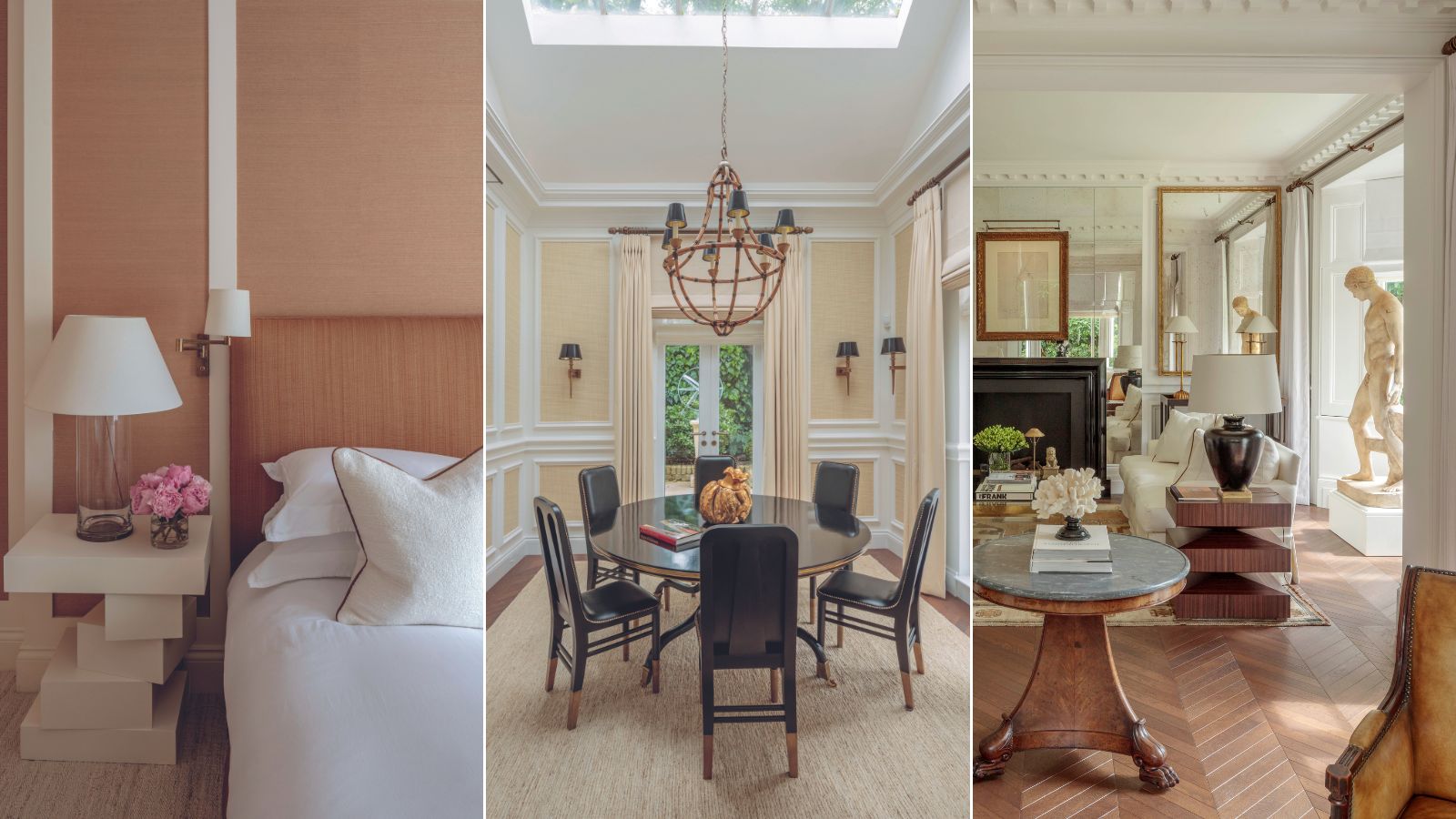

'I have never had a client reaction like the one I got for the house design of this project,’ says Philip Vergeylen, interior designer and co-principal lead at the London-based studio Paolo Moschino. ‘The couple were on-site every day and when it came to the final install I told them they had to leave. They came back a week later and were in tears.’
Happy tears, that is. ‘They just felt it reflected their personalities so much and was calm and warm.’ In fact, Philip and his team transformed a pretty soulless decor scheme into a space you’d want to relax into.
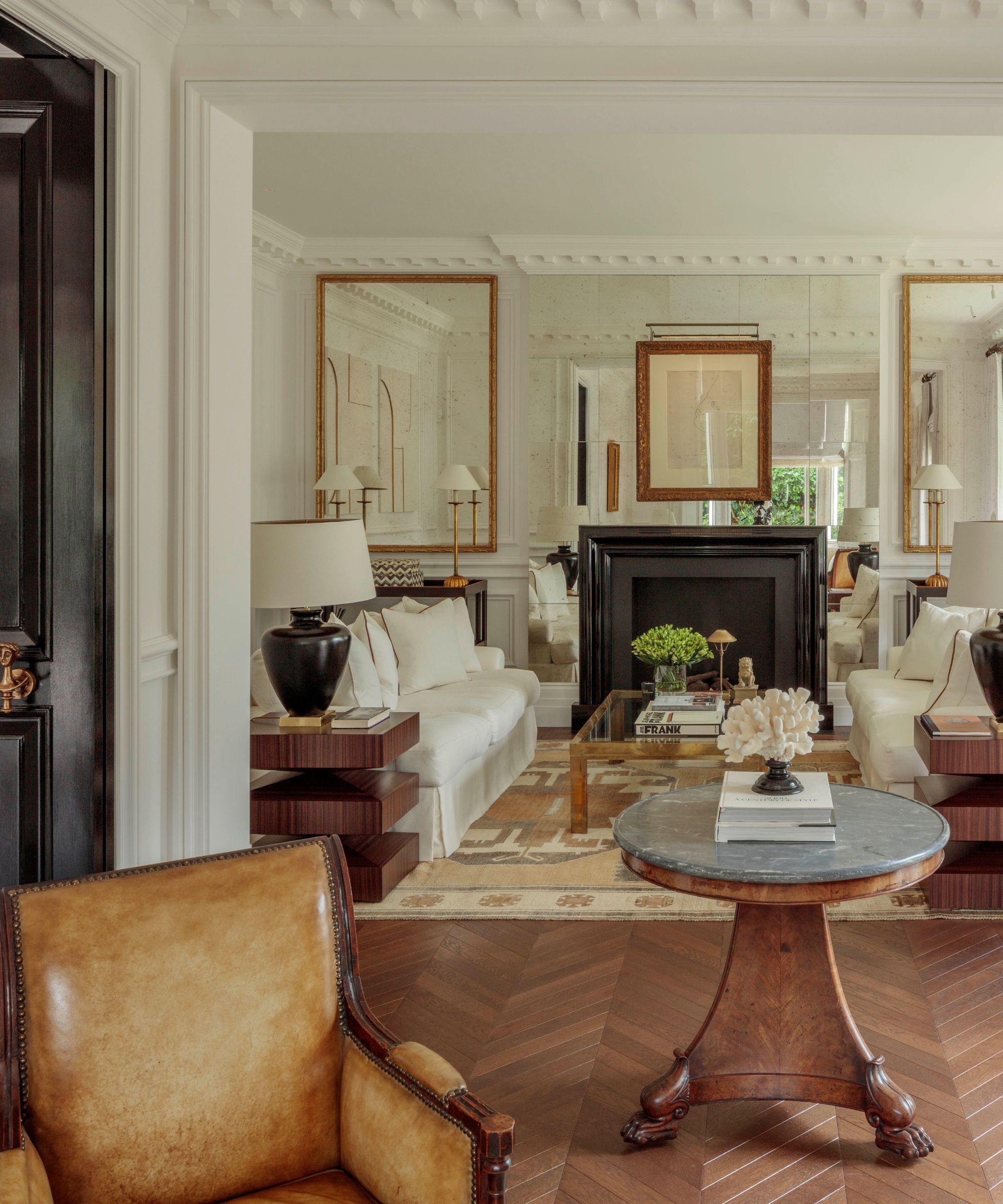
Philip table lamps, all Paolo Moschino. Anatolian rug, Gallery Yacou. Antique French coffee table; 19th-century life-size terracotta sculpture, both Paolo Moschino Antiquarium.
He turned what had – according to Philip – ‘the look and feel of a German clinic, all grey and chrome, and harsh downlights’ into a hushed haven that reflected the home’s quiet surroundings. Shrouded by trees, the Italianate-style three-bedroom house is just off a peaceful corner of Regent’s Park.
But don’t be misled by the neutral palette of whites, creams, and caramels, or the seemingly ordered approach to classical design themes like symmetry and sculpture. Look between the carefully curated collections of cushions and you’ll find a wit, a sense of humor that Philip fills all his projects with.
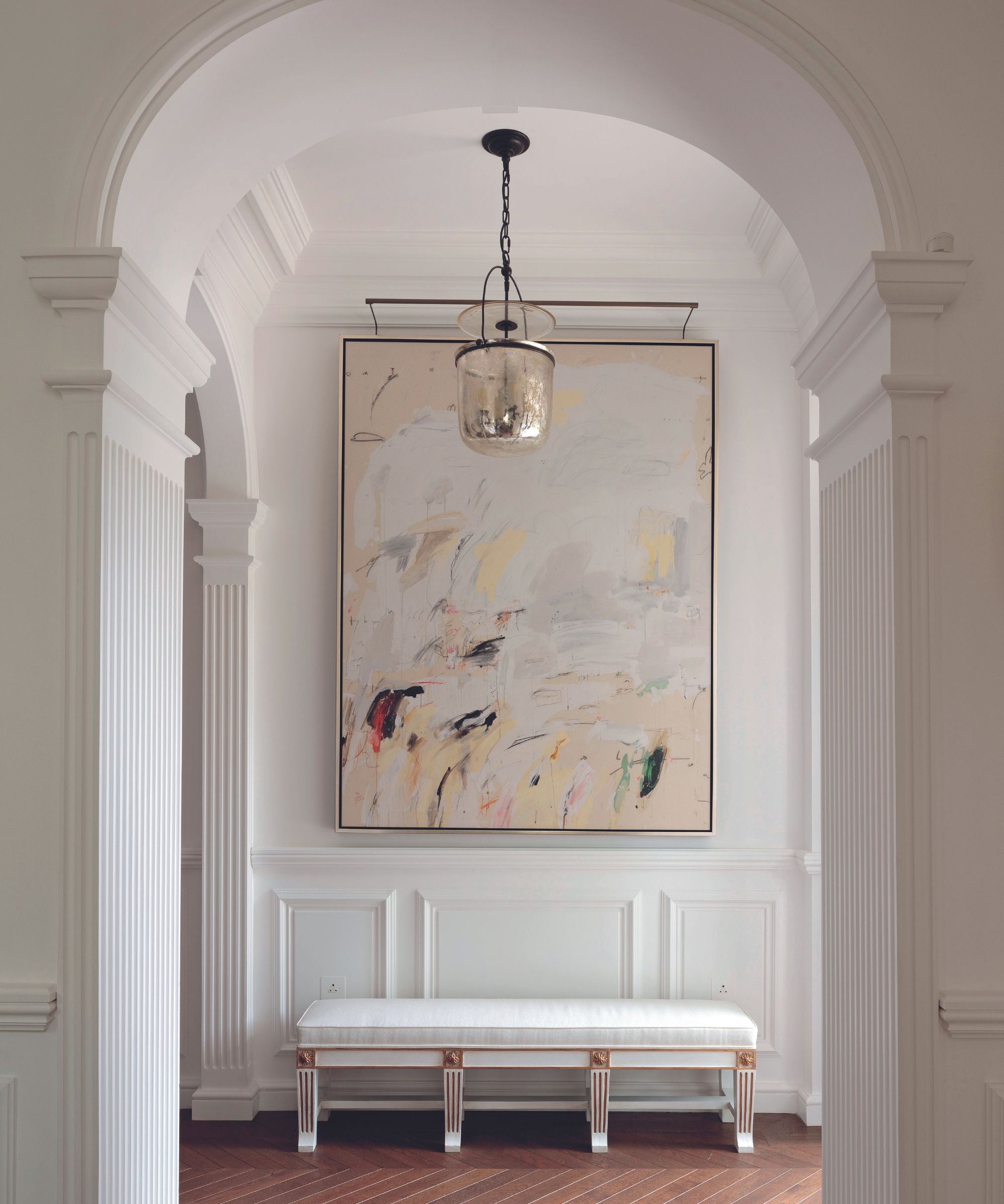
Walls in Not Totally White, Papers and Paints. Bench, custom Paolo Moschino. Inspiration White #3 artwork, Paolo Moschino. Lorford Smoke Bell lantern light, Visual Comfort & Co.
‘I always like to include something unexpected that brings a smile and that people would never expect,’ he says. Here, these are the door handles in the shape of a Grecian bust and the antique urn held aloft on a plinth above the kitchen door.
‘I had to fight for that one,’ says Philip. ‘It was a blank wall that needed something, but was too high up and so would have been ridiculous to hang a painting there. I fixed the bracket and had the idea of the bronze pot as it’s not a piece you’d normally think might belong in a kitchen, but that’s why I liked it. It’s fun!’
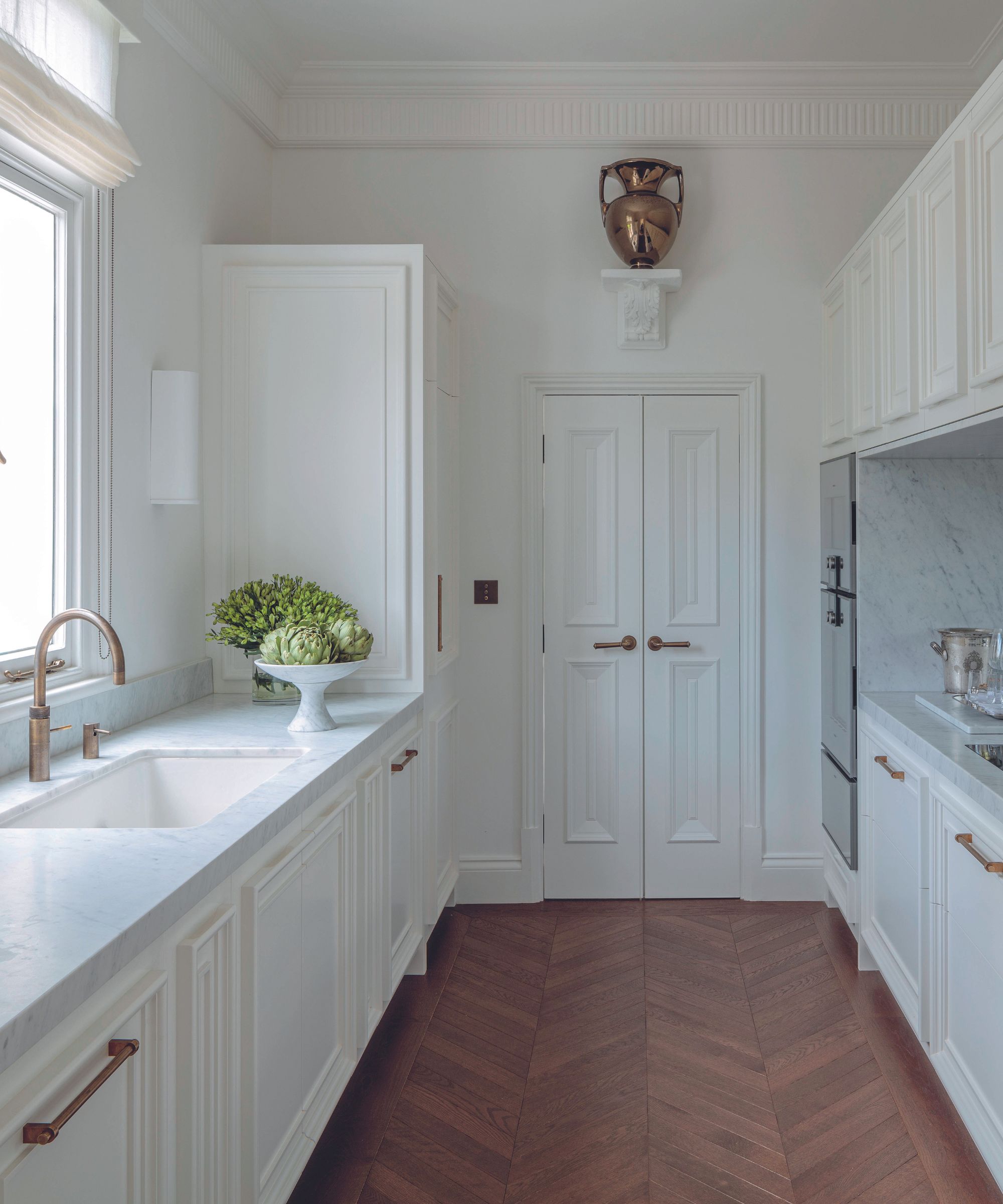
Kitchen cabinetry and polished Calacatta marble worktops, all Blakes London. Urn, Paolo Moschino.
As ever with the Paolo Moschino approach, the interest lies in the contrasts – the modern kitchen with the antique pot, or the book-filled reading room with its daring leopard print rug.
'I love push and pull,’ Philip says. ‘I like a Picasso on top of an 18th-century commode next to a wicker basket filled with lavender. If you play with objects from different times and still manage to create a sense of harmony then that’s how a house starts to feel like a home.’
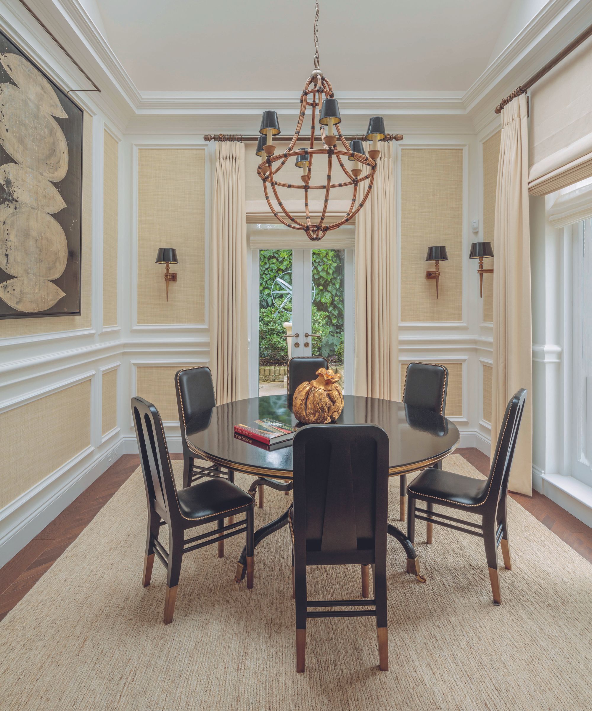
Antique Spanish dining table and vintage chandelier, both Paolo Moschino Antiquarium. Urban chairs and custom jute rug, both Paolo Moschino. Waterloo wall lights, Eichholtz. Driftwood wallcovering in Cream, Philip Jeffries.
His other trick for injecting warmth like this is to add in architectural details where there are none – all the decorative plasterwork like the coving and architraving here was installed by Philip’s team – and to make sure to use just the right neutrals.
‘My favorite paint color is Not Totally White From Papers and Paints,’ Philip says of the shade used in the sitting rooms and hallway and in many parts of his own home. ‘It has enough white in it to be clean and clear but it never makes you feel cold.’
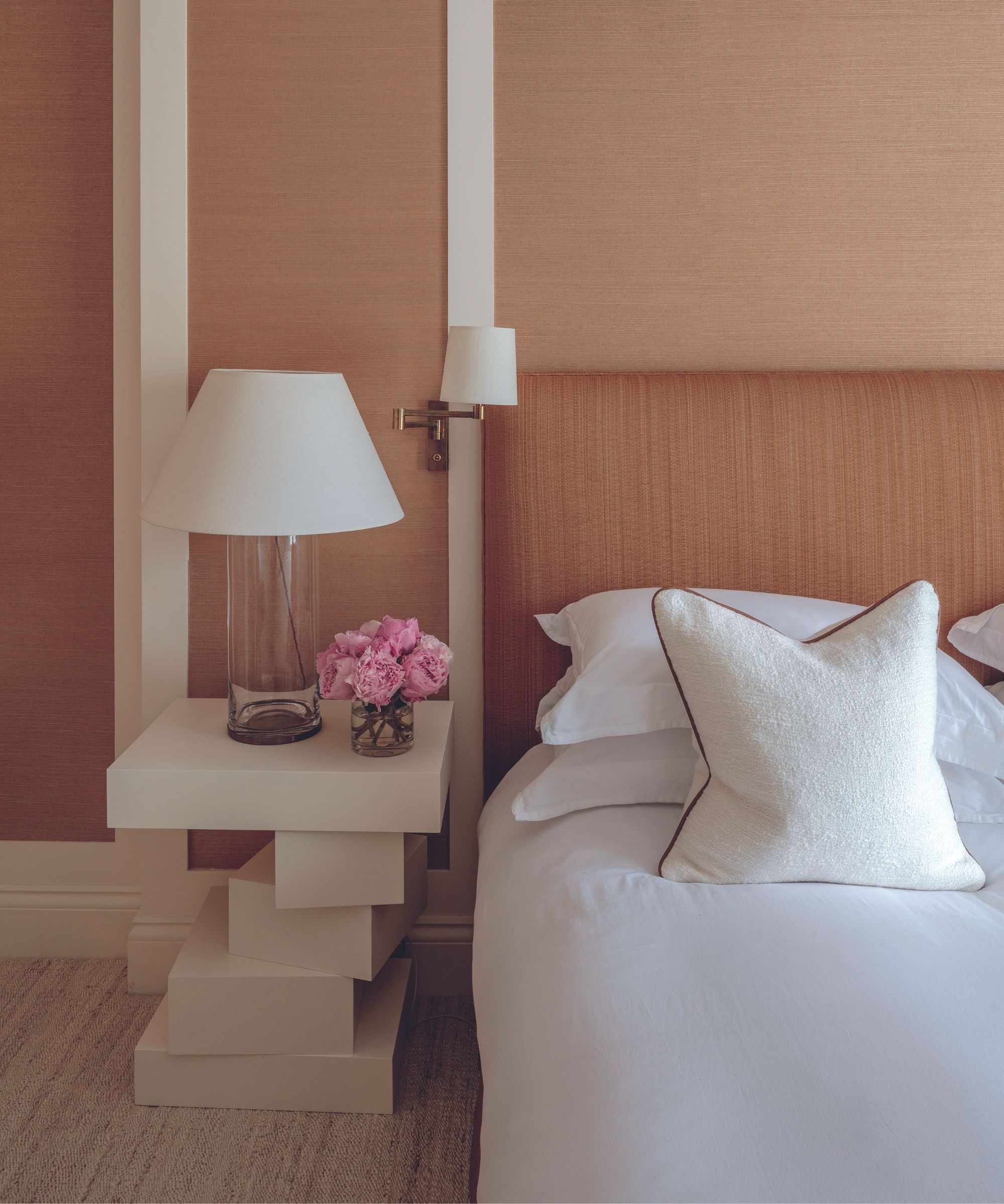
Headboard, custom Paolo Moschino; covered in Armure Cannele in Havane, Claremont. Fontana bedside table; Naomi lamp; swing arm reading light, all Paolo Moschino.
He caveats against using the paint color in a bathroom or kitchen, though. ‘Against marble, it can look a bit yellow.’ The garden also came under Philip’s remit and was previously ‘all bricked up’ and not at all reflective of its proximity to the park.
‘It’s now so tranquil with those water features,’ explains Philip. ‘One of the owners reads a lot and finds himself sitting out there, fountains on, relaxed.’
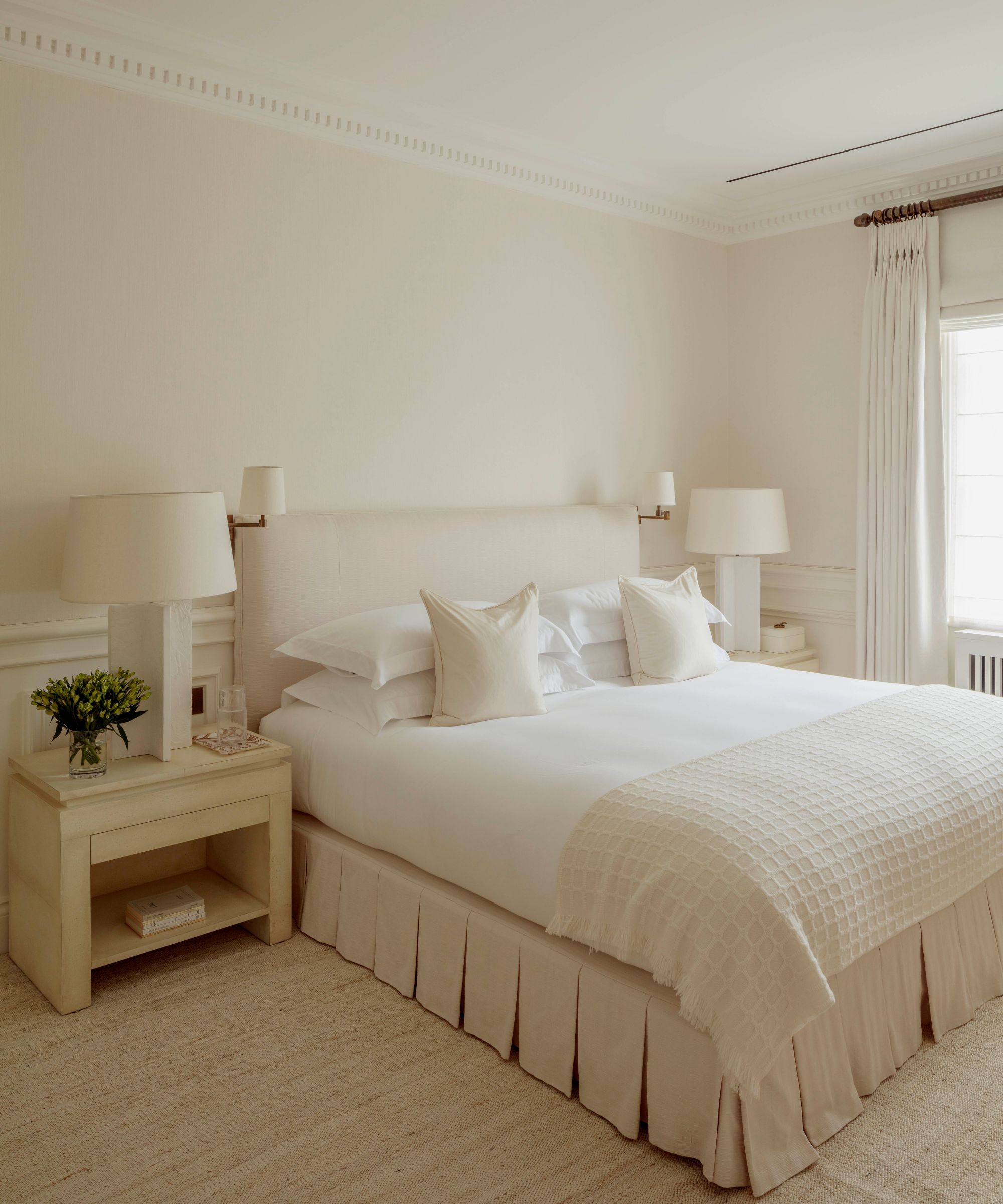
In fact, relaxation is the thread that runs through the entire project, built into the rationalized layout and its double drawing room, the breakfast room, and the demarcation between guest bedrooms on one side and the principal suite on the other.
‘The house is now not complicated,’ Philip says. ‘We wanted to make it very liveable. Libraries that are more like snugs, and sitting rooms that are more like loungers. A space where you just want to unwind.’
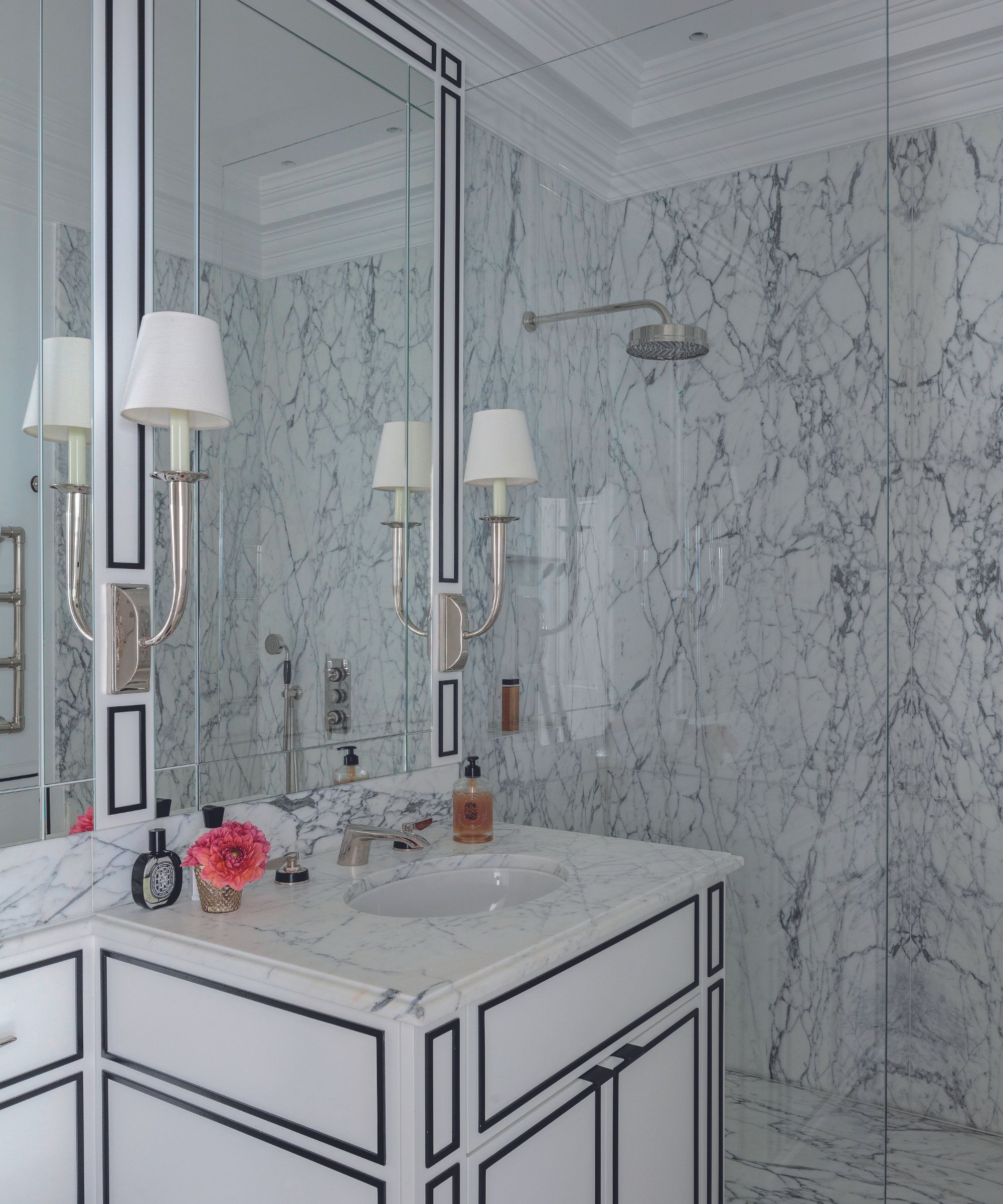
Vanity made from Statuarietto marble, designed by Paolo Moschino. Marco wall lights, Paolo Moschino. One Hundred Collection tap, Samuel Heath.
Meet the designers
Philip Vergeylen shares his style inspiration
What's your biggest indulgence?
My addiction to china – I have about 45 sets! But they all do get used.
What do you consider your greatest achievement?
When I met Paolo his business employed just one architect. Now, 12 years since I joined the company, we employ 18. I’m very proud of this.
Describe your style in three words.
Classic, unexpected, fun.
Finish the sentence, I know I'm a creative because...
I dream a lot.
Who is design's next game-changer?
Stephen Sills is not exactly a newcomer but I always look forward to his new projects. He uses color in such different ways.
Favorite museum?
The Musée Nissim de Camondo in Paris. It belonged to a Jewish family and is like a time capsule, a spectacular glimpse into the sophisticated way people lived in the 1930s.
What are you reading?
The Covenant of Water by Abraham Verghese.
Sign up to the Homes & Gardens newsletter
Design expertise in your inbox – from inspiring decorating ideas and beautiful celebrity homes to practical gardening advice and shopping round-ups.
Pip Rich is an interiors journalist and editor with 20 years' experience, having written for all of the UK's biggest titles. Most recently, he was the Global Editor in Chief of our sister brand, Livingetc, where he now continues in a consulting role as Executive Editor. Before that, he was acting editor of Homes & Gardens, and has held staff positions at Sunday Times Style, ELLE Decoration, Red and Grazia. He has written three books – his most recent, A New Leaf, looked at the homes of architects who had decorated with house plants. Over his career, he has interviewed pretty much every interior designer working today, soaking up their knowledge and wisdom so as to become an expert himself.
-
 Ina Garten's storage pantry is an insightful window into all of the best cookware used by the chef – and it's easy to recreate on your kitchen shelves from $48
The beautiful dishware in The Barefoot Contessa's Hamptons pantry showcases the tools she uses most often to cook – this is exactly how you replicate it
By Sophie Edwards Published
-
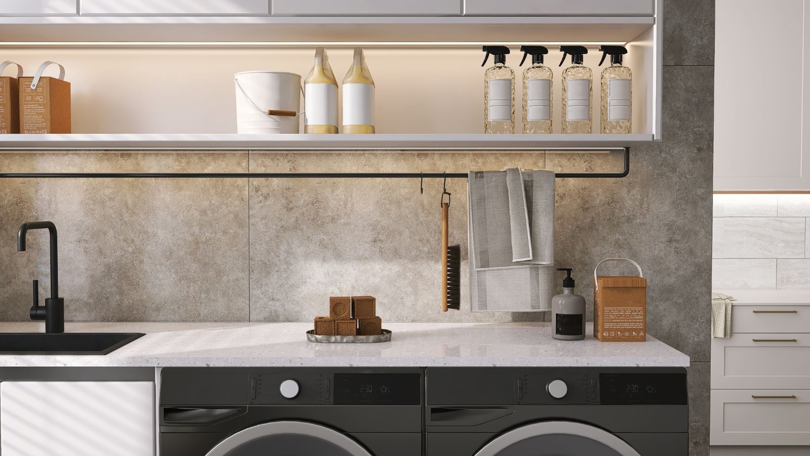 Extend the lifespan of your appliance with 5 simple but crucial washing machine maintenance tips
From cleaning the filters to keeping the door open, experts reveal the washer tips they swear by
By Andy van Terheyden Published