3 inventive ways to use plaster, according to an interior designer who swears it's making a comeback
Plaster is here to stay – and it goes far beyond the walls. Here's how interior designer Marie Flanigan and other experts are using the comeback material
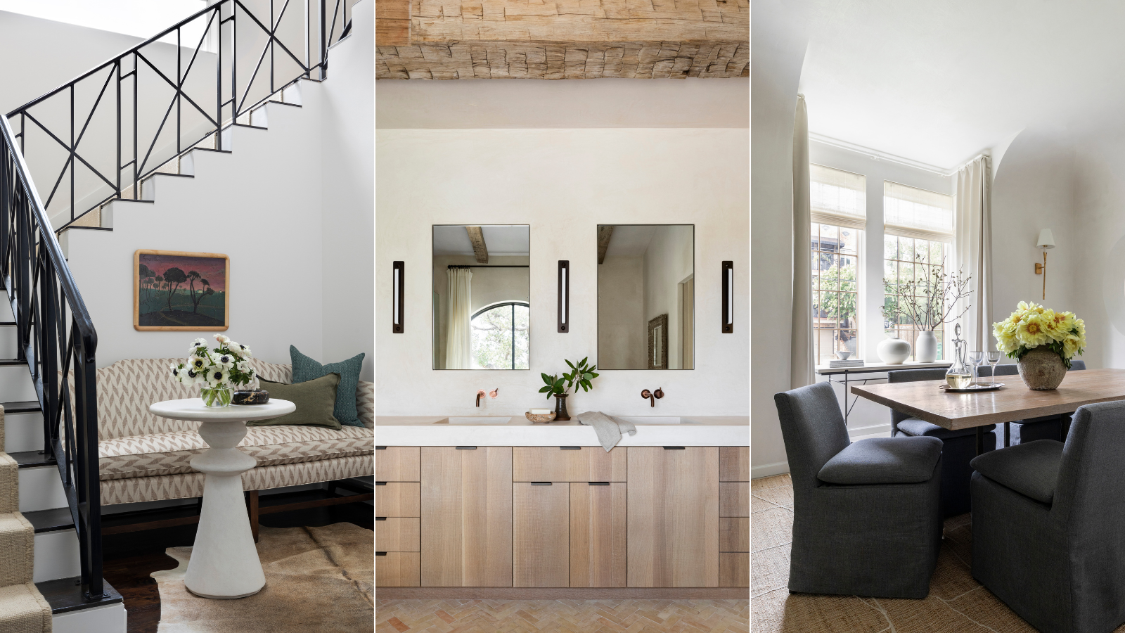

A plaster finish provides a space with textural detail and a timeless atmosphere, and the look is fresher than ever. Though plaster walls and ceilings have been around for ages, designers are constantly finding new and exciting uses for the material.
Designer Marie Flanigan, founder of Texas-based Marie Flanigan Interiors, just shared her top three uses for plaster – and they go far beyond wall decor. Here's how she levels up design schemes with the material, and what other interior designers suggest for bringing plaster into your own home.
A post shared by Marie Flanigan Interiors (@marieflaniganinteriors)
A photo posted by on
How to update your home with plaster details
In Marie's video on plaster, she notes that the material is 'all the rage' – all the more reason to update your home with plaster detailing.
Although she says plaster tends to work best in rooms that already have an organic atmosphere, the finish has the potential to upgrade an interior space of any style.
'Pairing plaster with reclaimed beams feels like a very authentic pairing, giving the home a feeling of authenticity even in a new build,' says Marie.
These are the three tips Marie shared for fitting plaster details into your home, no matter your interior design style.

Marie Flanigan is an award-winning interior designer whose passion and achievements in design have positioned her as one of the nation’s best. She is classically trained and practiced architect, and her trademark style is evident through the sophisticated use of color, texture, and light. Every home she designs receives her personal signature of timeless elegance and innovative simplicity.
Walls
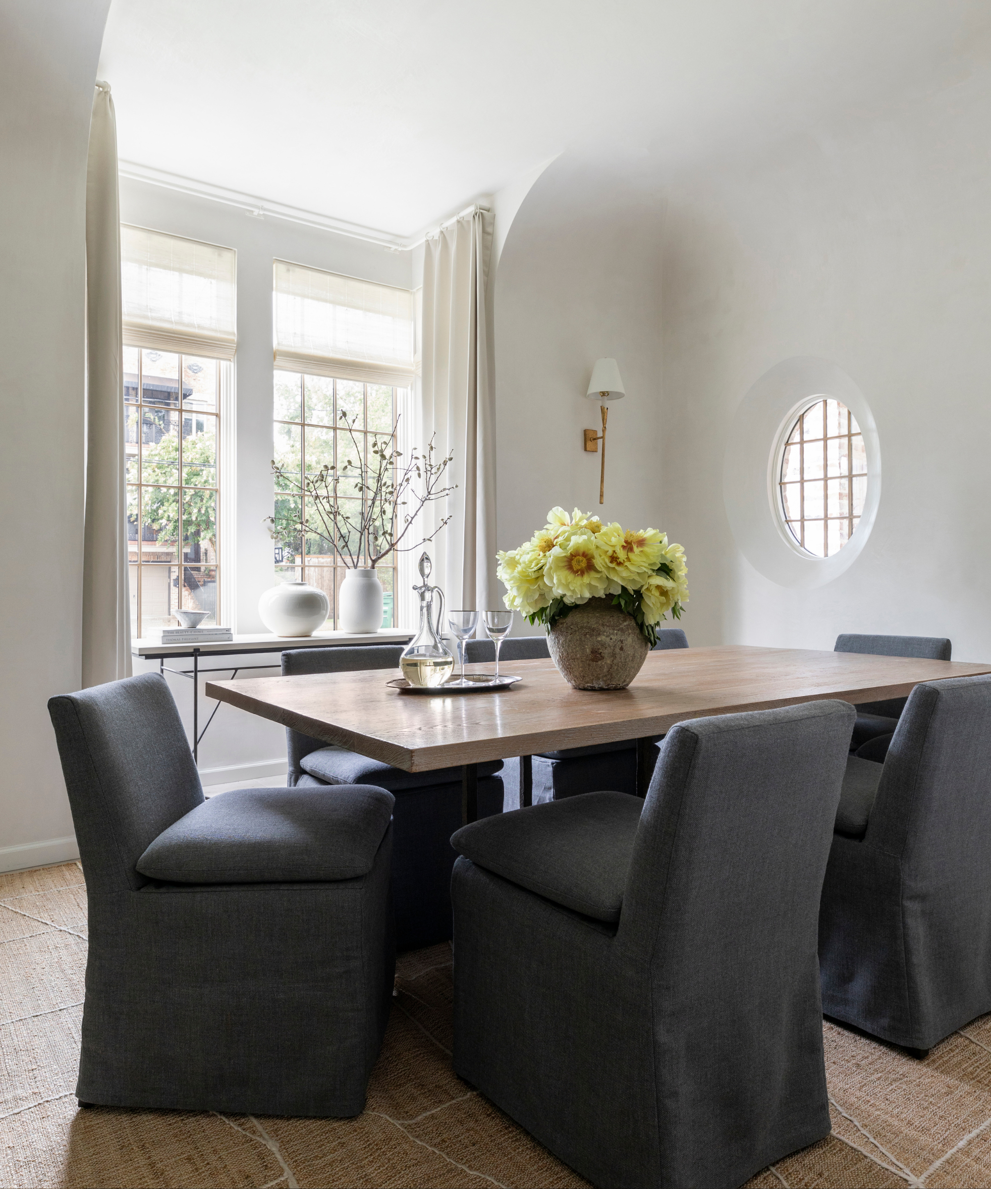
Marie starts off the video with the plaster location we're all most familiar with: the walls. But while the placement is expected, the type of plaster the designer prefers is not.
Sign up to the Homes & Gardens newsletter
Design expertise in your inbox – from inspiring decorating ideas and beautiful celebrity homes to practical gardening advice and shopping round-ups.
'Most people have heard of Venetian plaster. We use a product called Diamond plaster, and that's just a product that you put over gyp board that gives depth and color, and also a slight sheen,' she says in the video.
Marie tells Homes & Gardens that Diamond plaster offers a 'subtlety and sheen' that Venetian plaster doesn't always deliver: 'Diamond plaster feels older, more understated and organic. Venetian plaster has its moment, but typically it’s too much glamour and sheen for the homes I design,' she says.
On the whole, the texture and depth that plaster provides has made the material a go-to for Marie Flanigan Interiors. In fact, Marie says the firm opts for plaster walls more than any other use of the material.
'Plaster walls add a beautiful texture to any space, especially when you thicken openings, giving the room more mass and weight. This beautifully delineates spaces,' she says.
Countertops
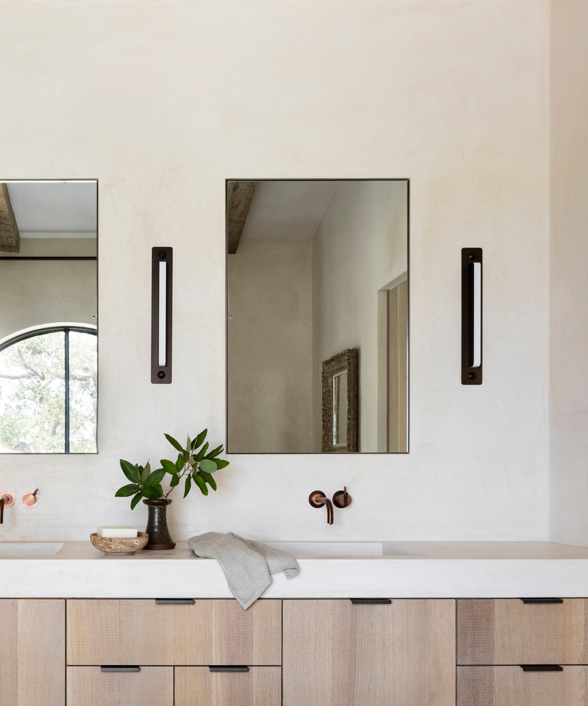
Using plaster for solid surfaces like countertops is another favorite of Marie's, pictured above in this neutral-toned bathroom. Tadelakt plaster, a waterproof type originally from Morocco, coats the walls and counters, offering a streamlined yet intricate shine. In the video, Marie says there's no need to worry about breakability.
'Although that sounds really delicate, it's actually harder than concrete and gives your room almost a stone-like appearance. We also use that for mantels and different architectural items,' Marie says in the post.
When it comes to creating a color scheme, Marie suggests personalizing your plaster finish. That way, the material will fit seamlessly into the rest of your home's design: 'We tint the plaster to match our favorite whites, which often include Greek Villa, White Dove and Cloud White,' she says.
Artem Kropvinsky, interior designer and founder of Arsight, says that tinted plaster is a new trend he's noticed in the material's market.
'It adapts to lighting and therefore creates blossoming, color-shifting walls during the day, he says.

Based in New York, Artem Kropovinsky, founder of Arsight, has a decade of extensive and considerable global design experience. Prioritizing minimalism, sustainability, and authenticity, Artem, alongside his team of professionals, works on projects in the US and worldwide.
Small items

In the final part of the video, Marie shares her current favorite way to integrate plaster into a design scheme – and the secret's in the details.
'We like to give small items a plastered look, which can be achieved with a thick paint type product. My recent favorite is plastering drapery rods, and frames of mirrors, and artwork,' Marie says in the video.
To give smaller accessories a plaster-coated look, Marie says she often opts for a paint-like finish rather than the 'more cumbersome process' of real plaster, which involves layering nine coats of the material atop one another.
Tanya Stone, interior designer and founder of Tanya Stone Interiors, agrees that plaster furniture is a welcome addition to just about any space, noting its adaptability and low cost.
'The captivating colors, textures, and tones in plaster furniture resemble a dance and song, making custom pieces uniquely tailored for specific spaces. Despite the perception of high costs, with the right execution, plaster furniture can surprisingly be more affordable than expected. The combination of versatility and durability makes crafting one-of-a-kind furniture with plaster truly special,' she says.

Tanya Stone is the founder and principal designer of Tanya Stone Interiors, a renowned firm that designs residential and commercial spaces, as well as bespoke furniture.
How to make plaster look fresh for 2024
If you're looking to give your home a plaster refresh in the new year, Marie suggests using a color palette of deep, dark hues.
'Deep jewel tones make for a beautiful plaster finish. Don’t be afraid to go dark,' she says
Another trending plaster use is Tadelakt, perfect for wet areas like showers, bathtubs and kitchen backsplash, she says: 'Tadelakt helps make plaster transitions blend seamlessly between spaces, despite being a different product,' says Marie.
Despite plaster's wide array of potential uses, Marie notes a few applications that may hinder homeowners from achieving the design scheme they're seeking.
'Since plaster adds a visual weight to a space, steer clear when you want walls to have a lightness or airy feel. I would also avoid plaster in spaces with a lot of rich texture,' she says.
It's clear that plaster is back, and with such an array of inventive uses. Whether you finish your furniture in a classy plaster coat or opt for a full wall makeover, this textural transformation is sure to elevate your interior design style.

Abby was the Interior Design News Editor at Homes & Gardens and is now studying for her Master's degree in Journalism at City University, London. Prior to joining our team, she worked with Better Homes & Gardens, where she wrote and edited content about home decor, gardening tips, food news, and more. She studied Journalism and English Literature at New York University and moved to London to pursue her love of writing in 2023.
-
 Extend the lifespan of your appliance with 5 simple but crucial washing machine maintenance tips
From cleaning the filters to keeping the door open, experts reveal the washer tips they swear by
By Andy van Terheyden Published
-
 These are the 6 must-have colors to decorate with in April 2025
What do retro-inspired yellows and beautiful blues all have in common? They're on our hot list for the season ahead
By Sophia Pouget de St Victor Published
