Pastel room ideas – 15 designer-approved ways to use these pretty shades
Pastels, but not as you know them, these ideas are chic and sophisticated and will make you want to get decorating with these pale hues immediately
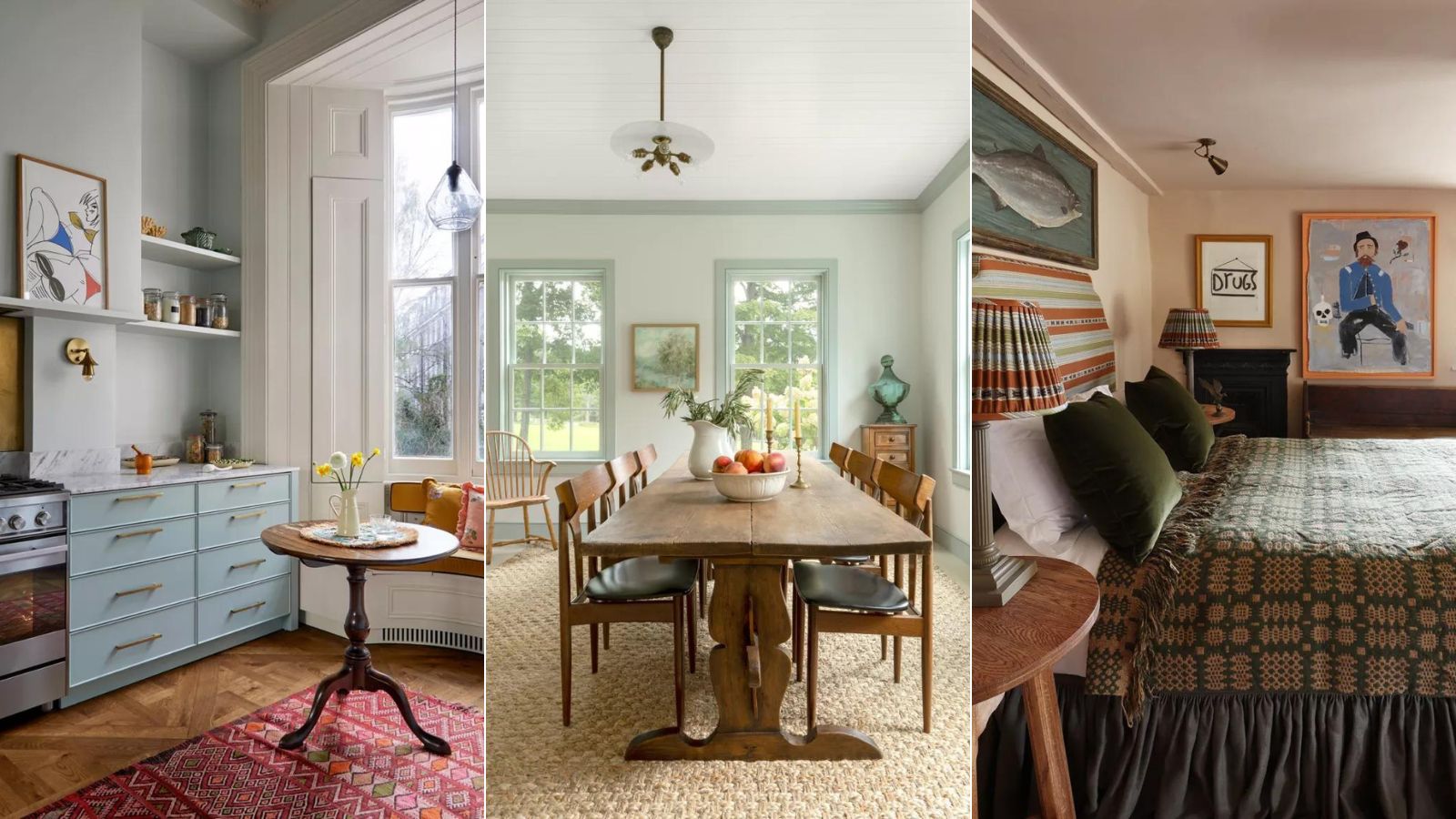
- 1. Don't think of it as decorating with pastels
- 2. Think dirty pastels for a more grown-up look
- 3. Layer different shades of pastel
- 4. Decorate a bathroom in soothing pastel greens
- 5. Pair pastels with bolder accents colors
- 6. Ground pastels with darker accents
- 7. Add just a hint of pastel with tiles
- 8. Create a calming space with pale greens and blues
- 9. Use pastels as the backdrop for vibrant shades
- 10. Mix your pastels
- 11. Embrace the trend for green
- 12. Play with patterns
- 13. Pair a pastel peach with white
- 14. Color drench with pastels
- 15. Brighten an entryway with pastel yellow

In a world of interior trends that favor all things neutral, pastels have forged an undeserved bad reputation. Well, actually bad isn't quite the right word, more that pastels have (unfortunately) for so long been associated with children's rooms, and they've got a reputation as being... overly sweet.
Pastels did, however, garner some attention when millennial pink was at its peak, but whenever we have talked of room color ideas and color trends in the past, pastels just don't get the attention they deserved. And they deserve the praise because there are so many designers doing incredible things with these beautiful shades.
Pastels come in so many forms and you would be surprised how easy it is to adapt them to any space and any style. You've got the shades that you think of when you think pastel – baby pinks, light blues, pale yellows – but there are also peaches, lilacs, soft sage greens, and the list goes on. And you can make them as pale or as bold as you fancy. So, to make the argument pastels are every bit as chic and sophisticated as our much-loved neutrals, we spoke with designers who have used (and loved) them throughout their projects to get you inspired to experiment with these shades too.
1. Don't think of it as decorating with pastels
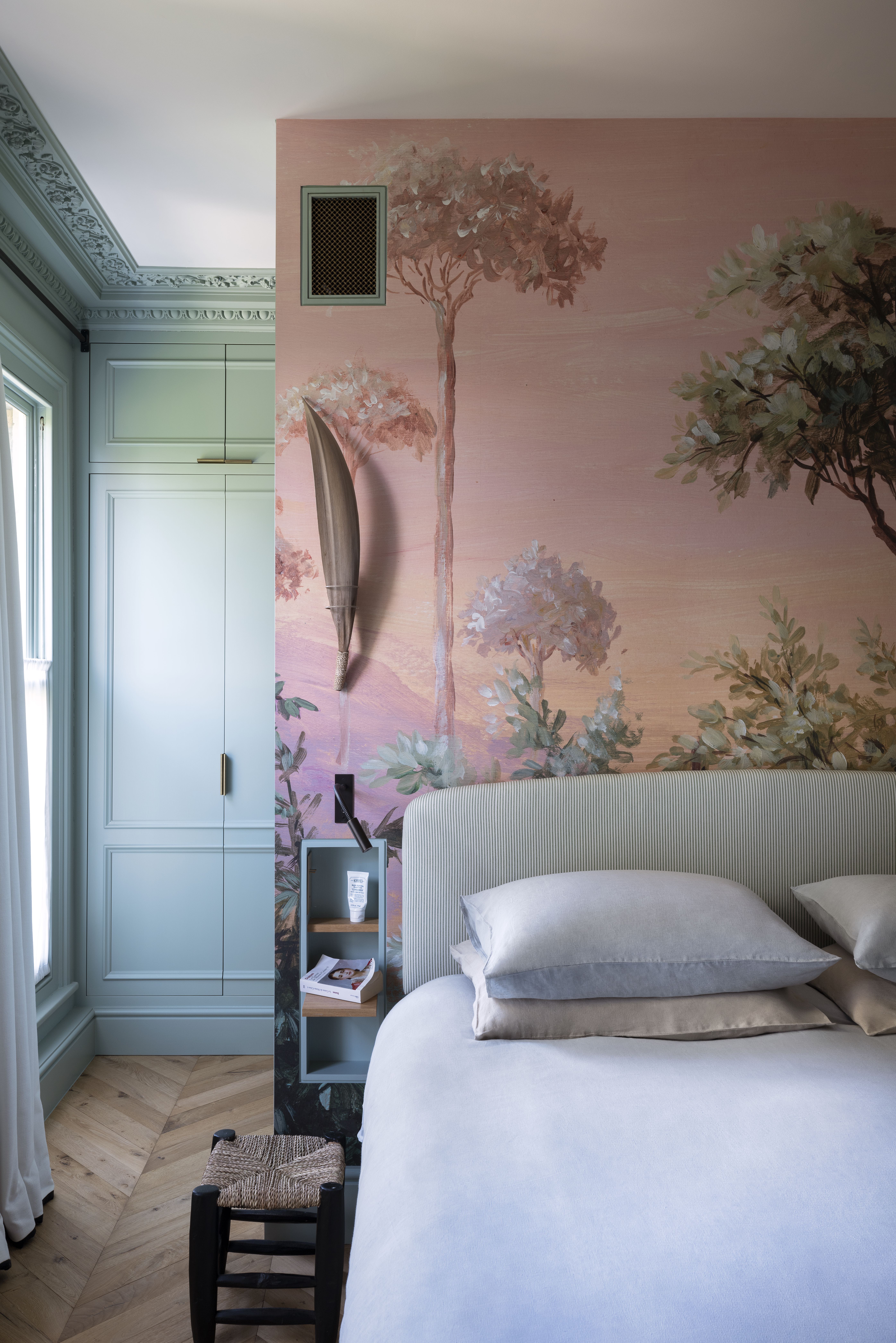
Bedroom designed by K&H Design
This is a great piece of advice from Patrick O'Donnell of Farrow & Ball and applies when decorating with any 'bolder' colors. Rid yourself of any pre-existing associations you have with the shades you are using and treat them just as you would a gray or cream.
'Try and ignore the fact that you are using pastel colors altogether, it has such a connotation of pretty which is subliminally limiting,' says Patrick. 'If you're after some more modern, think of them as neutrals – a foil to add more dynamic elements like accent colors or decorative cloth. This will give you more freedom to experiment!
Strong colors work beautifully against a plethora of pastel shades and you can err on tonality or much moodier contrasts; think earthy pinks and spice reds or the softest of blue-greens splashed with something much inkier & darker.'
2. Think dirty pastels for a more grown-up look
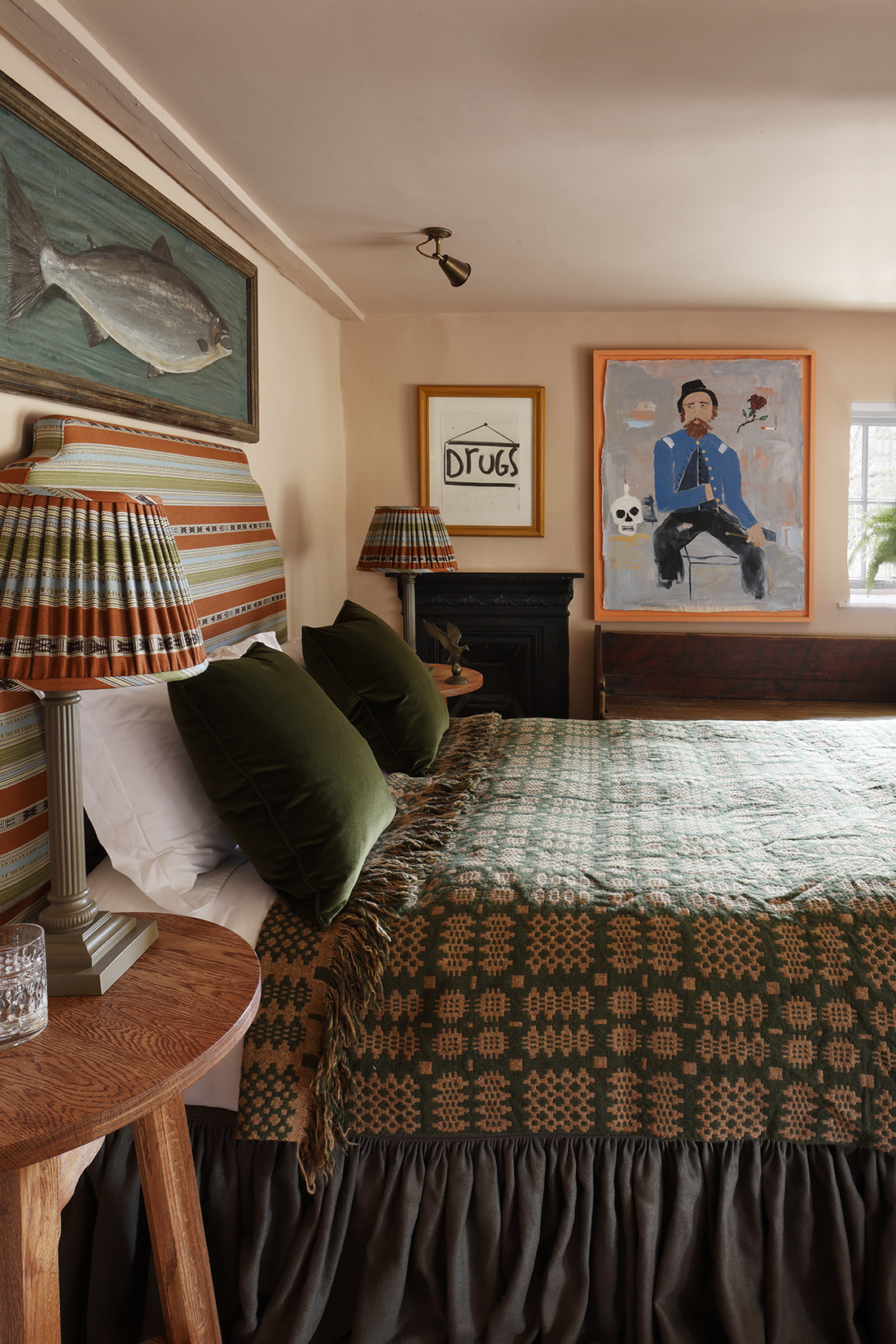
Traditionally, you might think of pastels as being very light, very sweet and gentle, and those shades have their assets, but if you are a neutral lover pick what we like to call dirtier pastels. A browner undertone will get rid of any of that saccharine feel you can get with pastels, and give them a far more earthy and sophisticated look.
Case in point, this pink bedroom, designed by HÁM Interiors. 'When selecting pastel shades, we are often inclined towards the gentle, pale pink tones. We appreciate their resemblance to setting plaster and the way their yellow and brown undertones create a flattering backdrop for antique furniture.' explains creative director Kate Cox.
Patrick O'Donnell agrees if you are going to do a pastel pink this is the way to go. 'Pastel renaissance happened in the early days of the pandemic but one color that isn’t going away soon is gentle earthy pinks – much more fleshy in tone than the common perception of pink. This color is most definitely your friendly neutral and will add warmth where needed but soften to the palest blush if drenched in full sun.' he adds.
3. Layer different shades of pastel
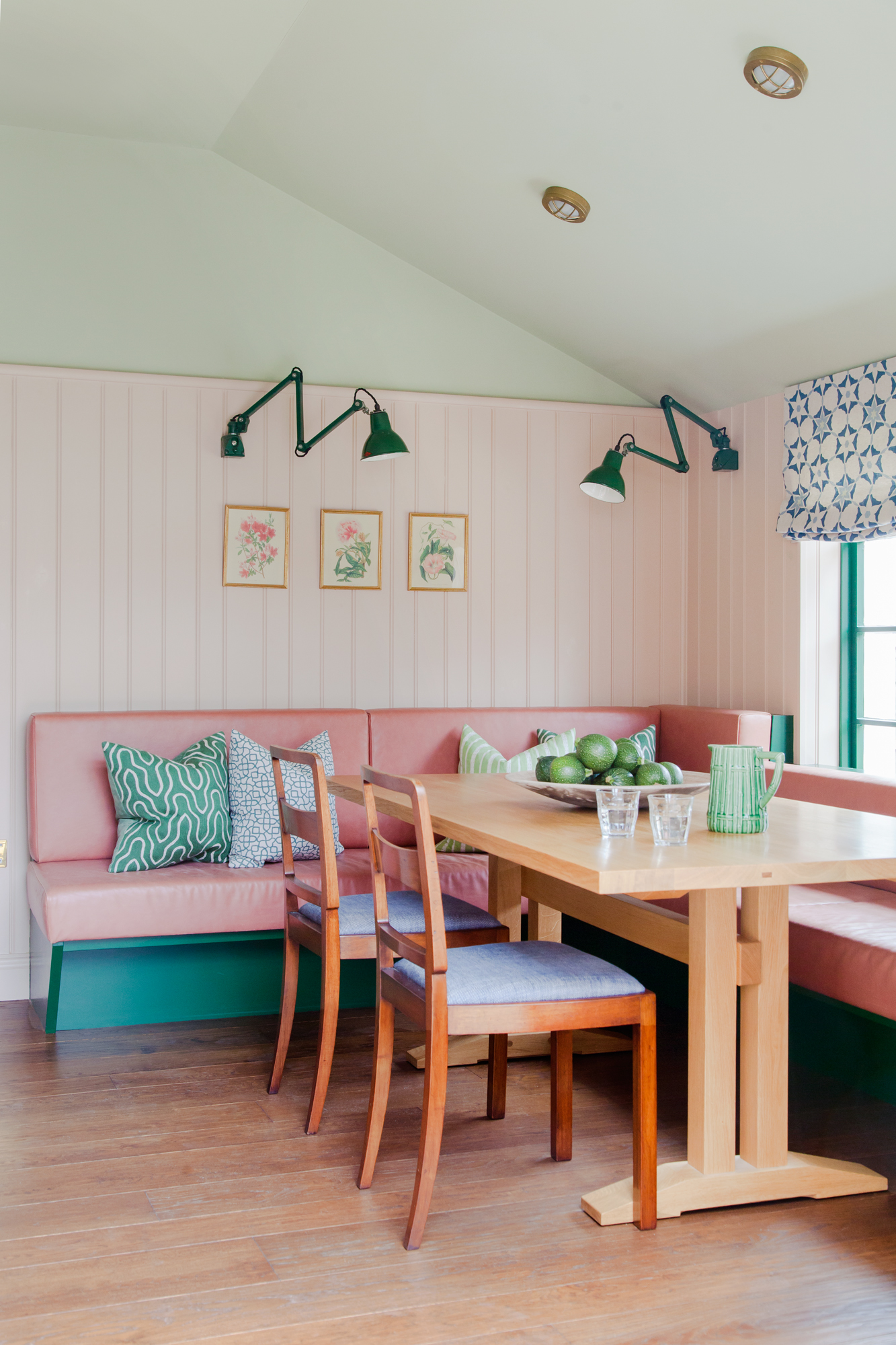
Thought baby pink could never work in a grown-up space? This dining nook proves that wrong. This space takes an all-pastel palette and makes it so chic and on-trend. The mid-century furniture helps, but it's also the combination of pastels. All those pale shades are balanced by bolder versions – the pale pink paneling could risk looking a little girl's bedroom-esque but that bolder pink that meets it in the seating balances the baby tones with something bolder, and the hints of teal adds the string contrast that's needed to ground the space.
'When decorating with pastels I always add some stronger accent colors within the scheme. This dining area was at the end of a long narrow kitchen, so we wanted to make the area feel cozier and connect the space to the sloping ceiling. The paneling zones the dining space and softens some of the hard edges of the kitchen – and the pastel pink gives the space a restorative and calming vibe,' describes designer Brooke Copp Barton.
4. Decorate a bathroom in soothing pastel greens
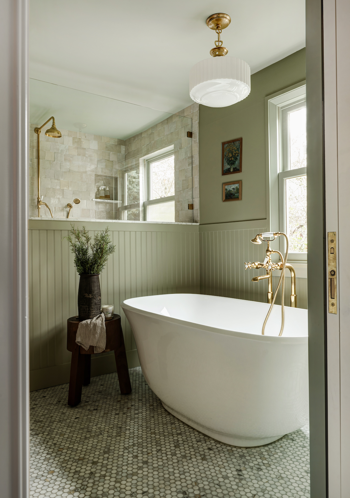
Pastel green is the perfect bathroom color – it's fresh and neutral just as a white or grey would be, but it's warmer and more calming. Pair it with fresh crisp whites to create some contrast and lift the muted shade, and go with gold or copper accents over silver as you want to be bringing out those really sophisticated olive undertones of the green.
'We took the entire second floor of this 1920s tudor down to the studs to allow for better layout opportunities. In doing so, we nearly tripled the size of the primary bathroom. Blue Gray by Farrow & Ball coat the walls, ceiling, and trim to create a spa-like atmosphere. We love how calming and tranquil this space feels,' explains designer Jessica Nelson.
5. Pair pastels with bolder accents colors
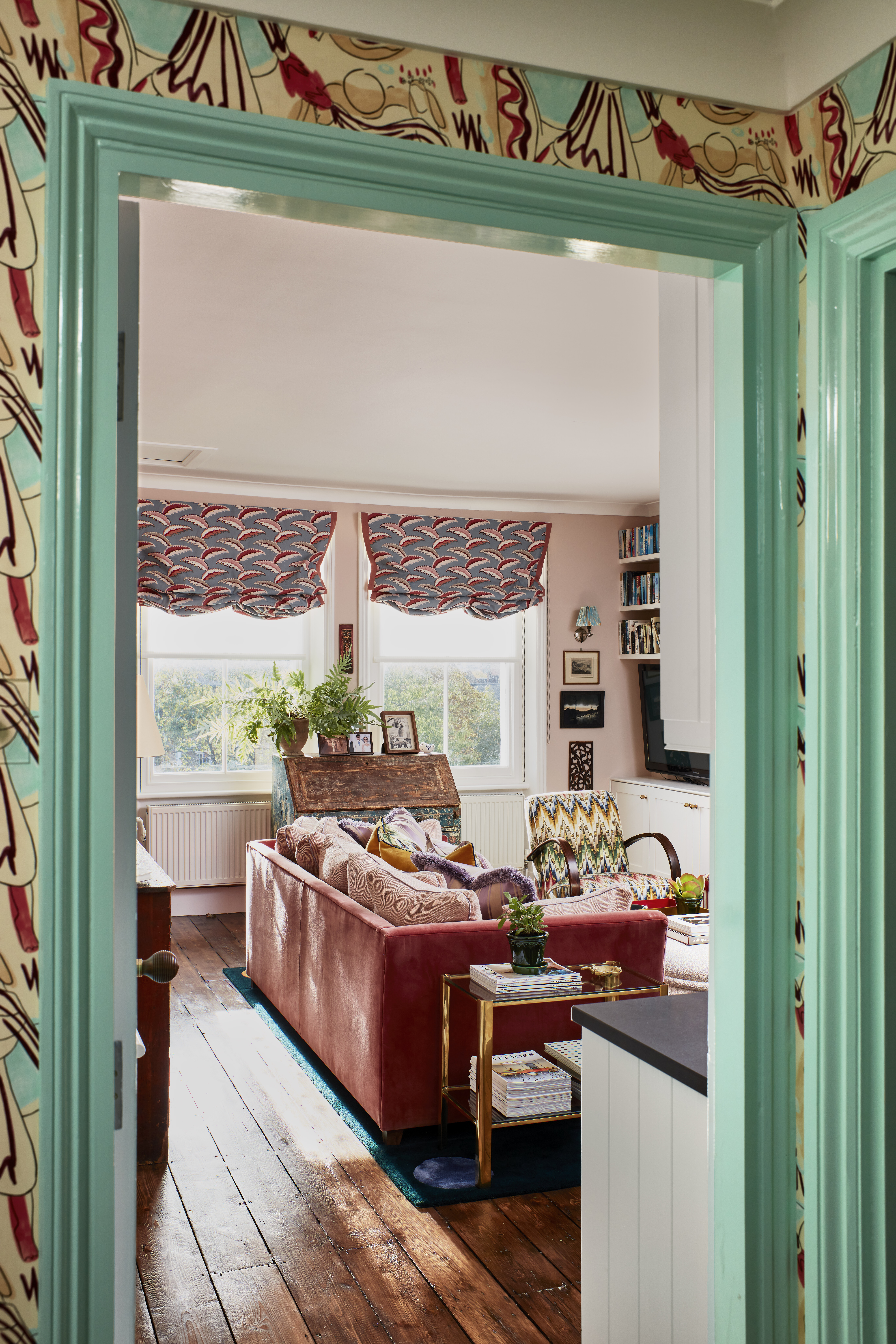
This whole apartment design by Yellow London shows how pastels can be both fun and playful whilst also looking incredibly chic and on-trend. The pairing of pastel pinks with bolder pops of turquoise and red freshens up those sweeter hues. It feels colorful of course but not overbearingly so, and that's the joy of pastels, you can experiment with color but the result will always be very soft and livable.
'For this space, we wanted to create a home full of warmth and personality that also maximized the space available. Using a pastel color palette added interest and character while still maintaining a bright and fresh feeling. The pastel pink walls in the living spaces complement the patterned furniture and contrast with bolder paint shades on the woodwork and wallpaper to create a layered and impactful scheme,' explains Cath Beckett, co-founder of Yellow London.
'Pastel hues are ideal for introducing subtle colors to a scheme, especially if working with brighter colors feels intimidating. Pastels add hints of color to a more neutral space while keeping it timeless, and are particularly effective when used to create an understated backdrop that allows stronger colors and patterns to come to the fore without overpowering the space,' she adds.
6. Ground pastels with darker accents
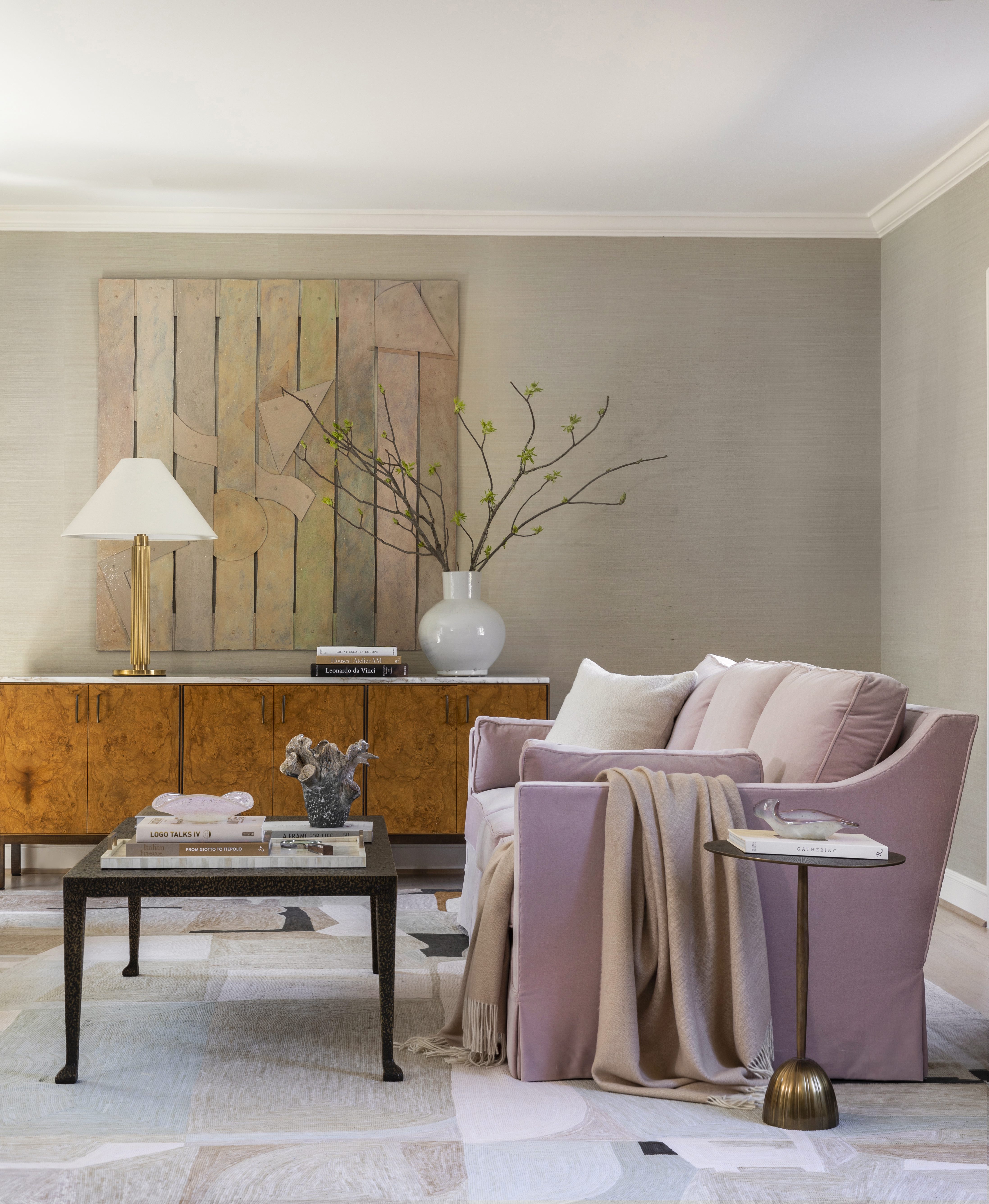
'I love to play with color saturation and pastels are a great way to do so. Choose your starting pastel color and then work to add in that color through varied saturation levels. This gives you color variation throughout the room that’s not too matchy-matchy. Whether it’s through your wall color, artwork, or sofa fabric, layered with a throw or pillows, you can really play with how variations of the color are incorporated within the room. If you’re looking for a true departure from pastels, look for complementary colors in dark or moody tones,' says designer Marie Flanigan.
'And ensuring you have the right pastel tones mixed with beautiful finishes is key. Personally, I love mixing pastels with wood and metal because they add a bit of masculinity to the aesthetic. I do like to mix some additional darker tones in slight touches throughout the room, whether it’s a case piece, table legs, or incorporated into the soft finishes like rug patterns, throws, or pillows.' Marie Flanigan.
7. Add just a hint of pastel with tiles
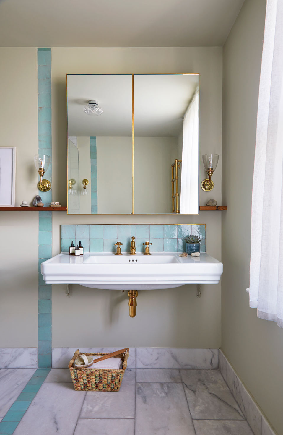
If choosing a sole pastel color scheme for your bathroom sounds daunting, be inspired by this space designed by Anthi Grapsa. The pastel blue zellige tiles add a playful vibe, whilst still fresh and modern and they look wonderful against the greige wall – a very sophisticated combination.
'This bathroom brief was to feel and look clean and fresh. The use of this beautiful pale blue/green on the walls and the marble on the floor gave us the perfect backdrop for the more intense pastel blue Zellige tiles insets and the brass taps and light fittings,' says Anthi.
8. Create a calming space with pale greens and blues
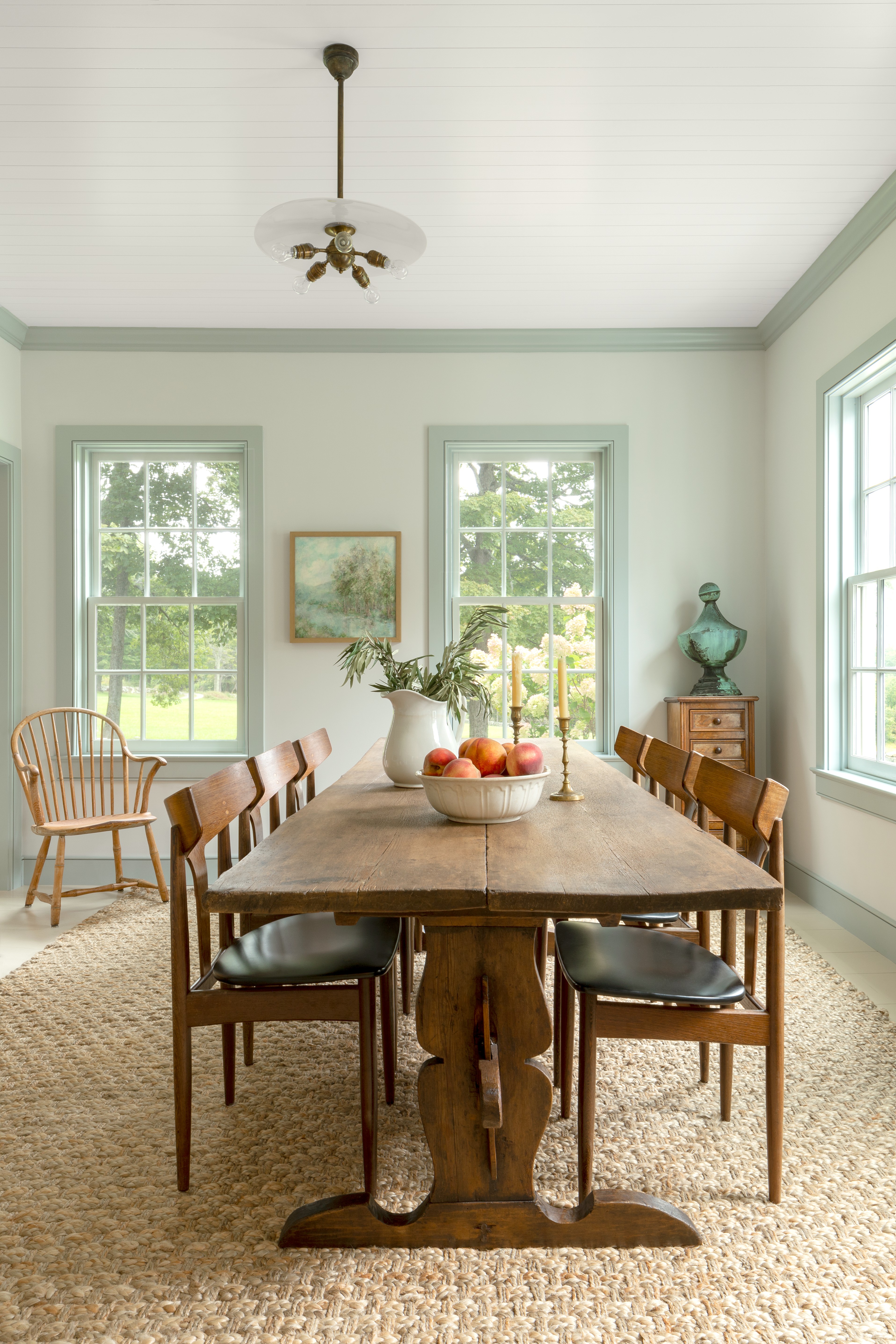
'When creating a calming and serene atmosphere, we like to feature lighter colors in soothing blues, greens, ivories, beiges, and other pastels,' says Victoria Holly, principal and founder of Victoria Holly Interiors. 'Really any color can be calming as long as the color is light and bright. But realistically, different people find different colors calming, so we like to make sure that we're tailoring calming colors to our clients. Usually, the eye perceives things as calming when it doesn't need to work a lot - which is why light and bright tones are relaxing.
This dining room designed by Joshua Smith is such a calming space. The pale pastel green walls make this already bright room feel even lighter, and the tonal effect with the slightly dark shade on the woodwork grounds that paler hue and makes you notice the contrast between the ever-so-slightly green walls and the white of the ceiling. The wooden furniture again grounds all those lighter shades and the mix of styles and shapes gives the room a modern edge.
9. Use pastels as the backdrop for vibrant shades
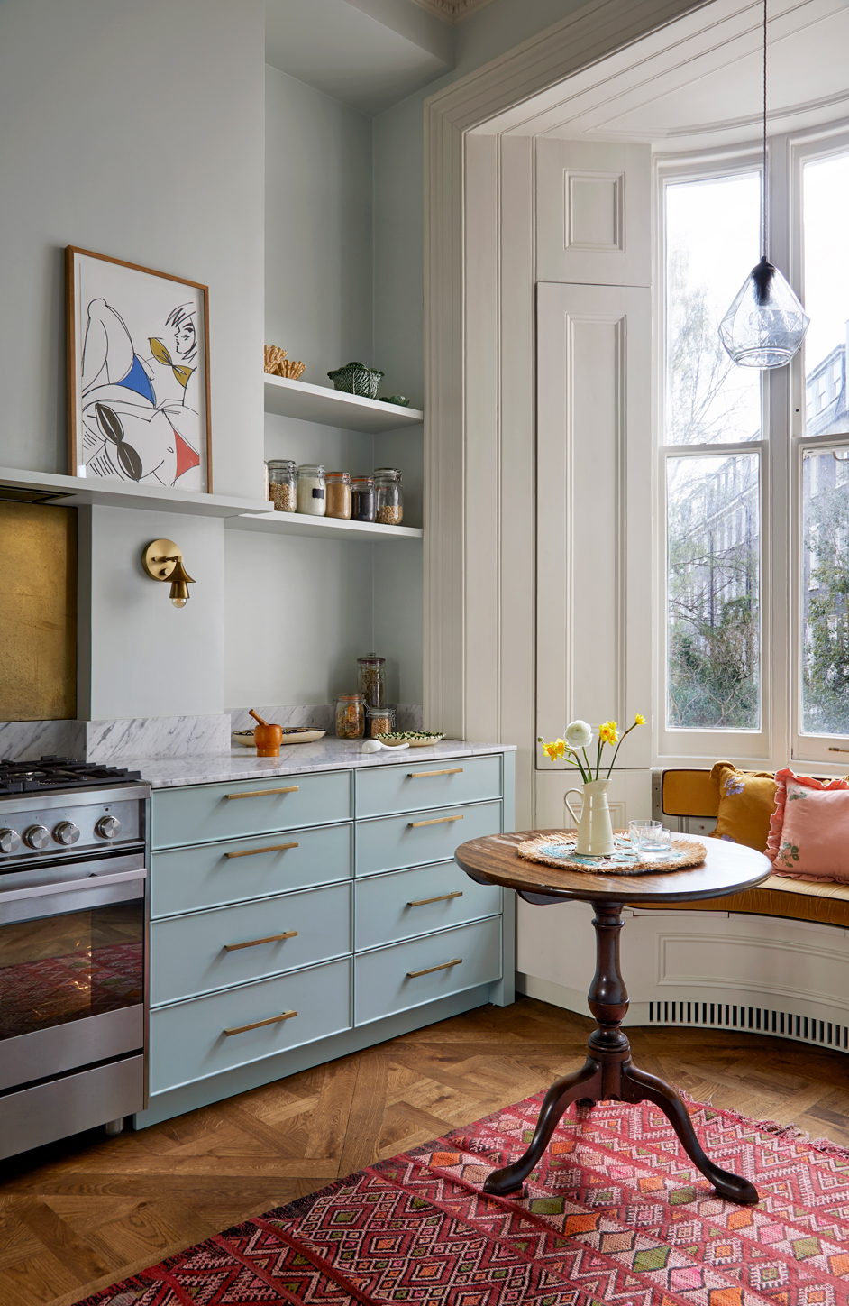
'Pastels are the ideal palette either on walls or joinery to create a calm backdrop for bolder colored rugs, or textured surfaces, wooden floors, vibrant textiles, or furniture. They work very well in my opinion with bolder colors as a contrast.' says Anthi Grapsa.
'This kitchen is part of a house for an art curator-it connects directly with a large opening to the living room where the walls have this pale pastel blue color that we took through to the kitchen. The concept was to create a soft background where art can be displayed on the walls. Similar to the kitchen the joinery color had a darker shade of the same pastel blue to add interest and then the rest of the room is layered with vibrant colors on the window seat, the rug, and textures from the wooden floor, marble worktop, and the brass splash back and fittings.'
Designer and founder of Barlow & Barlow Lucy Barlow agrees, 'Pastels are a great way to soften a room and give it a feminine touch, having a lighter backdrop also allows you to be a bit more daring when it comes to adding alternate colors and textures, we would suggest adding this slowly to see what works and then add to it. Avoid using pastels in darker rooms as they tend to get hidden and not have much impact.'
10. Mix your pastels

The rule pink and green must never be seen was thrown out years ago, and the color combination has become a huge color trend. But there is a way to do it, as using pastels is the easiest way to bring these colors together without having to go super bold and risk overwhelming a room. Bring together a blush pastel pink with a pale, sage pastel green and you are on to a winner – this pairing works especially well in kitchens and if you go pale and earthy enough they do work almost like a neutral.
Lucy Barlow says, 'Layering pastels is a lot less daunting than layering bold bright colors – although we love adding contrasting colors to pastel schemes for extra playfulness, this might be a bold border on a pastel curtain or a bright skirting board lining a pastel-colored wall.'
What makes the combination really work in this kitchen is that the textures are different. You aren't seeing flat green next to a flat pink. The zellige-style tiles add depth and the slight shine makes the combination less contrasting. And a top tip with this combo – let one color dominate, be it pink or green. 40/60 is a good ratio to aim for, you want to avoid the blockiness of 50/50 but also the 'pop' of color approach you get with 20/80.
11. Embrace the trend for green
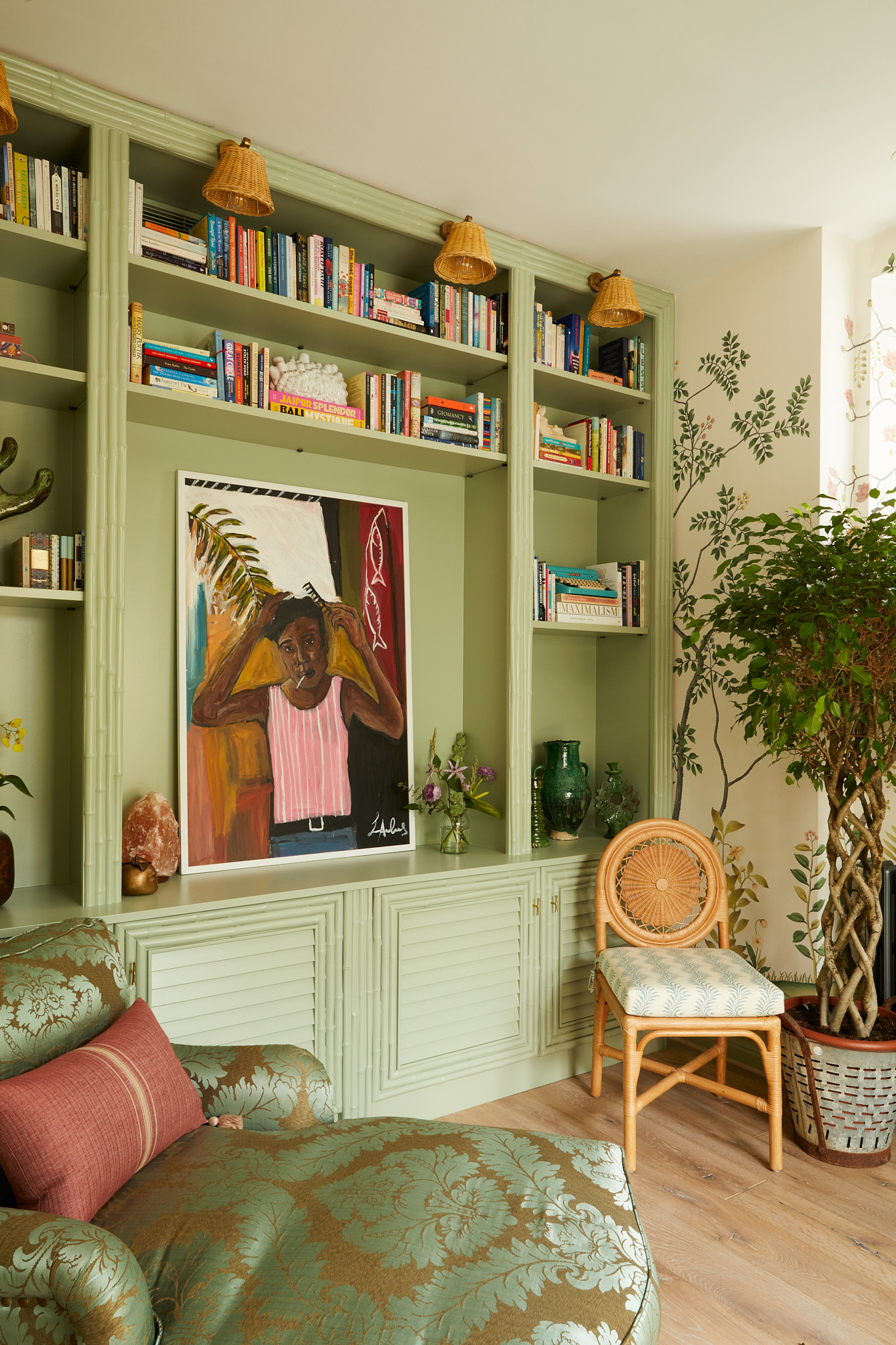
'We've noticed clients opting for green pastel shades – it's a fairly neutral color that works well within lots of schemes as well as different rooms around the house. It also has a really calming quality so is great for rooms you spend a lot of time in like the kitchen,' suggests Lucy Barlow.
Pastel greens are ideal if you want to add some color and not stray too far from greys, creams and whites. As Lucy says, in its palest form green can act just like a neutral. We can't image these living room shelves being any bolder if they were painted in a soft grey or yellowy cream. Green can be used just as much as a background color – which is why it works perfectly here as it doesn't distract from the prints and colorful spines of the books.
But unlike grey or cream, green adds a touch more interest and brings a calmness to a room. Look out for shades that have a sage undertone, avoid too much yellow as then you are getting into more vivid appley pastel greens.
12. Play with patterns
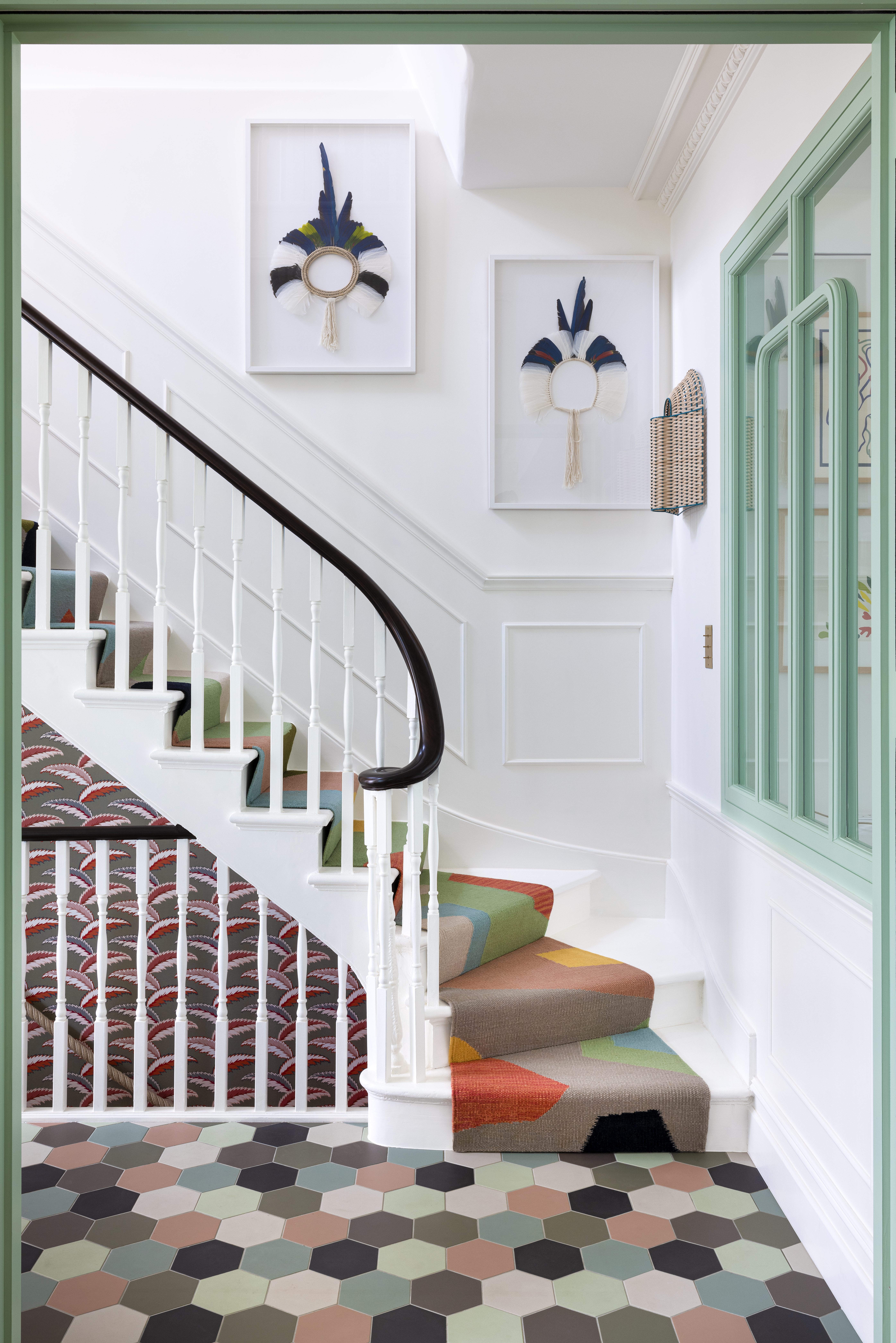
Decorating with softer colors means you can go bolder with patterns. Bringing together clashing and contrasting prints is a tricky look to get right, but by using pastels you are guaranteed that the patterns aren't going to overwhelm the space. This small entryway, designed by K&H Design makes our point. All those patterns coming together in one small space has the potential to feel a bit...chaotic, but the mellow pastel shades tone down the mix of patterns and make it a really fun but liveable look.
'I’d say it’s ‘all or nothing’! If you go for the ‘all in’ approach it can be calming or it can be more fun. Combining one pale pastel with softer whites will appear more soothing. Combining multiple pastels together, not all matching, will create more fun.' says K&H Design.
'For this entryway, K&H Design created the bespoke runner which is on sale through their website No Straight Lines, with its fabulous geometric design. The mosaic tiles are a colorful contemporary version of a traditional Victorian entrance hall, the tiles were purposely picked to pick up colors throughout the house. The wallpaper that leads down into the basement yoga studio, homework space, and the office is the ‘Persian Palm in Sage Green’ from Ottoline.'
13. Pair a pastel peach with white
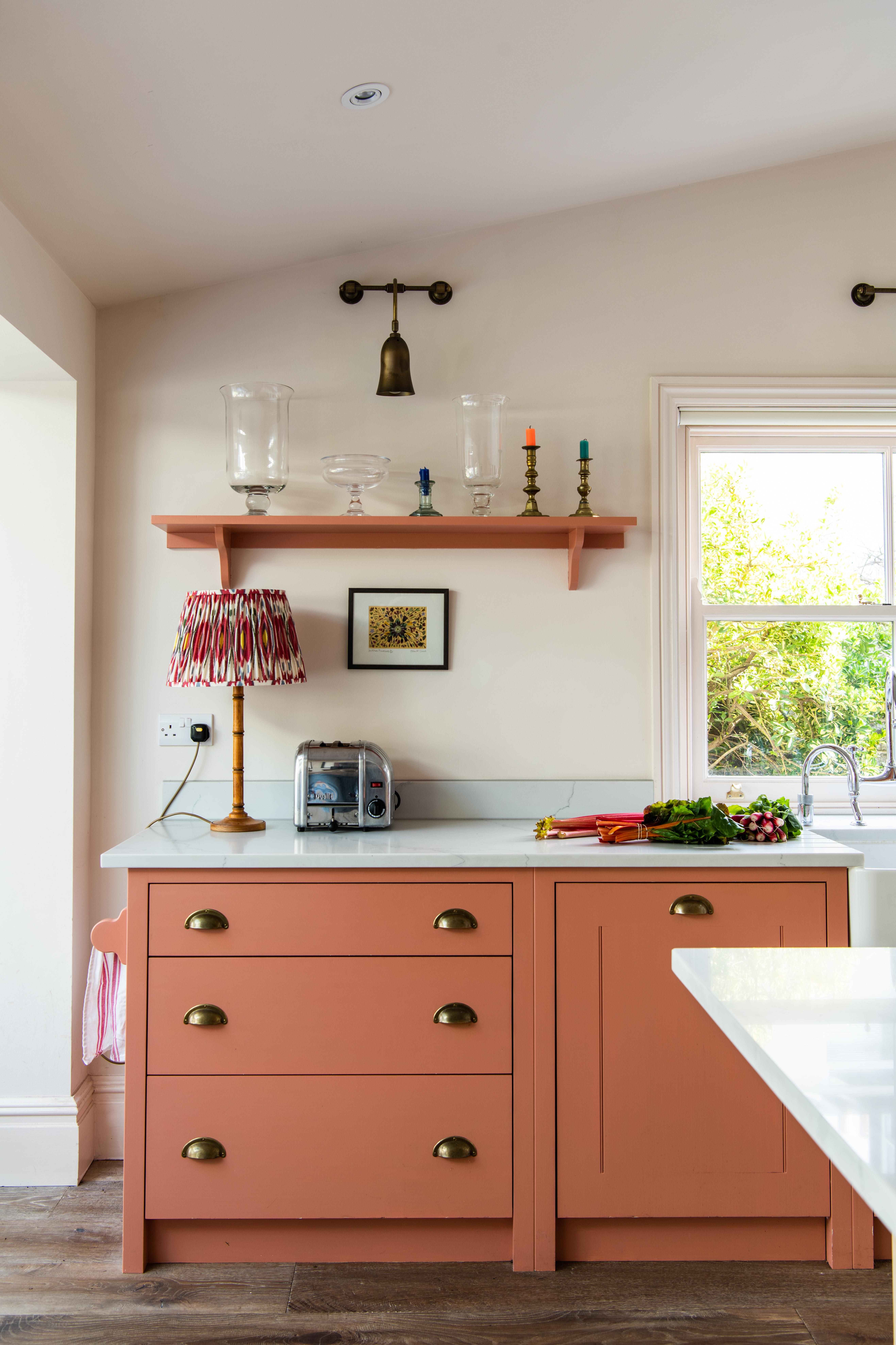
Colorful kitchens are becoming more popular than neutral kitchens. We see more green, blue, and pink kitchens nowadays than we do grey and this peachy pastel tone is making a strong case for going slightly bolder. The key to this look and why it still feels very fresh and contemporary is the combination of the crisp white marble countertops and the soft white walls.
'Where a room lacks light, consider opting for light and pastel colors to help brighten the room and make the space feel airy and bigger. The use of amber tones in this kitchen makes for a warm and welcoming space,' says Will Eaves, design and development director at British Standard by Plain English.
'The Edward Bulmer Brick on the cupboards pairs perfectly with the soft Edward Bulmer Cinnamon on the central island. Adding a pop of contrasting color inside a larder cupboard is one of our favorite tricks, in this case, the Edward Bulmer Celadon is a playful contrast.'
14. Color drench with pastels
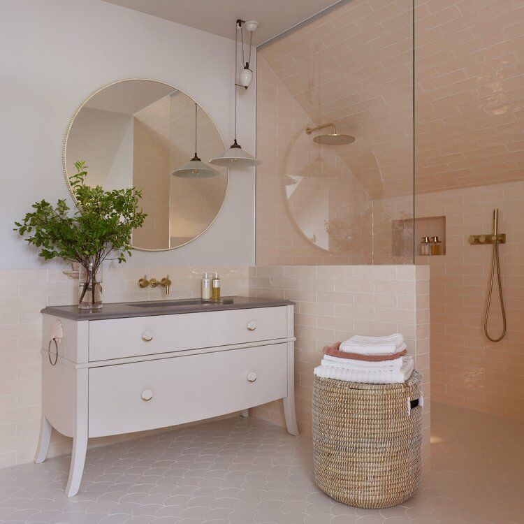
It's a bold look but it's a very on-trend way to use color. Take the same pastel across all surfaces, and furniture too. This works really well in a bedroom and can imagine it would look gorgeous with pastel sage green – a slightly lighter sage on the walls, a few shades darker on the woodwork, with some lovely green linen bedding too.
However, a bathroom is a great room to color drench because you have plenty of opportunities to add different textures, which is how you add interest. This colorful bathroom designed by Studio Duggan demonstrates the look perfectly.
'In this little girl’s bathroom, we opted for a tonal soft pastel peachy-pink on the wall tiles, and matched this with a paler tone on the bespoke vanity unit and little vintage shell-shaped towel ring. Introducing soft whites on the floor, walls, and pendant gives the pale pink a crisper look. Whilst this is a beautiful look for a younger client, I would suggest introducing some timber, or a darker hue (such as an aubergine skirting or black dado) to add a little more contrast and edge in an adult’s bathroom,' suggests Tiffany Duggan.
15. Brighten an entryway with pastel yellow
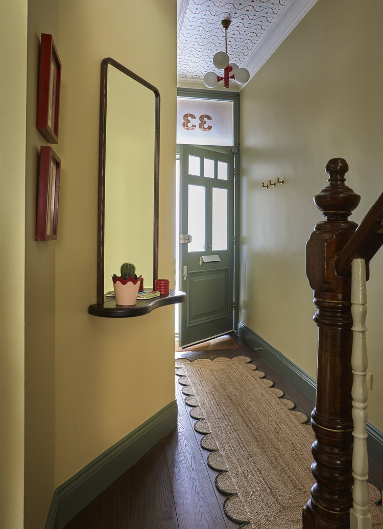
We don't see enough decorating with yellow in interiors. It's a bold color, there's no denying that but there are ways to tone it down and make it a livable shade. In its muted pastel form, yellow can be a gorgeous soft sunny shade that's perfect for smaller spaces like a hallway. Hallway colors are ideal for experimentation as it's an area of your home that although you see a lot you don't actually spend long periods of time in, so there's no risk of tiring of the shades.
The green and yellow pairing used in this hallway, designed by Studio Duggan, creates such a playful entrance, and yet it still feels very chic and stylish. 'In this typical Victorian terraced hallway in London, we wanted to paint the walls in a happy sunny shade of yellow (Farrow & Ball, Hay) to bring a little joy to what was otherwise quite a grey, dark space.
The pops of pillar box red within the wallpapered ceiling (Ottoline, Improvisation), vintage pendant light, and frames add a playful, punchy twist whilst the mid-green woodwork (Farrow & Ball, Green Smoke) and dark oak flooring and staircase keep it grounded – preventing the look from becoming to saccharine,' says Tiffany Duggan.
Sign up to the Homes & Gardens newsletter
Design expertise in your inbox – from inspiring decorating ideas and beautiful celebrity homes to practical gardening advice and shopping round-ups.

I am the Head of Interiors at Homes & Gardens. I started off in the world of journalism in fashion and luxury travel and then landed my first interiors role at Real Homes and have been in the world of interior design ever since. Prior to my role at H&G I was the digital editor at Livingetc, from which I took a sabbatical to travel in my self-converted van (not as glamorous as decorating a home, but very satisfying). A year later, and with lots of technical DIY lessons learned I am back to writing and editing, sometimes even from the comfort of my home on wheels.
-
 Zooey Deschanel and Jonathan Scott's breakfast nook is an innovative, effective use of kitchen space – it turns a 'dead area' into a cafe-style corner
Jonathan and Zooey have situated an eccentric yet elegant dining area in what may have been an otherwise underused corner
By Hannah Ziegler Published
-
 6 things you should never throw in the trash – and what to do for safe disposal instead
From batteries to space heaters, experts reveal what not to throw
By Andy van Terheyden Published