
White paint is an indispensable tool in an interior designer's arsenal. It is often thought of as the ultimate neutral, an uncomplicated and straightforward color that works everywhere. However, there are times when you should never paint a room white.
If you’re searching for room color ideas, you will undoubtedly discover beautiful examples of rooms painted in white that look timeless and effortlessly chic. It's worth bearing in mind, though, that this will not be the delivered effect in all rooms; depending on the context, the best white paint can make a room feel fresh, bright, and wonderfully light, or sparse, icy, and sometimes verging on clinical.
‘White walls can be a timeless backdrop, but in some cases, they do more harm than good,’ explains Jaime Zehner, founder and principal designer at California-based JZ Interiors. ‘A few years ago, I think everyone got a little bit too into the ‘light and bright’ aesthetic in design, and therefore spaces started all feeling the same and oftentimes, fell flat.’
Here, we expose seven times you shouldn’t paint a room white, and ask expert interior designers why.
1. Rooms with little natural light

Because of white’s reflective nature and its ability to bounce light around a room, it is easy to think it could be the best paint color for rooms with no natural light. After all, it would make the most of the small amount of light there is and make the room feel brighter and airier, surely? Conversely, despite color drenching a room in white paint, which can give it a ‘bleached’ look, with such little available natural light, the reflective properties vanish and the white appears sullen and drab.
‘I wouldn't recommend using white paint in an already dark room, as it can have the opposite effect of what you're hoping for,’ advises Megan Jay of Megan Jay Designs. ‘Instead of feeling open and bright, it can make the space feel cold and dingy. I prefer to lean into warmer tones, which can add a sense of coziness and balance to a darker room.’
2. Bathrooms

When searching for bathroom paint ideas, it can be easy to opt for white to keep the bathroom feeling simple, clean, and unfussy – somehow, there is something seemingly antiseptic about white. Bear in mind, though, that bathrooms house sanitaryware, plumbing fixtures and a lot of clean lines and hard surfaces. As a result, it's easy for a bathroom that is painted white to feel very severe.
‘While I understand the desire for that clean, bright feeling, painting a bathroom completely head to toe in white often results in a space that feels clinical rather than inviting,' explains UK-based interior designer Sean Symington. 'Bathrooms are a great place to be adventurous with design. You can have fun and be creative here without overwhelming your daily life. Bathrooms typically have limited natural light, so they can feel cold and stark when done entirely in white.’
‘One of my absolute favourite approaches is to play with wallpaper that features multiple colors, especially if you want a bright and airy bathroom. A gorgeous wallpaper with an interesting pattern not only adds immediate character but also gives you a built-in color palette to work with throughout the space. You might pull a lovely shade of blue or green from your bathroom wallpaper and use that for your vanity or tiling. Since bathrooms often lack abundant natural light, adding colour and pattern becomes so important, it brings energy and life to spaces that might otherwise feel flat and dimensionless.’
3. Large open plan spaces

While it is extremely tempting to slather walls with white paint when afforded a large, bright, open-plan space, it is worth remembering that the very nature of open-plan layouts means a lot of space is available to the eye all at once. Total untempered bright white can be quite arresting and heady when not mitigated with some color and texture.
While white can play a part in the color story of large open-plan spaces, it is important to consider visual layering and doses of color, however muted and pared back, to help zone the space.
‘If you are looking to make a space feel more light and airy, you do have options other than off-whites,’ explains Arianna Barone, color marketing manager at Benjamin Moore. ‘Blue paints and green paints are synonymous with nature and can visually recede, which helps in tricking the eye into making the room feel more spacious.’
Sean Symington advises that full-throttle white may make a room feel very unwelcoming. 'While it might seem like white would make the space feel larger and airier, painting everything white (walls, ceilings, and trims) often creates a flat, characterless box that lacks definition and warmth.'
'The trickiest part of open-plan spaces is finding natural points to start and stop different paint colours. Without architectural divisions, a large white room can feel unanchored and unwelcoming. Instead of defaulting to all-white, consider using a soft neutral colour on the walls to create a cohesive backdrop with more depth and warmth.'
‘Another trick you can do is to paint the ceiling a light and airy blue,' adds Arianna 'Which can conjure up thoughts of clear skies and make a room feel more open. If you are hesitant to use more saturated colors in your space, you can also look to blues and greens that have a hint of gray in them. These more subtle hues not only have the versatility of neutrals but also have the open and airy vibes of blues and greens.’
4. High traffic areas

If you have ever searched the internet and flicked through magazines looking for entryway ideas, you will see many examples in wonderfully welcoming and stylish colors, from warm butter yellows to vivid verdant greens. If a classic, pared-back look appeals, then white can seem like a perfectly straightforward choice.
However, there is an often overlooked consideration when it comes to entryway colors: the level of traffic coming into your home. If, like me, the daily onslaught of muddy dogs, kicked-off shoes, coats, friends, and family is inevitable (no matter how neat we try to be for the first weeks of freshly painted walls), then it is likely you will find the area in desperate need of a lick of paint more regularly than other colors.
The same can be said of other areas of the home we visit fleetingly, hurriedly, and often messily, like utility rooms and boot rooms. Painting these busy rooms white may seem like a quick and easy solution, but it will almost certainly cause more hassle further down the line.
‘High-traffic areas are a concern, as white walls show wear very easily and very quickly,’ explains Jaime Zehner. ‘Consider a textural alternative like clay, limewash, or a softly tinted plaster to add durability and visual interest. Why not try a high gloss and lacquer to elevate high-traffic areas?’
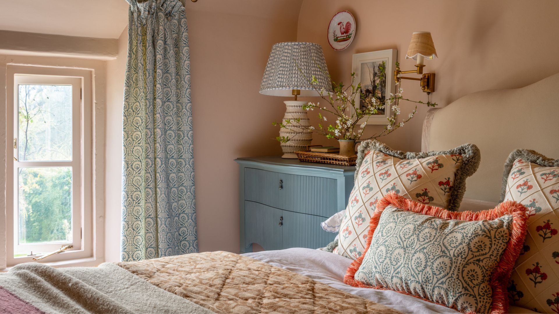
5. Bedrooms

Without wanting to contradict myself straight away, a white bedroom can, of course, be executed successfully, but proceed with caution. The intention in a bedroom is restfulness, and as such, avoiding wakeful, dazzling colors is sensible. That’s not to say you must have rich, cocooning, dark colors if that aesthetic is not to your taste. If, rather than a warming, cozy feel, you’re more keen on a calm, neutral atmosphere, you might find that lashings of porcelain white paint do not deliver the desired effect and can make a bedroom feel sterile and jarring.
If your dream bedroom is a vision of limewashed floors, linen muslin, and cool, breezy alabaster white and chic touches of rattan, then clearly white is an important color to weave into your bedroom. However, it is worth remembering that light, can be achieved without stark white or icy-cold greys. Cooler, creamier colors like Farrow and Ball's Scallop or Hollyhock by Little Greene are a more elegant, sophisticated alternative to pure white. Pastel shades like Eddy by Farrow & Ball or the iconic Mizzle.
'Don't paint your bedroom walls white,' says Megan Jay. Instead, use pastels for the light-reflecting purposes you want. ‘Pastel colors play off the increased daylight and the sense of lightness that spring brings. These lighter shades reflect natural light in a soft, diffused way, brightening up spaces without overwhelming them. I particularly love using pastel blues for bedroom colors, as the palette works well in a space focused on relaxation and rejuvenation. In my bedroom (shown above), I used Farrow & Ball Skylight. The moment you step into the room, it feels like a breath of fresh air, not like stepping into a sub-zero, startlingly cool, bright white room.'
6. North facing rooms

As noted earlier, even the softest, most sympathetic white can make a room feel bleak and dreary if it is not enlivened with natural light. North-facing rooms have a reputation for feeling gloomy because of their lack of direct sunlight. However, they do get light, just a much more gentle hum of light rather than full-throttle glaring sunlight.
As such, it would respond much better to a warm neutral paint, and it is best in these rooms to steer clear of stark white or graphite greys, which will only add to the somber feel. Instead, in these rooms, the objective should be to inject warmth with light neutrals, and crucially, those with a warm undertone.
For example, Farrow & Ball Blackened, on first glance, is a fairly amiable white color. However, it has a cold, grey undertone that would sit uncomfortably in a north-facing room. A better choice would be Farrow & Ball String, which has a softer, warmer, yellow-ish undertone that will perform much better at warming up the soft light in the room.
‘In a north-facing room, the cool light can make white appear sterile,’ explains Jaime. ‘If you’re aiming for a cozy atmosphere, instead of stark white, opt for enveloping materials like limestone cladding, tiled walls, or hand-troweled plaster to create depth and character. We've been using lots of custom wall paneling, rich paint colors, and wallpaper to bring that cozy environment to our spaces.’
7. Architectural details

Despite what you might first think, decorative detail isn’t highlighted with white but often silenced by it. ‘If there are intricate architectural details in a room, I would steer clear of white,’ says Jaime. ‘Crisp, clean white can strip depth from moldings or historic elements.’
‘A nuanced shade like Drop Cloth or School House White enhances dimension while keeping the space light,’ Jaime explains. ‘We would never suggest painting over a stained, patinaed, or weathered architectural element. It feels so cheap and uninspired. Lean into these historic details and opt for wood-stained details.’
If you’re wondering, are white walls still on trend? Rest assured that white is a color that will never go out of style, but be sure to think about the context.
‘White reacts extremely well to natural light, so if a room is dark, then people often make the mistake of thinking they must therefore paint it white to make it lighter and brighter. The reality is, no amount of light, bright white paint is going to suddenly make this room light and bright,’ explains Fiona Duke.
White works beautifully in sun-drenched south-facing rooms and east-facing rooms too, which benefit from morning light, so great rooms for breakfasting or working. ‘If you do love the idea of white, layering texture is key. Think clay, painted paneling, or if the budget allows, incorporate hard materials that add subtle detail and texture, such as limestone walls or a full tiled wall in a timeless, understated pattern,’ suggests Jaime.
You must confirm your public display name before commenting
Please logout and then login again, you will then be prompted to enter your display name.
-
 These are the 6 must-have colors to decorate with in April 2025
What do retro-inspired yellows and beautiful blues all have in common? They're on our hot list for the season ahead
-
 Plants never to grow next to fruit trees
Expert advice on which plants to keep away from fruit trees to encourage a healthy harvest

