

Little Greene is a British-based paint manufacturer praised for its range of timeless paint colors inspired by history. From the ever-popular Slaked Lime to the much richer Deep Space Blue, its colors range from quiet neutrals to bolder tones.
Here, we're showcasing a selection of rooms in real homes that designers decorated with Little Greene paint colors to give you some stylish paint ideas. From modern kitchens to period property living rooms, these spaces embrace a colorful scheme while feeling incredibly livable and serene.
While its paint colors have become favorites among designers, Little Greene is also known for its wallpapers, often found in more traditional homes, as you'll see below.
1. Arras

Little Greene's Arras is a dark and muted red paint that was used as a pop of color on the bath in this neutral bathroom.
'Working with our clients to embody a brief of 'comfort, creativity, warmth, and welcome' throughout the house, whilst placing a strong emphasis on sustainability, Arras played into our Victorian earthy palette but brought an aspect of drama,' explains interior designer Samantha Watkins McRae.
2. Middle Buff

In this living room designed by Kinder Design, Little Greene's Middle Buff, a dark orange paint, was used on the walls, adding richness and warmth to the space.
'I wanted to choose a really deep, rich color for this living room, so that this space could work well both for our client to entertain in and to spend time alone with his partner,' explains Leo Wood, founder of the south London design studio. 'Our client was open to going bold, and both he and I fell in love with this confident, warm caramel-like color.'
3. Pea Green

In this study, also designed by Kinder Design, Little Greene's Pea Green was used. 'Our client was happy for us to go bold in his home, and this green is peaceful but upbeat,' explains designer Leo Wood.
'I felt like the energy that this color created would work perfectly for a home office that needed to double up as a guest bedroom. Little Greene does these sorts of colors so well – strong, interesting color tones that really stand out,' says Leo.
4. Slaked Lime

Little Greene's Slaked Lime, a warm white paint, is proving to be a favorite among interior designers. It's available in different tones, offering various depths to suit your space.
Firstly, Leo Wood of Kinder Design opted for this calming color in this light and airy living space. 'It's my favourite plain white – it's a color that feels very pure white but has an underlying warmth to it,' explains Leo. 'It's a great bet in contemporary architectural projects.'

Melissa Read, Creative Director at Studio Burntwood, also enjoys decorating with Slaked Lime. In this living room, Slaked Lime Mid was used on the walls, resulting in a calming, timeless color scheme complete with neutral furnishings and a pop of dark green.

In this dining room designed by Owl Design, Slaked Lime makes an effective wall color choice with the room's ample natural light.
'We chose Slaked Lime by Little Greene for the walls and ceiling to create a soft, warm white backdrop that enhances the natural light in this space,' explains Simone Gordon, co-founder of Owl Design. 'Its versatility complements both the rich wood tones and the sleek black accents, bringing balance and warmth to the space.'
5. Goblin

Little Greene's Goblin, a dark teal green paint, was used alongside a teal wallpaper in the maximalist study designed by New York-based Josh Greene Design.
'The teal cypress wallcovering drove the palette in this intimate study,' shares designer Josh Greene. 'I wanted to match the ground of the paper with an equally rich teal, and Goblin was the obvious winner.'
6. Deep Space Blue

Also designed by Josh Greene Design, this blue bedroom uses Little Greene's Deep Space Blue, complete with layered shades of blue throughout for a dramatic, cool color scheme.
'We wanted it totally saturated in cobalt,' explains Josh Greene. 'The paint had to be as dramatic and deep cobalt as the fabrics I was using, and Deep Space Blue from Little Greene really hit the mark. At first, when it was applied before any of the furniture, I thought it was actually too strong. But I stayed the course, and it makes the room.'
7. Bone China Blue

'In this nursery, we selected Bone China Blue by Little Greene to evoke a calm and uplifting atmosphere,' explains London and Miami-based interior designer Natalia Miyar of Natalia Miyar Atelier.
'The soft blue-green tone works beautifully with warm textiles and playful details, making the space feel cozy yet fresh – ideal for a child’s room,' Natalia adds.
8. Ulla

'In the reception room of this Notting Hill Muse house, I used Little Greene's Ulla, a gentle shade of green with a beautiful warm undertone,' shares interior designer Jenny Luck.
'I was after a shade which had a hint of color yet didn’t feel insipid in a space which was not naturally well lit – given its Mews location, it was tucked away and surrounded by taller buildings. I also wanted a color that looked cozy during the evening, yet didn’t look too punchy on brighter days. Ulla provided the perfect backdrop for stronger colors and more decorative furnishings and prints. I have used it many times since, and it has become a real favourite of mine,' says Jenny.
9. Olive Colour

Little Greene's Olive Colour is a moody, dark green paint, used on the kitchen cabinets in this kitchen designed by Appreciation Project.
'The open plan kitchen-diner space opens onto the garden, and I really wanted to pull all the lush greens from the outside into the room,' explains Natasha Lyon, co-founder and Creative Director at Appreciation Project.
'Keen to avoid trends, I purposefully chose a color that would feel timeless and create the perfect background color to then add colorful accents around the room through the accessories. Being the main area of the home, I wanted it to feel a calm and happy space to balance with the chaos a young family brings,' Natasha adds.
10. Carys

In this boot room designed by Appreciation Project, Little Greene's Carys, a cheery yellow paint, was used on the walls.
'A boot room in a family home can naturally have a tendency to be chaotic, so I wanted this room to be a happy spot to encourage my kids to put their shoes, coats, and bags (and the endless list of things) away,' explains Natasha Lyon. 'It’s a yellow that’s neither too sickly nor bright, and is perfect against the linoleum chequerboard flooring.'
11. Yellow-Pink

Another yellow paint, Little Greene's Yellow-Pink is a mustard shade that was used in this kid's room, color-drenching the space. 'This room is at the top of the house with lots of sloped ceilings,' explains designer Natasha Lyon. 'I decided to completely bathe the space in one color to keep it calm and save it from becoming overly complicated, trying to cut in another color. It’s a bright sunny room and Yellow-Pink has a wonderfully earthy tone to it with mustard hues, making it not too bright; instead, it’s warming and very cozy.'
12. Blush

Also designed by Appreciation Project, this dressing room features Little Greene's Blush, a muted plaster pink paint.
'I wanted the entire room to be a pink box,' shares Natasha Lyon. 'A sophisticated grown-up blush pink, it covers everything from the floor to the walls, fireplace, and ceiling. It’s tucked off the master bedroom and creates an element of surprise when the eye lands on it, something unexpected with a color that naturally draws a smile.'
13. Clay

Homeowner: @home.werc
Little Greene's Clay is a warm neutral paint that was used in this relaxing bedroom, designed by Studio Werc.
'Little Greene Clay provided a slightly darker shade to the main bedroom space, which has south-facing natural light, with a lighter shade of Whitening used for the north side of the property,' says Rob Cullen, Director at Studio Werc.
14. Portland Stone

In interior designer Cate St Hill's light and airy dining room, Portland Stone Pale was used, creating a calming and timeless scheme.
‘I love Little Greene paints because they have different shades of the same color – pale, light, mid, and dark, for example – which means that you can find the perfect shade for your space, depending on the light conditions and orientation of the room,' explains Cate. 'In my sunnier south-facing rooms, I’ve used Portland Stone, but in my darker, north-facing rooms I’ve used Portland Stone Pale, a lighter version of the same color. It helps give continuity between the spaces.'
15. Hopper

In this charming Kate Feather kitchen, Little Greene's Hopper was used on the kitchen cabinets, pairing wonderfully with the white marble kitchen countertops and pops of pink throughout.
With plenty of warmth, Hopper is a great way to add color to the heart of the home while maintaining a natural and earthy look.
16. Dahlia Scroll Wallpaper

While Little Greene's paint colors are favorites among designers, their selection of wallpapers offers lots of inspiration for decorating with pattern, such as the Dahlia Scroll, which was used in this hallway.
'The Dahlia Scroll wallpaper in Giallo by Little Greene is a beautiful study in contrast and subtlety,' explains Hollis Loudon Puig, Principal at New York and Florida-based Hollis Loudon Interiors. 'The vibrant yellow hue brings a burst of warmth and energy to any space, while the tone-on-tone dahlia motif adds a refined, almost ethereal quality.'
'I love how the floral pattern is so delicately woven into the design that it can almost be missed at first glance, giving the space a layered, sophisticated feel. This combination makes it incredibly versatile – bold enough to make a statement yet subtle enough to complement a range of aesthetics,' says Hollis.
17. Massingberd Blossom Wallpaper

In this colorful bathroom, Little Greene's Massingberd Blossom in Verditer was used on the upper walls, teamed with Little Greene's Tea with Florence on the lower walls.
'Little Greene’s Massingberd Blossom, Verditer wallpaper perfectly ties the dusky pink from the bath and the wall panelling in the color Tea with Florence to give the room a fresh and pre-modern twist,' explains Annie Cartwright, Senior Designer at Summer House Interiors. 'The bright and colorful yet mature paint choices were a perfect match for our clients and their personalities.'
Whether you're drawn to Little Greene's flattering neutral paints to create a bright interior or are inspired by their richly pigmented darker tones for a statement look, these shades feel equally refined and sophisticated.
Browse the Little Greene website to order samples or visit the Little Greene Greenwich Showroom in Connecticut for expert paint and wallpaper advice.

You must confirm your public display name before commenting
Please logout and then login again, you will then be prompted to enter your display name.
-
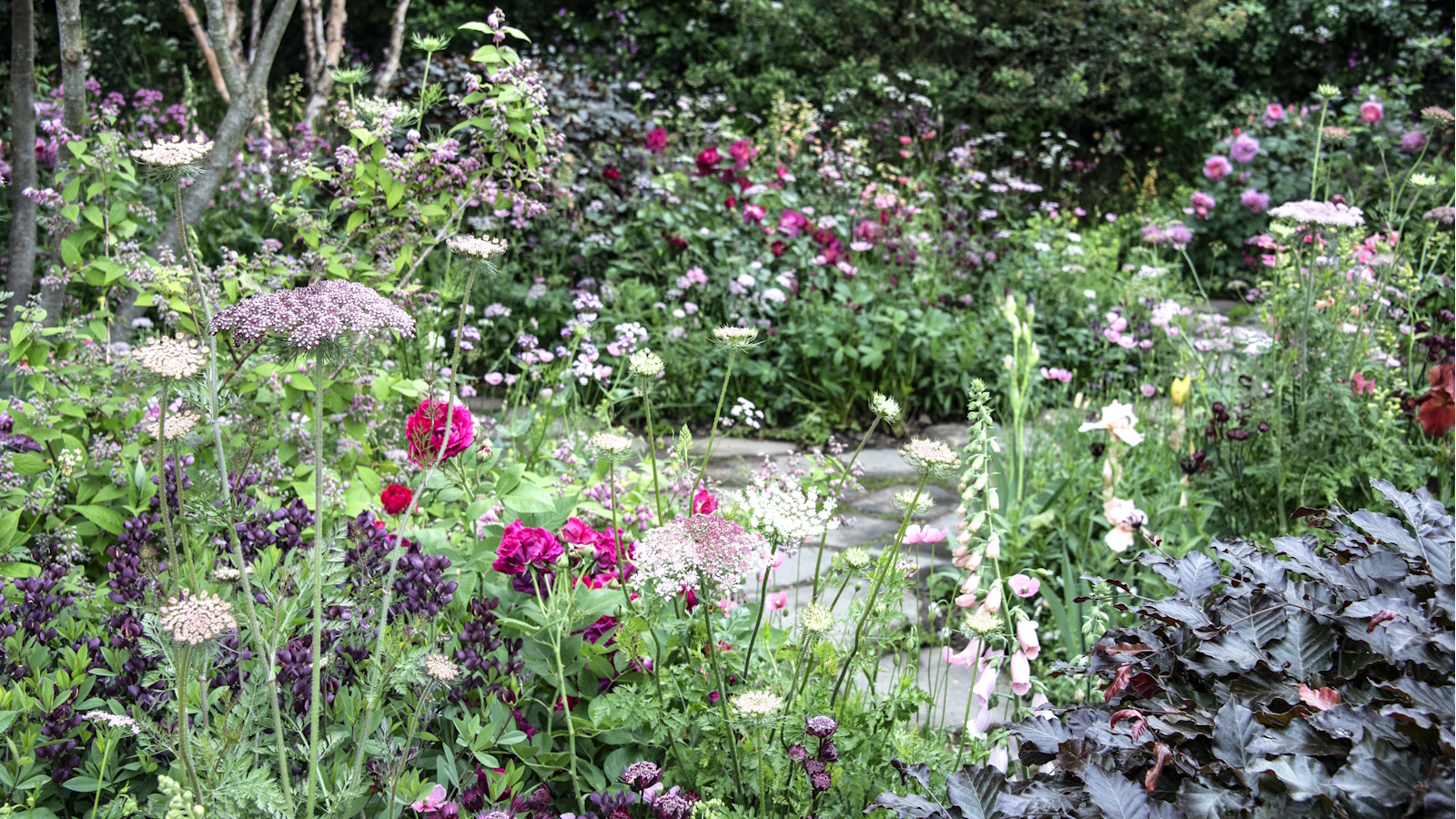 Best umbellifer plants – 5 whimsical, elegant flowers that will dance and delight in borders, softening planting schemes with zero effort
These fairy-like blooms will help you to create a wildlife haven in your yard
-
 This is the secret to unlocking your most powerful decluttering session yet – experts say it will instantly motivate you to get rid of stuff, guilt-free
Imagining other people using your unwanted things will free you

