

Pairing your home's color palette with your manicure or pedicure might seem like an unusual – or impulsive – choice, however, there is much to be said about borrowing inspiration from the latest fashion and beauty trends when choosing your room color ideas.
I know how overwhelming the color-selection process can be. From classic neutral hues to much richer, statement-making shades – whether it be through color trends or using the latest paint ideas – finding your home's color palette is often a long and complex process.
So, to help me make sense of my 'ideal' color palette, I sought inspiration from the latest nail color trends, my tried-and-true fashion favorites, and with the help of the expertise of designers and color specialists to inform my decisions, and it worked. I now have a home color palette that I can truly call my own.
Home color palette – 7 colors I have borrowed from beauty trends
The beginning of March marks the start of spring in all its joy, and what better way to ring in the new season than by switching up your home's color palette?
Read on to gain the knowledge I used to create a balanced and stylish color scheme throughout my home, taking inspiration from the most unexpected source – my manicure.
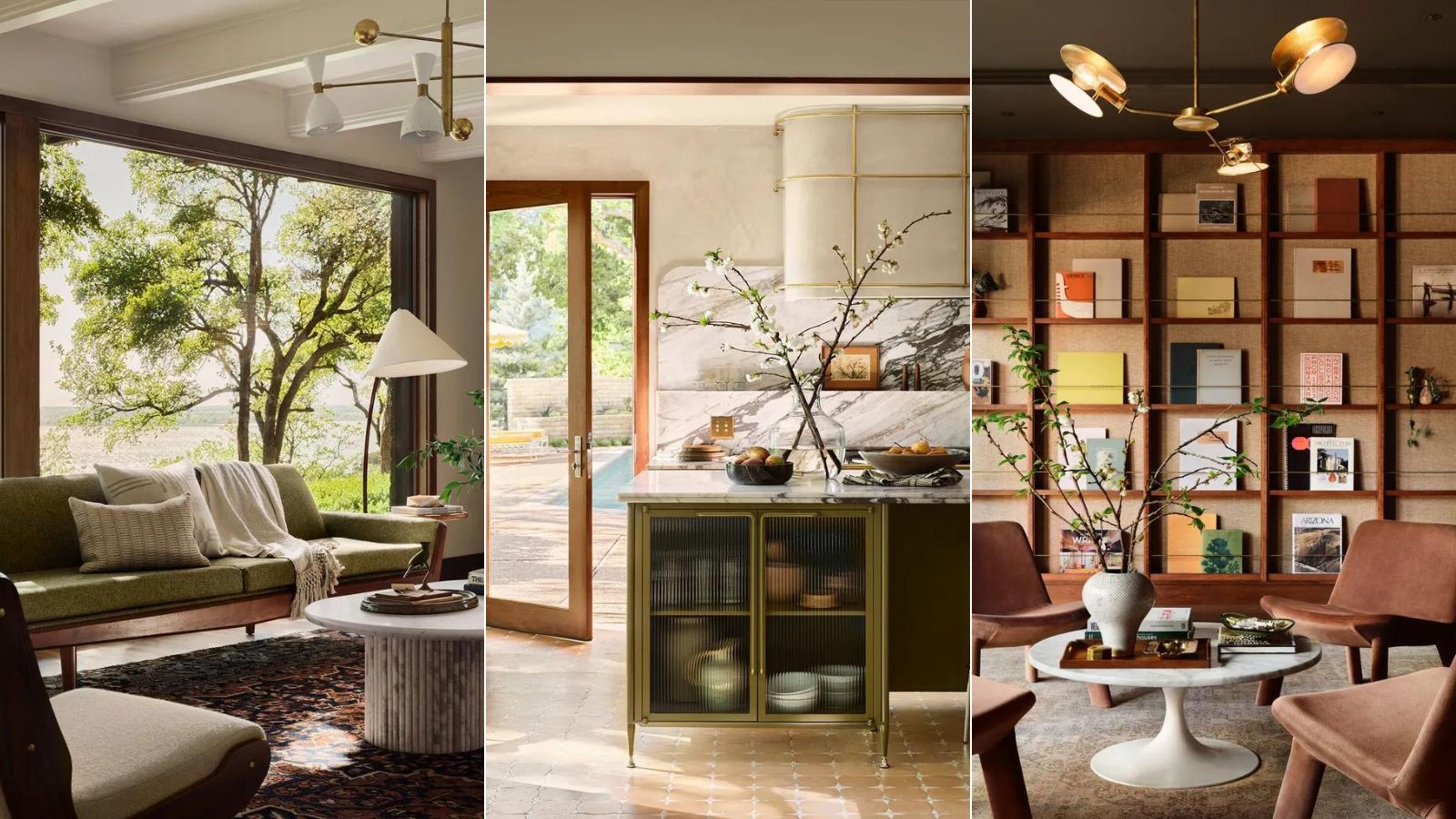
1. Brown – chocolate, taupe and coffee

The return of the seventies is influencing both beauty and interior design trends for 2025, and decorating with brown is no exception.
‘Tell someone you are painting a room brown and watch them recoil in horror,' says Sarah Brown, director, Sarah Brown Interiors. The same could be said for our manicures up until recently. 'However, this much maligned color is a great backdrop for accessories in brighter colors, especially neon pink, canary yellow or creamy white.’
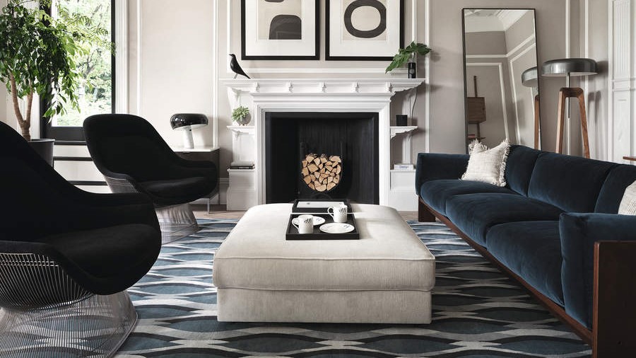
I couldn't agree more. It might be spring, but I am not quite over brown – a controversial color I was initially reluctant to try in my home and on my nails. Considered a dark neutral, earthy brown is grounding but also has a truly sophisticated elegance. Versatile, it can be striking on its own or allow other hues to stand proud.
My personal preference is to pair darker browns with lighter caramel tones. The melange of rich brown and caramel tones will bring a warm and inviting atmosphere to any space. These shades, especially contrasted with the spring-like pastels, are reminiscent of 1970s colors and create a sense of nostalgia – another dominant color trend for this season.
‘Being polychromatic, brown goes with everything,' explains Edward Bulmer, interior designer and founder, Edward Bulmer Natural Paint. I couldn't agree more.

Intricately woven in poly-rattan, the Handled Planter Basket has a clever box design with rounded edges. Lined with a plastic insert, this piece is ready to handle small indoor plants or stand alone as a textural addition to home decor.

Joanna Gaines x Loloi rugs are highly-rated for a good reason. They are machine washable, affordable and timeless. I have one in almost every room in my house, and I can't see myself shopping anywhere else for them. I would argue that a rug is the most defining feature in a room – it can make or break a space.

A stone washed velvet pillow made of cotton, the Bellevue Velvet Pillow Cover has a welcoming and soft texture that will elevate your pillow vignettes. Available in four calming colorways, the solid hue of the pillow brings depth and versatility to your space.
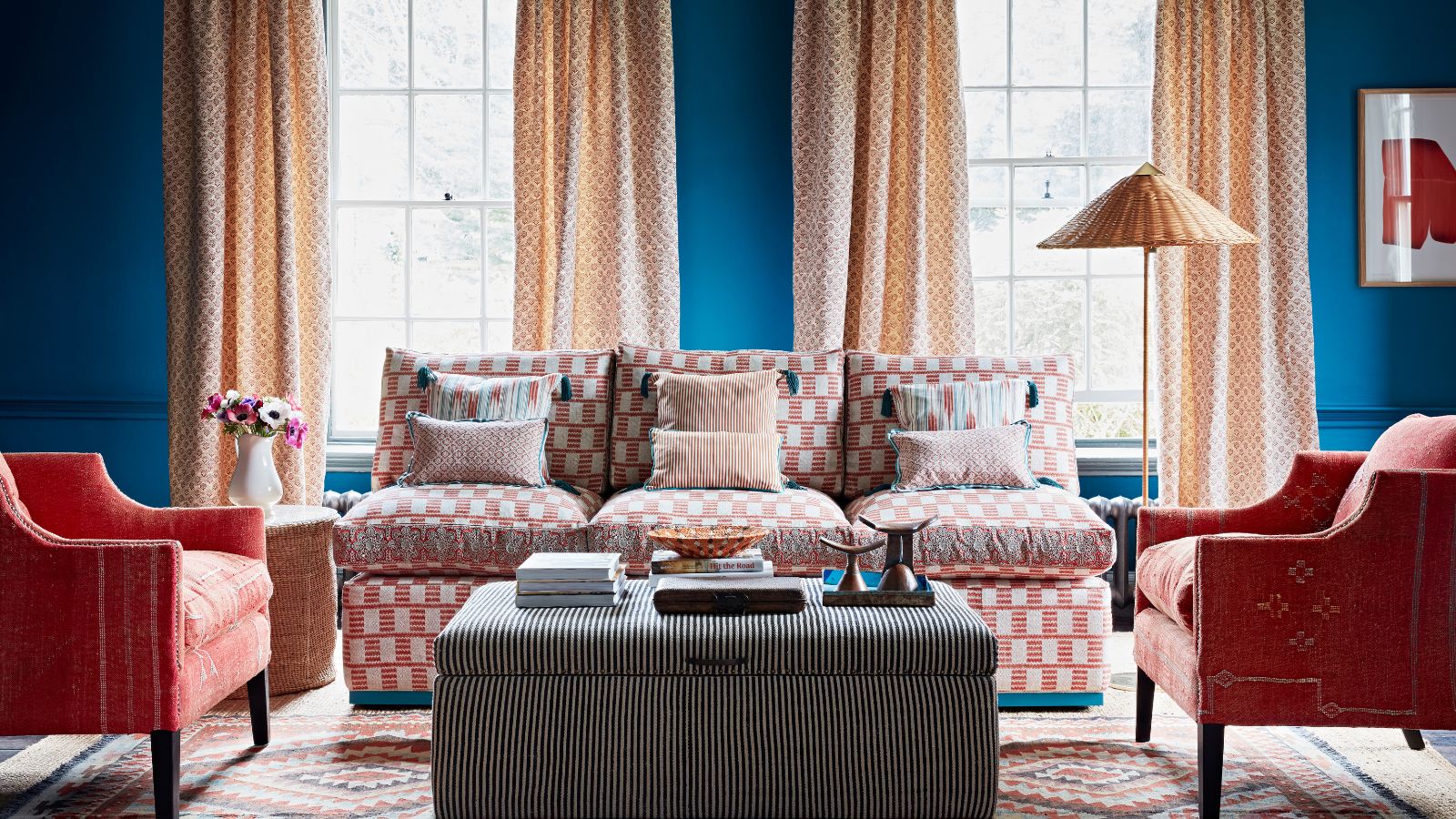
2. Red – cherry, burgundy and crimson

Red nails are a perennial favorite of mine, and decorating with red has become incredibly popular in interior design more recently – hello, unexpected red theory. The idea that introducing an 'unexpected' splash of red in your home – or closet – can have an immediate positive effect on your space took social media by storm in 2024, and my love affair with red is far from over this year.
I have used red in most of my schemes over the past 20 years – whether it’s an “unexpected red” side table, red throw pillows or even a red drinks bar. If you’re brave, try it on woodwork framing wallpaper, alternatively, introduce it on a lampshade or a curtain,' says Sarah Vanrenen, founder, Sarah Vanrenen.
Red is a rich and sensual color, which acts as an arresting alternative to the beige room ideas we've seen as a result of the quiet luxury trend.
‘Bamboozle, from Farrow & Ball (above), a rich paprika red, would be wonderful for kitchen cabinetry or on a bookcase to add a hint of color in a library or sitting room,' says Patrick O’Donnell, brand ambassador, Farrow & Ball. 'Team it with red-based whites, earthy pinks, or think of beautiful suzani fabrics and pair with warm blues.’

Bring a bold touch of light to your curation. The Fenwick lamp adds a warming addition to your space with its ceramic grid and pleated paper shade in a striking red-on-red colorway. We love this unique table lamp for bringing an artful edge to your design.

With flourished edges inspired by flower petals, the Lyla collection bestows a medley of handpainted charm that breathes the essence of spring. Mix and match different colors and patterns to create the perfect tablescape that stands the test of time.

Whenever I think of adding a touch of 'unexpected red' into my home, I always lean to fun and playful additions, and these food-themed salt and pepper shakers are the ideal choice. I plan to use these when hosting dinner parties al fresco. They also make the perfect gift for the hostess in your life.
3. Green – sage, forest and olive

Green might seem an unusual choice, but it is my favorite color and a sophisticated choice for nails, clothing and interiors alike. Dark green is my go-to, however, as we enter spring, I'm drawn to softer sage and olive hues too.
'I adore working with olive green,' says Emma Sims-Hilditch, founder and creative director, Sims Hilditch. This is a wonderful color that works well all through the year and is ideal if you are trying to bring an element of nature or a heritage feel into a more contemporary city home. It’s a restful and calming shade which not only works well on cabinetry but also looks great on walls.’
Sage is equally beautiful. The kitchen-garden borne shade inspired by its namesake herb, sage green is a perennial favorite for classic and timeless décor.
‘Sage green is a comforting color. Even by name alone, it evokes the thought of foraging and nourishment in the natural world, growth, renewal and life as a whole,’ says Alice Hood, senior design consultant at Roundhouse. ‘It brings the outside in, even in the most urban setting, and studies have been conducted to show that being surrounded by green can relax our nervous system and help us to feel calm, and in some cases, even live longer.’
Calming, creative and with links to nature, green in all its variations is a versatile color that can work in many schemes. ‘Green reassures us on a very primitive level. We know we can find food and water, which means green equals life. Decorating with greens in our home, brings in these feelings of reassurance and rest,’ says Karen Haller, color and design psychology specialist and author of The Little Book of Color, available on Amazon.
If you're debating where to use green in your home, try the entrance, or any transitional rooms. Green is a great choice for an entryway or hall – particularly one that offers views of the garden beyond. ‘If you think of the color green in a garden, it’s the backdrop for the whole setting – the foliage, grass and trees,’ explains Emma Deterding, founder and creative director of Kelling Designs. ‘You can really see how any color will go with it. But in an entrance, it adds a freshness and provides a base from which personality can shine through, setting the tone for the rest of the home.’

Take the color inspiration outdoors with a classic stripe cushion cover. Timeless stripes bring order and structure to a space and have the ability to redirect the eye. When incorporated into an interior design scheme, they inject a dose of understated elegance and sophistication.
 Storage favorite
Organize small items with these 2-Piece Powder-Coated Rectangular Metal Storage Trays from Hearth & Hand™ with Magnolia. Crafted from a durable metal, these open-top trays are ideal for keeping crafting materials, stationery and other items close and organized for quick access.

This oh-so-plush bath mat will introduce a hint of playful charm to your home spa. The scallop edging is one of my favorite designs of the past few years, and is still a fun way to decorate in 2025.
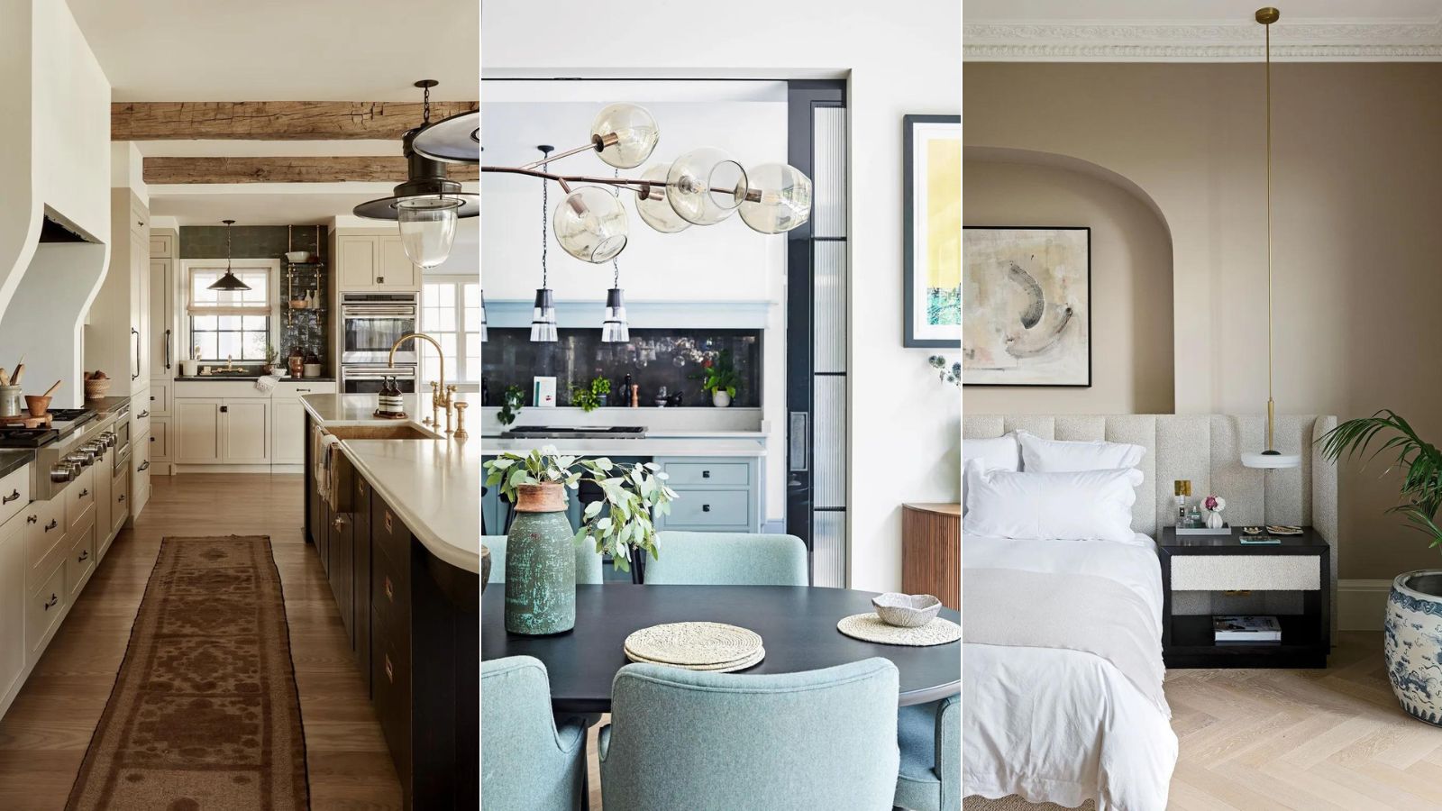
4. Light neutrals – ivory, sand and ecru

There is nothing quite like a perfectly pared-back palette. Yes, I am not quite over quiet luxury. Elegant and timeless in their simplicity, neutral room ideas are a stalwart in the world of interiors.
Decorating with neutrals is always a wonderful option – they seldom fail to please. The beauty of a neutral scheme is that it provides a wonderful scaffold upon which to hang accents of color, adds Deborah Bass, founder of Base Interior. ‘This is especially true in a space where a neutral wall or a textured plaster or wallpaper wall finish creates a background for books and art, both of which can take the decorative center stage.’ She recommends grounding subtler shades with a deeper, richer natural timber to create a balance.
Henriette Von Stockhausen, creative director, VSP Interiors shares my enthusiasm for decorating with beige and other warm-tinged neutrals. 'For me, neutrals such as taupe are grounding wall colors. It’s important to remember that sometimes a classic interior is just the ticket: calm colors, gentle schemes, traditional furniture and antiques – no pattern clashes, no huge color pops, just comfort and a quiet space to relax in.
Neutrals will never quite disappear, and why should they? They just get better with age.

Made from whitewashed seagrass, the Raleigh Laundry Basket brings an organic element to the laundry room. Its simple construction suits your decor seamlessly, while its natural material brings welcome texture. Complete with cotton lining, the basket is functional and easy to style.

If you want to give your living room a contemporary update, look no further than this decorative ceramic vase. Style it with cotton, baby's breath or freshly-picked flowers from the garden for an instant hit of style.

In this stylish mirror, light oak provides natural grain texture with a twist. The braided wood frame is decorated with ball finals, bringing a fresh dimension to the room with a chic look and feel. This wall mirror is from our exclusive Sarah Sherman Samuel collaboration and features all the trademarks of her warm, edited style.
5. Yellow – butter, ochre and flax

Yellow might not be the first color that comes to mind when choosing a room color, but it should be. Embraced in a big way or used in small doses, this sunny shade is rich, versatile and exudes positivity and warmth.
‘Yellow room ideas evoke happiness and provide a sense of positivity,' says Andy Greenall, head of design, Paint & Paper Library. 'It is perfect for areas of the home where there is much activity and socializing, such as the kitchen and dining room, where it adds energy and vitality.’
But before you reach for the zingy, bright yellow paint can, current trends show a real shift towards softer yellows, such as my personal favorite, butter yellow.
Susan Deliss, textile designer and interior decorator shares this sentiment: ‘To use pale yellow or ochre, you need to think of it as the “neutral” in the scheme; as a foil to set off other colors, not to overpower everything else. Avoid anything that says canary or banana and go for something that sets off the architecture or warms up a cooler space.’
If you're wondering where you've seen this color before, it is indeed a homage to the past. ‘Maybe intentional, maybe accidental, but the warm colors of my mid-1970s childhood are back in the spotlight again,’ says decorator Ben Pentreath. There is a touch of nostalgia appearing in schemes recently, and when reaching for heritage hues, there is no other color that is quite like butter yellow.

A stone washed velvet pillow made of 100% cotton, the Bellevue Yellow Velvet Pillow Cover has a welcoming and soft texture that will elevate your pillow vignettes. In a rich yellow colorway, the solid hue of the pillow brings depth and versatility to your space. Plus, it has been reduced to clear, so get it before it goes for good.

Woven of a luxurious linen, this bedding collection is precisely cut, washed, and dyed for a so-soft feel and a relaxed, lived-in look. A natural fiber, linen offers optimum durability (and effortless elegance) while ensuring a smooth, cozy resting space.

If you do want to add a zingier dash of yellow in your home, this faux lemon stem is the way to do it. Laden with lifelike fruit, the branch surrounds the realistic textured lemons with glossy green leaves. Introduce biophilia – without the maintenance – into your space with ease.
6. Pink – blush, bubblegum and cotton candy

Warm and inviting, rosy shades make a versatile and beautiful backdrop for almost any other color. I'll admit, I was somewhat late to the decorating with pink party, but better late than never. Pink is having a renaissance.
Soft blush shades are blossoming in the home – just in time for spring, both for their versatility and soothing design qualities. From hints of rose to on-trend setting plaster, it is a flattering choice for any room.
‘Blush pink paints are delightfully easy to work with, universally flattering, and bring warmth and sophistication to a space when used correctly,’ says Annie Sloan, color and paint expert. ‘Think of blush pinks as neutrals; as the building blocks for your scheme.’
If you prefer something more vibrant and springlike, go for an eye-catching bubblegum hue. First becoming popular in the fashion and beauty world, we are slowly starting to see this often described as 'sickly sweet' color entering our homes. It has a very alluring quality. It draws you in, is welcoming and is actually easier on the eye than once thought. Word of warning – use it in small doses to start. Whole pink room ideas take some getting used to.

Celebrated for their ceramics and bold designs, Lolly Lolly Ceramics brings their knack for sophistication with a playful edge to an exclusive collection. The vase is hand-carved from uniquely varied stone, making each a one-of-a-kind piece.

A top rated product for a reason, this fan-favorite bowl is now available in a sugary sweet colorway. Perfect for your morning breakfast or a delicious soup, these bowls will take pride of place on your dining table.

Elegance comes naturally to our Lupita bath collection. A classic striped design and thick fringe offer timeless appeal, while the organic cotton fibers make these bath towels feel as good as they look.
7. Pastels – aqua, lilac and sky blue

This season's delicate shades of pale aqua, sky blue and soft lilac bring freshness to decorating schemes, just in time for spring. Groundbreaking? No, but still every bit interesting.
Pastel rooms should not be reserved for nurseries or children's rooms either. Chalky tones have always been an attractive choice for informal and formal interiors, giving rise to delicate, light rooms that are easy to live in. You can create a relaxed, grown-up scheme by pairing these hues with bold accent colors, or opt for impact with one sugary shade.
In this pastel kitchen, Kasia Piorko, the founder of Kate Feather, used a lively aquamarine hue to make the island sing out. It is proof that pastels can work beautifully outside of the bedroom, especially when used to highlight focal points.
'Decorating with pastels offers a charming alternative to neutrals; they are calm but embracing, soothing but uplifting, and can give added life to a room without being overpowering,' says David Mottershead, marketing director at Little Greene.
If you love color but don't want to overpower a room, pastel shades are great for tempering richer tones, and are equally wonderful for adding life to neutral spaces.

Beloved (and top-rated!) since 2012, the Old Havana collection brings elevated, rustic charm to your table. Artisan-crafted in Portugal, each crackle-glazed piece offers durability for everyday use. Whether you mix and match or color-coordinate from an expansive selection of styles, you can expect years of compliments.

With its charming bullet shape and fun chrome metal accents, this mini electric kettle finished in glossy pastel green goes beyond basics. Known for their wonderfully retro refrigerators, Smeg's playful kitchen appliances are ideal for anyone wishing to recreate the 1950s-era aesthetic.

Wash, serve, and store seasonal berries in this adorable lilac Linnea fruit basket. Whether placed on the table or tucked into your fridge, its nostalgic design will please even the most discerning guest.
If you, too, are struggling to put together a color capsule, simply look to the items hanging in your closet, your favorite pair of shoes, or even your go-to nail colors for inspiration. Being happier at home has never been more important, and color is a wonderful place to start.

You must confirm your public display name before commenting
Please logout and then login again, you will then be prompted to enter your display name.
-
 Experts say to only use homemade compost after testing it with this fail-safe method – they say it will guarantee healthy soil and support plant growth
Simply grab some fast-growing seeds and observe how they germinate in your compost
-
 How safe are carpet deodorizers? As a seasoned vacuum tester, I urge you to try alternative methods
Natural cleaning is always the answer


-
 Couch dos and don'ts – 10 tips for choosing the right piece for your space
A couch is a big commitment, and finding the ideal one for your home and lifestyle is a serious matter. Experts tell us what to keep in mind
-
 I just spent 3 days in Belgium – 5 enduring trends that will never fade – and you'll want to replicate them all
From a warm, rich color palette to plenty of textural accents, here are the interior trends from Antwerp that I have been coveting
-
 No, not crushed gray velvet – 7 outdated '00s interior design trends making a comeback in 2025
These outdated early 2000s trends are sophisticated, contemporary, and better than ever, but will you re-introduce them back into your home in 2025?
-
 Joanna Gaines always decorates with 3 winning colors, and this instantly expensive-looking palette is the best choice for fall and winter 2024
Create balanced and stylish color schemes with these expert ideas from the master herself, Joanna Gaines
-
 I'm a maximalist and my partner is a minimalist – learning to compromise with these meet-in-the-middle decor ideas changed the way we live for the better
Moving in with a partner? Beautifully blend two interior design styles to perfection, as told by someone who has tried and mastered the look over many years


