
Using soft, muted pastel shades can quietly yet profoundly alter the feeling in a room. Spring-inspired pastel colors have somewhat of a playful attitude, so much so that sometimes they can err on the side of infantile. Despite their defining unsaturated, muted qualities, they can often be a little too sugary and garish.
If you’re on the hunt for pastel room ideas, but after a look that's far from saccharine, Farrow & Ball have whittled down nine sophisticated pastel shades that challenge our assumptions about pastels altogether, and will almost certainly better suit your appetite.
Each of these nine Farrow & Ball pastel paints has an unsurpassed ability to make a space feel cool, calm, and collected. Feminine but not frilly, pretty but never saccharine. These are nine grown-up pastels with a distinct livable quality.
1. Hay

Hay, Farrow & Ball (walls)
Hay is the quintessence of country-house style, a sophisticated, grown-up butter yellow without too much, well, yellowness.
Hay is far from a piping-hot, garish yellow and much more of a modest yellow, with a livable quality. If your interior scheme errs more toward the traditional, introducing this classic color is a great way to add some color without distracting from the character of your home.
This traditional color choice has longevity; it is distinctly familiar, comforting, and grounding. 'Hay is a very forgiving yellow with the softest of green undertones. Hay plays beautifully in barn conversions where the gentle yellow/green picks up on the oak frame structure,' explains Patrick O'Donnell, Farrow & Ball's brand ambassador. 'Hay is also a lovely foil to bolder greens on your trim, such as our new color Douter.'
2. Eddy

Eddy, Farrow & Ball
If you’re looking for a fresh, pale green paint for a garden room, a sun room or any area flooded with natural light, Eddy would be the perfect color for evoking a sense that the boundaries between home and backyard have been blurred, letting the outside in. Even on a gray, overcast day, Eddy expertly bounces the low light and won’t ever let a room feel gloomy.
Patrick describes Eddy as 'a warmer version of Mizzle.' Mizzle, of course, the enduringly popular soft gray-green so many of us know and love. 'Like Whirlybird, there is a wonderful, calming quality to this pale green, but just enough brightness to feel joyful!' Patrick explains. 'Team with a gentle white such as Lime White on your trim and ceiling, and you have a scheme to last the test of time. A classic!'
3. Scallop

Scallop, Farrow & Ball
They say nothing in life is certain except death and taxes – but for interior lovers, there is perhaps a third certainty in life, and that is we are all on an unending quest for the best off-white paint.
With the introduction of Scallop to Farrow & Ball’s newest collection, the search may now well and truly be over. This pinkish, soft off-white strikes the perfect balance between brightness and warmth. Scallop’s softness and creaminess in evening light is something to behold.
'Scallop is the new ‘go-to’ not quite white,' explains Patrick. 'Scallop is incredibly versatile and can be used as a wall color anywhere or simply as a trim color that will play beautifully with muddy browns such as Broccoli Brown or lovely mid-greens like Dibber. A brilliant all-rounder.'
4. Kakelugn

Kakelugn, Farrow & Ball
This simple, mood-boosting pale blue paint color imbues a room with a cooling burst of fresh sea air, perfect for coastal color schemes or Nancy Meyers-inspired boudoirs.
Kakelugn (which takes its name from the folkloric fires of Sweden) is restrained and unsaturated enough to be calming and not at all jarring. Patrick explains, 'This slightly cool, pale blue will work best in a room full of generous natural light – think classic coastal blue. It is so wonderful for a brightly lit sitting room on tongue and groove walls.'
5. Duster

Duster, Farrow & Ball (internal pantry wall)
Decorating with yellow can be tricky to get right. Yellow paint can often be overbearing if there is a lack of muddiness in it. However, Patrick hails Duster as 'the perfect yellow.' He explains, 'There is nothing too sharp about Duster as there is just enough black within it to give greater decorating flexibility, even for those nervous of yellow.'
This versatility means it can be used much more as a neutral than as an accent color. 'It will bring warmth to a room,' says Patrick, 'But Duster looks lovely in a sunnier room too and is a great wall color for kitchen cabinets in natural oak. Also lovely as a bathroom wall color in Modern Emulsion with brassware and zellige tiles in a dirty olive.'
6. Whirlybird

Whirlybird, Farrow & Ball (walls) paired with Beverley, Farrow & Ball (kitchen cupboards)
A truly joyful, informal green paint that, depending on its access to natural light, can be both wakeful, uplifting, restful, and soothing. It is a wonderful example of a pistachio green, but with a little more energy and effervescence than a true cool pistachio.
'This very calming green is a sound choice for a child’s bedroom or even a guest room,' says Patrick. 'While cooler than some greens, it never feels too chilly and will come alive in a bright space.'
7. Naperon

Naperon, Farrow & Ball
Who said all pastels had to be cool? The family of natural-clay tones offers enormous variety and can span from redder, spicier hues to sandier, cooler variants, and many hundreds of shades in between.
Naperon resides in this family of clay colors, and because clay is a natural, easygoing tone, it is wonderful at creating warm, intimate, and informal spaces. Despite being a wonderfully versative pastel color, Naperon looks unerringly warm – even in north-facing spaces.
'A hark back to classic decorating colors from the ’50s and ’60s,' says Patrick. 'This ‘Country House’ blush terracotta would look gorgeous in a light-starved hallway if of generous scale, but would also be a fun accent shade for the interior of a kitchen larder painted in a rich brown such as Tanner’s Brown.'
8. Calamine

Calamine, Farrow & Ball
A pretty pink paint with barely there blue/gray undertones that works miracles at preventing the pink hue from being too sugary. If you’re after a delicate pink but everything you try feels like the opening to the Barbie movie, Calamine gives a touch of blush but is far from a candy-colored pink, thanks to its grounding gray hues.
'The grayest of our soft pinks, Calamine, while very gentle, has none of the saccharine qualities you can get in some pinks,' says Patrick. 'A lovely choice for a bathroom color, but throw in a shock of boldness with Treron on a clawfoot bath or vanity unit to bring some muscularity to the scheme.'
9. Kittiwake

Kittiwake, Farrow & Ball
Patrick describes this blue paint as 'a clean, optimistic mid-blue.' This fresh pastel blue shade has surprising depth, though, thanks to a smidgen of black pigment, so it has the ability to create a warmer, more inviting feel than a crisp, uncompromising pastel blue.
'Like a lot of cleaner blues, they tend to play better with a generous amount of light,' explains Patrick. 'But Kittiwake would make a great color for kitchen cabinetry. Balance it with an empathetic white paint such as Sizing on your walls.'
If you plan on incorporating one or more of these sophisticated pastel colors into your home for a serene interior scheme, you will find inspiration in abundance in our pastel room ideas and pastel living room ideas. If you’re on the hunt for spring color ideas, these pastels are reliably tasteful, so you can be sure you are introducing a soft, spring palette that is sophisticated and refined – crucially, all of these nine pastel paints are evergreen. That’s to say, while they are reminiscent of a springtime palette, they will look enduringly chic all year round.
You must confirm your public display name before commenting
Please logout and then login again, you will then be prompted to enter your display name.
-
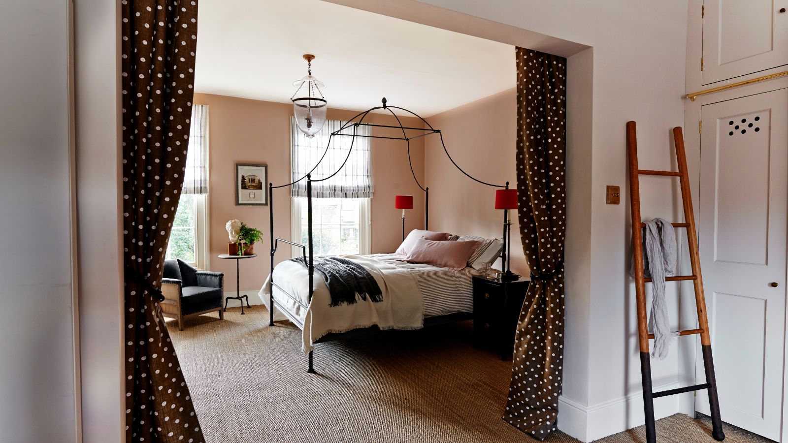 Stripes move over, I have surprised myself by deciding to decorate with dots instead – and designers agree they can be far more sophisticated than you might think
They might be known for their playfulness, but I've seen a whole new sophisticated side of this whimsical print
-
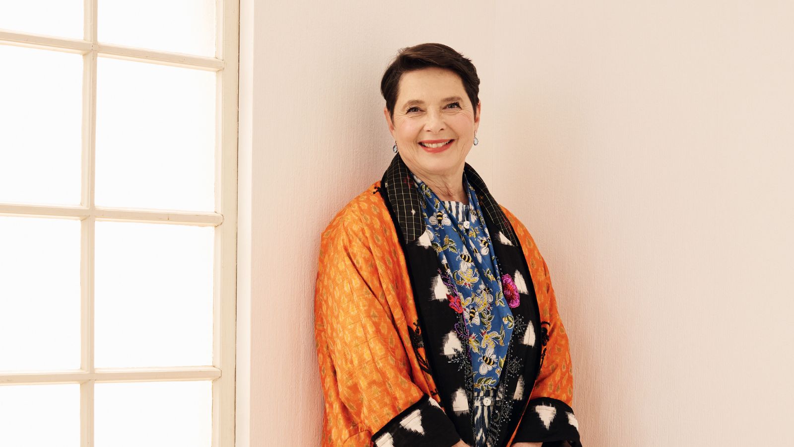 Isabella Rossellini's European-designed chef's knives are currently $65 off – and these luxury cooking tools have been around for over 200 years
These stunning German-made knives have a rich history, including being used in the Conclave actress's kitchen – and they're now on sale at Wayfair

