These are the colors that just don't work with purple – 4 shades to sheer clear of if you want to bring this on trend color into your home
Why some colors sabotage purple, and how to get it right every time.
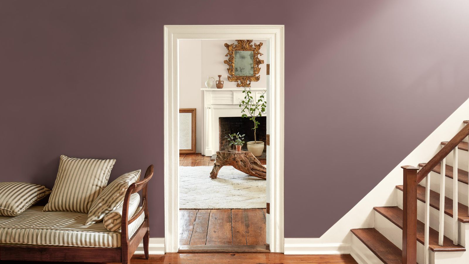
If you love purple for its depth and undeniable flair, you’re not alone. Purple is the color of creativity, luxury, and, when done right, can show real design prowess. But like any diva, it shines brightest with the right supporting cast.
Sometimes, it’s worth starting from a point of what definitely won't work. Pairing purple with certain hues can quickly go from bold to baffling. Bright orange, for instance? Unless you’re designing a Halloween poster, it’s a jarring clash.
'Decorating with purple is associated with being very regal and opulent and therefore a very bold choice, but it doesn’t have to be if you use it in moderation,' says the interior designer Caroline Borgman, of when purple rooms go wrong. ‘If you are a fan of purple, then go for it,’ she advises, ‘Paint your staircase, for example. There are no rules when it comes to interior design, and use what you love. But there are some no-nos for color combinations to be wary of.’
When using purple, there are four color combinations to avoid that will not play to purple’s strengths – not every color is lucky enough to be it’s plus one. And so, along with the help of designers, I have suggested alternatives that will work so much better.
1. Avoid cool-toned grays
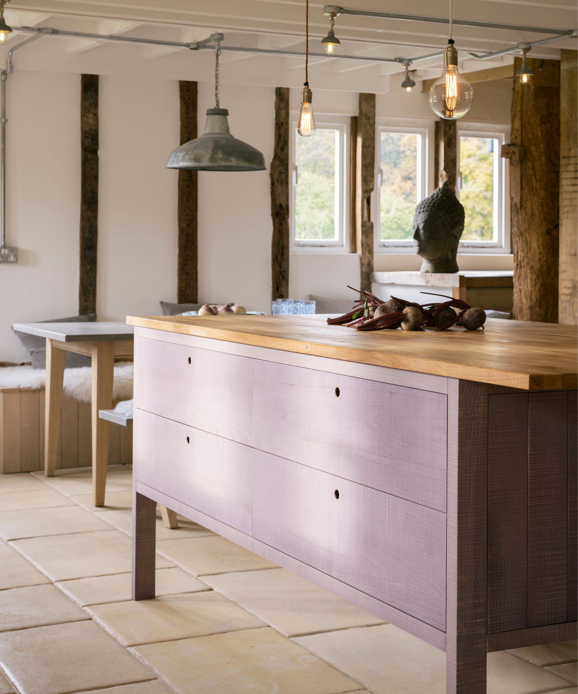
The Sebastian Cox Kitchen by deVOL Kitchens
Pairing purple with gray might sound sophisticated in theory, but in practice, it often falls flat. The cool undertones in most grays can sap the richness out of purple.
‘People often have strong opinions on the colour purple and often shy away from using it in interiors and opt for the more tried and tested colours such as green or blue,’ explains Chloe Vince, Senior Decorating Consultant at House of Hackney.
‘As with any colour, finding the perfect hue for your scheme will avoid any decorating mishaps. Lilacs can create a sense of nostalgia, but when used incorrectly, can leave a room feeling cold and unwelcoming if not paired with a warmer color. If you're working with a north-facing room, it is best to go for warm undertone neutrals and use purple in your accents. As a rule of thumb, I would avoid decorating with grays as this will only accentuate the coolness of the purple further.’
The result? A flat, chilly atmosphere that can make you feel drained of energy. Instead, I would forgo gray and use brown instead, which will ground purple without dimming it’s spark. Where gray cools things down, brown adds warmth and balance.
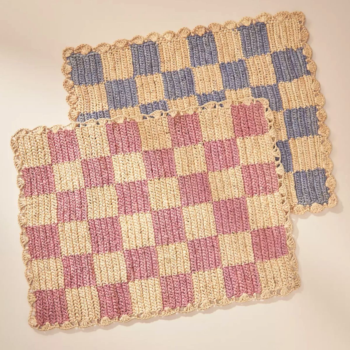
Bring some color and fun to your dining table with these checkered placemats, hand-crocheted by women artisans in Madagascar.
2. Steer clear of yellow
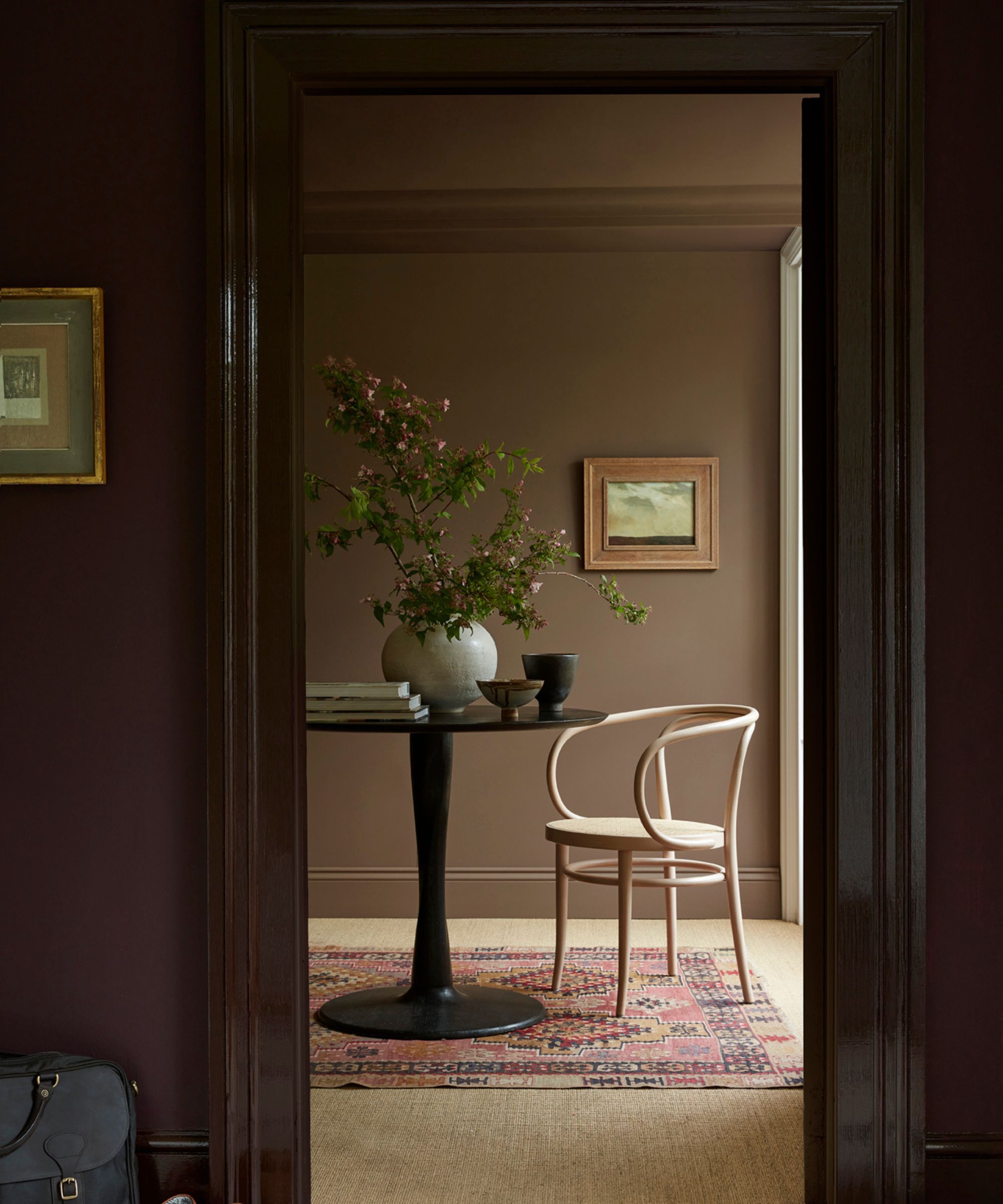
If you’re looking to the color wheel for advice on color pairings, yellow is purple’s color wheel opposite, so it's a tempting contrast. But in reality, the result can be extremely jarring and feel chaotic. Bright, lemony yellows clash, and clash hard, making the space feel loud and restless.
‘Although yellow is the complementary colour for a true purple, I would look to yellow-toned greens or earth tones such as UMBER,' advises Chloe. 'The brown undertone found in these earthier colors helps to ground the scheme and can stop it from feeling artificial.’ Instead of decorating with yellow with a primary version of the shade, steer instead into earthier territory: deep mustards, terracottas, and burnt ochres, to avoid a visual clash.
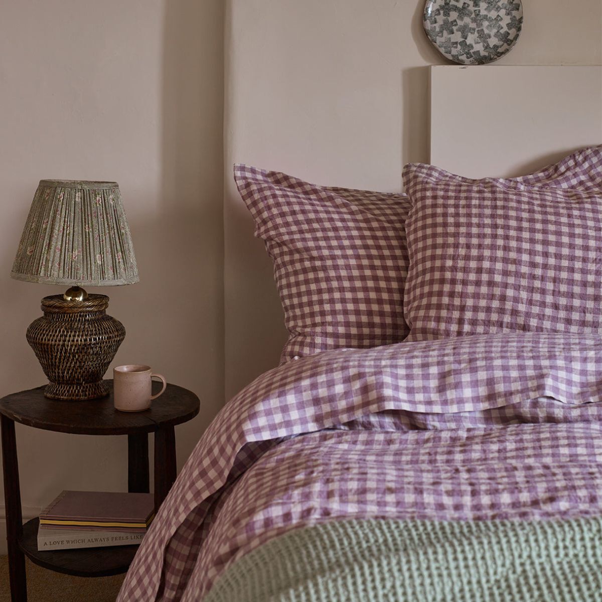
Caroline Borgman warns against using pollen yellows with purple, and suggests using warmer, earthier hues, like Farrow & Ball Red Earth, or Ringwold Ground, both of which, if paired with purple, would make for happy bedfellows. ‘However, I only tend to use these together within decorative details such as on cushions, throws, suzanis, rugs, and ceramics.’ Caroline warns. 'I generally like purple accents within soft furnishing and prints, for example, on blinds and curtains, rather than painting a whole wall purple.'
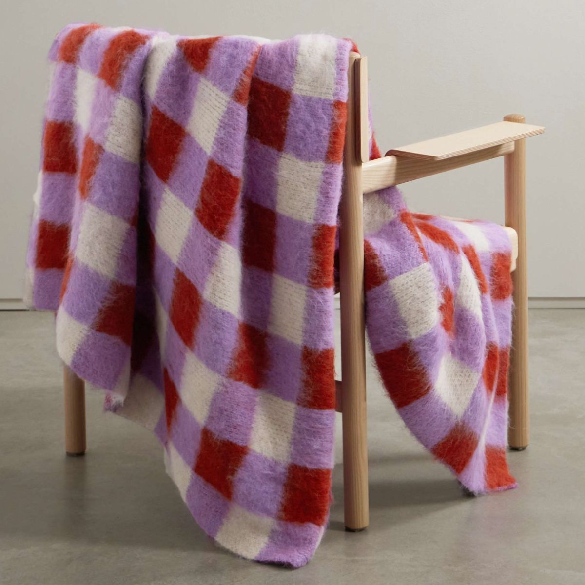
If you adore purple, or know somebody who does, this joy-sparking fuzzy alpaca-blend blanket is the ideal addition to a living space. A must-have for a true lover of color.
3. Don't clash purple with a bright pink
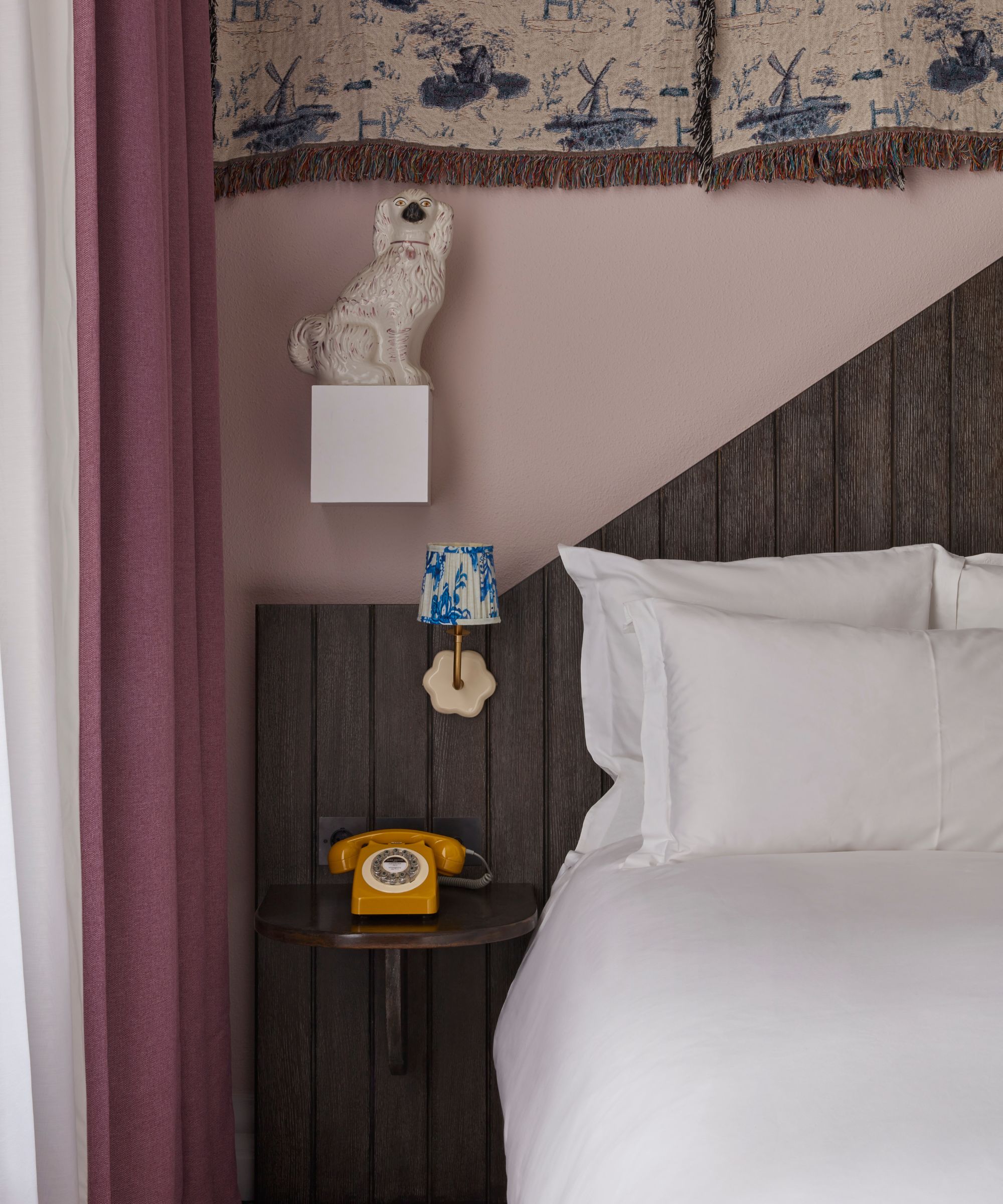
Purple and pink, in many ways is a match made in heaven. A real power couple when done right. The two can create a palette that feels romantic, layered and very chic. But tread carefully: not all pinks are created equal. If the pink paint or pink decorative accents are too sugary and bright, your space could resemble a birthday cake rather than a serene, design-led space.
‘For a fail-safe approach to using the color purple, I would opt for grounding the scheme in dusky pinks,’ advises Chloe Vince. I, for one, agree entirely. The key lies in the dusky, muted pinks – those with a hint of grey or beige in them. These create a balanced palette that feels warm, grown up and just the right amount of pretty.
If it's paint you’re looking for, a perfectly judged shade would be Nether Red by Little Greene. The perfect purple paint for a truly happy marriage is Paean Black by Farrow & Ball – a beautiful, almost black purple paint that, in my opinion, is the most tasteful of purples.
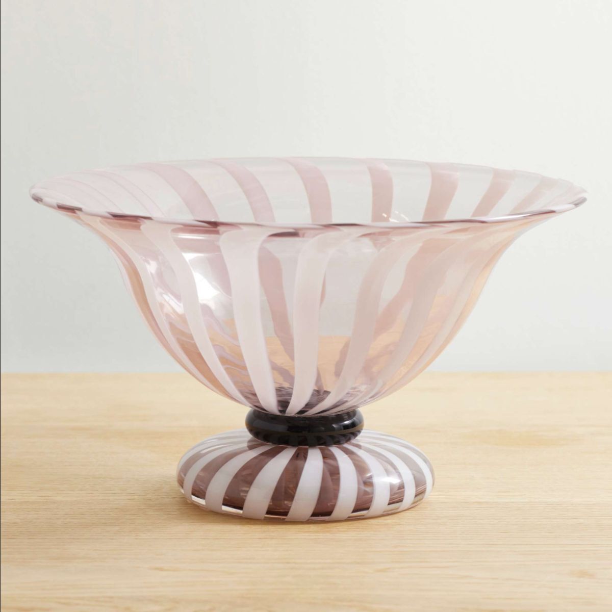
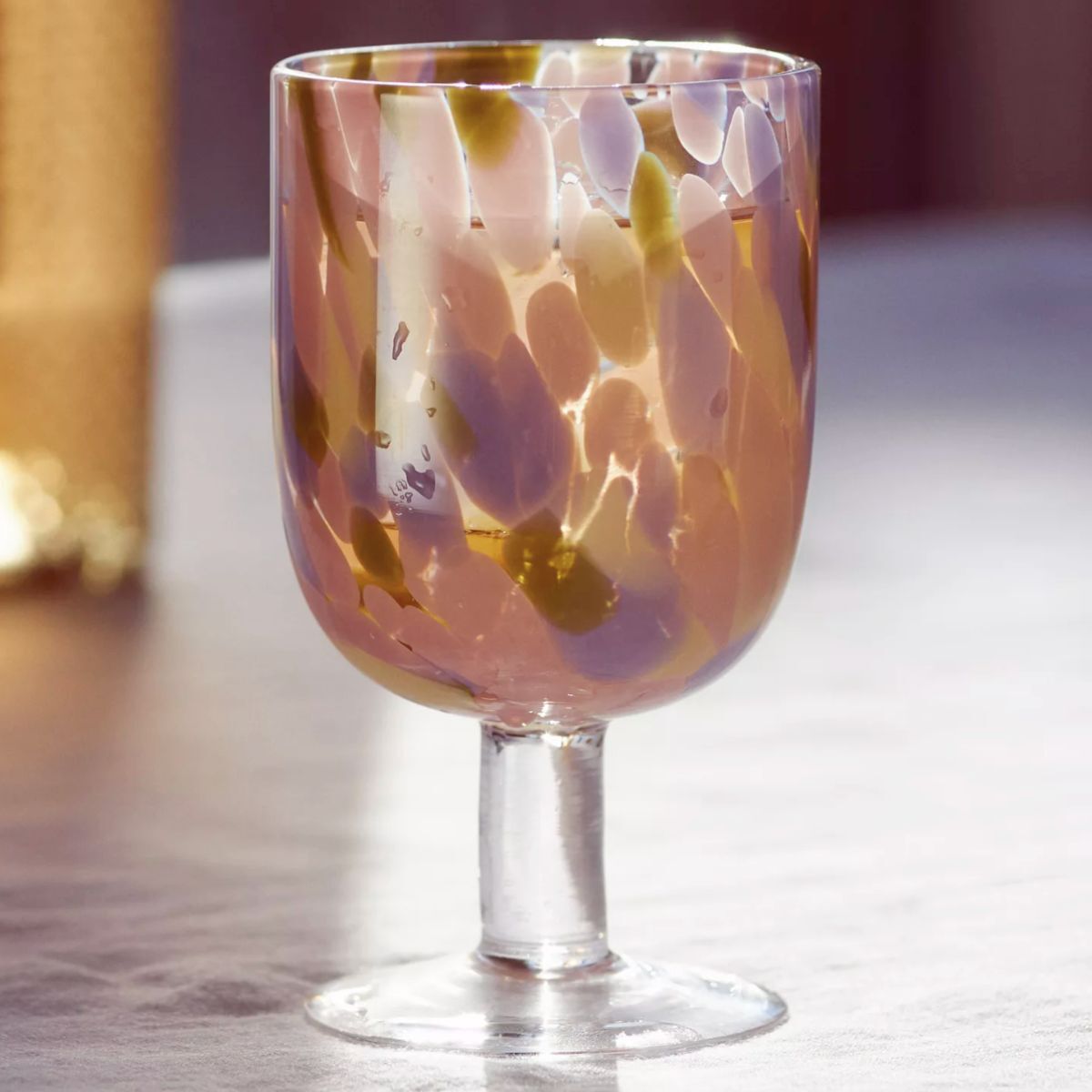
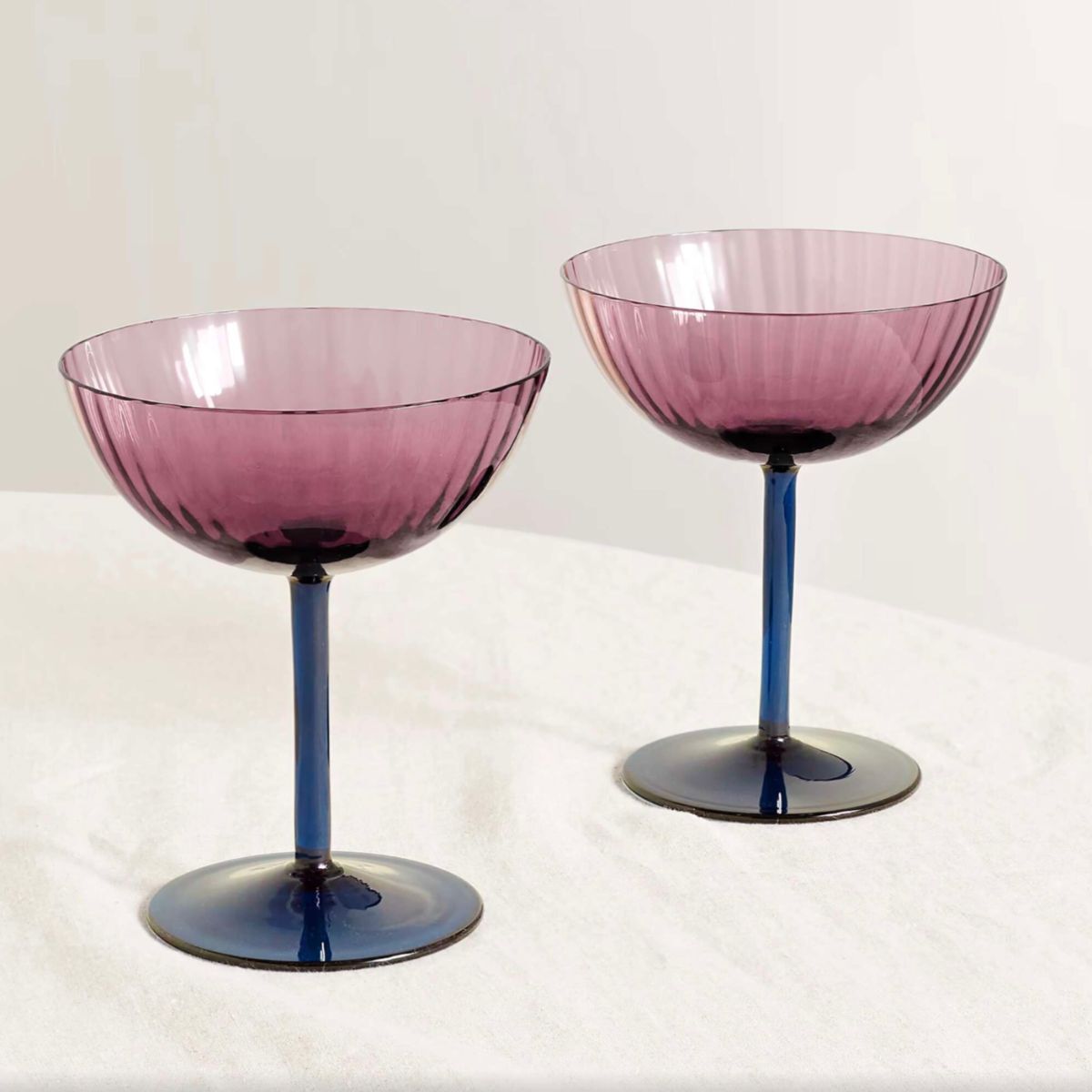
Soho Home's 'Carlotta' bowl is a beautiful example of Murano glass at its very finest. If you are searching for the perfect wedding gift ahead of the wedding season, your search officially stops here.
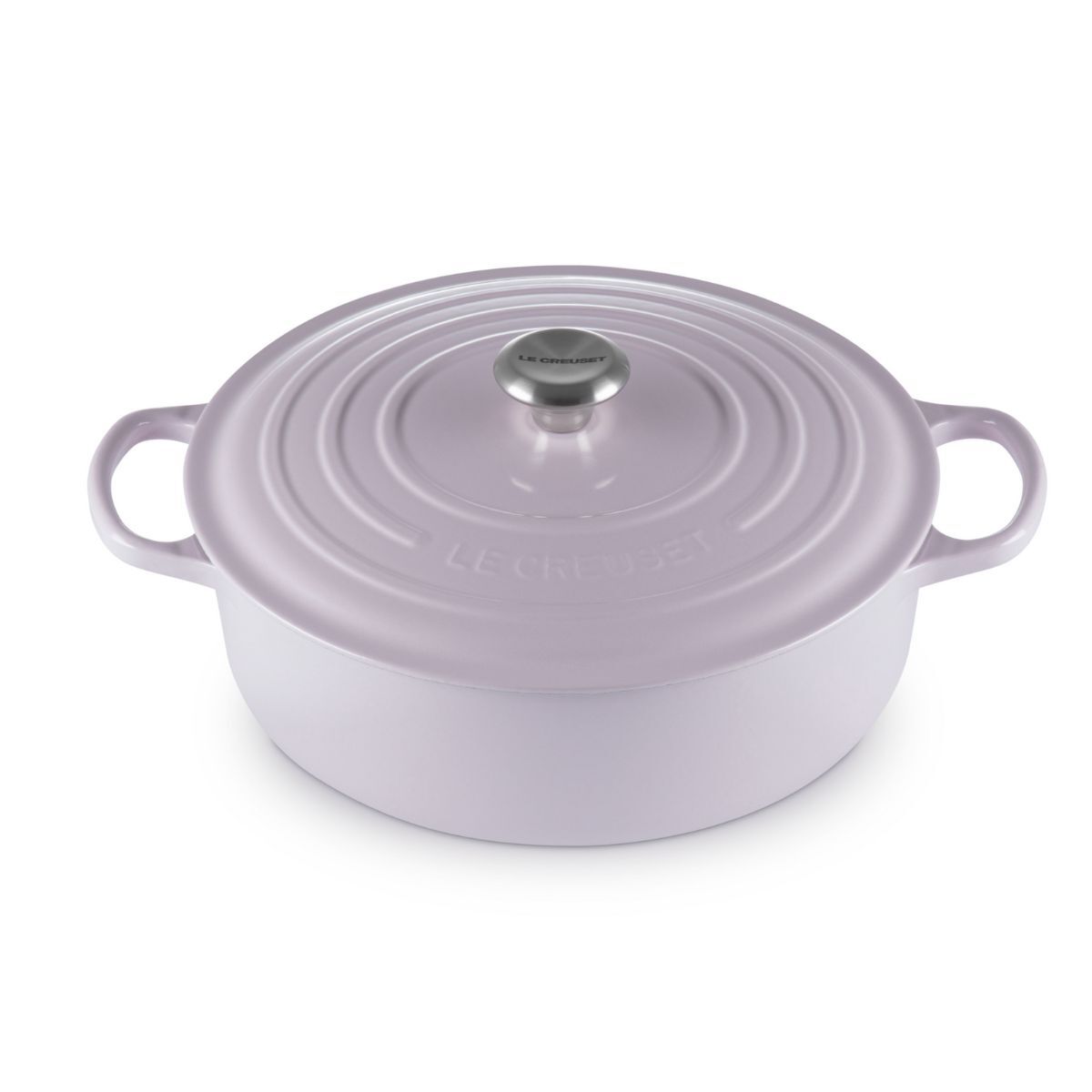
In my opinion, every home should have at least one Le Creuset pot, especially for those who love being in the kitchen, making culinary creations. If you know someone who has recently moved, or you're soon to see someone off to college, this is the perfect gift!
4. Don't pair with a garish green
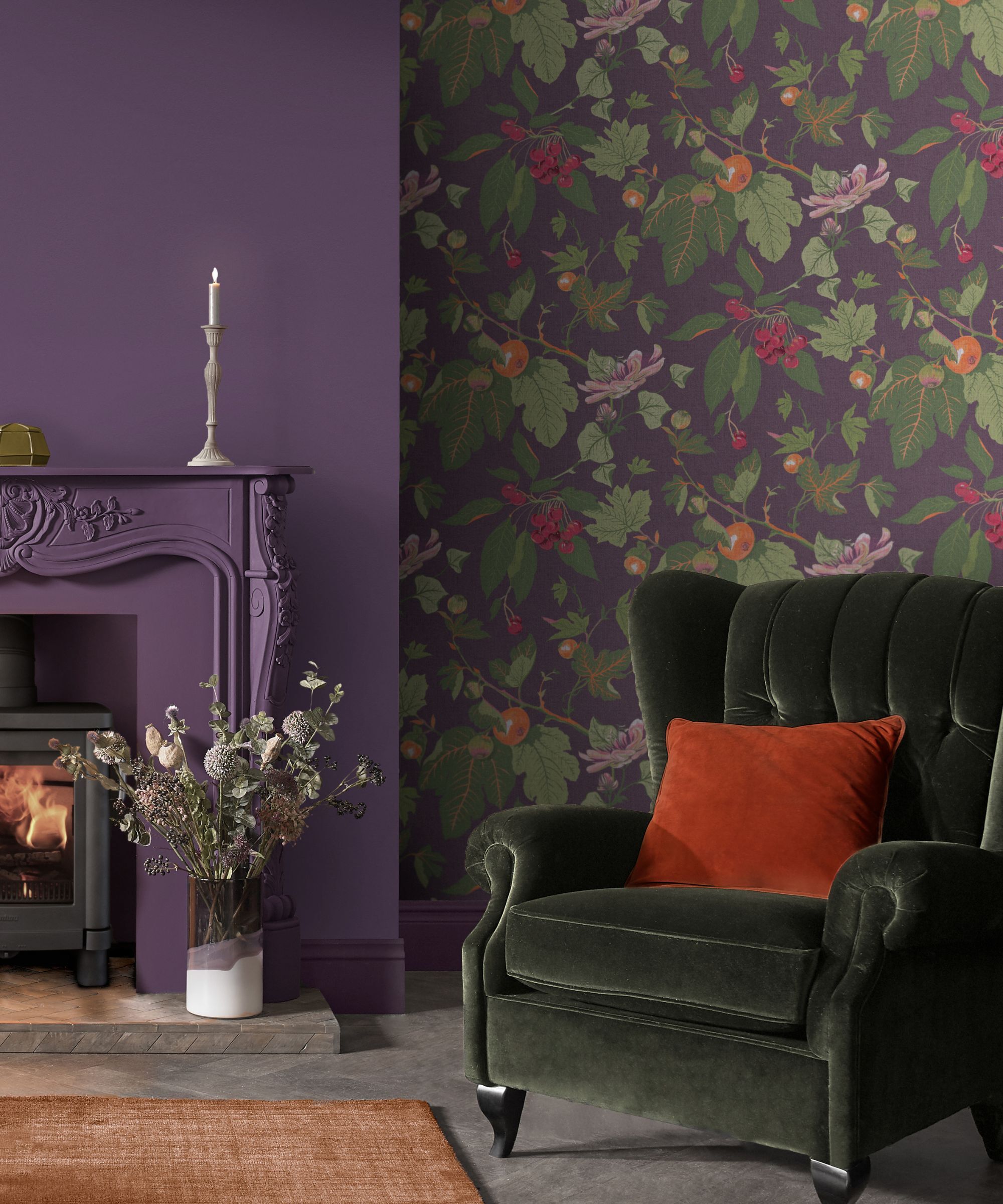
Purple and green can be a risky pairing – when it goes wrong, it goes really wrong. It conjures up images in my mind of cartoon villains or the cover of a sci-fi novel. Bright acid greens can fight with purple’s richness, which can sometimes result in a room feeling sickly and synthetic.
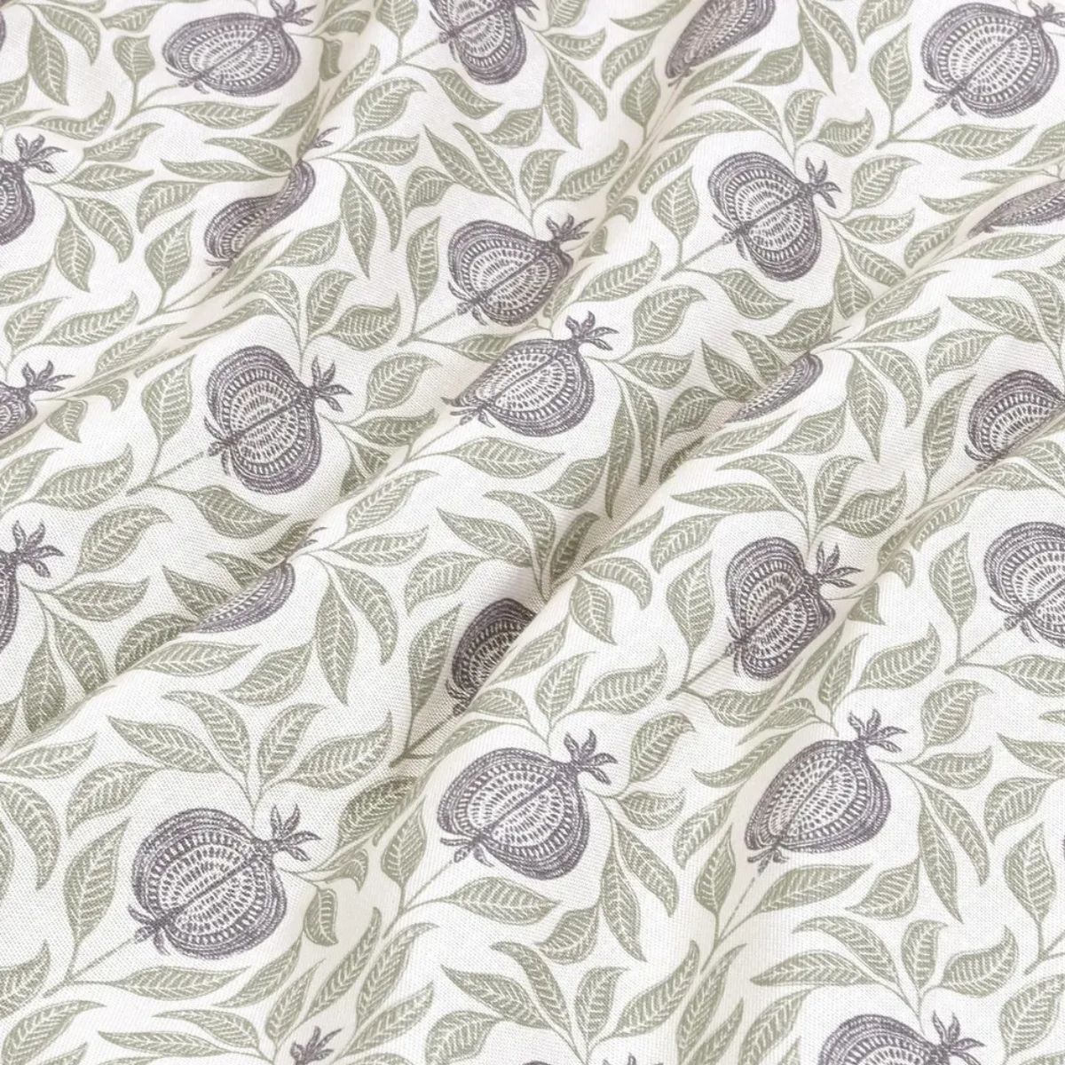
‘I love olive green with purple in particular,’ says Caroline. ‘Like Bancha by Farrow and Ball or Treron.’ Yes, purple and olive green are a different story entirely. Olive green hues have enough depth to hold their own without overpowering, and just enough warmth to soften purple’s cool edge. Together, they’re surprisingly calming and easy on the eye.
‘If you're worried about the scheme feeling too regal and rich, cool the palette down by leading into soft jade-tone greens such as our ARTEMIS cut-velvet in Eucalyptus,’ advises Chloe Vance. ‘Deep green fabric is a subtle way of adding pattern and texture to your scheme.’
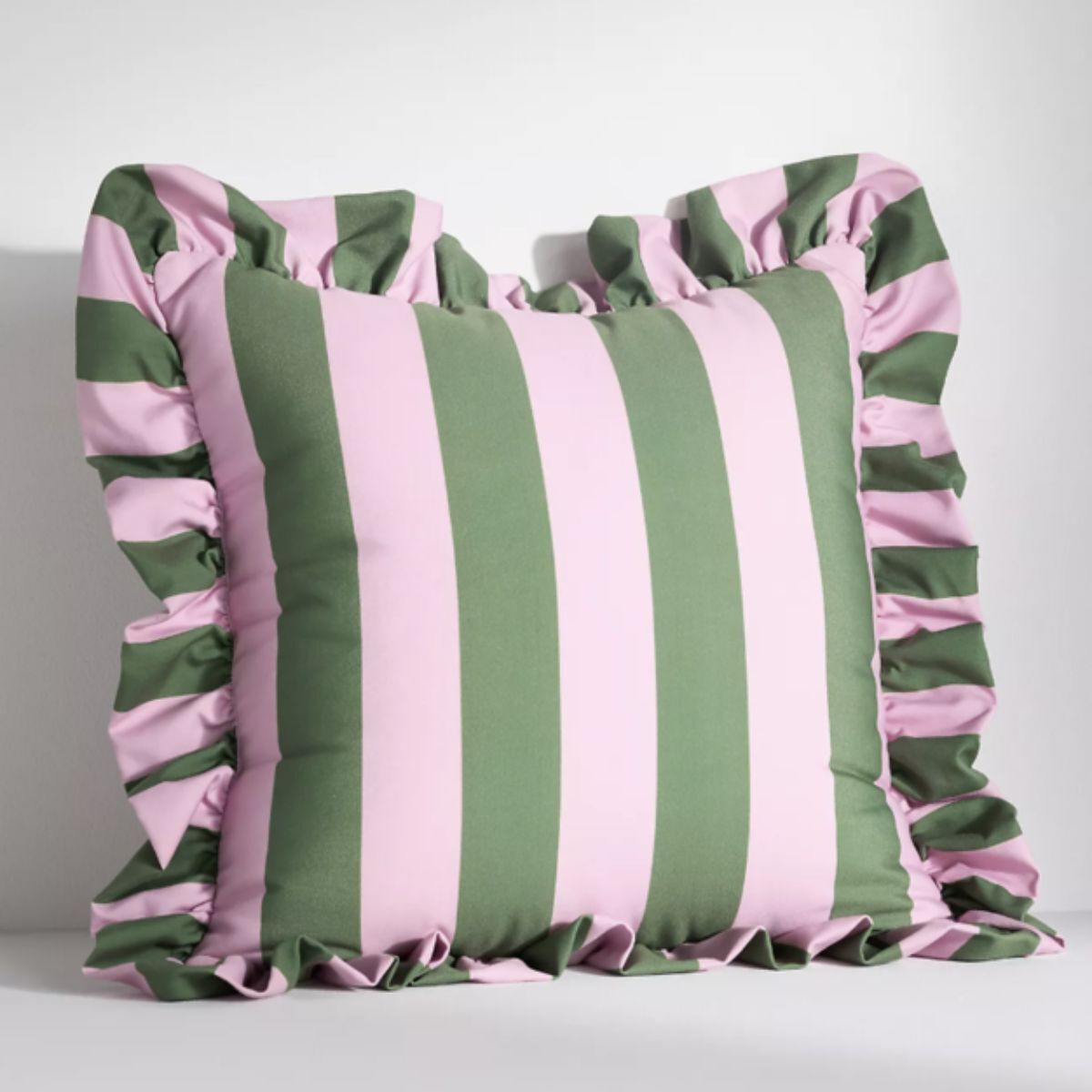
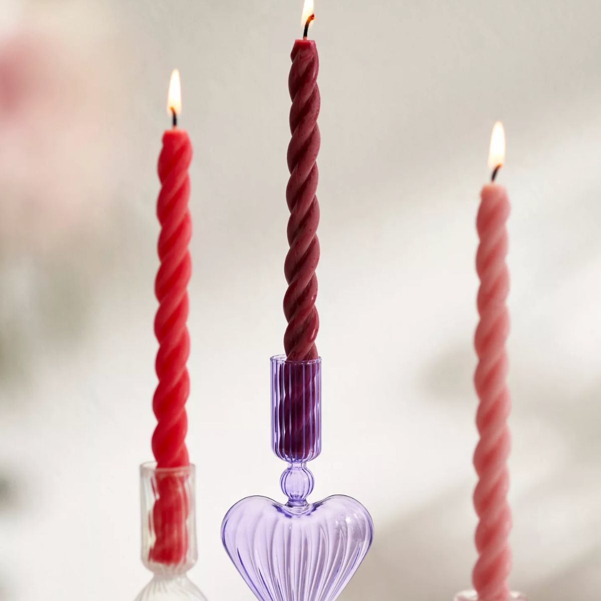
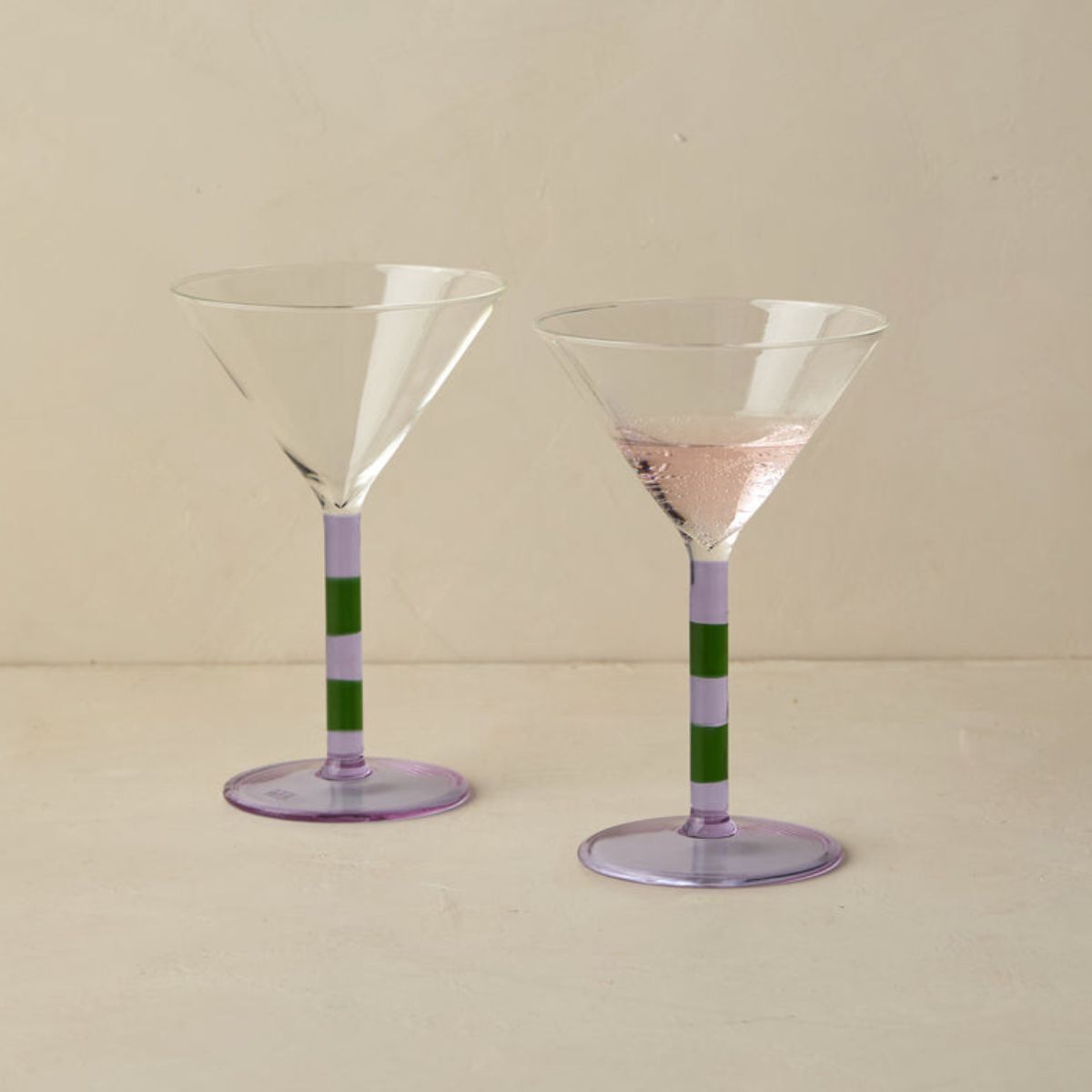
Unexpected, joyful and the right amount of eccentric; this is the kind of piece that makes a room (and your guests) smile.
When it comes to color, few shades command attention quite like purple. But its impact lies in precision, not excess. That said, purple doesn't have to be daunting. In fact, if done right, it's one of the most rewarding colors to work with. Using purple well requires a discerning eye, but the payoff is worth it. When layered with warm, earthy tones, muted pinks, and sage greens, purple reveals its potential.
With purple making a comeback in stylish interiors – from deep, glossy aubergine to pale, soothing lavender – it's the perfect time to experiment with this powerful color and use it with intention.
Sign up to the Homes & Gardens newsletter
Design expertise in your inbox – from inspiring decorating ideas and beautiful celebrity homes to practical gardening advice and shopping round-ups.
Sophia Pouget de St Victor is the UK Editor at Homes & Gardens, leading the editorial direction for the UK facing Homes & Gardens website. She brings readers the latest trends, expert insights, and timeless design inspiration tailored for a UK audience.
She has previously worked in the luxury homes and interiors industry and studied Garden Design in London, where she mastered her passion for creating landscapes that have a visceral impact on their onlookers. Home, though, is where Sophia's heart is. While she adores a wide variety of interior styles, she prefers interiors with a uniqueness that challenges any definable style. That said, there's little she finds more indulgent than walking down Pimlico Road and admiring the window display at Robert Kime; she has always found his interiors perfectly judged for a home that exudes an easy, unforced elegance.
Sophia lives in West London with her partner, along with two very naughty wiry terriers, and a plump cat named Lettuce.
You must confirm your public display name before commenting
Please logout and then login again, you will then be prompted to enter your display name.
-
 Lenny Kravitz says design is 'just like music' – and the stunning materials of this bedroom embody this laidback luxe approach
Rich textures and opulent finishes come together in a Los Angeles bedroom designed by the musician – it's ultra-chic, but relaxed
By Sophie Edwards
-
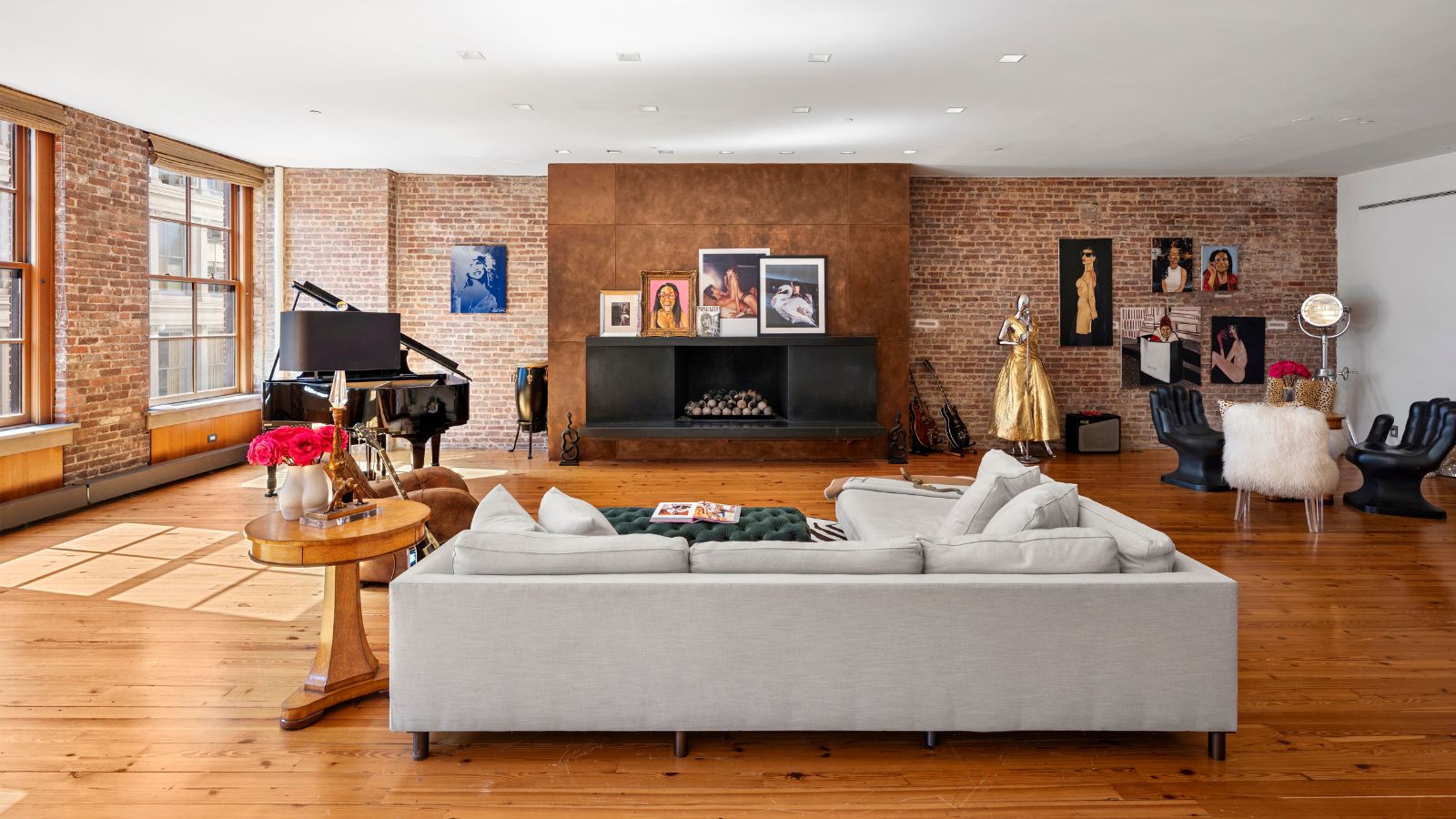 Courtney Love's historic loft combines rock star luxury with raw New York bones – it's on the market for almost $9.5 million
The singer's former SoHo home features exposed brick walls, original wooden columns, a gas fireplace, and high ceilings – take the tour
By Hannah Ziegler
