

Finding the right paint colors to decorate with in September – the start of fall – is a problem every designer and decorator wishes to solve. If you've ever felt indecision at this time of the year, you're not alone. This transitional month often coincides with festive planning, ever-changing weather, and new beginnings. It is the perfect time to press pause and really think about how your home is making you feel. And, no more so, than when it comes to color trends. Why, you ask?
September is a good time to reflect and ditch the coastal color palettes that got excited for summer and switch to fall color schemes to mark the arrival of the new season. Fall is the perfect time to explore warm, cozy, and cosseting color ideas before the colder weather sets in.
Here, designers, decorators, and experts reveal how to approach choosing room color ideas for spring with confidence.
Colors to decorate with in September
Want to decorate your home with the very latest color and paint ideas for September? One of the most important elements in any home, the chosen color scheme will transform even the dullest space into a delightful haven for the new season.
I've rounded up the most exciting colors set to dominate paint trends in September 2024, along with helpful advice and guidance from the experts in the know on how to use them in your home.
1. Sapphire

Used in decorating for centuries, serene sapphire blue is enduringly popular. Sapphire is also the birthstone for the month of September, making it the ideal choice for decorating with now.
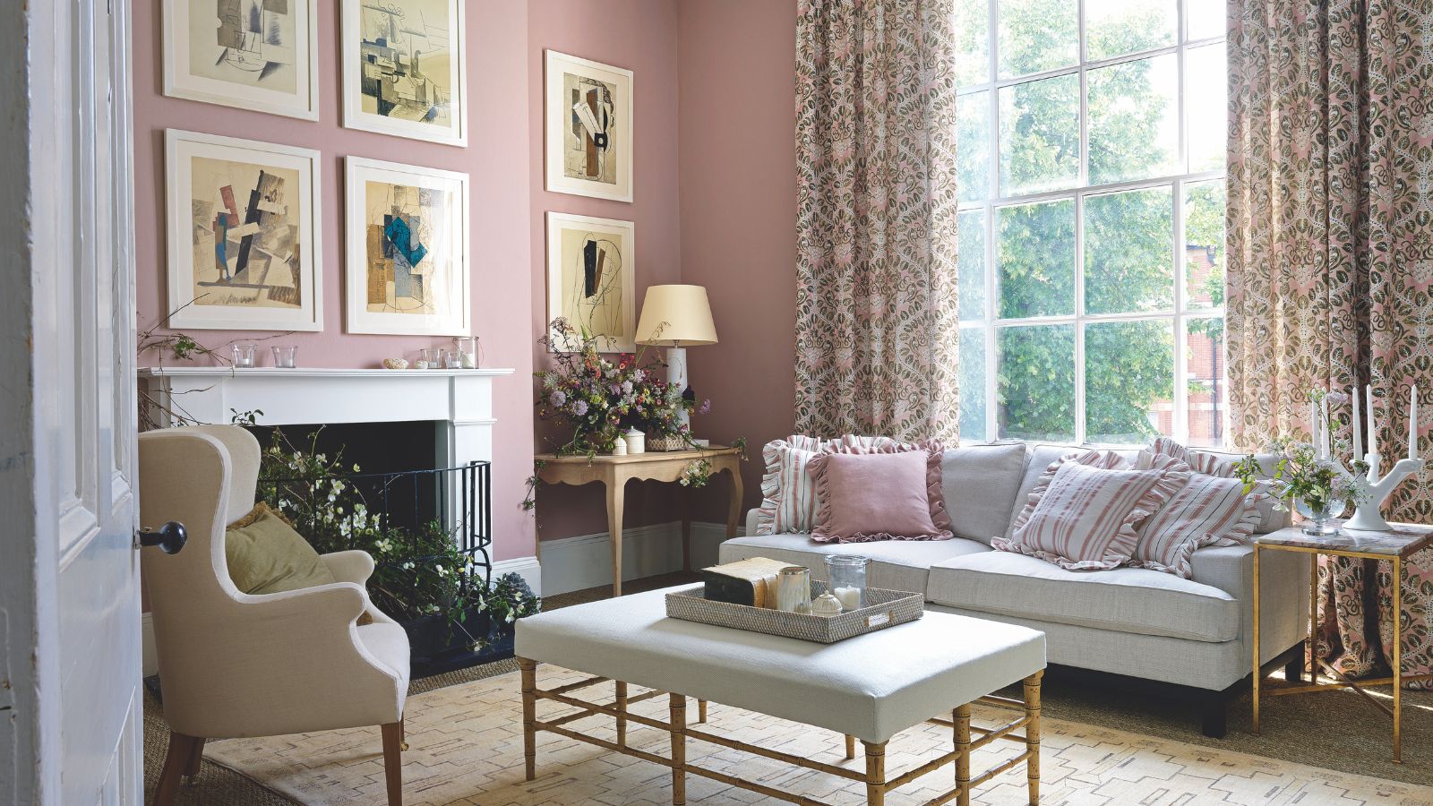
With its wide appeal of serenity and calm, it is perhaps no surprise that sapphire blue continues to be one of the most popular choices for interior design. Sapphire contrasts beautifully with crisp whites, more softly with salmon pinks, and almost every shade of green. Ochre and earth-toned hues nestle happily alongside it, too, but it is the drama and tension that can be created between a balance of dark and light that can be quite so arresting when choosing a room color scheme.
The depth of pigment of sapphire means that it offers an emotional content that can be as nurturing or soothing as any green, particularly when you decorate a room floor-to-ceiling in a sapphire blue. For some homeowners, the idea of dark colors might feel foreboding, but for others, it is the dark ‘night’ of a shade that offers serenity in a room scheme.
2. Gold

Decorating with gold is not for the faint of heart. However, done right, gold can be used to create spaces that are stimulating and energizing, fun or formal, to cozy and welcoming.
One of the most mood-boosting colors, gold is sure to lift your spirits and it is perhaps not surprising that this joyful option is experiencing a modern renaissance in interiors.
'The gold color is an invitation to dream and to travel,' says Jamie Beriestain, founder, of Jaime Beriestain Studio. 'I don’t use it a lot, but sometimes it can fill a space with light. I loved that the kitchen, a room that is usually not the “main character” of the flat, became the center of attention.’
The decorating potential of gold should never be underestimated – and it is not just a color for the holiday season either.


3. Chartreuse

There is something oh so cozy and comforting about chartreuse. Named chartreuse after its resemblance to the French herbal liqueur, the color chartreuse embodies a distinctive and energetic character that can beautifully uplift and brighten a room – the perfect antidote to the cooler, grayer weather.
The color also acts as an effective bridge between the outdoors and inside when used in threshold spaces. When seen in enclosed rooms on wallpapers or furnishings, the color brings relief and reassurance and elegantly reminds us of the living world beyond our four walls.
Chartreuse has enormous scope as a mindful décor mainstay, and is also seen as an effective backdrop for other organic shades. ‘We are noticing a change to the use of softer hues, such as chartreuse, being used all over as a base color, just how neutrals have been used traditionally,’ says Ruth Mottershead, creative director at Little Greene. ‘These are very calming, positive shades with a timeless quality, that are muted but not enough that they fade into the background, so they work beautifully as a foil for similar earthy tones and richer colors, which can give a more dynamic effect.’
4. Ruby-red

Rich ruby-red and burgundy hues are perfect for adding mood-enhancing, intense color to a fall home. An intrinsic part of life's color palette, red evokes feelings of passion, drama, love, heat, festivity and fruitfulness.
As the leaves slowly start to turn red outside, it is a wonderful color to bring indoors too. This hue has the ability to grab attention, and evoke passion and sensuality – and has also been known to stimulate the production of melatonin and help with memory.
'Red makes people sit up and take notice and is a color that says you are self-reliant, optimistic and know what you want,' says Emma Deterding, founder of Kelling Designs and KDLoves. 'This effect is the same in interior design as it can bring in a rich, warm color that will pack a punch come September.'
5. Espresso

Sabrina Carpenter's song Espresso might have been considered the song of the summer, but it is the color that best embodies early fall to me.
Considered a dark neutral, espresso brown is grounding but also has an elegance that is truly sophisticated. Versatile, it can be striking on its own or allow other hues to stand proud.
'Espresso is a smart mix of black and brown,' explains interior designer Nadia Watts. 'Similar to black coffee, it exudes feelings of warmth, comfort and coziness.' All the emotions you want to embrace as the seasons change.
Being polychromatic, espresso goes with everything, but in deeper, very rich hues it is particularly good at flattering beautiful, well-drawn patterns, so don't be afraid to pattern and color clash in an espresso-hued space.


6. Eggplant

Purple is a controversial color. After a very violet bedroom as a teenager, I now have a love-hate relationship with the color. But if there is one hue that has persuaded me to give it another go, it's eggplant.
This strong, bold color is a much more grown-up and sophisticated version than the color schemes of the nineties and early noughties.
'Often associated with royalty and tradition, eggplant is perfect for adding drama and character to a room,' suggests Helen Shaw, director of Benjamin Moore. 'Saturated shades envelop a room, so consider introducing the rich hue into a space that benefits from natural light to create an intriguing interplay of light and dark.'
If lilac was the color of summer, then eggplant is the color of fall.
7. Warm gray

Decorating with gray will forever be popular. This sultry shade goes with every color and can be used to add depth, dimension and sophistication to any room.
‘Gray is enormously versatile. Depending on the underlying tones within it and on the depth of color, it can be partnered with almost any other hue,’ says interior designer Victoria Wormsley of French-Brooks Interiors.
Treat gray as a neutral and layer it with darker and lighter tones, including plenty of texture and some accent pattern. It makes a cozy and wonderfully dramatic statement at the darker end of the grey spectrum and at its lightest, it offers schemes a sanctuary of calm. Consider pairing it with contrasting colors, too. Designer Vanessa Arbuthnott believes ‘many yellows, softer pinks, and warm blues’ work well as complementary colors.

-
 Anna Kendrick's favorite coffee maker is the first machine to make iced beverages that are 'just as cold as a coffee shop' – it's currently under $200
The actress uses this smart machine to make perfect mocha frappes straight out of her kitchen – it's a summer 2025 must-have
-
 Put your 'purgatory place' and 'dust detective' in play – 6 expert tricks professional organizers use to effortlessly edit down belongings
Stress-free streamlining is entirely within sight


