I'm finally painting my bedroom – these are the best pink paints in the running (and designers agree)
I want grown-up, sophisticated pink and these are the shades designers suggest I try out
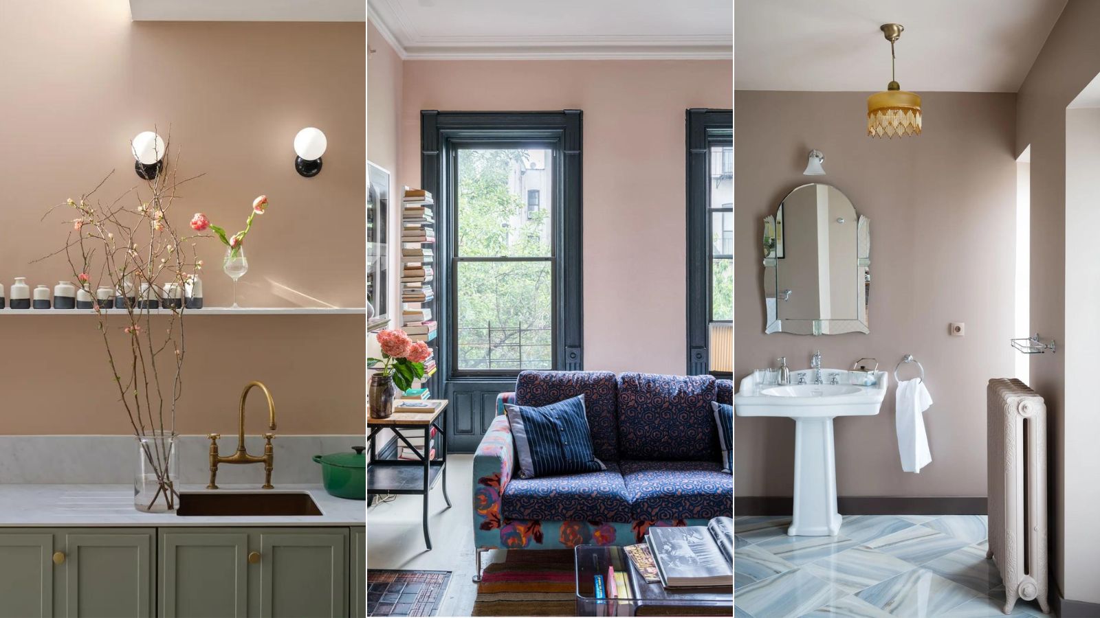

After years of never painting a wall any other color than white, I am finally taking the leap and giving my bedroom a pink makeover. Now when I say pink, I mean as subtly pink as you can get – almost neutral. Just warm enough it counts as a pink but still works with my very neutral scheme.
And since I know trying to find the perfect pink is something on many a decorating to-do list, I thought I would ask interior designers for their tips on choosing the perfect pink paint, as well as round up the top five shades I am considering for my pink bedroom.
The Barbie-core trend I loved as a cultural phenomenon, but it's those highly saturated, rosy pinks that I want to avoid here. I want them super blush, deep plaster pinks that will make my bedroom feel warm and welcoming. So these are my recommendations, most of which are backed by designers, and come with the promise that these shades won't make me feel like I'm back in my tweenage bedroom, and will, in fact, be a very elegant and chic upgrade from my white wall.
The best pink paints for a soft and sophisticated space
You would think by banishing the majority of pink shades and looking for a very specific warm earthy pink would narrow down my options slightly. But alas, there is an infinite amount of blush pinks still to choose from, so I asked some of my favorite designers and color experts for their expert advice on what to look for when choosing the perfect pink paint.
1. Templeton Pink, Farrow & Ball
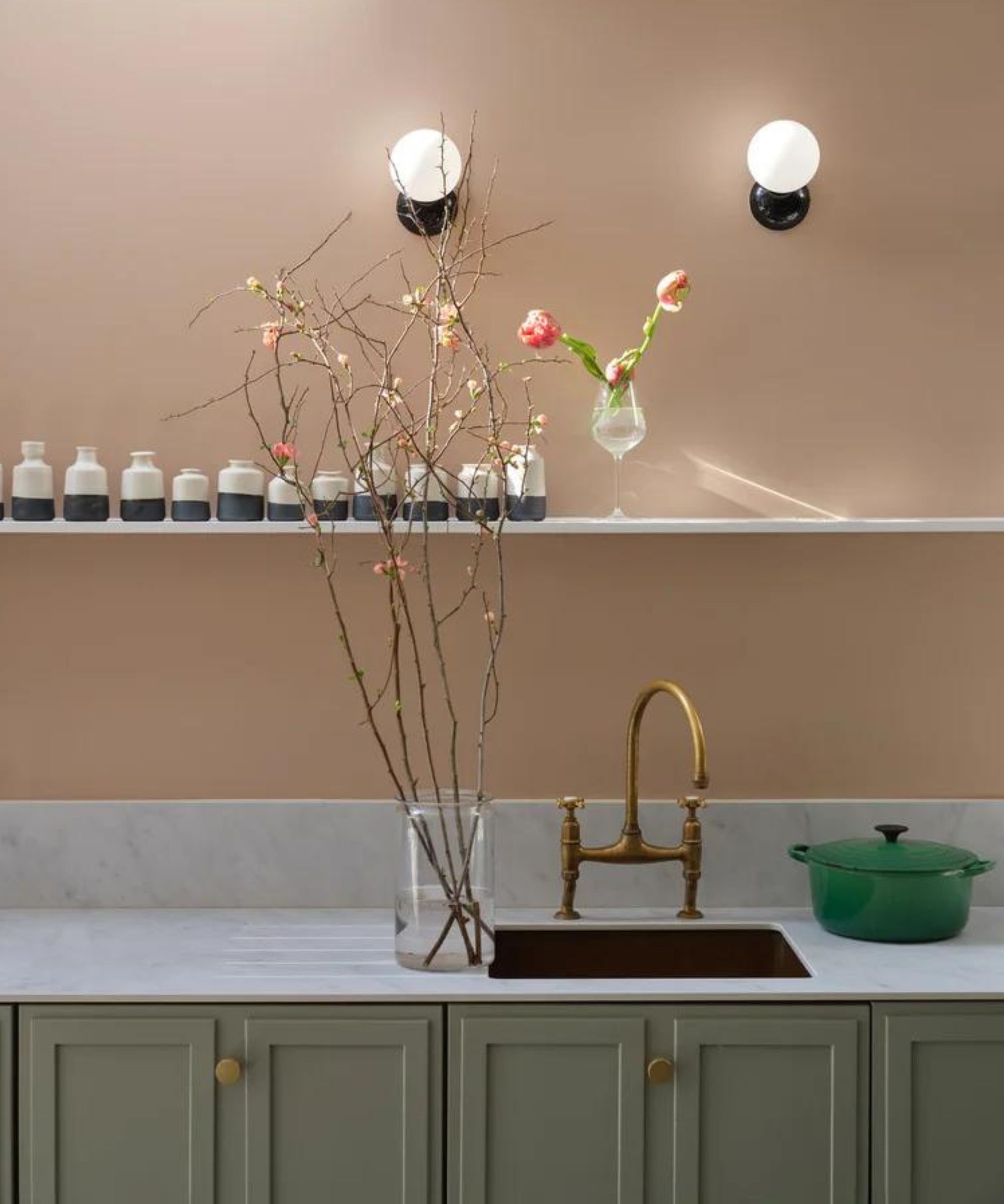
Farrow & Ball was my go-to for the perfect pink paint. They are known for shades that have so much depth and tone, and I was set on the iconic Setting Plaster. It's a gorgeous shade, but after ordering swatches it was actually Templeton Pink that was my favourite of the two. It's slightly deeper and I can imagine in a room with little natural light, it gets really dark and beautiful. Farrow & Ball do describe it as a more intense version of Setting Plaster.
'Farrow & Ball has some of the best subtle pink paint shades that pair well with other more muted tones,' says Keren Ritcher, co-founder of White Arrow. 'I think pinks that have a bit of a grey or a purple undertone to them can look great. We have used mauve and dusty pinks in a few projects and the more subdued shades are a nice counterpoint to “millennial pink.”'
2. Dead Salmon, Farrow & Ball
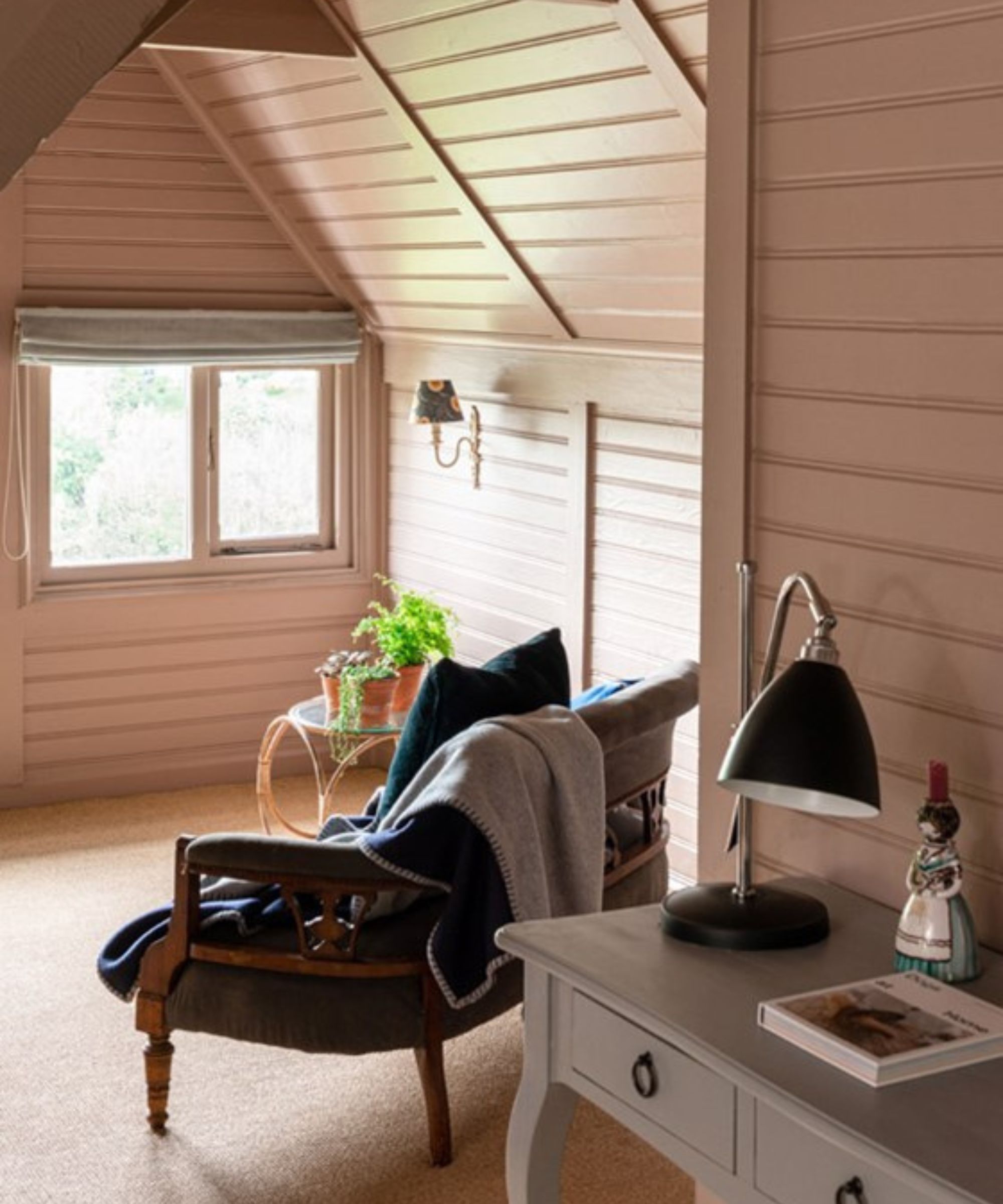
Another Farrow & Ball classic, Dead Salmon is far more beautiful than it sounds. It's less pink, more mushroomy than Templeton Pink and in some lights, it almost looks like a warm grey/brown, but that is very much the vibe I am after with my pink paint and the kind of shade that comes up year after year in color trends.
'I love Dead Salmon by Farrow & Ball,' says Lauren Sullivan of Well x Design. 'It feels subtle and sophisticated without "screaming" pink. This hue can be considered somewhat of a chameleon in spaces as everyone tends to see it differently – which also allows it to work well in a variety of settings and levels of natural light. Though a minor point, it's also named after an aged pink used at Kedleston Hall in 1805, and I always love a good historical reference.'
3. Rosetone, Benjamin Moore
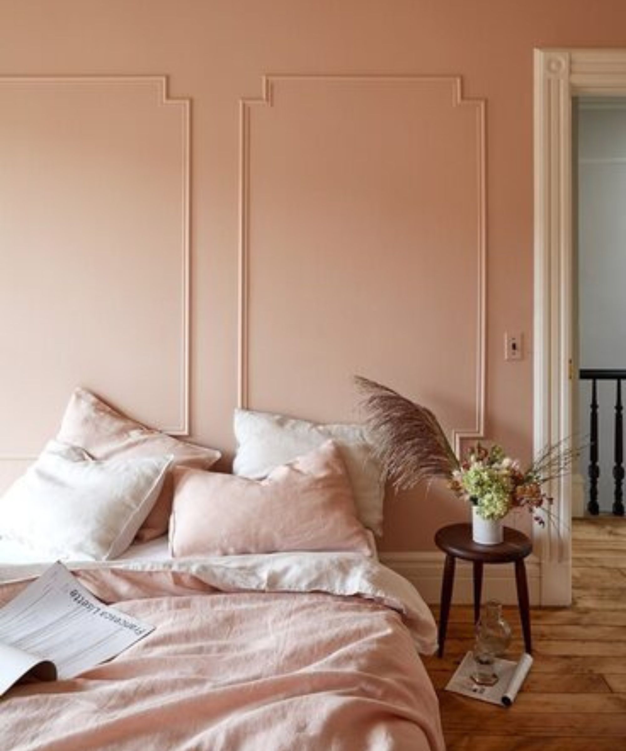
Getting ever so slightly more rosy-toned here, still earthy and muted but it's lighter and brighter than the two Farrow & Ball favorites. It's one of those shifting pinks that you can either lean into and really bring out those rosy hues, or if you like decorating with neutrals, pair with layers of warm creams and beige and it becomes almost like a neural too.
'With the rise of 'Barbie-core' over the summer, there's no denying that the color pink is having a major moment. But when your goal is chic and understated rather than kitschy, choosing the right shade of pink to bring into your interior design motif is key,' says designer Kathy Kuo.
'I love more muted pinks like blush, dusty rose, and mauve. Think about what other colors your pink tones are going to pair with and let that be a guide. Super-bright hot pink is fun, but it's harder to mix and match with, whereas a subtle dusty rose easily pairs so many shades.'

Described by Benjamin Moore as both 'earthen and elegant' this is the perfect balance between a rosy pink and a plaster pink. My tester is in a darker corner of the room (always test there) and it doesn't look overly pink, but I can imagine in a lighter space those pink tones would come out beautifully.
4.Romance,Sherwin Williams
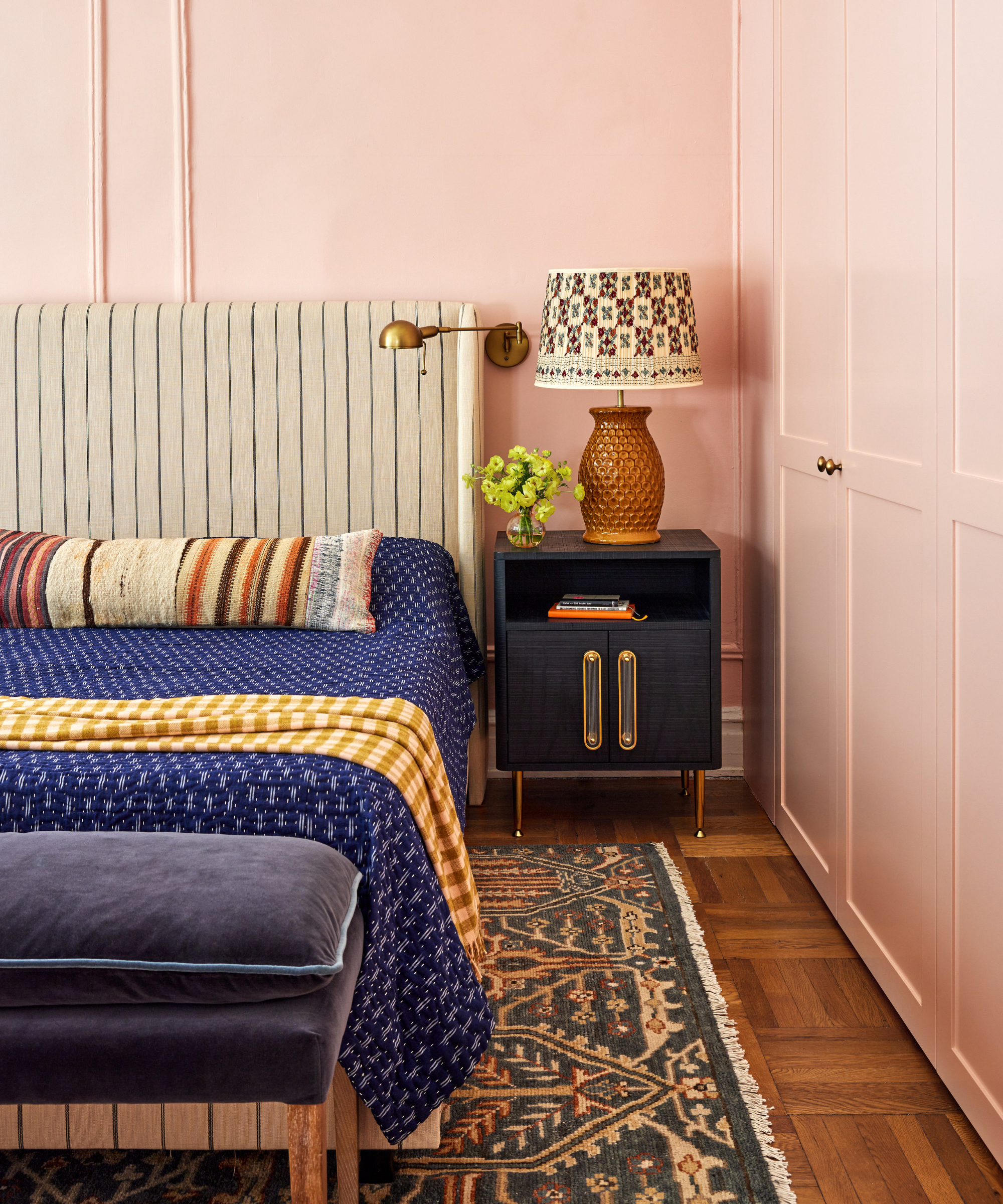
For a slightly lighter option, Romance by Sherwin Williams is definitely more of a true pink than the other picks. But it's still not too saccharine. I think to make this one work best I would pair light pink with some darker, earthy hues like a dark beige or even a brown just to really bring out the warmth and ground the lighter shade. But it does work.
This pink bedroom, designed by Rebecca Amir, is giving me a ton of inspiration of how to make a lighter pink work and still feel very grown up and sophisticated. I think pink walls need texture too, layers of different materials and finishes to ensure the room has depth.

Romance was Sherwin William's Color of the Year back in 2020 and has remained a favorite pink since then. Not too sweet but not too brown-toned it's the ideal warm, earthy light pink.
I'm very much looking forward to this change in bedroom color, a pink feels like a nice change from white, but not so bold it won't work with the decor I already have going on in the space, and the rest of my home.
All these suggestions are wonderful pink paints, but my top tip is to order swatches before you commit because pink is a chameleon shade that can change so much under different lights.
Design expertise in your inbox – from inspiring decorating ideas and beautiful celebrity homes to practical gardening advice and shopping round-ups.

I am the Head of Interiors at Homes & Gardens. I started off in the world of journalism in fashion and luxury travel and then landed my first interiors role at Real Homes and have been in the world of interior design ever since. Prior to my role at H&G I was the digital editor at Livingetc, from which I took a sabbatical to travel in my self-converted van (not as glamorous as decorating a home, but very satisfying). A year later, and with lots of technical DIY lessons learned I am back to writing and editing, sometimes even from the comfort of my home on wheels.

