
Benjamin Moore has long been immensely popular with interior designers for its century-spanning appeal and livable quality. And its Historical Collection is almost like an industry secret for finding paints that have a real classic, historical feel. It includes a wide range of time-honored colors inspired by 18th and 19th-century architecture throughout North America.
Each of the 191 shades in the collection has firmly held its place over the decades. The pallet within this kaleidoscopic collection offers a sense of continuity, somehow both nostalgic and timeless, making for versatile backdrops that work in many different home styles.
All of the shades feel right at home in an elevated look, as befits the collection’s origins, but this collection is by no means limited to grand houses. The versatility of the colors within the collection means they work beautifully in more relaxed, laid-back interiors, too. The collection spans grounding neutrals, wakeful minty greens, and timeless nautical blues, perfect for all of your paint ideas.

Sag Harbor Gray HC-95 (Wall) and Palladian Blue HC-144 (Ceiling)
Arianna Barone, the Color Marketing Manager at Benjamin Moore, explains ‘While the Historical Collection is steeped in traditional design, these hues transcend architectural styles with timeless colors that regularly top our best sellers list. This collection is a go-to of mine for exteriors and is always a first stop when looking for blues, greens, neutrals, and grays. Iconic Benjamin Moore colors, like Revere Pewter HC-172, Hale Navy HC-154, Essex Green HC-188, and Shaker Beige HC-45, can all be found in this collection and be easily incorporated into any color palette.’
To aid you in uncovering this collection's greatest hits, we’ve handpicked 7 of our favorite paint colors from the 191 shade-rich collection, as well as show you how these characterful Benjamin Moore colors look in real homes.
Newburg Green HC-158

Newbug Green HC-158 by Benjamin Moore
Don’t be fooled by the name, this sophisticated deep teal color appears much more of blue than a green in its response to light. Newburg Green has a chameleon-like reaction to light, which is part of its appeal, as it can vary dramatically from morning to evening, so it never feels stagnant or tiresome.
This particular blue paint has muddiness to it, so it has a depth that makes it grounded and calming and not at all startling. It looks right at home in this traditional kitchen, but we can imagine it looking just as beautiful in a snug or home library.
Black 2132-10

Black 2132-10 by Benjamin Moore
Not all black paints are created equal. If you’re keen to be adventurous and decorate with black, but worry it might appear flat and one-dimensional, rest assured it’s rare to find black paint that is truly, completely black. Like all other colors, it is the undertones that develop the paint’s unique personality.
If you’re looking for a statement-making black paint, it couldn’t be more imperative to try multiple swatches at home to see which paint best suits, and how it behaves throughout the day with the changing light. That said, Benjamin Moore's Black 2132-10 is one of the closest to ‘true black’ we have found and is exhilaratingly striking.
Buckland Blue HC-151

Buckland Blue HC-151 by Benjamin Moore
Buckland Blue is a true cerulean blue, but despite its strength and masculinity, this blue paint is ever so slightly faded, so it is soft enough that it is not oppressive. Like so many colors in this collection, this shade is multi-skilled and works well in a variety of home styles – it would look effortlessly elegant in a traditional home or serve as a bold accent in a contemporary space.
Elmira White HC-84

Elmira White HC-84 by Benjamin Moore
If you’re searching for a flattering neutral paint to incorporate into your scheme, this elegant, pared-back greige color is a great choice.
Elmira White is neither too yellow nor too gray, striking the perfect balance for a sophisticated fade into the background neutral that adds warmth and softness to a room. Its versatility means it works beautifully in modern and traditional homes, both large and small.
Hodley Red HC-65

Hodley Red HC-65 by Benjamin Moore
Benjamin Moore describes Hodley Red as ‘a deep red with versatile undertones that shift from an elegant purple to a comfortable brown.’ In this light-drenched bedroom, the bright berry undertones are exaggerated, whereas in a room deprived of natural light, this paint color appears much richer and moodier, more akin to a brown-ish red.
Rockport Gray HC-105

Rockport Gray HC-105 by Benjamin Moore
This rich medium gray tone makes for a great, versatile neutral and a great companion to more stimulating colors that need neutralizing. Rockport Gray can be a real workhorse, and would fit perfectly in larger spaces such as bedrooms, kitchens, and living rooms.
Webster Green HC-130

Webster Green HC-130 by Benjamin Moore
Decorating with green is a wonderful way to bring fresh, natural elegance to a room. If you’re on the hunt for green paint, it’s easy to feel overwhelmed by the kaleidoscopic range.
Webster Green is a great option if you’re searching for a deep green with bucketfuls of character, especially if you have a playful and colorful interior design style. It is a confident and joyful green, and as such it works very well on its own or when paired with non-competing neutrals. It works especially well on woodwork like closets, doors, and stairs to really make a statement
We're charmed by every one of these colors, all inspired by a bygone era but reimagined to work well in modern homes. Each color in the Historical Collection is wonderfully evocative and is sure to inspire. If you are looking for a paint that's going to give any room character and an aged feel (no matter what the era of your home) look no further than this collection.
You must confirm your public display name before commenting
Please logout and then login again, you will then be prompted to enter your display name.
-
 I tried this glycerin hack to stop the mirror in my bathroom from fogging up – and it worked like magic
It instantly fixed one of my biggest pet peeves
-
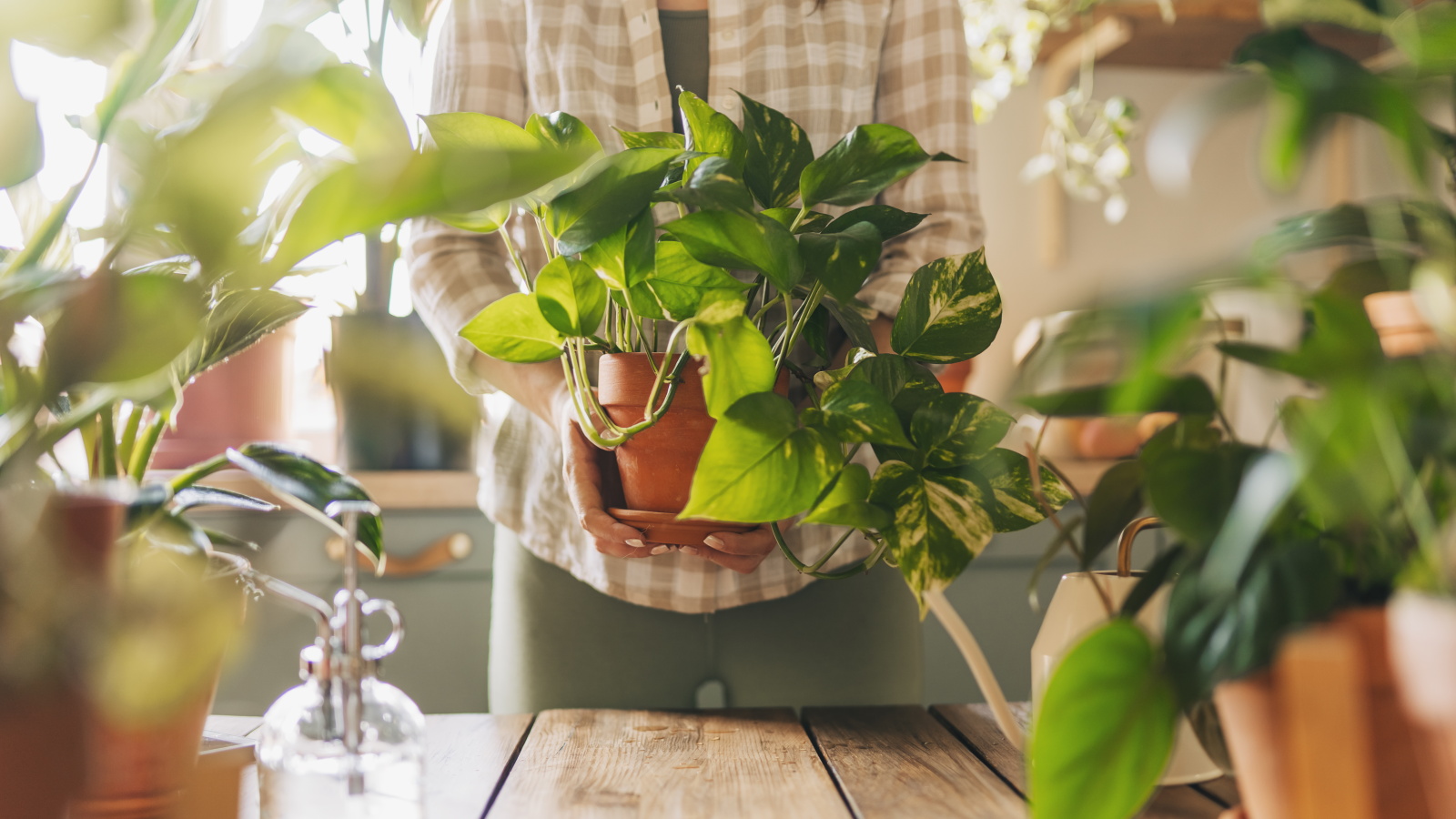 7 habits every good plant parent has, according to houseplant experts – number 3 will surprise you most
Watch your houseplants thrive after you build these tasks into your routine

