Benjamin Moore's cottage chic palette is an elegant mix of soft neutrals, the perfect color scheme for this timeless style
Benjamin Moore has shared its best paints for creating a calm, cozy, cottage-chic interior
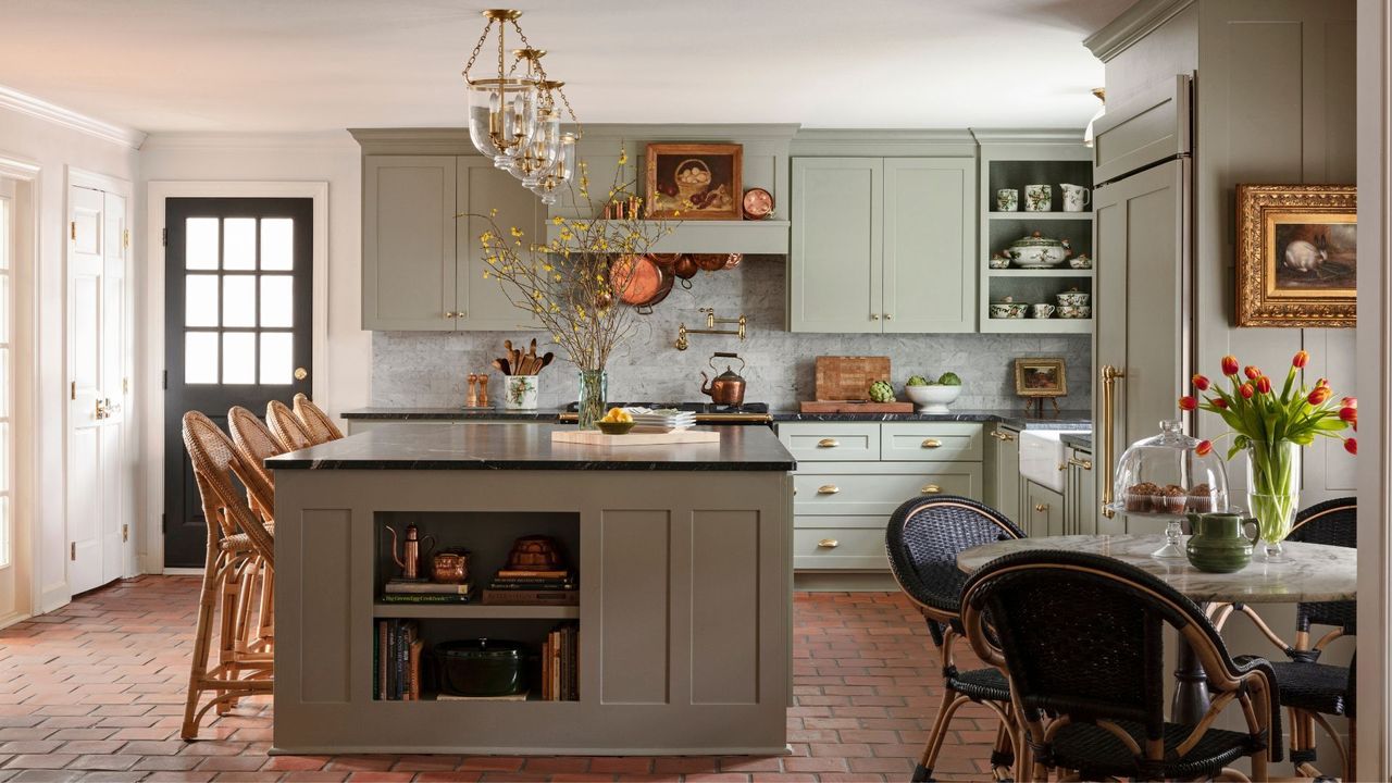
The cottage aesthetic is timeless, a style that might adapt and shift as tastes and trends change, but it remains a perennial favorite. The look is known for its scheme of soft neutrals and layers of warm and welcoming shades, both of which are reflected in Benjamin Moore's most recent color palette – cottage chic.
The six curated shades deliver charm, coziness, and that effortless cottage-chic style. Each one brings a unique character that can help to subtly uplift any room, blending into the background as the perfect backdrop for your space.
If you’re on the prowl for the best neutral paints to bring subtle style and softness to your home, these six Benjamin Moore shades are definitely worth a look. Here, we’ll shine a light on each of these neutrals, complete with expert tips from Arianna Barone, Color Marketing Manager at Benjamin Moore, so you can find the perfect tone to create a cottage chic feel in your own home.
A post shared by Benjamin Moore (@benjaminmoore)
A photo posted by on
Seapearl OC-19
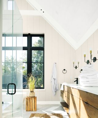
Soft, balanced, and endlessly versatile, Seapearl OC-19 walks the line between warm and cool undertones with ease.
'This soft off-white effortlessly balances between warm and cool, making it a great option for different styles and spaces,' says Arianna. In sun-soaked rooms, it leans whiter, while in lower light it reveals more of its subtle gray side.
For a crisp finish, pair it with Chantilly Lace OC-65 on trim and ceilings. For a monochrome feel, Arianna suggests layering in other neutrals like Rodeo 1534 and Pashmina AF-100.
Rodeo 1543
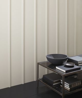
Calm and inviting, Rodeo 1534 is a soft neutral that works beautifully in high-traffic, connective spaces like entryways and living rooms.
'This soft and serene neutral paint has a great amount of depth,' Arianna notes. 'It’s present but not distracting.' In natural light, Rodeo reveals warm, welcoming tones; in dimmer rooms, it remains light and grounded. Arianna recommends pairing it with White Dove OC-17 and introducing blues and greens like Wedgewood Gray HC-146, for a relaxed, breezy feel.
Featherstone 1002
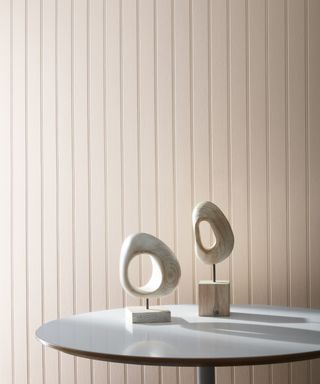
If you are looking for a neutral with a playful twist, Featherstone 1002 brings a hint of pink to the table, creating a beige paint that’s sophisticated but not too serious.
'I love the subtle hint of pink in this flattering beige hue,' Arianna says. In brighter spaces, the pink peeks through more, while in shadowed rooms it leans toward gray. Try it with Atrium White OC-145 on trim, and pull out that pink with earthy greens like Hampshire Gray HC-101.
Knitting Basket CSP-405
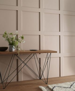
Warm and welcoming, Knitting Basket has a rustic charm that lends itself beautifully to cottage-style interiors.
Arianna says, 'I love to use this color for a more vintage but relaxed look. In rooms with a lot of natural light, it can feel welcoming and sophisticated but not too precious.'
For a classic look, try it with Gardenia AF-10 on trims, or for something bolder, add in deep accents like Hale Navy HC-154. If you’d like to soften the space, opt to pair with pale neutrals like Wind’s Breath OC-24.
Spanish Olive 1509
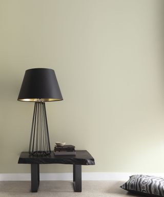
For an alternative to a typical gray paint, Spanish Olive 1509 introduces a quiet green undertone that makes it feel fresh yet grounded.
'Spanish Olive 1509 has the perfect hint of green that doesn’t overwhelm a space but still feels present,' Arianna explains. It’s particularly suited to kitchens and bathrooms, where its midtone quality holds up well next to hard finishes. Pair it with Swiss Coffee OC-45, and experiment with rich pinks or burgundies like Ruby Dusk 1267 to bring out its earthier side.
Sage Mountain 1488
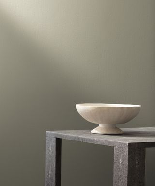
Deep and soothing, Sage Mountain 1488 is a standout neutral for a kitchen cabinet color or built-ins. 'I like to use this color to bring a subtle touch of moody vibes to a space,' Arianna notes. Depending on the lighting, it can feel lighter and greener or moodier and more atmospheric.
Arianna suggests 'pair this color with Hazy Skies OC-48 on the trim and ceiling because it is a softer off-white that also shares a similar green-gray quality'. Sage Mountain evokes a moodier vibe when paired with inky shades like Raccoon Fur 2126-20 and Ashwood Moss 1484, whilst other creamy neutral accents like Edgecomb Gray HC-173 and Grant Beige HC-83 will achieve a softer finish.
Whether you're painting an entire room or just refreshing finishing touches, neutral colors like these prove that 'neutral' doesn’t necessarily mean boring. Each one of these Benjamin Moore picks brings its own distinct personality using clever undertone combinations.
Some warm, some cool, and some a little moody, but all of them are ideal for a sophisticated yet rustic home aesthetic. 'Any of these colors can be layered in through painted furniture to bring in a subtle touch of earthy cottage chic hues to a space,' Arianna reminds us. So next time you're decorating with neutrals, let one of these timeless shades set the tone.
Sign up to the Homes & Gardens newsletter
Design expertise in your inbox – from inspiring decorating ideas and beautiful celebrity homes to practical gardening advice and shopping round-ups.
Sophia Pouget de St Victor is the UK Editor at Homes & Gardens, leading the editorial direction for the UK facing Homes & Gardens website. She brings readers the latest trends, expert insights, and timeless design inspiration tailored for a UK audience.
She has previously worked in the luxury homes and interiors industry and studied Garden Design in London, where she mastered her passion for creating landscapes that have a visceral impact on their onlookers. Home, though, is where Sophia's heart is. While she adores a wide variety of interior styles, she prefers interiors with a uniqueness that challenges any definable style. That said, there's little she finds more indulgent than walking down Pimlico Road and admiring the window display at Robert Kime; she has always found his interiors perfectly judged for a home that exudes an easy, unforced elegance.
Sophia lives in West London with her partner, along with two very naughty wiry terriers, and a plump cat named Lettuce.
You must confirm your public display name before commenting
Please logout and then login again, you will then be prompted to enter your display name.
-
 Is crown molding out of style? Interior designers discuss this classic feature and decide if it has a place in 2025
Will we be saying goodbye to the classic architectural feature this year? Interior designers share their thoughts
By Eleanor Richardson Published
-
 Horticulturists urge you to prune these 7 plants in April – for healthy growth and better-than-ever flowering displays
Discover a key selection of plants to cut back this month, with expert pruning advice
By Drew Swainston Published