'It has a presence but doesn’t overwhelm a space' – Benjamin Moore's best butter yellow paints prove how usable the color everyone is melting for can be
Bright, pollen yellow is out and muted, butter yellow is in
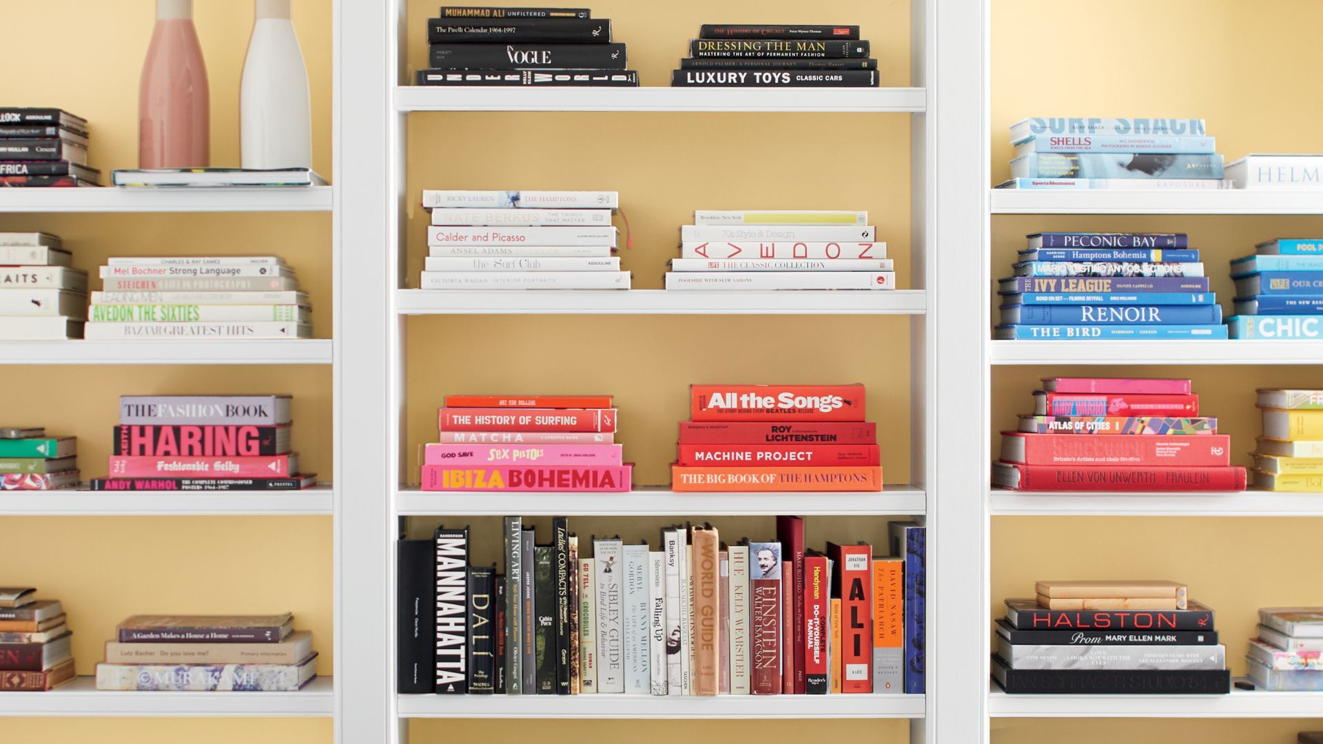
Soft, sunny, and surprisingly versatile, butter yellow is having a design moment. Whether you're leaning into vintage charm or just craving a little more warmth at home, Benjamin Moore has shared its favorite butter yellow shades that offer the perfect way to bring retro-inspired brightness into any space.
I spoke with Arianna Barone, Color Marketing Manager at Benjamin Moore, to get more insights into this delicious color trend and how to use it in your own home to bring warmth, personality, and a sunny disposition to your home without overwhelming.
A post shared by Benjamin Moore (@benjaminmoore)
A photo posted by on
While bold colors, deep tones, and neutral palettes are often the go-to choice, decorating with yellow, especially soft, buttery shades, has re-emerged as a standout favorite amongst interior designers in 2025.
Inviting, nostalgic, and undeniably happy, butter yellow enhances natural light and lifts a space. If you are feeling apprehensive about dousing your walls in yellow, this color doesn’t have to dominate; in fact, it can be a wonderful alternative to a traditional neutral palette when introducing just the right balance of yellow as these three buttery shades prove.
Golden Straw 2152-50
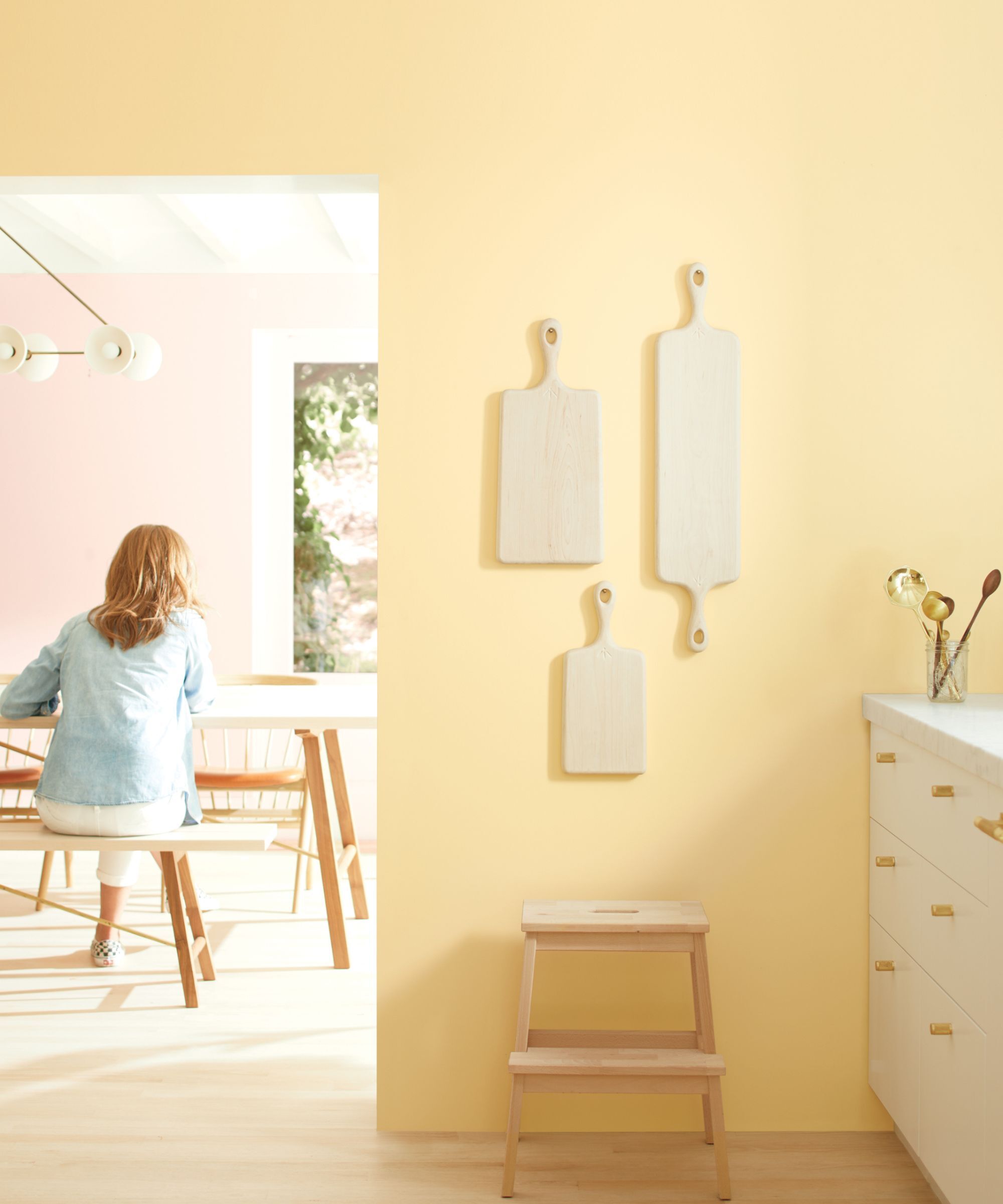
With its soft blend of neutral and peach undertones, Golden Straw 2152-50 brings a gentle warmth that works beautifully in kitchens, breakfast nooks, and other entertaining zones of the home.
'This easygoing yellow paint has touches of cream and peach, which softens it and makes it a more approachable golden hue,' Arianna explains. Paired with warm wood accents or bright white counters, it creates a welcoming, sun-drenched vibe that feels both nostalgic yet decidedly modern.
Hawthorne Yellow HC-4
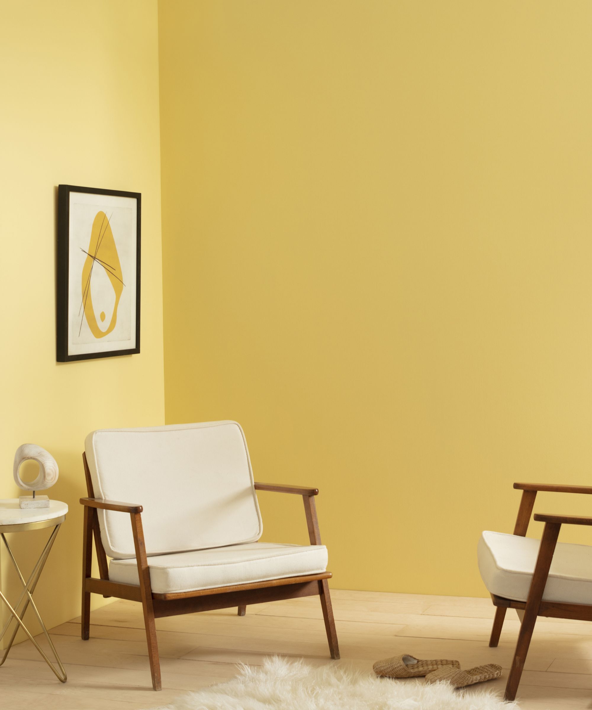
If you're looking for something bolder but still balanced, Hawthorne Yellow is a timeless favorite.
'One of our most popular yellow hues, Hawthorne Yellow HC-4 is a go-to for interiors and exteriors alike,' says Arianna. 'When looking for that traditional yellow exterior with a cheerful and inviting look, this is one of my first stops.'
It pairs effortlessly with off-whites, neutrals, grays, and blue paints if you are after a bolder look, making it a versatile choice. Its classic charm and bright spirit give any room an instant lift so ideal for rooms that don't get a lot of natural light too.
Man on the Moon OC-106
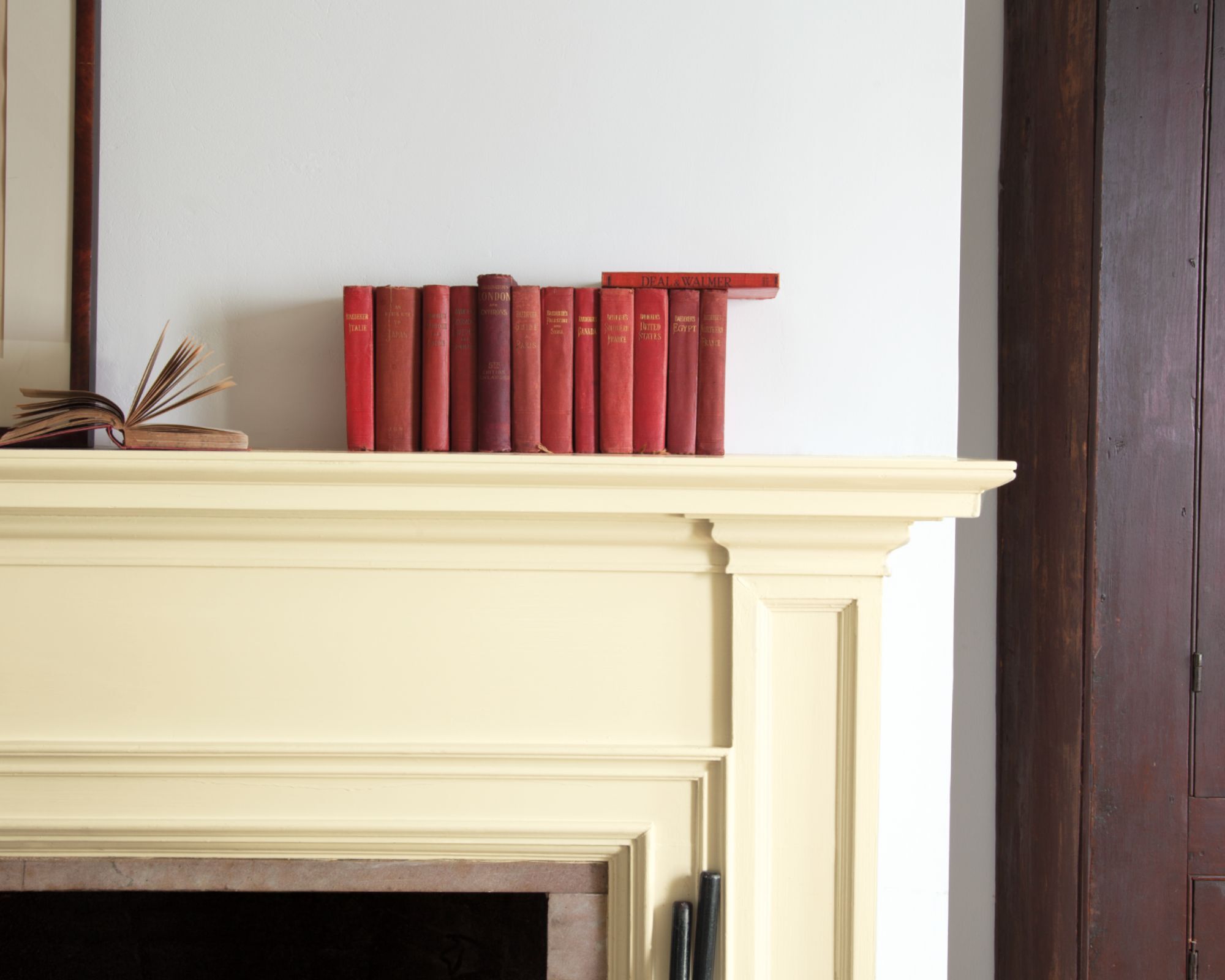
Pale and luminous, Man on the Moon is the lightest of the three, ideal for spaces that need a subtle touch of sunshine. This shade will give the appearance of natural light in dimmer, low-lit areas, opening up and warming the room more effectively than cooler white shades.
'The lightest of the three options, this sunny hue playfully balances between off-white and pale yellow,' says Arianna. 'I like to use it in rooms that receive a lot of cool northern exposure to help make the space feel lighter and brighter. It has just the right amount of yellow, so it has a presence but doesn’t overwhelm a space.' This hue is perfect for bedrooms, small living spaces, or anywhere you want a quiet, uplifting glow.
Shop butter yellow accessories
You might not want to commit to painting a whole room in a Benjamin Moore butter yellow, but it's a really easy shade to bring into your home through decor and accessories. Here are a few of my favourite picks to shop right now.

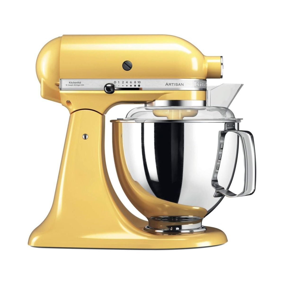
A fabulous way to bring a mellow, muted buttery yellow into your kitchen in smaller accents, this vintage-inspired toaster is wonderfully nostalgic but perfectly suited to a contemporary kitchen.
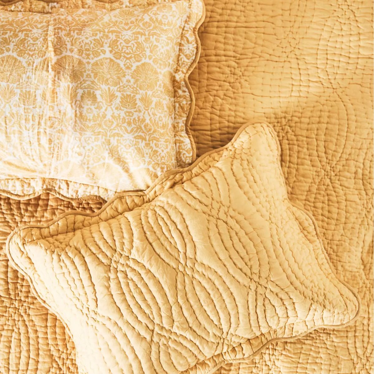
A delightfully retro but utterly charming sham in a cheery shade of butter yellow, a great addition to a reading nook or bedroom, and a great gift for someone feeling a little low or under the weather.
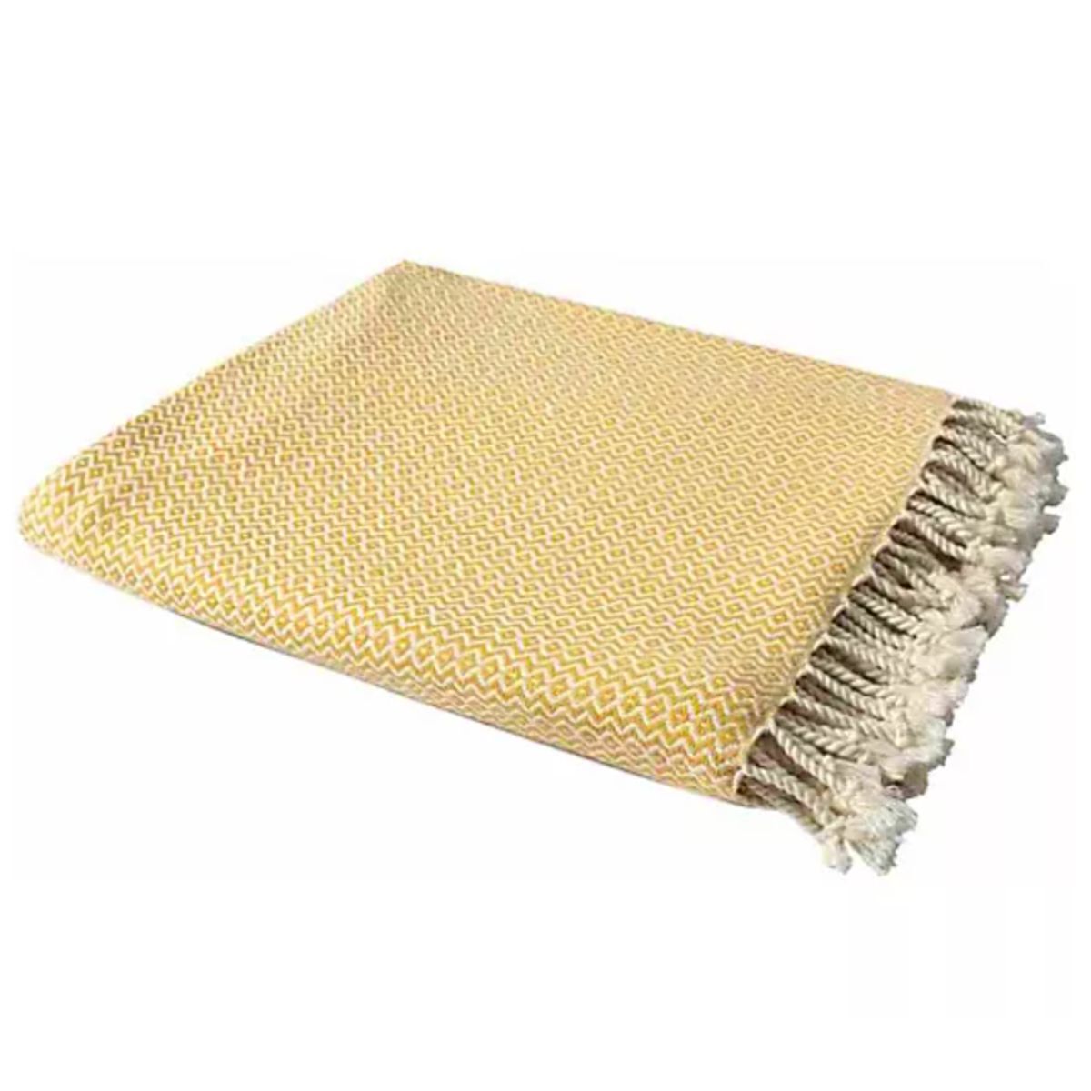
This gorgeously inviting organic cotton throw would work wonders and make a space feel more sunny and optimistic. It makes for a great housewarming gift!
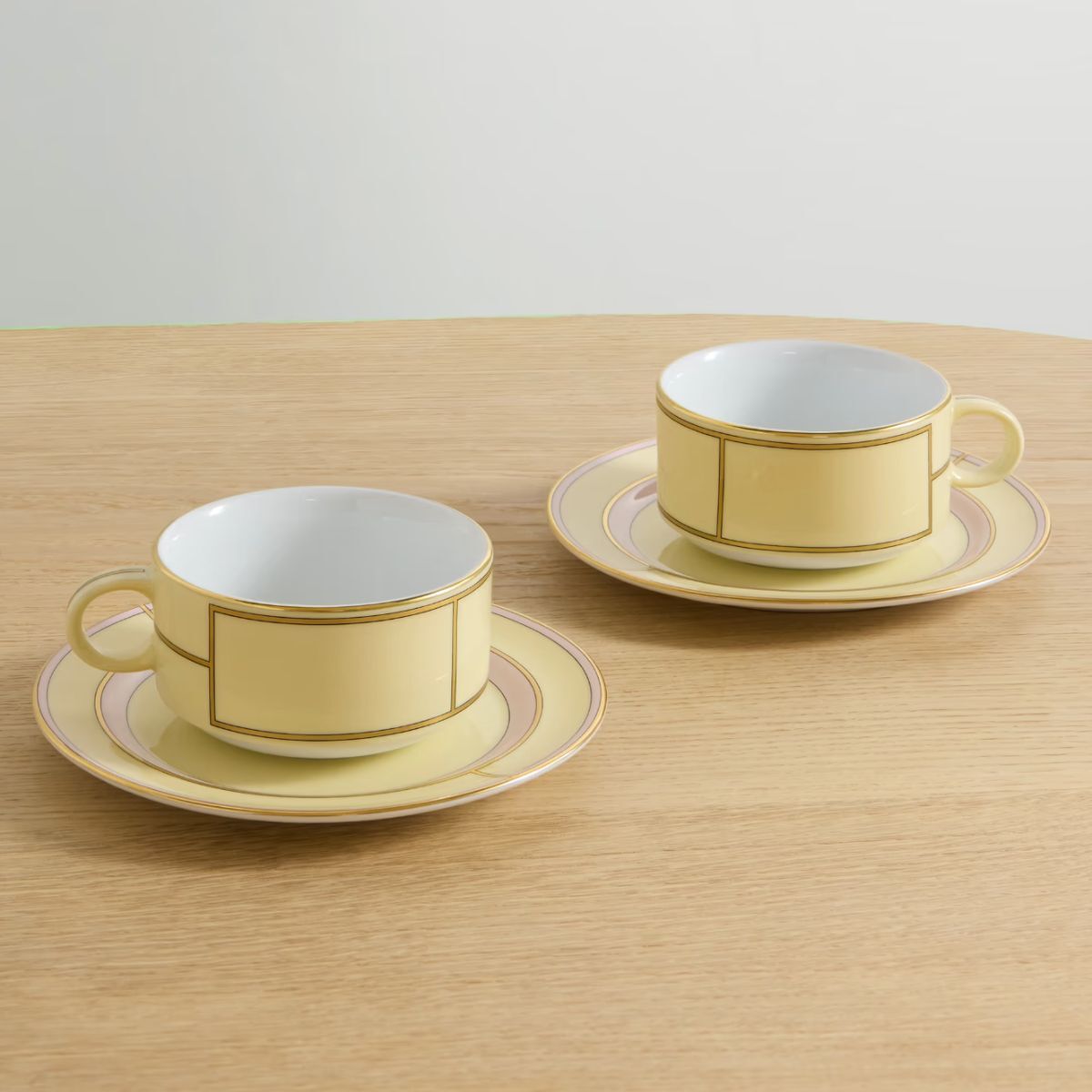
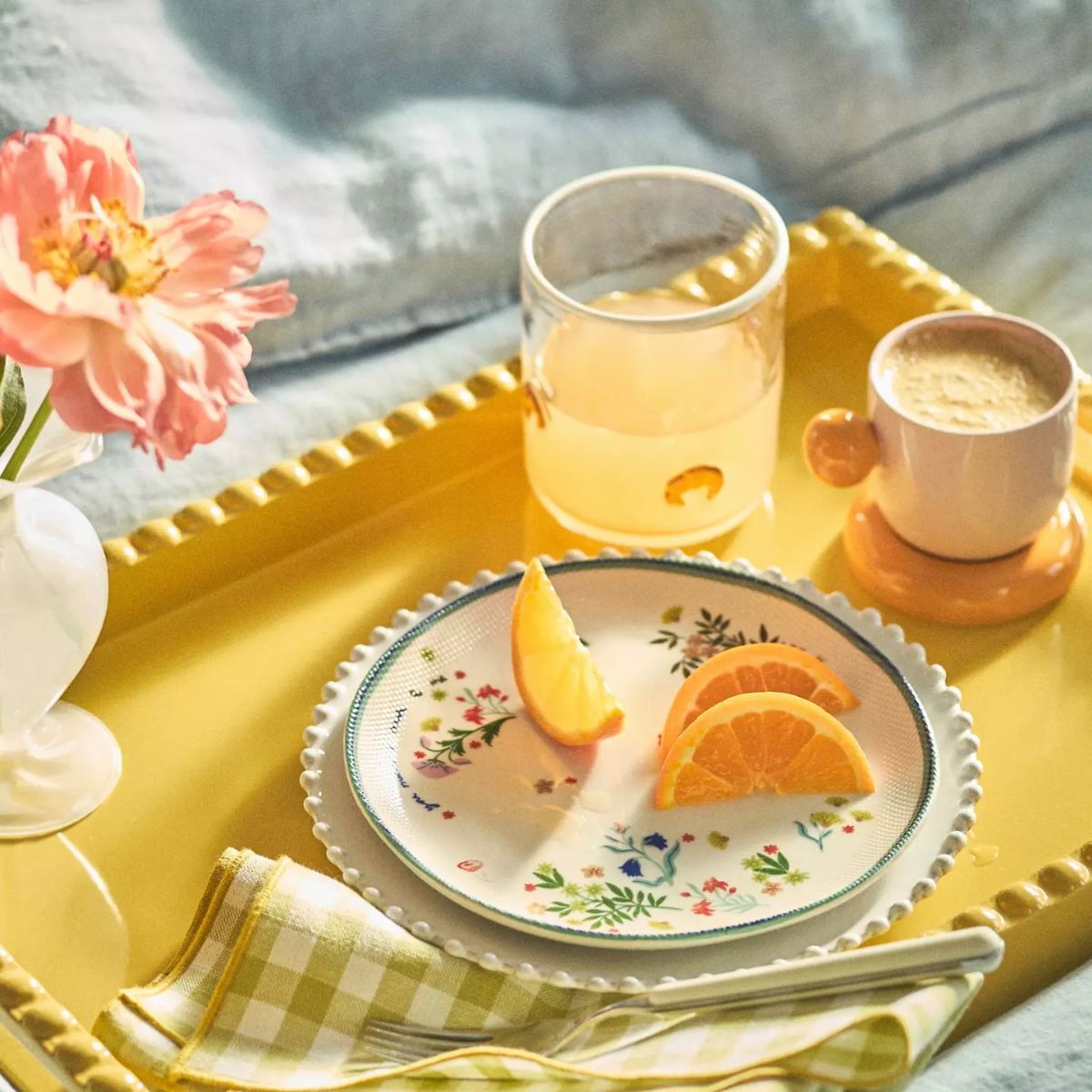
This darling set of vintage inspired teacups and saucers would make an inspired wedding or anniversary gift. They're handcrafted in Italy from porcelain and would almost certainly be treasured possessions and heirloom pieces to hand down through the generations.
From the mellow tones of Man on the Moon to the sunny glow of Hawthorne Yellow, these shades from Benjamin Moore show that yellow can be just as versatile as any neutral paint. Whether you're reviving a retro vibe or just looking to add warmth and light to your home, these three paints offer a stylish and approachable way to do it. As Arianna suggests, incorporating color doesn't always mean going bold, sometimes, it's as simple as letting a little sunshine in.
Sign up to the Homes & Gardens newsletter
Design expertise in your inbox – from inspiring decorating ideas and beautiful celebrity homes to practical gardening advice and shopping round-ups.
Sophia Pouget de St Victor is the UK Editor at Homes & Gardens, leading the editorial direction for the UK facing Homes & Gardens website. She brings readers the latest trends, expert insights, and timeless design inspiration tailored for a UK audience.
She has previously worked in the luxury homes and interiors industry and studied Garden Design in London, where she mastered her passion for creating landscapes that have a visceral impact on their onlookers. Home, though, is where Sophia's heart is. While she adores a wide variety of interior styles, she prefers interiors with a uniqueness that challenges any definable style. That said, there's little she finds more indulgent than walking down Pimlico Road and admiring the window display at Robert Kime; she has always found his interiors perfectly judged for a home that exudes an easy, unforced elegance.
Sophia lives in West London with her partner, along with two very naughty wiry terriers, and a plump cat named Lettuce.
You must confirm your public display name before commenting
Please logout and then login again, you will then be prompted to enter your display name.
-
 Plants never to grow next to fruit trees
Expert advice on which plants to keep away from fruit trees to encourage a healthy harvest
By Jacky Parker Published
-
 Martha Stewart's tips for arranging daffodils are unbelievably simple and effective – it's the only flower advice you need this springtime
Martha shows us that we can create gorgeous bouquets of this seasonal flower by simply trimming the stems and placing them in specific vases
By Hannah Ziegler Published
