7 paint colors to decorate with in March 2024 that will outlast any trends – I promise
This March's paint color trends explore everything from earthy beige, grounding green to subtle pinks and rich reds

Finding the right paint colors to decorate with in March is a problem every designer and decorator wishes to solve. If you've ever felt indecision at this time of the year, you're not alone. This transitional month often coincides with spring cleaning, ever-changing weather and new beginnings. In fact, I often do the bulk of my yearly planning, and decision-making and follow the 'in with the new, out with the old' mantra now. And, no more so, than when it comes to color trends. Why, you ask?
March is a good time to reflect and ditch the comforting color trend and palettes that got us through the winter and switch to spring color ideas to mark the arrival of the new season. Spring is a time of renewal and growth, and is the perfect time to readdress your current color scheme.
Here, designers, decorators, and experts reveal how to approach choosing room color ideas for spring with confidence.
7 paint colors to decorate with in March – to signal new beginnings for spring
Want to decorate your home with the very latest color and paint ideas for March? One of the most important elements in any home, the chosen color scheme will transform even the dullest space into a delightful haven for the new season.
I've rounded up the most exciting colors set to dominate paint trends in March 2024, along with helpful advice and guidance from the experts in the know on how to use them in your home.
1. Red
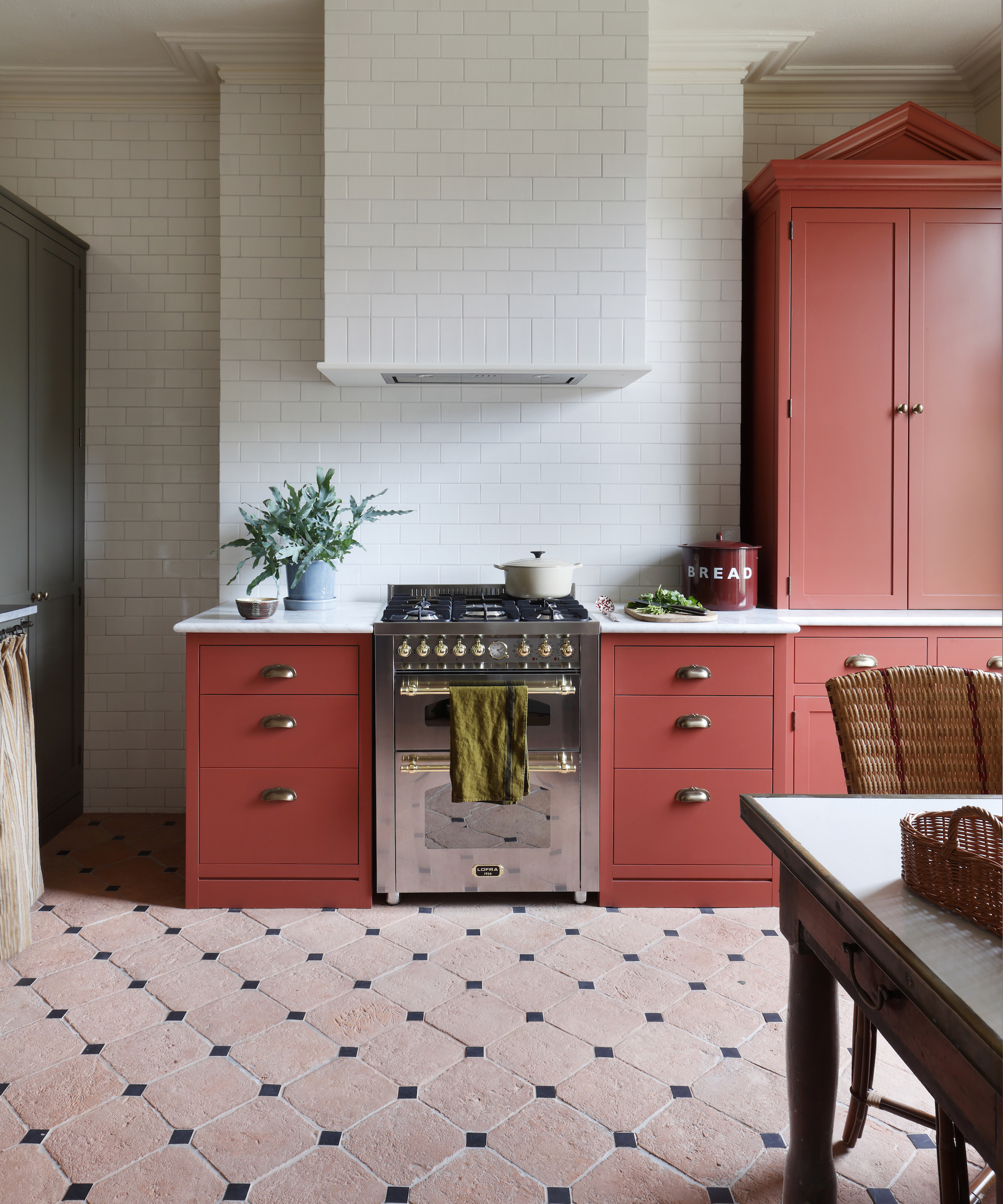
Red might seem like an unusual choice for spring, but before you switch off, hear me out. The 'Unexpected Red Theory' coined by designer Taylor Simon has changed my perspective on red – often considered the most stressful color.
One of the most passionate and life-enhancing colors to use in a decorating scheme, red offers a luxurious bank of positive energy, making it an exceptional choice for spring decorating.
Red can transform interiors, adding a sophisticated to fun aesthetic, and introducing red over smaller areas, such as on interior woodwork, is a wonderful way to highlight original features and period architecture.
If you plan on decorating with red, there are a few key things to consider first, says Simon Temprell, head of interior design at Neptune.
‘When using red in a color scheme, it’s best to choose shades that are rich and warm rather than loud and insistent,' he says. With bold colors, it is time well spent to consider how you react to the color and how it makes you feel. There is often a clue in our wardrobes as to which colors we lean towards. However, while we can change our outfits, we can’t so easily make that change with our interiors
2. Blush pink
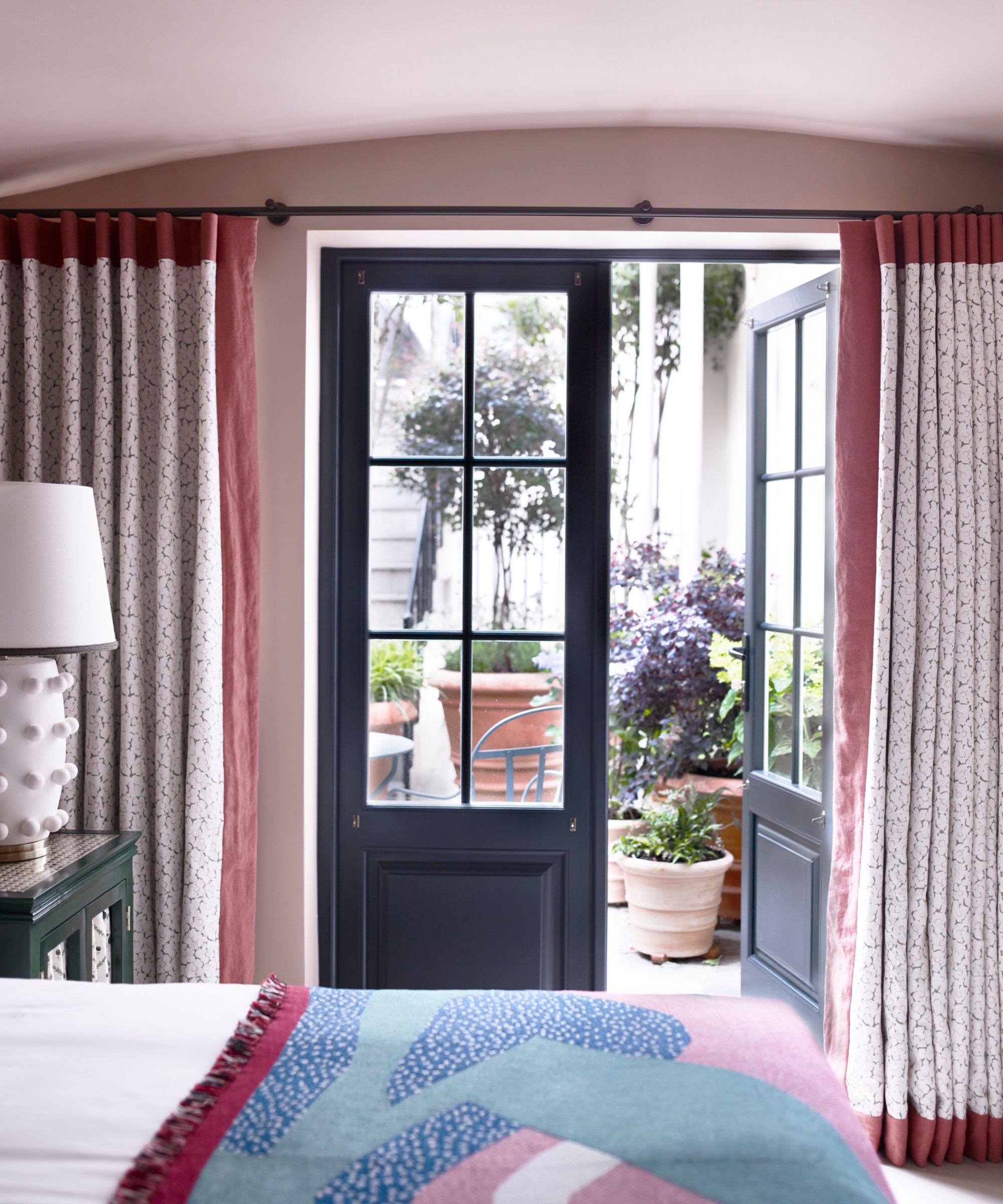
Last summer saw the much-anticipated return of bubblegum pink, also known as 'Barbie' pink, thanks to the Greta Gerwig movie of the same name. While pink is still very much part of the cultural zeitgeist, this spring we will see subtle, blush shades blossoming in the home.
Pastel pink can form a reliable background color that channels anything from a contemporary to a classical country-house spirit. What's more, it has been named the most beautiful color for a room. For this reason, the bedroom is my favorite place to decorate with pink.
Pink is an excellent choice for a bedroom as it doesn’t distract or stimulate the brain. ‘Choose a warm and cozy hue,’ recommends Irene Gunter of Gunter & Co. ‘My current favorites include Temple by Paint & Paper Library and Setting Plaster by Farrow & Ball. Using blush shades like these, particularly in a bedroom, creates a soothing and inviting atmosphere.’ She likes to pair these shades with natural wood floors and textured materials such as velvet in a deep grey
3. Sage green
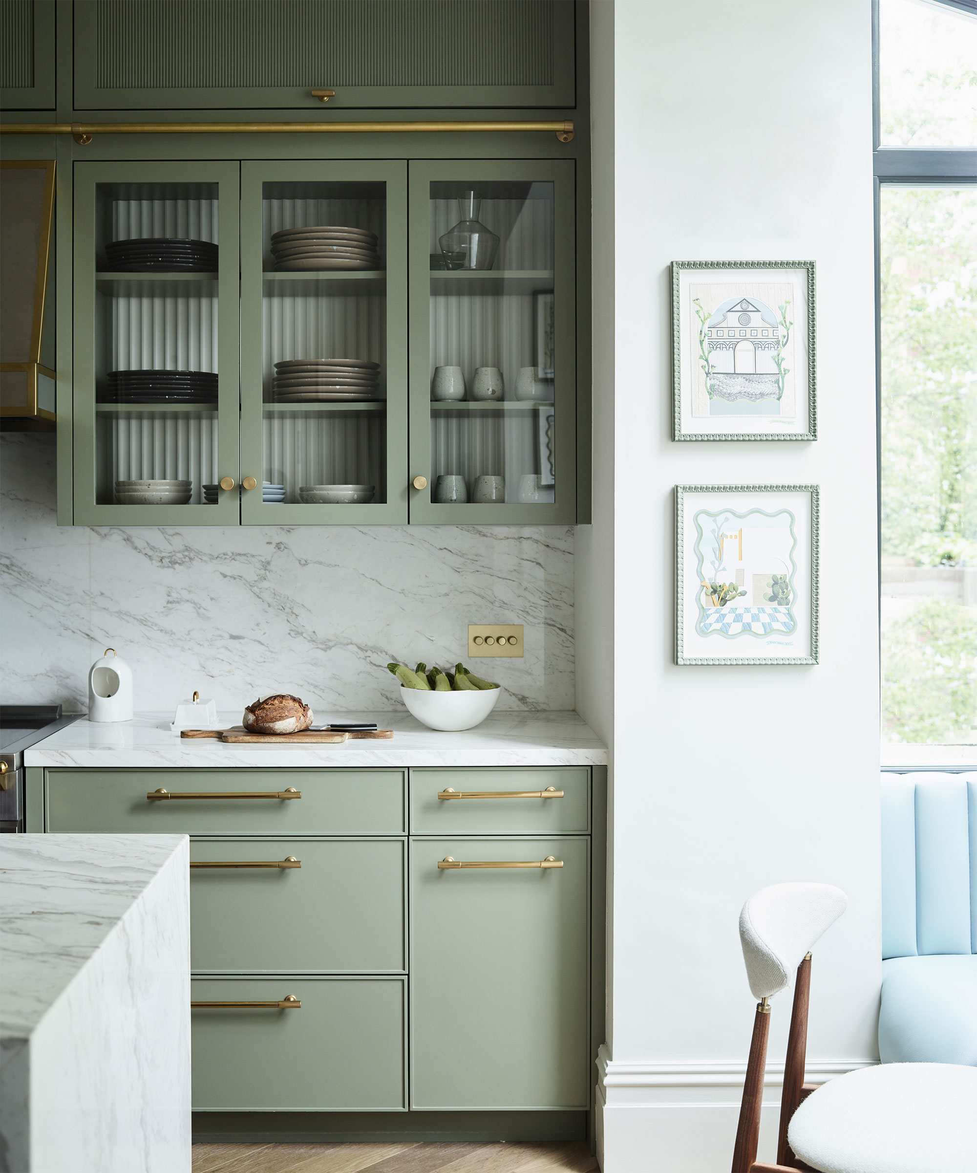
Inspired by the natural world, sage green is restful with a touch of heritage. Strong yet soothing, this popular spring color brings an enveloping feel but can also sit quietly and allow bold furniture and joinery to shine. It goes without saying that color aficionados and decorators love to embrace this adaptable green in their homes, and it is easy to see why.
Decorating with green is entwined with the permanence and beauty of nature and is a timeless choice for interior decorating that shows no signs of abating this season. Conjuring to mind the silvery green leaves of the fragrant Mediterranean plant, sage is a soft shade which, just like the myriad tones of the natural world, can lean warm or cool.
‘This is a wonderful color that works well all through the year and is ideal if you are trying to bring an element of nature or a heritage feel into a more contemporary city home,' says Emma Sims-Hilditch, founder and creative director, of Sims Hilditch. 'It’s a restful and calming shade which not only works well on cabinetry but also looks great on walls.’
For the ultimate nurturing spring space, layer greens with blues to evoke calming country vistas. ‘Working with a green-blue color combination will ensure a feeling of peace and tranquillity as both colors appear strongly in nature,’ explains Simon Temprell, interior design lead at Neptune.
4. Soft beige
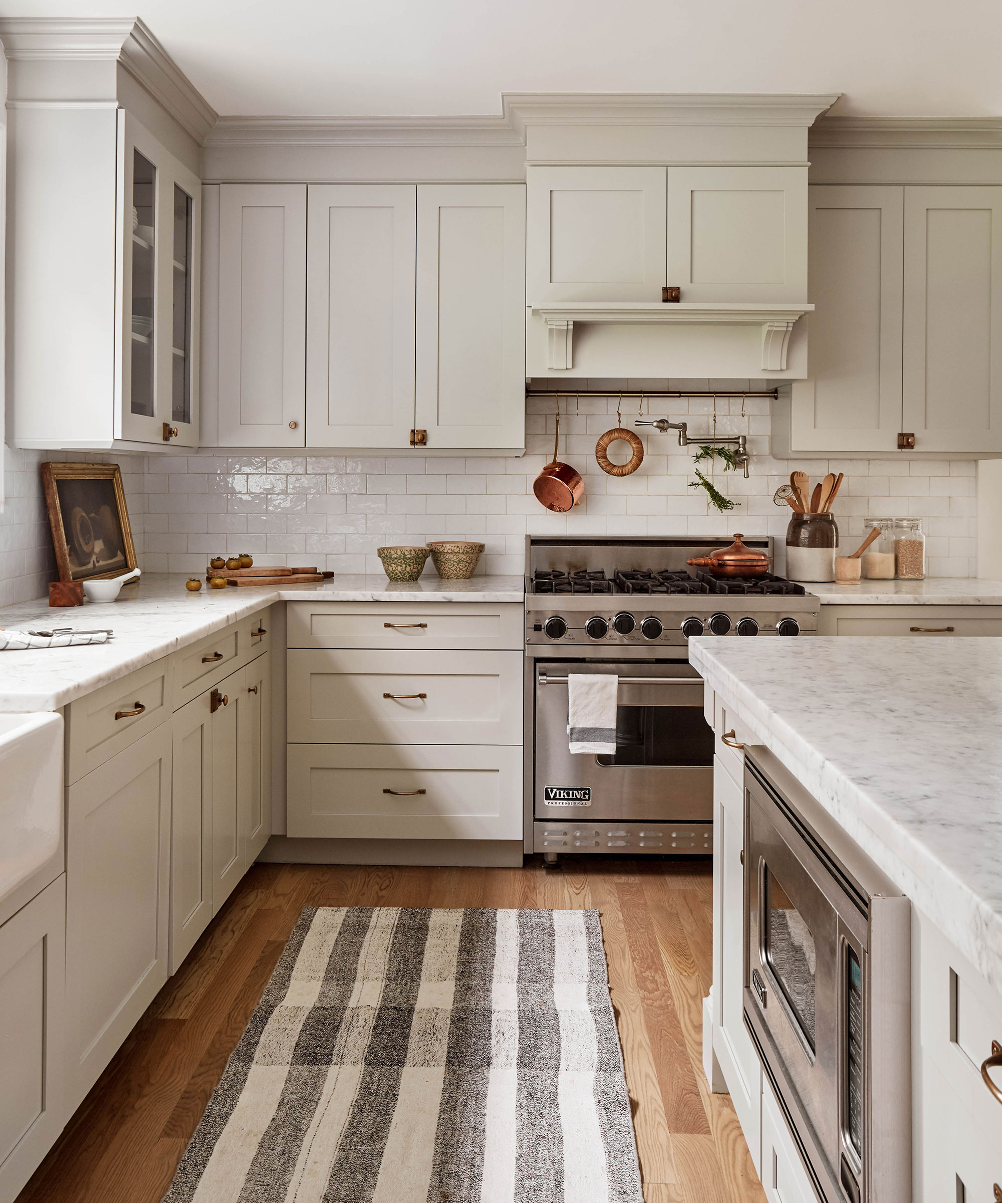
Beige, once considered an interior design faux pas, has come full circle, and it finally has its moment in the spotlight. A creamy, soft beige – I love it for its quiet beauty and versatility and it will suit just about any space.
The beauty of beige room ideas is that they provide a wonderful scaffold upon which to hang accents of color, adds Deborah Bass, founder of Base Interior.
‘This is especially true in a home office where a cream or beige wall or a textured plaster or wallpaper wall finish creates a background for books and art, both of which can take the decorative center stage.’
She recommends grounding subtler shades with a deeper, richer natural timber to create a balance. ‘Calming colors, such as beige, offer an elegant, timeless response to the working from home dilemma, likewise versatile in the sense that different family members might be using the space at different times of day and for a variety of functions,’ she adds.
5. Lilac
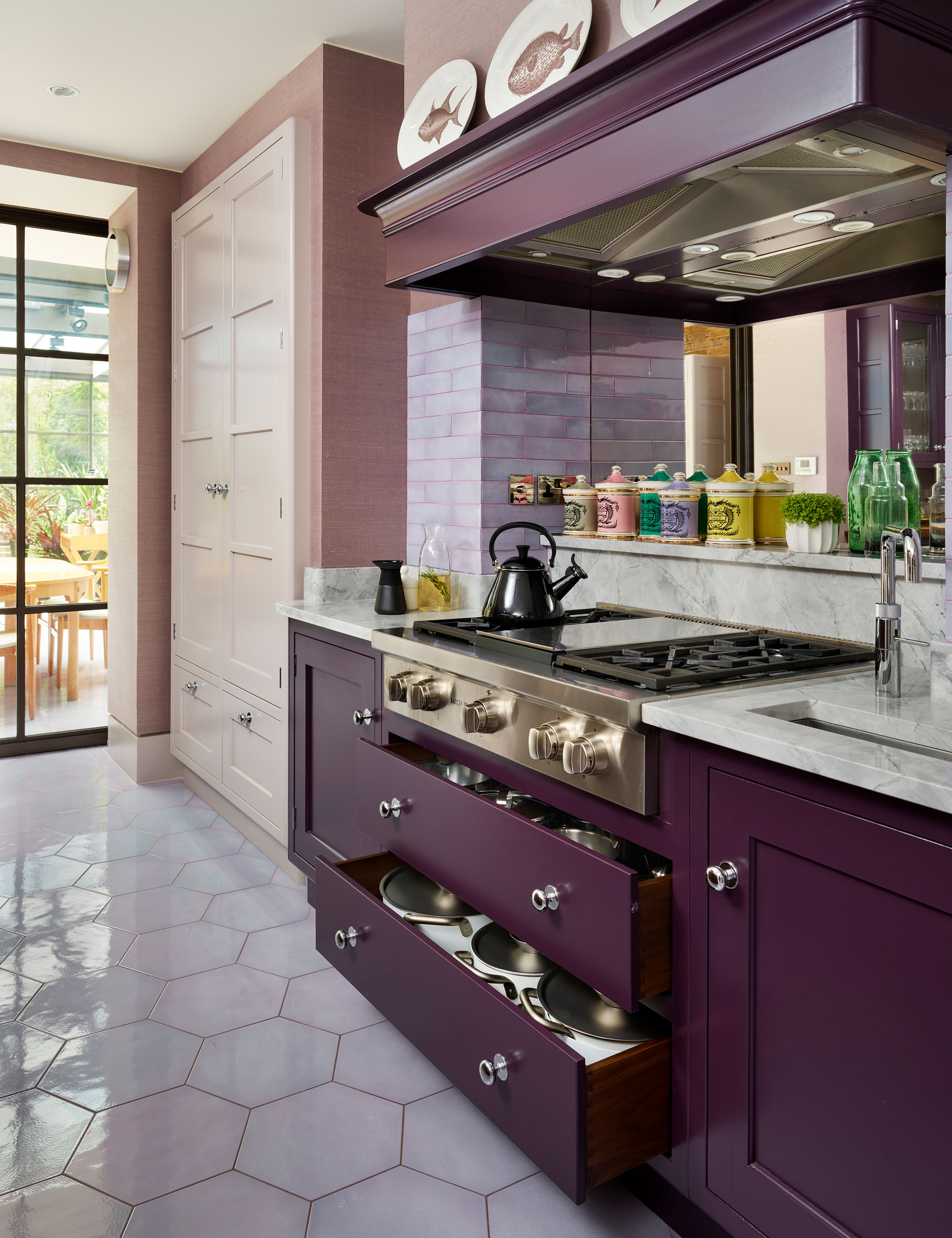
Much like florals, purple for spring isn't particularly ground-breaking. However, in recent years, the once popular color, often associated with royalty, luxury, and wealth, had fallen out of fashion. This season, purple rooms are having a moment.
While vivid violets and royal purples can be seen as bold, daring choices, their softer-toned cousin lilac lends a soothing, gentle feel to a space, and can feel like a breath of fresh air. Conjuring scenes of trailing wisteria, alluring alliums and swathes of heather, the myriad variations of a delicate pastel purple can inspire the most elegant and restful interiors, making it the ideal option for the start of spring.
Soft lilac has an inviting, friendly energy and is great for creating a relaxed feel within a home. Associated with sociability and open-mindedness, it helps make people feel at ease – perfect for communal areas. Lilac also has a slight feminine edge, which reinforces the feeling of comfortability.
6. Terracotta
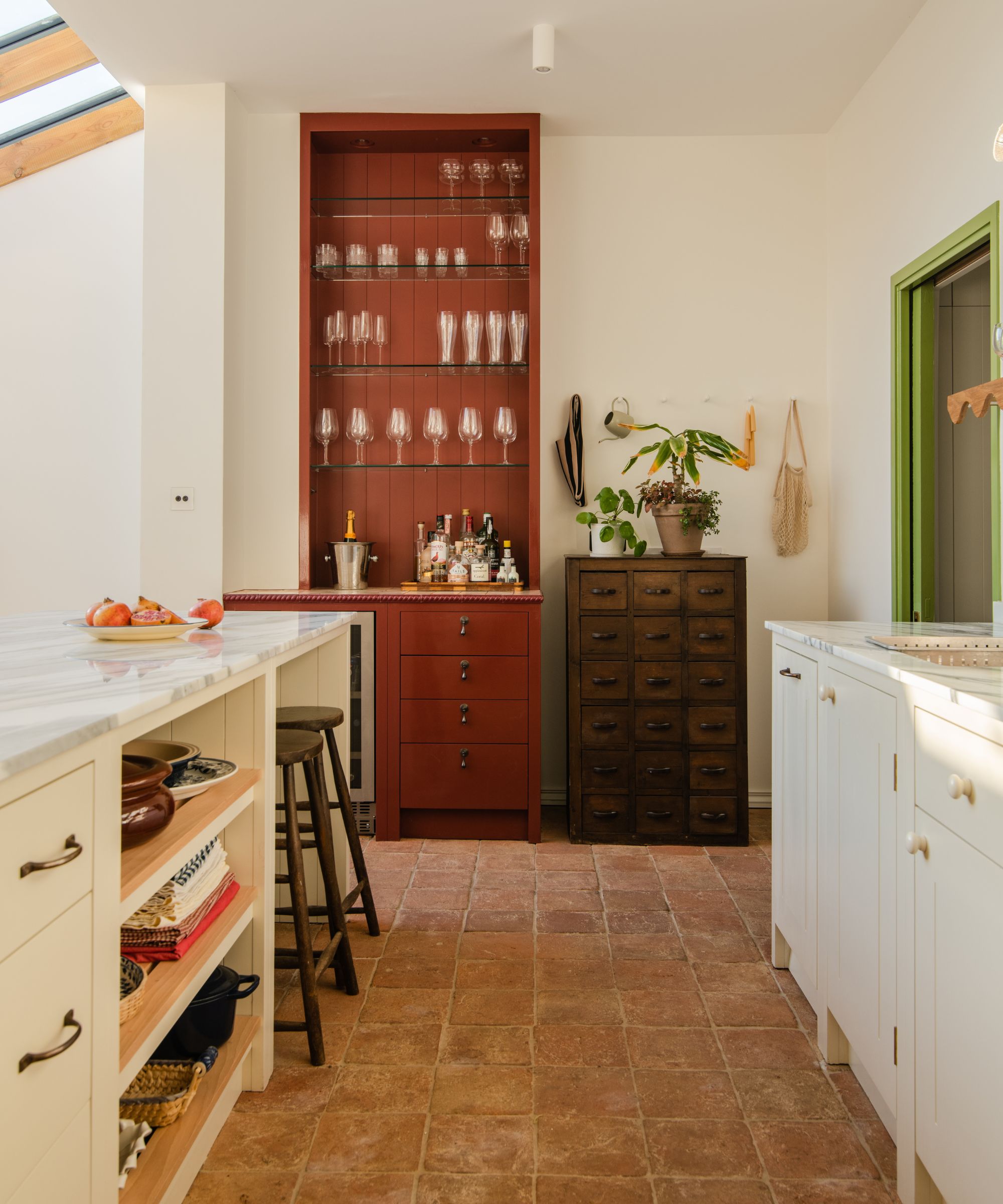
I spoke earlier about red being on my color radar for 2024, but if a primary red is just too bold, then look across the color spectrum. While my love affair with dramatic rich red color schemes is far from over, this season things are warming up. Move over lipstick red, because rich terracotta is radiating its way into my home this spring.
Not quite decorating with red, and not quite decorating with orange, terracotta paint brings its own unique quality to a room.
Interior designer, Naomi Astley Clarke comments, 'Terracotta’s appeal is often linked to the color’s ability to make us feel close to the earth. It’s such a versatile and neutral tone, yet some still shy away from this ancient color, worried they might make their home feel dark and dated. The key to achieving a chic terracotta scheme is to only employ as much as your space can handle and to balance it out with thoughtful color combinations. Here, terracotta pairs beautifully with cream and green for an earthy-inspired palette that is at one with nature.
7. Sunshine yellow
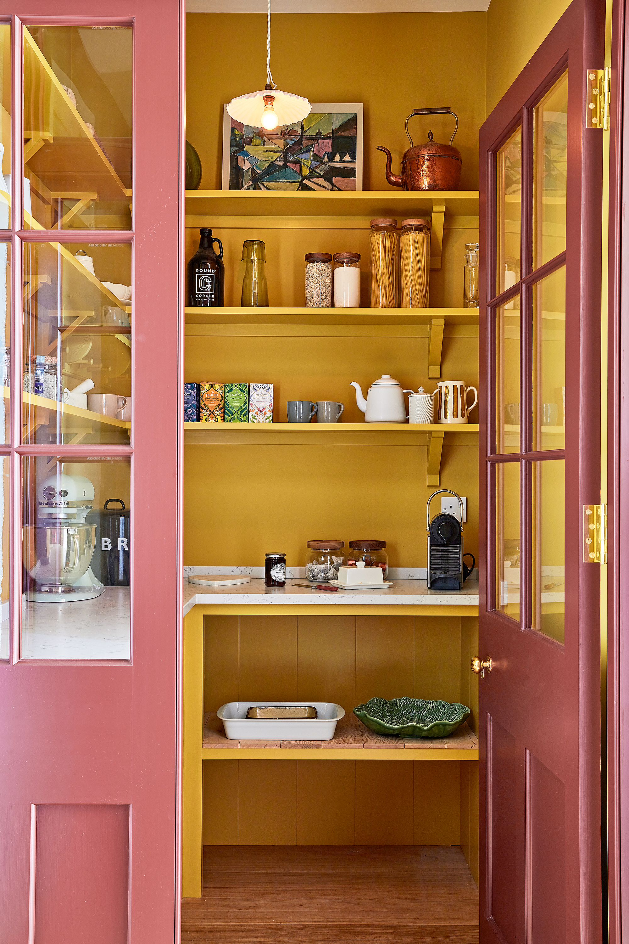
Sunshine yellow is one of my favorite colors for spring 2024. Be inspired to decorate with yellow – the most cheerful color, guaranteed to inject warmth and creativity into any space. It is so easy to spread happiness throughout the season with this uplifting hue. As one of the most uplifting colors it is not surprising that it is currently having a renaissance. But while pretty primrose and subtle sherbert will introduce a color pop to your home, it is the more vibrant and zesty yellows that have stolen my heart.
‘Decorating with yellow imbues the room with optimism and is perfect for bringing a sense of positivity into the home,’ says Justyna Korczynska, senior designer at Crown.
The versatility of yellow makes it a favorite element in decorating schemes for interior designers. Francesca Rowan-Plowden believes it works perfectly in both period and modern homes, no matter the style. ‘Yellow is a color that people are often scared to use, but it’s a fantastic color to really lift a space and create interest.
Yellow is a welcoming, joyful, vibrant choice, agrees Dominic Myland of Mylands. It works well as an accent color or as the main color within the room. Rich, golden yellows pair well with a range of accent colors. ‘Try monochrome accents for a modern interior – what color scheme could be more uplifting than yellow and white? Or look to nature for inspiration and pair it with soft greens for a fresh but calming feel. For bedrooms, yellow and blue is a warm combination that feels calming and bright at the same time.’
Understanding paint color lies at the root of all interior design decisions, and exploring the latest seasonal trends, along with consulting the color wheel, and basic color theory, will ensure that you choose the perfect palette for your space every single month.
Sign up to the Homes & Gardens newsletter
Design expertise in your inbox – from inspiring decorating ideas and beautiful celebrity homes to practical gardening advice and shopping round-ups.

Jennifer is the Digital Editor at Homes & Gardens. Having worked in the interiors industry for several years in both the US and UK, spanning many publications, she now hones her digital prowess on the 'best interiors website' in the world. Multi-skilled, Jennifer has worked in PR and marketing and occasionally dabbles in the social media, commercial, and the e-commerce space. Over the years, she has written about every area of the home, from compiling houses designed by some of the best interior designers in the world to sourcing celebrity homes, reviewing appliances, and even writing a few news stories or two.
-
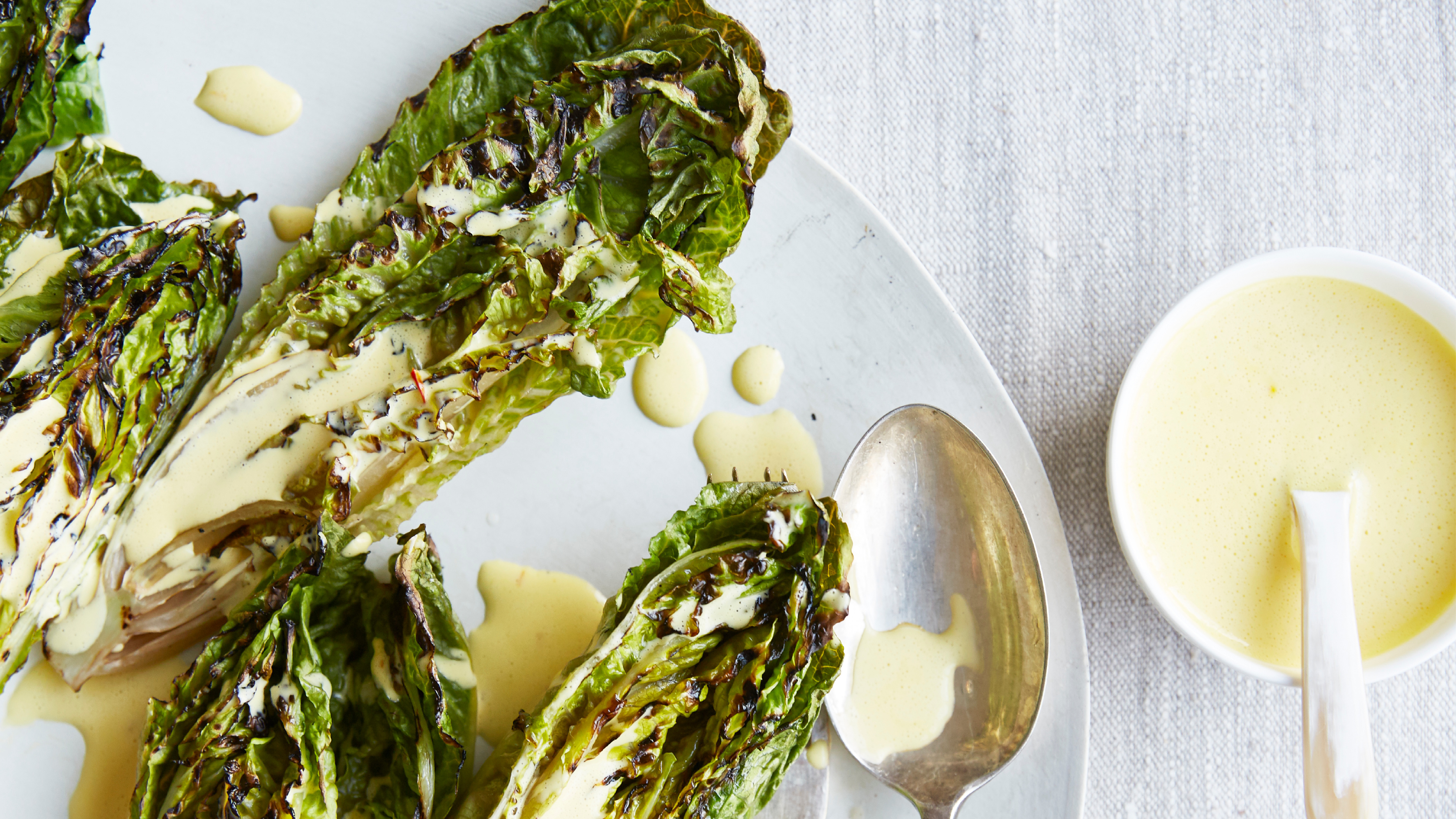 Charred little gem with saffron dressing
This recipe with charred little gem is both easy to make and sure to impress guests. It's the perfect side for fresh spring menus
By Alice Hart
-
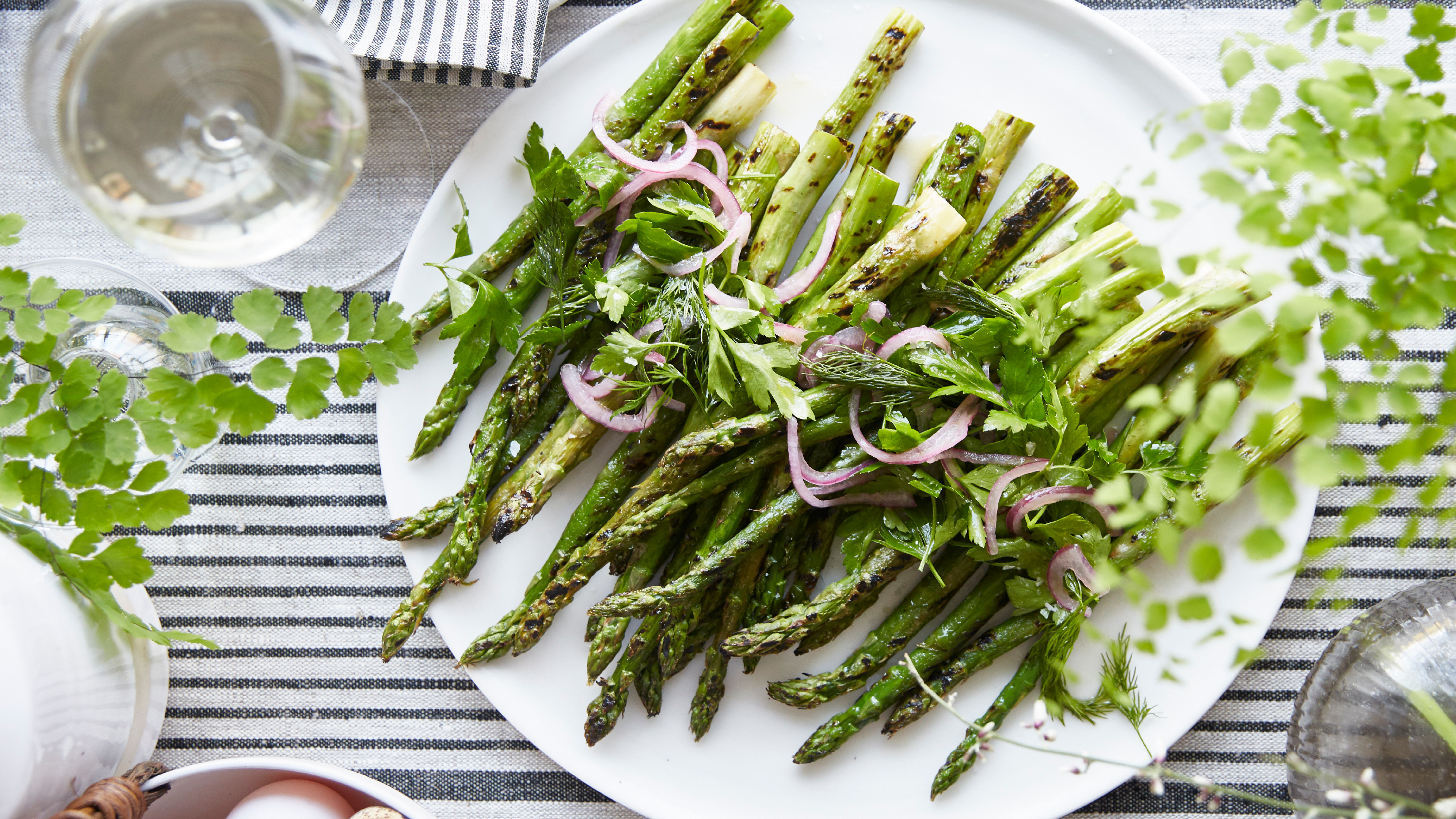 Grilled asparagus with herb and pickled red onion
This grilled asparagus couldn't be easier, and it's a wonderful way to get the best flavor from our favorite spring veg. It's perfect alongside fish or lamb
By Alice Hart